
2 or F 3 family means for BCC BCE SL SW and 20SWT in 2016F2 and 2017F3 experiments BCC brix content central BCE brix content edge SL seed length SW seed width 20SWT 20seed ID: 929710
Download Presentation The PPT/PDF document "Fig. S1 . Frequency distribution of F" is the property of its rightful owner. Permission is granted to download and print the materials on this web site for personal, non-commercial use only, and to display it on your personal computer provided you do not modify the materials and that you retain all copyright notices contained in the materials. By downloading content from our website, you accept the terms of this agreement.


Slide1
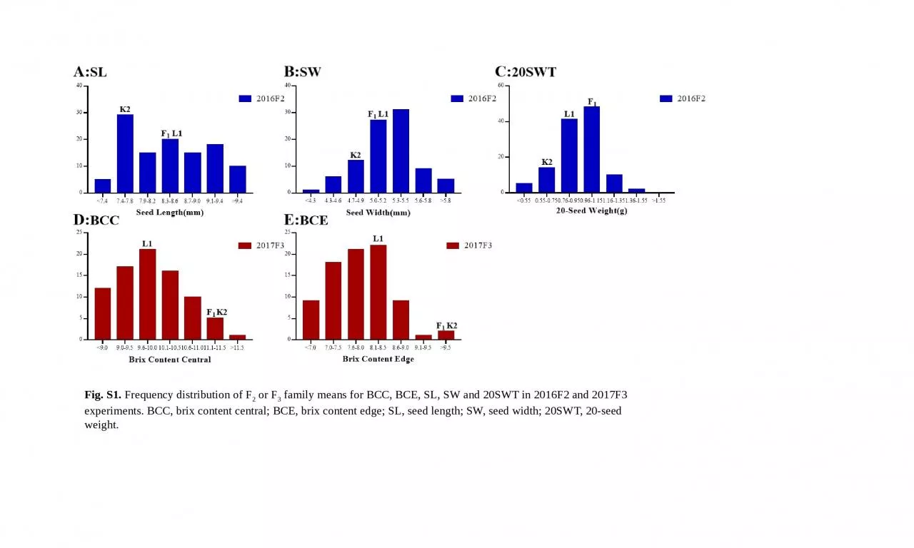
Fig. S1. Frequency distribution of F2 or F3 family means for BCC, BCE, SL, SW and 20SWT in 2016F2 and 2017F3 experiments. BCC, brix content central; BCE, brix content edge; SL, seed length; SW, seed width; 20SWT, 20-seed weight.
Slide2Fig. S2. Correlation matrix between the measured traits. The scale represent the values of Pearson’s correlation coefficient between the traits using the mean value across the blocks for each variable. FW, fruit weight; FFC, fruit flesh color; RC, rind color; RSP, rind stripe pattern; BCC, brix content central; BCE, brix content edge; SL, seed length; SW, seed width; 20SWT, 20-seed weight; FD, fruit diameter; FL, fruit length; FSI, fruit shape index.
Slide3Fig S3. Collinearity analysis between the physical map and the genetic map. For each chromosome, the left panel indicates alignment of markers on the genetic map against the pseudo-chromosome, and the right panel shows plotting of genetic distances against physical distances. The X axis is the marker position on the physical map, and the Y axis is the marker position on the genetic maps. The numbers in the figure represent the Spearman rank correlation coefficients between the marker order of the genetic maps and the physical map. A-K: chromosome1-chromosome 11
A
B
C
F
D
E
G
H
I
J
K
Slide4Fig. S4. A global view of all QTL detected across the eleven chromosomes is provided. The X axis represents linkage map of 11 chromosomes, and Y axis is LOD score. FW, fruit weight; FFC, fruit flesh color; RC, rind color; RSP, rind stripe pattern; BCC, brix content central; BCE, brix content edge; SL, seed length; SW, seed width; 20SWT, 20-seed weight; FD, fruit diameter; FL, fruit length; FSI, fruit shape index.
Slide5Fig. S5. Global view of QTL locations for different fruit-related traits detected in both 2016F2 and 2017F3 experiments. For each trait, the X axis represents linkage map of 11 chromosomes, and Y axis is LOD scores. (A) RC; (B) RSP; (C) FFC; (D) FD; (E) FL; (F) FSI; (G) FW. FW, fruit weight; FFC, fruit flesh color; RC, rind color; RSP, rind stripe pattern; FD, fruit diameter; FL, fruit length; FSI, fruit shape index.
A:
RC
B:
RSP
C:
FFC
D:
FD
E:
FL
F:
FSI
G:
FW
Slide6Fig. S6. Global view of QTL locations for different fruit and seed traits detected from single environment. For each trait, the X axis represents linkage map of 11 chromosomes, and Y axis is LOD scores. (A) BCC; (B) BCE; (C) SL; (D) SW; (E) 20SWT. BCC, brix content central; BCE, brix content edge; SL, seed length; SW, seed width; 20SWT, 20-seed weight; BA
C
D
E