
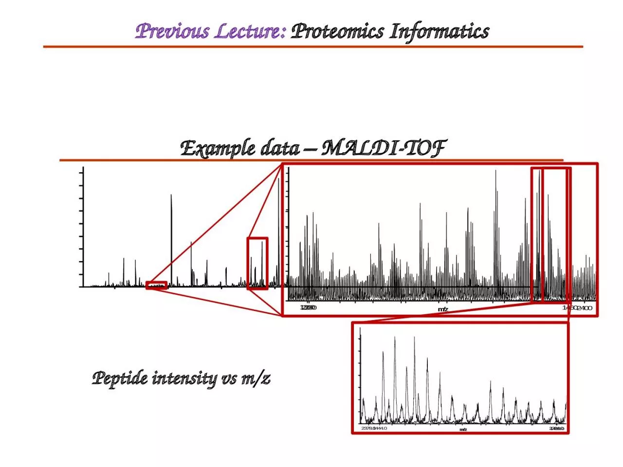
Peptide intensity vs mz Previous Lecture Proteomics Informatics Gene Expression Analysis I This Lecture Learning Objectives Microarray experimental details Microarray data formats QC analysis and data exploration ID: 933333
Download Presentation The PPT/PDF document "Example data – MALDI-TOF" is the property of its rightful owner. Permission is granted to download and print the materials on this web site for personal, non-commercial use only, and to display it on your personal computer provided you do not modify the materials and that you retain all copyright notices contained in the materials. By downloading content from our website, you accept the terms of this agreement.


Slide1
Example data – MALDI-TOF
Peptide intensity vs m/z
Previous Lecture:
Proteomics Informatics
Slide2Gene Expression Analysis (I)
This Lecture
Slide3Learning Objectives
Microarray experimental detailsMicroarray data formatsQC analysis and data explorationNormalizationDifferential expressionFunctional enrichmentDatabases
Slide4protein
RNA
DNA
transcription
translation
replication
The Central Dogma of Molecular Biology
DNA is
transcribed
into RNA which is then
translated
into protein
Measured by Microarray
Slide5What is a Microarray
A simple concept: Dot Blot + Northern Reverse the hybridization - put the probes on the filter and label the bulk RNA Make probes for lots of genes - a massively parallel experimentMake it tiny so you don’t need so much RNA from your experimental cells.Make quantitative measurements
Slide6Microarrays are Popular
At NYU Med Center we are now collecting about 3 GB of microarray data per week (60 chips, 6-10 different experiments)PubMed search "microarray"= 13,948 papers2005 = 44062004 = 35092003 = 24212002 = 15572001 = 8342000 = 294
Slide7A Filter Array
Slide8DNA Chip Microarrays
Put a large number (~100K) of cDNA sequences or synthetic DNA oligomers onto a glass slide (or other subtrate) in known locations on a grid.Label an RNA sample and hybridize Measure amounts of RNA bound to each square in the gridMake comparisonsCancerous vs. normal tissueTreated vs. untreatedTime courseMany applications in both basic and clinical research
Slide9cDNA Microarray Technologies
Spot cloned cDNAs onto a glass microscope slideusually PCR amplified segments of plasmidsLabel 2 RNA samples with 2 different colors of flourescent dye - control vs. experimentalMix two labeled RNAs and hybridize to the chipMake two scans - one for each colorCombine the images to calculate ratios of amounts of each RNA that bind to each spot
Slide10Spot your own Chip
(plans available for free from Pat Brown’s website)
Robot spotter
Ordinary glass
microscope slide
Slide11Slide12Combine scans for Red & Green
False color image is made from digitized fluorescence data,
not by superimposing scanned images
Slide13cDNA Spotted Microarrays
Slide14Slide15Data Acquisition
Scan the arraysQuantitate each spotSubtract backgroundNormalizeExport a table of fluorescent intensities for each gene in the array
Slide16Affymetrix “Gene chip” system
Uses 25 base oligos synthesized in place on a chip (20 pairs of oligos for each gene)RNA labeled and scanned in a single “color”one sample per chipCan have as many as 20,000 genes on a chipArrays get smaller every year (more genes)Chips are expensiveProprietary system: “black box” software, can only use their chips
Slide17Affymetrix Gene Chip
Slide18Slide19Slide20Affymetrix Technology
Slide21Slide22Slide23Affymetrix Software
Affymetrix System is totally automatedComputes a single value for each gene from 40 probes - (using surprisingly kludgy math)Highly reproducible (re-scan of same chip or hyb. of duplicate chips with same labeled sample gives very similar results)Incorporates false results due to image artefactsdust, bubblespixel spillover from bright spot to neighboring dark spots
Slide24Affymetrix Pivot Table
Slide25Plot of raw data (PM probes)
Slide26Plot of log2 data (PM probes)
Slide27MA plot: log of fold change (M) vs log of Intensity (A)
Hypox1 vs
Hypox2
Hypox3
Norm1
Norm2
Norm3
M = log
2
(A/B)
A = ½ log
2
(A*B) = ½ (log
2
(A) + log
2
(B))
Slide28Goals of a Microarray Experiment
Find the genes that change expression between experimental and control samplesClassify samples based on a gene expression profileFind patterns: Groups of biologically related genes that change expression together across samples/treatments
Slide29Basic Data Analysis
Fold change (relative increase or decrease in intensity for each gene)Set cutoff filter for low values (background +noise)Cluster genes by similar changes - only really meaningful across multiple treatments or time pointsCluster samples by similar gene expression profiles
Slide30Streamlined Affy Analysis
Normalize
Raw data
Filter
Classification
Significance
Clustering
Gene lists
Function
(Genome Ontology)
(RMA)
•Present/Absent
•Minimum value
•Fold change
•t-test
•SAM
•Rank Product
•PAM
•Machine learning
Slide31Scatter plot of all genes in a simple comparison of two control (A) and two treatments (B: high vs. low glucose) showing changes in expression greater than 2.2 and 3 fold.
Slide32Thomas Hudson, Montreal Genome Center
Slide33Normalization
Can control for many of the experimental sources of variability (systematic, not random or gene specific)Bring each image to the same average brightnessCan use simple math or fancy - divide by the mean (whole chip or by sectors)LOESS (locally weighted regression)No sure biological standards
Slide34RMA
Robust Multichip AverageBolstad, B.M., Irizarry R. A., Astrand, M., and Speed, T.P. (2003), A Comparison of Normalization Methods for High Density Oligonucleotide Array Data Based on Bias and Variance. Bioinformatics 19(2):185-193 log(medpol(PMij − BG)) = µ i + α
j + e ijfor (array i, probe j)
Slide35Are the Treatments Different?
Analysis of microarray data has tended to focus on making lists of genes that are up or down regulated between treatmentsBefore making these lists, ask the question: "Are the treatments different?"PCA/MDS or cluster the samplesIf the treatment is responsible for differences, then use statistical methods to find the genes most responsibleIf there are not significant overall differences, then lists of genes with large fold changes may only reflect random variability.
Slide36Statistics
When you have variability in measurements, you need replication and statistics to find real differencesIt’s not just the genes with 2 fold increase, but those with a significant p-value across replicatesNon-parametric (i.e. rank or permutation) or paired value statistics may be more appropriate (low number of samples, high standard deviation)
Slide37Multiple Comparisons
In a microarray experiment, each gene (each probe or probe set) is really a separate experimentYet if you treat each gene as an independent comparison, you will always find some with significant differences(the tails of a normal distribution)Different genes are NOT independent
Slide38False Discovery
Statisticians call false positives a "type 1 error" or a "False Discovery"The FDR must be smaller than the number of real differences that you find - which in turn depends on the size of the differences and variability of the measured expression valuesYou can’t know the true false discovery rate for your data, but it can be estimated in a number of different ways. In biology we tend to be comfortable with an estimated FDR of 5-10%
Slide39SAM
Significance Analysis of MicroarraysTusher, Tibshirani and Chu (2001): Significance analysis of microarrays applied to the ionizing radiation response. PNAS 2001 98: 5116-5121, (Apr 24).
R package, Excel pluginFreePermutation basedMost published method of microarray data analysis
Slide4040
SAM- procedure overview
Sample genesexpression scale
Define and calculate
a statistic, d(i)
Generate permutated
samples
Estimate attributes
of d(i)’s distribution
Identify potentially
Significant genes
Estimate FDR
Choose
Δ
Slide41Calculate “relative difference” – a value that incorporates the change in expression between conditions and the variation of measurements in each condition
Calculate “expected relative difference” – derived from controls generated by permutations of data
Plot against each other, set cutoff to identify deviating genesCalculate FDR for chosen cutoff from the control permutations
Slide42Relative Difference
Mean expression of gene
i
in conditions
I
and
U
Gene-specific scatter
Constant to reduce variation of low expressed genes
Slide43Permutation tests
For each gene, compute the d-value (similar to a t-statistic). This is the
observed d-value (d
i) for that gene.
ii) Randomly shuffle the expression values between groups A and B. Compute the d-value for each randomized set.
iii)
Take the average of the randomized d-values for each gene. This is the ‘
expected relative difference’
(
d
E
) of that gene. Difference between
(di)
and (d
eE)
is used to measure significance.
iv) Plot d(i
) vs. dE(
i)
v) Calculate FDR = average number of genes that exceed in the permuted data.
Exp 1
Exp 2
Exp 3
Exp 4
Exp 5
Exp 6
Gene 1
Group A
Group B
Exp 1
Exp 4
Exp 5
Exp 2
Exp 3
Exp 6
Gene 1
Group A
Group B
Original grouping
Randomized grouping
SAM Two-Class Unpaired
Slide44SAM Two-Class Unpaired
Significant positive genes
(i.e., mean expression of group B >mean expression of group A)
Significant negative genes
(i.e., mean expression of group A > mean expression of group B)
“Observed d = expected d” line
The more a gene deviates from the “observed = expected” line, the more likely it is to be significant. Any gene beyond the first gene in the +
ve
or –
ve
direction on the x-axis (including the first gene), whose observed exceeds the expected by at least delta, is considered significant.
Plot d(i) vs. d
E
(i)
For most of the genes:
Slide45Higher Level
Microarray data analysisClustering and pattern detectionData mining and visualizationControls and normalization of resultsStatistical validatationLinkage between gene expression data and gene sequence/function/metabolic pathways databasesDiscovery of common sequences in co-regulated genesMeta-studies using data from multiple experiments
Slide46Types of Clustering
HerarchicalLink similar genes, build up to a tree of allSelf Organizing Maps (SOM)Split all genes into similar sub-groupsFinds its own groups (machine learning)Principle Componentevery gene is a dimension (vector), find a single dimension that best represents the differences in the data
Slide47Cluster by fold change
Slide48GeneSpring
Slide49Slide50SOM Clusters
Slide51Classification
How to sort samples into two classes based on gene expression dataCancer vs. normalCancer sub-types (benign vs. malignant)Responds well to drug vs. poor response (i.e. tamoxifen for breast cancer)
Slide52PAM: Prediction Analysis for Microarrays
Class Prediction and Survival Analysis for Genomic Expression Data MiningPerforms sample classification from gene expression data,via "nearest shrunken centroid method'' of Tibshirani, Hastie, Narasimhan and Chu (2002): "Diagnosis of multiple cancer types by shrunken centroids of gene expression" PNAS 2002 99:6567-6572 (May 14).
Slide53BioConductor
All of these normalization, statistical, and clustering methods are available in a free software package called BioConductor, which is part of the R statistical environmentwww.bioconductor.orgcommand line interface> data(SpikeIn)> pms <- pm(SpikeIn)> mms <- mm(SpikeIn)> par(mfrow = c(1, 2))> concentrations <- matrix(as.numeric(sampleNames(SpikeIn)), 20,
+ 12, byrow = TRUE)> matplot(concentrations, pms, log = "xy", main = "PM", ylim = c(30,+ 20000))> lines(concentrations[1, ], apply(pms, 2, mean), lwd = 3)> matplot(concentrations, mms, log = "xy", main = "MM", ylim = c(30,+ 20000))> lines(concentrations[1, ], apply(mms, 2, mean), lwd = 3)
Slide54Functional Genomics
Take a list of "interesting" genes and find their biological relationshipsGene lists may come from significance/classfication analysis of microarrays, proteomics, or other high-throughput methodsRequires a reference set of "biological knowledge"
Slide55Genome Ontology
How to organize biological knowledge?Biologists work on a variety of different research organisms: yeast, fruit fly, mouse, … humanthe same gene can have very different functions (antennapedia)and very different names (sonic hedgehog…)
Slide56GO
Biologists got together and developed a sensible system called Genome Ontology (GO)3 hierarchical sets of terminologyBiological ProcessCellular Component (location within cell)Molecular Functionabout 1000 categories of functions
Slide57Slide58List (and convert) gene identifiers from many
genomic resources including NCBI, PIR and Uniprot/SwissProt as well as Illumina and Affymetrix gene IDsGene IDs matched to GO function annotations (for human)Test for enrichment of GO categories (or KEGG pathways, disease associations, etc.) in list.Groups significant categories into clusters
Slide59DAVID uses a modified Fishers Exact text to get p-values for enrichment.
Basic idea: is enrichment of this category in this list greater than frequency of the category in the genome.DAVID enrichment score: EASE
A Hypothetical Example: In human genome background (20,000 gene total), 40 genes are involved in p53 signaling pathway. A given gene list has found that 3 out of 300 belong to p53 signaling pathway. Then we ask the question if 3/300 is more than random chance comparing to the human background of 40/20000.Fisher Exact P-Value = 0.008.
However, EASE Score is more conservative. EASE Score = 0.06 (using 3-1 instead of 3). Since P-Value > 0.01, this user gene list is specifically associated (enriched) in p53 signaling pathway no more than random chance
Slide60Microarray Databases
Large experiments may have hundreds of individual array hybridizationsCore lab at an institution or multiple investigators using one machine - data archive and validate across experimentsData-mining - look for similar patterns of gene expression across different experiments
Slide61Public Databases
Gene Expression data is an essential aspect of annotating the genomePublication and data exchange for microarray experimentsData mining/Meta-studiesCommon data format - XMLMIAME (Minimal Information About a Microarray Experiment)
Slide62Array Express
at EMBL
Slide63Slide64GEO
at the NCBI
Slide65Slide66Slide67Slide68Slide69Sumary
Microarray experimental detailsMicroarray data formatsQC analysis and data explorationNormalizationDifferential expressionFunctional enrichmentDatabases
Slide70Next Lecture:
Next Generation Sequencing Informatics