
Sam Levitus and Professor David Schaffer Department of Economics University of WisconsinEau Claire Background and Overview of Research There has been much attention given to income inequality within the US labor market especially recently From the huge amount of discussion and deb ID: 1027985
Download Presentation The PPT/PDF document "Occupational and Wage Inequality in the ..." is the property of its rightful owner. Permission is granted to download and print the materials on this web site for personal, non-commercial use only, and to display it on your personal computer provided you do not modify the materials and that you retain all copyright notices contained in the materials. By downloading content from our website, you accept the terms of this agreement.


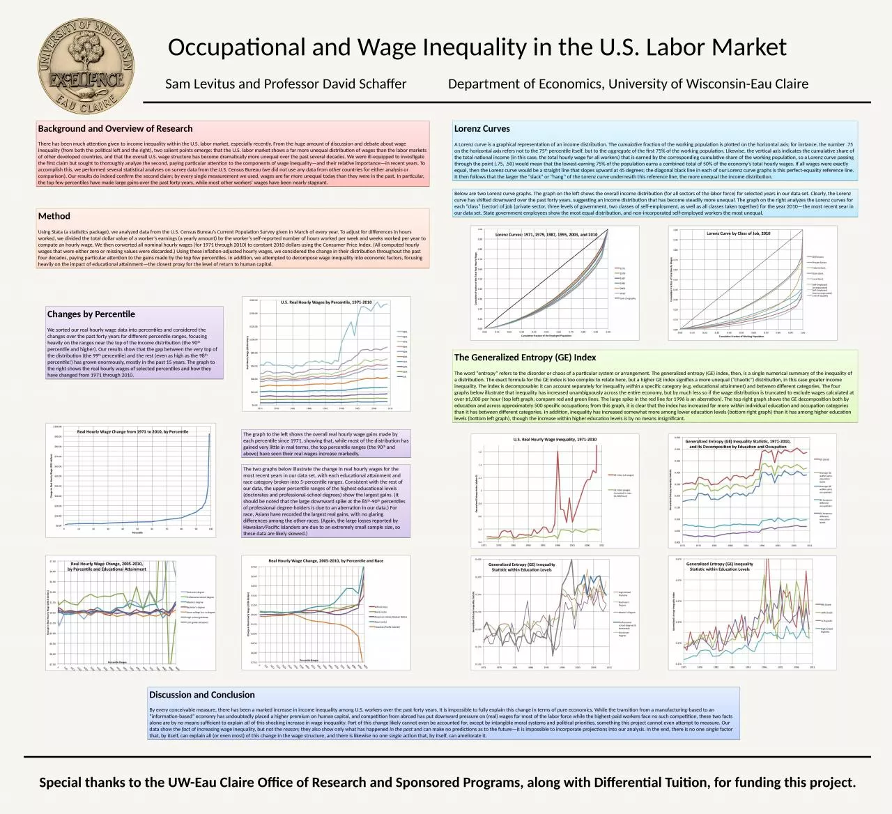
1. Occupational and Wage Inequality in the U.S. Labor MarketSam Levitus and Professor David SchafferDepartment of Economics, University of Wisconsin-Eau ClaireBackground and Overview of Research There has been much attention given to income inequality within the U.S. labor market, especially recently. From the huge amount of discussion and debate about wage inequality (from both the political left and the right), two salient points emerge: that the U.S. labor market shows a far more unequal distribution of wages than the labor markets of other developed countries, and that the overall U.S. wage structure has become dramatically more unequal over the past several decades. We were ill-equipped to investigate the first claim but sought to thoroughly analyze the second, paying particular attention to the components of wage inequality—and their relative importance—in recent years. To accomplish this, we performed several statistical analyses on survey data from the U.S. Census Bureau (we did not use any data from other countries for either analysis or comparison). Our results do indeed confirm the second claim; by every single measurement we used, wages are far more unequal today than they were in the past. In particular, the top few percentiles have made large gains over the past forty years, while most other workers’ wages have been nearly stagnant.Method Using Stata (a statistics package), we analyzed data from the U.S. Census Bureau’s Current Population Survey given in March of every year. To adjust for differences in hours worked, we divided the total dollar value of a worker’s earnings (a yearly amount) by the worker’s self-reported number of hours worked per week and weeks worked per year to compute an hourly wage. We then converted all nominal hourly wages (for 1971 through 2010) to constant 2010 dollars using the Consumer Price Index. (All computed hourly wages that were either zero or missing values were discarded.) Using these inflation-adjusted hourly wages, we considered the change in their distribution throughout the past four decades, paying particular attention to the gains made by the top few percentiles. In addition, we attempted to decompose wage inequality into economic factors, focusing heavily on the impact of educational attainment—the closest proxy for the level of return to human capital. Changes by Percentile We sorted our real hourly wage data into percentiles and considered the changes over the past forty years for different percentile ranges, focusing heavily on the ranges near the top of the income distribution (the 90th percentile and higher). Our results show that the gap between the very top of the distribution (the 99th percentile) and the rest (even as high as the 98th percentile!) has grown enormously, mostly in the past 15 years. The graph to the right shows the real hourly wages of selected percentiles and how they have changed from 1971 through 2010. The graph to the left shows the overall real hourly wage gains made by each percentile since 1971, showing that, while most of the distribution has gained very little in real terms, the top percentile ranges (the 90th and above) have seen their real wages increase markedly. The two graphs below illustrate the change in real hourly wages for the most recent years in our data set, with each educational attainment and race category broken into 5-percentile ranges. Consistent with the rest of our data, the upper percentile ranges of the highest educational levels (doctorates and professional-school degrees) show the largest gains. (It should be noted that the large downward spike at the 85th-90th percentiles of professional degree-holders is due to an aberration in our data.) For race, Asians have recorded the largest real gains, with no glaring differences among the other races. (Again, the large losses reported by Hawaiian/Pacific Islanders are due to an extremely small sample size, so these data are likely skewed.) Lorenz Curves A Lorenz curve is a graphical representation of an income distribution. The cumulative fraction of the working population is plotted on the horizontal axis; for instance, the number .75 on the horizontal axis refers not to the 75th percentile itself, but to the aggregate of the first 75% of the working population. Likewise, the vertical axis indicates the cumulative share of the total national income (in this case, the total hourly wage for all workers) that is earned by the corresponding cumulative share of the working population, so a Lorenz curve passing through the point (.75, .50) would mean that the lowest-earning 75% of the population earns a combined total of 50% of the economy’s total hourly wages. If all wages were exactly equal, then the Lorenz curve would be a straight line that slopes upward at 45 degrees; the diagonal black line in each of our Lorenz curve graphs is this perfect-equality reference line. It then follows that the larger the “slack” or “hang” of the Lorenz curve underneath this reference line, the more unequal the income distribution. Below are two Lorenz curve graphs. The graph on the left shows the overall income distribution (for all sectors of the labor force) for selected years in our data set. Clearly, the Lorenz curve has shifted downward over the past forty years, suggesting an income distribution that has become steadily more unequal. The graph on the right analyzes the Lorenz curves for each “class” (sector) of job (private sector, three levels of government, two classes of self-employment, as well as all classes taken together) for the year 2010—the most recent year in our data set. State government employees show the most equal distribution, and non-incorporated self-employed workers the most unequal. The Generalized Entropy (GE) Index The word “entropy” refers to the disorder or chaos of a particular system or arrangement. The generalized entropy (GE) index, then, is a single numerical summary of the inequality of a distribution. The exact formula for the GE index is too complex to relate here, but a higher GE index signifies a more unequal (“chaotic”) distribution, in this case greater income inequality. The index is decomposable: it can account separately for inequality within a specific category (e.g. educational attainment) and between different categories. The four graphs below illustrate that inequality has increased unambiguously across the entire economy, but by much less so if the wage distribution is truncated to exclude wages calculated at over $1,000 per hour (top left graph; compare red and green lines. The large spike in the red line for 1996 is an aberration). The top right graph shows the GE decomposition both by education and across approximately 500 specific occupations; from this graph, it is clear that the index has increased far more within individual education and occupation categories than it has between different categories. In addition, inequality has increased somewhat more among lower education levels (bottom right graph) than it has among higher education levels (bottom left graph), though the increase within higher education levels is by no means insignificant. Discussion and Conclusion By every conceivable measure, there has been a marked increase in income inequality among U.S. workers over the past forty years. It is impossible to fully explain this change in terms of pure economics. While the transition from a manufacturing-based to an “information-based” economy has undoubtedly placed a higher premium on human capital, and competition from abroad has put downward pressure on (real) wages for most of the labor force while the highest-paid workers face no such competition, these two facts alone are by no means sufficient to explain all of this shocking increase in wage inequality. Part of this change likely cannot even be accounted for, except by intangible moral systems and political priorities, something this project cannot even attempt to measure. Our data show the fact of increasing wage inequality, but not the reason; they also show only what has happened in the past and can make no predictions as to the future—it is impossible to incorporate projections into our analysis. In the end, there is no one single factor that, by itself, can explain all (or even most) of this change in the wage structure, and there is likewise no one single action that, by itself, can ameliorate it. Special thanks to the UW-Eau Claire Office of Research and Sponsored Programs, along with Differential Tuition, for funding this project.