
68136831 User Interface Design and Implementation 1 Lecture 18 Graphic Design GR3 due tonight at midnight PS3 RS3 released due Sunday GR4 released due in 2 weeks UI Hall of Fame or Shame ID: 316796
Download Presentation The PPT/PDF document "Spring 2011" is the property of its rightful owner. Permission is granted to download and print the materials on this web site for personal, non-commercial use only, and to display it on your personal computer provided you do not modify the materials and that you retain all copyright notices contained in the materials. By downloading content from our website, you accept the terms of this agreement.


Slide1
Spring 2011
6.813/6.831 User Interface Design and Implementation
1
Lecture 18: Graphic Design
GR3 due tonight at midnight
PS3, RS3 released, due Sunday
GR4 released, due in 2 weeksSlide2
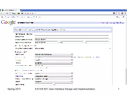
UI Hall of Fame or Shame?
Spring 2011
6.813/6.831 User Interface Design and Implementation
2Slide3
Nanoquiz
closed book, closed notes
submit before
time is up (paper or web) we’ll show a timer for the last 20 seconds
Spring 2011
3
6.813/6.831 User Interface Design and ImplementationSlide4
A good prototyping technique for evaluating efficiency is: (
choose one best answer
) A. task analysis
B. scenario C. computer prototype D. paper prototype E. Wizard of Oz
Which of the following are
advantages
of paper as a prototyping technique? (
choose all good answers
)
A. It’s cheaper than coding
B. A paper prototype can’t be shipped as the final product
C. Users may act more deliberately when using a paper prototype
D. Hand-sketching encourages different kinds of feedback from users
Suppose you’re designing a new tab bar for Internet Explorer, and you build a paper prototype of the tab bar. Which of the following areas will have
the best fidelity
in this prototype? (
choose one best answer
)
A. look B. feel C. breadth D. depth
20
19
18
17
16
15
14
13
12
11
10
9
8
7
6
5
4
3
2
1
0
Spring 2011
4
6.813/6.831 User Interface Design and ImplementationSlide5
Today’s Topics
Human perceptionChunking
Visual variablesGestalt principles of groupingGraphic design guidelines
SimplicityContrastWhite spaceBalanceAlignment
Spring 2011
6.813/6.831 User Interface Design and Implementation
5Slide6
Simplicity
“Perfection is achieved not when there is nothing more to add, but when there is nothing left to take away.”
Antoine de St-Exupery
“Simplicity does not mean the absence of any decor… It only means that the decor should belong intimately to the design proper, and that anything foreign to it should be taken away.”Paul Jacques Grillo
“Keep it simple, stupid.” (KISS)
“Less is more.”
“When in doubt, leave it out.”
Spring 2011
6.813/6.831 User Interface Design and Implementation
6Slide7
Techniques for Simplicity: Reduction
Remove inessential elements
Spring 2011
6.813/6.831 User Interface Design and Implementation7Slide8
Techniques for Simplicity: Regularity
Use a regular patternLimit inessential variation among elements
Spring 2011
6.813/6.831 User Interface Design and Implementation
8Slide9
Techniques for Simplicity: Double-Duty
Combine elements for leverage
Find a way for one element to play multiple rolesSpring 2011
6.813/6.831 User Interface Design and Implementation
9
title bar
scrollbar thumb
help prompt
selection handlesSlide10
Chunking
“
Chunk”: unit of perception or memory
Chunking depends on:What you already know How the information is presentedHard: M W B C R A L O A B I M B F I
Easier: MWB CRA LOA BIM BFI
Easiest: BMW RCA AOL IBM FBI
3-4-character chunking is good for presenting unrelated digits or letters
Spring 2011
6.813/6.831 User Interface Design and Implementation
10Slide11
Contrast & Visual Variables
Contrast encodes information along visual dimensions
Spring 2011
6.813/6.831 User Interface Design and Implementation11
size
value
hue
orientation
texture
shape
positionSlide12
Characteristics of Visual Variables
Scale = kinds of comparisons possible
Nominal (=)All variables
Ordered (<, >)Ordered: position, size, value, texture granularityNot ordered: orientation, hue, shape
Quantitative (amount of difference)
Quantitative: position, size
Not quantitative: value, texture, orientation, hue, shape
Length = number of distinguishable levels
Shape is very long (infinite variety)
Position is long and fine-grained
Orientation is very short (~ 4 levels)
Other variables are in between (~ 10 levels)
Spring 2011
6.813/6.831 User Interface Design and Implementation
12Slide13
Selectivity
Selective perception: can attention be focused on one value of the variable, excluding other variables and values?
Selective: position, size, orientation, hue, value, textureNot selective: shape
Spring 20116.813/6.831 User Interface Design and Implementation
13Slide14
N
N
N
N
N
N
N
N
N
N
N
Z
Z
Z
Z
Z
Z
Z
Z
Z
K
K
K
K
K
K
K
K
K
K
K
M
M
M
M
M
M
M
M
M
M
M
Spring 2011
14
6.813/6.831 User Interface Design and ImplementationSlide15
Associativity
Associative perception: can variable be ignored when looking at other variables?
Associative: position, hue, value, texture, shape, orientationNot associative: size, value
Small size and low value interfere with ability to perceive hue, value, texture, and shapeSpring 2011
6.813/6.831 User Interface Design and Implementation
15Slide16
Techniques for Contrast
Choose appropriate visual variablesUse as much length as possible
Sharpen distinctions for easier perceptionMultiplicative scaling, not additive
Redundant coding where neededCartoonish exaggeration where neededUse the “squint test”
Spring 2011
6.813/6.831 User Interface Design and Implementation
16Slide17
Choosing Visual Variables for a Display
Spring 2011
6.813/6.831 User Interface Design and Implementation
17Slide18
Designing Information Displays
Spring 2011
6.813/6.831 User Interface Design and Implementation
18Slide19
Contrast in Publication Styles
Title
Heading
This is body text. It’s smaller than the heading, lighter in weight, and longer in line length. We’ve also changed its shape to a serif font, because serifs make small text easier to read. Redundant encoding produces an effective contrast that makes it easy to scan the headings and distinguish headings from body text.1
1
This is a footnote. It’s even smaller, and positioned at the bottom of the page.
Spring 2011
6.813/6.831 User Interface Design and Implementation
19
Figure 1. This is a caption, which is
smaller than body text, and set off by
position, centering, and line length.Slide20
Simplicity vs. Contrast
Spring 2011
6.813/6.831 User Interface Design and Implementation
20
min
25%
50%
75%
max
Tukey
Tufte #1
Tufte #2Slide21
Contrast Problems
Spring 2011
6.813/6.831 User Interface Design and Implementation
21
Source: Interface Hall of ShameSlide22
White Space
Use white space for grouping, instead of linesUse margins to draw eye around design
Integrate figure and groundObject should be scaled proportionally to its background
Don’t crowd controls togetherCrowding creates spatial tension and inhibits scanning
Spring 2011
6.813/6.831 User Interface Design and Implementation
22Slide23
Crowded Dialog
Spring 2011
6.813/6.831 User Interface Design and Implementation
23
Source: Mullet & Sano, p. 110Slide24
Using White Space to Set Off Labels
Spring 2011
6.813/6.831 User Interface Design and Implementation
24
Source: Mullet & Sano, p. 96
(a)
(b)Slide25
The Gestalt Principles of Grouping
Gestalt principles explain how eye creates a whole (
gestalt) from parts
Spring 20116.813/6.831 User Interface Design and Implementation
25
proximity
similarity
continuity
closure
area
symmetrySlide26
White Space Avoids Visual Noise
Spring 2011
6.813/6.831 User Interface Design and Implementation
26Slide27
Balance & Symmetry
Choose an axis (usually vertical)Distribute elements equally around the axis
Equalize both mass and extent
Spring 20116.813/6.831 User Interface Design and Implementation
27Slide28
Symmetry Example
Spring 2011
6.813/6.831 User Interface Design and Implementation
28Slide29
Alignment
Align labels on
left or rightAlign controls on left and
rightExpand as neededAlign text baselinesSpring 2011
6.813/6.831 User Interface Design and Implementation
29Slide30
Grids Are Effective
Spring 2011
6.813/6.831 User Interface Design and Implementation
30
Source: Mullet & Sano, p. 165Slide31
Summary
Use contrast to emphasize important distinctionsChoose appropriate visual variables
Squint testSimplify unimportant distinctionsRemember Gestalt grouping
Alignment, balance, symmetrySpring 2011
6.813/6.831 User Interface Design and Implementation
31