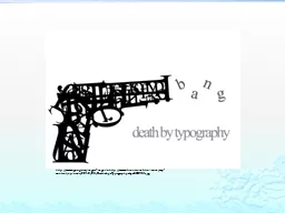

typography usually uncountable plural typographies The art or practice of setting and arranging type typesetting The practice or process of printing with type The appearance and style of typeset matter ID: 627525
Download Presentation The PPT/PDF document "http://www.google.ca/imgres?imgurl=http:..." is the property of its rightful owner. Permission is granted to download and print the materials on this web site for personal, non-commercial use only, and to display it on your personal computer provided you do not modify the materials and that you retain all copyright notices contained in the materials. By downloading content from our website, you accept the terms of this agreement.
Slide1
http://www.google.ca/imgres?imgurl=http://www.braincrumbtrail.com/wp-content/uploads/2010/03/Death_by_Typography_by_GCORE1.jpgSlide2
typography (usually uncountable;
plural typographies)The art or practice of setting and arranging type; typesetting.The practice or process of printing with type.The appearance and style of typeset matter.
http://www.google.ca/imgres?imgurl=http://1.bp.blogspot.com/_IFThO3GWZEs/S8YYrdHbrOI/AAAAAAAAAWI/ijC7XEsj6F4/s1600/Typography_by_DamagedInnocence.jpg&imgrefurl=http://katspeak88.blogspot.comSlide3
ascenderThe part of a lowercase letter that rises above the main body of the letter (as in b, d, h). The part that extends above the x-height of a font.
Common Typography Terms
bx
This part hereSlide4
Common Typography Terms
descender
The lowest portion of letters such as 'g,' 'j,' 'p.' 'q,' and 'y' that extends below the baseline, or reading line of type. (See descender line.) The portion of a lowercase letter that extends below the base line of the letter.
px
This part hereSlide5
Common Typography Terms
bowl
The enclosed oval or round curve of letters like 'D', 'g', b', and 'o'. In an open bowl, the stroke does not meet with the stem completely; a closed-bowl stroke meets the stem.
Dgbo
Dgbo
DgboSlide6
Common Typography Terms
baseline
The imaginary line upon which text rests. Descenders extend below the baseline. Also known as the "reading line." The line along which the bases of all capital letters (and most lowercase letters) are positioned.
BaselineSlide7
Common Typography Terms
cap line
The imaginary line which represents the uppermost part of capital letters and some character's ascenders. A line marking the height of uppercase letters within a font.
Cap lineSlide8
Common Typography Terms
header
One or more lines of text appearing at the top of every page.Slide9
Common Typography Terms
Calibri (body)
AlgerianChiller
Freestyle ScriptJokerman
Palatino
Times New Roman
font
The complete set of characters for one typeface at one particular type size, excluding attributes such as bold or italic. In modern usage, the term "font" is often confused with "typeface" and "family." Traditionally, the term "font" represents a complete set of characters (including all the letters of the alphabet, punctuation, and symbols), which share the same typeface, style, and size. For example, 12 point Goudy
Oldstyle
Bold is a font.Slide10
Common Typography Terms
body size
The type's point size which is determined by measuring from the highest ascender to the lowest descender (plus any additional white space to the descender line).
A
A
A
A A A A Arrgh!
96 pt.
18 pt.
point
A unit of measurement, often used to measure type size, equal to 0.013837 inch (approximately equal to 1/72"). The traditional point measurement was slightly more or less than 72 points to the inch (depending on the typesetting measurement system).Slide11
Common Typography Terms
caps and small caps
The typesetting option in which the lowercase letters are set as small capital letters; usually 75% the height of the size of the innercase.Slide12
Common Typography Terms
bold face
A heavy, stroked typeface, in which the negative space of counters is minimized; appears thick and massive; calls attention to itself in contrast to regular text for emphasis.
You can attract the eye with bold face
text.Slide13
Common Typography Terms
italics
A type style with slightly slanted characters, used for emphasis. Best used to set off quotes, special phrases, and foreign words, italic letters have a redesigned structure that allows them to slant to the right. The first italic type was designed by Aldus Manutius in AD 1501 and was based on the handwriting style of that time. Furthermore, lowercase letters were in italics while capital letters were Roman (or vertical stance).
Italics Not italics
Italics
Not italics
Italics
Not italics
Italics Not italics Italics
Not italics Italics Not italicsSlide14
Common Typography Terms
serif
Small, finishing strokes on the arms, stems, and tails of characters. Serif typefaces are usually used for text since the serifs form a link between letters that leads the eye across a line of type.
Small, finishing strokes on the arms, stems, and tails of characters. Serif typefaces are usually used for text since the serifs form a link between letters that leads the eye across a line of type.Slide15
Common Typography Terms
sans serif
A typeface without serifs. For example, Helvetica or Modern. Sans serif type is more legible in headings than in a long passage of text. Helvetica is an example of a sans serif typeface. First designed by William Caslon IV in 1816, it was originally referred to as "English Egyptian." Also known as "Gothic" in the United States and "Grotesque" in Europe.
A typeface without serifs. For example, Helvetica or Modern. Sans serif type is more legible in headings than in a long passage of text.Slide16
Common Typography Terms
dingbats
Once known as "printer's flowers," these are the small decorative marks, bullets, or symbols that usually make up a specialty face. Zapf Dingbats is one well-known example of a dingbat font.Slide17Slide18Slide19Slide20Slide21Slide22Slide23
http://www.proximasoftware.com/fontexpert/terms/c.htm