/
ITEC397  Macro Coding 0 8 ITEC397  Macro Coding 0 8

ITEC397 Macro Coding 0 8 - PowerPoint Presentation

deborah
deborah . @deborah
Follow
65 views
Uploaded On 2023-10-26

ITEC397 Macro Coding 0 8 - PPT Presentation

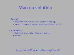
DIalogs Dialogs UserForm a llows you to design your own custom user interface using standard windows controls so that you end up with a form that has the look and feel of a standard Windows form ID: 1025062

control form default toolbox form control toolbox default click box properties code user window button property cell controls text

Share:

Link:

Embed:

Download Presentation from below link

Download Presentation The PPT/PDF document "ITEC397 Macro Coding 0 8" is the property of its rightful owner. Permission is granted to download and print the materials on this web site for personal, non-commercial use only, and to display it on your personal computer provided you do not modify the materials and that you retain all copyright notices contained in the materials. By downloading content from our website, you accept the terms of this agreement.


Presentation Transcript

1. ITEC397 Macro Coding08 – DIalogs

2. DialogsUserForm allows you to design your own custom user interface, using standard windows controls, so that you end up with a form that has the look and feel of a standard Windows form.To use a UserForm, you have to select Insert  UserForm from the code window menu to insert a blank UserForm into your project.2

3. UserFormThe form is a blank canvas on which you can place controls. Notice that a Toolbox window has also been opened; this allows you to select controls to place on the form such as text boxes, check boxes, and so on.3

4. UserFormYou can also see that the Properties window reflects the properties for the form, of which there are many. (If the Properties window is not open, select View  Properties Window from the VBE menu or press F4.) The UserForm is similar to a Visual Basic form and has similar properties, events, and methods. The UserForm is an object and has a place in the VBA Project tree.4

5. Main Properties For The Form5

6. Main Properties For The Form6

7. Viewing Your FormAs you design your form, you may want to see what it looks like when it is running. You can do this in design mode on the form by selecting Run  Sub/UserForm or pressing F5.As usual with Visual Basic objects, each form has its own module to deal with events on the form.To access the module, double-click the design form, select View  Code from the menu, or press F7.You can see a drop-down list on the right-hand side of the module that lists events for the form that you can attach code to. 7

8. Viewing Your FormAs you design your form, you may want to see what it looks like when it is running. You can do this in design mode on the form by selecting Run  Sub/UserForm or pressing F5.As usual with Visual Basic objects, each form has its own module to deal with events on the form.To access the module, double-click the design form, select View  Code from the menu, or press F7.You can see a drop-down list on the right-hand side of the module that lists events for the form that you can attach code to. 8

9. Viewing Your FormThere are many events that can you use in your project. Try the MouseMove event. Click MouseMove to get the code header and footer and then insert the following code:Private Sub UserForm_MouseMove(ByVal Button As Integer, _ ByVal Shift As Integer, ByVal X As Single, ByVal Y As Single)If UserForm1.Caption = "UserForm1" ThenUserForm1.Caption = "You moved the mouse"ElseUserForm1.Caption = "UserForm1"End IfEnd Sub9

10. Viewing Your FormYou will find that when you move the mouse over the form, the caption in the title bar of the form keeps changing.Note that the MouseMove event also passes you parameters for the X and Y position of the mouse on your form and for any mouse buttons or SHIFT key being pressed. You will see events for KeyDown, KeyUp, MouseDown, and MouseUp:KeyDown Fired off when a key is being pressed down by the user.KeyUp Fired off when the key is released from being pressed down by the user.MouseDown Fired off when a button on the mouse is pressed down by the user.MouseUp Fired off when the user releases a mouse button from being pressed down.10

11. Viewing Your FormKeyPress Fired off when a key on the keyboard is pressed and then released. The parameter in this event will give you the value of the key pressed. This is a combination of both KeyDown and KeyUp.Click Fired off when the mouse is clicked on a control such as a command button or11

12. Displaying Your Form in CodeYou can view the results of your form by pressing F5, but you need to be able to link it into your code. You can use the Show method to do this:UserForm1.ShowWhen this statement is executed, command is transferred to the UserForm1 window. Any code in the Initialize event is executed and then awaits user intervention. This could be the user closing the window or clicking an OK button on the form.You can also hide a form once it has done its work. Although the form is hidden and not visible to the user, the application is still running. You use the Hide method:UserForm1.Hide12

13. Displaying Your Form in CodeThe only other decision is from where you fire the form off. You need to connect it to a user event, such as when a new sheet is added to the workbook. Remember how in Chapter 1 you added a “Hello World” message box to the NewSheet event? You can do the same thing to display a form. Double-click ThisWorkBook in the Project tree to open up the Workbook module. On the drop-down on the left-hand side of the module window, select Workbook and then NewSheet from the right-hand drop-down. Enter the code as follows:Private Sub Workbook_NewSheet(ByVal Sh As Object)UserForm1.ShowEnd SubNow go to the Excel worksheet and insert a new sheet. Your form will appear.13

14. Populating Your FormYour form now works well, but it does not do anything. You need to put some controls on it to interact with the user. These can be combo boxes, text boxes, or command buttons. You can view the Toolbox window by selecting View  Toolbox on the VBE menu.The Toolbox window normally appears to the left of your form and contains the most popular controls. If it is not visible, click the UserForm, and the Toolbox window will appear.The toolbox displays icons for the controls that are available to you.14

15. Populating Your FormTo place a control onto your form, simply click it in the toolbox and drag it to the required position on your form. You can subsequently drag it to a new position on the form or resize it by dragging on the handles around the edge of the control.To see what a control is (if it is not apparent from the icon), place your cursor on the icon and view the tooltip text.15

16. Default Toolbox ControlsLabelThe Label control displays text on the form. You can enter text by entering it in the Caption property in the Properties window at the bottom left-hand corner of screen.Other properties that can be set for the label include BackColor, ForeColor, Font, TextAlign, andWordWrap. This is not a complete list of properties; many more can be set.You can see other properties available within the Properties window for that control.16

17. Default Toolbox ControlsTextBoxThe TextBox control is similar to the label control, but it allows the user to input text at runtime. You can also reference it to a control source (via properties), such as a spreadsheet cell, like sheet1!A1. If you do this, not only does the text box take the value of that cell, but anything typed into the text box is written back to that cell—the cell effectively acts as a variable in storing the data.17

18. Default Toolbox ControlsTextBoxProperties that can be set include: BackColor, Enabled, ForeColor, Font, Locked, TextAlign, MaxLength, Mulitiline, PasswordCharacter, andWordWrap.18

19. Default Toolbox ControlsComboBoxThe ComboBox control is the familiar horizontal box in which a list of values appears when you click the downward pointing arrow. It shares the same properties we discussed for the text box, apart from the password character. There are also some new properties:19

20. Default Toolbox ControlsListBoxThe ListBox control shows a permanently displayed list of optional values. It has similar properties as the combo box but there is an extra MultiSelect property:20

21. Default Toolbox ControlsCheckBoxThe CheckBox control allows the user to check or uncheck a check box. The text can be set by double-clicking the control or by setting the Caption property. It can be linked to a cell by setting the ControlSource property to point to a cell such as sheet1!a1. If the cell contains no value, the check box will contain a check and therefore a True value by default. Note that the control source cell will display the value True or False to reflect the state of the check box.21

22. Default Toolbox ControlsOptionButtonOption buttons are sometimes known as radio buttons. You need to have at least two of these on your form for them to work properly because as you switch one on, the others are automatically turned off. If you have only one, you can never turn it off (although you could turn it off using VBA code)!Option buttons can be linked to a cell using the ControlSource property, such as sheet1!c1. The cell holds a True or False value dependent on whether the option button has been clicked.22

23. Default Toolbox ControlsToggleButtonA toggle button changes from raised to sunken and back each time it is clicked. Its operation is similar to a check box: you change the caption on it by setting the Caption property in the properties box. It can be linked to a cell by setting the ControlSource property, such as sheet1!d1.23

24. Default Toolbox ControlsFrameFrames allow you to put a frame around a set of related controls to describe what they do.You can only set the caption of the frame by setting the Caption property—you cannot double-click it as with the check box and the option button. One of the problems with a Frame control is that it overlays previous controls, even at runtime24

25. Default Toolbox ControlsFrameWhen using a Frame control, you should define the Frame control first and then make the other controls sit inside the frame on top of it. If you do it the other way around, the controls will not be visible.25

26. Default Toolbox ControlsCommandButtonThe CommandButton control is a powerful control that frequently is used on forms. You can alter a command button’s caption by double-clicking it or by setting the Caption property.You can also make a button the default button on the form by setting the Default property to True. This means that when the form is loaded, this button has the focus—if the user presses ENTER, then the code for that button will run.26

27. Default Toolbox ControlsTabStripThe TabStrip control allows you to put a tab strip onto your form. You can use a TabStrip control to view different sets of information for related controls. The client region of aTabStrip control is not a separate form. Instead, the region is a portion of the form that contains the TabStrip control.27

28. Default Toolbox ControlsTabStripYou can select the tabs at design time by clicking the tab while holding down SHIFT. You can add pages, rename pages, and delete pages by right-clicking a tab. You need to use code to interpret the user’s actions on the tab strip. Double-click the form to view the module and select TabStrip from the top-left drop-down. Select the Change event from the top-right drop-down and enter any code as a respond to that action.Each time you click a tab, your code will be executed.28

29. Default Toolbox ControlsMultiPageThe TabStrip control is still only one form. The MultiPage control is different forms selected by tabs and is more useful in a lot of ways. You can select each tab at design time by clicking it and right-clicking the tab to insert, delete, or rename pages. You can drag controls onto each individual tab page. Try putting a text box onto the first page and then putting a command button onto the second page.29

30. Default Toolbox ControlsMultiPageWhen you run the form, each page behaves like a separate form, displaying the controls that you set up on it. They all behave as if they were on a separate form. Notice that when you click each page at design time, there are separate Properties windows for each page, which was not the case for the TabStrip control.You can use code to interpret the user’s actions much as you did with the TabStrip.30

31. Default Toolbox ControlsScrollBarThe ScrollBar control places a vertical scroll bar onto your form, similar to the ones that you see in many Microsoft applications. There are properties for maximum and minimum values and for small and big changes, called SmallChange and BigChange. A small change is when you click one of the arrows on the scroll bar; a big change is when you click the area between the arrow and the cursor on the scroll bar.31

32. Default Toolbox ControlsScrollBarBigChange and SmallChange are set by default to 1, the maximum value is set to 32767, and the minimum to 0. This means that clicking the arrows or the space between arrow and cursor does not really move anything very far: BigChange needs to be about 1000 and SmallChange needs to be about 100 if the maximum is set to 32767.32

33. Default Toolbox ControlsScrollBarYou can link this control to a spreadsheet cell using the ControlSource property, such as sheet1!a1. The value of the scroll bar will appear in the cell, but it is only updated when the scroll bar has lost focus (when you click another control).You can also use code to read the value of the scroll bar. Double-click the scroll bar, and this will take you into the scroll bar Change event.So, every time the scroll bar is moved, your code in the Change event willbe executed.33

34. Default Toolbox ControlsSpinButtonThe SpinButton is a control that can be used on a form. It is a box which accepts a number and has an up and down arrow key to increase or decrease the value. A familiar example of it is on the Excel print dialog Print Pages From and To. This control is normally linked to another control, such as a text box, in order to display a value.The SmallChange property sets the increment of the change. The Orientation property sets whether the control is split vertically or horizontally.34

35. Default Toolbox ControlsImageThe Image control is one that can hold a picture or an image. To insert a picture, click the Picture property and then click the ellipsis (...) box that appears. This will take you into a screen where you can select an image file. Click OK and the picture will be inserted into your control.To delete the picture, delete the value in the Picture property box. This will be replaced with (None).35

36. Default Toolbox ControlsRefEditThe RefEdit control collects details about a range of cells selected by the user. It also allows the user to manually type their range in, which means they can edit a cell reference. When you place this control on a form, it is best to size it like a text box using small height and large width.When the form runs, the user can either type in the cell references manually or click the button on the right-hand side of the control.The form will then collapse and a range selection window will appear. 36

37. Default Toolbox ControlsRefEditDrag the cursor over a selection with the mouse, and the selection details will appear in the window. Click the button on the right-hand side with red in it, and the form will be redisplayed with the selection in the control box.When you close the selection box and the UserForm reappears, you will see that the title bar of the form now has your selection details in it.37