
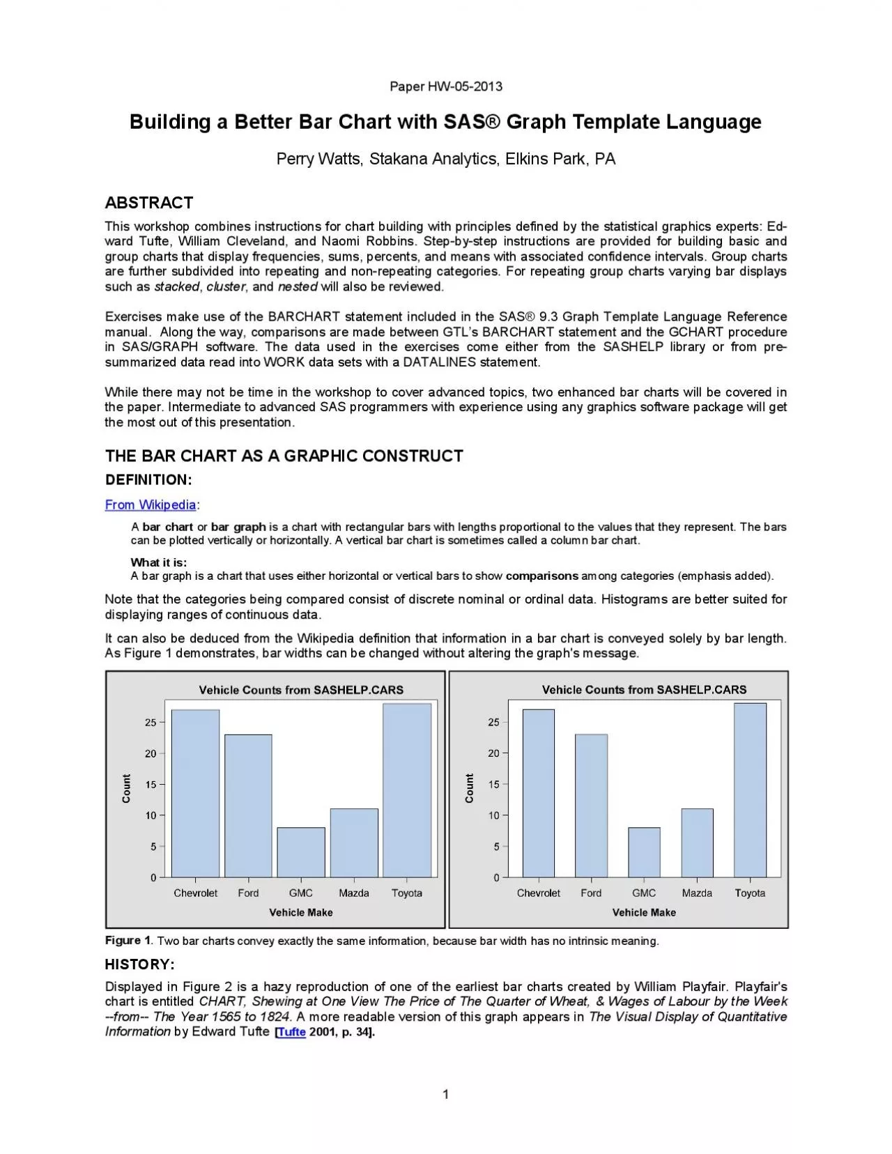
From Wikipedia bar chartor bar graphis a chart with rectangular bars with lengths proportional to the values that they represent The bars Tufte 2001 p 34 x0000x00002 xMCIxD 0 xMCI ID: 937275
Download Pdf The PPT/PDF document "x0000x00001 xMCIxD 0 xMCIxD 0 Paper HW20..." is the property of its rightful owner. Permission is granted to download and print the materials on this web site for personal, non-commercial use only, and to display it on your personal computer provided you do not modify the materials and that you retain all copyright notices contained in the materials. By downloading content from our website, you accept the terms of this agreement.


��1 &#x/MCI; 0 ;&#x/MCI; 0 ;Paper HW2013Building a Better Bar Chart with SAS® Graph Template LanguagePerry Watts, Stakana Analytics,Elkins Park, PAABSTRACTThis workshop combines instructions for chart building with principles defined by the statistical graphics experts: E From Wikipedia bar chartor bar graphis a chart with rectangular bars with lengths proportional to the values that they represent. The bars Tufte 2001, p. 34 ��2 &#x/MCI; 0 ;&#x/MCI; 0 ; &#x/MCI; 1 ;&#x/MCI; 1 ; &#x/MCI; 2 ;&#x/MCI; 2 ; &#x/MCI; 3 ;&#x/MCI; 3 ; &#x/MCI; 4 ;&#x/MCI; 4 ; &#x/MCI; 5 ;&#x/MCI; 5 ; &#x/MCI; 6 ;&#x/MCI; 6 ; &#x/MCI; 7 ;&#x/MCI; 7 ; &#x/MCI; 8 ;&#x/MCI; 8 ; &#x/MCI; 9 ;&#x/MCI; 9 ; &#x/MCI; 10;&#x 000;&#x/MCI; 10;&#x 000; &#x/MCI; 11;&#x 000;&#x/MCI; 11;&#x 000; &#x/MCI; 12;&#x 000;&#x/MCI; 12;&#x 000; &#x/MCI; 13;&#x 000;&#x/MCI; 13;&#x 000; &#x/MCI; 14;&#x 000;&#x/MCI; 14;&#x 000; &#x/MCI; 15;&#x 000;&#x/MCI; 15;&#x 000; &#x/MCI; 16;&#x 000;&#x/MCI; 16;&#x 000; &#x/MCI; 17;&#x 000;&#x/MCI; 17;&#x 000;Figure 2. An early bar chart by William Playfaircompares the price of wheat to the wages for skilled laborers.Playfair enhanced his chart by adding series plots for wages, reignsof monarchsand centuries. With these hancements he anticipatedthe arrival ofLAYOUT OVERLAY in GTLthat makes it possible to enhance a bar chart with the addition of points, lines and annotation. Nevertheless, the standalone bar chart with its simple structure has managed to endure over the centuries. Possibly its longevity can be attributed to its transparency. Bar charts use summary data to convey brief messages quickly!THE BAR CHART GETS BAD PRESSDespite their popularity, graphics experts do not have a high regard for bar charts. Cleveland makes no reference to them in The Elements of Graphing Data Cleveland , 1994and Tufte points to a lowdataink ratiodefined below as a reason for not taking themseriously. Dataink ratio dataink total ink used to print the graphicproportion of a graphic's ink devoted to theredundant display of datainformation Tufte , 2001,p. 93]For Tufte, the only dataink in a bar chart is the height or altitude of the bars. Furthermore, he showsthat redundancy increases when a single labeled shaded bar conveyt
he same altitude in six separate ways (any five of the six can be erased and the sixth will still indicate the height) Tufte , 2001,p. Howeverthe dataink ratio is not approprate metric to applywhen the stated goalof a graphicis to compareresults(see Wikipedia definitionIn Figure , for example, scatter plot portrays a confusingrelationship between HITS andSALARYeven though the dataink score is muchhigherThe confusioncan be attributed to thepresence of overlappingplotting symbolsin the scatter plot.Figure3.Tufte's data ink ratio collides with Cleveland's maxim that "overlapping plotting symbols must be visually distinguishable" Tufte p. 50]. Overlap is not an issue with a bar chart, because the data are summarized. Data source in StatLib , 1988 George III Elizabeth Reigns of British Kings and Queens Price of Wheat Century marker Wages ��3 &#x/MCI; 0 ;&#x/MCI; 0 ;ODSSETUP FOR BAR CHARTSIN GTLTHE STYLE TEMPLATE REPLACES SAS/GRAPH’S GOPTIONSSTATEMENTThe overall appearance of a graph is controlled by theSTYLE template in ODS. The STYLE template pretty much replaces GOPTIONS in SAS/GRAPHsoftware. Both packages contain inline options for further refinements that take precedence over general settings. However, ODS STYLEshines over GOPTIONS by using inheritance to eliminate the need for coding default. This way the programmer can hone in on defining customized settings for a subset of attributes. The interaction between inheritance and customization isbest illustrated by example: ODS PATH PROC The source template store for STYLES.DEFAULT is SASHELP.TMPLMST. To prevent any changes from being made, it is opened in READ mode. On the other hand, WORK.TEMPLAT is where the newly created templateswill be stored. WORK.TEMPLAT accepts changes but goes away at the end of the session. Creating a temporary template makes iterative graphics development possible in GTL.A new style template BIGTEXT is being created. It will be stored in WORK.TEMPLAT.BIGTEXTinherits approximately 400 attribute settings from STYLES.DEFAULTThe style element GRAPHFONTS is changed with a CLASS statement. The term CLASS is shorthand for STYLE GRAPHFONTS FROM GRAPHFONTS. What CLASSis telling SAS to do is to take the defaults rom theGRAPHFONTSin STYLES.DEFAULTand store them together with any changes to GRAPHFONTS in BIGTECLASS can always be usedas a keywordwhen graphics style elements are being modified. On t
he other hand, inheritance for tabular style elements is muchmore versatile. For eample style element HEADER can inherit attributes and theirsettings from HEADERSANDFOOTERS.No border is drawn around the graph. Instead the border is created in Microsoft WORD. A new style MYCOLORS is created. It inherits from BIGTEXT that continues to inherit from STYLES.DEFAULT. Default color assignments are changed in MYCOLORS. The symbol color in the scatter plot comfrom CONTRASTCOLOR in GRAPHDATADEFAULT, and the fillcolor in the bar chart comes from the COLOR attribute.The color for the bar outlineis changed from black to dark blue by changing CONTRASTCOLOR in GRAPHOUTLINES.For more information about STYLE templates and style elements see Chapter 3 in Statistical Graphics in SAS: An Introduction to the Graph Template Language and the Statistical Graphics Procedures Kuhfeld , 2010, pp. 115152].THE ODS DESTINATION STATEMENTThe following destination statement indicates where thegraph will reside (PATH, the name of the STYLE teplate that will define its appearance (STYLE=), and the number of dots per inch for graphics resolution(IMAGE_DPI) ODS The LISTING destination is chosen, because graphs can also be viewed inthe RESULTS window. In this instance, STYLE points to the style template just created, and IMAGE_DPIis being set to a high value to improve the resoltion of the output ��4 &#x/MCI; 0 ;&#x/MCI; 0 ;THE ODS GRAPHICS STATEMENTThe ODS GRAPHICS statement makes it possible forODS to create graphics ODS GRAPHICS With this statement the graphics output that appears in the RESULTS window will also be written out to FIG3A.PNG. Antialiasing with a high number makes graph less pixilated, smoother and allaround better looking. THE STATGRAPH TEMPLATEAND PROC SGRENDERGraphs produced in GTL are defined in a STATGRAPH template and generated in PROC SGRENDER where STATGRAPH template meets input data set. Two types of templates are used in GTL: STYLEand STATGRAPH. You have already seen an example of STYLE. STATGRAPH is addressed in this sectionGTL works hierarchically and topdown in code blocks to produce a graph. SAS codefor the bar chart shown in Fiure 3is shown below. GTL hierarchy isoutlined in the source code with rectangle overlays. PROC TEMPLATE; RUN ... PROC RUN The outermost DEFINE block names the STATGRAPH template myBchartThe GRAPH block is where the graph title is inserted. LAYOUT OVERLAY
contains the single plotting statement for this particular graph. Notice that axes are defined as options for the OVERLAY block. Since a bar chart is being plotted, SAS automatically assignTYPE=DISCRETE X axis and TYPE=LINEAR r the Y axis. (TYPE can also be set by the user).Oneinline option assigned to YAXISOPTS. TICKVALUEFORMATdoes as the name implies: it nama format that is applied totick values alonga LINEAR axis. TICKVALUEFORMATis not supported when TYPE=DISCRETELAYOUT OVERLAY typically supports multiple plotting statements; hence the name OVERLAY. In this particular example, only the BARCHART statement with X and Y parameters is entered. (The Y parameter is required, because stat=MEANBARLABELATTRS=(SIZE=14PT) takes precedence over the default setting of 7PT, found by looking atthe GRAPHDATATEXT style element the STYLES.DEFAULT template.Defaults are identified by style element affiliation for each option in the BARCHART statement SAS Institute , 2011a, pp.161177].Bar labels can be conveniently formatted with the BARLABELFORMAT optionTHE BASIC BAR CHART INPROC GCHART AND GTLWhile PROC GCHART in SAS/GRAPH software has significantlyinfluenced the development of the BARCHART statement in GTL, there are basic structural differences between the two packages that should be mentioned. First are the axes configurations. Unique to PROC GCHART is the midpointaxis. This is the axis immediately below the axis line. No tick marks are displayed along midpoint axis. A second groupaxis below the midpoint axisis also available when group bar charts are plotted in PROC GCHART. In additionthere is a unique RAXIS or responseaxis GCHART, andseparate HBAR and VBAR statements are used to generate horizontal and vertical bar charts.In Graph Template Language there is only the Xaxis for discrete categorical data and the Yaxis for continuous lindata. groupaxis simply does not exist. Later on we see how to circumvent the requirement for one when group charts are created in GTL. Also, there are no HBAR orVBAR options in GTL. If you want to create a horizontal bar chart you do not changetheX or Y parameter assignments. Instead you create avertical bar chartand then addthe optionORIENT=HORIZONTAL to the code. ��5 &#x/MCI; 0 ;&#x/MCI; 0 ;With such a unique axis configuration in PROC GCHART, you have to count on the availability ofan optionin the procedureto get the graph you want. In GTL, on the other hand, charts can be enhanced by option orby adding ferent plotting statements to LAYOUT OVERLAY. For example, in PROC GCHART you get confidence in
tervals with the ERRORBARS= option whereas in GTL you need to issue a separate SCATTERPLOT statement to add them to your graph. Specific instructions for generating a bar chart with confidence intervals are provided later in the paper. Below in Figure 4you will see a comparison between GTL and GCHART outputfor the basic bar chartFigure 4.If appearances are downplayed, GTL and PROC GCHART produce similarbar charts. Where the chartsdiffer is in their axes configurations. Ticks are found along the discrete axis in GTL whereas theare missing in the GCHART graph. The Yaxis is also different. Inthe GTL version, bar heights exceed the maximum tick valueof 25 whereas the maximum tick value must always be greater than thetallest bar in PROC GCHART.VARIATIONS ON THE BASIC BAR CHART IN GTLIn this section, bar charts that support frequencies, means, sums and percents are presented. Since code for a frills bar chart has been listedforin Figure 3, enhancements will be featured in this section. Also described hereare difficultiesencountered when chartingpercents, ordering bars, and inserting confidence limitsinto a graph created from raw data. Workaroundsinvolve presummarizing the data.CHARTING FREQUENCIES AND SUMSWITH RAW DATA FREQUENCIES Since we have already encountered a bar chart for means in Figure 3, let’s start off by charting frequencies and sums. In Figure5, a more glitzyfrequencybar chart with a nonrepeating group affiliation is displayed.If the bar chart in Figure 5 were supporting a repeating group, then MAKE (Chevrolet ...Toyota) would have two bars reprsening the twocar manufacturer originfor a total of 10 bars inthe graph. Repeating group bar charts are discussed later in the paper. To makea chart with a similar format in PROC GCHART, use the NOZERO option that suppresses bars whenthe chart statistic is zero. Forexample, when ‘Chevrolet’ is processed, the Asia count would be zero and no room would be made for the bar in PROC GCHART.However, in repeating group bar charts zero counts are informative, so the NOZERO option ould be suppressed. PROC GCHART: Vehicle Counts from SASHELP.CARS CountVehicle MakeChevroletFordGMCMazdaToyota ��6 &#x/MCI; 0 ;&#x/MCI; 0 ; &#x/MCI; 1 ;&#x/MCI; 1 ; &#x/MCI; 2 ;&#x/MCI; 2 ; &#x/MCI; 3 ;&#x/MCI; 3 ; &#x/MCI; 4 ;&#x/MCI; 4 ; &#x/MCI; 5 ;&#x/MCI; 5 ; &#x/MCI; 6 ;&#x/MCI; 6 ; &#x/MCI; 7 ;&#x/MCI; 7 ; &#x/MCI; 8 ;&#x/MCI; 8 ; &#x/MCI; 9 ;&#x/MCI; 9 ; &#x/MCI; 10;&#x 000;&#x/MCI; 10;&#x 000; &#
x/MCI; 11;&#x 000;&#x/MCI; 11;&#x 000; &#x/MCI; 12;&#x 000;&#x/MCI; 12;&#x 000; &#x/MCI; 13;&#x 000;&#x/MCI; 13;&#x 000; &#x/MCI; 14;&#x 000;&#x/MCI; 14;&#x 000; &#x/MCI; 15;&#x 000;&#x/MCI; 15;&#x 000; &#x/MCI; 16;&#x 000;&#x/MCI; 16;&#x 000;Figure The frequency bar chart in GTL is enhanced by adding presseddata skinThe two colors assigned to the bars come from GRAPHDATA1 (blue) and GRAPHDATA2 (red) style elements in the STYLES.DEFAULT template. There are 12 such style elements containing contrasting colors. Group affiliationcan easily be identified with contrasting colorsCode for the STATGRAPH template used for generating the bar chart in Figure 5 is listed below proc Default settingsare usedfor the Yaxis. Therefore, YAXISOPTS are not listedY parameter assignment is notrequired when a frequency bar chart is being made.Also the STAT=tion does not have to bespecified, since FREQ is the defaultThe only way to create bars with different colors is with a GROUP= option. By assigning the variable ORIGIN to theGROUP= option, color can be used as a third dimension. The NAME= option provides a link to the legend that explains the newly added third dimension.Here is where the bar chart is jazzed up. Other choices available for DATASKIN include GLOSS, SHEEN, CRISP, and MATTE.Here is where the discrete legend “oGroup” is created. For more details, see the manual SAS Institute , 2011a, p.661-676]. SUMS Any technique that increases the size of the plotting region in a graph should be used.Unfortunately, sums quickly add up to very large numbers that stretch out horizontallyalong the YAxis. In Figure 6, before and after graphs show one way to compress the width of the Yaxis region. The rightside graph in Figure 6 also takes up the issueof bar width with the BARWIDTH= option. In GTL BARWIDTH is defined with a range of zero (narrowest) to 1 (widest where the adjacent bars are touching). The default 0.85 is used for the leftside graph in Figure 6 whereas the bar width is reduced to 0.75 in the chart on the right. BARWIDTH in GTL is far more effective thathe WIDTHSPACEGSPACEcombination in PROC GCHART. WIDTH is GCHART’S BARWIDTH, SPACE is the space between the bars, and GSPACE is the space between groups. GTL has no need for SPACE anGSPACE whereas all three width options can be adjusted in PROC GCHART. Unfor
tnately though, the units of measurement are“character cells”that are difficult to estimate. Furthermore, if you enter numbers that are too high, the default chart that you are trying to change is produced along with a warningthat tellsyou othing aboutthe largest values you can enter ��7 &#x/MCI; 0 ;&#x/MCI; 0 ; &#x/MCI; 1 ;&#x/MCI; 1 ; &#x/MCI; 2 ;&#x/MCI; 2 ; &#x/MCI; 3 ;&#x/MCI; 3 ; &#x/MCI; 4 ;&#x/MCI; 4 ; &#x/MCI; 5 ;&#x/MCI; 5 ; &#x/MCI; 6 ;&#x/MCI; 6 ; &#x/MCI; 7 ;&#x/MCI; 7 ; &#x/MCI; 8 ;&#x/MCI; 8 ; &#x/MCI; 9 ;&#x/MCI; 9 ; &#x/MCI; 10;&#x 000;&#x/MCI; 10;&#x 000; &#x/MCI; 11;&#x 000;&#x/MCI; 11;&#x 000; &#x/MCI; 12;&#x 000;&#x/MCI; 12;&#x 000; &#x/MCI; 13;&#x 000;&#x/MCI; 13;&#x 000; &#x/MCI; 14;&#x 000;&#x/MCI; 14;&#x 000; &#x/MCI; 15;&#x 000;&#x/MCI; 15;&#x 000; &#x/MCI; 16;&#x 000;&#x/MCI; 16;&#x 000;Figure In the rightside graph, the width of the Yaxis region is reduced by setting Y= EVAL(MSRP/. Bar width can also be reduced in the rightside graph, because the number of digits in the bar labels has been reduced to four. Numbers won’t spill over.Code for the STATGRAPH template used for generating the bar chart on the rightside in Figure is listedbelow proc run There is no TITLE2 in GTL. The only way to get smaller text for it is with a TEXTATTRS optionThe YAxis and bar label formats are constructed the same way as they were in the code for Figure 3Typically, GTL summary statistic functions are used with EVAL such that NUMBER = EVAL(functionname(numericcolumn)). There are 32 summary statistic functions available in GTL: pretty much a suset of the statistics that are provided by PROC UNIVARIATEIn this instance, however, a simple arithmtic operation (division) is performed on the raw data.Here is where the bar widths are made smallerEXTENDINGTHE BARCHART STATEMENT IN GTL WITH PRESUMMARIZED DATA PERCENT BAR CHARTS The percent bar chart does not work as advertised in GTL, because fractions, not percentsappear in the outputThisis unfortunate, since it is easieto compare bar heights when they are labeled with percents rather thanfrequencies. Recall from the definition that comparison is the main reason why bar charts are created. The leftside graph in Figure 7 shows what h
appens when the following is executed: BARCHART X WithSTAT=PCT, fractions are created in version 9.3 SAS. The only reliable solution this problem is to summarize the data and alter the code so that STAT=SUM (not PCT). When you work with summary data, the value itself is what appears in the graph. STAT=SUM works, because the sum of a singleentity is itself. In this instance, bar labels match data set values for the VariablePCTVEHICLES theFigure 7rightsidegraph. ��8 &#x/MCI; 0 ;&#x/MCI; 0 ; &#x/MCI; 1 ;&#x/MCI; 1 ; &#x/MCI; 2 ;&#x/MCI; 2 ; &#x/MCI; 3 ;&#x/MCI; 3 ; &#x/MCI; 4 ;&#x/MCI; 4 ; &#x/MCI; 5 ;&#x/MCI; 5 ; &#x/MCI; 6 ;&#x/MCI; 6 ; &#x/MCI; 7 ;&#x/MCI; 7 ; &#x/MCI; 8 ;&#x/MCI; 8 ; &#x/MCI; 9 ;&#x/MCI; 9 ; &#x/MCI; 10;&#x 000;&#x/MCI; 10;&#x 000; &#x/MCI; 11;&#x 000;&#x/MCI; 11;&#x 000; &#x/MCI; 12;&#x 000;&#x/MCI; 12;&#x 000; &#x/MCI; 13;&#x 000;&#x/MCI; 13;&#x 000; &#x/MCI; 14;&#x 000;&#x/MCI; 14;&#x 000; &#x/MCI; 15;&#x 000;&#x/MCI; 15;&#x 000; &#x/MCI; 16;&#x 000;&#x/MCI; 16;&#x 000; &#x/MCI; 17;&#x 000;&#x/MCI; 17;&#x 000;Figure In the rightside graph, percents are correctly coded alongthe Yaxis and on top of the . Note that the word “Percent” has been removed as a Yaxis label. It is not needed, since all the tick values are shown with percent signs affixed to them. Its rmoval expands the data display region for better viewing.What follows is a printout of the summary data for the rightside graph along with a review of source code for the evant STATGRAPH template PROC RUN proc run Picture formats are used to create the two percent annotations used in this graph. Format names are higlighted in blueThe BARCHART statement is a better choice than the BARCHARTPARM statement here, because the BARLABELFORMAT option is not a listed option for BARCHARTPARM.To totally remove an axis label from a graph, the DISPLAY= option has to be specified without the mention of the word “LABEL”PCTVEHICLES containingjust five observations is assigned to the Y parameter and STAT=SUM is clared. ORDERING BARS Unlike PROC GCHART, the BARCHART statement in GTL has no such options as ASCENDING=, DESCENDING= or MIDPOINTS= forreorderbars in a graph. Bar order in GTL is determined exclusively the order in
which caegorical variables appear in the input data set. Up to now you have been looking at graphs where vehicle makes are ��9 &#x/MCI; 0 ;&#x/MCI; 0 ;listed in alphabetic order along the Xis. This only happens because SASHELP.CARS is already sorted alphabetcallyby MAKELet’s saythough thatyou want a graph of ehicle ake averagesordered byMPG_HIGHWAY. You won’t get them in the right order if you sort rawdata by MPG_HIGHWAY. Insteadyou get the leftside graph shown in Figure 8. From this graph, you can determine that the vehicle make for the first record in the data set is “Ford” and that “Mazda” apears after all other makes in the data set have at least one entry. On the other hand when means are calculated in a summary data set that is then sorted, the bars come out in the ascending order that appears in the rightside graph of Figure 8. Figure In the rightside graph, averages come out in ascending order only because the inputsummary data set has been sorted.What follows is a print out of the sorted summary data for the rightside graph along with an abbreviated review of source code for the BARCHART statements applied to each chart proc DEFINE STATGRAPH run proc DEFINE STATGRAPH run MYBCHART is the name repeatedly given to the STATGRAPH template that resides in the WORK library. MYBCHARTis overwritten each time PROC TEMPLATE is compiled and goes away at the end of the ses-sion.Note that the different values are assigned to the Y parameter and to the STAT= option in theBARCHART statements. 10 ADDING CONFIDENCE LIMITS TO MEANS Confidence limits cannot be directlyadded to a bar chart, because there is no option for them in GTL’sBARCHART statement. There are the LIMITS= and LIMITSTAT= options forthe VBAR statement in the SGPLOT procedure SAS Institute , 2011, p. 388]and the ERRORBARS= option in PROC GCHART SAS Institute , 20, p. 803].For theworkround in GTL, a summary data set containing the interval of interest must first be created. Thena SCATTERPLOT statement is addedin GTL to superimpose confidence limitover the bar chart. In Figure 9, confidence limits replace ar labels in the ascending bar chart from Figure 8.Figure Confidence Limits replace bar labels in the ascending bar chart in Figure 8. When the summary data are created, care must be taken tdefine the ALPHAoptioncorrectly in PROC SUMMARYBelow is a printout of the input data set along with an abbreviatedlisting of the revis
ed STATGRAPH template The Xaxis is discrete and the Yaxis is linear for both the BARCHART and SCATTERPLOT statements.The X and Y parameters in the BARCHART and SCATTERPLOT statements have identical assignments. While the SCATTERPLOT statement generates a graph with points, the points are hidden here. This is a fairly common “trick”.All that is left from tSCATTERPLOT statement then are theYERRORLOWER= and YERRORUPPER= options; just what is neededTHE REPEATING GROUP BAR CHART IN PROC GCHART AND GTLIn this section, we take up the repeating group bar chart where bars are “clustered in groups of more thanone” wikipedia , Bar ChartRepeating group comparisons are more complex, since bar categoriesand groupscan be diplayed in different orders. The total number of bars in a repeating group bar chart increases from (number of bar ��11 &#x/MCI; 0 ;&#x/MCI; 0 ;categories) to X #groups). A variation on the repeating group bar chart is the stacked bar chart that hasthe same axis configuration as the basic bar chartGroup affiliation in this type of chart is denoted byidentifiablebar segmentsWhile PROC GCHART and GTL work with both group and stacked bar charts, structural differences exist between the two packages that are reviewedpictoriallybelow. To find out more about constructing bar charts using the GCHART procedure see Watts , 2007a] Watts , 2007b], and Watts , 2008]REPRESENTING A GROUP BAR CHART IN PROC GCHARTUnlike GTL, PROC GCHART supports two categorical axes: the midpoint axis that is contiguous with the bars and the group axis that appears immediately below the midpoint axis. Their relationship can be easily identified by looking at Figure 10 that shows the relationship between a categorized Body Mass Index (BMI) and the incidence of Chronic Heart Disease (CHD) for subjects who participated in the Framingham Heart Study (SASHELP.HEART)Figure In Proc GCHART the Xaxis is replaced by two axes: the midpoint and group axes (MAXIS, GAXIS)Note that a single group member references multiple midpoints (in this case “No CHD” and “CHD”). Also, programmers only have access to coordnates along the red lines.Everything else, including the coordinates for the GAXIS labels, is out of bounds.DISPLAYING A GROUP BAR CHART WITHGTL’S BARCHART STATEMENTIn GTL, the midpoint axis is replaced by a generic discrete axis that can be used by many separate plotting statments. Thi
s flexibility is what made it possible to position confidence limits with a SCATTERPLOT statement over a bar chart of means in Figure 9. Also there is no group axis in GTL. Instead, group affiliation is indicated by legend. The graph from Figure10 is replicated in Figure 11 using a BARCHART statement from GTL.Figure In GTLthere is onlya single Xxis, and in this graph it references BMI. CHD is relegated to the legend. While vertical red grid lines are associated withthediscreteaxis tick marks, they are not restrictive. Instead, in 9.3 SAS the entire data display area is available to the programmerNow theoffgridline bar labels can be assigned with easeGTL acknowledges its GCHART origins by calling the Xaxis tick marks “category midpoints SAS Institute , 20, p. mphasis added ��12 &#x/MCI; 0 ;&#x/MCI; 0 ;Let’s enlarge upon comments the figure captions fromFigures 10 and 11. In PROC GCHART a single group ber (BMI) references multiple midpoints(CHD)whereas his onemanyrelationship is reversed in GTL’s BARCHART statement. In GTL the role of the midpoint is assigned to what was the groupin GCHARTand the new midpoint(BMI)references many group members(CHD). So now we are looking at a manyrelationship. To drive the point homeCHD, not BMI, is assigned to the GROUP= option in the BARCHART statement. This reversal can be very confusing to programmers coming to GTL from SAS/GRAPH software. Just remember: the groupalways gets the legendin GTL.Clearly the four red lines in Figure 11 are not restrictive, because you see two bars spread out from each of them. In Figure 10, on the other hand, each bar represents a midpoint category even though tick marks are not drawn. The splaying in Figure 11 is made possible by the GROUPDISPLAY= option. When GROUPDISPLAY is set to CLUSTER, bars are spread out, and when the option is set to STACK a stacked (subgroup) bar chart is created. The programer can control the width of the splayed bars with the BARWIDTH= option that combinesGCHART’S WIDTH and corresponding SPACE options. GWIDTH along with GSPACE can be altered in GTL with the CLUSTERWIDTH= option. How BARWIDTHactually workis illustrated by example in the sections thatfollow. WORKING WITH REPEATING GROUP BAR CHARTIN GTLSince comparisons are more complex in repeating group bar charts, percent bar charts are pretty much the norm in the examples from this section. Later, though, you will see an example that combines both frequency and percent displays plus another example with confidence boundsadded to a repeating group bar cha
rt of means.With percents comes the need for working with summary data. The summary data, derived from SASHELP.HEARTis enhanced with the addition ofBody Mass Index (BMI) from WEIGHT and HEIGHT variablesin the data set What follows is a listing of a PROC FREQ command, its output, and how that output translates into a summary data set. Data have been preformatted for PROC FREQ input so that BMI and CHD(chronic heart disease) categories areprinted out in the right order. For this run, CHD is assigned to the GROUP and BMI suppliesthe midpointalong the XAxis. You can find the bar label percents in Figure 11 by scanning the highlighted rows he PROC FREQ output and theG100PCTcolumn in the summary data set Col Pct ---------OAPCTMP100PCT G100PCT -------1:CHD | 7 | 551 | 613 | 275 | 1446OAPCT G100PCT ---------Total 79 2456 1970 694 5199 SUMMARY DATA SET: MPbmi_GRchd MIDPOINT=BMI GROUP=CHD BMI_ CHD_ CHD_ Grp MPOrd BMI_MPDesc GrpOrd GrpDesc MPFreq Freq OAPct mp100pct g100pct ----- ----------- ------ ------- ------ ---- ----- -------- ------- 1 Underweight 1 No CHD 79 72 1.4 1.9 91.1 1 Underweight 2 CHD 79 7 0.1 0.5 8.9 2 Normal 1 No CHD 2456 1905 36.6 50.8 77.6 2 Normal 2 CHD 2456 551 10.6 38.1 22.4 3 Overweight 1 No CHD 1970 1357 26.1 36.2 68.9 3 Overweight 2 CHD 1970 613 11.8 42.4 31.1 4 Obese 1 No CHD 694 419 8.1 11.2 60.4 4 Obese 2 CHD 694 275 5.3 19.0 39.6 ��13 &#x/MCI; 0 ;&#x/MCI; 0 ;Already you can see that there are three different percent bar charts that can be plotted: OAPCT for overall percentMP100PCTwhere BMI categories sum to 100% for each CHD outcome, and G100PCT where CHD outcomes sum to 100 percent for each BMI outcome. But wait, there’s more! If you reverse roles in PROC FREQ so that BMI is now assigned to the GROUP and CHD supplies the two midpoints along the XAxis you will end up with a table that has the same percents occupying very different positions: MPOrd MPDesc GrpOrd mp100pct g100pct 0 No CHD 1 Underweight 3753 72 1.4 91.1 1.9 0 No CHD 2 Normal 3753 1905 36.6 77.6 50.8 0 No CH
D 3 Overweight 3753 1357 26.1 68.9 36.2 0 No CHD 4 Obese 3753 419 8.1 60.4 11.2 1 CHD 1 Underweight 1446 7 0.1 8.9 0.5 1 CHD 2 Normal 1446 551 10.6 22.4 38.1 1 CHD 3 Overwe 31.1 42.4 1 CHD 4 Obese 1446 275 5.3 39.6 19.0 For example, values from G100PCT from the previous table now populate MP100PCT in the current table, but theorder is different. the question iswhich data column should be charted” The answer undoubtedly comes from the questions that are being asked of the data, but Naomi Robbinsobserves in her book Creating More Effective Graphsthat “the closer together objects are, the easier it is to judge attributes that compare them” [Robbins, 2005, p. She then goes on to add “it is certainly easier to judge the difference in lengths of two bars if they are next to one another than if they are pages apart”[Robbins, 2005, p. 63]In Figure 12 the two highlighted data columns from the summary data sets are plotted in separate charts.Figure 12. Bar heights are the same in the two graphs. Only the bars themselves have been rearranged. Robbinsobservation is confirmed. It is easier to compare by midpointin both graphs, because midpoint values are next to each other. For the leftside graph that would be BMI and for the rightside graph CHD. Thisis an instance, however, where G100PCT and MP100PCT could be perceived as misleading. Relatively few subjects in the Framingham heart study are underweight, but the height of the 91.1% bar overshadows the remaining bars in the graph. Bear in mind, though, whatthe grapharesaying. Underweight people ypicallydo not have chronic heart disease. CODING CLUSTER, STACKED AND NESTED GROUP BAR CHARTS IN GTL CLUSTER CHARTS In this section we take a look at how to code cluster, stacked and nested bar charts in GTL. Up to now you have been looking at the clusterformat for repeating group bar charts. In Figure 13 we stick to the cluster format but switch from the G100PCT column in data set and MP100PCT from GRbmiMP100PCT in and G100PCT in (See highlighted blue columns in the data listings above). Code for the rightside graph is reviewed in the discussion that follows. Calculations for the G100PCT graphsin Figures 12 and 13are easier to track visually. Bars over each midpoint catgory add up to 100 percent. For the MP100PCT graphs, calculations are a bit more challenging. Members of indiviual groups sum to 100 percent acr
ossall midpoints. To get to 100% in a MP100PCT chart just sum by bar color. ��14 &#x/MCI; 0 ;&#x/MCI; 0 ; &#x/MCI; 1 ;&#x/MCI; 1 ; &#x/MCI; 2 ;&#x/MCI; 2 ; &#x/MCI; 3 ;&#x/MCI; 3 ; &#x/MCI; 4 ;&#x/MCI; 4 ; &#x/MCI; 5 ;&#x/MCI; 5 ; &#x/MCI; 6 ;&#x/MCI; 6 ; &#x/MCI; 7 ;&#x/MCI; 7 ; &#x/MCI; 8 ;&#x/MCI; 8 ; &#x/MCI; 9 ;&#x/MCI; 9 ; &#x/MCI; 10;&#x 000;&#x/MCI; 10;&#x 000; &#x/MCI; 11;&#x 000;&#x/MCI; 11;&#x 000; &#x/MCI; 12;&#x 000;&#x/MCI; 12;&#x 000; &#x/MCI; 13;&#x 000;&#x/MCI; 13;&#x 000; &#x/MCI; 14;&#x 000;&#x/MCI; 14;&#x 000; &#x/MCI; 15;&#x 000;&#x/MCI; 15;&#x 000; &#x/MCI; 16;&#x 000;&#x/MCI; 16;&#x 000; &#x/MCI; 17;&#x 000;&#x/MCI; 17;&#x 000;Figure 1From this pair of graphs you see how few subjects are underweight in the Framingham Heart StudyThat leaves the three remaining categories of the BMI to consider. From the leftside graph the percentage of obese people nearly doubles for those with CHD whereas the increase is far less for overweight individuals who acquire CHD. To look at the right side graph draw an iinary line up from the tick marks at No CHD and CHD. Bars to the left of the line decrease in height when the transition fromNo CHD is made to CHD, and those to the right do the opposite. The connection between weight and chronic heart disease is made clearwith the rightside graph.Code for the STYLE and STATGRAPH templateused for generating the rightside bar chart in Figure is listed below proc run ODS ��15 &#x/MCI; 2 ;&#x/MCI; 2 ; The new BMISTYLE template changes defaults for the COLOR (for bar fill) and CONTRASTCOLOR (for bar outline). Blue (cold) is for light weight. Gray (neutral) is for normal weight. Dark Red (getting hot) is for overweight, and bright red is for obese.See data set listing for MPCHD_GRBMI on page 13 for columns assigned to the X and Y parameters.statSUMby default for a summary data bar chartHowever, it is being spelled out here.The GROUP variable is identified with a pointer to a legend statement.Here is the command required for making a cluster bar chart.Bar width is increased from the default 0.85.BMISTYLEwith the four colors is linked to the output. STACKED BAR CHARTS In a stackedbar chart,bars forming a group cluster are placed on top of each other in a right to left order. This action results
in a bar chart where the number of bars is equal to the number of midpoint categories; exactly what you would have when a basic bar chart is plottedWhile simpler in structure, the stackedbar chart has a couple of drawbacks that are illustrated in Figure 14. With all fourbars at the same heightin the leftside graph of percents, the main task of comparison is severely compromised. Furthermore it is just about impossible to estimatethe percent foreach ofthe bar segmentStackedbar charts work better for frequencies. At least bar heights are different in the rightside graph in Figure 14. However, it is still hard to estimatefrequencies for the upper bar segmentseven withthe added bar labelsFigure 1Conventional stackedbar charts such as those you see heredo not work as well as cluster charts. However, for an aternative that combines percents from the leftside graph with frequencies from the rightside graphinto a fully functional stacked bar chartsee the combined frequencypercent bar chart in Figure 16.An abbreviated code listing for the STATGRAPH template used for generating thleftside bar chart in Figure 1is listed belowThis time, the data set MPBMI_GRCHDon page 1provides values for columns assigned to the X and Y parameters.GROUPDISPLAY is set to STACK, even though STACK is the default(meaning that in this instance the GROUP= option sufficient for generating a stacked bar chart).Bar width is narrowed, because there are so few barsMore white space is desired. 16 NESTED BAR CHARTS The nestedbar chart is similar to the stacked bar chart except thatbars from a group cluster share a midpoint categry and extend upwards from the base of the Yaxis. Matange and Heath state thatsuch graphs havea “barbar” ovelay, because multiple BARCHART statements need to be executed in order to create them Mantangeand Heath , 2011, p. 49]As seen from Figure 15, nested bar charts solve the two problems associated with stacked bar charts: bar heights for percents areno longer fixed at 100, and valuesfor the nested bars can easily be estimated. Nevertheless bar heights in a nested bar chart are not guaranteed to be as consistent as they are in the leftside graph from Figure 15 where percentages for those with chronic heart disease are always lower than those who are disease free. In the rightside graph, a higher percentage of females fall into the normal weight category whereas their percentage is lower than that for males in the overweight category. Alsoall bars, with the exception of the underweight category, are fully visble in the righside graph. Visibi
lity is enhancedby an application of transparency available in ODS statistical graphics.Figure 1The nested bar chart solves problems commonly associated with stacked bar charts. In addition, transparency is used to increase visibility in the rightside chart where bar height relationships are inconsistent. Nested bar charts with their shortened dis-nces increase the viewer’s ability to makebothbetweencategorywithingroupcomparisons. An abbreviated code listing for the STATGRAPH template used for generating the rightside bar chart in Figure is listed below proc run Bar fill colors are assigned by statement iteration rather than by group affiliation.Two BARCHART statements replace the GROUP= option: one for males and a second for femalesSeparate NAME= options are used in the two BARCHART statements: again one for males and the other for females. Transparency is set at the halfway mark (0.5) in both BARCHART statements.Here is where the DISCRETELEGEND statement picks up the values in for the two NAME= options. ��17 &#x/MCI; 0 ;&#x/MCI; 0 ;CREATING ENHANCED GROUP BAR CHARTS IN GTLThe enhanced bar charts in this section are created by adding separate graphics statements to LAYOUT OVERLAY in a STATGRAPH template. We saw an example of this type of enhancement when error bars were added to the basic bar chart in Figure 9with a SCATTERPLOT statement. In Figure 16 the inside percent labels are again added via scatter plot,and the Figure 17 graph is enhanced with the addition of threeSCATTERPLOT statements plus DRAWTEXT and DRAWRECTANGLE statementthat work like SAS/GRAPH’s ANNOTATE inversion 9.3 GTL. COMBINING FREQUENCIES AND PERCENTS IN A STACKED BAR CHART In Figure 16 below theoutside bar labels that reflectAxis values are assigned conventionally in a BARCHART statement. Inside bar labels are added via a SCATTERPLOT statement withcoordinates that are adjusted with an EVAL function. Underweight and normal BMI categories have been combined into “Under_Normal” in Figure 16 so that all inside bar labels will befully visible.Figure 1stacked bar chart works, because bar heights determined by COUNTvary and segment labels sum to 100%. Below is a printout of the input data set along with an abbreviated listing of the STATGRAPH templatefor Figure 16
��18 &#x/MCI; 2 ;&#x/MCI; 2 ; The Ycoordinate in the BARCHART statement is GRPFREQ. Therefore, Yaxis values and OUTSIDE bar labels are formatted with COMMA5ADJGRPFREQ is the starting point when Y coordinates for INSIDE percents are calculated. They are rduced a little with an application of the EVAL optionA format is applied to G100PCT at the data step level, since MARKERCHARACTERATTRS= does not support formattingGROUPDISPLAY=stack in the BARCHART statement is equivalent to GROUPDISPLAY=overlay in the SCATTERPLOT statement COMBINING FREQUENCIES, MEANS AND ERROR BARS IN A CLUSTER BAR CHART The motivation for the graph in Figure 17 comefrom an entry in the SAS Sample Library that shows how to make grouped bar chartof percentages with overlaid error bars of subjects complaining of eye irritation Sample 39166 2010].While the appearance and major tasks performed in the two programs are similar, mplementationis very diferent. single LAYOUT OVERLAY statement is usedto create the bar chart in Figure 17whereas the graph geneated from SAS Sample codeuses a multiple panel format:LAYOUT DATALATTICE nested witha LAYOUT GRIDDED statement. In Figure 17 the row of frequencies (preceded by ) is created with a SCATTERPLOT statment whereas the corresponding variable becomesaxis tick values in the code from the SAS Sample library. Genuine bar labels are also used in the code from the SAS Sample Library. In fact the BARLABEL option is advertized as a major feature in the source code header. For Figure 7, BARLABEL is set to FALSE, and means are written to bar INSIDEs with a second SCATTERPLOT statement. INSIDE is choseover OUTSIDE so that bar labels and error bars don’t competefor the same space. Both programs use a SCATTERPLOT statement to create the error bars. However, full error bars that block out some of the BARLABELs are created in the SAS Sample Librarychartwhereas Figure 17 uses halferror bars to complete the same task.You are encouraged to take a look at the source code in both listings. The entireprogram for Figure 17 is listedwith commentsthe appendix. See if you can figure out what is going on. If you need assistance, contact the author. Figure 1An annotated repeating group bar chart created with LAYOUT OVERLAY, BARCHART statementsplushreeSCATTERPLOT statementfor
individual bar counts and means. Now the viewer can see the connection between bar count and the length of the corresponding half error bar.SUMMARY AND CONCLUSIONStepstep instructions have been provided for building basic and group bar charts that display frequencies, sums, percents and means with associated confidence intervals. As yousaw from the beginning, percent bar charts do not work as intendedA switch from raw to summary datawhere picture formats for percents canbe appliedprovided a solution to the problemGroup charts were further subdivided into repeating and nonrepeating categories. For the repeating category, sumary data was again the format of choice. In addition to working satisfactorily with percents, summary data provide ��19 &#x/MCI; 0 ;&#x/MCI; 0 ;a ready check for what goes on in themore complex repeating group bar chart. Examples of stackedcluster, and nestedrepeating group charts were also presented.Besides learningwhat impactthe BARCHART statement and its associatedoptionshave on graphics outputan efort has been made to show how the STYLE template, ODS Destination and Graphics statements, axis options, leends and even other GTL graphics statements are corporated into chart building.Probably the greatest strength of the BARCHART statement over SAS/GRAPH’s GCHART procedure is that it works with a generic discreteaxis and not GCHART’sspecialized midpointand groupaxes. With both thediscrete axisthe GROUPDISPLAY optionnew in 9.3 SAS, theprogrammer is in an excellent position to create intricate graphswith relative ease. As you will see in the complete listing for the Figure 17,repeating group bar charts and scatter plots can now ombined to produce a single graph, simply because the SCATTERPLOT statement alsosupports a GROUPDISPLAY option. Also while code is not presented for Figure 18 below, you can see that bar charts can be aligned with box plots and vertical strip plots with the addition of the DISCRETEOFFSET option so that now the programmer has access to the entire data display region while working within the confines of a discrete axis.For additional information about this graph, see Watts and Derby , 2012Figure The common X axis in the twopanel display that uses a LATTICE layout is discrete. That means all unique values for ROUNDWEIGHT are fully enumerated along the horizontal axis. Regions between the major ticksfor the strip plots and box plots can be accessed by setting the DISCRETEOFFSET option to a nonzero number ranging from 0.5 to +0.5 where 0represents half the distance between
axis ticks SAS Institute , 2011a, p. 447. In other words, 0.5 and +0.5 are located at the bar boundaries. REFERENCESCleveland, W. S. (1994).The Elements of Graphing Data, revised edn. SummitHobart Press,Bar chart: From Wikipedia, the free encyclopedia http://en.wikipedia.org/wiki/Bar_chart A definition and history of the bar chart is provided.Access Date: June 26, 2013.Kuhfeld, 2010Statistical Graphics in SAS®: An Introduction to the Graph Template Language and the Statitical Graphics Procedures. Cary, NC: SAS Institute Inc. Mantange, S. and D.Heath. Statistical Graphics Procedures by Example: Effective Graphs Using SAS®.Cary, NC: SAS Institute Inc.Robbins, N. Creating More Effective GraphsHobokenJohn Wiley & Sons, Inc.Sample 39166: Distribution of eye irritation(2010). http://support.sas.com/kb/39/166.html This sample uses the Graph Template Language (GTL) to produce a grouped bar chart with overlaid error bars.Access Date: June 26, SAS Institute. (2004SAS/GRAPH® Reference, Volume 2. Cary NC: SAS Institute Inc.SAS Institute11a).® 9.Graph Template Language Reference. Cary, NC:SAS Institute, Inc. ��20 &#x/MCI; 0 ;&#x/MCI; 0 ;SAS Institute. (11b).® 9.3 ODS Graphics Procedures Guide. Cary, NC:SAS Institute, Inc.StatLib. Baseball Data from Datasets Archive http://lib.stat.cmu.edu/datasets/baseball.data . This was the 1988 ASA Graphics Section Poster Session data set. The section organizer was Lorraine Denby. Access Date: June 26, 2013.Tufte, E. R001The Visual Display of Quantitative Information: Second Edition. Cheshire, CT: Graphics Press.Watts, . 2007Building a Better Bar Chart with SAS/Graph® SoftwareProceedings of the 20Annual Northeast SAS Users Group ConferenceBaltimore, MD,paper #NP16. http://www.nesug.org/proceedings/nesug07/np/np16.pdf Watts, P. 2007. Charting the Basics with PROC GCHART. Proceedings of the 20Annual Northeast SAS Users Group Conference. Baltimore, MD, paper #FF17. http://www.nesug.org/proceedings/nesug07/ff/ff17.pdf Watts, P. 2008Sensitivity Training for Building Better BarCharts with SAS/GRAPH® Software.Proceedings of the 21Annual Northeast Sas Users Group Conference. Pittsburgh, PA, paper # http://www.nesug.org/proceedings/nesug08/hw/hw07.pdf ts, P.and N. Derby.2012Using SAS® GTL with 9.3 Updates to Visualize Data When there is Too Much of It to VisualizeProceedings of the 20Annual Northeast SAS Users Group Conference. Baltimore, MDpaper #PO14 http://www.nesug.org/proceedings/nesug12/po/po14.pdf ACKNOWLEDGEMENTSI would like to thank Arthur Li for encouraging me to make my first present
ation at MWSUGNate Derby, President of Stakana Analytics, for his steadfast support of my efforts in the field of statistical graphics. I am deeply honored to be part of Nate’steam at Stakana Analytics.I also want to thank my husband, Samuel Litwin, who literally has gone the extra mile to make it possible for me to attend MWSUG.TRADEMARK CITATION SAS and all other SAS Institute Inc. product or service names are registered trademarks or trademarks of SAS Institute Inc. in the USA and other countries. ® indicates USA registration.Other brand and product names are registered trademarks or trademarks of their respective companies.CONTACT INFORMATION Comments and questions are valued and encouraged. Workshop source code and handoutwill be madeavailable at http://www.PerryWatts.org Perry WattsStakana Analytics pwatts@stakana.com ��21 &#x/MCI; 0 ;&#x/MCI; 0 ;APPENDIX: COMPLETE SOURCE CODE FOR FIGURE 17WITH QUESTIONS /* --------------------------------------------------------------------------- Program : Figure17.sas Author : Perry Watts Purpose : Create a MEAN repeating group bar chart with confidence limits. Output : Fig17.png Questions: 1) what does fillattrs=(transparency=0.3) do in the FIRST BARCHART statement? 2) Why was this option set? 3) Also in the first BARCHART statement, "DATASKIN=PRESSED replaces the SAS Sample version, "SKIN=MODERN". The replacement was the term "SKIN" does not appear anywhere in 9.2 or 9.3 GTL manuals. The same is true for "MODERN". However when the to "DATASKIN=PRESSEDoutlines cannot not drawn around chart bars or in the legend. (See manual).Your task is to find the statements that create the outlines and tofigure out how they work. ------------------------------------------------------------------------ */ %let mypath=C:\MWSUG2013; ods path work.templat() sashelp.tmplmst(read ods listing gpath="&myPath"; data heartSysDat; length BMI_MPDesc $12; length CHD_GrpDesc $; length grpFreq $; input BMI_MPDesc CHD_GrpDesc & GrpFreq YforN meanRvar_Sys lclm uclm; cards; Underweight No CHD 72 5 124.42 119.00 129.83 Underweight CHD 7 5 122.86 91.10 154.62 Normal No CHD 1,905 5 128.56 127.58 129.54 Normal CHD 551 5 137.37 135.17 139.58 Overweight No CHD 1,357 5 137.46 136.12 138.81
Overweight CHD 613 5 144.71 142.55 146.86 Obese No CHD 419 5 149.22 146.50 151.93 Obese CHD 275 5 158.93 154.62 163.25 run; /* STYLE TEMPLATE */ proc template; define Style myStyle; parent = styles.default; CLASS GraphFonts "Fonts used in graph styles"/ 'GraphTitleFont' = (12 'GraphLabelFont' = (11 'GraphValueFont' = (11 CLASS graphBorderLines / linethickness = px; CLASS graphdata1 / contrastColor=black color=cx8CaEdF; -- LIGHT BLUE */ CLASS graphdata2 / contrastcolor=black color=cx42659C; -- DARKER BLUE */ CLASS graphAxisLines / contrastcolor=black; CLASS graphwalls / contrastcolor=black; end; run; ods listing styleimage_dpi=300; /* STATGRAPH TEMPLATE */ proc template; define statgraph myBChart; begingraph; entrytitle "CHD Status Related to Systolic Blood Pressure and BMI for SASHELP.Heart" entrytitle "Systolic BP Averages and Confidence Limits are Reported by BMI Category" / textattrs=(size=11 layout overlay / xaxisopts=( label= labelAttrs=(weight=bold)) yaxisopts=( label=Bars" 22 labelattrs=(weight=bold) offsetmin= offsetmax= /* FOR FILLED BARS IN THE BAR CHART */ barchart X=BMI_MPDesc Y=MeanRvar_Sys / stat=sum BarLabel=FALSE group=CHD_GrpDesc name="barGroup" groupdisplay=cluster dataskin=pressed display=(fill) barwidth= fillattrs=(transparency= /* FOR barchart X=BMI_MPDesc Y=MeanRvar_Sys / stat=sum BarLabel=FALSE group=CHD_GrpDesc groupdisplay=CLUSTER display=(OUTLINE) outlineattrs=(color=BLACK thickness=PX) barwidth=; discreteLegend "barGroup" / across= autoalign=(TOPLEFT) titleattrs=(size=10 valueattrs=(size=9PT) border=FALSE location=INSIDE title="Chronic Heart Disease Status:" /* OUTSIDE LABELS ARE MOVED INSIDE */ scatterplot
X=BMI_MPDesc Y=EVAL(MeanRvar_Sys 6)/ markercharacterattrs=(size=9PT color=BLACK) markercharacter=MeanRvar_Sys group=CHD_GrpDesc groupdisplay=CLUSTER clusterwidth=; /* ERRORBAR: WHY IS SIZE=0? */ scatterplot X=BMI_MPDesc Y=MeanRvar_Sys / markerattrs=(size=) errorbarattrs=(thickness=1) yerrorlower=meanRvar_Sys yerrorupper=uclm group=CHD_GrpDesc groupdisplay=CLUSTER clusterwidth=; /* ***** DRAW THE LETTER 'N' WITH DRAWTEXT, AN ANNOTATE STATEMENT IN GTL. XSPACE IS SET TO WALLPERCENT IN DRAWTEXT, SINCE THE XAXIS IS DISCRETE. THE XCOORD HERE IS 2% TO THE RIGHT OF THE WALL. (IT COULD BE 2.0791 A REAL NUMBER). YSPACE IS SET TO DATAVALUE, BECAUSE THE Y AXIS IS LINEAR AND CAN SUPPORT FRACTIONS. ***** */ drawtext textattrs=(size=9pt style=ITALIC weight=BOLD) "n:" / width=5 widthunit=PERCENT xspace=WALLPERCENT yspace=DATAVALUE x=2 y=-4.5 justify=CENTER; /* **** PLOT ALL THE VALUES FOR 'N' WITH A SCATTERPLOT STATEMENT. TO GET COMMA FORMATTED OUTPUT FOR GRPFREQ, (SEE PAPER). THE TRICK FOR THIS SCATTERPLOT CONCERNS THE Y PARAMETER WHERE Y=YFORN=5. POINTS WITH VALUES EQUAL TO BECOME VISIBLE BY EXTENDING OFFSET MIN FROM 0 TO 0.02. IN OTHER WORDS, DATA CAN BEPLOTTED BY VALUE IN THE OFFSET REGION. ***** */ scatterplot y=YforN x=BMI_MPDesc / markercharacterattrs=(size=9PT color=BLACK) markercharacter=GRPFreq group=CHD_GrpDesc groupdisplay=CLUSTER clusterwidth=; /* ***** DRAWRECTANGLE PLACES AN OUTLINE AROUND THE COLOR SAMPLES IN THE LEGEND. WHY WOULD ANYONE DO THIS? THE ANCHOR=OPTION PLAYS AN IMPORTANT ROLE. WHAT IS IT? (SEE MANUAL) ***** */ drawrectangle x= y= width= height= / anchor=BOTTOMLEFT drawspace=WALLPERCENT display=(OUTLINE) outlineattrs=(color=BLACK thickness=PX); drawrectangle x= y= width= height= / anchor=BOTTOMLEFT drawspace=WALLPERCENT display=(OUTLINE) outlineattrs=(color=BLACK thickness=PX); endlayout; endgraph; end; run; ods graphics on / reset=index imageName="Fig17" antialiasmax=10000 imagefmt=png; proc sgrender datatemplate=myBchart; run; quit;