

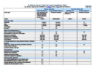
Summary We are Not Done The Error in the Files have Prevented Completion With the Data that we h ave we can compare November and December for Five Companies and Eight Nodes Companies with the Greatest Seasonality Have Done the Best at Managing Error and Bias ID: 791973
Download The PPT/PDF document "Company Comparison Charts" is the property of its rightful owner. Permission is granted to download and print the materials on this web site for personal, non-commercial use only, and to display it on your personal computer provided you do not modify the materials and that you retain all copyright notices contained in the materials. By downloading content from our website, you accept the terms of this agreement.


Slide1
Company Comparison Charts
Slide2Summary
We are Not Done. The Error in the Files have Prevented Completion.
With the Data that we
h
ave we can compare November and December for Five Companies and Eight Nodes.
Companies with the Greatest Seasonality Have Done the Best at Managing Error and Bias.
32% of the Time the Monthly Company Forecasts were Worse than the Naïve Forecast.
Demand Error at the DC Level is High for All.
Slide3November, 2014 Forecast Bias
Bias Ranking
Company
Slide4November, 2014 MAPE
Company
MAPE Ranking
Slide5December, 2014 Forecast Bias
Bias Ranking
Company
Slide6December, 2014 MAPE
MAPE Ranking
Company
Slide7Positioning of Participants
0.16
, 11.65
0.07, 8.39
0.09
, 5.88
0.14, 0.44
Slide8Orbit Chart General Mills: Inventory
Turns vs. Operating Margin
(2007 – 2014)
Source: Supply Chain Insights LLC, Corporate Annual Reports 2007-2014
Best Scenario
Average
(Operating Margin, Inventory Turns)
Inventory Turns
Slide9Orbit Chart Campbell’s: Inventory
Turns vs. Operating Margin
(2007 – 2014)
Source: Supply Chain Insights LLC, Corporate Annual Reports 2007-2014
Best Scenario
Average
(Operating Margin, Inventory Turns)
Inventory Turns
Slide10Orbit Chart: Procter & Gamble
(Inventory Turns and Operating Margin
) 2000-2013
Slide11Orbit Chart:
Colgate
(Inventory
Turns and Operating Margin) 2000-2014
CL
0.21, 5.7