
Fixing your text to be visually pleasing pleasing Typography The art and technique of arranging type to make written language legible readable and appealing when displayed Typeface also known as a ID: 546962
Download Presentation The PPT/PDF document "Type, Kerning, & Leading" is the property of its rightful owner. Permission is granted to download and print the materials on this web site for personal, non-commercial use only, and to display it on your personal computer provided you do not modify the materials and that you retain all copyright notices contained in the materials. By downloading content from our website, you accept the terms of this agreement.


Slide1
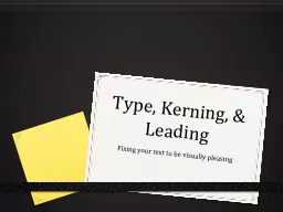
Type, Kerning, & Leading
Fixing your text to be visually pleasing
pleasingSlide2Slide3
Typography
The art and technique of arranging type to make written language legible, readable, and appealing when displayed.Slide4
Typeface
(also known as a
font family
) is a set of one or more fonts each composed of
glyphs that share common design features
such as Garamond, Helvetica or Times New Roman.Slide5
Font
Traditionally, a font describes a
subset of a Typeface
– each font embodies a particular
size
and
weight
such as
Garamond 12 point
versus
Garamond Italic 8 point
. Today it is used interchangeably with Typeface for Print, but exists in CSS for web.Slide6
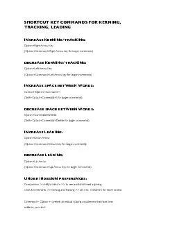
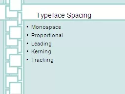
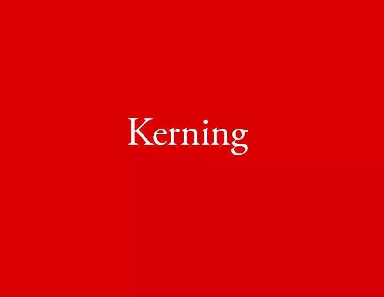
Kerning
The process of adjusting the spacing between characters in a font to create visually even spacing.Slide7
Tracking
Refers to uniformly increasing or decreasing the horizontal spacing between a range of characters.Slide8
Leading
Refers to the spacing between the baselines of successive lines of type.Slide9
Examples of Poor Kerning ChoicesSlide10
Examples of Poor Typeface
& Kerning ChoicesSlide11
Poor Handwritten Kerning ChoicesSlide12
Bad Kerning is EVERYWHERESlide13Slide14
To make sure this does NOT happen to you – start with the
Character PanelSlide15
The Character Panel…
i
s where you will control your typography. You can make all your type choices here. Start with your Typeface, weight and size.Slide16
The Character Panel…
i
s where you will control your kerning.Slide17
The Character Panel…
i
s where you will control your leading.Slide18
The Character Panel…
i
s where you will control your tracking.Slide19
Assignment
To continually use great font choices, kerning, tracking, and leading.
Extra Credit:
Take up to
3 photos of poor kerning
and email me your images.