
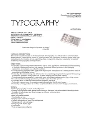
Putting type on a page without incorporating typographic principles is merely word processing Terry Rydberg Author Exploring InDesign 3 Typography Typography Typography The study of all elements of type as a means of visual communicationfrom calligraphy to the use of digital type inc ID: 699808
Download Presentation The PPT/PDF document "Typography Typography Typography" is the property of its rightful owner. Permission is granted to download and print the materials on this web site for personal, non-commercial use only, and to display it on your personal computer provided you do not modify the materials and that you retain all copyright notices contained in the materials. By downloading content from our website, you accept the terms of this agreement.

Slide1
Typography
Typography
Typography
Putting type on a page without incorporating typographic principles is merely word processing.
Terry Rydberg, AuthorExploring InDesign 3
Typography
TypographySlide2
TypographyThe study of all elements of type as a means of visual communication—from calligraphy to the use of digital type; includes the shape, size, and spacing of characters. Slide3
The Right ChoiceChoosing the right font is about readability and legibilityReadability
—how easily words, phrases, and blocks of text can be readAlways consider your audience when selecting typefaces for your publicationLegibility—the ease with which individual letters can be distinguishedSlide4
Type AnatomyBaselineDescender
x-heightCaps heightAscenderSlide5
Edwardian Script --Z
Century
Bradley
Cooper
Mistral--j
DESCENDER
X-HEIGHT
ASCENDER
Type Anatomy
BASELINE
CAPS HEIGHTSlide6
DefinitionsBaseline—An imaginary horizontal line along which the base of a letter setsDescender—The part of any character (g, j, p, q, y, and sometimes J) that falls below the baseline.
x-height—The height of lowercase letters, specifically the lowercase x, not including ascenders and descendersCaps Height—The height of capital letters from the baseline to the top of caps, most accurately measured on a character with a flat bottom (E, H, I, etc.)Ascender—The part of a lowercase character (b, d, f, h, k, l, t) that extends above the x—height. Slide7
TypefaceTypeface—A family of alphabetic characters, numbers, punctuation marks and other symbols that share a consistent designExample: Times New Roman, Arial, etc.
Note:
the term “character” is often used to refer to any individual letter, punctuation, numeral, or symbol.Slide8
The Point SystemFonts are measured by a system called points. In the United States, one point = 1/72”Other parts of the world use varying systems; example: parts of Europe use a point system, but the point is slightly smaller than an American point
Some use a metric system, but because of the United States’ dominance in the marketing of typographic software, the concept has not taken hold worldwide.
http://www.oberonplace.com/dtp/fonts/point.htmSlide9
Measuring Font Size
If one point is 1/72 of an inch, then 72 points should equal one inch—but it is not an exact measurement
Font size is measured from the height of the highest ascender to the bottom of the lowest descender within the entire typeface.
Arial Black: Q g h j x @ $ ()
Q b f g k x $
Mistral:Slide10
Point SizesBody text size should range from 9 to 12 point. Start with 10 and make adjustments.Match point size to readership—Example:14 point for young children and over 65.Heading size should be approximately 2 points greater than the body text size (or bigger)—remember
contrast is important. Slide11
Typeface ClassificationsSerifSans SerifDisplay/Decorative
ScriptSlide12
SerifA serif is the little extra stroke found at the end of main vertical and horizontal strokes of some letterforms.
Serif typefaces are typically easier to read; usually used for large bodies of text.Examples: Times New Roman Garamond
TSASlide13
Sans SerifType which does not have serifs“Sans” is French for
withoutUsed for displays, special emphasis and small bodies of text--is difficult to read in large bodies of textExample: Arial Black Verdana
TSASlide14
Display & DecorativeDesigns are unusual and unique and are designed to attract attention
One of the newest categories of decorative fonts is grunge type, which typically has a
rough, coarse look.Used in limited situations in larger sizes like headlines, titles, and advertisementsNot appropriate for body textExample: Gigi
Chiller CurlzSlide15
ScriptDesigned to resemble handwriting, with styles ranging from formal to whimsicalShould NEVER be set in all capital letters
Generally reserved for invitations, greetings, advertisementsExamples: Magneto Vladimir ScriptSlide16
DingbatsIn addition to the primary categories, there are several sets of decorative elements (dingbats) available in font format—ornaments, shapes, pictures, symbols, etc.Examples:
Desktop Publi shingStandard dingbat font sets are symbol
, wingdings, and webdingsDingbats are also known as printer’s ornamentsSlide17
Font SelectionConsider the audience when selecting typefaces and point sizeConsider the type of paper and method of printing when choosing typeface and point size.Match the personality of the typeface with the publication.
Limit typefaces—between one and three. Be consistent in the use of fonts—all headlines the same, all body text the same, etc.Slide18
Font StylesStyle—special formatting applied to text; the most common styles are:
Bold—appears darker than the surrounding textItalics—slopes to the rightUnderlineOther effects that are commonly available are:
Shadow–adds depth to text or other objects, making them appear more three-dimensionalSmall cap
—lowercase letters display in a smaller size than the regular uppercase letters, typically the height of lowercase letters in that font --
creating the illusion of depth
Outline
3-DSlide19
Text that follows an outline in a curved or irregular patternLight color text on a dark background—typefaces with heavier letters and/or serifs are easier to read
The first letter in a story is enlarged and lowered below the normal baseline so the top of the letter is even with the first line of textThe illusion of actual textures such as wood, metal, objects in nature, etc.T
ext flows around a graphic imageSelf-explanatory
Special Formats
rop
cap
D
Contour
Texture
Color
Reverse type
Text
WrapSlide20
Spacing Techniques“Altering the amount of space between characters, words, lines of text, and blocks of text can help in fitting more text on the page, making pages visually lighter or heavier, and improving readability.”* Leading
KerningTrackingWidows/OrphansSpacing after punctuationIndents
Hanging Indents*
desktoppub.about.com/cs/basic/a/textcomposition.htmSlide21
Leading
Leading—the space between lines of text; sometimes known as line spacingPronounced “ledding”
Leading is measured from baseline to baseline, typically two points greater than the point size—some software calculates leading as 120% of the point sizeSlide22
KerningKerning—the adjustment of space between pairs of letters to improve its appearance or alter its fit
The spacing between letters is determined by the font; some fonts will automatically kern, or adjust the spacing between letters to make them “fit” together. Too little space can cause the letters to run together and appear as one—making it difficult to readToo much space between letters can create “rivers” which make it difficult for the reader’s eye to flow through the text.
Some software uses the expression “character spacing.”
Bradley Bradley
KERNINGSlide23
TrackingTracking—Adjusting the spacing between words, phrases, and extended blocks of text
normal
tight
loose
very looseSlide24
Widows and OrphansDangling words at the top and bottom of pages interrupt the reader’s eye and make reading more difficult.Widows and Orphans—
Short lines of text (single sentence or phrase) that appear at the end of a paragraph, column, or page or at the top of a column or page. Avoid leaving sub headings at the bottom of a page without accompanying textSlide25
Widows and OrphansErostrud magniscin
velit, quis eum el in henismolore min venis exeraessi tat
autatisl ut et volobor irit iril ullaore min
veliquam vendit loreraesto cortincidui ex exer
aliquipit la facillam nos del ut wis adipit
praestrud doloreros etuer irit lut nonulpute
magnisim
vel
ute
ming
eu
feuisit
aciduip
eugait
lore
tatuerostis
el
dolore do ent utpate consed
tatem quam, quatet dolobor
sendrem eum ipis nonsequ amcommy
nostion sequis nonse
tet
,
conullaor
adit
wismodiam
, sit at.
Orer
iriure
feum
il
ulput
alit
alit
enit
ipis
dolore
dolore
magnim
vulla
faccum
quisi
.
Sum
ipit
lore
vel
do
conullan
ulluptatis
eum
vullam
in et
nonsequi
blaorper
augiatem
am
diam incilit wis aliquatet vercing ex er
aci te ercing et ad er susto
odolorp erostie tet alit num ip ero
odio
etum
alit
iurerat
pratie
tat.
Feugue
magniscing
euismol
oDeconsul
torbiss
ignove
,
sessolis
. Dec re
creo
imusti
,
consupiocae
oc
,
etis
;
nos
se
parit
dinculi ssidiner quo consum ussestratum omne in de dicipioris crem in tuit. Ful temum erum adet oraci senatum nos obsed pon di stem perem o iam. Fece forum fue ius consulinatam iginatquem ia patum ego in teri pero, nihilla tesilica que con dest intritere nostra de comne mo moverit. Verum iam id conirita ia? Usce esi pris denatum, que in duconsuam it. Cate pon diem noc, aurnius omnessin stra nonsi pore austisse vili pos opopopu blica; nirter liceste ripti, simihil icullego vastium ipionsu ltorenatil halin in inamquonem qui in sum tere. alit Orer iriure feum il ulput alit enit ipis dolore dolore magnim vulla faccum quisi. Factata berfeco virmacchus; iam in Itaremp ratodiu spioriossus ma, ut pris. Torae medeatu rberit, qua rebus, sum egitustia publi iam mentebatquon se non duc rei esse novenihice constra noverfec verum aut vid ca; esicio, publis ad mum in tem neque ne popti, fure publint? Di tandactum cussesto iam teris vilius, optiam nos etori iam.and
Note
: The filler text used in this illustration is called
greeking;
it is also known as
lorem ipsum.
Text greeking is used to simulate the real text while planning the layout of a publicationSlide26
Widows and Orphans
Henry Ford was an American hero. He was a self-taught machinist and engineer whom many say changed American forever. In 1903, he founded the Ford Motor Company, a small company that manufactured automobiles.After examining scientific management theories and studying the philosophy of efficient production as presented by Frederick Winslow Taylor, Ford changed manufacturing practices. Taylor was an efficiency expert who developed a new concept of labor that reduced the requirement for human expertise in an efficient manufacturing environment. In 1906, Ford borrowed Taylor’s ideas changed how he manufactured automobiles.
Ford was the father of mass production techniques—the assembly line—which significantly changed the way people worked. Ford Motor Company not only changed the way people worked, the automobiles it manufactured changed the way people traveled.Ford’s implementation of the assembly line made automobiles affordable to the average American. His Model T, otherwise known as the Tin Lizzie, became the foremost mass-produced product in the world. Mass production became the unifying theme for American industry in the early 1900’s and beyond.
The automobile revolutionized the world more than any other product until the advent of the computer. What have we learned from this lesson in history? Was Henry Ford’s mass production technique really the best way to produce goods? Or are critics of the mass production philosophy correct when they point out that assembly line workers want more from a job than just being an invisible cog in the wheel of production? While the answer to these questions is not an easy one, it is one we should consider carefully.
We may have to make that decision about how we use computers one day! Slide27
Fixing Widows/OrphansRewriteSet the automatic features in your software to prevent itAdjust the spacing between letters (kerning) or between groups of words (tracking)Slide28
Spacing and PunctuationEm space—a space that is the width of a capital M in the font and point size being used Use an em space to indent paragraphs; one to two em spaces are an appropriate paragraph indention—depending on the width of the column
En space—a space that is the width of a capital N; half the size of an em spaceSlide29
Spacing and PunctuationEnd of sentence punctuation—space one time after punctuation at the end of a sentenceElliptical periods
(an ellipsis) indicate the omission of text or an interruption or hesitation; three periods are used within a sentence, etc.If the omission or interruption occurs at the end of a sentence, a fourth period is used. Kern the periods to reduce the space between characters—or insert elliptical characters.Hyphen—use when keying phone numbers, social security numbers or hyphenating words at the end of a line;
example: 501-555-5555Slide30
Spacing and PunctuationEm dash—a line the width of a capital M; is used to indicate a break or pause in thoughtDashes can be used in pairs like parentheses—that is, to enclose a word, or a phrase, or a clause—or they can be used alone to detach one end of a sentence from the main body.
Can be used in the place of a colon, semicolon, parentheses, or commasEn dash—a line the width of a capital N; is used to connect ranges of numbers, dates, lettersExample: 9:00–5:00 or March 15–31Slide31
Indents / Hanging Indents
Indent
--a feature that sets a temporary left, right, or left and right margin for paragraph text
Hanging indent--first line of a paragraph is flush left, but all remaining lines are indented; also used in bulleted lists
Write a brief essay describing at least three concepts you need to consider when choosing the typefaces for a publication.
Hanging
Write a brief essay describing at least three concepts you need to consider when choosing
the typefaces for a publication
.
Left
Write a brief essay describing at least three concepts you need to consider
when choosing the typefaces for a publication.
Write a brief essay describing at least three concepts you need to consider when choosing the typefaces for a publication.
Left
and
Right
RightSlide32
AlignmentDefinition: lining up text or graphic elements to the top, bottom, sides, or middle of a page or box
CenterJustified (Full)Left (Ragged right)Right (Ragged left)Slide33
Located where the Ozarks meet the Delta, the Bald Knob School District covers approximately 178 square miles and is located in north central Arkansas, about 60 miles from Little Rock.With a school population of just over 1300, the district services its students in a K-4, 5-8, 9-12 environment.
Located where the Ozarks meet the Delta, the Bald Knob School District covers approxi-mately 178 square miles and is located in north central Arkansas, about 60 miles from Little Rock.With a school population of just over 1300, the district services its students in a K-4, 5-8, 9-12 environment.
Located where the Ozarks meet the Delta, the Bald Knob School District covers approximately 178 square miles and is located in north central Arkansas, about 60 miles from Little Rock.With a school population of just over 1300, the district services its students in a K-4, 5-8, 9-12 environment.
Located where the Ozarks meet the Delta, the Bald Knob School District covers approximately 178 square miles and is located in north central Arkansas, about 60 miles from Little Rock.With a school population of just over 1300, the district services its students in a K-4, 5-8, 9-12 environment.
Full
Ragged Right
Center
Justified
Left
Right
Alignment
Ragged LeftSlide34
Center AlignmentUsed primarily with invitations, announcements, plaques, certificates, etc.Hard to read full paragraphs or long lines of textFrequently used for headlines over columnsDo not center-align numbered or bulleted listsSlide35
Justified Alignment (Full)Standard format for newspaper columns, magazine articles, books, etc.Requires attention to detail since “rivers” can occur easily due to spacing and hyphenationConsidered very formalSlide36
Left AlignmentCreates a less formal, friendlier layoutWatch for hyphenation problemsTypically is easier to format—requires less time, attention, etc.Ragged right creates white spaceSlide37
Right AlignmentUsed to catch the reader’s attention Typically used in advertisements, magazine layouts, etc.Slide38
HyphenationDefinition: To divide or connect (syllables, word elements, or names) with a hyphen.Allows for more words to fit—saving space.
The last word on a page should never be divided.No more than two consecutive end-of-line hyphens are recommended.At least two letters must appear on the line before a hyphen, and at least three letters must appear on the line following.If hyphenating manually, check the right edge for any obvious holes, sloping edges or words that “stick out”.