
Warm Up How are colors matched when designing Provide 2 examples of colors that look good together PO Analyze the use of color schemes in design and the effect they have on the success of the design ID: 781030
Download The PPT/PDF document "Color Schemes Design Seminar" is the property of its rightful owner. Permission is granted to download and print the materials on this web site for personal, non-commercial use only, and to display it on your personal computer provided you do not modify the materials and that you retain all copyright notices contained in the materials. By downloading content from our website, you accept the terms of this agreement.


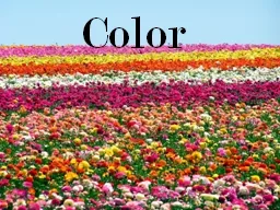

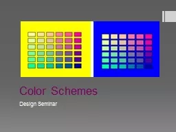
Slide1
Color Schemes
Design Seminar
Slide2Warm Up
How are colors matched when designing? Provide 2 examples of colors that look good together.
PO: Analyze the use of color schemes in design and the effect they have on the success of the design.
Slide3Analogous
Uses colors that are directly next to each other on the color wheel
Slide4Complimentary
Uses two colors that are directly opposite on the color wheel.
Slide5Split Complementary
Uses three colors
Combines one color with the two colors on each side of its complement
Slide6Double complementary
Uses four colors for a total of two sets of complementary colors
Slide7Triad
Uses any three colors that are an equal distance apart from each other on the color wheel
Slide8Monochromatic
Uses tints, tones and shades of one color on the color wheel
Slide9Neutral
Use of whites, blacks and graysBeige and brown pairings
Allow people to feel safer when working with color
Slide10Accented Neutral
Small amount of a bright color in a neutral color scheme
Slide11Warm Colors
Makes a space/item feel warmerOften associated with the sun
Reds, oranges, and yellows
Slide12Cool
Colors
Often associate with the essence of the ocean
Makes an item feel cooler
Blues, greens and violets
Be aware:
depending on the tint or tone of the base (undertone) it is possible to have warm greens and cool yellows
Slide13Accented Analogous
Uses colors that are next to each other on the color wheel PLUS a complementary color.
Slide14Color Choices and their Effects
Colors affect the:Lighting and personal skin tone
Perceived space of a room or a person
Comfort level
Colors reflect:
Personality
Style
Trends Mood
Slide15Play around
Neat website to play onhttp://colorschemedesigner.com/
Slide16Assignment
Create all of the color schemes using colored pencils on the back of your sheet. Be sure to NAME each scheme
On each area of design, pick one color scheme and apply it to the design (fashion and interiors).
Slide17Examples