PPT-Visualization of Student Migration Data Using Google Charts Sankey

Author : natalia-silvester | Published Date : 2018-09-30

Diagrams Sean V Hoffman Institutional Research Analyst Office of Institutional Research Planning amp Effectiveness Goals To learn the basics of Sankey diagrams To

Presentation Embed Code

Download Presentation

Download Presentation The PPT/PDF document "Visualization of Student Migration Data ..." is the property of its rightful owner. Permission is granted to download and print the materials on this website for personal, non-commercial use only, and to display it on your personal computer provided you do not modify the materials and that you retain all copyright notices contained in the materials. By downloading content from our website, you accept the terms of this agreement.

Visualization of Student Migration Data Using Google Charts Sankey: Transcript


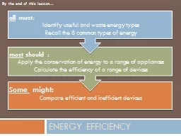
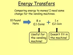
Diagrams Sean V Hoffman Institutional Research Analyst Office of Institutional Research Planning amp Effectiveness Goals To learn the basics of Sankey diagrams To gain an understanding of how Sankey diagrams can be used in Institutional . x Dedicated migration experts provide unique product knowledge and experience 57479 Oracle Migration Factory dashboard provides complete guidance and visibility into the process every step of the way KEY BENEFI TS x Faster and more accurate migratio B.Tech Major Project. Project Guide. Dr. . Naresh. . Nagwani. Project Team Members. Pawan Singh. Sumit. . Guha. What is Data Visualisation ?. Data Visualisation . is the graphical representation. of information. Bar charts, scatter graphs, and. might:. Compare efficient and inefficient devices. Energy efficiency. most. should :. Apply the conservation of energy to a range of appliances. Calculate the efficiency of a range of devices . all. 2014 Summer Internship - Tetherless World Constellation. Sumithra Gnanasekar. Lakshmi Chenicheri. Objective. Visualize Minimum Information about a Marker Gene Sequence (. MiMarks. ) compliant datasets. Desktop Migration Team. Student Affairs. Sam. Patten. Rick. Dougherty. ITS. Ben . Kirchmeier. Randy Woods. Ilya Pinchuk. Jacob Flynn. Darren Kearney. Enterprise Applications. Randy Wood. Application Administration Manager. 2. nd. Lt. Tom Guilford. 155 Composite Squadron. CAP. Objectives. CAP Grid Maps/Aeronautical Charts can be imported into Google Earth as a layer.. Data can be downloaded from the following site: . http://www.chartbundle.com/charts/. Creates interactive visualization . and dashboards . Fast and easy to use. Connect to any . data regardless . of its size and . complexity. To present . data from multiple sources. It gives . you . the ability . Creating Rich Data Visualizations using the Google API. Yolanda M. Davis. Senior Software Engineer . AdvancED . August . 2. , . 2012. Baltimore. , MD. *. What We'll Cover. What is Data Visualization?. Chart Types Covered. 2. Column. Line. Pie. Stock. XY (Scatter). Area. Bubble. Visualizing Data. 3. Data Graphics Principles. 4. Data Graphics Principles. 5. “Above all else show the data”. Reminder not to clutter a chart by adding unneeded illustration or decoration.. Note. 8 x . £1 Coins. 1 x . £2 Coin. Useful for the vending machine!. Doesn’t fit in the machine!. Comparing energy to money! I need some change for the vending machines.. Energy Transfers. 10 Pound . David Granholm. , Senior Director PM . Matt Milella, VP Engineering. Oracle Analytics. October 4, 2017. 2. 3. Oracle Analytic Apps Portfolio. OTBI. DV. Content. Packs. Oracle Analytic Cloud (OAC). Next-Gen. Você gosta de emagrecer? Ou de perder 5kg ou 10kg? Independentemente da sua resposta, esse
é um objetivo que pode ser alcançado com, pelo menos, um exercício básico de autocontrole.
https://go.hotmart.com/B7042989
0F
Eudeslima08@gmail.com It’s no secret that this world we live in can be pretty stressful sometimes. If you find yourself feeling out-of-sorts, pick up a book.According to a recent study, reading can significantly reduce stress levels. In as little as six minutes, you can reduce your stress levels by 68%. Chong Ho (Alex) Yu. Agenda. What is data visualization?. What isn’t data visualization?. What is the difference between dynamic, semi-dynamic, and non-dynamic (static) visualization systems?. Why do we need data visualization?.

Download Document

Here is the link to download the presentation.
"Visualization of Student Migration Data Using Google Charts Sankey"The content belongs to its owner. You may download and print it for personal use, without modification, and keep all copyright notices. By downloading, you agree to these terms.

Related Documents