

Qualitative data 1 2 Another Classification numerical variable categorical variable binary variable dichotomous poly tomous variable multinomial Ordinal or ranked data ID: 915852
Download Presentation The PPT/PDF document "Descriptive statistics (2)" is the property of its rightful owner. Permission is granted to download and print the materials on this web site for personal, non-commercial use only, and to display it on your personal computer provided you do not modify the materials and that you retain all copyright notices contained in the materials. By downloading content from our website, you accept the terms of this agreement.


Slide1
Descriptive statistics (2)
Qualitative data
1
Slide22
Another Classification
numerical variable
categorical variable
binary variable/ dichotomous
polytomous variable
multinomialOrdinal (or ranked data)
Slide33
Descriptive statistics for categorical data
Relative number
and application
tabular and graphic methods
Slide44
numerical method -Relative number
Rate
Proportion
Ratio
Slide5Rate
In contrast to the static nature of proportions, rates are aimed at measuring the occurrences of events during or after a certain time period.
(1) Changes
(2) Measures of Morbidity and Mortality
5
Slide6Change rate
6
Slide77
Rate-Force Index
A single figure that measures the forces of specific events, for example death, disease. mortality & morbidity)
a= the frequency with which an event has occurred
during some specified period of time
.
a+b= the number of person exposed to the risk of the event during
the same period of timeK=some number such as 100,1000,100,000
Slide88
Vital Statistics-Rates as measure of health status.
Incidence rate (morbidity)
prevalence rate
Slide9Measures of Morbidity and Mortality
3
types of rate are commonly mentioned:
crude, specific,
&
adjusted (or standardized)
Unlike change rates, these measures are proportions.
Crude rates are computed for an entire large group or population; they disregard factors such as age, gender, and race. Adjusted or standardized rates are used to make valid summary comparisons between 2 or more groups possessing different age distributions.
9
Slide10The annual
crude death rate is defined as the number of deaths in a calendar year divided by the population on July 1 of that year .
the
1980 population of California
was 23,000,000(as estimated by July 1) and
there were 190,237 deaths during 1980.
10
Age-specific death rate
Slide1111
Proportion
Composing index, The relative frequency of every composition taking account of special factor, such as race, sex, age group in a whole group.
For example, sex proportion, race proportion, age proportion.
Slide1212
Homogenous in factors except for treatment
Comparison of morbidity between two region.
Sex, age distribution should be equal significantly.
For the sex, age may be the factor that effect the mortality.
Slide13Rate & proportion
The term rate is somewhat confusing; sometimes it is use d interchangeably with the term p oportion; sometimes it refers to a quantity of a very different nature.
Sometimes, we focus on rates used interchangeably with proportions as measures of morbidity and mortality.
Even when they refer to th e same things — measures of morbidity and mortality —there is some degree of difference between these two terms. In contrast to the static nature of proportions, rates are aimed at measuring the occurrences of events during or after a certain time period .
13
Slide1414
Ratio-comparison index
C,d the frequency or relative frequency of occurrence of some events or terms,such as the person-doctor ratio,the person-hospital bed ratio.
K used in ratio are mostly 1 and 100.
Slide1515
Sex ratio in China in 2000
=
(65355units/64228 units)X100=106.74
1 unit=10,000
万 (wan)
Slide1616
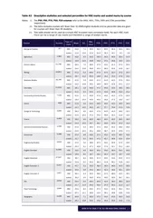
Summary of relative number
BMI group
number
N
of patients
ratio
Composition
%
prevalence rate %
(
1
)
(
2
)
(
3
)
(
4
)
(
5
)
(
6
)
low
212
10
—
3.10
4.72
Overweight
661
57
5.70
17.65
8.62
light obesity
1120
125
12.50
38.70
11.16
Middle obesity
825
112
11.20
34.67
13.58
Heavy obesity
102
19
1.90
5.88
18.63
total
2920
323
—
100.00
11.06
BMI (body mass index)
Slide1717
Slide1818
Note on calculation of relative number
The denominator should not be two small
½=50%???
The average relative frequencies can not be added directly when n’s are not the same.
Difference between force index & composition index
disease
No disease
total
rate
male
20
20
40
0.5
female
45
15
60
0.75
total
65
35
100
0.65
Slide19Construction of statistical table
A table is intended to communicate information, so it should be easy to read and understand.
A statistical table has at least four major parts and some other minor parts.
(1) The Title, (2) The Box Head (column captions),(3) The Stub (row captions), (4) The Body, (5) Notes.
19
Slide20Frequency table for categorical data
20
Slide21structure of Statistical table
(1) The Title: must explain the contents of the table.
(2) Column captions
(3) Row captions
(4) The Body:
It is the main part of the table which contains the numerical information.
21
Slide22Displaying data graphically
One of the first things that you may wish to do when you have entered your data onto a computer is to summarize them in some way so that you can get a 'feel' for the data.
diagrams, tables or summary statistics.
Diagrams are often powerful tools for conveying information about the data, for providing simple summary pictures
22
Slide23A bar chart shows data in the form of horizontal or vertical bars.
Figure2.4 shows cancer of the oesophagus in the form of a bar chart, the heights of the bars being
proportional
to the mortality.
The bars are separated by
small gaps to indicate that the data are categorical or discrete.
Bar Chart
23
Slide24Simple Bar Chart
A simple bar diagram is used to represent only one variable.
Table2.10 Cancer of the oesophagus: standardized mortality rate per
100,000 per year, England and Wales, 1960-1969
Bar chart can be used to show the relationship
between two variables, one being quantitative
and the other either qualitative or a quantitative
variable which is grouped, as is time in years. 24
Slide25Figure 2.4 Bar chart showing the relationship between mortality
due to cancer of the
oesophagus
and year, England and Wales, 1960-1969
25
Slide26Multiple bar
Multiple bar charts can be used to represent relationships between more than 2 variables.
the relationship between children's reports of breathlessness and
cigarette smoking by themselves and their parents
.
26
Slide2727
Slide28Bar chart for quantitative data
28
Slide29Pie chart
The pie chart or pie diagram, shows the relative frequency for each category by dividing a circle into sections, one for each category, so that the area of each section is proportional to the frequency in that category. And the angles of which are proportional to the relative frequency also.
29
Slide3030
Slide3131
Slide32Line Graphs
A line graph is similar to a bar chart, but the horizontal axis represents time.
Different ‘‘groups’’ are consecutive years, so that a line graph is suitable to illustrate how certain proportions change over time.
In a line graph, the proportion associated with each year is represented by a point at the appropriate height; the points are then connected by straight lines.
32
Slide33Table 2.13 crude death rates for women between the years 1984 and 1987
33
Slide34Figure 3.9 Death rates for U.S.women,1984
–
1987
34
Slide35Line for quantitative data
35
Slide36Scatter diagrams
The bar chart shows the relationship between two continuous variables such as vital capacity(Y) and weight(X) for 12 female students.
36
Slide37Table3.10 The relation of vital capacity and weight for 12 female students
37
Slide3838
38
Standardization
rate
Why?
How?
Direct method
Indirect method properties
Slide3939
39
Why standardized rate?
Why? There are different age structures in the populations in 1901 and 1981 .
Slide4040
Direct methods
To eliminate this impact from different age proportion ,we can use standardization methods
Direct methods
select a standard population structure to calculate a adjusted rate.
a standard population with specific age proportion must be great in size, steady, and representative.
Slide4141
41
The age-standardized mortality rate for 1981 was
7.3
per 1000 men per year.There was much higher in 1901 than in 1981.
Direct method for 1981
Slide4242
42
Indirect method
Slide4343
Slide4444
Thanks