
What is it Whos using it Why you should be today What is Responsive Design An Industry Buzz Word Demystified Responsive websites respond to their environment R esponsive designs are comprised of fluid grids and flexible images Code ID: 388861
Download Presentation The PPT/PDF document "RESPONSIVE DESIGN" is the property of its rightful owner. Permission is granted to download and print the materials on this web site for personal, non-commercial use only, and to display it on your personal computer provided you do not modify the materials and that you retain all copyright notices contained in the materials. By downloading content from our website, you accept the terms of this agreement.


Slide1
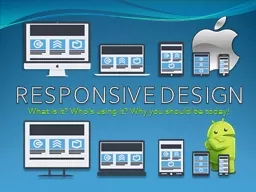
RESPONSIVE DESIGN
What is it? Who’s using it? Why you should be today!Slide2
What is Responsive Design?
An Industry Buzz Word De-mystified
Responsive
websites respond to their environment
.
R
esponsive designs are comprised of fluid grids and flexible images. Code
works on smart phones, tablets, smart watches, computers, tvs, blimps, cars, you name it.
Applications are compatible on all popular operating systems including OSX & Android.
Responsive design saves time and money. One website for all devices means less work & maintenance.
Responsive designs are more compatible from browser to browser.
Consistency and familiarity across platforms enforces your brand identity.Slide3
How does it all work
?
The 3 Elements Responsive Designs are Built Upon
HTML5
is the scalable code behind responsive design
HTML5 is a coding language designed for flexibility. Many of its core functions are built to support mobile devices, smart
phones and tablets
.
JavaScript &
jQuery
define interactivity in responsive designs
JavaScript and jQuery introduce interactivity and tie together how web sites and applications work, react and behave.
CSS3 defines how an application looks and feels
CSS3 defines the overall look of a site or application and how it behaves in a defined space. Slide4
Why Responsive Design?
Why Companies are Adopting Responsive Design
One Design, Many Devices and Interfaces
Day
by
day the
number of
devices platforms and browsers
that need to work with
your
site
grows Responsive
web design represents a fundamental shift
in
how we’ll build websites for the decade to
come…
Jeffrey
Veen
VP - Products at
Adobe
Slide5
www.disney.comSlide6
www.microsoft.comSlide7
www.starbucks.comSlide8
Why Responsive Design?
Why Companies are Adopting Responsive Design
Mobile First Design for Tablets & Smart Phones
The web's moved beyond the desktop, and it's
not
looking back. The number of devices we're designing for is growing just as quickly
as mobile traffic…
Ethan
Marcotte
Guru
of
Responsive Web DesignSlide9
Why Responsive Design?
Why Companies are Adopting Responsive Design
With more Visitors Using Smartphones to access websites mobile design in more important than ever.
Designing
for today’s Web means considering single-handed thumb use on
smartphones…
Luke
Wroblewski
Product
Director at
GoogleSlide10
Thank You