
Born in Paris France Self Portrait Paul Gauguin was a leading French Post Impressionist painter sculptor print maker ceramist and writer Large Blue Horses Post Impressionism is a way of using vivid colors thick application of paint distinctive brush strokes and reallife subject ID: 626401
Download Presentation The PPT/PDF document "Paul Gauguin (GO-GAN) 1848-1903" is the property of its rightful owner. Permission is granted to download and print the materials on this web site for personal, non-commercial use only, and to display it on your personal computer provided you do not modify the materials and that you retain all copyright notices contained in the materials. By downloading content from our website, you accept the terms of this agreement.


Slide1
Paul Gauguin(GO-GAN)1848-1903Born in Paris, France
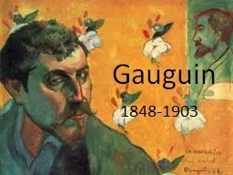
Self PortraitSlide2
Paul Gauguin was a leading French Post Impressionist painter, sculptor, print maker, ceramist and writer.Slide3
“Large Blue Horses”
Post
Impressionism is a way of using vivid colors, thick application of paint, distinctive brush strokes, and real-life subject matter, but emphasizes simple geometric shapes, distorts form for expressive effect, and uses unnatural color.
For example, what color are these horses? Are mountains usually red? Is there a lot of detail in the picture?Slide4
Gauguin travelled quite a bit in his early life.
He lived in
Peru as a child and became a sailor as a teenager. His many travels and adventures instilled an imagination in him that would later be evident in his art.
“The Swineherd”Slide5
Gauguin did not become an artist until later in his life, leaving a successful career as a stockbroker.
“The Vision After the Sermon”Slide6
Gauguin went to Tahiti to paint and never left.Slide7
Gauguin used complimentary colors to make his artwork seem more vibrant and intense.
Complimentary colors are opposite one another on the color wheel.
If you look at the color wheel to the left, you see that a primary color is complemented or enhanced by its opposite secondary color such as blue and orange.Slide8
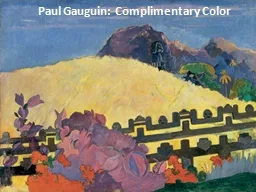
“The Sacred Mountain”
In the painting, “The Sacred Mountain”, Gauguin used complementary colors like yellow/purple and red/green to make the colors more vibrant because they “complement” each other.Slide9
Gauguin also used perspective in his paintings.
Notice how the items at the bottom of the painting (foreground) are larger and have more detail while the objects at the top of the painting (background) are smaller with less detail.
Also notice the curved horizontal line that separates the sky from the earth. This is called the horizontal line.All of these elements give depth and perspective to his painting. Slide10
What is one thing that you learned today about Paul Gauguin? Slide11
Complementary Colors LandscapePut on a paint shirt.
Put your name on the back of your paper.Using masking tape, tape your paper down on all sides making a “frame” around your future painting.On a separate piece of paper, sketch your ideas first, including mountains, hills, lakes, rivers, clouds, trees, bushes or whatever you choose. Remember to make the items in the background smaller and those in the foreground bigger with more detail.
Think about your horizon line, where sky meets the earth, traveling across your paper. This could be a hill, mountain range or the flat line of water.When satisfied with your drawing, redraw on your taped down piece of paper.
Think about the normal colors of your landscape and choose their opposite, complimentary colors to use in most of your painting. (Look at the color wheel if needed)
Be sure to rinse your brushes in between colors. Slide12Slide13