/
(Source: World Bank Development Indicators 2008: (Source: World Bank Development Indicators 2008:

(Source: World Bank Development Indicators 2008: - PowerPoint Presentation

calandra-battersby
calandra-battersby . @calandra-battersby
Follow
401 views
Uploaded On 2017-01-24

(Source: World Bank Development Indicators 2008: - PPT Presentation

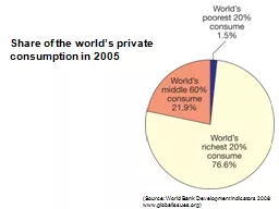
wwwglobalissuesorg Share of the worlds private consumption in 2005 The local geodemography of Glasgow showing the 78mile route dark blue line that links communities A Lenzie and B Calton with wildly different life expectancies ID: 513494

source www boundaries courtesy www source courtesy boundaries states united showing glacier 2004 image map 2008 org disasters annual

Share:

Link:

Embed:

Download Presentation from below link

Download Presentation The PPT/PDF document "(Source: World Bank Development Indicato..." is the property of its rightful owner. Permission is granted to download and print the materials on this web site for personal, non-commercial use only, and to display it on your personal computer provided you do not modify the materials and that you retain all copyright notices contained in the materials. By downloading content from our website, you accept the terms of this agreement.


Presentation Transcript

Slide1

(Source: World Bank Development Indicators 2008:

www.globalissues.org)

Share of the world’s private consumption in 2005 Slide2

The local geodemography of Glasgow, showing the 7.8-mile route (dark blue line) that links communities (A: Lenzie and B: Calton) with wildly different life expectancies

(Background data: Google Maps)Slide3

The proportions of people in poverty at different income thresholds

(Source: www.globalissues.org)Slide4

The geography of human poverty. Territory size is used to represent the proportion of all people living on less than or equal to US$1 in purchasing power parity a day.

(Source: www.worldmapper.org. © Copyright 2006 SASI Group, University of Sheffield, and Mark Newman, University of Michigan)Slide5

Projected changes in crop yield consequent upon different levels of CO

2 stabilization achieved

(Source: ec.europa.eu/environment/climat/adaptation)Slide6

World population annual growth rates according to the U.S. Bureau of Census

(www.census.gov/ipc/www/idb/worldgrgraph.html)Slide7

Annual percentage growth in the world’s population by country

(Source:commons.wikimedia.org/wiki/File:Population_growth_rate_world.PNG based on estimated figures in the 2006 CIA Factbook)Slide8

Chart showing mortality from the 1918 influenza pandemic in the United States and Europe

Emergency military hospital during influenza epidemic, Camp Funston, Kansas, United States.

(Courtesy of the National Museum of Health and Medicine, Armed Forces Institute of Pathology, Washington, DC)Slide9

A photograph of Muir Glacier taken on August 13, 1941, by glaciologist William O. Field

Is a photograph taken from the same vantage point on August 31, 2004, by geologist Bruce F. Molnia of the United States Geological Survey (USGS). According to Molnia, between 1941 and 2004 the glacier front retreated more than 12 km (7 mi) and thinned by more than 800 m (875 yd). Ocean water has filled the valley, replacing the ice of Muir Glacier; the end of the glacier has retreated out of the field of view.

(Courtesy U.S. National Snow and Ice Data Center)Slide10

The map identifies known claims and agreed boundaries, plus potential areas that might be claimed in the future by the countries bordering the Arctic, that is, Canada, Denmark, Iceland, Norway, Russia, and the United States.

(Courtesy: International Boundaries Research Unit, Durham University)

Maritime jurisdiction and boundaries in the Arctic areaSlide11

(A) Banda Aceh, Sumatra, Indonesia on June 23, 2004, 6 months before the tsunami struck.

(B) The same area on December 28, 2004, two days after the earthquake nearby and the consequent tsunami. High-resolution satellite images such as these are of value in directing disaster relief, though prediction of future infrequent events are error prone and unpersuasive to government decision makers

(Image Courtesy of DigitalGlobe, www.digitalglobe.com)

A

BSlide12

Trends in the number of occurrences of natural disasters and their victims

(Source: The Center for Research on the Epidemiology of Disasters (CRED) at the Université catholique de Louvain in Belgium. www.emdat.be)Slide13

The annual reported damages from natural disasters between 1975 and 2007

(Source: www.emdat.be/Activities/press_conference.html)Slide14

Projected insurance losses to members of Lloyds of London in one year attributable to hurricanes of different categories in the southeastern United States

(Image NASA, Image © 2008 TerraMatrices, Image © 2008 Digital Globe)Slide15

(A) 1979 map showing global distribution of seismic potential at plate boundariesSlide16

(Source: W. R. McCann, S. P. Nishenko, L.R. Sykes and J. Krause, Seismic gaps and plate tectonics: Seismic potential for major boundaries, Pure and Applied Geophysics 117, 6, November 1979)

(B) Enlargement showing likelihood of tsunami identified near Banda Ache—which occurred 25 years after publication of this mapSlide17

(Courtesy: MapAction)

Situation map of Chinese earthquake at Sichuan, produced and distributed widely to summarize known situation on May 12, 2008Slide18

Simplistic illustration of how GIS&S inputs can contribute to tackling the Grand Challenges.

Note that this ignores many feedback loops and many other complications; GIS has a more limited area of contributionSlide19

Jeff Foote and his class

(Courtesy Mike Goodchild)Slide20

Michael Palin

(© AbbieTrayler-Smith/ eyevine/ZumaPress)