/
Title formatted in Upper and Lower Case Title formatted in Upper and Lower Case

Title formatted in Upper and Lower Case - PowerPoint Presentation

conchita-marotz
conchita-marotz . @conchita-marotz
Follow
415 views
Uploaded On 2016-04-18

Title formatted in Upper and Lower Case - PPT Presentation

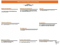
Names Milligan College Advisor Name Sponsor Names   Research Question Literature Review Participants Method and Measures Results Conclusions Literature Cited Further Information ID: 282813

results put pictures literature put results literature pictures research question section convey purpose reader combined poster short study cited

Share:

Link:

Embed:

Download Presentation from below link

Download Presentation The PPT/PDF document "Title formatted in Upper and Lower Case" is the property of its rightful owner. Permission is granted to download and print the materials on this web site for personal, non-commercial use only, and to display it on your personal computer provided you do not modify the materials and that you retain all copyright notices contained in the materials. By downloading content from our website, you accept the terms of this agreement.


Presentation Transcript

Slide1

Title formatted in Upper and Lower CaseName(s)Milligan College Advisor: NameSponsor: Name(s)


Research Question

Literature Review

Participants

Method and Measures

Results

Conclusions

Acknowledgments

This section could be really short of called an “Introduction” or “Background” section and combined with your literature review. Its up to you but the reader should easily be able to find your hypothesis, purpose or question.

Keep this really short. Only put what you to here to convey any major works cited in your paper and how they helped form the basis for your study. A poster does not have to include a reference list. You can always say “references available upon request” if you want to ensure the reader that you can back up your claims.

Describe here what you did and how you did it with just enough detail to give people the basic idea. You can verbally tell them anything you may have left out when they come up to talk to you about your poster. Pictures can be really helpful here, especially if you used any equipment or took pictures of your process, specimen, or participants while conducting the study.

This could be combined with the methods section too. Again, pictures, graphs or tables are a nice way to break up all the text.

If you would like to thank any organizations or individuals for helping you with your project you can put it here if you have room. You can also include an image of their logo along with Milligan’s logo as another “shout out” to the organization that provided you with important resources or participants.

Do more than repeat your results here. You should describe whether your results answered your research question and how. Discuss any limitations, strengths, or applications of your findings. You went to a lot of trouble to do this research so there must be a purpose and a plan for how the information could be used. Here is the place to try to convey that succinctly to your reader.

If you have tables, figures or graphs you should include them if space allows. It is much better to have a visual representation of results than just sentences.

A few notes about poster design:

DO NOT CHANGE THE SIZE OF THE TEMPLATE! If you need a larger amount of printed space talk to Dr. Drinnon first. We are charged by the yard and if you exceed a yard, you will be charged double.

Personalize this template. It is barebones and boring at the moment to show you what

could be in a poster

. Feel free to change the elements for headings, color schemes, etc.

Keep the fonts large enough to read from a few feet away and avoid harsh colors.

Pictures and graphs are a nice way to break up text but select high quality images that add to the reader’s understanding of your topic and results rather than just to take up space or be cute.

Ensure that elements flow or fit with your theme and that there is plenty of white space. A poster is not a paper. You don’t need a lot of wordy details. Make it visually appealing and easy/fast to read.

Proof-read carefully for spelling and understanding before sending in your final copy for print.

The Milligan logo should be on the poster somewhere and large enough to notice, especially if you are taking the poster to a regional/national conference.