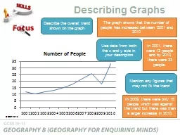
PPT-Use data from both the x and y axis in your description
Author : karlyn-bohler | Published Date : 2017-04-17
Describing Graphs Describe the overall trend shown on the graph Mention any figures that may not fit the trend The graph shows that the number of people has increased
Presentation Embed Code
Download Presentation
Download Presentation The PPT/PDF document "Use data from both the x and y axis in y..." is the property of its rightful owner. Permission is granted to download and print the materials on this website for personal, non-commercial use only, and to display it on your personal computer provided you do not modify the materials and that you retain all copyright notices contained in the materials. By downloading content from our website, you accept the terms of this agreement.
Use data from both the x and y axis in your description: Transcript
Describing Graphs Describe the overall trend shown on the graph Mention any figures that may not fit the trend The graph shows that the number of people has increased between 2001 and 2010 In 2001 there were 12 people and by 2010 there were 33 people. A Global View. Gretchen A. Koch. Goucher College. PEER UTK 2011. Special Thanks To:. Dr. Claudia . Neuhauser. University of Minnesota – Rochester. Author and creator of modules. Learning Objectives. LG: to interpret and compare data displays . What does it mean to interpret data displays? . When we collect data, we use graphs and tables (displays) to help us organise the data to make it easy to understand and read. . Collection . for Space Weather Monitoring. Abstract. In collaboration with 6 other high schools and the University of New Hampshire, Phillips Exeter Academy has completed the building of two fluxgate magnetometers to operate as part of the seven school network. This network will collect 3-axis geomagnetic data to monitor space weather and assist in research to that end. We present details on the construction. Designators. Compound Data Standards. Class Words. 1. Generic Data Standards. M. inimize repetition of:. Data Exchange Standards. and. Data Entry Guidelines. 2. Data Standard Name: Final Fire Acre Quantity. Unit 1a: The scientific method. Or, never say, “I have a theory!”. The scientific method. Pattern of . logical. . investigation. involving stating a problem, forming a . hypothesis. , researching and gathering information, testing a hypothesis, analyzing data, drawing conclusions.. Of MICE Spectrometer Solenoid 2. M. Tartaglia. 18 January 2013. The Spectrometer Solenoid. M1 M2 E1 C E2. 40 cm diameter warm bore. 2.6m long cryostat. SS2 under test; SS1 under repair. Jian Pei. JD.com. & Simon Fraser University. Outlier Detection: Beauty and the Beast in Data Analytics. Subjectivity. Because of . …. Finding . Only Outliers Is . Not Useful. Every outlier detection algorithm bears some “model(s)” in mind. Submitted by:. Etay Barzilay. Under the guidance of: . Prof. Jihad El-. sana. Department of computer science. Ben-Gurion University of the Negev. In cooperation with. Stratasys, Ltd.. The Problems in the 3D printing industry. Of . QCD Multijet Backgrounds . For . LHC . Searches. T.Dorigo, INFN – Padova. The Problem. At the LHC, we search for . rare phenomena . amidst a huge production of quark-gluon interactions. The Problem. Highly precise universal milling machines for 5-sided / 5-axis machining 02 Applications and partsControl technologyTechnical data AerospaceLarge work piece volumes an optional fire extinguishing Typi discrete data. . Discrete data is usually collected in a frequency table and then presented as a bar chart.. A bar chart has a . horizontal. axis and a . vertical. axis. . A bar chart must always have a . X-Axis – Unit Conversion Settings. X-Axis – Operation Settings. X-Axis – Other Operation Settings. X-Axis – Limit Settings. X-Axis – Homing Settings. X-Axis – Position Count Settings. XYZ_Stage. What should be on every graph?. THREE TITLES. !. . overall title . at the top of your graph describing what your graph is about. x-axis title . (bottom line) describing what information you test.. Y-axis title . S. imple Graphs in Python. using. matplotlib. and . pyplot. By Dr. Ziad Al-Sharif. What is data visualization. ?. Data visualization . is the . graphical representation . of information and data. . Can be achieved using .
Download Document
Here is the link to download the presentation.
"Use data from both the x and y axis in your description"The content belongs to its owner. You may download and print it for personal use, without modification, and keep all copyright notices. By downloading, you agree to these terms.
Related Documents