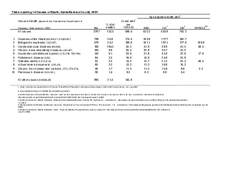
/
Ratio of Age Adjusted Death Rates in the Highest Vs. Lowest Ratio of Age Adjusted Death Rates in the Highest Vs. Lowest

Ratio of Age Adjusted Death Rates in the Highest Vs. Lowest - PowerPoint Presentation

kittie-lecroy
kittie-lecroy . @kittie-lecroy
Follow
474 views
Uploaded On 2016-05-26

Ratio of Age Adjusted Death Rates in the Highest Vs. Lowest - PPT Presentation

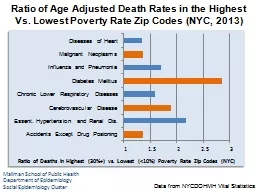
Data from NYCDOHMH Vital Statistics Mailman School of Public Health Department of Epidemiology Social Epidemiology Cluster Ratio of Deaths in Highest 30 vs Lowest lt10 Poverty Rate Zip Codes NYC ID: 336542

mortality data poverty nyc data mortality nyc poverty zip cluster epidemiologysocial healthdepartment school mailman 2013 public rates adjusted age

Share:

Link:

Embed:

Download Presentation from below link

Download Presentation The PPT/PDF document "Ratio of Age Adjusted Death Rates in the..." is the property of its rightful owner. Permission is granted to download and print the materials on this web site for personal, non-commercial use only, and to display it on your personal computer provided you do not modify the materials and that you retain all copyright notices contained in the materials. By downloading content from our website, you accept the terms of this agreement.


Presentation Transcript

Slide1

Ratio of Age Adjusted Death Rates in the Highest Vs. Lowest Poverty Rate Zip Codes (NYC, 2013)

Data

from NYCDOHMH Vital Statistics

Mailman School of Public HealthDepartment of EpidemiologySocial Epidemiology Cluster

Ratio of Deaths in Highest (30%+) vs. Lowest (<10%) Poverty Rate Zip Codes (NYC)Slide2

Age Adjusted Mortality Rates for Diseases of the Heart by Zip Code Poverty Rate (NYC, 2013)

Mailman School of Public Health

Department of EpidemiologySocial Epidemiology Cluster

Data from: New York City Department of Health and Mental Hygiene, EpiQuery website for Mortality DataSlide3

Age Adjusted Mortality Rates for Malignant

Neoplasms by Zip Code Poverty Rate (NYC, 2013)

Mailman School of Public HealthDepartment of EpidemiologySocial Epidemiology Cluster

Data from: New York City Department of Health and Mental Hygiene, EpiQuery

website for Mortality DataSlide4

Age Adjusted Mortality Rates for Influenza and Pneumonia by Zip Code Poverty Rate (NYC, 2013)

Mailman School of Public Health

Department of EpidemiologySocial Epidemiology Cluster

Data from: New York City Department of Health and Mental Hygiene, EpiQuery website for Mortality DataSlide5

Age Adjusted Mortality Rates for Diabetes Mellitus by Zip Code Poverty Rate (NYC, 2013)

Mailman School of Public Health

Department of EpidemiologySocial Epidemiology Cluster

Data from: New York City Department of Health and Mental Hygiene, EpiQuery website for Mortality DataSlide6

Age Adjusted Mortality Rates for

Cerebrovascular Disease by Zip Code Poverty Rate (NYC, 2013)

Mailman School of Public HealthDepartment of EpidemiologySocial Epidemiology Cluster

Data from: New York City Department of Health and Mental Hygiene, EpiQuery

website for Mortality DataSlide7

Age Adjusted Mortality Rates for Chronic Lower Respiratory Disease by Zip Code Poverty (NYC, 2013)

Mailman School of Public Health

Department of EpidemiologySocial Epidemiology Cluster

Data from: New York City Department of Health and Mental Hygiene, EpiQuery website for Mortality DataSlide8

Age Adjusted Mortality Rates for Hypertension and Renal Diseases by Zip Code Poverty (NYC, 2013)

Mailman School of Public Health

Department of EpidemiologySocial Epidemiology Cluster

Data from: New York City Department of Health and Mental Hygiene, EpiQuery website for Mortality DataSlide9

Age Adjusted Mortality Rates for Accidents Except Drug Poisoning by Zip Code Poverty (NYC, 2013)

Mailman School of Public Health

Department of EpidemiologySocial Epidemiology Cluster

Data from: New York City Department of Health and Mental Hygiene, EpiQuery website for Mortality Data