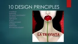
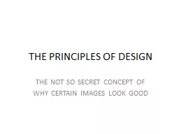
THE NOT SO SECRET CONCEPT OF WHY CERTAIN IMAGES LOOK GOOD BALANCE SYMMETRICAL amp ASYMMETRICAL As you walk a sense of balance keeps you from falling over In a work of art or a photograph balance refers to the arrangement of elements on either side of a center line Shapes colours an ID: 637725
Download Presentation The PPT/PDF document "THE PRINCIPLES OF DESIGN" is the property of its rightful owner. Permission is granted to download and print the materials on this web site for personal, non-commercial use only, and to display it on your personal computer provided you do not modify the materials and that you retain all copyright notices contained in the materials. By downloading content from our website, you accept the terms of this agreement.
Slide1
THE PRINCIPLES OF DESIGN
THE NOT SO SECRET CONCEPT OF
WHY CERTAIN IMAGES LOOK GOODSlide2
BALANCE:
SYMMETRICAL & ASYMMETRICAL
As you walk, a sense of balance keeps you from falling over. In a work of art or a photograph, balance refers to the arrangement of elements on either side of a center line. Shapes, colours, and values can be arranged to create a sense of comfort and balance.
Symmetrical balance
features an equal division of the elements in the composition, whereas
Asymmetrical Balance
features an off centering of subjects and place.Slide3
SYMMETRICAL BALANCESlide4
ASYMMETRICAL BALANCESlide5
CONTRAST
If the clothes in your closet were all the same, your wardrobe would be unexciting. If colours, textures and values in your art were all the same, it also would be unexciting. Contrast is needed. Contrast refers to differences in values, colours, or other art elements. Contrast makes photography exciting.Slide6
CONTRASTSlide7
PATTERN
Pattern is everywhere you look-in clothes, building, carpets, animals, trees, and manufactured things. Patterns are made in art when the same shapes or elements are repeated again and again. Pattern makes art more exciting by decorating the surfaces of paintings, sculptures, crafts, or architecture. Slide8
PATTERNSlide9
MOVEMENT
Artists use movement to take viewers on a trip through their work. When we look at art or photography, our eyes move along edges and also on paths made of connecting shapes of similar value and colour. Such often leads us to the focal area and gives our work a sense of unity and organization. Movement can also literally imply the use of physical motion in an image or work of art.Slide10
MOVEMENTSlide11
RHYTHM
Rhythm is a part of life. Think of heartbeats, music, walking, dancing or breathing. Rhythm as a design principle is based on repetition of colors shapes, forms lines or value contrasts. Developing and looking for rhythm in a photograph will unify the image and create a feeling or organizationSlide12
RYHTHMSlide13
EMPHASIS
When something in your life is exciting, you will tell others-and emphasize the most important fact. In works of art visual emphasis is placed on the most important part of the work-
the focal area.
Other things in the artwork may be important, but we look in the focal are to see what the artist emphasized.Slide14
EMPHASISSlide15
UNITY AND VARIETY
Unity makes a photograph feel complete because everything( such as colour, texture, repetition, movement and the subject) seem to be in harmony and work together. Variety creates visual excitement. If everything looks too much alike, the work may appear dull. Unity with variety is much more pleasing.Slide16
UNITY AND VARIETY