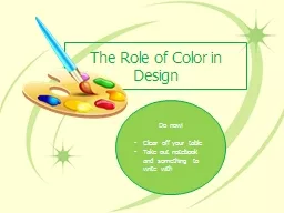
/
The Role of Color in Design The Role of Color in Design

The Role of Color in Design - PowerPoint Presentation

lois-ondreau
lois-ondreau . @lois-ondreau
Follow
414 views
Uploaded On 2015-11-10

The Role of Color in Design - PPT Presentation

Just FACS Warm Colors Warm colors red orange and yellow Red and orange conveys the most warmth Warm colors are suitable for areas of high activity such as kitchens and family rooms Cool Colors ID: 188854

colors color cool wheel color colors wheel cool warm schemes objects red complement creates adding neutral tone light tint room closer green

Share:

Link:

Embed:

Download Presentation from below link

Download Presentation The PPT/PDF document "The Role of Color in Design" is the property of its rightful owner. Permission is granted to download and print the materials on this web site for personal, non-commercial use only, and to display it on your personal computer provided you do not modify the materials and that you retain all copyright notices contained in the materials. By downloading content from our website, you accept the terms of this agreement.


Presentation Transcript

Slide1

The Role of Color in Design

Just FACSSlide2
Slide3

Warm ColorsWarm colors: red, orange, and yellow

Red and orange conveys the most warmthWarm colors are suitable for areas of high activity such as kitchens and family roomsSlide4

Cool Colors

Cool colors: blues and greensPopular in bedrooms, bathrooms and home offices because of their relaxing effect.Slide5

Illusions with ColorWarm colored objects appear closer than cool colored ones.

You can visually enlarge a room by painting the walls a cool color.High ceilings painted dark colors appear lower and a light color will allow a ceiling to seem higher.Bold, bright colors make objects stand out.Slide6

Components of Color

Pigments- substances that absorb some light rays and reflect others.Hue is the color feature that makes one color different from others.Intensity is the brightness or dullness of a color.Complement color is the color opposite it on the color wheel.

Value is the lightness or darkness of a color.

Adding white to a hue creates a tint.

Ex. Pink is a tint of red.

Adding black to a he creates a shade.

Lowers the value and darkens it.

Adding gray to a color creates a tone.Slide7

Color Scheme

A combination of colors selected for a room design in order to create a mood or set a tone.

Provides guidelines for designing successfully with color.

Color schemes look best when one color dominatesSlide8

Types of Color

Schemes

1. Neutral

2. Monochromatic

3. Analogous

4. Complementary

5. Split-Complementary

6. TriadSlide9

Neutral

Neutral color schemes can be easier to live with than with vibrant color schemes.

• Often used as background colors in rooms because they blend well with other colors

• Touches of accent colors are usually added for interestSlide10
Slide11
Slide12
Slide13
Slide14
Slide15
Slide16

Monochromatic

Tints and shades of one color on the color wheelSlide17
Slide18
Slide19
Slide20
Slide21
Slide22
Slide23
Slide24

Analogous

3 to 5 hues next to each other on the color wheelSlide25
Slide26
Slide27
Slide28
Slide29
Slide30
Slide31
Slide32

Complement

Two colors that are directly opposite each other on the color wheel.Slide33
Slide34
Slide35
Slide36
Slide37
Slide38
Slide39
Slide40
Slide41
Slide42

Split

Complement

Three colors, they combine one color with the two colors on each side of its complementSlide43

Triad

Three colors that are equal distance apart on the color wheel.Slide44
Slide45
Slide46
Slide47
Slide48
Slide49
Slide50
Slide51
Slide52

This is what happens with no color scheme.Slide53

Warm Colors

Yellow-green to red

Advancing- make objects look larger or closer than they really areSlide54
Slide55
Slide56
Slide57
Slide58

Cool Colors

Green to red-violet

Receding- objects seems larger and farther awaySlide59
Slide60
Slide61