<codeb!nd/> {Technologies} Solution Without
TG
Published · 36 slides · 0 views

1 / 1


Description
codeb!nd Technologies Solution Without Compromise! Web Development Bootstrap Bootstrap is a free front-end framework for faster and easier web development Bootstrap includes HTML and CSS based design templates for typography, forms,
Related Topics
Share
Embed code
Download this presentation From Below
"<codeb!nd/> {Technologies} Solution Without" is the property of its rightful owner. Permission is granted to download and print the materials on this website for personal, non-commercial use only, and to display it on your personal computer provided you do not modify the materials and that you retain all copyright notices contained in the materials. By downloading content from our website, you accept the terms of this agreement.
Presentation Transcript
01
<codeb!nd/>
{Technologies} Solution Without Compromise! Web Development Bootstrap<br>
02
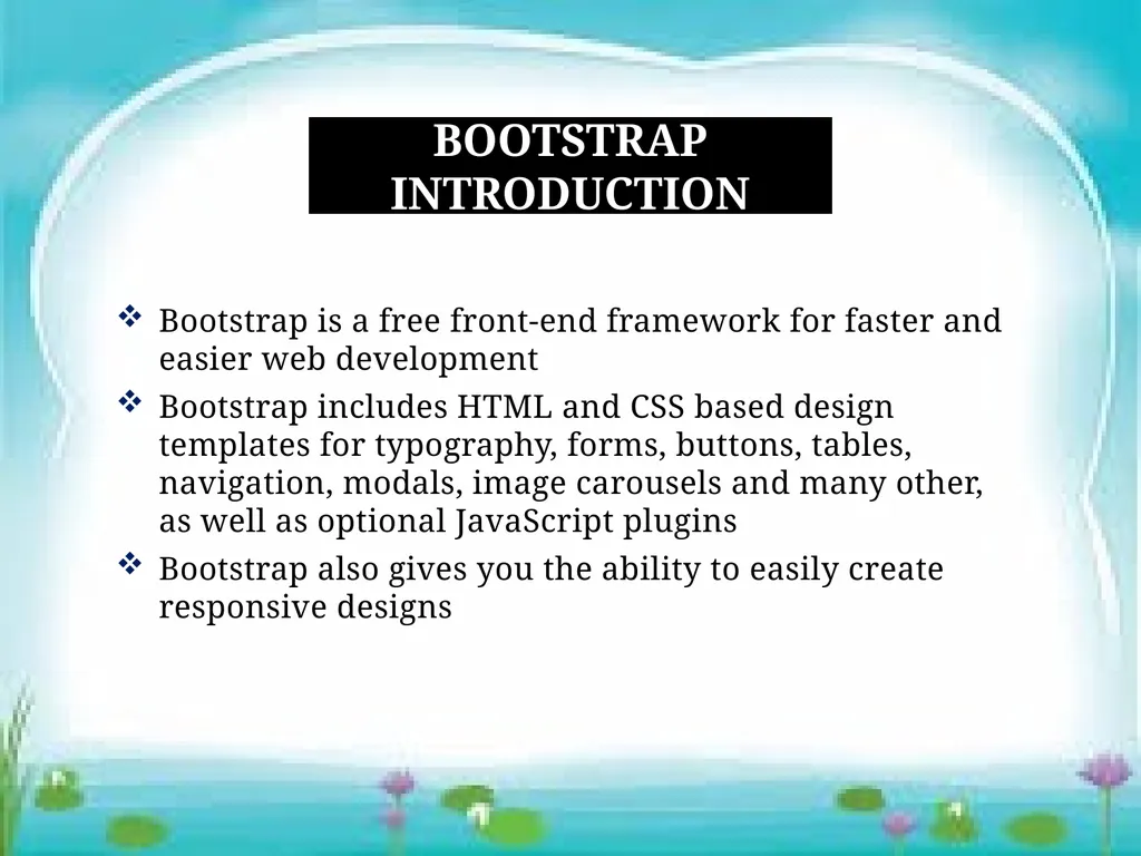
Bootstrap is a free front-end framework for faster and easier web development
Bootstrap includes HTML and CSS based design templates for typography, forms, buttons, tables, navigation, modals, image carousels and many other, as well as optional JavaScript plugins
Bootstrap also gives you the ability to easily create responsive designs Bootstrap Introduction<br>
Bootstrap includes HTML and CSS based design templates for typography, forms, buttons, tables, navigation, modals, image carousels and many other, as well as optional JavaScript plugins
Bootstrap also gives you the ability to easily create responsive designs Bootstrap Introduction<br>
03
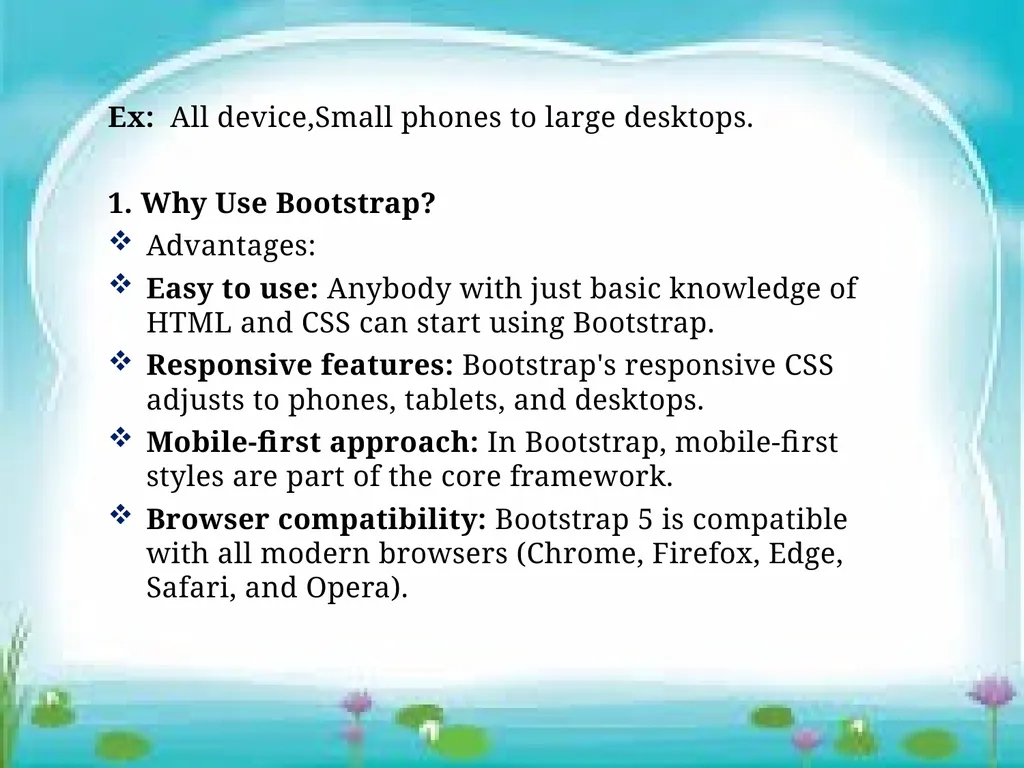
Ex: All device,Small phones to large desktops.
1. Why Use Bootstrap?
Advantages:
Easy to use: Anybody with just basic knowledge of HTML and CSS can start using Bootstrap.
Responsive features: Bootstrap's responsive CSS adjusts to phones, tablets, and desktops.
Mobile-first approach: In Bootstrap, mobile-first styles are part of the core framework.
Browser compatibility: Bootstrap 5 is compatible with all modern browsers (Chrome, Firefox, Edge, Safari, and Opera).<br>
1. Why Use Bootstrap?
Advantages:
Easy to use: Anybody with just basic knowledge of HTML and CSS can start using Bootstrap.
Responsive features: Bootstrap's responsive CSS adjusts to phones, tablets, and desktops.
Mobile-first approach: In Bootstrap, mobile-first styles are part of the core framework.
Browser compatibility: Bootstrap 5 is compatible with all modern browsers (Chrome, Firefox, Edge, Safari, and Opera).<br>
04
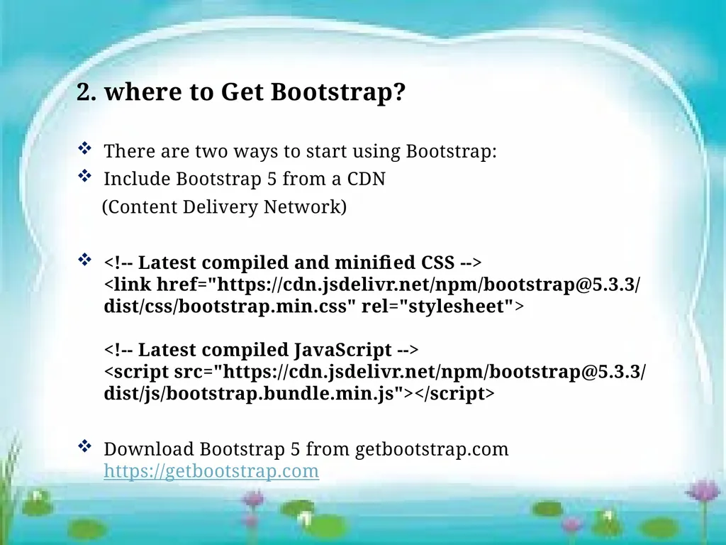
2. where to Get Bootstrap?
There are two ways to start using Bootstrap:
Include Bootstrap 5 from a CDN
(Content Delivery Network)
<!-- Latest compiled and minified CSS --> <link href="https://cdn.jsdelivr.net/npm/bootstrap@5.3.3/dist/css/bootstrap.min.css" rel="stylesheet"> <!-- Latest compiled JavaScript --> <script src="https://cdn.jsdelivr.net/npm/bootstrap@5.3.3/dist/js/bootstrap.bundle.min.js"></script>
Download Bootstrap 5 from getbootstrap.com https://getbootstrap.com<br>
There are two ways to start using Bootstrap:
Include Bootstrap 5 from a CDN
(Content Delivery Network)
<!-- Latest compiled and minified CSS --> <link href="https://cdn.jsdelivr.net/npm/bootstrap@5.3.3/dist/css/bootstrap.min.css" rel="stylesheet"> <!-- Latest compiled JavaScript --> <script src="https://cdn.jsdelivr.net/npm/bootstrap@5.3.3/dist/js/bootstrap.bundle.min.js"></script>
Download Bootstrap 5 from getbootstrap.com https://getbootstrap.com<br>
05
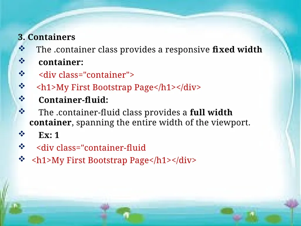
3. Containers
The .container class provides a responsive fixed width
container:
<div class="container">
<h1>My First Bootstrap Page</h1></div>
Container-fluid:
The .container-fluid class provides a full width container, spanning the entire width of the viewport.
Ex: 1
<div class="container-fluid
<h1>My First Bootstrap Page</h1></div><br>
The .container class provides a responsive fixed width
container:
<div class="container">
<h1>My First Bootstrap Page</h1></div>
Container-fluid:
The .container-fluid class provides a full width container, spanning the entire width of the viewport.
Ex: 1
<div class="container-fluid
<h1>My First Bootstrap Page</h1></div><br>
06
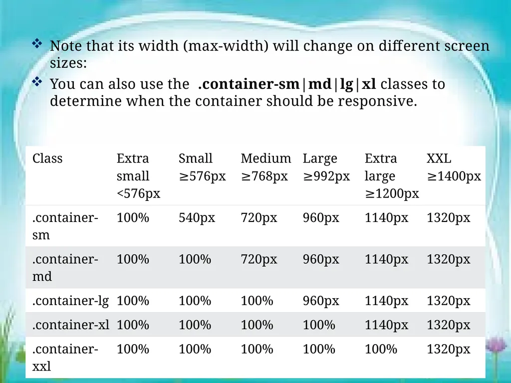
Note that its width (max-width) will change on different screen sizes:
You can also use the .container-sm|md|lg|xl classes to determine when the container should be responsive.<br>
You can also use the .container-sm|md|lg|xl classes to determine when the container should be responsive.<br>
07
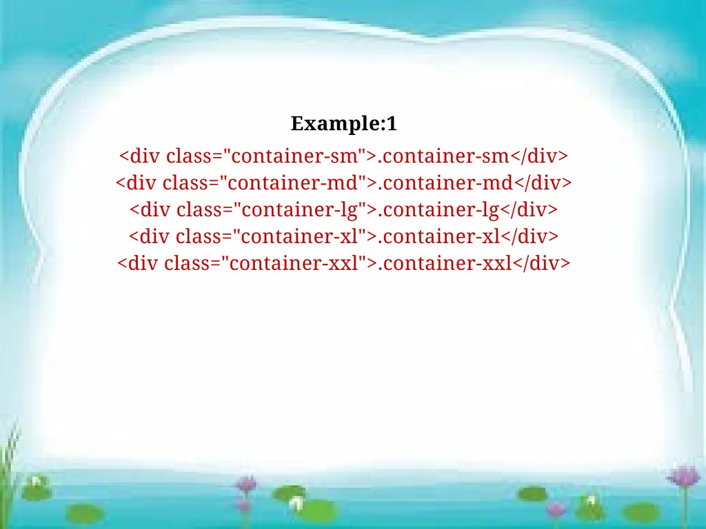
Example:1
<div class="container-sm">.container-sm</div> <div class="container-md">.container-md</div> <div class="container-lg">.container-lg</div> <div class="container-xl">.container-xl</div> <div class="container-xxl">.container-xxl</div><br>
<div class="container-sm">.container-sm</div> <div class="container-md">.container-md</div> <div class="container-lg">.container-lg</div> <div class="container-xl">.container-xl</div> <div class="container-xxl">.container-xxl</div><br>
08
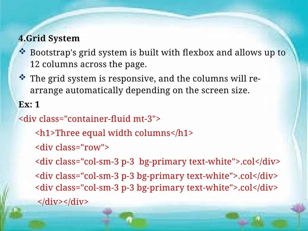
4.Grid System
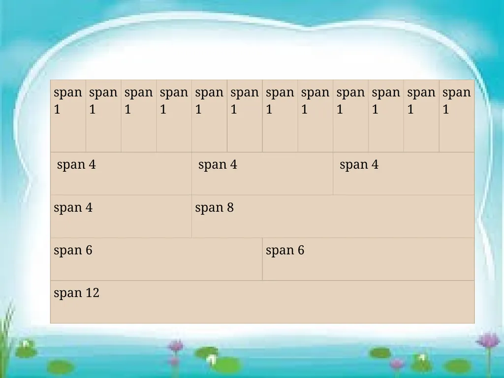
Bootstrap's grid system is built with flexbox and allows up to 12 columns across the page.
The grid system is responsive, and the columns will re-arrange automatically depending on the screen size.
Ex: 1
<div class="container-fluid mt-3">
<h1>Three equal width columns</h1>
<div class="row">
<div class="col-sm-3 p-3 bg-primary text-white">.col</div>
<div class="col-sm-3 p-3 bg-primary text-white">.col</div> <div class="col-sm-3 p-3 bg-primary text-white">.col</div>
</div></div><br>
Bootstrap's grid system is built with flexbox and allows up to 12 columns across the page.
The grid system is responsive, and the columns will re-arrange automatically depending on the screen size.
Ex: 1
<div class="container-fluid mt-3">
<h1>Three equal width columns</h1>
<div class="row">
<div class="col-sm-3 p-3 bg-primary text-white">.col</div>
<div class="col-sm-3 p-3 bg-primary text-white">.col</div> <div class="col-sm-3 p-3 bg-primary text-white">.col</div>
</div></div><br>
09
5.Text/Typography
Bootstrap 5 uses a default font-size of 1rem (16px by default), and its line-height is 1.5rem.
In addition, all <p> elements have margin-top: 0 and margin-bottom: 1rem (16px by default).
<h1> - <h6>
<p class="h1">h1 Bootstrap heading</p>
.display-1 to .display-6
<h1 class="display-5">Display 5</h1><br>
Bootstrap 5 uses a default font-size of 1rem (16px by default), and its line-height is 1.5rem.
In addition, all <p> elements have margin-top: 0 and margin-bottom: 1rem (16px by default).
<h1> - <h6>
<p class="h1">h1 Bootstrap heading</p>
.display-1 to .display-6
<h1 class="display-5">Display 5</h1><br>
10
<small>
. Small class is used to create a smaller, secondary text in any heading.
<h5>h5 heading <small>secondary text</small></h5>
<mark>
<p>Mark elements means Highlight Text
<mark>highlight</mark> </p>
<blockquote>
<blockquote class="blockquote">
<p> 5 million globally </p> <footer class="blockquote-footer">From WWF's website</footer></blockquote><br>
. Small class is used to create a smaller, secondary text in any heading.
<h5>h5 heading <small>secondary text</small></h5>
<mark>
<p>Mark elements means Highlight Text
<mark>highlight</mark> </p>
<blockquote>
<blockquote class="blockquote">
<p> 5 million globally </p> <footer class="blockquote-footer">From WWF's website</footer></blockquote><br>
11
6.Text Color
.text-muted, .text-primary, .text-success,
.text-info, .text-warning, .text-danger,
.text-secondary, .text-white, .text-dark,
.text-body (default body color/often black)
and .text-light
Ex: 1
<p class="text-primary">This text is important.</p>
add 50% opacity for black or white text with the
.text-black-50 or .text-white-50 classes.
<p class="text-black-50">Black text with 50% opacity on white background</p>
<p class="text-white-50 bg-dark">White text with 50% opacity on black background</p><br>
.text-muted, .text-primary, .text-success,
.text-info, .text-warning, .text-danger,
.text-secondary, .text-white, .text-dark,
.text-body (default body color/often black)
and .text-light
Ex: 1
<p class="text-primary">This text is important.</p>
add 50% opacity for black or white text with the
.text-black-50 or .text-white-50 classes.
<p class="text-black-50">Black text with 50% opacity on white background</p>
<p class="text-white-50 bg-dark">White text with 50% opacity on black background</p><br>
12
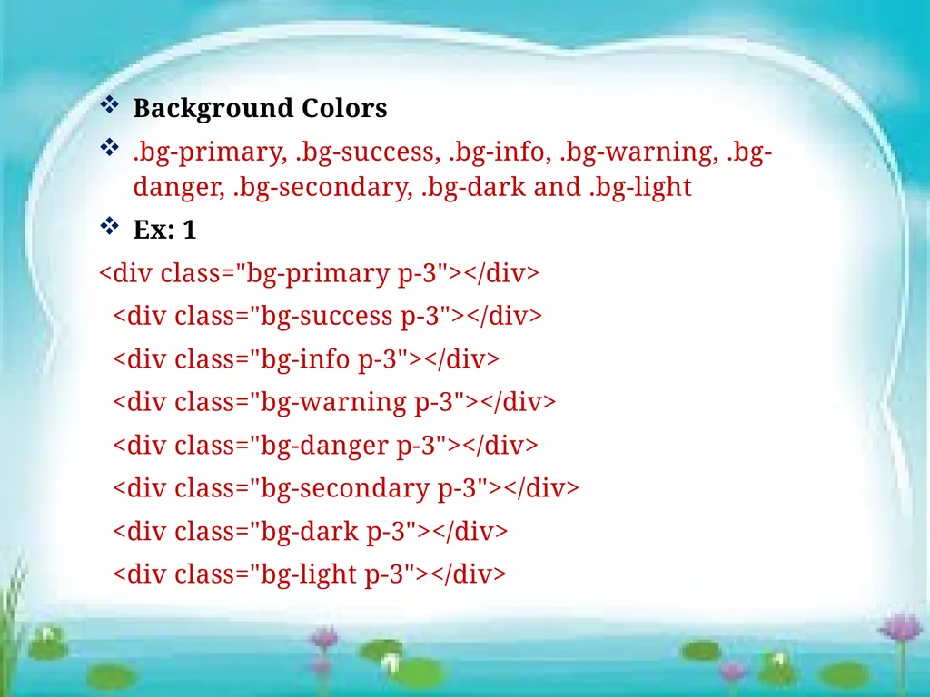
Background Colors
.bg-primary, .bg-success, .bg-info, .bg-warning, .bg-danger, .bg-secondary, .bg-dark and .bg-light
Ex: 1
<div class="bg-primary p-3"></div>
<div class="bg-success p-3"></div>
<div class="bg-info p-3"></div>
<div class="bg-warning p-3"></div>
<div class="bg-danger p-3"></div>
<div class="bg-secondary p-3"></div>
<div class="bg-dark p-3"></div>
<div class="bg-light p-3"></div><br>
.bg-primary, .bg-success, .bg-info, .bg-warning, .bg-danger, .bg-secondary, .bg-dark and .bg-light
Ex: 1
<div class="bg-primary p-3"></div>
<div class="bg-success p-3"></div>
<div class="bg-info p-3"></div>
<div class="bg-warning p-3"></div>
<div class="bg-danger p-3"></div>
<div class="bg-secondary p-3"></div>
<div class="bg-dark p-3"></div>
<div class="bg-light p-3"></div><br>
13
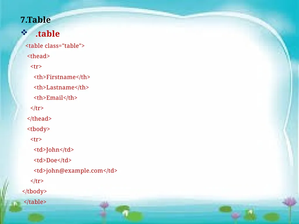
7.Table
.table
<table class="table">
<thead>
<tr>
<th>Firstname</th>
<th>Lastname</th>
<th>Email</th>
</tr>
</thead>
<tbody>
<tr>
<td>John</td>
<td>Doe</td>
<td>john@example.com</td>
</tr>
</tbody>
</table><br>
.table
<table class="table">
<thead>
<tr>
<th>Firstname</th>
<th>Lastname</th>
<th>Email</th>
</tr>
</thead>
<tbody>
<tr>
<td>John</td>
<td>Doe</td>
<td>john@example.com</td>
</tr>
</tbody>
</table><br>
14
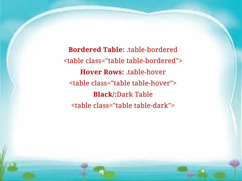
Bordered Table: .table-bordered
<table class="table table-bordered">
Hover Rows: .table-hover
<table class="table table-hover">
Black/:Dark Table
<table class="table table-dark"><br>
<table class="table table-bordered">
Hover Rows: .table-hover
<table class="table table-hover">
Black/:Dark Table
<table class="table table-dark"><br>
15
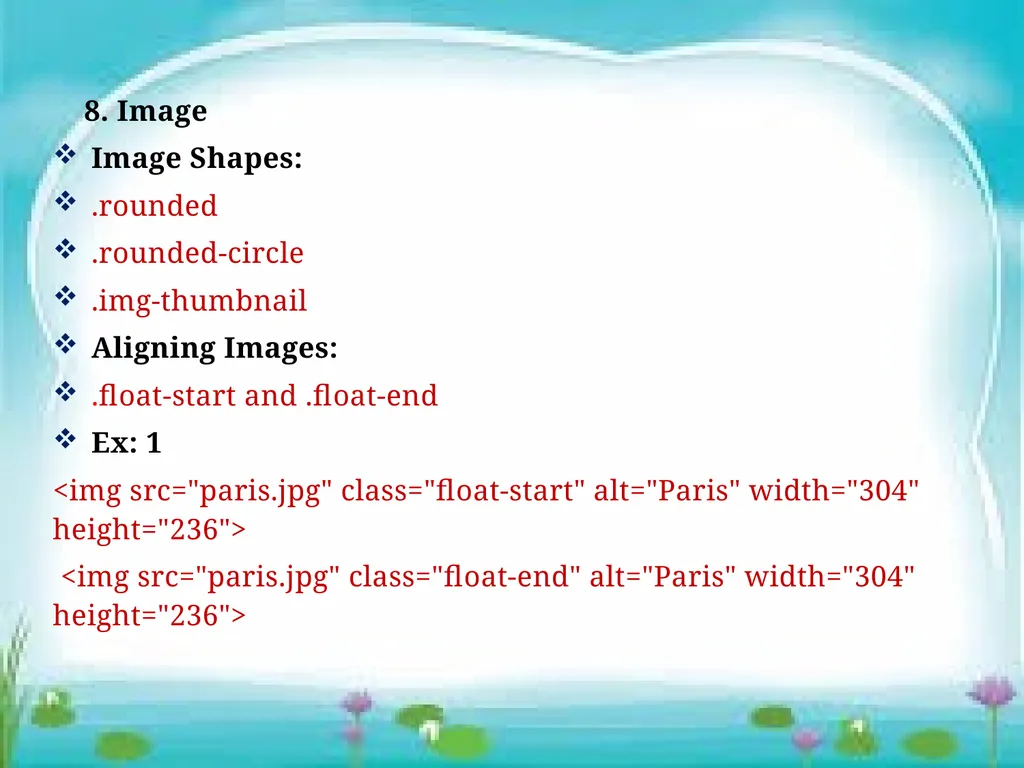
8. Image
Image Shapes:
.rounded
.rounded-circle
.img-thumbnail
Aligning Images:
.float-start and .float-end
Ex: 1
<img src="paris.jpg" class="float-start" alt="Paris" width="304" height="236">
<img src="paris.jpg" class="float-end" alt="Paris" width="304" height="236"><br>
Image Shapes:
.rounded
.rounded-circle
.img-thumbnail
Aligning Images:
.float-start and .float-end
Ex: 1
<img src="paris.jpg" class="float-start" alt="Paris" width="304" height="236">
<img src="paris.jpg" class="float-end" alt="Paris" width="304" height="236"><br>
16
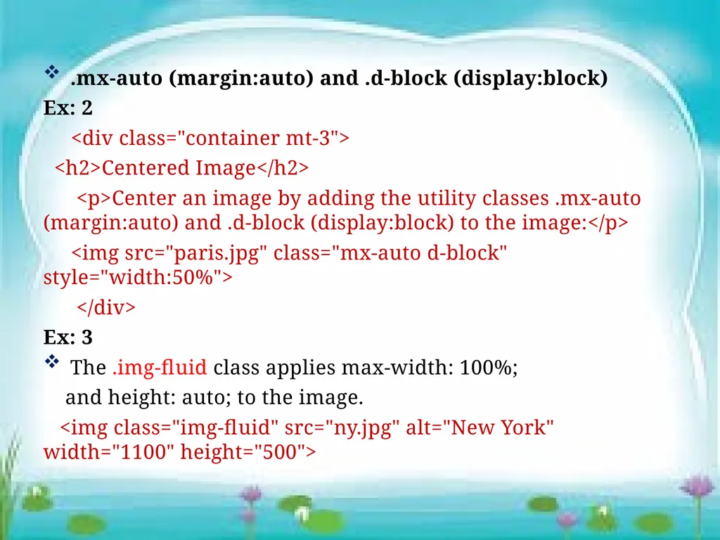
.mx-auto (margin:auto) and .d-block (display:block)
Ex: 2
<div class="container mt-3">
<h2>Centered Image</h2>
<p>Center an image by adding the utility classes .mx-auto (margin:auto) and .d-block (display:block) to the image:</p>
<img src="paris.jpg" class="mx-auto d-block" style="width:50%">
</div>
Ex: 3
The .img-fluid class applies max-width: 100%;
and height: auto; to the image.
<img class="img-fluid" src="ny.jpg" alt="New York" width="1100" height="500"><br>
Ex: 2
<div class="container mt-3">
<h2>Centered Image</h2>
<p>Center an image by adding the utility classes .mx-auto (margin:auto) and .d-block (display:block) to the image:</p>
<img src="paris.jpg" class="mx-auto d-block" style="width:50%">
</div>
Ex: 3
The .img-fluid class applies max-width: 100%;
and height: auto; to the image.
<img class="img-fluid" src="ny.jpg" alt="New York" width="1100" height="500"><br>
17
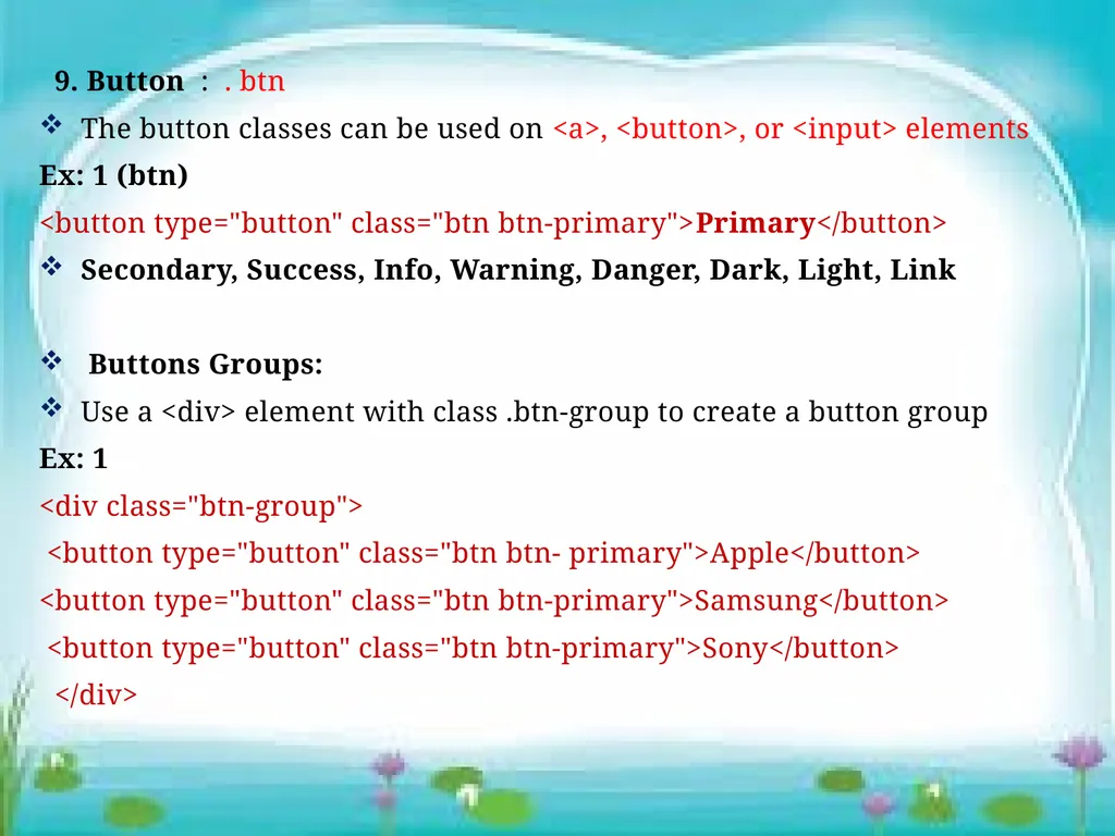
9. Button : . btn
The button classes can be used on <a>, <button>, or <input> elements
Ex: 1 (btn)
<button type="button" class="btn btn-primary">Primary</button>
Secondary, Success, Info, Warning, Danger, Dark, Light, Link
Buttons Groups:
Use a <div> element with class .btn-group to create a button group
Ex: 1
<div class="btn-group">
<button type="button" class="btn btn- primary">Apple</button>
<button type="button" class="btn btn-primary">Samsung</button>
<button type="button" class="btn btn-primary">Sony</button>
</div><br>
The button classes can be used on <a>, <button>, or <input> elements
Ex: 1 (btn)
<button type="button" class="btn btn-primary">Primary</button>
Secondary, Success, Info, Warning, Danger, Dark, Light, Link
Buttons Groups:
Use a <div> element with class .btn-group to create a button group
Ex: 1
<div class="btn-group">
<button type="button" class="btn btn- primary">Apple</button>
<button type="button" class="btn btn-primary">Samsung</button>
<button type="button" class="btn btn-primary">Sony</button>
</div><br>
18
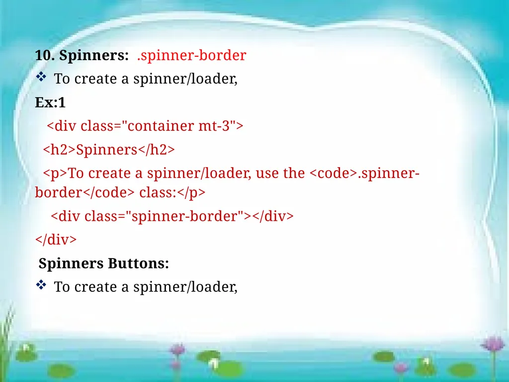
10. Spinners: .spinner-border
To create a spinner/loader,
Ex:1
<div class="container mt-3">
<h2>Spinners</h2>
<p>To create a spinner/loader, use the <code>.spinner-border</code> class:</p>
<div class="spinner-border"></div>
</div>
Spinners Buttons:
To create a spinner/loader,<br>
To create a spinner/loader,
Ex:1
<div class="container mt-3">
<h2>Spinners</h2>
<p>To create a spinner/loader, use the <code>.spinner-border</code> class:</p>
<div class="spinner-border"></div>
</div>
Spinners Buttons:
To create a spinner/loader,<br>
19
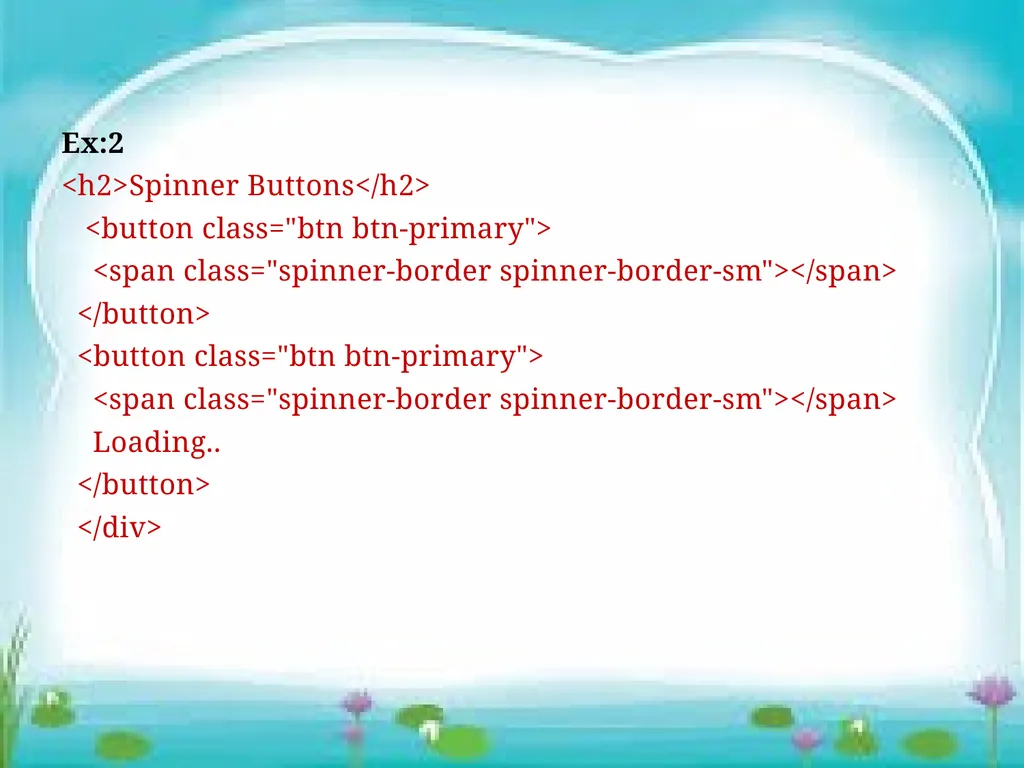
Ex:2
<h2>Spinner Buttons</h2>
<button class="btn btn-primary">
<span class="spinner-border spinner-border-sm"></span>
</button>
<button class="btn btn-primary">
<span class="spinner-border spinner-border-sm"></span>
Loading..
</button>
</div><br>
<h2>Spinner Buttons</h2>
<button class="btn btn-primary">
<span class="spinner-border spinner-border-sm"></span>
</button>
<button class="btn btn-primary">
<span class="spinner-border spinner-border-sm"></span>
Loading..
</button>
</div><br>
20
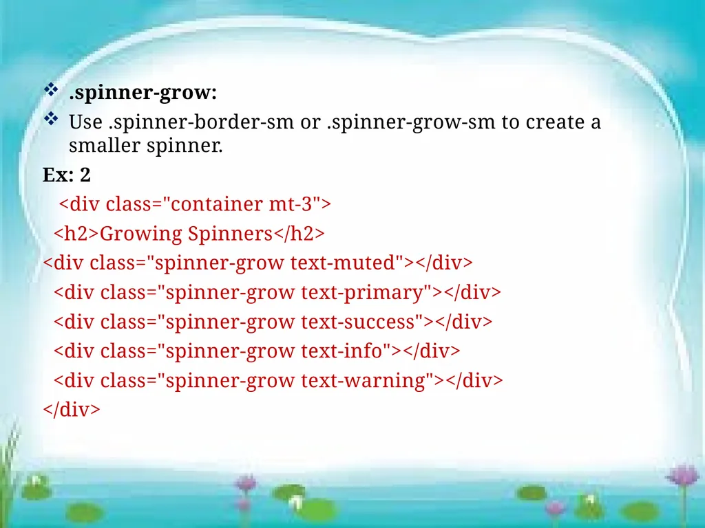
.spinner-grow:
Use .spinner-border-sm or .spinner-grow-sm to create a smaller spinner.
Ex: 2
<div class="container mt-3">
<h2>Growing Spinners</h2>
<div class="spinner-grow text-muted"></div>
<div class="spinner-grow text-primary"></div>
<div class="spinner-grow text-success"></div>
<div class="spinner-grow text-info"></div>
<div class="spinner-grow text-warning"></div>
</div><br>
Use .spinner-border-sm or .spinner-grow-sm to create a smaller spinner.
Ex: 2
<div class="container mt-3">
<h2>Growing Spinners</h2>
<div class="spinner-grow text-muted"></div>
<div class="spinner-grow text-primary"></div>
<div class="spinner-grow text-success"></div>
<div class="spinner-grow text-info"></div>
<div class="spinner-grow text-warning"></div>
</div><br>
21
11. Pagination:
add the .pagination class to an <ul> element.Then add the .page-item to each <li> element and a .page-link class to each link inside <li>
Ex: 1
<div class="container mt-3">
<h2>Pagination</h2>
<p>To create a basic pagination, add the .pagination class to an ul element. Then add the .page-item to each li element and a .page-link class to each link inside li:</p><br>
add the .pagination class to an <ul> element.Then add the .page-item to each <li> element and a .page-link class to each link inside <li>
Ex: 1
<div class="container mt-3">
<h2>Pagination</h2>
<p>To create a basic pagination, add the .pagination class to an ul element. Then add the .page-item to each li element and a .page-link class to each link inside li:</p><br>
22
<ul class="pagination">
<li class="page-item"><a class="page-link" href="#">Previous</a></li>
<li class="page-item"><a class="page-link" href="#">1</a></li>
<li class="page-item"><a class="page-link" href="#">2</a></li>
<li class="page-item"><a class="page-link" href="#">3</a></li>
<li class="page-item"><a class="page-link" href="#">Next</a></li>
</ul>
</div><br>
<li class="page-item"><a class="page-link" href="#">Previous</a></li>
<li class="page-item"><a class="page-link" href="#">1</a></li>
<li class="page-item"><a class="page-link" href="#">2</a></li>
<li class="page-item"><a class="page-link" href="#">3</a></li>
<li class="page-item"><a class="page-link" href="#">Next</a></li>
</ul>
</div><br>
23
12. Cards
A card in is a bordered box with some padding around its content. It includes options for headers, footers, content, colors, etc.
Ex: 1
<div class="container mt-3">
<h2>Basic Card</h2>
<div class="card">
<div class="card-header">Header</div>
<div class="card-body">Content</div>
<div class="card-footer">Footer</div>
</div>
</div><br>
A card in is a bordered box with some padding around its content. It includes options for headers, footers, content, colors, etc.
Ex: 1
<div class="container mt-3">
<h2>Basic Card</h2>
<div class="card">
<div class="card-header">Header</div>
<div class="card-body">Content</div>
<div class="card-footer">Footer</div>
</div>
</div><br>
24
13. Carousel / Slideshow
The Carousel is a slideshow for cycling through element.
Ex: 1
<!-- Carousel -->
<div id="demo" class="carousel slide" data-bs-ride="carousel">
<!-- Indicators/dots -->
<div class="carousel-indicators">
<button type="button" data-bs-target="#demo" data-bs-slide-to="0" class="active"></button>
<button type="button" data-bs-target="#demo" data-bs-slide-to="1"></button>
<button type="button" data-bs-target="#demo" data-bs-slide-to="2"></button>
</div><br>
The Carousel is a slideshow for cycling through element.
Ex: 1
<!-- Carousel -->
<div id="demo" class="carousel slide" data-bs-ride="carousel">
<!-- Indicators/dots -->
<div class="carousel-indicators">
<button type="button" data-bs-target="#demo" data-bs-slide-to="0" class="active"></button>
<button type="button" data-bs-target="#demo" data-bs-slide-to="1"></button>
<button type="button" data-bs-target="#demo" data-bs-slide-to="2"></button>
</div><br>
25
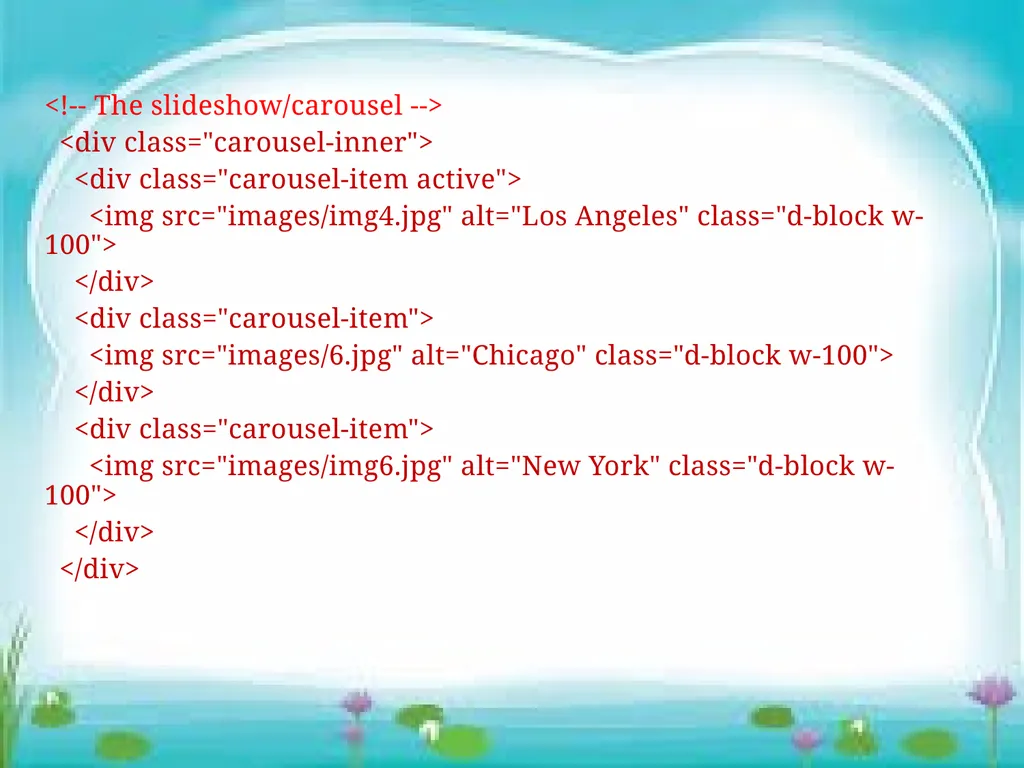
<!-- The slideshow/carousel -->
<div class="carousel-inner">
<div class="carousel-item active">
<img src="images/img4.jpg" alt="Los Angeles" class="d-block w-100">
</div>
<div class="carousel-item">
<img src="images/6.jpg" alt="Chicago" class="d-block w-100">
</div>
<div class="carousel-item">
<img src="images/img6.jpg" alt="New York" class="d-block w-100">
</div>
</div><br>
<div class="carousel-inner">
<div class="carousel-item active">
<img src="images/img4.jpg" alt="Los Angeles" class="d-block w-100">
</div>
<div class="carousel-item">
<img src="images/6.jpg" alt="Chicago" class="d-block w-100">
</div>
<div class="carousel-item">
<img src="images/img6.jpg" alt="New York" class="d-block w-100">
</div>
</div><br>
26
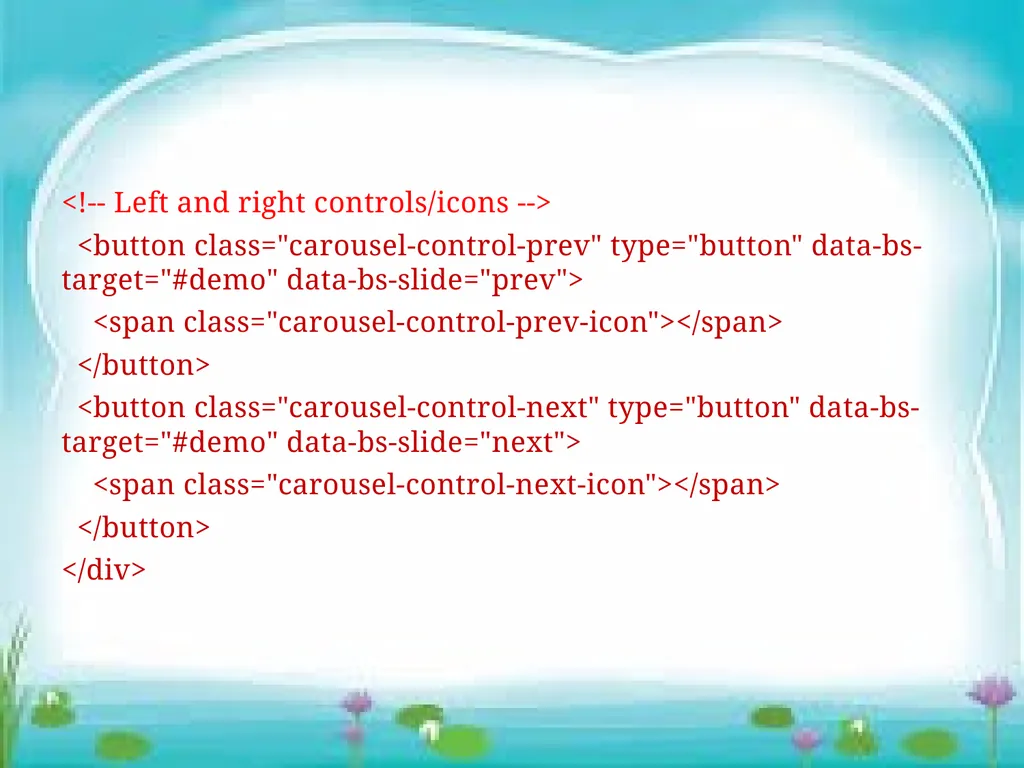
<!-- Left and right controls/icons -->
<button class="carousel-control-prev" type="button" data-bs-target="#demo" data-bs-slide="prev">
<span class="carousel-control-prev-icon"></span>
</button>
<button class="carousel-control-next" type="button" data-bs-target="#demo" data-bs-slide="next">
<span class="carousel-control-next-icon"></span>
</button>
</div><br>
<button class="carousel-control-prev" type="button" data-bs-target="#demo" data-bs-slide="prev">
<span class="carousel-control-prev-icon"></span>
</button>
<button class="carousel-control-next" type="button" data-bs-target="#demo" data-bs-slide="next">
<span class="carousel-control-next-icon"></span>
</button>
</div><br>
27
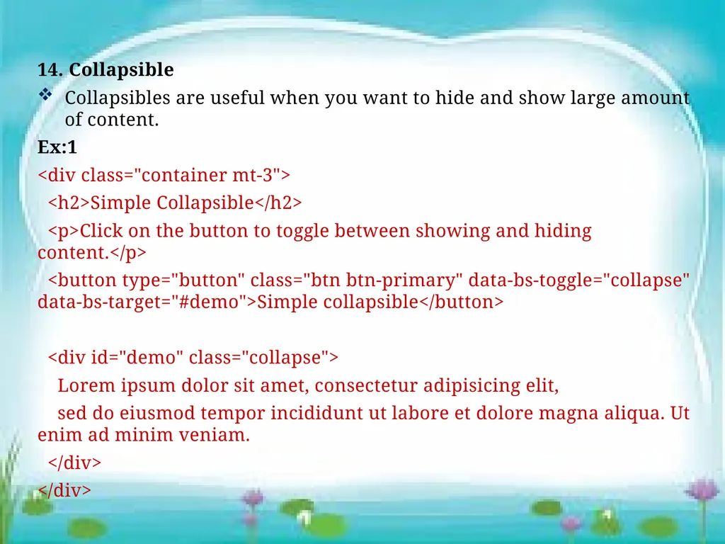
14. Collapsible
Collapsibles are useful when you want to hide and show large amount of content.
Ex:1
<div class="container mt-3">
<h2>Simple Collapsible</h2>
<p>Click on the button to toggle between showing and hiding content.</p>
<button type="button" class="btn btn-primary" data-bs-toggle="collapse" data-bs-target="#demo">Simple collapsible</button>
<div id="demo" class="collapse">
Lorem ipsum dolor sit amet, consectetur adipisicing elit,
sed do eiusmod tempor incididunt ut labore et dolore magna aliqua. Ut enim ad minim veniam.
</div>
</div><br>
Collapsibles are useful when you want to hide and show large amount of content.
Ex:1
<div class="container mt-3">
<h2>Simple Collapsible</h2>
<p>Click on the button to toggle between showing and hiding content.</p>
<button type="button" class="btn btn-primary" data-bs-toggle="collapse" data-bs-target="#demo">Simple collapsible</button>
<div id="demo" class="collapse">
Lorem ipsum dolor sit amet, consectetur adipisicing elit,
sed do eiusmod tempor incididunt ut labore et dolore magna aliqua. Ut enim ad minim veniam.
</div>
</div><br>
28
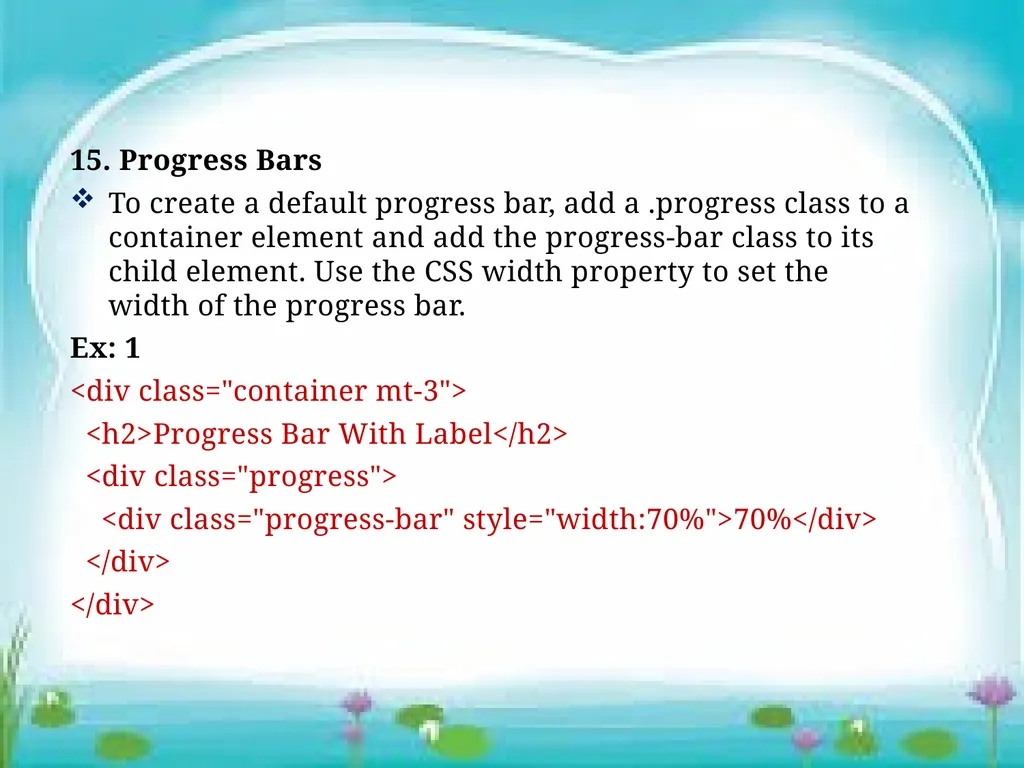
15. Progress Bars
To create a default progress bar, add a .progress class to a container element and add the progress-bar class to its child element. Use the CSS width property to set the width of the progress bar.
Ex: 1
<div class="container mt-3">
<h2>Progress Bar With Label</h2>
<div class="progress">
<div class="progress-bar" style="width:70%">70%</div>
</div>
</div><br>
To create a default progress bar, add a .progress class to a container element and add the progress-bar class to its child element. Use the CSS width property to set the width of the progress bar.
Ex: 1
<div class="container mt-3">
<h2>Progress Bar With Label</h2>
<div class="progress">
<div class="progress-bar" style="width:70%">70%</div>
</div>
</div><br>
29
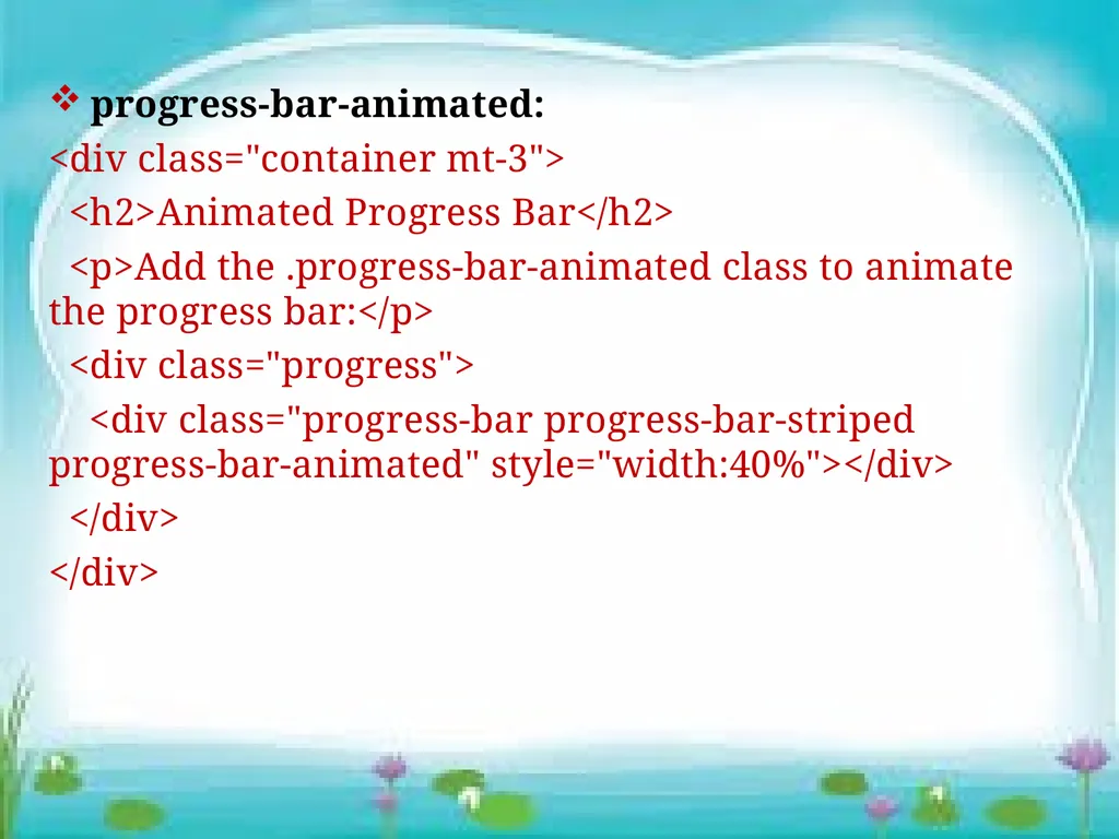
progress-bar-animated:
<div class="container mt-3">
<h2>Animated Progress Bar</h2>
<p>Add the .progress-bar-animated class to animate the progress bar:</p>
<div class="progress">
<div class="progress-bar progress-bar-striped progress-bar-animated" style="width:40%"></div>
</div>
</div><br>
<div class="container mt-3">
<h2>Animated Progress Bar</h2>
<p>Add the .progress-bar-animated class to animate the progress bar:</p>
<div class="progress">
<div class="progress-bar progress-bar-striped progress-bar-animated" style="width:40%"></div>
</div>
</div><br>
30
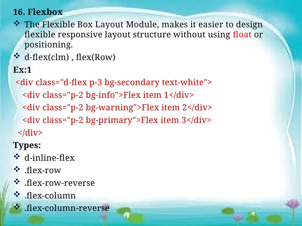
16. Flexbox
The Flexible Box Layout Module, makes it easier to design flexible responsive layout structure without using float or positioning.
d-flex(clm) , flex(Row)
Ex:1
<div class="d-flex p-3 bg-secondary text-white">
<div class="p-2 bg-info">Flex item 1</div>
<div class="p-2 bg-warning">Flex item 2</div>
<div class="p-2 bg-primary">Flex item 3</div>
</div>
Types:
d-inline-flex
.flex-row
.flex-row-reverse
.flex-column
.flex-column-reverse<br>
The Flexible Box Layout Module, makes it easier to design flexible responsive layout structure without using float or positioning.
d-flex(clm) , flex(Row)
Ex:1
<div class="d-flex p-3 bg-secondary text-white">
<div class="p-2 bg-info">Flex item 1</div>
<div class="p-2 bg-warning">Flex item 2</div>
<div class="p-2 bg-primary">Flex item 3</div>
</div>
Types:
d-inline-flex
.flex-row
.flex-row-reverse
.flex-column
.flex-column-reverse<br>
31
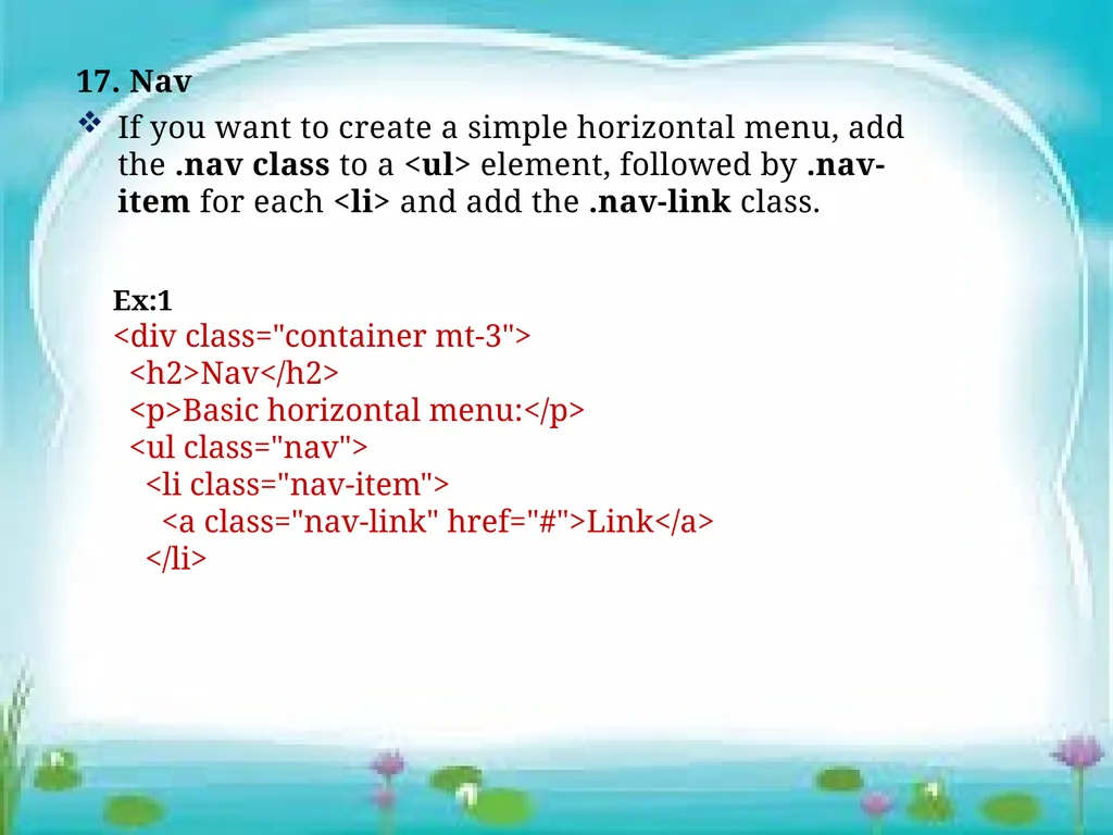
17. Nav
If you want to create a simple horizontal menu, add the .nav class to a <ul> element, followed by .nav-item for each <li> and add the .nav-link class. Ex:1
<div class="container mt-3">
<h2>Nav</h2>
<p>Basic horizontal menu:</p>
<ul class="nav">
<li class="nav-item">
<a class="nav-link" href="#">Link</a>
</li><br>
If you want to create a simple horizontal menu, add the .nav class to a <ul> element, followed by .nav-item for each <li> and add the .nav-link class. Ex:1
<div class="container mt-3">
<h2>Nav</h2>
<p>Basic horizontal menu:</p>
<ul class="nav">
<li class="nav-item">
<a class="nav-link" href="#">Link</a>
</li><br>
32
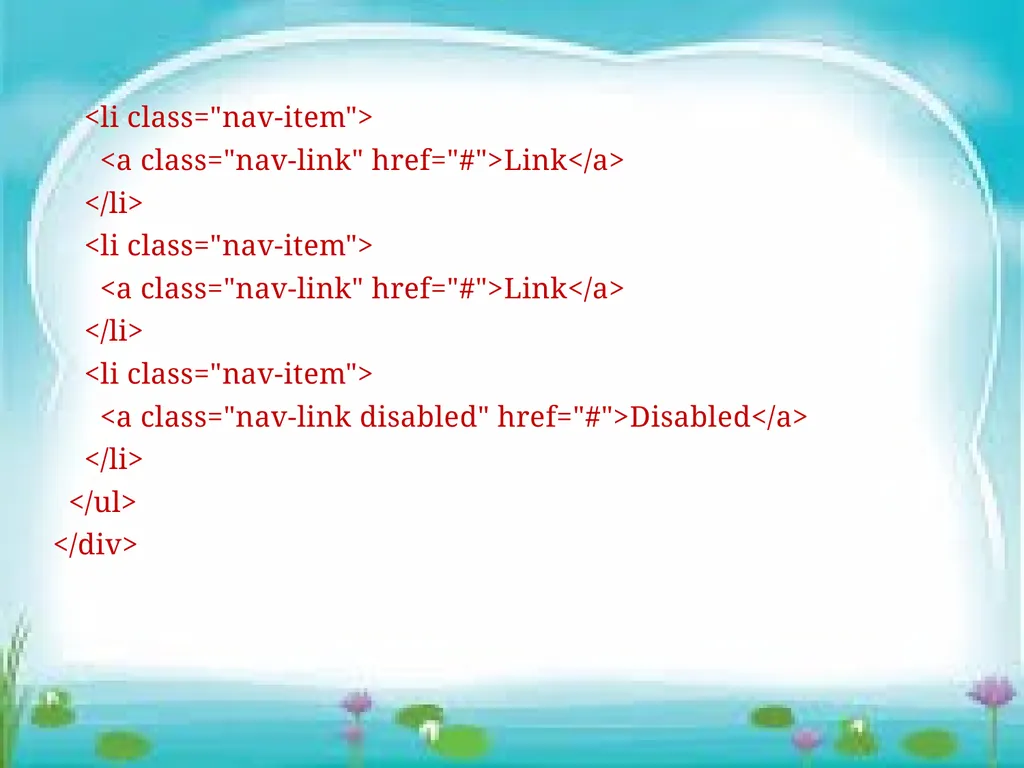
<li class="nav-item">
<a class="nav-link" href="#">Link</a>
</li>
<li class="nav-item">
<a class="nav-link" href="#">Link</a>
</li>
<li class="nav-item">
<a class="nav-link disabled" href="#">Disabled</a>
</li>
</ul>
</div><br>
<a class="nav-link" href="#">Link</a>
</li>
<li class="nav-item">
<a class="nav-link" href="#">Link</a>
</li>
<li class="nav-item">
<a class="nav-link disabled" href="#">Disabled</a>
</li>
</ul>
</div><br>
33
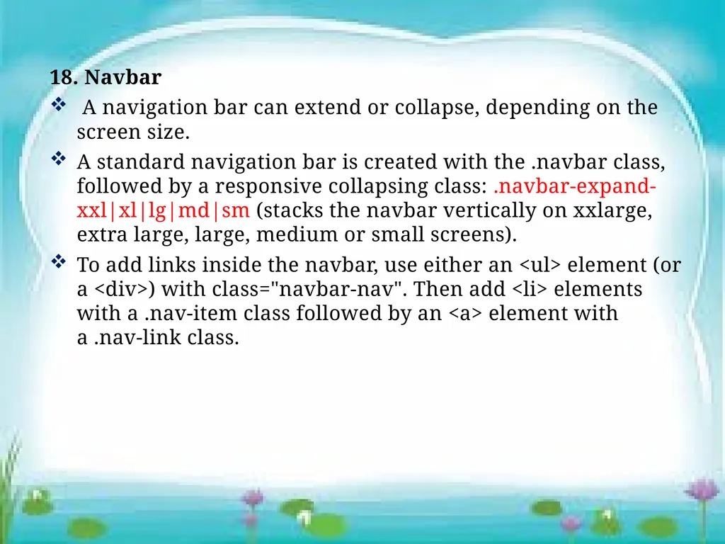
18. Navbar
A navigation bar can extend or collapse, depending on the screen size.
A standard navigation bar is created with the .navbar class, followed by a responsive collapsing class: .navbar-expand-xxl|xl|lg|md|sm (stacks the navbar vertically on xxlarge, extra large, large, medium or small screens).
To add links inside the navbar, use either an <ul> element (or a <div>) with class="navbar-nav". Then add <li> elements with a .nav-item class followed by an <a> element with a .nav-link class.<br>
A navigation bar can extend or collapse, depending on the screen size.
A standard navigation bar is created with the .navbar class, followed by a responsive collapsing class: .navbar-expand-xxl|xl|lg|md|sm (stacks the navbar vertically on xxlarge, extra large, large, medium or small screens).
To add links inside the navbar, use either an <ul> element (or a <div>) with class="navbar-nav". Then add <li> elements with a .nav-item class followed by an <a> element with a .nav-link class.<br>
34
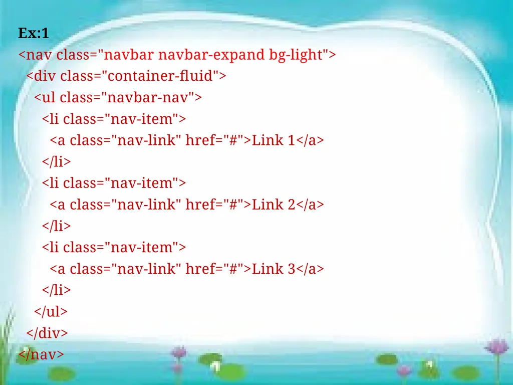
Ex:1
<nav class="navbar navbar-expand bg-light">
<div class="container-fluid">
<ul class="navbar-nav">
<li class="nav-item">
<a class="nav-link" href="#">Link 1</a>
</li>
<li class="nav-item">
<a class="nav-link" href="#">Link 2</a>
</li>
<li class="nav-item">
<a class="nav-link" href="#">Link 3</a>
</li>
</ul>
</div>
</nav><br>
<nav class="navbar navbar-expand bg-light">
<div class="container-fluid">
<ul class="navbar-nav">
<li class="nav-item">
<a class="nav-link" href="#">Link 1</a>
</li>
<li class="nav-item">
<a class="nav-link" href="#">Link 2</a>
</li>
<li class="nav-item">
<a class="nav-link" href="#">Link 3</a>
</li>
</ul>
</div>
</nav><br>
35
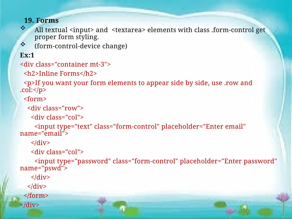
19. Forms
All textual <input> and <textarea> elements with class .form-control get proper form styling.
(form-control-device change)
Ex:1
<div class="container mt-3">
<h2>Inline Forms</h2>
<p>If you want your form elements to appear side by side, use .row and .col:</p>
<form>
<div class="row">
<div class="col">
<input type="text" class="form-control" placeholder="Enter email" name="email">
</div>
<div class="col">
<input type="password" class="form-control" placeholder="Enter password" name="pswd">
</div>
</div>
</form>
</div><br>
All textual <input> and <textarea> elements with class .form-control get proper form styling.
(form-control-device change)
Ex:1
<div class="container mt-3">
<h2>Inline Forms</h2>
<p>If you want your form elements to appear side by side, use .row and .col:</p>
<form>
<div class="row">
<div class="col">
<input type="text" class="form-control" placeholder="Enter email" name="email">
</div>
<div class="col">
<input type="password" class="form-control" placeholder="Enter password" name="pswd">
</div>
</div>
</form>
</div><br>