
Constructing pie charts from different data
DP
Published · 34 slides · 0 views
1 / 1

Description
Constructing pie charts from different data representations (from 5.1 Statistical representations and measures) KS3 Mastery PD Materials: Exemplified Key Ideas Materials for use in the classroom or to support professional development
Related Topics
Share
Embed code
Download this presentation From Below
"Constructing pie charts from different data" is the property of its rightful owner. Permission is granted to download and print the materials on this website for personal, non-commercial use only, and to display it on your personal computer provided you do not modify the materials and that you retain all copyright notices contained in the materials. By downloading content from our website, you accept the terms of this agreement.
Presentation Transcript
01
Constructing pie charts from different data representations (from 5.1 Statistical representations and measures) KS3 Mastery PD Materials: Exemplified Key Ideas
Materials for use in the classroom or to support professional development discussions Summer 2021<br>
Materials for use in the classroom or to support professional development discussions Summer 2021<br>
02
About this resource These slides are designed to complement the 5.1 Statistical representations and measures core concept document and its associated Statistics and probability theme overview document, both found in the Secondary Mastery Professional Development pages.
These slides re-present the key examples from the Core Concept document so that the examples can be used either directly in the classroom or with a group of teachers. There are prompt questions alongside the examples, and further clarification in the notes.
These slides do not fully replicate the Core Concept document, so should be used alongside it. Reference to specific page numbers, and to other useful NCETM resources, can be found in the notes for each slide.
This slide deck is not designed to be a complete PD session, rather it is a selection of resources that you can adapt and use as needed when planning a session with a group of teachers.<br>
These slides re-present the key examples from the Core Concept document so that the examples can be used either directly in the classroom or with a group of teachers. There are prompt questions alongside the examples, and further clarification in the notes.
These slides do not fully replicate the Core Concept document, so should be used alongside it. Reference to specific page numbers, and to other useful NCETM resources, can be found in the notes for each slide.
This slide deck is not designed to be a complete PD session, rather it is a selection of resources that you can adapt and use as needed when planning a session with a group of teachers.<br>
03
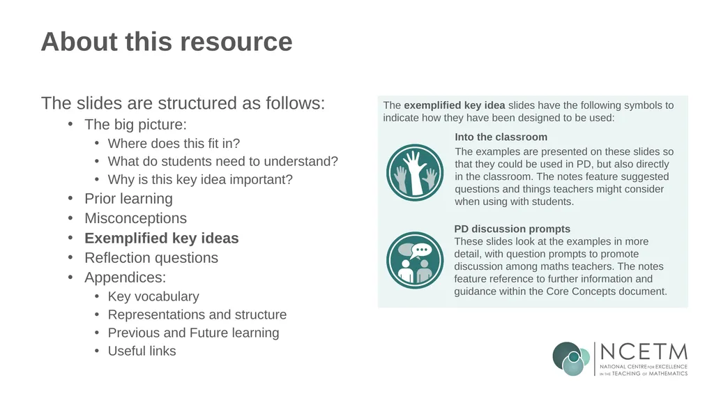
About this resource The slides are structured as follows:
The big picture:
Where does this fit in?
What do students need to understand?
Why is this key idea important?
Prior learning
Misconceptions
Exemplified key ideas
Reflection questions
Appendices:
Key vocabulary
Representations and structure
Previous and Future learning
Useful links The exemplified key idea slides have the following symbols to indicate how they have been designed to be used: Into the classroom
The examples are presented on these slides so that they could be used in PD, but also directly in the classroom. The notes feature suggested questions and things teachers might consider when using with students. PD discussion prompts
These slides look at the examples in more detail, with question prompts to promote discussion among maths teachers. The notes feature reference to further information and guidance within the Core Concepts document.<br>
The big picture:
Where does this fit in?
What do students need to understand?
Why is this key idea important?
Prior learning
Misconceptions
Exemplified key ideas
Reflection questions
Appendices:
Key vocabulary
Representations and structure
Previous and Future learning
Useful links The exemplified key idea slides have the following symbols to indicate how they have been designed to be used: Into the classroom
The examples are presented on these slides so that they could be used in PD, but also directly in the classroom. The notes feature suggested questions and things teachers might consider when using with students. PD discussion prompts
These slides look at the examples in more detail, with question prompts to promote discussion among maths teachers. The notes feature reference to further information and guidance within the Core Concepts document.<br>
04
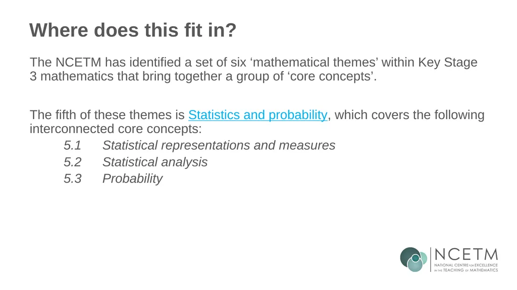
Where does this fit in? The NCETM has identified a set of six ‘mathematical themes’ within Key Stage 3 mathematics that bring together a group of ‘core concepts’.
The fifth of these themes is Statistics and probability, which covers the following interconnected core concepts:
5.1 Statistical representations and measures
5.2 Statistical analysis
5.3 Probability<br>
The fifth of these themes is Statistics and probability, which covers the following interconnected core concepts:
5.1 Statistical representations and measures
5.2 Statistical analysis
5.3 Probability<br>
05
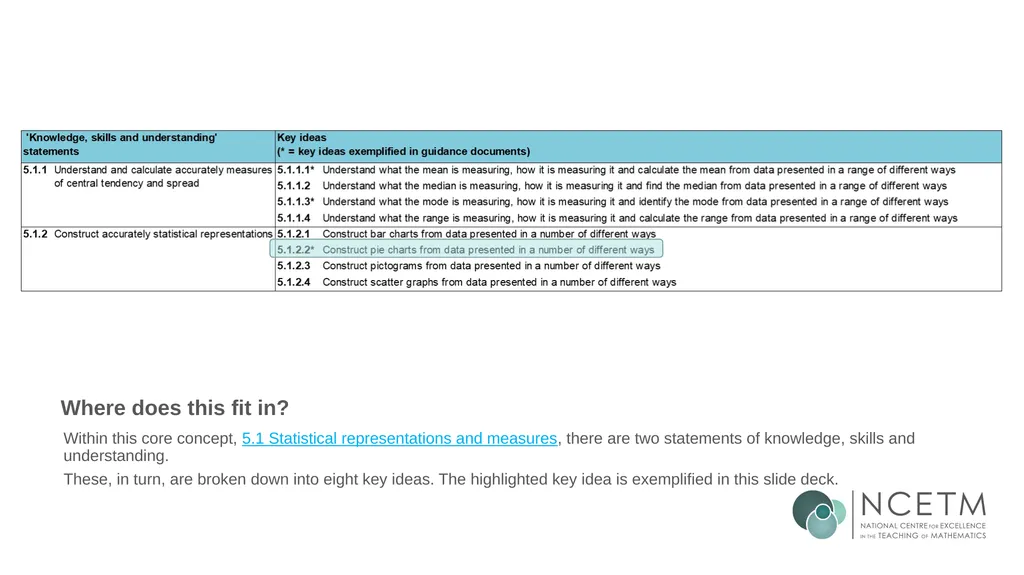
Where does this fit in? Within this core concept, 5.1 Statistical representations and measures, there are two statements of knowledge, skills and understanding.
These, in turn, are broken down into eight key ideas. The highlighted key idea is exemplified in this slide deck.<br>
These, in turn, are broken down into eight key ideas. The highlighted key idea is exemplified in this slide deck.<br>
06
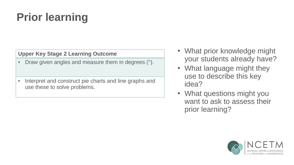
What do students need to understand? What prior knowledge might your students already have?
What language might they use to describe this key idea?
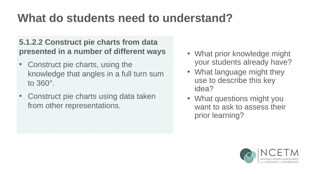
What questions might you want to ask to assess their prior learning? 5.1.2.2 Construct pie charts from data presented in a number of different ways
Construct pie charts, using the knowledge that angles in a full turn sum to 360°.
Construct pie charts using data taken from other representations.<br>
What language might they use to describe this key idea?
What questions might you want to ask to assess their prior learning? 5.1.2.2 Construct pie charts from data presented in a number of different ways
Construct pie charts, using the knowledge that angles in a full turn sum to 360°.
Construct pie charts using data taken from other representations.<br>
07
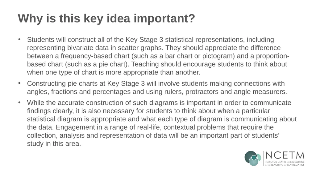
Why is this key idea important? Students will construct all of the Key Stage 3 statistical representations, including representing bivariate data in scatter graphs. They should appreciate the difference between a frequency-based chart (such as a bar chart or pictogram) and a proportion-based chart (such as a pie chart). Teaching should encourage students to think about when one type of chart is more appropriate than another.
Constructing pie charts at Key Stage 3 will involve students making connections with angles, fractions and percentages and using rulers, protractors and angle measurers.
While the accurate construction of such diagrams is important in order to communicate findings clearly, it is also necessary for students to think about when a particular statistical diagram is appropriate and what each type of diagram is communicating about the data. Engagement in a range of real-life, contextual problems that require the collection, analysis and representation of data will be an important part of students’ study in this area.<br>
Constructing pie charts at Key Stage 3 will involve students making connections with angles, fractions and percentages and using rulers, protractors and angle measurers.
While the accurate construction of such diagrams is important in order to communicate findings clearly, it is also necessary for students to think about when a particular statistical diagram is appropriate and what each type of diagram is communicating about the data. Engagement in a range of real-life, contextual problems that require the collection, analysis and representation of data will be an important part of students’ study in this area.<br>
08
Prior learning What prior knowledge might your students already have?
What language might they use to describe this key idea?
What questions might you want to ask to assess their prior learning?<br>
What language might they use to describe this key idea?
What questions might you want to ask to assess their prior learning?<br>
09
Checking prior learning The following slides contain questions for checking prior learning.
What representations might students use to support their understanding of these questions?
What variation might you put in place for these questions to fully assess students’ understanding of the concept?
How might changing the language of each question change the difficulty?
Why are these such crucial pre-requisites for this key idea?<br>
What representations might students use to support their understanding of these questions?
What variation might you put in place for these questions to fully assess students’ understanding of the concept?
How might changing the language of each question change the difficulty?
Why are these such crucial pre-requisites for this key idea?<br>
10
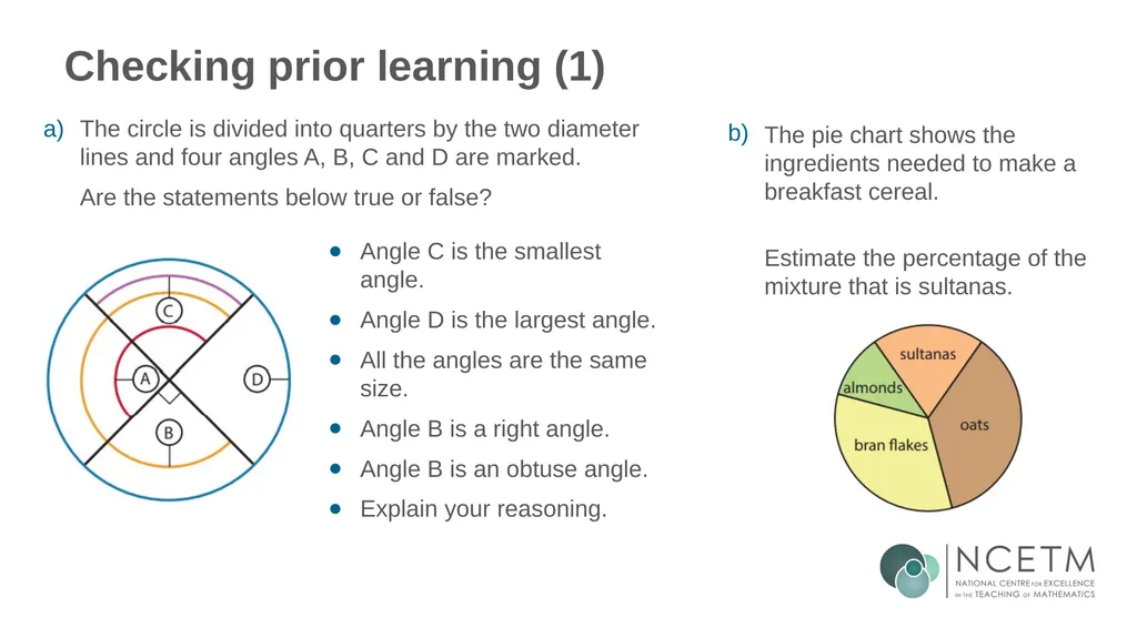
Checking prior learning (1) Angle C is the smallest angle.
Angle D is the largest angle.
All the angles are the same size.
Angle B is a right angle.
Angle B is an obtuse angle.
Explain your reasoning. The circle is divided into quarters by the two diameter lines and four angles A, B, C and D are marked.
Are the statements below true or false? a) The pie chart shows the ingredients needed to make a breakfast cereal.
Estimate the percentage of the mixture that is sultanas. b)<br>
Angle D is the largest angle.
All the angles are the same size.
Angle B is a right angle.
Angle B is an obtuse angle.
Explain your reasoning. The circle is divided into quarters by the two diameter lines and four angles A, B, C and D are marked.
Are the statements below true or false? a) The pie chart shows the ingredients needed to make a breakfast cereal.
Estimate the percentage of the mixture that is sultanas. b)<br>
11
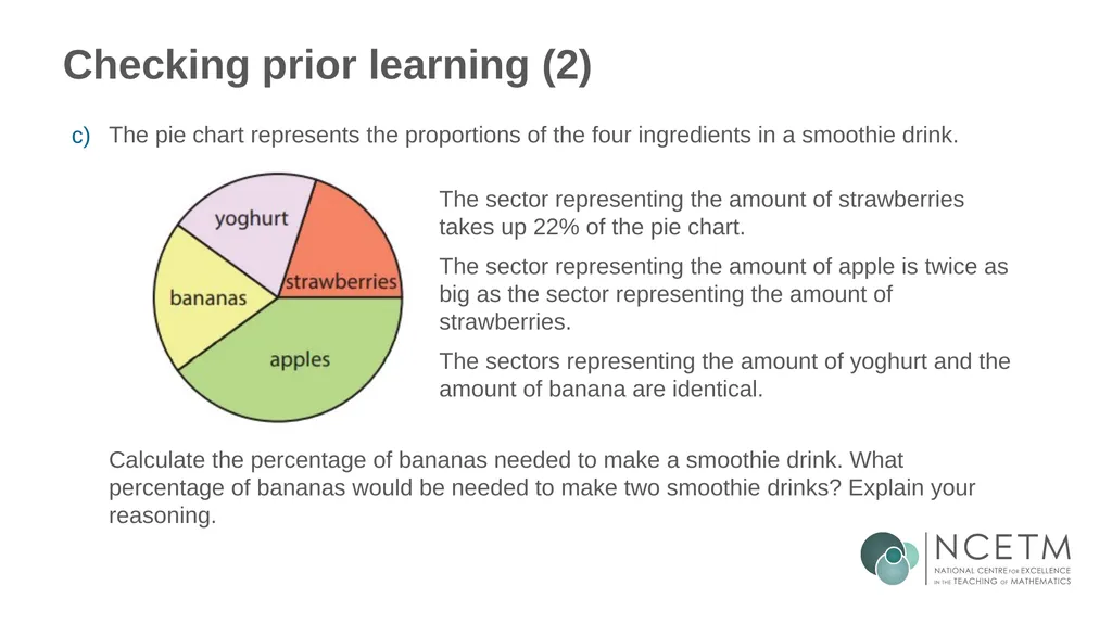
Checking prior learning (2) The sector representing the amount of strawberries takes up 22% of the pie chart.
The sector representing the amount of apple is twice as big as the sector representing the amount of strawberries.
The sectors representing the amount of yoghurt and the amount of banana are identical. The pie chart represents the proportions of the four ingredients in a smoothie drink. Calculate the percentage of bananas needed to make a smoothie drink. What percentage of bananas would be needed to make two smoothie drinks? Explain your reasoning. c)<br>
The sector representing the amount of apple is twice as big as the sector representing the amount of strawberries.
The sectors representing the amount of yoghurt and the amount of banana are identical. The pie chart represents the proportions of the four ingredients in a smoothie drink. Calculate the percentage of bananas needed to make a smoothie drink. What percentage of bananas would be needed to make two smoothie drinks? Explain your reasoning. c)<br>
12
Common difficulties and misconceptions What aspects of this key idea might students find challenging?
What misconceptions might students have? When teaching this topic, you may find students encounter difficulties with…
Drawing upon more than one area of learning
More information, and some suggestions for overcoming these challenges, can be found on the following slides.<br>
What misconceptions might students have? When teaching this topic, you may find students encounter difficulties with…
Drawing upon more than one area of learning
More information, and some suggestions for overcoming these challenges, can be found on the following slides.<br>
13
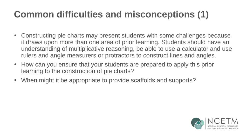
Common difficulties and misconceptions (1) Constructing pie charts may present students with some challenges because it draws upon more than one area of prior learning. Students should have an understanding of multiplicative reasoning, be able to use a calculator and use rulers and angle measurers or protractors to construct lines and angles.
How can you ensure that your students are prepared to apply this prior learning to the construction of pie charts?
When might it be appropriate to provide scaffolds and supports?<br>
How can you ensure that your students are prepared to apply this prior learning to the construction of pie charts?
When might it be appropriate to provide scaffolds and supports?<br>
14
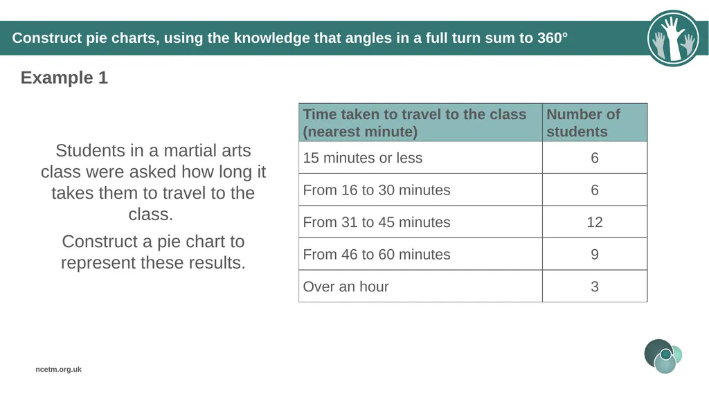
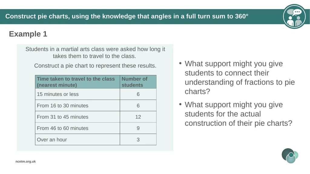
Construct pie charts, using the knowledge that angles in a full turn sum to 360° Example 1 Students in a martial arts class were asked how long it takes them to travel to the class.
Construct a pie chart to represent these results.<br>
Construct a pie chart to represent these results.<br>
15
Construct pie charts, using the knowledge that angles in a full turn sum to 360° Example 1 What support might you give students to connect their understanding of fractions to pie charts?
What support might you give students for the actual construction of their pie charts?<br>
What support might you give students for the actual construction of their pie charts?<br>
16
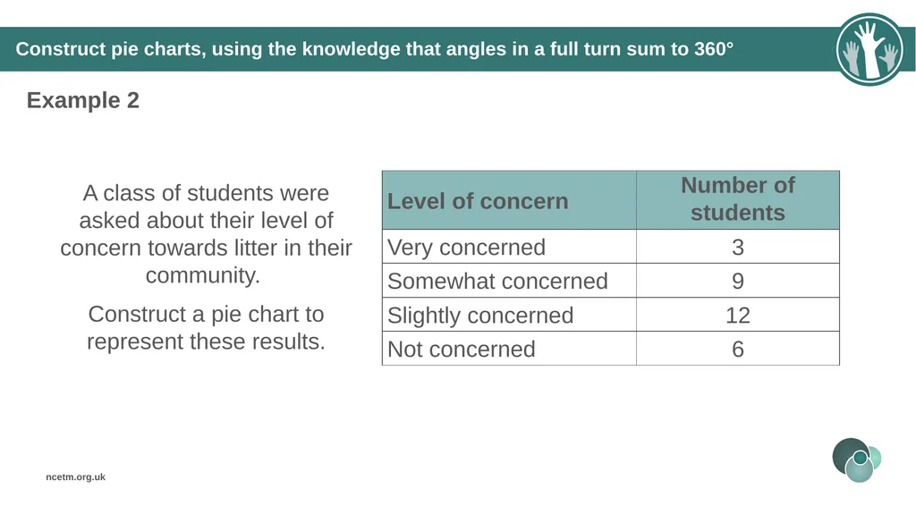
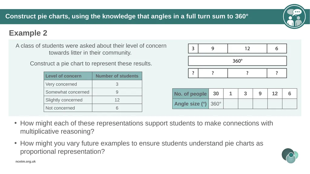
Construct pie charts, using the knowledge that angles in a full turn sum to 360° Example 2 A class of students were asked about their level of concern towards litter in their community.
Construct a pie chart to represent these results.<br>
Construct a pie chart to represent these results.<br>
17
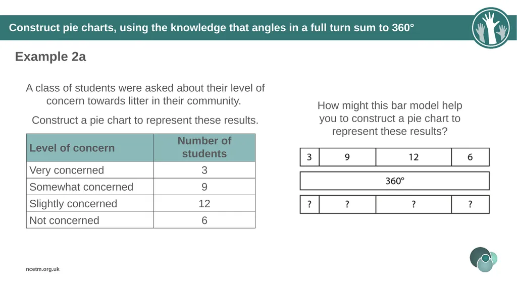
A class of students were asked about their level of concern towards litter in their community.
Construct a pie chart to represent these results. Construct pie charts, using the knowledge that angles in a full turn sum to 360° Example 2a How might this bar model help you to construct a pie chart to represent these results?<br>
Construct a pie chart to represent these results. Construct pie charts, using the knowledge that angles in a full turn sum to 360° Example 2a How might this bar model help you to construct a pie chart to represent these results?<br>
18
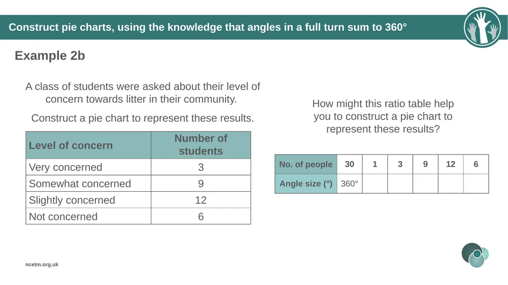
Construct pie charts, using the knowledge that angles in a full turn sum to 360° Example 2b A class of students were asked about their level of concern towards litter in their community.
Construct a pie chart to represent these results. How might this ratio table help you to construct a pie chart to represent these results?<br>
Construct a pie chart to represent these results. How might this ratio table help you to construct a pie chart to represent these results?<br>
19
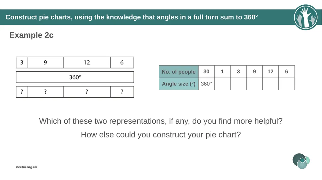
Construct pie charts, using the knowledge that angles in a full turn sum to 360° Example 2c Which of these two representations, if any, do you find more helpful?
How else could you construct your pie chart?<br>
How else could you construct your pie chart?<br>
20
Construct pie charts, using the knowledge that angles in a full turn sum to 360° Example 2 How might each of these representations support students to make connections with multiplicative reasoning?
How might you vary future examples to ensure students understand pie charts as proportional representation?<br>
How might you vary future examples to ensure students understand pie charts as proportional representation?<br>
21
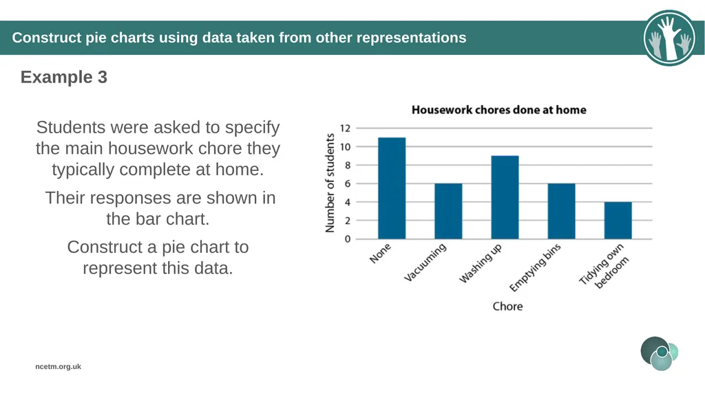
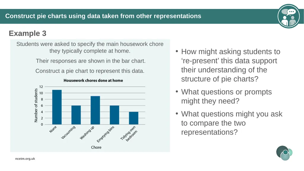
Construct pie charts using data taken from other representations Example 3 Students were asked to specify the main housework chore they typically complete at home.
Their responses are shown in the bar chart.
Construct a pie chart to represent this data.<br>
Their responses are shown in the bar chart.
Construct a pie chart to represent this data.<br>
22
Construct pie charts using data taken from other representations Example 3 How might asking students to ‘re-present’ this data support their understanding of the structure of pie charts?
What questions or prompts might they need?
What questions might you ask to compare the two representations?<br>
What questions or prompts might they need?
What questions might you ask to compare the two representations?<br>
23
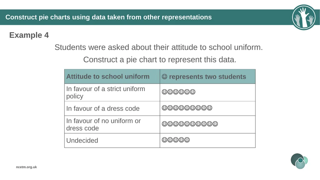
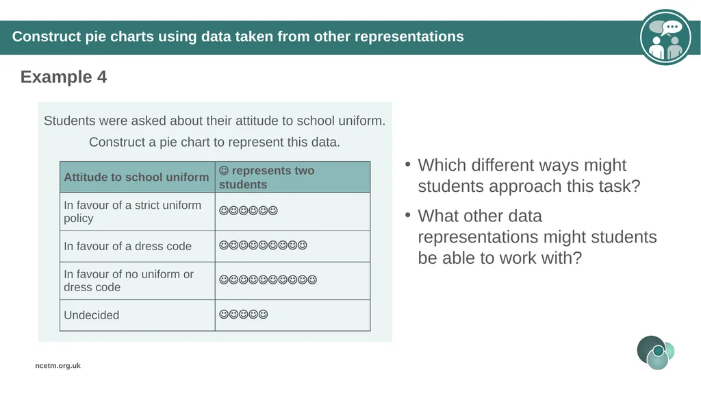
Construct pie charts using data taken from other representations Example 4 Students were asked about their attitude to school uniform.
Construct a pie chart to represent this data.<br>
Construct a pie chart to represent this data.<br>
24
Construct pie charts using data taken from other representations Example 4 Which different ways might students approach this task?
What other data representations might students be able to work with?<br>
What other data representations might students be able to work with?<br>
25
Reflection questions What other mathematical concepts will be supported by students’ stronger understanding of this key idea?
What mathematical language will you continue to use to support pupils to make connections with other areas?
Which representations might you continue to use to further develop students’ understanding?<br>
What mathematical language will you continue to use to support pupils to make connections with other areas?
Which representations might you continue to use to further develop students’ understanding?<br>
26
Appendices You may choose to use the following slides when planning or delivering a PD session. They cover:
Key vocabulary
Representations and structure
Previous learning
Future learning
Library of links<br>
Key vocabulary
Representations and structure
Previous learning
Future learning
Library of links<br>
27
Key vocabulary<br>
28
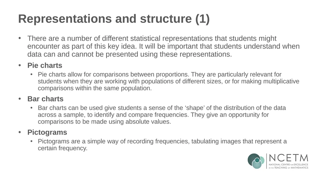
Representations and structure (1) There are a number of different statistical representations that students might encounter as part of this key idea. It will be important that students understand when data can and cannot be presented using these representations.
Pie charts
Pie charts allow for comparisons between proportions. They are particularly relevant for students when they are working with populations of different sizes, or for making multiplicative comparisons within the same population.
Bar charts
Bar charts can be used give students a sense of the ‘shape’ of the distribution of the data across a sample, to identify and compare frequencies. They give an opportunity for comparisons to be made using absolute values.
Pictograms
Pictograms are a simple way of recording frequencies, tabulating images that represent a certain frequency.<br>
Pie charts
Pie charts allow for comparisons between proportions. They are particularly relevant for students when they are working with populations of different sizes, or for making multiplicative comparisons within the same population.
Bar charts
Bar charts can be used give students a sense of the ‘shape’ of the distribution of the data across a sample, to identify and compare frequencies. They give an opportunity for comparisons to be made using absolute values.
Pictograms
Pictograms are a simple way of recording frequencies, tabulating images that represent a certain frequency.<br>
29
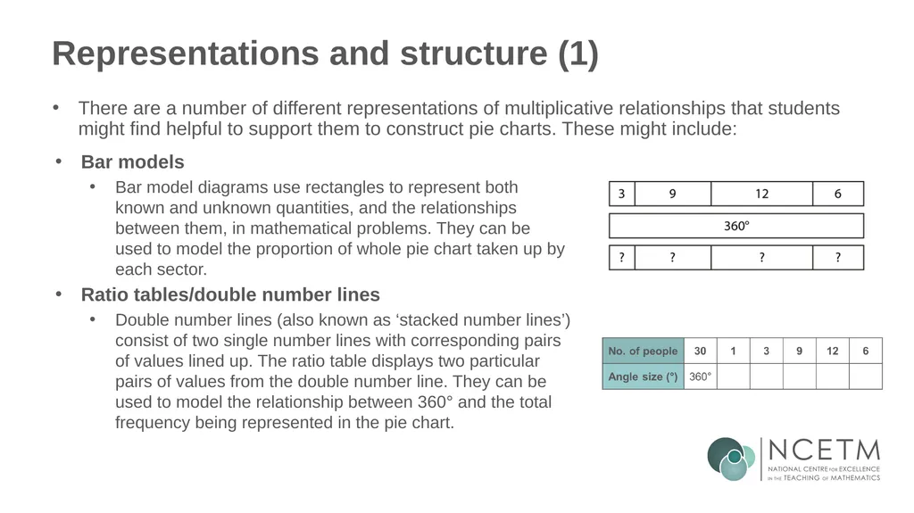
Representations and structure (1) There are a number of different representations of multiplicative relationships that students might find helpful to support them to construct pie charts. These might include: Bar models
Bar model diagrams use rectangles to represent both known and unknown quantities, and the relationships between them, in mathematical problems. They can be used to model the proportion of whole pie chart taken up by each sector.
Ratio tables/double number lines
Double number lines (also known as ‘stacked number lines’) consist of two single number lines with corresponding pairs of values lined up. The ratio table displays two particular pairs of values from the double number line. They can be used to model the relationship between 360° and the total frequency being represented in the pie chart.<br>
Bar model diagrams use rectangles to represent both known and unknown quantities, and the relationships between them, in mathematical problems. They can be used to model the proportion of whole pie chart taken up by each sector.
Ratio tables/double number lines
Double number lines (also known as ‘stacked number lines’) consist of two single number lines with corresponding pairs of values lined up. The ratio table displays two particular pairs of values from the double number line. They can be used to model the relationship between 360° and the total frequency being represented in the pie chart.<br>
30
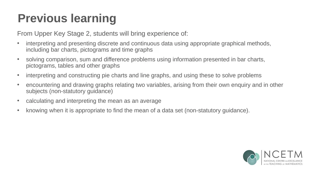
Previous learning From Upper Key Stage 2, students will bring experience of:
interpreting and presenting discrete and continuous data using appropriate graphical methods, including bar charts, pictograms and time graphs
solving comparison, sum and difference problems using information presented in bar charts, pictograms, tables and other graphs
interpreting and constructing pie charts and line graphs, and using these to solve problems
encountering and drawing graphs relating two variables, arising from their own enquiry and in other subjects (non-statutory guidance)
calculating and interpreting the mean as an average
knowing when it is appropriate to find the mean of a data set (non-statutory guidance).<br>
interpreting and presenting discrete and continuous data using appropriate graphical methods, including bar charts, pictograms and time graphs
solving comparison, sum and difference problems using information presented in bar charts, pictograms, tables and other graphs
interpreting and constructing pie charts and line graphs, and using these to solve problems
encountering and drawing graphs relating two variables, arising from their own enquiry and in other subjects (non-statutory guidance)
calculating and interpreting the mean as an average
knowing when it is appropriate to find the mean of a data set (non-statutory guidance).<br>
31
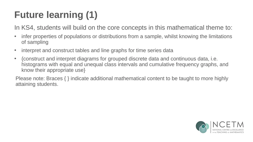
Future learning (1) In KS4, students will build on the core concepts in this mathematical theme to:
infer properties of populations or distributions from a sample, whilst knowing the limitations of sampling
interpret and construct tables and line graphs for time series data
{construct and interpret diagrams for grouped discrete data and continuous data, i.e. histograms with equal and unequal class intervals and cumulative frequency graphs, and know their appropriate use}
Please note: Braces { } indicate additional mathematical content to be taught to more highly attaining students.<br>
infer properties of populations or distributions from a sample, whilst knowing the limitations of sampling
interpret and construct tables and line graphs for time series data
{construct and interpret diagrams for grouped discrete data and continuous data, i.e. histograms with equal and unequal class intervals and cumulative frequency graphs, and know their appropriate use}
Please note: Braces { } indicate additional mathematical content to be taught to more highly attaining students.<br>
32
Future learning (2) In KS4, students will build on the core concepts in this mathematical theme to:
interpret, analyse and compare the distributions of data sets from univariate empirical distributions through:
appropriate graphical representation involving discrete, continuous and grouped data, {including box plots}
appropriate measures of central tendency (including modal class) and spread {including quartiles and inter-quartile range}
apply statistics to describe a population
use and interpret scatter graphs of bivariate data; recognise correlation and know that it does not indicate causation; draw estimated lines of best fit; make predictions; interpolate and extrapolate apparent trends whilst knowing the dangers of so doing
Please note: Braces { } indicate additional mathematical content to be taught to more highly attaining students.<br>
interpret, analyse and compare the distributions of data sets from univariate empirical distributions through:
appropriate graphical representation involving discrete, continuous and grouped data, {including box plots}
appropriate measures of central tendency (including modal class) and spread {including quartiles and inter-quartile range}
apply statistics to describe a population
use and interpret scatter graphs of bivariate data; recognise correlation and know that it does not indicate causation; draw estimated lines of best fit; make predictions; interpolate and extrapolate apparent trends whilst knowing the dangers of so doing
Please note: Braces { } indicate additional mathematical content to be taught to more highly attaining students.<br>
33
Library of links The following resources from the NCETM website have been referred to within this slide deck:
NCETM Secondary Mastery Professional Development
Statistics and probability theme overview document
5.1 Statistical representations and measures core concept guidance document
Using mathematical representations at KS3 | NCETM
NCETM primary mastery professional development materials
NCETM primary assessment materials<br>
NCETM Secondary Mastery Professional Development
Statistics and probability theme overview document
5.1 Statistical representations and measures core concept guidance document
Using mathematical representations at KS3 | NCETM
NCETM primary mastery professional development materials
NCETM primary assessment materials<br>