
Graphics in R data analysis and visualization
KB
Published · 49 slides · 0 views
1 / 1
Description
Graphics in R data analysis and visualization Katia Oleinik koleinikbu.edu Scientific Computing and Visualization Boston University http:www.bu.edutechresearchtrainingtutorialslist Getting started R comes along with some packages
Related Topics
Share
Embed code
Download this presentation From Below
"Graphics in R data analysis and visualization" is the property of its rightful owner. Permission is granted to download and print the materials on this website for personal, non-commercial use only, and to display it on your personal computer provided you do not modify the materials and that you retain all copyright notices contained in the materials. By downloading content from our website, you accept the terms of this agreement.
Presentation Transcript
01
Graphics in R
data analysis and visualization
Katia Oleinik
koleinik@bu.edu
Scientific Computing and Visualization
Boston University http://www.bu.edu/tech/research/training/tutorials/list/<br>
02
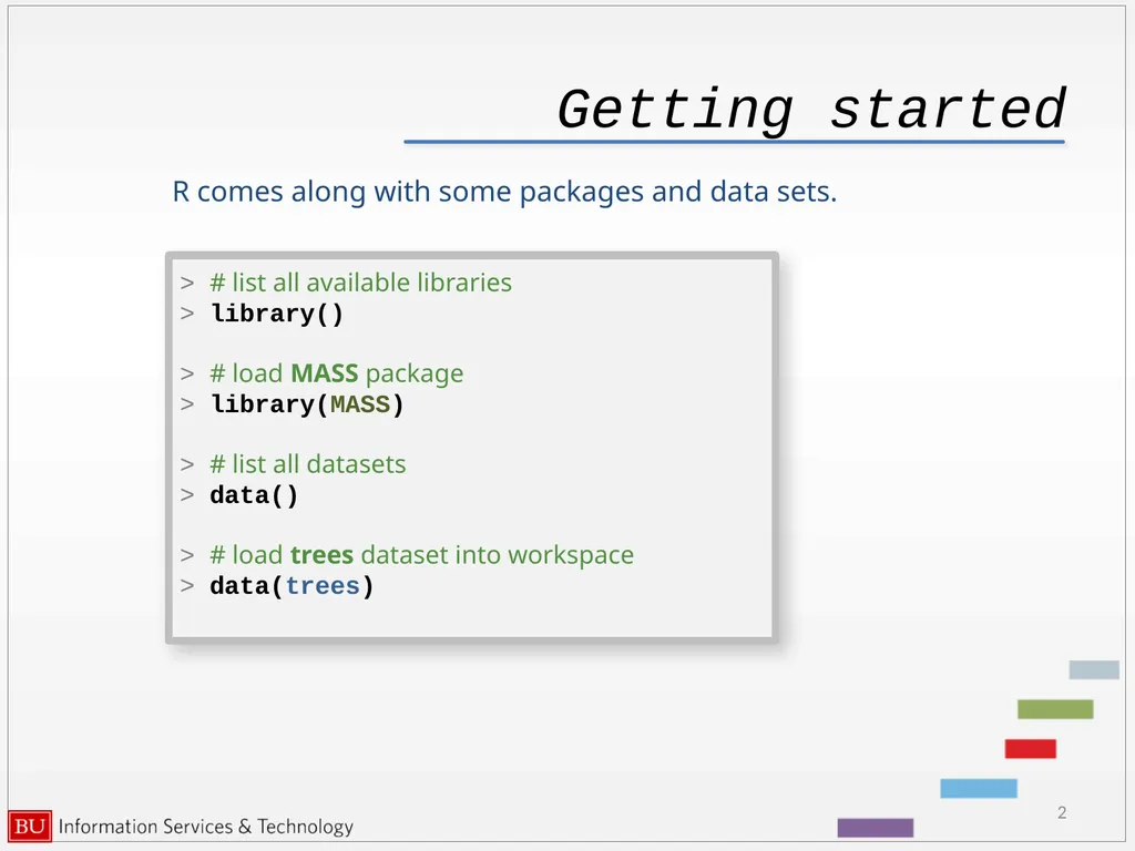
Getting started R comes along with some packages and data sets. 2 > # list all available libraries
> library()
> # load MASS package
> library(MASS)
> # list all datasets
> data()
> # load trees dataset into workspace
> data(trees)<br>
> library()
> # load MASS package
> library(MASS)
> # list all datasets
> data()
> # load trees dataset into workspace
> data(trees)<br>
03
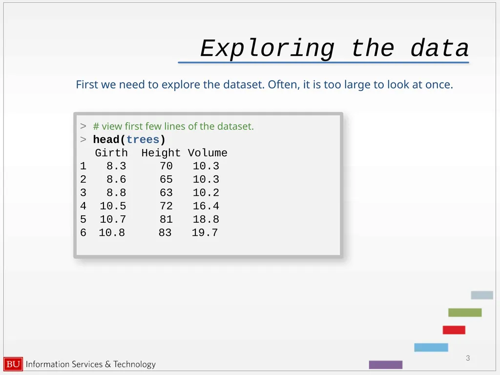
Exploring the data First we need to explore the dataset. Often, it is too large to look at once. 3 > # view first few lines of the dataset.
> head(trees)
Girth Height Volume
1 8.3 70 10.3
2 8.6 65 10.3
3 8.8 63 10.2
4 10.5 72 16.4
5 10.7 81 18.8
10.8 83 19.7<br>
> head(trees)
Girth Height Volume
1 8.3 70 10.3
2 8.6 65 10.3
3 8.8 63 10.2
4 10.5 72 16.4
5 10.7 81 18.8
10.8 83 19.7<br>
04
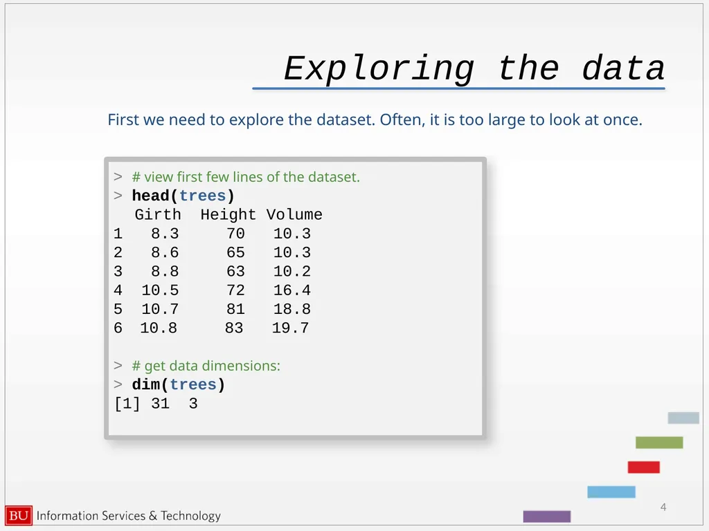
Exploring the data First we need to explore the dataset. Often, it is too large to look at once. 4 > # view first few lines of the dataset.
> head(trees)
Girth Height Volume
1 8.3 70 10.3
2 8.6 65 10.3
3 8.8 63 10.2
4 10.5 72 16.4
5 10.7 81 18.8
10.8 83 19.7
> # get data dimensions:
> dim(trees)
[1] 31 3<br>
> head(trees)
Girth Height Volume
1 8.3 70 10.3
2 8.6 65 10.3
3 8.8 63 10.2
4 10.5 72 16.4
5 10.7 81 18.8
10.8 83 19.7
> # get data dimensions:
> dim(trees)
[1] 31 3<br>
05
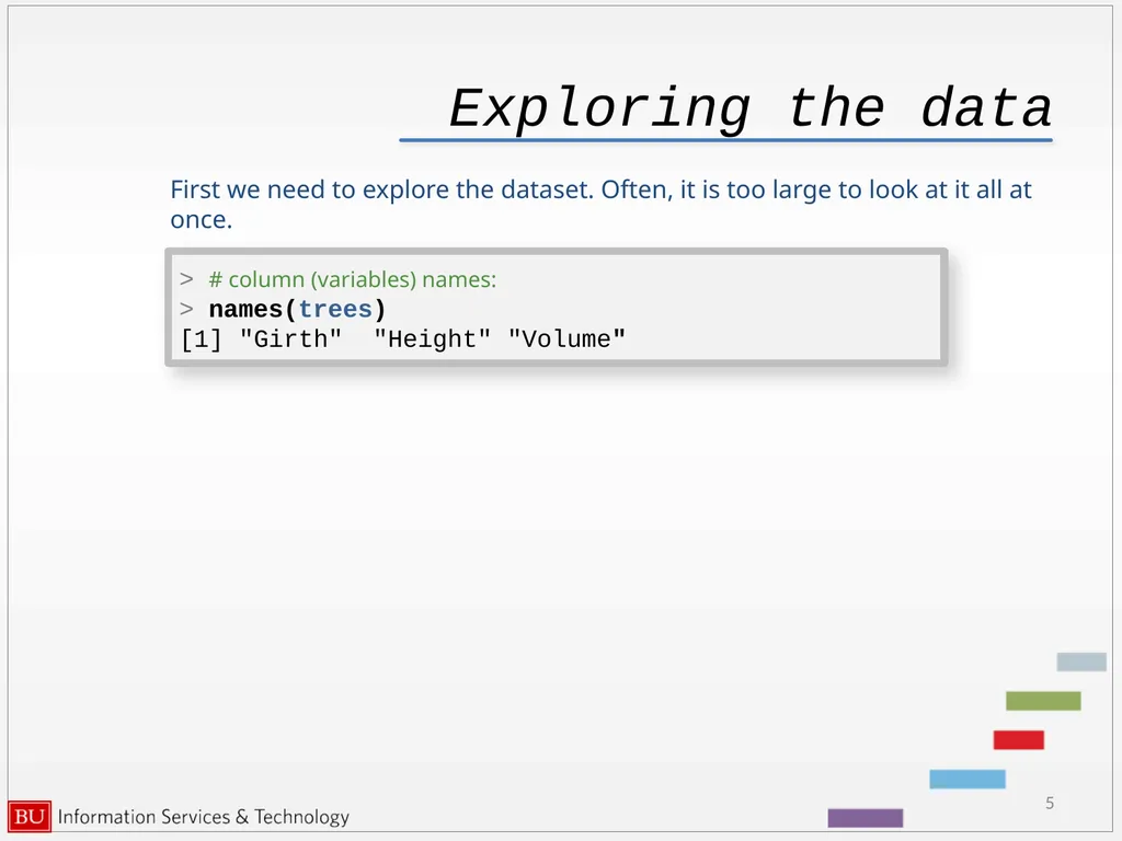
Exploring the data First we need to explore the dataset. Often, it is too large to look at it all at once. 5 > # column (variables) names:
> names(trees)
[1] "Girth" "Height" "Volume"<br>
> names(trees)
[1] "Girth" "Height" "Volume"<br>
06
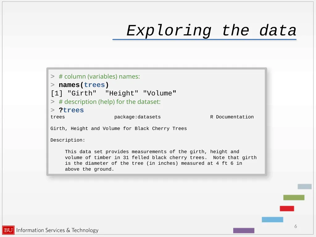
Exploring the data 6 > # column (variables) names:
> names(trees)
[1] "Girth" "Height" "Volume"
> # description (help) for the dataset:
> ?trees
trees package:datasets R Documentation
Girth, Height and Volume for Black Cherry Trees
Description:
This data set provides measurements of the girth, height and
volume of timber in 31 felled black cherry trees. Note that girth
is the diameter of the tree (in inches) measured at 4 ft 6 in
above the ground.<br>
> names(trees)
[1] "Girth" "Height" "Volume"
> # description (help) for the dataset:
> ?trees
trees package:datasets R Documentation
Girth, Height and Volume for Black Cherry Trees
Description:
This data set provides measurements of the girth, height and
volume of timber in 31 felled black cherry trees. Note that girth
is the diameter of the tree (in inches) measured at 4 ft 6 in
above the ground.<br>
07
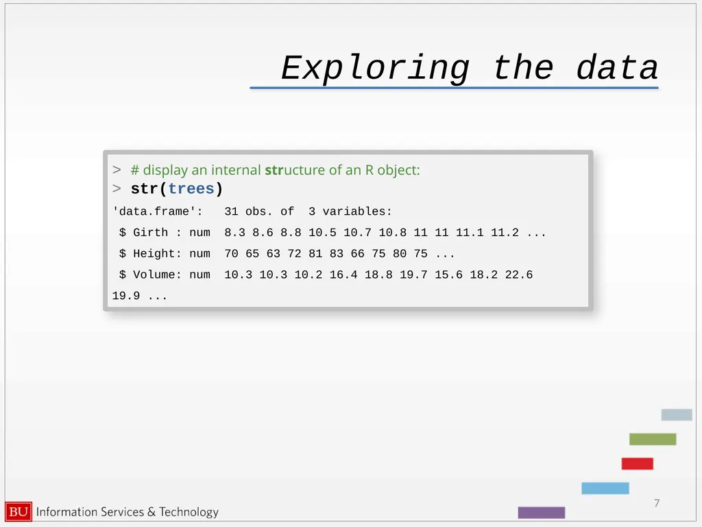
Exploring the data 7 > # display an internal structure of an R object:
> str(trees)
'data.frame': 31 obs. of 3 variables:
$ Girth : num 8.3 8.6 8.8 10.5 10.7 10.8 11 11 11.1 11.2 ...
$ Height: num 70 65 63 72 81 83 66 75 80 75 ...
$ Volume: num 10.3 10.3 10.2 16.4 18.8 19.7 15.6 18.2 22.6 19.9 ...<br>
> str(trees)
'data.frame': 31 obs. of 3 variables:
$ Girth : num 8.3 8.6 8.8 10.5 10.7 10.8 11 11 11.1 11.2 ...
$ Height: num 70 65 63 72 81 83 66 75 80 75 ...
$ Volume: num 10.3 10.3 10.2 16.4 18.8 19.7 15.6 18.2 22.6 19.9 ...<br>
08
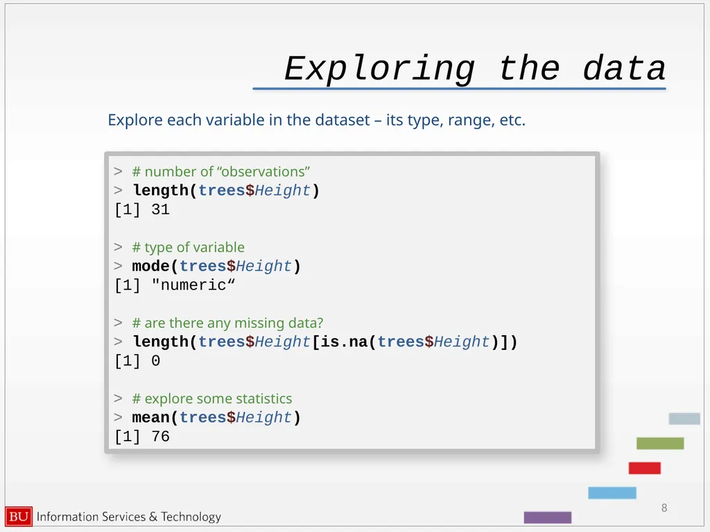
Exploring the data Explore each variable in the dataset – its type, range, etc. 8 > # number of “observations”
> length(trees$Height)
[1] 31
> # type of variable
> mode(trees$Height)
[1] "numeric“
> # are there any missing data?
> length(trees$Height[is.na(trees$Height)])
[1] 0
> # explore some statistics
> mean(trees$Height)
[1] 76<br>
> length(trees$Height)
[1] 31
> # type of variable
> mode(trees$Height)
[1] "numeric“
> # are there any missing data?
> length(trees$Height[is.na(trees$Height)])
[1] 0
> # explore some statistics
> mean(trees$Height)
[1] 76<br>
09
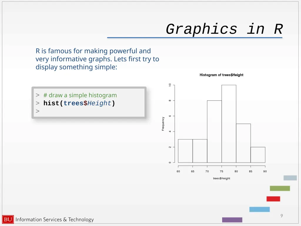
Graphics in R R is famous for making powerful and very informative graphs. Lets first try to display something simple: 9 > # draw a simple histogram
> hist(trees$Height)
><br>
> hist(trees$Height)
><br>
10
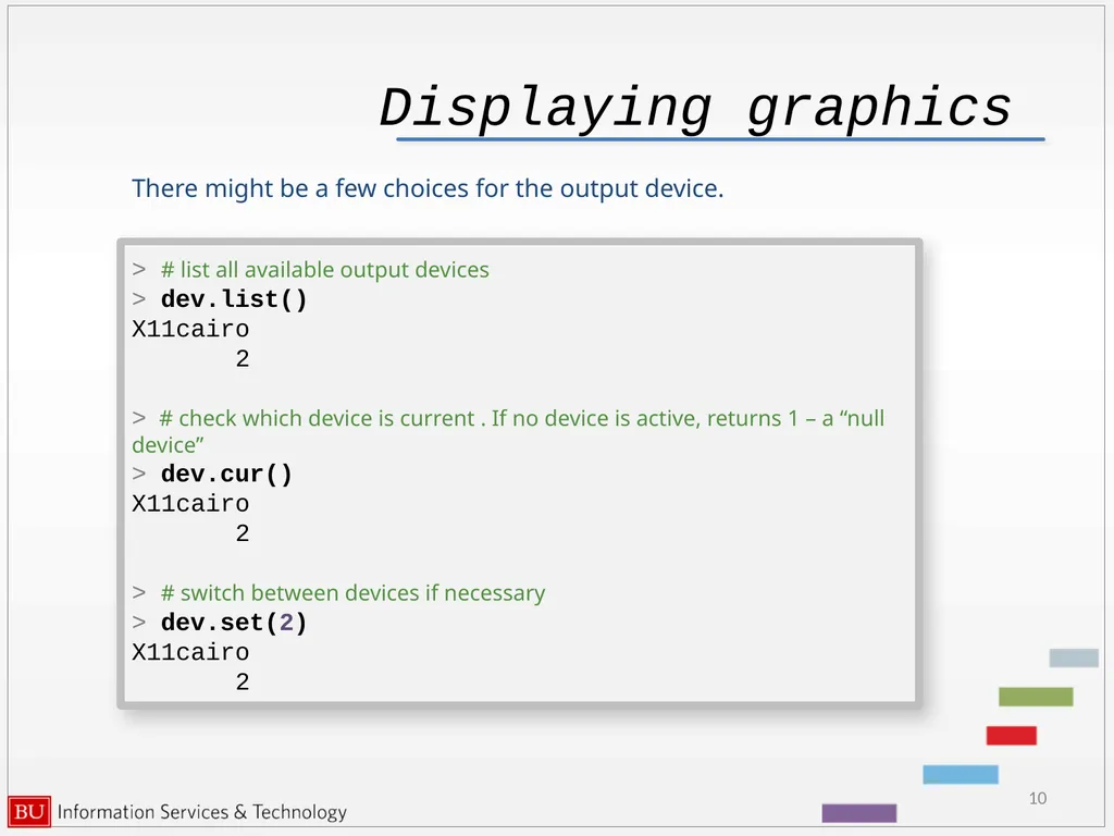
Displaying graphics There might be a few choices for the output device. 10 > # list all available output devices
> dev.list()
X11cairo
2
> # check which device is current . If no device is active, returns 1 – a “null device”
> dev.cur()
X11cairo
2
> # switch between devices if necessary
> dev.set(2)
X11cairo
2<br>
> dev.list()
X11cairo
2
> # check which device is current . If no device is active, returns 1 – a “null device”
> dev.cur()
X11cairo
2
> # switch between devices if necessary
> dev.set(2)
X11cairo
2<br>
11
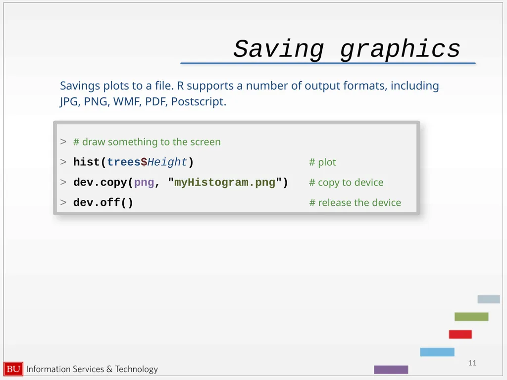
Saving graphics Savings plots to a file. R supports a number of output formats, including
JPG, PNG, WMF, PDF, Postscript. 11 > # draw something to the screen
> hist(trees$Height) # plot
> dev.copy(png, "myHistogram.png") # copy to device
> dev.off() # release the device<br>
JPG, PNG, WMF, PDF, Postscript. 11 > # draw something to the screen
> hist(trees$Height) # plot
> dev.copy(png, "myHistogram.png") # copy to device
> dev.off() # release the device<br>
12
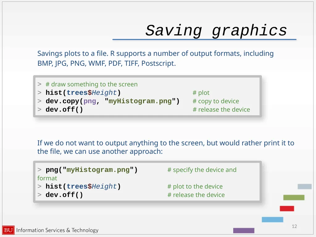
Saving graphics Savings plots to a file. R supports a number of output formats, including
BMP, JPG, PNG, WMF, PDF, TIFF, Postscript. 12 > # draw something to the screen
> hist(trees$Height) # plot
> dev.copy(png, "myHistogram.png") # copy to device
> dev.off() # release the device If we do not want to output anything to the screen, but would rather print it to the file, we can use another approach: > png("myHistogram.png") # specify the device and format
> hist(trees$Height) # plot to the device
> dev.off() # release the device<br>
BMP, JPG, PNG, WMF, PDF, TIFF, Postscript. 12 > # draw something to the screen
> hist(trees$Height) # plot
> dev.copy(png, "myHistogram.png") # copy to device
> dev.off() # release the device If we do not want to output anything to the screen, but would rather print it to the file, we can use another approach: > png("myHistogram.png") # specify the device and format
> hist(trees$Height) # plot to the device
> dev.off() # release the device<br>
13
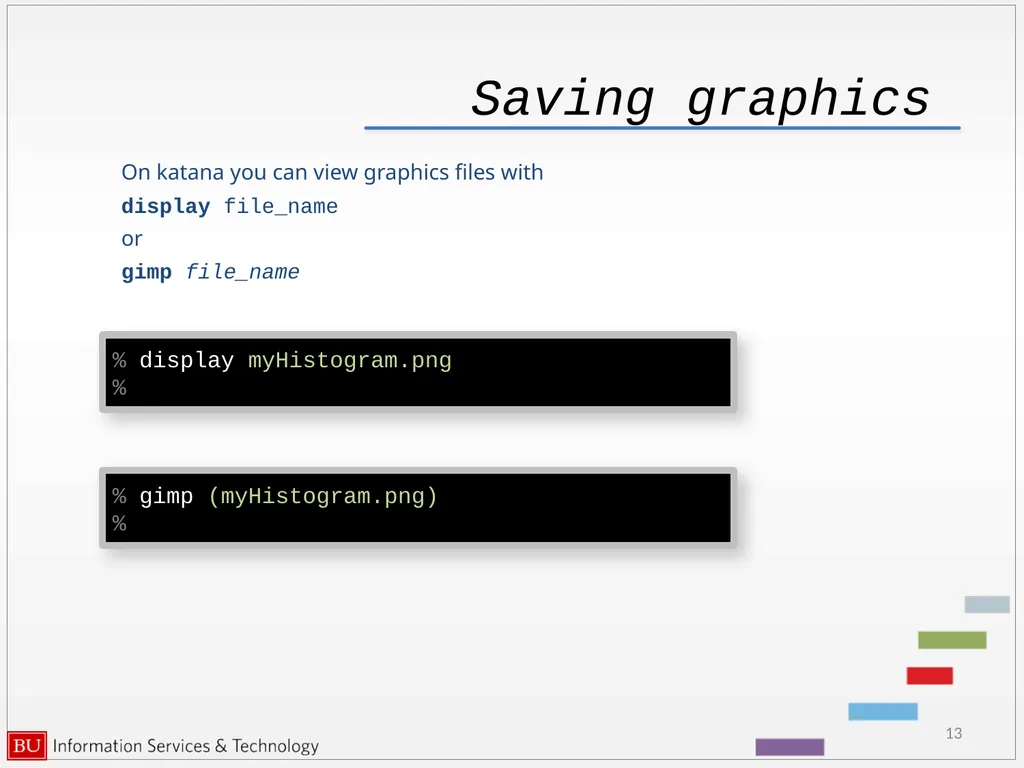
Saving graphics On katana you can view graphics files with
display file_name
or
gimp file_name 13 % display myHistogram.png)
% % gimp (myHistogram.png)
%<br>
display file_name
or
gimp file_name 13 % display myHistogram.png)
% % gimp (myHistogram.png)
%<br>
14
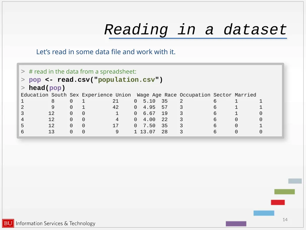
Reading in a dataset Let’s read in some data file and work with it. 14 > # read in the data from a spreadsheet:
> pop <- read.csv("population.csv")
> head(pop)
Education South Sex Experience Union Wage Age Race Occupation Sector Married
1 8 0 1 21 0 5.10 35 2 6 1 1
2 9 0 1 42 0 4.95 57 3 6 1 1
3 12 0 0 1 0 6.67 19 3 6 1 0
4 12 0 0 4 0 4.00 22 3 6 0 0
5 12 0 0 17 0 7.50 35 3 6 0 1
6 13 0 0 9 1 13.07 28 3 6 0 0<br>
> pop <- read.csv("population.csv")
> head(pop)
Education South Sex Experience Union Wage Age Race Occupation Sector Married
1 8 0 1 21 0 5.10 35 2 6 1 1
2 9 0 1 42 0 4.95 57 3 6 1 1
3 12 0 0 1 0 6.67 19 3 6 1 0
4 12 0 0 4 0 4.00 22 3 6 0 0
5 12 0 0 17 0 7.50 35 3 6 0 1
6 13 0 0 9 1 13.07 28 3 6 0 0<br>
15
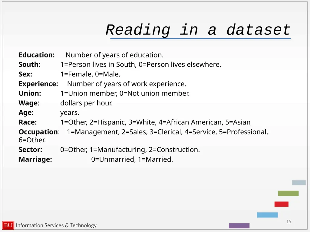
Reading in a dataset Education: Number of years of education.
South: 1=Person lives in South, 0=Person lives elsewhere.
Sex: 1=Female, 0=Male.
Experience: Number of years of work experience.
Union: 1=Union member, 0=Not union member.
Wage: dollars per hour.
Age: years.
Race: 1=Other, 2=Hispanic, 3=White, 4=African American, 5=Asian
Occupation: 1=Management, 2=Sales, 3=Clerical, 4=Service, 5=Professional, 6=Other.
Sector: 0=Other, 1=Manufacturing, 2=Construction.
Marriage: 0=Unmarried, 1=Married. 15<br>
South: 1=Person lives in South, 0=Person lives elsewhere.
Sex: 1=Female, 0=Male.
Experience: Number of years of work experience.
Union: 1=Union member, 0=Not union member.
Wage: dollars per hour.
Age: years.
Race: 1=Other, 2=Hispanic, 3=White, 4=African American, 5=Asian
Occupation: 1=Management, 2=Sales, 3=Clerical, 4=Service, 5=Professional, 6=Other.
Sector: 0=Other, 1=Manufacturing, 2=Construction.
Marriage: 0=Unmarried, 1=Married. 15<br>
16
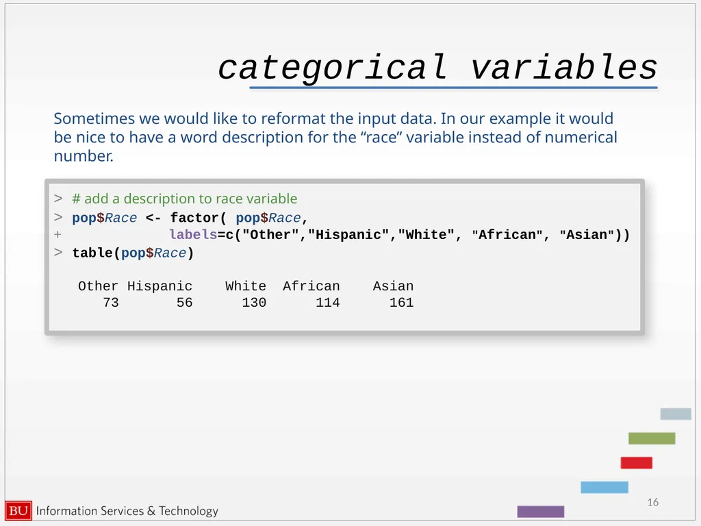
categorical variables Sometimes we would like to reformat the input data. In our example it would be nice to have a word description for the “race” variable instead of numerical number. 16 > # add a description to race variable
> pop$Race <- factor( pop$Race,
+ labels=c("Other","Hispanic","White", "African", "Asian"))
> table(pop$Race)
Other Hispanic White African Asian
73 56 130 114 161<br>
> pop$Race <- factor( pop$Race,
+ labels=c("Other","Hispanic","White", "African", "Asian"))
> table(pop$Race)
Other Hispanic White African Asian
73 56 130 114 161<br>
17
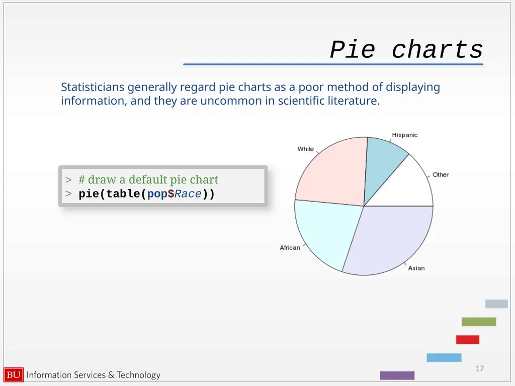
Pie charts Statisticians generally regard pie charts as a poor method of displaying information, and they are uncommon in scientific literature. 17 > # draw a default pie chart
> pie(table(pop$Race))<br>
> pie(table(pop$Race))<br>
18
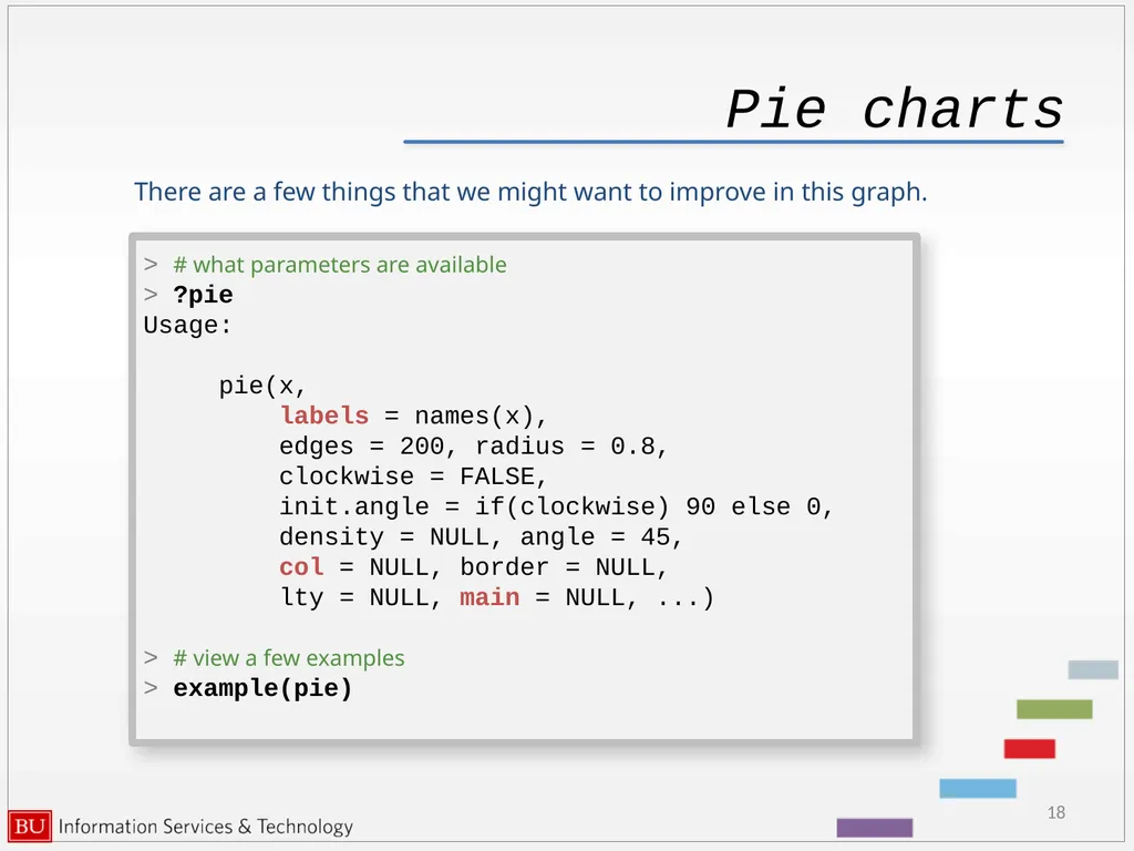
Pie charts There are a few things that we might want to improve in this graph. 18 > # what parameters are available
> ?pie
Usage:
pie(x,
labels = names(x),
edges = 200, radius = 0.8,
clockwise = FALSE,
init.angle = if(clockwise) 90 else 0,
density = NULL, angle = 45,
col = NULL, border = NULL,
lty = NULL, main = NULL, ...)
> # view a few examples
> example(pie)<br>
> ?pie
Usage:
pie(x,
labels = names(x),
edges = 200, radius = 0.8,
clockwise = FALSE,
init.angle = if(clockwise) 90 else 0,
density = NULL, angle = 45,
col = NULL, border = NULL,
lty = NULL, main = NULL, ...)
> # view a few examples
> example(pie)<br>
19
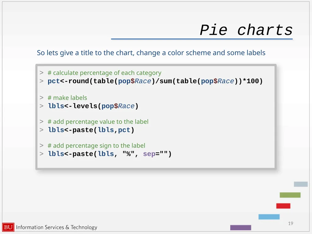
Pie charts So lets give a title to the chart, change a color scheme and some labels 19 > # calculate percentage of each category
> pct<-round(table(pop$Race)/sum(table(pop$Race))*100)
> # make labels
> lbls<-levels(pop$Race)
> # add percentage value to the label
> lbls<-paste(lbls,pct)
> # add percentage sign to the label
> lbls<-paste(lbls, "%", sep="")<br>
> pct<-round(table(pop$Race)/sum(table(pop$Race))*100)
> # make labels
> lbls<-levels(pop$Race)
> # add percentage value to the label
> lbls<-paste(lbls,pct)
> # add percentage sign to the label
> lbls<-paste(lbls, "%", sep="")<br>
20
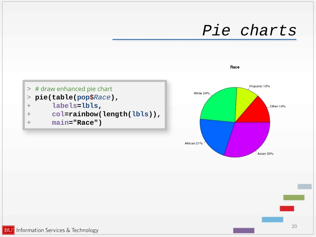
Pie charts 20 > # draw enhanced pie chart
> pie(table(pop$Race),
+ labels=lbls,
+ col=rainbow(length(lbls)),
+ main="Race")<br>
> pie(table(pop$Race),
+ labels=lbls,
+ col=rainbow(length(lbls)),
+ main="Race")<br>
21
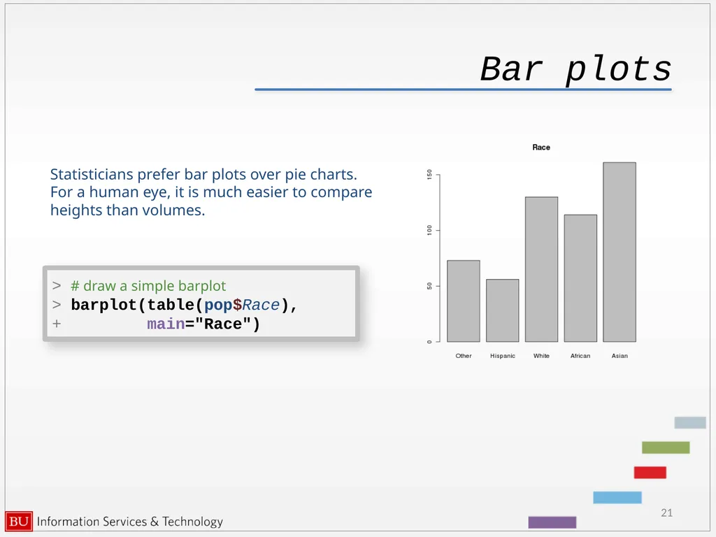
Bar plots 21 > # draw a simple barplot
> barplot(table(pop$Race),
+ main="Race") Statisticians prefer bar plots over pie charts. For a human eye, it is much easier to compare heights than volumes.<br>
> barplot(table(pop$Race),
+ main="Race") Statisticians prefer bar plots over pie charts. For a human eye, it is much easier to compare heights than volumes.<br>
22
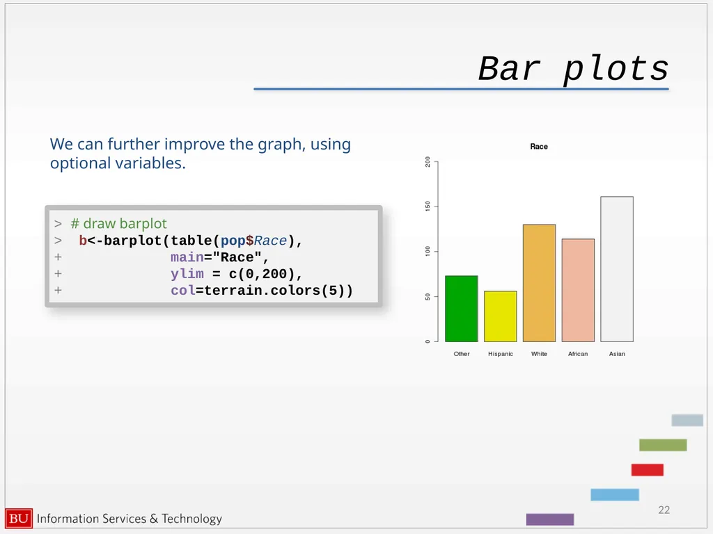
Bar plots 22 > # draw barplot
> b<-barplot(table(pop$Race),
+ main="Race",
+ ylim = c(0,200),
+ col=terrain.colors(5)) We can further improve the graph, using optional variables.<br>
> b<-barplot(table(pop$Race),
+ main="Race",
+ ylim = c(0,200),
+ col=terrain.colors(5)) We can further improve the graph, using optional variables.<br>
23
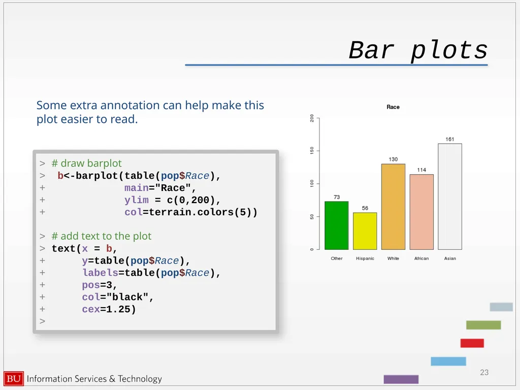
Bar plots 23 > # draw barplot
> b<-barplot(table(pop$Race),
+ main="Race",
+ ylim = c(0,200),
+ col=terrain.colors(5))
> # add text to the plot
> text(x = b,
+ y=table(pop$Race),
+ labels=table(pop$Race),
+ pos=3,
+ col="black",
+ cex=1.25)
> Some extra annotation can help make this plot easier to read.<br>
> b<-barplot(table(pop$Race),
+ main="Race",
+ ylim = c(0,200),
+ col=terrain.colors(5))
> # add text to the plot
> text(x = b,
+ y=table(pop$Race),
+ labels=table(pop$Race),
+ pos=3,
+ col="black",
+ cex=1.25)
> Some extra annotation can help make this plot easier to read.<br>
24
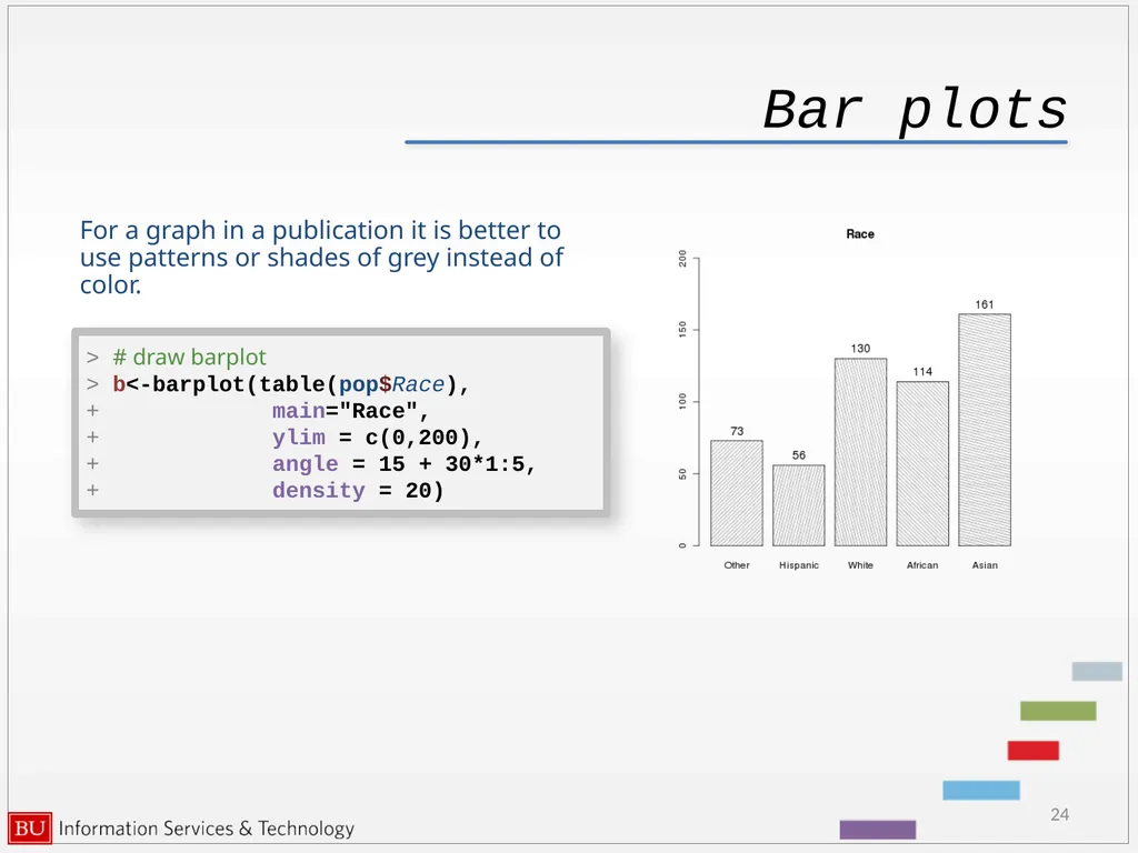
Bar plots 24 > # draw barplot
> b<-barplot(table(pop$Race),
+ main="Race",
+ ylim = c(0,200),
+ angle = 15 + 30*1:5,
+ density = 20) For a graph in a publication it is better to use patterns or shades of grey instead of color.<br>
> b<-barplot(table(pop$Race),
+ main="Race",
+ ylim = c(0,200),
+ angle = 15 + 30*1:5,
+ density = 20) For a graph in a publication it is better to use patterns or shades of grey instead of color.<br>
25
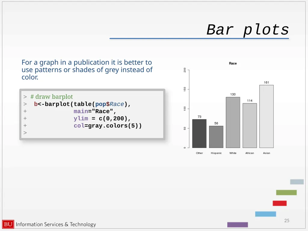
Bar plots 25 > # draw barplot
> b<-barplot(table(pop$Race),
+ main="Race",
+ ylim = c(0,200),
+ col=gray.colors(5))
> For a graph in a publication it is better to use patterns or shades of grey instead of color.<br>
> b<-barplot(table(pop$Race),
+ main="Race",
+ ylim = c(0,200),
+ col=gray.colors(5))
> For a graph in a publication it is better to use patterns or shades of grey instead of color.<br>
26
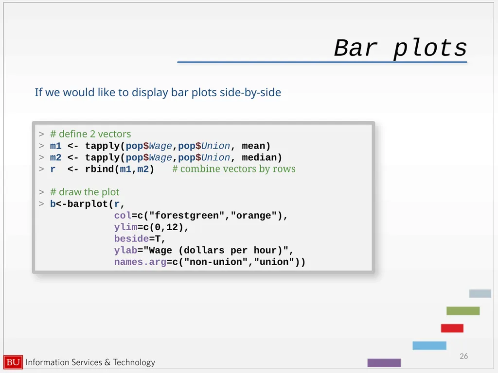
Bar plots 26 > # define 2 vectors
> m1 <- tapply(pop$Wage,pop$Union, mean)
> m2 <- tapply(pop$Wage,pop$Union, median)
> r <- rbind(m1,m2) # combine vectors by rows
> # draw the plot
> b<-barplot(r,
col=c("forestgreen","orange"),
ylim=c(0,12),
beside=T,
ylab="Wage (dollars per hour)",
names.arg=c("non-union","union")) If we would like to display bar plots side-by-side<br>
> m1 <- tapply(pop$Wage,pop$Union, mean)
> m2 <- tapply(pop$Wage,pop$Union, median)
> r <- rbind(m1,m2) # combine vectors by rows
> # draw the plot
> b<-barplot(r,
col=c("forestgreen","orange"),
ylim=c(0,12),
beside=T,
ylab="Wage (dollars per hour)",
names.arg=c("non-union","union")) If we would like to display bar plots side-by-side<br>
27
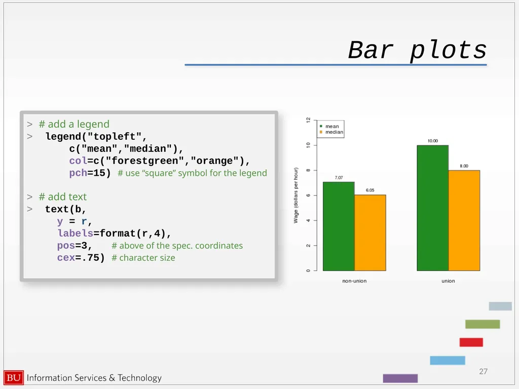
Bar plots 27 > # add a legend
> legend("topleft",
c("mean","median"),
col=c("forestgreen","orange"),
pch=15) # use “square” symbol for the legend
> # add text
> text(b,
y = r,
labels=format(r,4),
pos=3, # above of the spec. coordinates
cex=.75) # character size<br>
> legend("topleft",
c("mean","median"),
col=c("forestgreen","orange"),
pch=15) # use “square” symbol for the legend
> # add text
> text(b,
y = r,
labels=format(r,4),
pos=3, # above of the spec. coordinates
cex=.75) # character size<br>
28
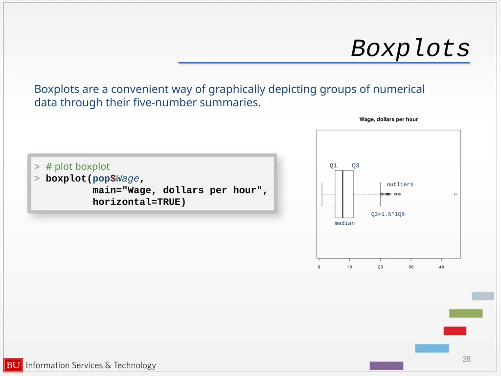
Boxplots 28 Boxplots are a convenient way of graphically depicting groups of numerical data through their five-number summaries. > # plot boxplot
> boxplot(pop$Wage,
main="Wage, dollars per hour",
horizontal=TRUE) outliers Q3+1.5*IQR median Q1 Q3<br>
> boxplot(pop$Wage,
main="Wage, dollars per hour",
horizontal=TRUE) outliers Q3+1.5*IQR median Q1 Q3<br>
29
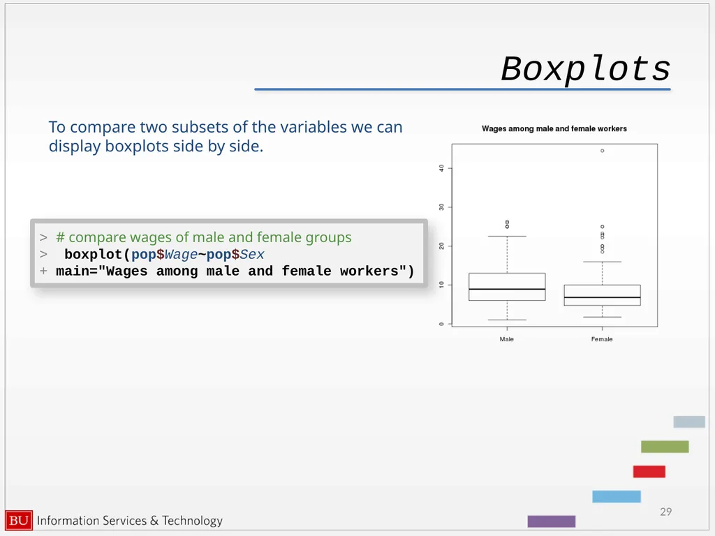
Boxplots 29 To compare two subsets of the variables we can display boxplots side by side. > # compare wages of male and female groups
> boxplot(pop$Wage~pop$Sex
+ main="Wages among male and female workers")<br>
> boxplot(pop$Wage~pop$Sex
+ main="Wages among male and female workers")<br>
30
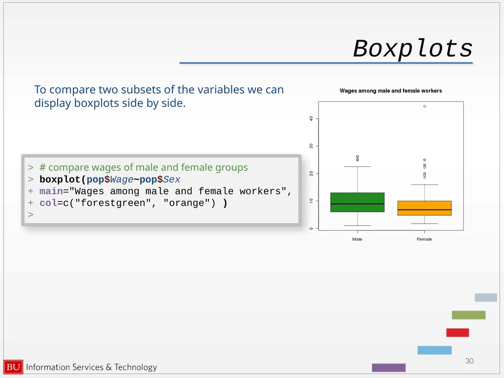
Boxplots 30 To compare two subsets of the variables we can display boxplots side by side. > # compare wages of male and female groups
> boxplot(pop$Wage~pop$Sex
+ main="Wages among male and female workers",
+ col=c("forestgreen", "orange") )
><br>
> boxplot(pop$Wage~pop$Sex
+ main="Wages among male and female workers",
+ col=c("forestgreen", "orange") )
><br>
31
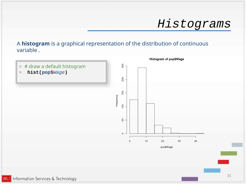
Histograms 31 > # draw a default histogram
> hist(pop$Wage) A histogram is a graphical representation of the distribution of continuous variable .<br>
> hist(pop$Wage) A histogram is a graphical representation of the distribution of continuous variable .<br>
32
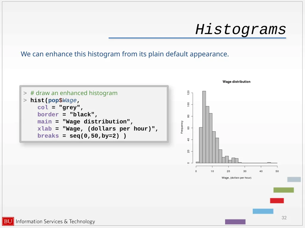
Histograms 32 > # draw an enhanced histogram
> hist(pop$Wage,
col = "grey",
border = "black",
main = "Wage distribution",
xlab = "Wage, (dollars per hour)",
breaks = seq(0,50,by=2) ) We can enhance this histogram from its plain default appearance.<br>
> hist(pop$Wage,
col = "grey",
border = "black",
main = "Wage distribution",
xlab = "Wage, (dollars per hour)",
breaks = seq(0,50,by=2) ) We can enhance this histogram from its plain default appearance.<br>
33
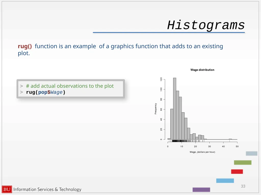
Histograms 33 > # add actual observations to the plot
> rug(pop$Wage) rug() function is an example of a graphics function that adds to an existing plot.<br>
> rug(pop$Wage) rug() function is an example of a graphics function that adds to an existing plot.<br>
34
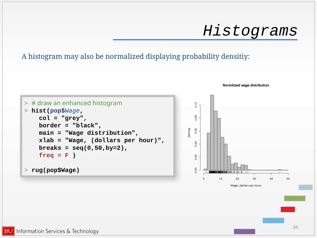
Histograms 34 A histogram may also be normalized displaying probability densitiy: > # draw an enhanced histogram
> hist(pop$Wage,
col = "grey",
border = "black",
main = "Wage distribution",
xlab = "Wage, (dollars per hour)",
breaks = seq(0,50,by=2),
freq = F )
> rug(pop$Wage)<br>
> hist(pop$Wage,
col = "grey",
border = "black",
main = "Wage distribution",
xlab = "Wage, (dollars per hour)",
breaks = seq(0,50,by=2),
freq = F )
> rug(pop$Wage)<br>
35
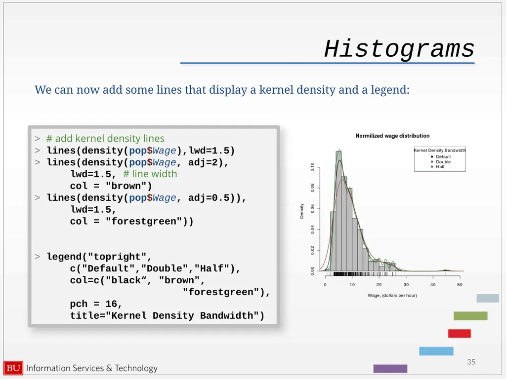
Histograms 35 We can now add some lines that display a kernel density and a legend: > # add kernel density lines
> lines(density(pop$Wage),lwd=1.5)
> lines(density(pop$Wage, adj=2),
lwd=1.5, # line width
col = "brown")
> lines(density(pop$Wage, adj=0.5)),
lwd=1.5,
col = "forestgreen"))
> legend("topright",
c("Default","Double","Half"),
col=c("black“, "brown",
"forestgreen"),
pch = 16,
title="Kernel Density Bandwidth")<br>
> lines(density(pop$Wage),lwd=1.5)
> lines(density(pop$Wage, adj=2),
lwd=1.5, # line width
col = "brown")
> lines(density(pop$Wage, adj=0.5)),
lwd=1.5,
col = "forestgreen"))
> legend("topright",
c("Default","Double","Half"),
col=c("black“, "brown",
"forestgreen"),
pch = 16,
title="Kernel Density Bandwidth")<br>
36
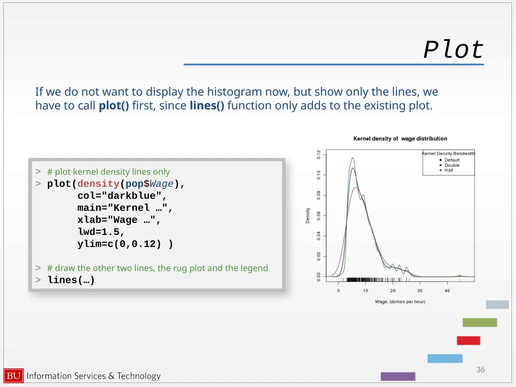
Plot 36 If we do not want to display the histogram now, but show only the lines, we have to call plot() first, since lines() function only adds to the existing plot. > # plot kernel density lines only
> plot(density(pop$Wage),
col="darkblue",
main="Kernel …",
xlab="Wage …",
lwd=1.5,
ylim=c(0,0.12) )
> # draw the other two lines, the rug plot and the legend
> lines(…)<br>
> plot(density(pop$Wage),
col="darkblue",
main="Kernel …",
xlab="Wage …",
lwd=1.5,
ylim=c(0,0.12) )
> # draw the other two lines, the rug plot and the legend
> lines(…)<br>
37
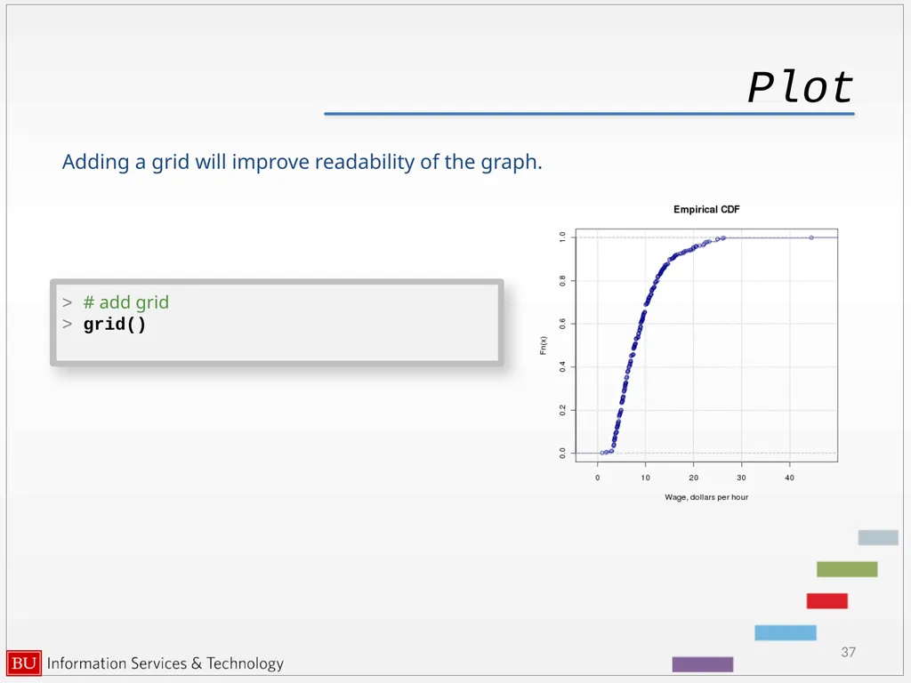
Plot 37 Adding a grid will improve readability of the graph. > # add grid
> grid()<br>
> grid()<br>
38
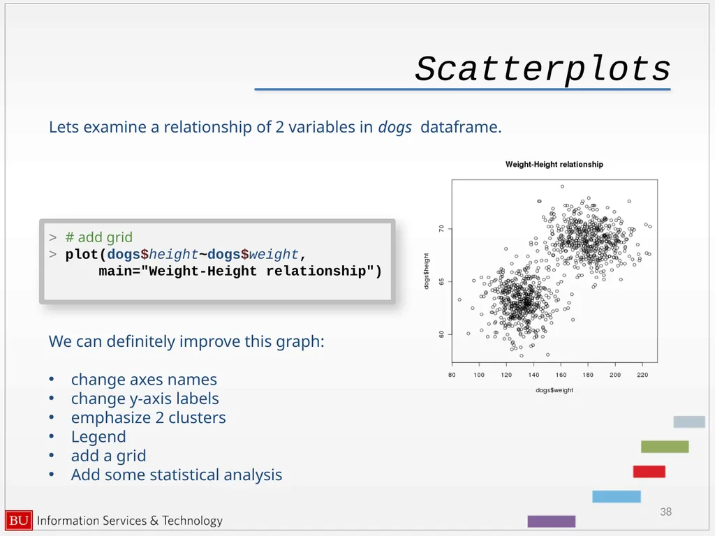
Scatterplots 38 Lets examine a relationship of 2 variables in dogs dataframe. > # add grid
> plot(dogs$height~dogs$weight,
main="Weight-Height relationship") We can definitely improve this graph:
change axes names
change y-axis labels
emphasize 2 clusters
Legend
add a grid
Add some statistical analysis<br>
> plot(dogs$height~dogs$weight,
main="Weight-Height relationship") We can definitely improve this graph:
change axes names
change y-axis labels
emphasize 2 clusters
Legend
add a grid
Add some statistical analysis<br>
39
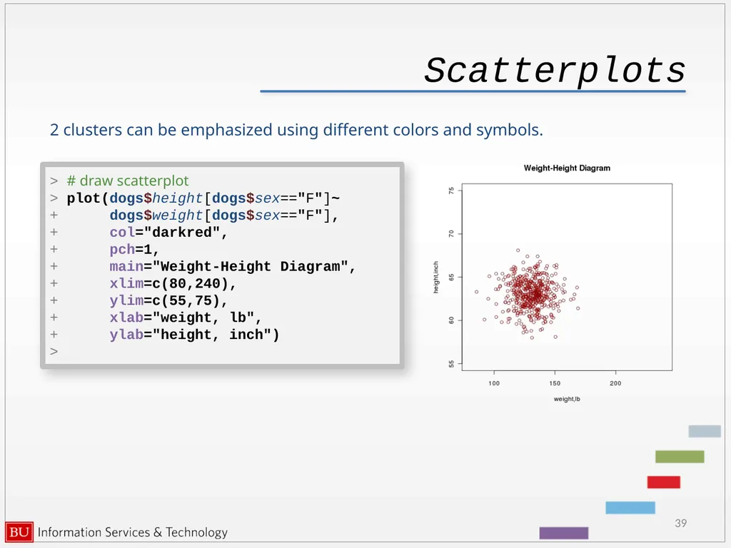
Scatterplots 39 2 clusters can be emphasized using different colors and symbols. > # draw scatterplot
> plot(dogs$height[dogs$sex=="F"]~
+ dogs$weight[dogs$sex=="F"],
+ col="darkred",
+ pch=1,
+ main="Weight-Height Diagram",
+ xlim=c(80,240),
+ ylim=c(55,75),
+ xlab="weight, lb",
+ ylab="height, inch")
><br>
> plot(dogs$height[dogs$sex=="F"]~
+ dogs$weight[dogs$sex=="F"],
+ col="darkred",
+ pch=1,
+ main="Weight-Height Diagram",
+ xlim=c(80,240),
+ ylim=c(55,75),
+ xlab="weight, lb",
+ ylab="height, inch")
><br>
40
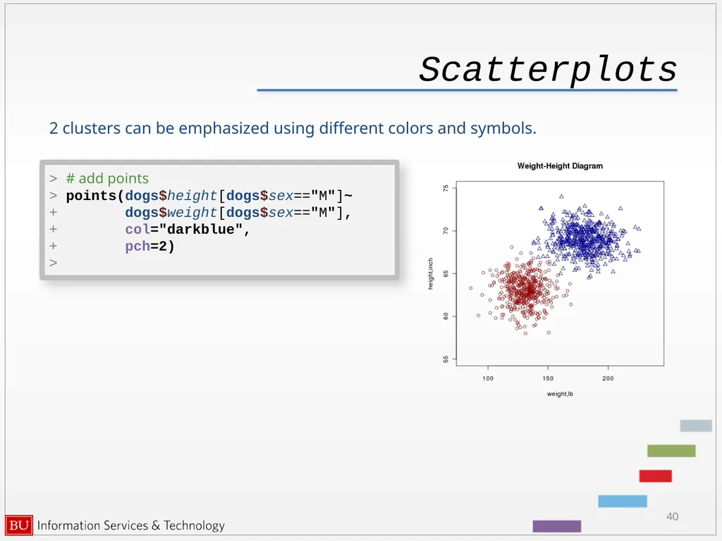
Scatterplots 40 2 clusters can be emphasized using different colors and symbols. > # add points
> points(dogs$height[dogs$sex=="M"]~
+ dogs$weight[dogs$sex=="M"],
+ col="darkblue",
+ pch=2)
><br>
> points(dogs$height[dogs$sex=="M"]~
+ dogs$weight[dogs$sex=="M"],
+ col="darkblue",
+ pch=2)
><br>
41
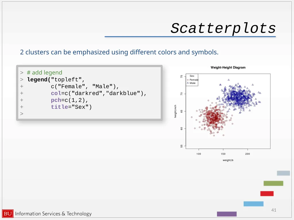
Scatterplots 41 2 clusters can be emphasized using different colors and symbols. > # add legend
> legend("topleft",
+ c("Female", "Male"),
+ col=c("darkred","darkblue"),
+ pch=c(1,2),
+ title="Sex")
><br>
> legend("topleft",
+ c("Female", "Male"),
+ col=c("darkred","darkblue"),
+ pch=c(1,2),
+ title="Sex")
><br>
42
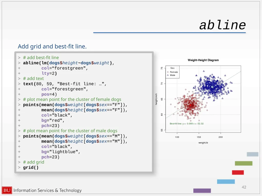
abline 42 > # add best-fit line
> abline(lm(dogs$height~dogs$weight),
+ col="forestgreen",
+ lty=2)
> # add text
> text(80, 59, "Best-fit line: …",
+ col="forestgreen",
+ pos=4)
> # plot mean point for the cluster of female dogs
> points(mean(dogs$weight[dogs$sex=="F"]),
+ mean(dogs$height[dogs$sex=="F"]),
+ col="black",
+ bg="red",
+ pch=23)
> # plot mean point for the cluster of male dogs
> points(mean(dogs$weight[dogs$sex=="M"]),
+ mean(dogs$height[dogs$sex=="M"]),
+ col="black",
+ bg="lightblue",
+ pch=23)
> # add grid
> grid() Add grid and best-fit line.<br>
> abline(lm(dogs$height~dogs$weight),
+ col="forestgreen",
+ lty=2)
> # add text
> text(80, 59, "Best-fit line: …",
+ col="forestgreen",
+ pos=4)
> # plot mean point for the cluster of female dogs
> points(mean(dogs$weight[dogs$sex=="F"]),
+ mean(dogs$height[dogs$sex=="F"]),
+ col="black",
+ bg="red",
+ pch=23)
> # plot mean point for the cluster of male dogs
> points(mean(dogs$weight[dogs$sex=="M"]),
+ mean(dogs$height[dogs$sex=="M"]),
+ col="black",
+ bg="lightblue",
+ pch=23)
> # add grid
> grid() Add grid and best-fit line.<br>
43
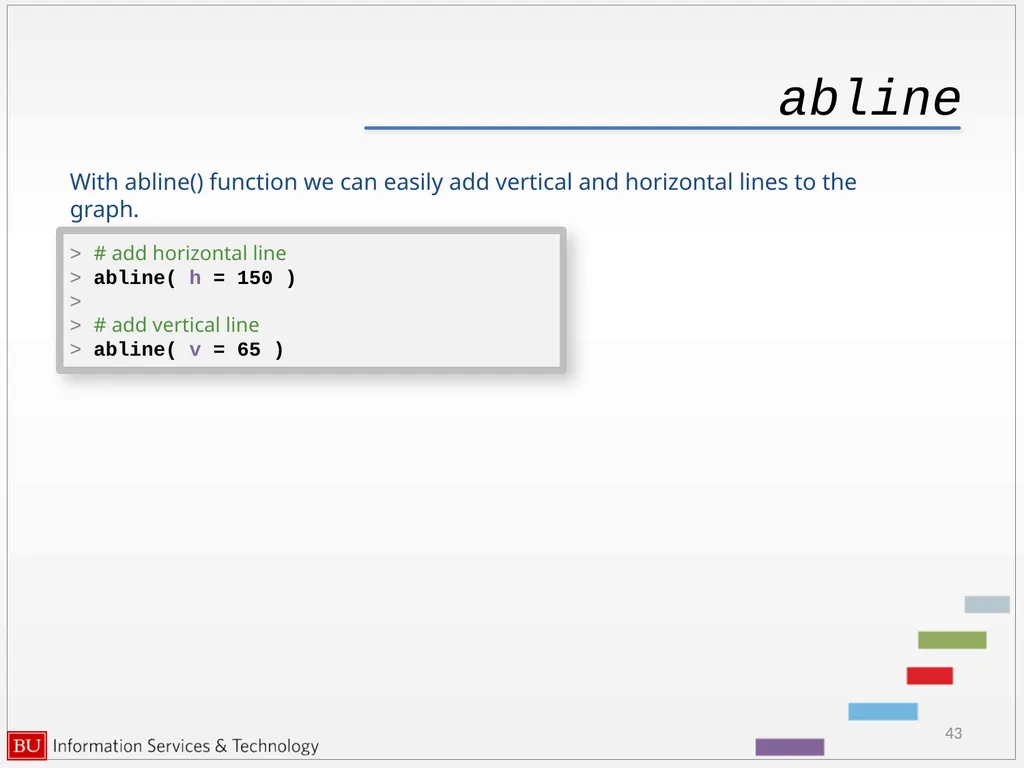
abline 43 > # add horizontal line
> abline( h = 150 )
>
> # add vertical line
> abline( v = 65 ) With abline() function we can easily add vertical and horizontal lines to the graph.<br>
> abline( h = 150 )
>
> # add vertical line
> abline( v = 65 ) With abline() function we can easily add vertical and horizontal lines to the graph.<br>
44
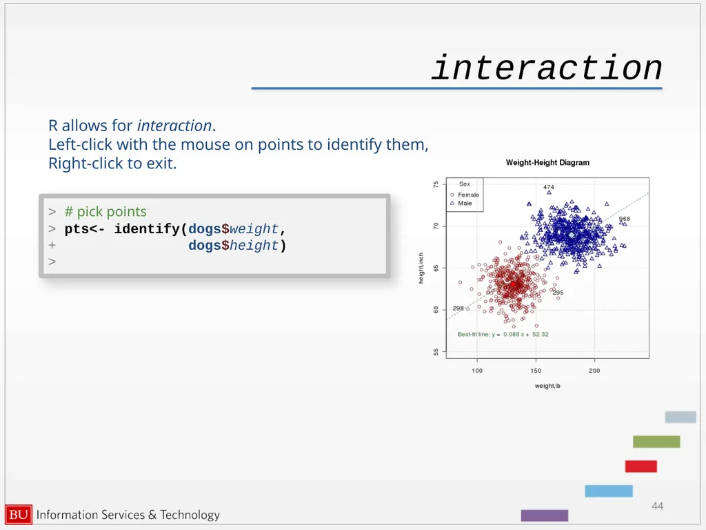
interaction 44 R allows for interaction.
Left-click with the mouse on points to identify them,
Right-click to exit. > # pick points
> pts<- identify(dogs$weight,
+ dogs$height)
><br>
Left-click with the mouse on points to identify them,
Right-click to exit. > # pick points
> pts<- identify(dogs$weight,
+ dogs$height)
><br>
45
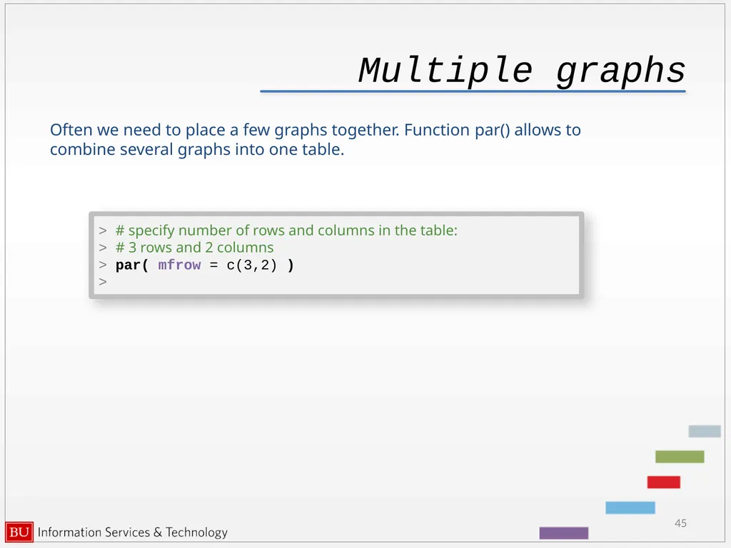
Multiple graphs 45 Often we need to place a few graphs together. Function par() allows to combine several graphs into one table. > # specify number of rows and columns in the table:
> # 3 rows and 2 columns
> par( mfrow = c(3,2) )
><br>
> # 3 rows and 2 columns
> par( mfrow = c(3,2) )
><br>
46
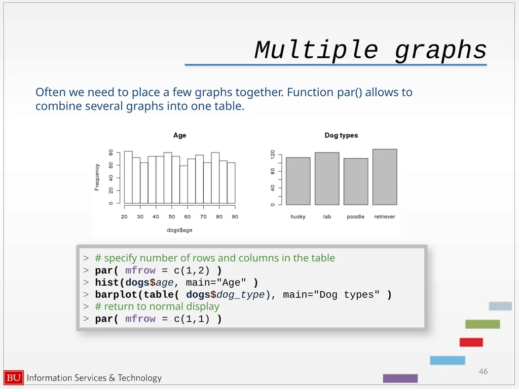
Multiple graphs 46 Often we need to place a few graphs together. Function par() allows to combine several graphs into one table. > # specify number of rows and columns in the table
> par( mfrow = c(1,2) )
> hist(dogs$age, main="Age" )
> barplot(table( dogs$dog_type), main="Dog types" )
> # return to normal display
> par( mfrow = c(1,1) )<br>
> par( mfrow = c(1,2) )
> hist(dogs$age, main="Age" )
> barplot(table( dogs$dog_type), main="Dog types" )
> # return to normal display
> par( mfrow = c(1,1) )<br>
47
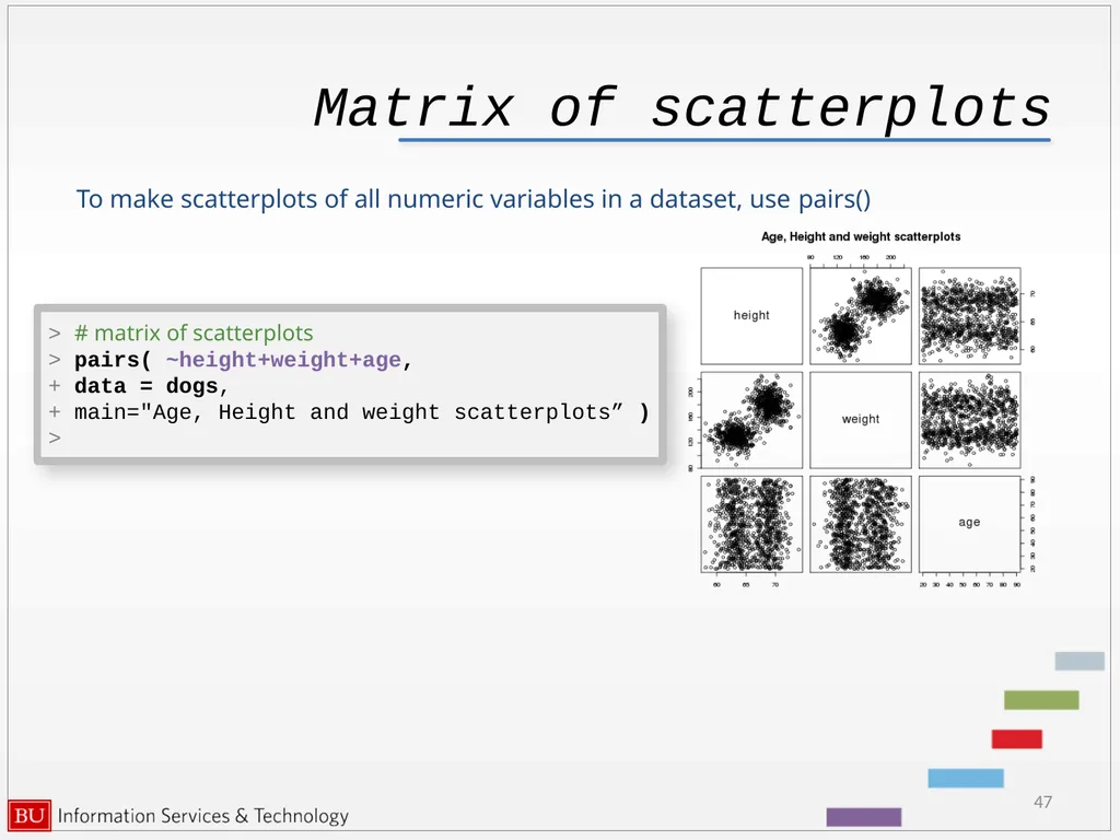
Matrix of scatterplots 47 To make scatterplots of all numeric variables in a dataset, use pairs() > # matrix of scatterplots
> pairs( ~height+weight+age,
+ data = dogs,
+ main="Age, Height and weight scatterplots” )
><br>
> pairs( ~height+weight+age,
+ data = dogs,
+ main="Age, Height and weight scatterplots” )
><br>
48
Future R sessions 48 Some programming, debugging and optimization techniques will be covered in the third session “Programming in R”<br>
49
49 This tutorial has been made possible by
Scientific Computing and Visualization
group
at Boston University.
Katia Oleinik koleinik@bu.edu
http://www.bu.edu/tech/research/training/tutorials/list/<br>
Scientific Computing and Visualization
group
at Boston University.
Katia Oleinik koleinik@bu.edu
http://www.bu.edu/tech/research/training/tutorials/list/<br>