Presentation template Guide for creating on-brand presentations Notes for Using This Template This template is designed to provide a foundation for developing Section 508 compliant course documents. Course content should be developed in the
"Presentation template Guide for creating on-brand" is the property of its rightful owner. Permission is granted to
download and print the materials on this website for personal, non-commercial use only, and to display it
on your personal computer provided you do not modify the materials and that you retain all copyright
notices contained in the materials. By downloading content from our website, you accept the terms of this
agreement.
Presentation Transcript
01
Presentation template Guide for creating on-brand presentations Notes for Using This Template
This template is designed to provide a foundation for developing Section 508 compliant course documents. Course content should be developed in the template following best practices in accessible document design.
This PowerPoint Template uses master slides to ensure that styles and certain pieces of content remain consistent. When adding slides, insert them using the “New Slide” command on the Ribbon—you’ll be able to select from the available style templates. New layouts can be added to the master as needed.
The Slide Master view can be opened from the View tab in the Ribbon. In the Slide Master view, use the first slide master (1) to enter the Course Name and the Module number in the footer—this will apply to all slides except for the cover. While in the Slide Master view, enter the course information on the cover slide. The font size can be adjusted as needed for longer course titles. All fonts on the cover must be 18pt or larger.
Included graphics (with the exception of the FEMA logo) are marked as decorative. If you are using an older version of Microsoft PowerPoint the Mark as Decorative feature may not be available and these items will need to be manually marked as decorative by using the null tag (““) in the alt text pane.
Please delete this slide prior to finalizing the document.<br>
02
Divider Slide (Option 1) This is a divider slide<br>
03
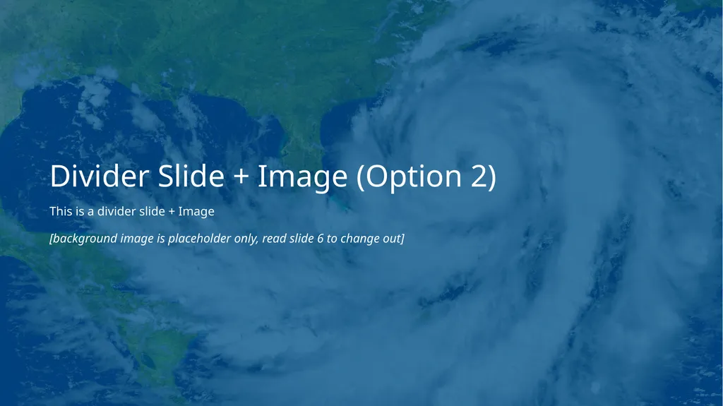
Divider Slide + Image (Option 2) This is a divider slide + Image
[background image is placeholder only, read slide 6 to change out]<br>
04
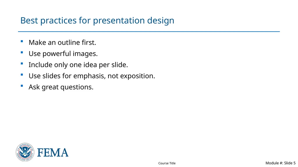
Best practices for presentation design Make an outline first.
Use powerful images.
Include only one idea per slide.
Use slides for emphasis, not exposition.
Ask great questions.<br>
05
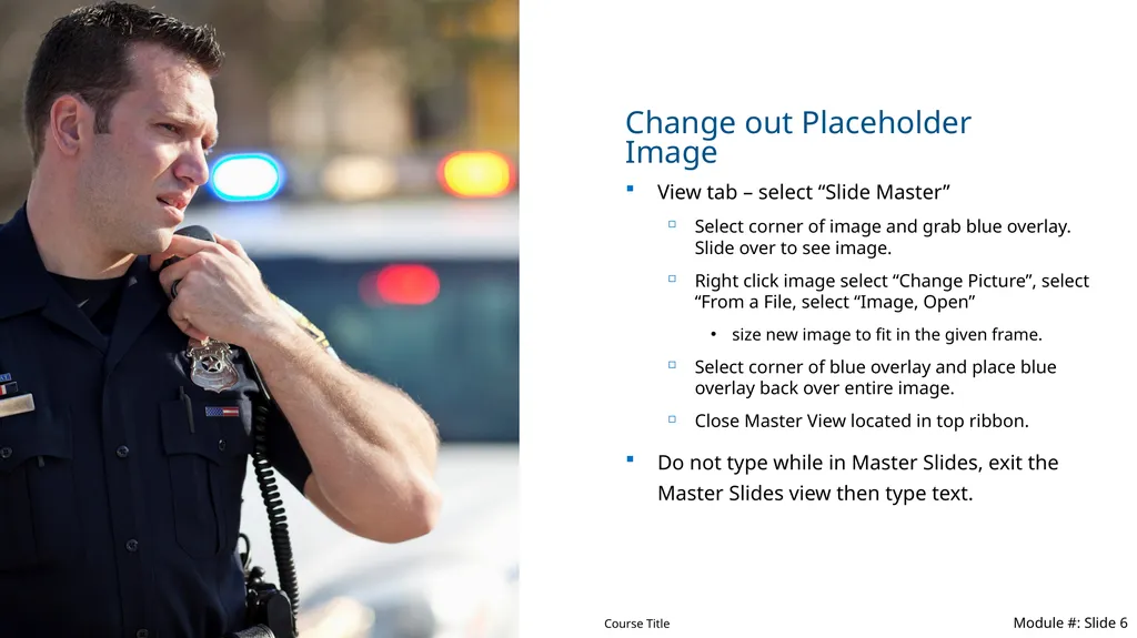
Change out Placeholder Image View tab – select “Slide Master”
Select corner of image and grab blue overlay. Slide over to see image.
Right click image select “Change Picture”, select “From a File, select “Image, Open”
size new image to fit in the given frame.
Select corner of blue overlay and place blue overlay back over entire image.
Close Master View located in top ribbon.
Do not type while in Master Slides, exit the Master Slides view then type text.<br>
06
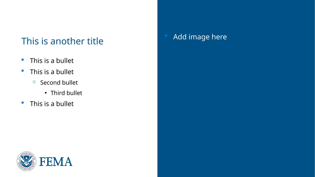
This is another title This is a bullet
This is a bullet
Second bullet
Third bullet
This is a bullet Add image here<br>
07
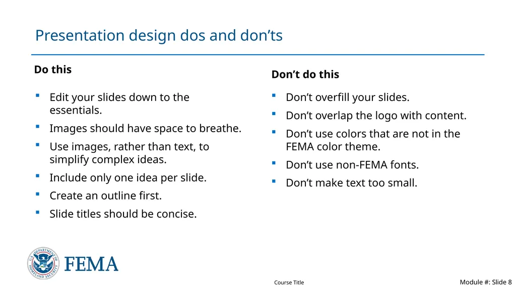
Presentation design dos and don’ts Do this Edit your slides down to the essentials.
Images should have space to breathe.
Use images, rather than text, to simplify complex ideas.
Include only one idea per slide.
Create an outline first.
Slide titles should be concise. Don’t do this Don’t overfill your slides.
Don’t overlap the logo with content.
Don’t use colors that are not in the FEMA color theme.
Don’t use non-FEMA fonts.
Don’t make text too small.<br>
08
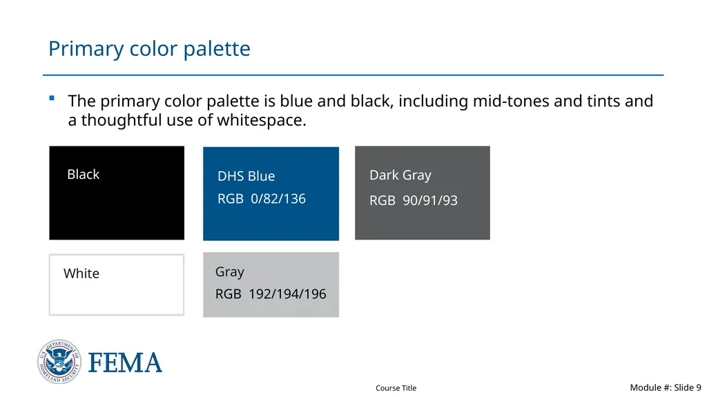
Primary color palette The primary color palette is blue and black, including mid-tones and tints and a thoughtful use of whitespace.<br>
09
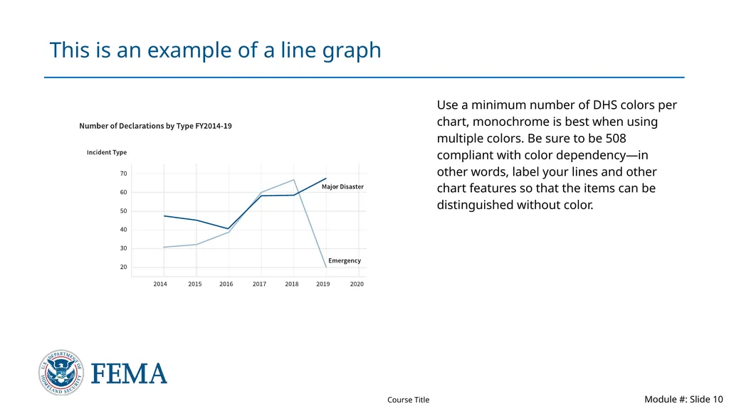
This is an example of a line graph Use a minimum number of DHS colors per chart, monochrome is best when using multiple colors. Be sure to be 508 compliant with color dependency—in other words, label your lines and other chart features so that the items can be distinguished without color.<br>
10
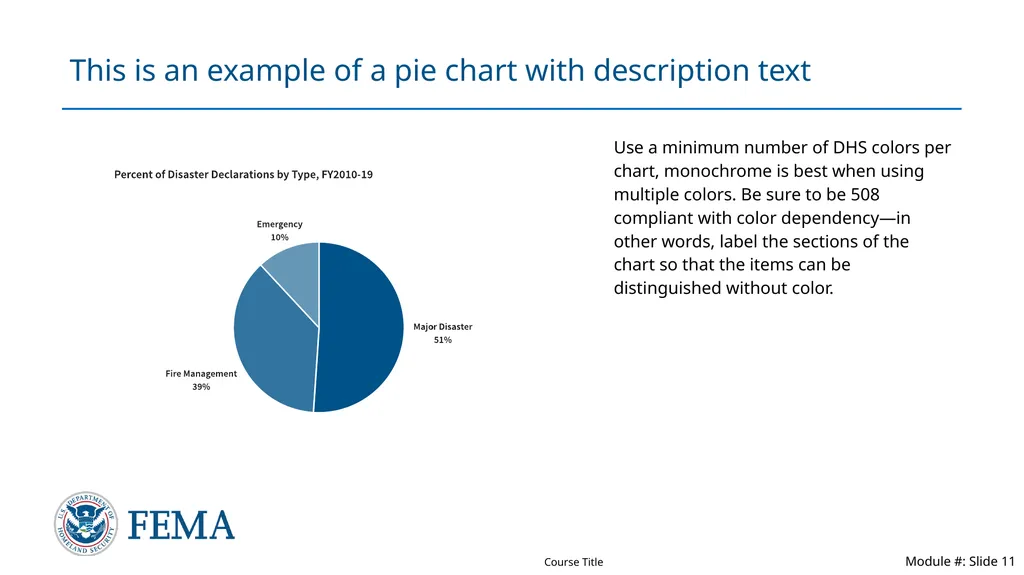
This is an example of a pie chart with description text Use a minimum number of DHS colors per chart, monochrome is best when using multiple colors. Be sure to be 508 compliant with color dependency—in other words, label the sections of the chart so that the items can be distinguished without color.<br>
11
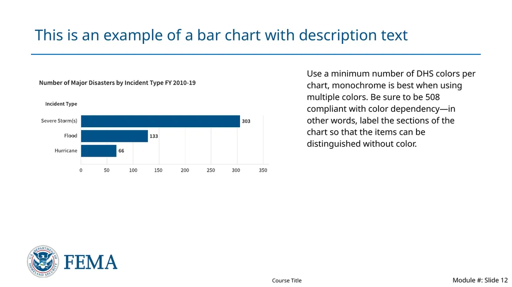
This is an example of a bar chart with description text Use a minimum number of DHS colors per chart, monochrome is best when using multiple colors. Be sure to be 508 compliant with color dependency—in other words, label the sections of the chart so that the items can be distinguished without color.<br>
12
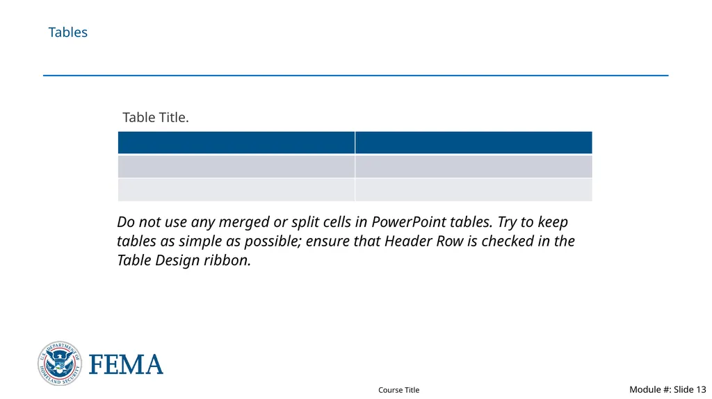
Tables Table Title. Do not use any merged or split cells in PowerPoint tables. Try to keep tables as simple as possible; ensure that Header Row is checked in the Table Design ribbon.<br>
13
How to use icons An icon should never stand alone. It should always appear with descriptive text.
An icon size should never be larger than 1 inch.
Icons should always be one color.
Icon should either be filled or outlined and never use both in the same presentation.<br>
14
This is an example of a two-line header, if needed. We recommend keeping headlines to one line.<br>
15
Contact Slide Option 1 First Name Last Name
Title
Email.Address@fema.dhs.gov
First Name Last Name
Title
Email.Address@fema.dhs.gov Picture here Picture here<br>