01
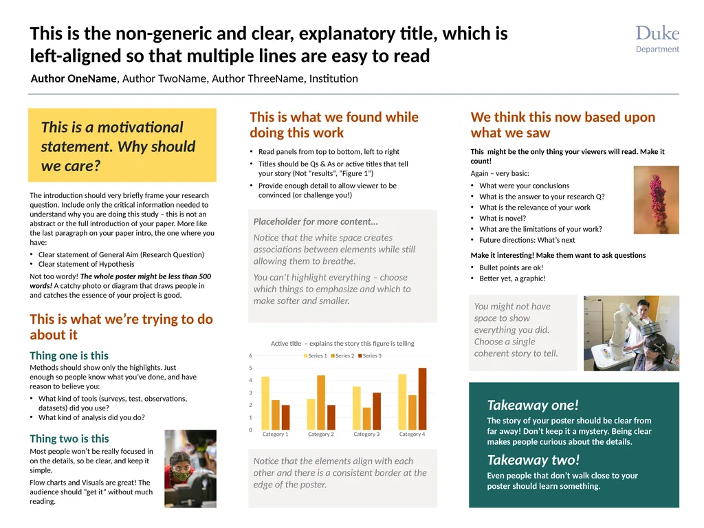
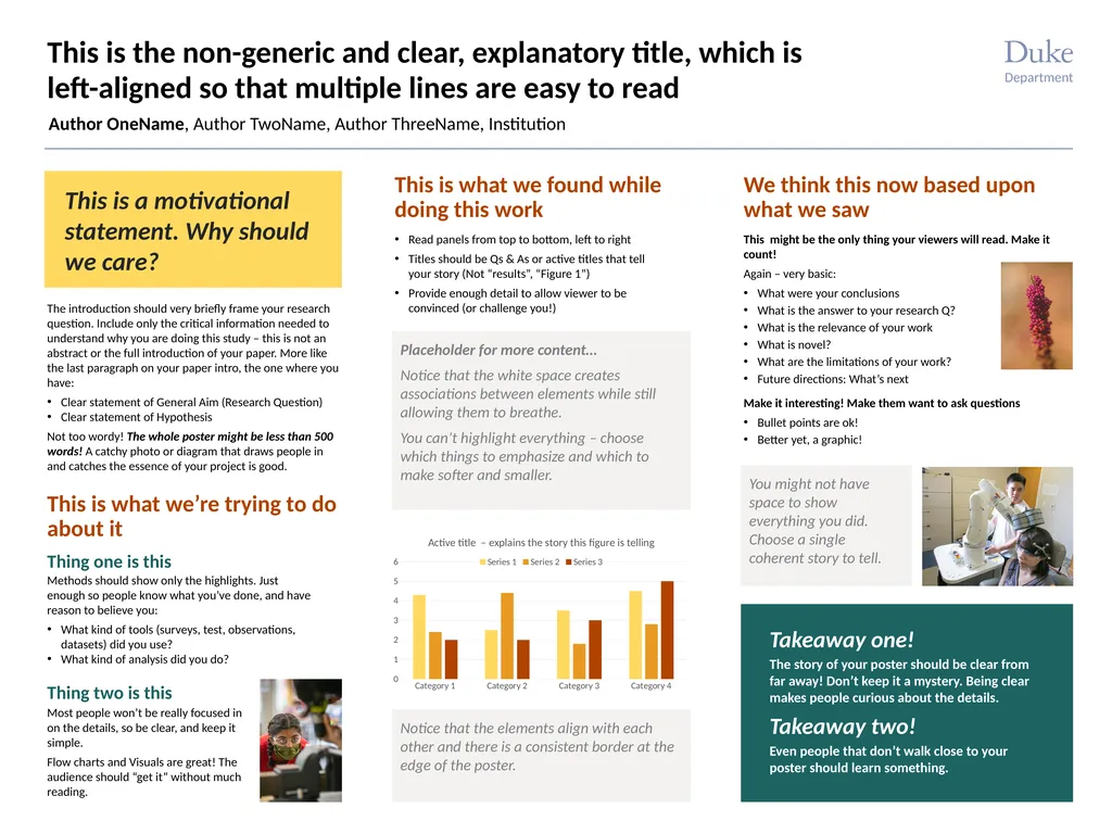
This is the non-generic and clear, explanatory title, which is left-aligned so that multiple lines are easy to read Author OneName, Author TwoName, Author ThreeName, Institution This is a motivational statement. Why should we care? Methods should show only the highlights. Just enough so people know what you’ve done, and have reason to believe you:
What kind of tools (surveys, test, observations, datasets) did you use?
What kind of analysis did you do? This is what we’re trying to do about it This is what we found while doing this work Read panels from top to bottom, left to right
Titles should be Qs & As or active titles that tell your story (Not “results”, “Figure 1”)
Provide enough detail to allow viewer to be convinced (or challenge you!) Takeaway one! We think this now based upon what we saw Takeaway two! The story of your poster should be clear from far away! Don’t keep it a mystery. Being clear makes people curious about the details. Even people that don’t walk close to your poster should learn something. Thing one is this Thing two is this The introduction should very briefly frame your research question. Include only the critical information needed to understand why you are doing this study – this is not an abstract or the full introduction of your paper. More like the last paragraph on your paper intro, the one where you have:
Clear statement of General Aim (Research Question)
Clear statement of Hypothesis
Not too wordy! The whole poster might be less than 500 words! A catchy photo or diagram that draws people in and catches the essence of your project is good. Most people won’t be really focused in on the details, so be clear, and keep it simple.
Flow charts and Visuals are great! The audience should “get it” without much reading. Notice that the elements align with each other and there is a consistent border at the edge of the poster. This might be the only thing your viewers will read. Make it count!
Again – very basic:
What were your conclusions
What is the answer to your research Q?
What is the relevance of your work
What is novel?
What are the limitations of your work?
Future directions: What’s next
Make it interesting! Make them want to ask questions
Bullet points are ok!
Better yet, a graphic! Placeholder for more content…
Notice that the white space creates associations between elements while still allowing them to breathe.
You can’t highlight everything – choose which things to emphasize and which to make softer and smaller. You might not have space to show everything you did. Choose a single coherent story to tell. Department<br>
02
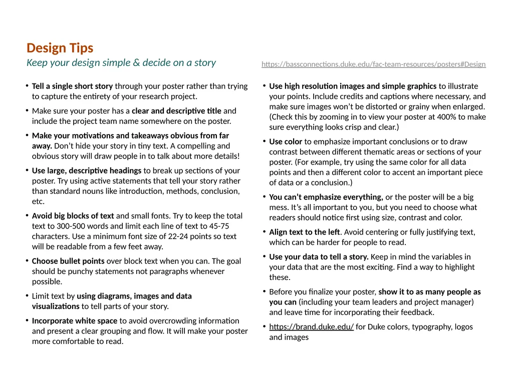
Tell a single short story through your poster rather than trying to capture the entirety of your research project.
Make sure your poster has a clear and descriptive title and include the project team name somewhere on the poster.
Make your motivations and takeaways obvious from far away. Don’t hide your story in tiny text. A compelling and obvious story will draw people in to talk about more details!
Use large, descriptive headings to break up sections of your poster. Try using active statements that tell your story rather than standard nouns like introduction, methods, conclusion, etc.
Avoid big blocks of text and small fonts. Try to keep the total text to 300-500 words and limit each line of text to 45-75 characters. Use a minimum font size of 22-24 points so text will be readable from a few feet away.
Choose bullet points over block text when you can. The goal should be punchy statements not paragraphs whenever possible.
Limit text by using diagrams, images and data visualizations to tell parts of your story.
Incorporate white space to avoid overcrowding information and present a clear grouping and flow. It will make your poster more comfortable to read.
Use high resolution images and simple graphics to illustrate your points. Include credits and captions where necessary, and make sure images won’t be distorted or grainy when enlarged. (Check this by zooming in to view your poster at 400% to make sure everything looks crisp and clear.)
Use color to emphasize important conclusions or to draw contrast between different thematic areas or sections of your poster. (For example, try using the same color for all data points and then a different color to accent an important piece of data or a conclusion.)
You can’t emphasize everything, or the poster will be a big mess. It’s all important to you, but you need to choose what readers should notice first using size, contrast and color.
Align text to the left. Avoid centering or fully justifying text, which can be harder for people to read.
Use your data to tell a story. Keep in mind the variables in your data that are the most exciting. Find a way to highlight these.
Before you finalize your poster, show it to as many people as you can (including your team leaders and project manager) and leave time for incorporating their feedback.
https://brand.duke.edu/ for Duke colors, typography, logos and images Design Tips
Keep your design simple & decide on a story https://bassconnections.duke.edu/fac-team-resources/posters#Design<br>