
UNDERSTANDING AIR QUALITY WITH R Cosmos Senyo
CB
Published · 16 slides · 0 views

1 / 1


Description
UNDERSTANDING AIR QUALITY WITH R Cosmos Senyo Wemegah Research Fellow at Institute of Earth Observation Research and Innovation Centre (IORIC) University of Energy and Natural Resources (UENR), Ghana. R R is a free, open-source programming
Related Topics
Share
Embed code
Download this presentation From Below
"UNDERSTANDING AIR QUALITY WITH R Cosmos Senyo" is the property of its rightful owner. Permission is granted to download and print the materials on this website for personal, non-commercial use only, and to display it on your personal computer provided you do not modify the materials and that you retain all copyright notices contained in the materials. By downloading content from our website, you accept the terms of this agreement.
Presentation Transcript
01
UNDERSTANDING AIR QUALITY WITH R Cosmos Senyo Wemegah
Research Fellow at Institute of Earth Observation Research and Innovation Centre (IORIC)
University of Energy and Natural Resources (UENR), Ghana.<br>
Research Fellow at Institute of Earth Observation Research and Innovation Centre (IORIC)
University of Energy and Natural Resources (UENR), Ghana.<br>
02
R R is a free, open-source programming language (widely accessible and has no license restrictions) used for statistical computing, data analysis, and visualization. R has a large community that can assist with questions and other R-related topics.
R is a cross-platform language that can be used on Windows, Mac OSX, or Linux.
R has a simple programming language with loops, conditionals, input and output functions, and the ability to write recursive functions.
R is used in many industries for various purposes, including:
Data science: Data cleaning, analysis, and visualization.
Academic research: Creating reproducible research with statistics and graphics.
Health care: Applied in epidemiology to track and predict the spread of disease, and in drug discovery to analyze pre-clinical trial data.
Financial technology: Credit scoring, risk management, and statistical analyses for investment predictions.
You can learn more about R and find documentation on the R Project Website. You can also check out resources like: DataCamp, Codecademy, Coursera, Noble Desktop<br>
R is a cross-platform language that can be used on Windows, Mac OSX, or Linux.
R has a simple programming language with loops, conditionals, input and output functions, and the ability to write recursive functions.
R is used in many industries for various purposes, including:
Data science: Data cleaning, analysis, and visualization.
Academic research: Creating reproducible research with statistics and graphics.
Health care: Applied in epidemiology to track and predict the spread of disease, and in drug discovery to analyze pre-clinical trial data.
Financial technology: Credit scoring, risk management, and statistical analyses for investment predictions.
You can learn more about R and find documentation on the R Project Website. You can also check out resources like: DataCamp, Codecademy, Coursera, Noble Desktop<br>
03
Openair Openair is an R package developed for the purpose of analyzing air quality data or more generally atmospheric composition data.
The package is extensively used in academia, the public and private sectors.
More information on its development can be found here and the manual for its use can be downloaded here.<br>
The package is extensively used in academia, the public and private sectors.
More information on its development can be found here and the manual for its use can be downloaded here.<br>
04
Downloads and Installations To install the R and Rstudio;
First download the R setup and install on the computer
Second download and install the RStudio setup
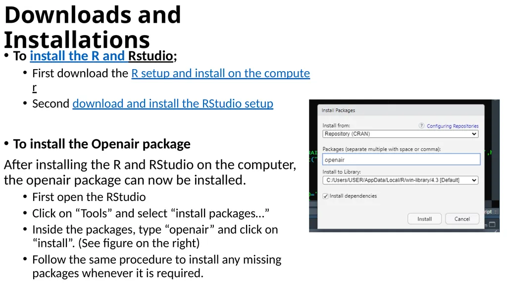
To install the Openair package
After installing the R and RStudio on the computer, the openair package can now be installed.
First open the RStudio
Click on “Tools” and select “install packages…”
Inside the packages, type “openair” and click on “install”. (See figure on the right)
Follow the same procedure to install any missing packages whenever it is required.<br>
First download the R setup and install on the computer
Second download and install the RStudio setup
To install the Openair package
After installing the R and RStudio on the computer, the openair package can now be installed.
First open the RStudio
Click on “Tools” and select “install packages…”
Inside the packages, type “openair” and click on “install”. (See figure on the right)
Follow the same procedure to install any missing packages whenever it is required.<br>
05
Applying openair to understand Air Quality Core Features
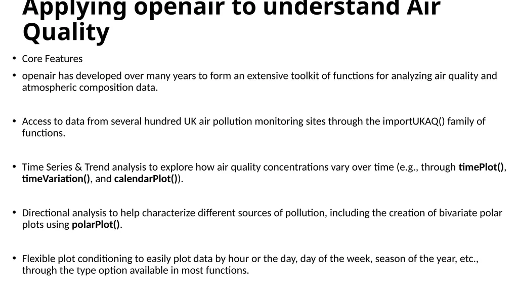
openair has developed over many years to form an extensive toolkit of functions for analyzing air quality and atmospheric composition data.
Access to data from several hundred UK air pollution monitoring sites through the importUKAQ() family of functions.
Time Series & Trend analysis to explore how air quality concentrations vary over time (e.g., through timePlot(), timeVariation(), and calendarPlot()).
Directional analysis to help characterize different sources of pollution, including the creation of bivariate polar plots using polarPlot().
Flexible plot conditioning to easily plot data by hour or the day, day of the week, season of the year, etc., through the type option available in most functions.<br>
openair has developed over many years to form an extensive toolkit of functions for analyzing air quality and atmospheric composition data.
Access to data from several hundred UK air pollution monitoring sites through the importUKAQ() family of functions.
Time Series & Trend analysis to explore how air quality concentrations vary over time (e.g., through timePlot(), timeVariation(), and calendarPlot()).
Directional analysis to help characterize different sources of pollution, including the creation of bivariate polar plots using polarPlot().
Flexible plot conditioning to easily plot data by hour or the day, day of the week, season of the year, etc., through the type option available in most functions.<br>
06
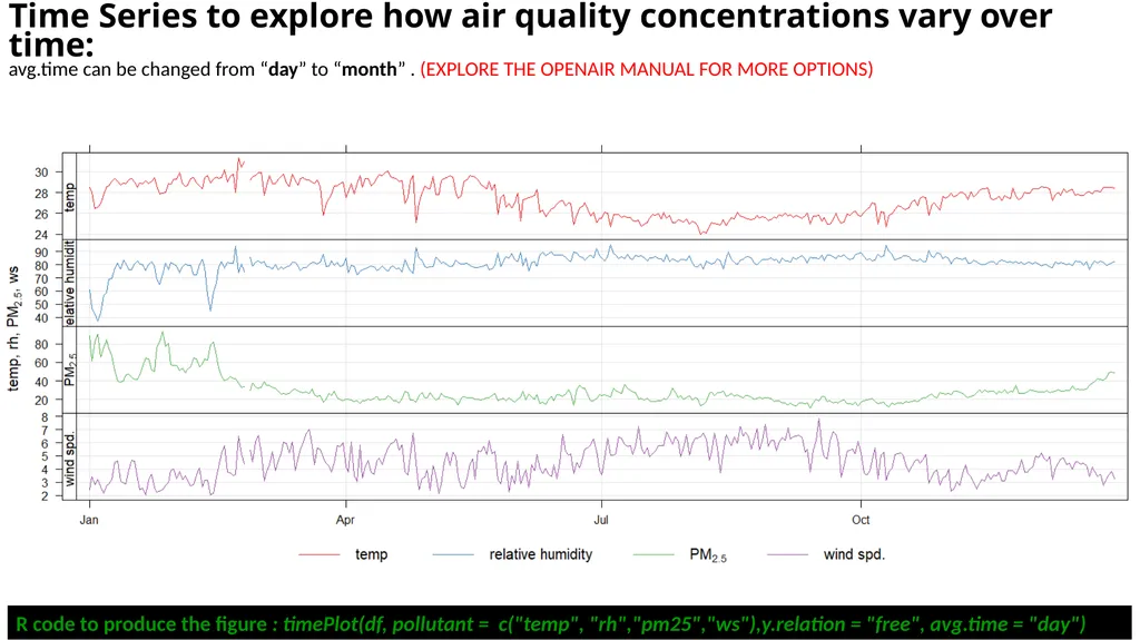
Time Series to explore how air quality concentrations vary over time:
avg.time can be changed from “day” to “month” . (EXPLORE THE OPENAIR MANUAL FOR MORE OPTIONS) R code to produce the figure : timePlot(df, pollutant = c("temp", "rh","pm25","ws"),y.relation = "free", avg.time = "day")<br>
07
Time Series to explore how air quality concentrations vary over time:
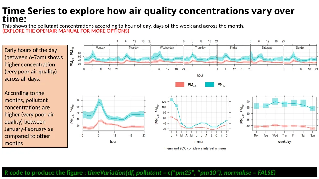
This shows the pollutant concentrations according to hour of day, days of the week and across the month.
(EXPLORE THE OPENAIR MANUAL FOR MORE OPTIONS) Early hours of the day (between 6-7am) shows higher concentration (very poor air quality) across all days.
According to the months, pollutant concentrations are higher (very poor air quality) between January-February as compared to other months R code to produce the figure : timeVariation(df, pollutant = c("pm25", "pm10"), normalise = FALSE)<br>
According to the months, pollutant concentrations are higher (very poor air quality) between January-February as compared to other months R code to produce the figure : timeVariation(df, pollutant = c("pm25", "pm10"), normalise = FALSE)<br>
08
Time Series to explore how air quality concentrations vary over time:
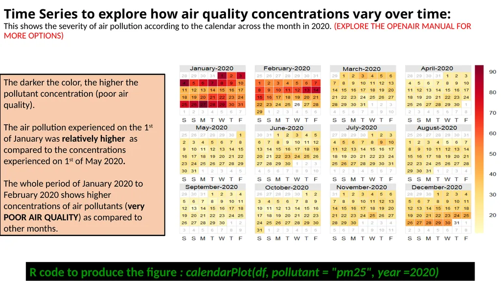
This shows the severity of air pollution according to the calendar across the month in 2020. (EXPLORE THE OPENAIR MANUAL FOR MORE OPTIONS) R code to produce the figure : calendarPlot(df, pollutant = "pm25", year =2020) The darker the color, the higher the pollutant concentration (poor air quality).
The air pollution experienced on the 1st of January was relatively higher as compared to the concentrations experienced on 1st of May 2020.
The whole period of January 2020 to February 2020 shows higher concentrations of air pollutants (very POOR AIR QUALITY) as compared to other months.<br>
The air pollution experienced on the 1st of January was relatively higher as compared to the concentrations experienced on 1st of May 2020.
The whole period of January 2020 to February 2020 shows higher concentrations of air pollutants (very POOR AIR QUALITY) as compared to other months.<br>
09
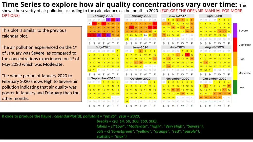
Time Series to explore how air quality concentrations vary over time: This shows the severity of air pollution according to the calendar across the month in 2020. (EXPLORE THE OPENAIR MANUAL FOR MORE OPTIONS) R code to produce the figure : calendarPlot(df, pollutant = "pm25", year = 2020,
breaks = c(0, 14, 50, 100, 150, 300),
labels = c("Low", "Moderate", "High", "Very High", "Severe"),
cols = c("forestgreen", "yellow", "orange", "red", "purple"),
statistic = "max") This plot is similar to the previous calendar plot.
The air pollution experienced on the 1st of January was Severe as compared to the concentrations experienced on 1st of May 2020 which was Moderate.
The whole period of January 2020 to February 2020 shows High to Severe air pollution indicating that air quality was poorer in January and February than the other months.<br>
breaks = c(0, 14, 50, 100, 150, 300),
labels = c("Low", "Moderate", "High", "Very High", "Severe"),
cols = c("forestgreen", "yellow", "orange", "red", "purple"),
statistic = "max") This plot is similar to the previous calendar plot.
The air pollution experienced on the 1st of January was Severe as compared to the concentrations experienced on 1st of May 2020 which was Moderate.
The whole period of January 2020 to February 2020 shows High to Severe air pollution indicating that air quality was poorer in January and February than the other months.<br>
10
Directional analysis to help characterize different sources of pollution:
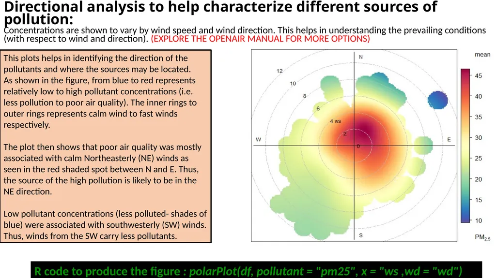
Concentrations are shown to vary by wind speed and wind direction. This helps in understanding the prevailing conditions (with respect to wind and direction). (EXPLORE THE OPENAIR MANUAL FOR MORE OPTIONS) This plots helps in identifying the direction of the pollutants and where the sources may be located.
As shown in the figure, from blue to red represents relatively low to high pollutant concentrations (i.e. less pollution to poor air quality). The inner rings to outer rings represents calm wind to fast winds respectively.
The plot then shows that poor air quality was mostly associated with calm Northeasterly (NE) winds as seen in the red shaded spot between N and E. Thus, the source of the high pollution is likely to be in the NE direction.
Low pollutant concentrations (less polluted- shades of blue) were associated with southwesterly (SW) winds. Thus, winds from the SW carry less pollutants. R code to produce the figure : polarPlot(df, pollutant = "pm25", x = "ws ,wd = "wd")<br>
As shown in the figure, from blue to red represents relatively low to high pollutant concentrations (i.e. less pollution to poor air quality). The inner rings to outer rings represents calm wind to fast winds respectively.
The plot then shows that poor air quality was mostly associated with calm Northeasterly (NE) winds as seen in the red shaded spot between N and E. Thus, the source of the high pollution is likely to be in the NE direction.
Low pollutant concentrations (less polluted- shades of blue) were associated with southwesterly (SW) winds. Thus, winds from the SW carry less pollutants. R code to produce the figure : polarPlot(df, pollutant = "pm25", x = "ws ,wd = "wd")<br>
11
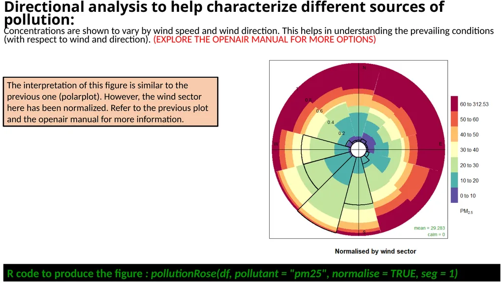
The interpretation of this figure is similar to the previous one (polarplot). However, the wind sector here has been normalized. Refer to the previous plot and the openair manual for more information. R code to produce the figure : pollutionRose(df, pollutant = "pm25", normalise = TRUE, seg = 1) Directional analysis to help characterize different sources of pollution:
Concentrations are shown to vary by wind speed and wind direction. This helps in understanding the prevailing conditions (with respect to wind and direction). (EXPLORE THE OPENAIR MANUAL FOR MORE OPTIONS)<br>
12
Directional analysis to help characterize different sources of pollution:
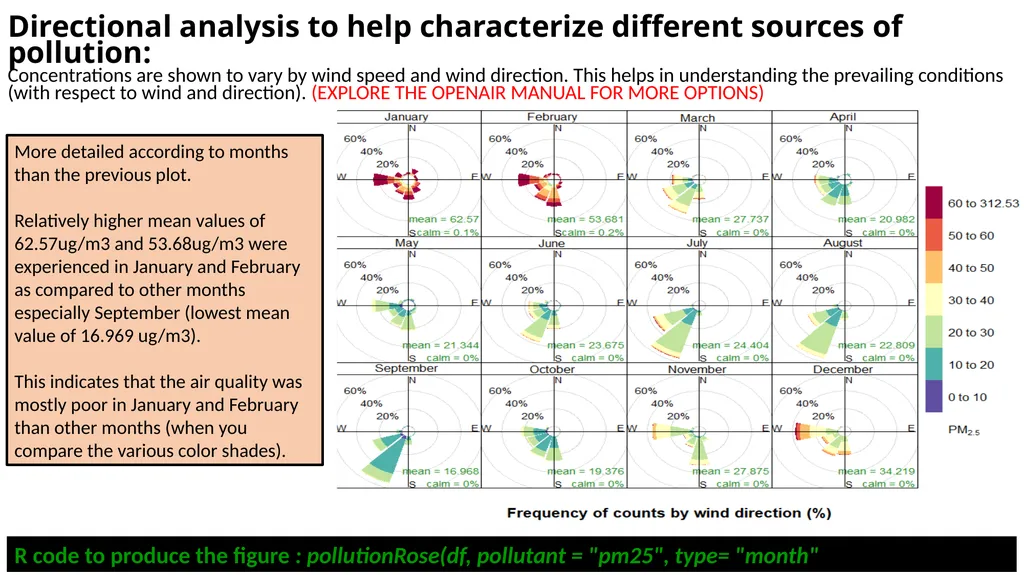
Concentrations are shown to vary by wind speed and wind direction. This helps in understanding the prevailing conditions (with respect to wind and direction). (EXPLORE THE OPENAIR MANUAL FOR MORE OPTIONS) R code to produce the figure : pollutionRose(df, pollutant = "pm25", type= "month" More detailed according to months than the previous plot.
Relatively higher mean values of 62.57ug/m3 and 53.68ug/m3 were experienced in January and February as compared to other months especially September (lowest mean value of 16.969 ug/m3).
This indicates that the air quality was mostly poor in January and February than other months (when you compare the various color shades).<br>
Relatively higher mean values of 62.57ug/m3 and 53.68ug/m3 were experienced in January and February as compared to other months especially September (lowest mean value of 16.969 ug/m3).
This indicates that the air quality was mostly poor in January and February than other months (when you compare the various color shades).<br>
13
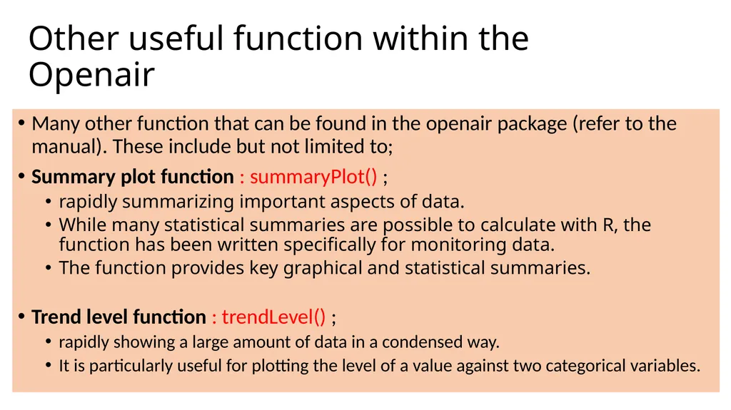
Other useful function within the Openair Many other function that can be found in the openair package (refer to the manual). These include but not limited to;
Summary plot function : summaryPlot() ;
rapidly summarizing important aspects of data.
While many statistical summaries are possible to calculate with R, the function has been written specifically for monitoring data.
The function provides key graphical and statistical summaries.
Trend level function : trendLevel() ;
rapidly showing a large amount of data in a condensed way.
It is particularly useful for plotting the level of a value against two categorical variables.<br>
Summary plot function : summaryPlot() ;
rapidly summarizing important aspects of data.
While many statistical summaries are possible to calculate with R, the function has been written specifically for monitoring data.
The function provides key graphical and statistical summaries.
Trend level function : trendLevel() ;
rapidly showing a large amount of data in a condensed way.
It is particularly useful for plotting the level of a value against two categorical variables.<br>
14
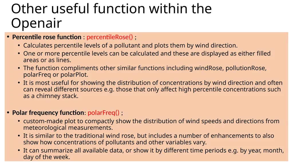
Other useful function within the Openair Percentile rose function : percentileRose() ;
Calculates percentile levels of a pollutant and plots them by wind direction.
One or more percentile levels can be calculated and these are displayed as either filled areas or as lines.
The function compliments other similar functions including windRose, pollutionRose, polarFreq or polarPlot.
It is most useful for showing the distribution of concentrations by wind direction and often can reveal different sources e.g. those that only affect high percentile concentrations such as a chimney stack.
Polar frequency function: polarFreq() ;
custom-made plot to compactly show the distribution of wind speeds and directions from meteorological measurements.
It is similar to the traditional wind rose, but includes a number of enhancements to also show how concentrations of pollutants and other variables vary.
It can summarize all available data, or show it by different time periods e.g. by year, month, day of the week.<br>
Calculates percentile levels of a pollutant and plots them by wind direction.
One or more percentile levels can be calculated and these are displayed as either filled areas or as lines.
The function compliments other similar functions including windRose, pollutionRose, polarFreq or polarPlot.
It is most useful for showing the distribution of concentrations by wind direction and often can reveal different sources e.g. those that only affect high percentile concentrations such as a chimney stack.
Polar frequency function: polarFreq() ;
custom-made plot to compactly show the distribution of wind speeds and directions from meteorological measurements.
It is similar to the traditional wind rose, but includes a number of enhancements to also show how concentrations of pollutants and other variables vary.
It can summarize all available data, or show it by different time periods e.g. by year, month, day of the week.<br>
15
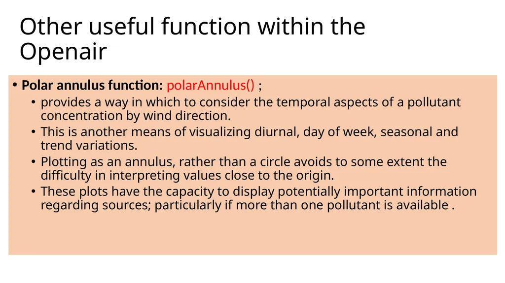
Other useful function within the Openair Polar annulus function: polarAnnulus() ;
provides a way in which to consider the temporal aspects of a pollutant concentration by wind direction.
This is another means of visualizing diurnal, day of week, seasonal and trend variations.
Plotting as an annulus, rather than a circle avoids to some extent the difficulty in interpreting values close to the origin.
These plots have the capacity to display potentially important information regarding sources; particularly if more than one pollutant is available .<br>
provides a way in which to consider the temporal aspects of a pollutant concentration by wind direction.
This is another means of visualizing diurnal, day of week, seasonal and trend variations.
Plotting as an annulus, rather than a circle avoids to some extent the difficulty in interpreting values close to the origin.
These plots have the capacity to display potentially important information regarding sources; particularly if more than one pollutant is available .<br>
16
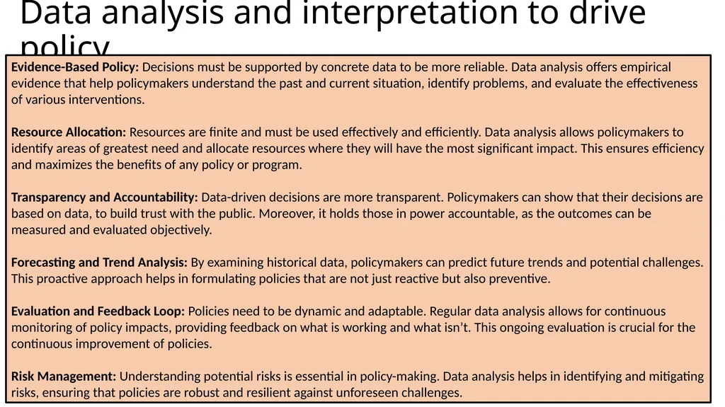
Data analysis and interpretation to drive policy Evidence-Based Policy: Decisions must be supported by concrete data to be more reliable. Data analysis offers empirical evidence that help policymakers understand the past and current situation, identify problems, and evaluate the effectiveness of various interventions.
Resource Allocation: Resources are finite and must be used effectively and efficiently. Data analysis allows policymakers to identify areas of greatest need and allocate resources where they will have the most significant impact. This ensures efficiency and maximizes the benefits of any policy or program.
Transparency and Accountability: Data-driven decisions are more transparent. Policymakers can show that their decisions are based on data, to build trust with the public. Moreover, it holds those in power accountable, as the outcomes can be measured and evaluated objectively.
Forecasting and Trend Analysis: By examining historical data, policymakers can predict future trends and potential challenges. This proactive approach helps in formulating policies that are not just reactive but also preventive.
Evaluation and Feedback Loop: Policies need to be dynamic and adaptable. Regular data analysis allows for continuous monitoring of policy impacts, providing feedback on what is working and what isn’t. This ongoing evaluation is crucial for the continuous improvement of policies.
Risk Management: Understanding potential risks is essential in policy-making. Data analysis helps in identifying and mitigating risks, ensuring that policies are robust and resilient against unforeseen challenges.<br>
Resource Allocation: Resources are finite and must be used effectively and efficiently. Data analysis allows policymakers to identify areas of greatest need and allocate resources where they will have the most significant impact. This ensures efficiency and maximizes the benefits of any policy or program.
Transparency and Accountability: Data-driven decisions are more transparent. Policymakers can show that their decisions are based on data, to build trust with the public. Moreover, it holds those in power accountable, as the outcomes can be measured and evaluated objectively.
Forecasting and Trend Analysis: By examining historical data, policymakers can predict future trends and potential challenges. This proactive approach helps in formulating policies that are not just reactive but also preventive.
Evaluation and Feedback Loop: Policies need to be dynamic and adaptable. Regular data analysis allows for continuous monitoring of policy impacts, providing feedback on what is working and what isn’t. This ongoing evaluation is crucial for the continuous improvement of policies.
Risk Management: Understanding potential risks is essential in policy-making. Data analysis helps in identifying and mitigating risks, ensuring that policies are robust and resilient against unforeseen challenges.<br>