PDF-Using the People Describer Chart The People Describer
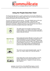
The chart can also be used by those working with people with communication difficulties The chart is divided into several sections The green shaded areas are the
Download Presentation
"Using the People Describer Chart The People Describer" is the property of its rightful owner. Permission is granted to download and print materials on this website for personal, non-commercial use only, provided you retain all copyright notices. By downloading content from our website, you accept the terms of this agreement.
Presentation Transcript
Transcript not available.