/
Ch3 Graphics Overview  of Ch3 Graphics Overview  of

Ch3 Graphics Overview of - PowerPoint Presentation

briana-ranney
briana-ranney . @briana-ranney
Follow
358 views
Uploaded On 2018-03-15

Ch3 Graphics Overview of - PPT Presentation

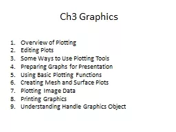
Plotting Editing Plots Some Ways to Use Plotting Tools Preparing Graphs for Presentation Using Basic Plotting Functions Creating Mesh and Surface Plots Plotting Image Data Printing ID: 651413

plotting graph plots data graph plotting data plots plot surface figure functions graphs mesh function matlab graphics image sin

Share:

Link:

Embed:

Download Presentation from below link

Download Presentation The PPT/PDF document "Ch3 Graphics Overview of" is the property of its rightful owner. Permission is granted to download and print the materials on this web site for personal, non-commercial use only, and to display it on your personal computer provided you do not modify the materials and that you retain all copyright notices contained in the materials. By downloading content from our website, you accept the terms of this agreement.


Presentation Transcript

Slide1

Ch3 Graphics

Overview

of

Plotting

Editing

Plots

Some Ways to Use Plotting

Tools

Preparing Graphs for

Presentation

Using Basic Plotting

Functions

Creating Mesh and Surface

Plots

Plotting Image

Data

Printing

Graphics

Understanding Handle Graphics ObjectSlide2

1. Overview of

Plotting

Plotting

Process

Graph Components

Figure Tools

Arranging Graphs Within a Figure

Choosing a Type of Graph to PlotSlide3
Slide4

2. Editing Plots

Plot

Edit Mode

Using Functions to Edit GraphsSlide5

Enabling Plot Edit ModeSlide6

Setting Object PropertiesSlide7

Using the Property EditorSlide8

Using Functions to Edit

Graphs

If

you prefer to work from the MATLAB command line, or if you are creating a MATLAB program file, you can use MATLAB commands to edit the graphs you create.

You

can use the set and get commands to change the properties of the objects in a graph.

For

more information about using graphics commands, see Understanding Handle Graphics Objects.Slide9

3. Some Ways to Use Plotting

Tools

Plotting

Two Variables with Plotting Tools

Changing the Appearance of Lines and Markers

Adding More Data to the Graph

Changing the Type of Graph

Modifying the Graph Data SourceSlide10

Plotting Two Variables with Plotting

Tools

x = -1:.1:1; % Define the range of x

y = x.^3; % Raise each element in x to the third powerSlide11
Slide12

Changing the Appearance of Lines and MarkersSlide13

4. Preparing Graphs for

Presentation

Annotating

Graphs for Presentation

Printing the Graph

Exporting the GraphSlide14

Annotating Graphs for

Presentation

x = -10:.005:40;

y = [1.5*cos(x)+4*exp(-.01*x).*cos(x)+exp(.07*x).*sin(3*x)];

plot(x,y)Slide15
Slide16
Slide17

Printing the Graph

Before printing the graph, select File > Print Preview to view and modify how the graph will be laid out on the page.

When you

are ready to print your plot,

click

Print in the right pane.

You

can also click Close to accept the settings and dismiss the dialog box.

You can

print the figure as you previewed it using Print on the figure's File menu.Slide18

Exporting the Graph

Exporting

a graph is the process of creating a standard graphics file format of the graph (such as EPS or TIFF), which you can then import into other applications like word processors, drawing packages, etc.

This example exports the graph as an EPS file with the following requirements:

The size of the picture when imported into the word processor document should be 4 inches wide and 3 inches high.

All the text in the figure should have a size of 8 points.Slide19
Slide20

5. Using Basic Plotting

Functions

Creating a

Plot

Plotting Multiple Data Sets in One

Graph

Specifying Line Styles and Colors

Plotting

Lines and

Markers

Graphing Imaginary and Complex

Data

Adding Plots to an Existing

Graph

Figure

Windows

Displaying Multiple Plots in One

Figure

Controlling the

Axes

Adding Axis Labels and

Titles

Saving FiguresSlide21

Creating a Plot

x

= 0:pi/100:2*pi;

y = sin(x);

plot(x,y

)

xlabel

('x = 0:2\pi')

ylabel

('Sine of x')

title('Plot of the Sine Function','FontSize',12)Slide22

Plotting Multiple Data Sets in One Graph

x

= 0:pi/100:2*pi;

y = sin(x);

y2 = sin(x-.25);

y3 = sin(x-.5);

plot(x,y,x,y2,x,y3

)

legend('sin(x)','sin(x-.25)','sin(x-.5)')Slide23

Graphing Imaginary

and Complex

Data

t = 0:pi/10:2*pi;

plot(

exp

(i*t),'-o')

axis equalSlide24

Adding Plots to an Existing Graph

[

x,y,z

] = peaks;

pcolor

(

x,y,z

)

shading

interp

hold on

contour(x,y,z,20,'k')

hold offSlide25

Displaying Multiple Plots in One

Figure

The

subplot command enables you to display multiple plots in the same window or print them on the same piece of paper.

Typing subplot(

m,n,p

)

t = 0:pi/10:2*pi;

[X,Y,Z] = cylinder(4*

cos

(t));

subplot(2,2,1); mesh(X)

subplot(2,2,2); mesh(Y)

subplot(2,2,3); mesh(Z)

subplot(2,2,4); mesh(X,Y,ZSlide26

6. Creating Mesh and Surface

Plots

About

Mesh and Surface Plots

Visualizing Functions of Two VariablesSlide27

About Mesh and Surface Plots

Visualizing

Functions of Two

Variables

To display a function of two variables, z = f (

x,y

),

Generate X and Y matrices consisting of repeated rows and columns, respectively, over the domain of the function.

Use X and Y to evaluate and graph the function.

The

meshgrid

function transforms the domain specified by a single vector or two vectors x and y into matrices X and Y for use in evaluating functions of two variables. The rows of X are copies of the vector x and the columns of Y are copies of the vector y.Slide28

Example — Graphing the

sinc

Function

This

example evaluates and graphs the two-dimensional

sinc

function, sin(r)/r, between the x and y directions. R is the distance from the origin, which is at the center of the matrix. Adding

eps

(a MATLAB command that returns a small floating-point number) avoids the indeterminate 0/0 at the origin:

[X,Y] =

meshgrid

(-8:.5:8);

R =

sqrt

(X.^2 + Y.^2) +

eps

;

Z = sin(R)./R;

mesh(X,Y,Z,'

EdgeColor

','black')Slide29

Example

— Colored Surface

Plots

A surface plot is similar to a mesh plot except that the rectangular faces of the surface are colored. The color of each face is determined by the values of Z and the

colormap

(a

colormap

is an ordered list of colors). These statements graph the

sinc

function as a surface plot, specify a

colormap

, and add a color bar to show the mapping of data to color:

surf(X,Y,Z)

colormap

hsv

colorbarSlide30

Making

Surfaces

Transparent

You can make the faces of a surface transparent to a varying degree. Transparency (referred to as the alpha value) can be specified for the whole object or can be based on an

alphamap

, which behaves similarly to

colormaps

. For example,

surf(X,Y,Z)

colormap

hsv

alpha(.4)Slide31

Illuminating

Surface Plots with Lights

Lighting

is the technique of illuminating an object with a directional light source. In certain cases, this technique can make subtle differences in surface shape easier to see. Lighting can also be used to add realism to three-dimensional graphs

.

This example uses the same surface as the previous examples, but colors it red and removes the mesh lines. A light object is then added to the left of the "camera" (the camera is the location in space from where you are viewing the surface):

surf(X,Y,Z,'

FaceColor

','red','

EdgeColor

','none')

camlight

left; lighting

phongSlide32

7. Plotting Image

Data

About

Plotting Image Data

Reading and Writing ImagesSlide33

Two-dimensional

arrays can be displayed as images, where the array elements determine brightness or color of the images. For example, the statements

load

durer

whos

Name Size Bytes Class

X 648x509 2638656 double array

caption 2x28 112 char array

map 128x3 3072 double array

load

the file

durer.mat

, adding three variables to the workspace. The matrix X is a 648-by-509 matrix and map is a 128-by-3 matrix that is the

colormap

for this image

.Slide34

MAT-files

, such as

durer.mat

, are binary files that can be created on one platform and later read by the MATLAB software on a different platform.

The elements of X are integers between 1 and 128, which serve as indices into the

colormap

, map. Then

image(X)Slide35

colormap

(map)

axis

imageSlide36

Reading

and Writing Images

You can read standard image files (TIFF, JPEG, BMP,

etc

using the

imread

function. The type of data returned by

imread

depends on the type of image you are reading.

You can write MATLAB data to a variety of standard image formats using the

imwrite

functionSlide37

8. Printing Graphics

Overview

of Printing

Printing from the File Menu

Exporting the Figure to a Graphics File

Using the Print CommandSlide38

9. Understanding Handle Graphics

Objects

Using

the Handle

Graphics Objects

Setting Object Properties

Specifying the Axes or Figure

Finding the Handles of Existing ObjectsSlide39

End of Getting StartedSlide40

Data from User’s GuideSlide41

What Is a MATLAB Graph?

The

MATLAB environment offers a variety of data plotting functions plus a set of GUI tools to create, and modify graphic displays. The GUI tools afford most of the control over graphic properties and options that typed commands such as annotate, get, and set provide.

A

figure

is a MATLAB window that contains graphic displays (usually data plots) and UI components.

By

default, figure windows are resizable and include pull-down menus and toolbars.

A

plot

is any graphic display you can create within a figure window. Plots can display tabular data, geometric objects, surface and image objects, and annotations such as titles, legends, and

colorbars

. Figures can contain any number of plots. Each plot is created within a 2-D or a 3-D data space called an axes.

A

graph

is a plot of data within a 2-D or 3-D axes. Most plots made with MATLAB functions and GUIs are therefore graphs. Slide42
Slide43
Slide44

Two-Dimensional

Plotting

FunctionsSlide45

Three-Dimensional Plotting FunctionsSlide46

End