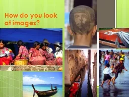
Overall effect is the impression left in the viewers mind Does it remind you of something What is the first idea that comes to your mind What does it mean Do you like it Is it a strikingstrong image ID: 620691
Download Presentation The PPT/PDF document "How do you look at images?" is the property of its rightful owner. Permission is granted to download and print the materials on this web site for personal, non-commercial use only, and to display it on your personal computer provided you do not modify the materials and that you retain all copyright notices contained in the materials. By downloading content from our website, you accept the terms of this agreement.
Slide1
How do you look at images?Slide2
Overall
effect is the impression left in the viewer’s mind:Does it remind you of something?
What is the first idea that comes to your mind?What does it mean? Do you like it? Is it a striking/strong image?
What is wrong with the image?Is the effect literal or symbolic?Does the image elicit certain/specific emotions?Slide3
Artistic Principles:
Rule of thirds use imaginary lines at each third, both horizontally and vertically; place the central focus on one of the intersectionsSlide4
Artistic Principles:
Framing – is the process of placing the main subject inside a naturally occurring or man-made frame of some sort Slide5
Artistic Principles:
Orientation of the frame - by just slightly tilting the camera, a tilted photo has a new dynamic added that often makes it appear more lively and interestingSlide6
Artistic Principles:
Close-ups are used to highlight and draw attention to a specific ideaSlide7
Elements of Design
Six elements are the foundation of artistic design in imagesThese six elements work together to create an overall effectThe elements are: line, shape, texture, space, colour and valueSlide8
Line
Horizontal lines – denote stability, calmness, rest,
etcVertical lines – implies size, strength, masculinity (a bit Freudian)
Diagonal lines – show motion, tension, actionCurved lines – lead the eye, create smooth movement, are sensuous and
feminineSlide9
Shape – shape are either two-dimensional (up/down, sideways) or three-dimensional (sideways, up/down & back/front)
shapes. These shapes are used in construction, in nature, in design, and even in the shapes of people around us. Shapes may also hold symbolic meanings
Organic and frequent
shapes:SquareTriangle
CircleSlide10
Texture – refers to the quality of touch a surface gives ;
the sensation must be interpreted visually
Terms to describe visual texture include
:SlipperinessRoughnessWetness
DrynessSoftnessSmoothnessCoarsenessHardnessSlide11
Space – is either “positive” or “negative”.
Positive space
is the outline of the main subject in a visual. It may take up a very tiny portion of a photo or a huge amount of space.Negative
space is all of the rest of the space in that same visual. It’s what is outside of the positive space, or main subject. Space helps to direct the eye toward an area of the photo/visual. It can create claustrophobia, if there is not enough room to “breath” or “move” at the edge of a photo, or it can also have the effect of relaxing our eye. Space also helps to make a photo dynamic by forcing our eye to move from place to place, in the photo.Slide12
Colour . Each colour has very specific culturally determined psychological
and symbolic associations
Red – love, life, passion, heat, warmth, heart - draws most attention Yellow – fear, warmth, fall, cheerfulGreen – envy, greed, growth, nature, relaxing, fertility, wealth, peace, spring
Blue – cold, peaceful, tranquil, trustworthyPurple – royalty, luxury, sophistication, feminine, romanticBlack – authority, power, submission, evil, sinful, male, strength, griefWhite – innocence, purity, virginity, cleanliness, sterilityBrown – earthy, genuineness, sad, wistful, friendship, stability
Pink – most calming of all colours, gentleSlide13
Value – is the quality of light in a visual (photo). It refers to the brightness or darkness of a particular colour in the photograph
For example, a photo may have a wide range of values of one colour in it, as the sky moves from sun to another part of the photo, nearer the horizon, where the colour has become much darker. Another way to think of it, is to see the quality and richness of the colours in the photo and how they fade or intensify from one area to another. Slide14
Principles of design
Principles help our eye/mind to find appeal or surprise or interest in a photograph. It also helps us to have more ways to speak about a visual which is a way of analyzing art. Principles provide a dynamic engagement in a photo. Slide15
Balance – is the equal or unequal distribution of weight across a photograph
Formal balance
– which is the PRECISE EQUAL WEIGHT distribution across a photo. It’s identical from one side to the other, in weight (size, colour, shape, number, etc). Formal balance provides a sense of equilibrium. It’s safe and
predictable.Informal balance – is the unequal or unbalanced weight distribution across a photograph. It adds a sense of dissonance to
a photo. Informal balance creates a sense of uneasiness or shiftiness. It’s messy.Slide16
Unity is the similarity of subject matter in a photograph
It refers to same colours, same or similar shapes, same content, etc. It’s the opposite of the song, “which of these things does not belong…”. In other words, all of the things belong together in a photo. The photo is unified through the similarity of content (whether line,
space or shape). Slide17
Contrast refers to subjects, colours, content, textures, or any other content found in a visual, that are opposite each-other
This is a photo of things that do not belong together or that make a statement against the other. It can be very subtle or quite obvious. Another way to think about this is to see how different things are or how much variety we see – this is contrast. Obvious examples of contrast are “tall & short” or “close & far” or “black & white” or “rough & soft” or “old & young” or “wet & dry” or “slow & fast” or “bald & hairy” or “squares & circles” or “dressed & naked” or “bright & dim” or “short & long” or “start & end”…Slide18
Simplicity is another term for EMPHASIS. It means that one simple subject is clearly the center of attention in the photograph
There is nothing
else competing for our eye’s attention – the subject is the only thing drawing our attention in the piece. Simple is always best.
Simplicity is one of the most important principles in all of art – especially photography. To get simple, limit depth of field, use telephoto or macro lenses, or get in close. Make sure the background or anything else that might be distracting will be cropped out. Busy photos
(like this one) are just too distracting and our eye does not know to what to pay attention. So, keep it simple. Slide19
Rhythm is another word for REPETITION
It is about emphasis (and of course design quality)
Pattern is the IDENTICAL repetition of elements in a photograph. It could be colour or shape or line or subject that is repeated identically, that creates a pattern. Slide20
Movement is another word we use to describe capturing the feeling of movement Slide21
Proportion refers to the size of subjects in the photo, in comparison to other things in the photo
Sometimes the subject is seen in the foreground compared to further back in the photo, using perspectiveSlide22
Perspective is another way of saying point of view. In visual texts
perspective refers to the exact location of the camera (and photographer), when it took the photo