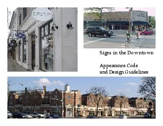
/
Signs in the DowntownAppearance Code Signs in the DowntownAppearance Code

Signs in the DowntownAppearance Code - PDF document

caroline
caroline . @caroline
Follow
359 views
Uploaded On 2021-09-24

Signs in the DowntownAppearance Code - PPT Presentation

IntentSigns can Enhance the appearance of a business propertyServe as business identificationHelp maintain a quality community appearanceThis document describes a userfriendly process for businesses ID: 884527

signs sign building design sign signs design building blade downtown mounted wall letters illuminated height storefront window pin business

Share:

Link:

Embed:

Download Presentation from below link

Download Pdf The PPT/PDF document "Signs in the DowntownAppearance Code" is the property of its rightful owner. Permission is granted to download and print the materials on this web site for personal, non-commercial use only, and to display it on your personal computer provided you do not modify the materials and that you retain all copyright notices contained in the materials. By downloading content from our website, you accept the terms of this agreement.


Presentation Transcript

1 Signs in the DowntownAppearance Code In
Signs in the DowntownAppearance Code Intent Signs can: •Enhance the appearance of a business property•Serve as business identification•Help maintain a quality community appearanceThis document describes a user-friendly process for businesses and building owners to install well-designed signs in appropriate locations that enhance the character of Downtown Glenview.Sign Regulations and Approval Process Downtown Signs This document refers to signs in the Downtown area, which generally encompasses Glenview Road, east of Washington Street and west of Waukegan Road, and Waukegan Road, north of Henley Road and south of Lake Avenue. Signs located in the shaded areas shall be considered part of the Downtown. Signs require: •Certificate of Appropriateness (Appearance Commission)•Building Permit A Certificate of Appropriateness is granted by the Appearance Commission, which indicates the proposed sign meets the appearance standards of the Village. A building permit is reviewed, approved, issued and inspected by the Inspectional Services Division for all new signs in the Village. Both the Certificate of Appropriateness and the Building Permit are issued by the Develop

2 ment Department prior to the beginning o
ment Department prior to the beginning of any work. The first step in the approval process is to contact the Planning & Economic Development Department at (847) 904-4340 for Appearance Commission application information. Sign details are submitted to the Planning Division with a completed Appearance Commission application and permit application. The design guidelines contained in this document are just that –guidelines. If the proposed sign varies from the design guidelines, it does not necessarily mean the sign will not be allowed, but it means the Appearance Commission will review the proposal for consistency with the design guidelines at a public meeting and determine if a Certificate of Appropriateness should be issued. Please see Article VII of the Zoning code for additional guidance. BAFFIN RD. WAUKEGAN RD GLENVIEW RD. GROVE ST. PRAIRIE ST. HENLEY ST. HARLEM AVE. WASHINGTON ST. E. LAKE AVE. PINE ST. CHURCH ST. HUTCHINGS AVE. MCLEAN CT. RALEIGH RD. VERNON RD. MAPLEWOOD LN. STEVEN’S DR. LINNENMAN ST. Routed out graphics are part of an interesting background. 1. Interior illuminated panel signs or box signs with translucent acrylic faces shall not be pe

3 rmitted. 2.Boxsignsshallonlybepermitted
rmitted. 2.Boxsignsshallonlybepermittedwithmetalorcompletelyopaquematerial3.Letterformsorlogotypeshallbestencilcutthroughthesurfaceandfilledwithback-upandpush-thruacrylicformswithaninteriordiffuser(acrylicformsshallnotbetransparent),orbackgroundsmayberoutedoutwithinterioracrylicforms.A creative box sign uses a metal background with push-thru forms. Zoning CodeArticle VII. Signs Sec. 98-337 Signs accessory to business, commercial or industrial uses(1) Front wall signsg. Box Signs Illuminated push-thru graphics are used on an opaque background. A blade sign is routed out and uses back-up acrylic forms. Downtown Sign Design Guidelines1. Wall signsProjecting raceways are not permitted due to the pedestrian nature of the Downtown Sign is incompatible because it is roof-It is preferred that sign area not exceed 5% of the square footage of the tenant space (height x a. Design1. Simple typefaces and fonts provide for legibility and style. 2. Signs should contain a minimum number of proposed graphic elements. Detailed illustrations or menus of services are not desirable. When additional information is necessary to identify a business, no more than two (2) addi

4 tional elements will generally be accept
tional elements will generally be acceptable.3. Sign colors, materials and lighting should be restrained and harmonious with the building architecture.4. Signs should be compatible with adjacent signs and should not compete for attention (using elements such as excessively bright colors or disproportionately sized letters).5. Due to the pedestrian nature of the Downtown, projecting raceways are not permitted. Channel letters may be flush-mounted to the building.6. A single trademark logo or symbol compliant with the applicable design guidelines may be allowed with the business name.b. Size1. Overall height of storefront letters/sign should generally not exceed 18” in height, when utilizing all capital letters. 2. When combining upper and lower case letters, upper case should not exceed 24” in height and lower case should not exceed 18” in height. 3. Wall sign square footage is encouraged to remain within 5 percent of the square footage of the tenant space, to allow flexibility for other business identification, such as awnings and blade signs (sign code allows up to 10 percent of the square footage of the tenant space).c. Administration1. For new multi-

5 tenant buildings, owner/management presc
tenant buildings, owner/management prescribed design guidelines are preferred to establish consistency for individual tenants.2. For buildings undergoing major façade renovations, owner/management prescribed design guidelines could be developed at that time. When combining upper and lowercase letters, uppercase should not exceed 24” in height and lowercase should not exceed 18” in height (1b2)Wall Sign 18” Overall height of storefront letters/sign should not exceed 18” in height, when utilizing all capital letters (1b1)WALL SIGN 18” Storefront width Storefront Downtown Sign Design Guidelines1. Wall signs (continued) ok c.Architectural aspects1. Signs should never cover architectural details and should be integrated with architectural façade elements.2. Business identification should be integrated into the building architecture. Building design elements such as window patterns and arches may help determine the sign shape that best suits the building.3. Signs should be surrounded by negative space (the space around the sign) to provide for a balanced design on the building.4. Wall signs are preferred to be placed no higher than the first floor because a p

6 edestrian scale is desired.d.Illuminatio
edestrian scale is desired.d.Illumination1. The light source of externally illuminated signs should not be visible or create glare.2. Internally illuminated neon or LED signs are not encouraged, but exposed neon in a channel form with a matte clear acrylic face can be acceptable.Wall signs are preferred to be placed no higher than the first floor (1c4) Building design elements help determine the best sign shape (1c2)Wall sign illustrates exposed neon in metal channel letterform with a matte acrylic face (1d2) A well-designed sign is located inappropriately on the building (1c2) Downtown Sign Design Guidelines2. Pin-mounted wall signsPin-mounted letterforms should contrast with the background material, not blend in so that the sign is illegible (2c) ok Illuminated pin-mounted letterforms are simple to read and are centered over a thin background (2b)Contrasting, non-illuminated pin letters maintain the character of the existing storefront façade (2c)Pin-mounted letters on an obtrusive box that projects from the storefront (2b)a. Pin-mounted letterforms should be unobtrusive and should project no more than 12 inches from the b. Pin-mounted letterforms shou

7 ld be attached to a thin, flat backgroun
ld be attached to a thin, flat background, not a raceway. Backgrounds should be no more than four (4) inches or less than the depth of the pin-mounted letters.c. Pin-mounted letterforms should contrast with the material color on which they are mounted.d. Pin-mounted letterforms should not use mirror e. Pin-mounted letterforms should not use metals or pins that will rust. Downtown Sign Design Guidelines3. Window displaysBoxes and paper signs clutter the window and do not provide an inviting, open retail appearance(3e, 3f) ok Merchandise and simple text are used to create an inviting display and allow visibility inside the retail space(3e)Window graphics are minimal and the display is tasteful, to reinforce the identification of the store (3a, 3c)Low-quality materials completely obscure visibility into the storefront (3b, 3e)a. Window graphics and displays should be tasteful and minimal, and designed to be pedestrian friendly.b. Window graphics should use high quality, durable materials.c. Window graphics should reinforce the identification of the store, and not compete with wall signs or distract from the business.d. Illuminated window signs are e. Win

8 dow graphics and displays should create
dow graphics and displays should create an open and inviting appearance and express the nature or “personality” of the business without obf. Merchandise may be displayed but should not be stacked in the windows for storage, resulting in visual clutter.g. Window graphics and displays can not exceed the window sign ordinance, Section , which is 25 percent (up to 20 percent of the total may be illuminated). Blade sign design provides sufficient clearance from the meets required dimensions (4c,4d) Sec. 98-337 Signs accessory to business, commercial or industrial uses(4) Projecting Signsa. Two sided blade signs shall be permitted to be mounted perpendicular to the storefront. b. No sign shall extend above the parapet wall of the storefront building. c. Blade signs shall provide a minimum clearance of 4” between the storefront and signface. Blade signs shall project a maximum of 48” from the storefront and shall have a maximum 44” width. d. 7’-6” clearance shall be provided between the baseline of any sign and the sidewalk. e. Blade signs shall have a maximum depth of 12” if located at a height less than 9’-0”, and a maximum depth of 18” if located at 9’-0”

9 height or higher. Zoning CodeArticle VI
height or higher. Zoning CodeArticle VII. Signs both sides (4a)Sign is mounted below the parapet Maximum 4’ ProjectionMinimum 7’6” clearance Maximum 44” below parapet Downtown Sign Design Guidelines4. Projecting (Blade) SignsInternal illumination is not preferred and mounting hardware is not part of the sign design(4a2, 4b1) ok Attractive mounting hardware is part of the sign design (4a2)Blade sign is attached with wiring from the roof and is oriented toward automobile traffic (4a1)Blade sign is non-illuminated (4b1) 1. Blade signs should be oriented toward pedestrians passing on the sidewalk of the building rather than automobiles or pedestrians on the other side of the 2. Mounting hardware for blade signs should be attractive and an integral part of the sign design. Metal brackets with decorative and complex shapes are encouraged where appropriate to add to the character of the building.3. Blade signs should never cover architectural details and should be integrated with architectural façade elements.4. Blade signs should have two finished sides that are consistent on both sides.5. Blade signs should be consistent with downtown wall sign design gu

10 idelines.1. External illumination is pr
idelines.1. External illumination is preferred for smaller sidewalk oriented signs.2. Blade signs may use attractive, external lighting fixtures or may be non-illuminated. 3. The light source of externally illuminated signs should not be visible or create glare.a. Designb. Illumination Downtown Sign Design Guidelines5. Ground signs ok The scale of the ground sign is appropriate in this pedestrian corridor a. Ground signs are not recommended in the downtown because they are oriented to vehicular corridors. b. When buildings are set back on a lot in the downtown, a ground sign may be appropriate (although not preferred) when all of the following conditions are met:1. Other alternative type of signs do not provide adequate identification2. Scale and location of ground sign complements the building in adjacent properties3. Integration into site landscaping so as not to create a site or visual obstructionA pole sign is oriented toward vehicular traffic, rather than pedestrians (5a)A unique ground sign does not complement the building architecture (5b2)element on the building, or a fence can be used for identification, rather than an individual ground s