PPT-Graphs and Charts

Author : conchita-marotz | Published Date : 2016-04-29

Curriculum links and teaching notes For L1L2 Adult Numeracy and Functional Maths Can be used as an introduction and also for revision April 2012 Kindly contributed

Presentation Embed Code

Download Presentation

Download Presentation The PPT/PDF document "Graphs and Charts" is the property of its rightful owner. Permission is granted to download and print the materials on this website for personal, non-commercial use only, and to display it on your personal computer provided you do not modify the materials and that you retain all copyright notices contained in the materials. By downloading content from our website, you accept the terms of this agreement.

Graphs and Charts: Transcript


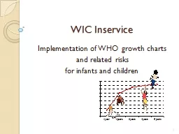
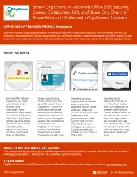
Curriculum links and teaching notes For L1L2 Adult Numeracy and Functional Maths Can be used as an introduction and also for revision April 2012 Kindly contributed by Chris Farrell Bolton College Search for Chris on . Often the data presented in a graph or table show change over time There are specific verbs adjectives and adverbs that can help you describe these changes For example Verbs for describing how data have changed to increase to remain unchanged to dec Quantitative data can frequently be illustrated in a compelling way using charts and graphs. .. see . www.gapminder.org. for fascinating, interactive charts. Spreadsheet systems usually provide graphing and charting capabilities.. The following presentation is designed to help you correctly identify and read a guitar chord chart.. WHY IT MATTERS. : Guitar chord charts are literally everywhere: in guitar books & magazines, on handouts in class, on the world wide waste of time (WWW), and in apps for your phone.. By Susan . Wojciechowski. creative. Inventive and imaginative. A very . creative. person invented the. a. utomobile.. report. To tell or write about something. The student is giving a . report. over. Graphs.  . Graphs . capture . much more detail than numerical summaries, so very useful for learning about data and communicating its features.. At the same time, graphical interpretation isn’t standard in the way that numerical summaries are, and our eyes can fool us.. The vertical scale is too big or too small, or skips numbers, or doesn’t start at zero.. The graph isn’t labeled properly.. Data is left out.. But some real life misleading graphs go above and beyond the classic types. Some are intended to mislead, others are intended to shock. And in some cases, well-meaning individuals just got it all plain wrong. These are some of my favorite recent-history misleading graphs from real life.. and related risks . for infants and children. 1. Background. Growth charts are a key tool used to interpret growth measurements. 2. Activity. Discuss together:. How do you use growth charts? . When do you show growth charts to parents?. Chart Types Covered. 2. Column. Line. Pie. Stock. XY (Scatter). Area. Bubble. Visualizing Data. 3. Data Graphics Principles. 4. Data Graphics Principles. 5. “Above all else show the data”. Reminder not to clutter a chart by adding unneeded illustration or decoration.. David Goldstein. February, 2018. Types of Cascade Charts. Build Up/Down. Change. Stacked. Horizontal. iPhone SE Component Costs . This build up cascade allows you to show each component contributes to total cost and its relationship to retail price. . OFFICE 365 APP BUILDER PROFILE: . BrightArch. BrightArch delivers org changes that work for everyone. BrightArch saves significant costs over competing methods by delivering cloud-based, time-saving solutions with our OrgWeaver software. OrgWeaver simplifies org chart creation so that businesses, universities, governments, and non-profits can focus on their strategies, instead of on drawing org chart boxes. . Percentage of Total NSF . Research . Funding. YEAR: 2008. Research for a reason.. CHARTS AND VISUALIZATIONS. Incoming Freshman Average ACT Scores – UL Lafayette. 1999-2009. Research for a reason.. CHARTS AND VISUALIZATIONS. M. Gonzalez Berges. Context . Linac. 4 BPM expert application. New FESA devices developed by Ana. Replacement of existing . Qt. /C++ application. New functionality. Display of raw signals. 4 x 65 000 samples in a chart. Date: . February 15. Topic: . Visual Aids. Essential Question: . How can I use visual aids to . effectively convey important information about my topic?. Performance Indicator . 10. Exceptional explanation and presentation of visual aids; audience focused. Chart is a . visual representation of data from a worksheet . that can bring more understanding to the data than just looking at the numbers.. A chart is a powerful tool that allows you to visually display data in a variety of different chart formats such as Bar, Column, Pie, Line, Area, Doughnut, Scatter, Surface, or Radar charts..

Download Document

Here is the link to download the presentation.
"Graphs and Charts"The content belongs to its owner. You may download and print it for personal use, without modification, and keep all copyright notices. By downloading, you agree to these terms.

Related Documents