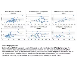
Scatter plots of MSH6 expression against the caféau lait macule burden CALM phenotype The upper panel of plots represents the microarray experiment and the lower panel represents ID: 367905
Download Presentation The PPT/PDF document "Supporting Figure S1A" is the property of its rightful owner. Permission is granted to download and print the materials on this web site for personal, non-commercial use only, and to display it on your personal computer provided you do not modify the materials and that you retain all copyright notices contained in the materials. By downloading content from our website, you accept the terms of this agreement.
Slide1
Supporting Figure S1A
Scatter plots of
MSH6
expression against the café-au-
lait
macule burden (CALM) phenotype.
The
upper panel of plots represents the microarray experiment, and the lower panel represents
qPCR
validation results. Plots on the left represent data for all
affecteds
, while the plots in the middle and on the right represent data for affected females or affected males, respectively.
Expression values are plotted on the X-axis, corresponding NF1-phenotype values are plotted on the Y-axis.Slide2
Supporting Figure S1B
Scatter plots of
DPH2
expression against the café-au-
lait
macule burden (CALM) phenotype.
The
upper panel of plots represents the microarray experiment, and the lower panel represents
qPCR
validation results. Plots on the left represent data for all
affecteds
, while the plots in the middle and on the right represent data for affected females or affected males, respectively.
Expression values are plotted on the X-axis, corresponding NF1-phenotype values are plotted on the Y-axis.Slide3
Supporting
Figure S1C
Scatter plots of
MED21 expression against the café-au-
lait
macule (CALM) burden phenotype. The upper panel of plots represents the microarray experiment, and the lower panel represents
qPCR validation results. Plots on the left represent data for all
affecteds
, while the plots in the middle and on the right represent data for affected females or affected males, respectively. Expression values are plotted on the X-axis, corresponding NF1-phenotype values are plotted on the Y-axis.Slide4
Supporting Figure
S1D
Scatter plots of
NMT2
expression against the
Lisch
nodule burden phenotype.
The
u
pper panel of plots represents the microarray experiment, and the lower panel represents
qPCR
validation results. Plots on the left represent data for all
affecteds
, while the plots in the middle and on the right represent data for affected females or affected males, respectively.
Expression values are plotted on the X-axis, corresponding NF1-phenotype values are plotted on the Y-axis.Slide5
Supporting Figure
S1E
Scatter plots of
TMEM109
expression against the
Lisch
nodule burden phenotype.
The upper panel of plots represents the microarray experiment, and the lower panel represents
qPCR
validation results. Plots on the left represent data for all
affecteds
, while the plots in the middle and on the right represent data for affected females or affected males, respectively.
Expression values are plotted on the X-axis, corresponding NF1-phenotype values are plotted on the Y-axis.Slide6
Supporting Figure
S1F
Scatter plots of
FHL2
expression against the height phenotype (expressed as centile ranking for the NF1 population).
The
u
pper panel of plots represents the microarray experiment, and the lower panel represents
qPCR
validation results. Plots on the left represent data for all
affecteds
, while the plots in the middle and on the right represent data for affected females or affected males, respectively.
Expression values are plotted on the X-axis, corresponding NF1-phenotype values are plotted on the Y-axis.Slide7
Supporting Figure
S1G
Scatter plots of
PREB
expression against the height phenotype (expressed as centile ranking for the NF1 population).
The
upper panel of plots represents the microarray experiment, and the lower panel represents
qPCR
validation results. Plots on the left represent data for all
affecteds
, while the plots in the middle and on the right represent data for affected females or affected males, respectively.
Expression values are plotted on the X-axis, corresponding NF1-phenotype values are plotted on the Y-axis.Slide8
Supporting Figure
S1H
Scatter plots of
RAB11FIP1
expression against the height phenotype (expressed as centile ranking for the NF1 population).
The upper panel of plots represents the microarray experiment, and the lower panel represents
qPCR
validation results. Plots on the left represent data for all
affecteds
, while the plots in the middle and on the right represent data for affected females or affected males, respectively.
Expression values are plotted on the X-axis, corresponding NF1-phenotype values are plotted on the Y-axis.