
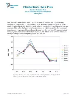
perceptualedge Line charts are often used to show a dayoftheweek or a monthoftheyear effect by displaying a separate line for each week or month An analyst might want to know for example if ID: 141144
Download Pdf The PPT/PDF document "Visual Business Intelligence Newsletter" is the property of its rightful owner. Permission is granted to download and print the materials on this web site for personal, non-commercial use only, and to display it on your personal computer provided you do not modify the materials and that you retain all copyright notices contained in the materials. By downloading content from our website, you accept the terms of this agreement.


Visual Business Intelligence Newsletter perceptualedge Line charts are often used to show a day-of-the-week or a month-of-the-year effect by displaying a separate line for each week or month. An analyst might want to know, for ex-ample, if sales differ by the day-of-the-week or by the month-of-the-year. Figure 1 shows an that sales were highest on Wednesdays and lowest over the weekend. We also notice that some days are more variable than others. However, it is dif cult to determine a trend over Series3 Series4 Series5 Series6 Series7 Series8 Figure 1: This line chart uses one line per week to display the sales of a hypothetical line showing the mean for Mondays. Next the sales for the eight Tuesdays are shown, again with the horizontal line showing the mean for Tuesdays. This is continued for each day of the 6080100 MonTuesWedThursFriSatSun Figure 3: This cycle plot rst plots the rst Monday, the second Monday, and on through the eighth Monday. Then it plots the rst Tuesday, second Tuesday, and so on. The horizontal lines show the means for each day of the week. Trends that were much more dif cult to see gure.The features we noticed in Figure 1, such as sales are highest on Wednesdays, are still clear. However, so much more is clear in Figure 3 that went unnoticed in the previous ones. We now see that sales for Mondays and Wednesdays have increased during the eight week period while sales for Tuesdays have decreased. Sales for the other four days were uctuated around their means. This is information that any sales manager would want to know. This cycle plot immediately raises questions that the manager must address, such as What makes Tuesdays different from Mondays...from Wednesdays, and so on? Perhaps advertisements were placed on Mondays and Wednesdays. Perhaps there was a different staff. As you can see from this example, cycle plots allow us to see important characteristics of the data that do not show up in standard line charts. Another advantage of Figure 3 is that it does not depend on color, so it can be used in black and white publications with no loss of clarity. Copyright © 2008 Naomi Robbins, Ph.D.Page 5 of 7 100150200 JanFebMarAprMayJunJulAugSepOctNovDec Figure 5: This cycle plot makes it much easier to visualize the trend of a given month over in the months December through February, then it would be better to begin around July so gure. Cleveland, Dunn, and Terpenning (1978) introduced cycle plots to study the behavior of seasonal time series. They rst decomposed time series into frequency components: trend, seasonality, oscillation, and the remainder, and then examined the components individually, using different techniques. Cycle plots were used to study the seasonal component. The support cycle plots directly. However, they are easy to create with almost any software. S-Plus, and Stata. The cycle plots in this article were drawn using S-Plus. S-Plus and R are Copyright © 2008 Naomi Robbins, Ph.D.Page 7 of 7 Visualizing DataCleveland, William, Douglas Dunn, and Irma Terpenning. 1978. The SABL Seasonal Robbins, Naomi B. 2006. Dot Plots: A Useful Alternative to Bar ChartsAbout the Authorpublished by John Wiley (2005). She is a consultant, keynote speaker, trains corporations and organizations on the effective presentation of data. This was published as a guest article in Stephen Fews monthly Visual Business Intelligence Newsletter. A complete library of Stephen Fews articles, as well as other guest articles, is available at www.perceptualedge.com.