/
Animated Transitions in Statistical Data Graphics Animated Transitions in Statistical Data Graphics

Animated Transitions in Statistical Data Graphics - PDF document

liane-varnes
liane-varnes . @liane-varnes
Follow
418 views
Uploaded On 2016-05-10

Animated Transitions in Statistical Data Graphics - PPT Presentation

Jeffrey Heer George G Robertson Abstract x2014 In this paper we investigate the effectiveness of animated transitions between common statistical data graphics such as bar charts pie charts and ID: 313382

Jeffrey Heer George Robertson Abstract — In

Share:

Link:

Embed:

Download Presentation from below link

Download Pdf The PPT/PDF document "Animated Transitions in Statistical Data..." is the property of its rightful owner. Permission is granted to download and print the materials on this web site for personal, non-commercial use only, and to display it on your personal computer provided you do not modify the materials and that you retain all copyright notices contained in the materials. By downloading content from our website, you accept the terms of this agreement.


Presentation Transcript

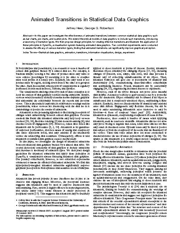
Animated Transitions in Statistical Data Graphics Jeffrey Heer, George G. Robertson Abstract — In this paper we investigate the effectiveness of animated transitions between common statistical data graphics such as bar charts, pie charts, and scatter plots . We extend theoretical models of data graphics to include such transitions, introduc ing a taxonomy of transition types. We then propose design principles for creating effective transitions and illustrate the applic ation of these principles in DynaVis , a v isualization system featuring animated data graphics . Two controlled experiments were conducted to assess the efficacy of various transition types, f ind ing that animated transitions can significantly improve graphical perception . Index Terms — Statistical da ta graphics, animation, transitions, information visualization, design, experiment 1 I NTRODUCTION In both analysis and presentation, it is common to view a number of related data graphics backed by a s hared data set . For example, a business analyst viewi ng a bar chart of product sales may want to view relative percenta ges by switching to a pie chart or compare sales with profits in a scatter plot. Similarly, she may wish to see product sales by region, drilling down from a bar chart to a grouped bar chart . Such incremental construction of visualizations is regularly performed in tools such as Excel, Tableau, and Spotfire. The visualization challenge posed by each of these examples is to keep the readers of data graphics oriented during transitions. Ideally , viewers would accurately identify ele ments across disparate graphics and understand the relationship between the current and previous views . This is particularly important in collaborative settings such as presentations, where viewers not interacting wi th the data are at a disadvantage to predict the results of transitions. Animation is one promising approach to facilitating perception of changes when transitioning between related data graphics. Previous research has found that animated transitions ma y h elp keep viewers oriented [20 , 24 ], facilitate lear ning [3] and decision - making [9 ], and i ncrease levels of engagement [24 ]. However, others have noted that animation can be problematic [2, 5, 2 4 ]. Animation is no guarantee of improved performance , involve s issues of timing and complexity that static depictions avoid, and may mislead if the animation s violate the underlying data semantics. Consequently , efforts to add animation to standard data graphics require careful study. In this paper, w e investigate the design of animated transitions between statistical data graphics backed by a shared data table. We extend theoretical treatments of data graphics to include transitions and introduc e a taxonomy of transition types. W e then pos it design guidelines for a nimated transitions and apply these principles in DynaVis , a visualization system featuring animated data graphics . O ur primary contribution, however, is t wo controlled experiments conducted to assess the efficacy of animated tra nsitions. We find that appr opriately - designed animated transitions significantly improve graphical perception at both syntactic and semantic levels of analysis . 2 A NIMATION Animation has proven popular in user interfaces due in part to its intuitive and engaging nature. Moreover, the perceptual literature suggests that animation may be used to improve interaction and understanding. First, motion is highly effective at attracting attention, and unlike many other visual features is easily perceived in per ipheral vision [17 ]. This suggest s that animation may be fruitfully applied to direct attention to points of interest. Second, animation facilitates object constancy for changing objects [1 7, 20 ], including changes of position, size, shape, and color, and thus provides a natural way of co nveying transformations of an object. Third, animated behaviors can give rise to perceptions of causality and intentionality [16 ], communicating cause - and - effect relationships and establishing narrative. Fourth, animation c an be emotionally engaging [24, 2 5 ], engendering increased interest or enjoyment . However, each of the above features can prove more harmful than helpful. Animation’s ability to grab attention can be a powerful force for distraction. Object constancy can be abused if an object is transfo rmed into a completely unrelated object, establishing a false relation. Similarly, incorrect interpretations of causality may mislead more than inform. Engagement may facilitate interest, but can be used to make misleading information more attractive or ma y be frivolous — a f orm of temporal “chart junk” [23 ]. Additionally, animation is ephemeral, complicating comparison of items in flux. Furthermore, there remain a number of issues when applying animation, such as time/error tradeoffs. Animations that are to o slow may prove boring or degrade task times, while those that are too fast may result in increased errors. Optimal times may be hard to predict and subject to both the complexity of the scene and the familiarity of the viewer. These and other issues have led some researchers to instead advocate the use of sta tic depictions of changes [2, 24 ]. The upshot is that animation is a double - edged sword — designers must take both the benefits and pitfalls under consideration. 2.1 Principles for Animation Given the vast design space available to animators and the potential pitfalls of animation misuse, guidelines have been proposed for crafting ef fective animations. Lasseter [13 ] shares principles of hand - drawn character animation, such as squash - and - stretch, exaggeration , anticipation, staging, and slow - in slow - out timing. Zongker and Salesin [2 7 ] discuss the use these principles for creating animated presentations in their Slithy framework. They suggest making all movement meaningful, eschewing principles which promote t he agency of animated item s over the semantics of the animation, such as squash - and - stretch and exaggeration. On the other hand, they endorse the use of anticipation and staging to direct attention and partition animations such that only one action happens at a time. The psychologists Tversky et al [24 ] cast a skeptical eye on animation, finding no benefit for communicating the workings of complex systems. However, they make an exception for animated transitions in visualizations and suggest two high - level principles for effective animation. Their Congruence Principle states “the structure and content of the external representation should correspond to the desired structure and content of the internal representation” and their Apprehension Principle states that “the structure and content of the external representation should be readily and accurately perceived and comprehended.” Interestingly, the congruence principle echoes Mackinlay’s expressiveness criteria for automatic generation of static Jeffrey Heer is with the Computer Science Division at the University of California, Berkeley , E - Mail: jheer@cs.berkeley.edu . George Robertson is with Microsoft Research , E - Mail: ggr@microsoft.com Man uscript received 31 March 2007; accepte d 1 August 2007; posted online 2 7 October 2007. For information on obtaining reprints of this article, please send e - mail to: tvcg@computer.org . data graphics [14 ], suggesting that accepted guidelines for visualization might also be applied to animation. We revisit these principles in greater detail later in the paper. 2.2 Animation in Information Visualization Animation in interactive visualization has been a top ic of research for over the last decade and a half. Some research has focused on systems issues, developing frameworks for applying animation in user i nterfaces. Hudson and Stasko [11 ] introduced toolkit support for animation and the Information Visualizer [ 19 ] enabled animation and level - of - detail control with a cognitive coprocessor that was leveraged by a number of pion eering visualizations (e.g., [20 ]). Other research has focused on designing animations to facilitate perception. One approach is to use m otion as an additional visual variable within which to encode data [1]. Another is to use animation to facilitate understanding of transitions between different states of an interface. We focus on this second approach. Animated transitions have received mu ch attention within tr ee visualization. Cone Trees [20 ] use animated rotations at multiple levels of a tree to bring selected items into view. Yee et al [2 6 ] introduce valuable heuristics for animating transitions in rad ial tree layouts. SpaceTrees [18 ] an d DOITrees [1 0 ] animate tree branches as they are expanded and collapsed. Both apply staging, breaking up animations into distinct phases. For example, a transition within SpaceTree might involve first collapsing a subtree, translating the viewing region, and then expanding newly visible subtrees. In many cases, the evaluation of animated transitions has relied on anecdotal evidence, leaving questions as to their actual efficacy. Some systems, however, have been the subject of formal studies of animated tr ansitions. StepTree [5], a 3D treemap visualization, uses animated fading and resizing to “zoom” into subtrees. A controlled experiment found mixed results in revisitation tasks: one set of users successfully used navigation shortcuts in animated condition s, while others made more errors relative to static transitions. Bederson and Boltman [3] found that animated transitions within a family tree explorer improved subjects’ abilities to reconstruct the tree from memory, evidence of facilitated learning. Robe rtson et al’s studies of polyarchy visualizations [2 1 ] found that use of animated transitions improved both task time and user satisfaction. Simple transitions (e.g., translation rather than rotation) about 1 second long gave the best performance, though u ser preferences varied. More recently, animated transitions have been applied within statistical dat a graphics. The Name Voyager [25 ] stacked area chart visualization uses animation when data is filtered, often including scale changes that involve animati ng gridlines and axis labels. These and other related uses of animation are applied in the visualizations Figure 1. A nimatin g from a scatter plot to a bar chart. The top path directly interpolates between the starting and ending states. The bottom path is staged: the first stage moves points to their x - coordinates and update s the x - axis, the second stage morphs the points into bars. Figure 2. Animating from stacked bars to grouped bars. The top path directly interpolates between the starting and ending states. The bottom path is staged: the first stage changes the widths an d x - coordinates of bars, the second stage drops the bars down to the baseline. Figure 3. A m ulti - stage animation of changing values in a donut chart. Stage 1: Wedges split into two rings. Stage 2: Wedges translate to be centered on their final position. Stage 3: Wedges then update their values, changing size. Stage 4: Wedges reunite into a single ring. within the Many Eyes [15 ] web service. Gapminder [8 ] uses animated data graphics in both presentation and analysis scenarios. Examples include movemen t of marks to convey change over time, subdivision of marks to indicate a drill - down operation, and shape morphing and translation to animate from a stacked area chart to a scatter plot. While these visualizations have proven popular and engaging, little research has been conducted to characterize the design space of transitions between statistical data graphics and assess how animated transitions affect graphical perception. This paper seeks to take the first steps in filling the gap. We start by consider ing the various transitions a statistical data graphic might undergo. 3 T RANSITIONS IN S TATISTICAL D ATA G RAPHICS As described by Kosslyn [1 2 ], data graphics can be considered at three levels of analysis: syntax, semantics, and pragmatics. Syntax concerns the actual visual marks and their composition. Semantics focuses on the meaning of the graphic — the underlying data values and relations that the marks represent. Pragmatics focuses on connotations above and beyond the semantic interpretation. We limit our dis cussion to the first two: syntax and semantics. Data graphics contain different classes of syntactic elements. These include framing marks such as axes and gridlines, identifying marks such as labels, and data - representative marks such as points, bars, and lines. Perceptual analysis at the syntactic level involves recognizing to which class a mark belongs and perceiving visual properties such as position, shape, and color, both in absolute terms and relative to other marks. Analysis at the semantic level, o n the other hand, requires associating the se syntactic properties of the graph with the data they represent. This involves identifying marks as representatives of specific data points and interpreting the absolute and relative values of visually encoded el ements. Both levels of analysis are needed to formally model the state of a data graphic. At the semantic level, one must represent the data dimensions (or schema ) being visualized ( often a subset of the full schema of the backing data table) , filtering an d ordering conditions, and the actual values of data elements. The resulting syntactic elements are determined by encoding operators, which map the semantic description to visual objects with properties such as position, size, shape, transp arency, color hu e, and value [14 ]. Transitions between graphics can be modeled as state changes within this characterization. Analytic operators make changes to the semantic model of the data graphic, editing the data schema, data values, or visual mappings. This in turn results in changes to the graphical syntax. In static transitions, the original syntactic form is simply replaced with the new one. The challenge of designing animations is to visually interpolate the syntactic features such that semantic changes are most effectively communicated. 3.1 A Taxonomy of Transition Types To better inform the design of ani mated transitions, we crafted a taxonomy of the various types of transitions between data graphics. We identified the following transition types by considering the s yntactic or semantic operators one might apply to a data graphic. 3.1.1 View Transformation View transformations consist of a change in viewpoint, often modeled as movement of a camera through a virtual space. Examples include panning and zooming. View transform ation is a purely syntactic operator; schemas and visual encodings remain unchanged. 3.1.2 Substrate Transformation Substrate transformations consist of changes to the spatial substrate in which marks are embedded. Examples include axis rescaling and log transfo rms as well as bifocal and graphical fisheye distortions. 3.1.3 Filtering Filter transitions apply a predicate specifying which elements should be visible. In response, visible items are added or removed from the display. Filtering does not change visual encodin gs or data schemas, but a substrate transformation such as axis rescaling may be desired. 3.1.4 Ordering Ordering transitions spatially rearrange ordinal data dimensions. Examples include sorting on attribute values and manual re - ordering. 3.1.5 Timestep Timestep tran sitions apply temporal changes to data values. Apart from the sample point from which data is drawn, the data schema does not change. For example, a business analyst might transition between sales figures for the current and previous year. Axis rescaling m ay be desirable for some changes of value. 3.1.6 Visualization Change Visualization transitions consist of changes to the visual mappings applied to the data. For example, data represented in a bar chart may instead be represented in a pie chart, or a user might edit the palettes used for color, size, or shape encodings. 3.1.7 Data Schema Change Data schema transitions change the data dimensions being visualized. For example, starting from a univariate bar chart, one might wish to visualize an additional data column, r esulting in a number of possible bivariate graphs. Such transitions may be accompanied by changes to the visual mappings, as the bivariate graph may be presented as a stacked or grouped bar chart, a scatterplot, or a small multiples display. Changes of sch ema may be orthogonal , in which an independent dimension is added or removed, or nested , in which the schema change traverses a hi erarchical relation between dimensions of the data table , such as roll - up and drill - down operations. 3.2 Design Considerations Bef ore crafting transitions for the types identified above, we sought principles to guide our design process. After reviewing literature in perception, visualization, and user interface design, we arrived at the following considerations. Our guidelines take t he form of specific recommendations for adhering to Tversky et al’s [24 ] Congruence and Apprehension principles of effective animation. 3.2.1 Congruence Maintain valid data graphics during transitions. To ensure viewers’ mental models are congruent with the sema ntics of the data, we suggest that, as much as possible, intermediate interpolation states remain valid data graphics. While some violations are unavoidable, such as during shape deformations, this rule seeks to minimize unwarranted attributions to the dat a. Entailments of this principle include avoiding uninformative animation, and considering the relation between axes and the data marks during transitions. Use consistent semantic - syntactic mappings. To aid understanding, similar semantic operators should have suitably similar transitions across different types of data graphics. For example, the filtering of items in and out of the display could be standardized across graphic types. This should improve consistency and learnability. Respect semantic correspo ndence . If syntax violates semantics, poor interpretations may result. For example, marks representing specific data points should not be reused to depict different data points across a transition. Thus some data schema changes should involve the removal a nd addition of marks even if the data graphic type remains unchanged. In multivariate conditions, where marks may correspond to multiple values, nuanced judgment is needed. Avoid ambiguity. Avoid ambiguous semantics across transitions. For example, timeste ps in bar charts could involve animated changes of bar heights. The same animation might be used in a data schema change in which an unrelated variable is swapped into the bar chart. However, not only does this abuse object constancy (see above), the ambig uity increases the risk of misinterpreting the transition. Ideally, semantic operators should have noticeably different transitions. 3.2.2 Apprehension Group similar transitions . The Gestalt principle of Common Fate [1 7 ] states that objects that undergo similar visual changes are more likely to be perceptually grouped, helping viewers to understand that elements are simultaneously undergoing the same operation. Minimize occlusion . If objects occlude each other during a transition, they will be more difficult to t rack, potentially harming perception. Maximize predictability . If the target state of a transitioning item is predictable after viewing a fraction of its trajectory, this will reduce cognitive load and improve tracking. This suggests slow - in slow - out timin g — not only are starting and ending states emphasized, the use of acceleration should improve spatial and temporal predictability. Use simple transitions . Complicated transforms with unpredictable motion paths or multiple simultaneous changes result in incr eased cognitive load. Simple, direct transitions alleviate confusion, impose less memory burden, and improve predictability. P erceptual research provides evidence that translation and divergence (expand/contract) motions are easier to understand than rotat ion [4]. Use staging for complex transitions . Some transitions are inherently complex and do not lend themselves to simple transitions. In such cases, one can break up the transition into a set of simple sub - transitions, allowing multiple changes to be eas ily observed. For example, separating axis rescaling from value changes may help. Make transitions as long as needed, but no longer . T ransition stages and dwells between them must be long enough for accurate change track ing, but when too slow can result in longer task times and diminished engagement [2, 21 ]. The results of Robertson et al [2 1 ] recommend transition times around 1 second, though transitions with minimal movement can likely be performed faster. E mpirical testing may be needed to determine opti mal parameters. 4 D YNA V IS : I MPLEMENTING A NIMATED D ATA G RAPHICS Guided by the transition taxonomy and design principles, we built DynaVis , a visualization framework supporting animation and direct manipulation of data graphics. As an exhaustive description of the features and animated transitions in DynaVis are beyond the scope of this paper, we focus on the design of selected animated transitions, such as those of Figures 1 - 5. All discussed transitions are also included in the accompanying video figure. W e al so note here that all animations discussed below use slow - in slow - out timing. 4.1.1 Filtering Different data graphics afford different techniques for the entry and exit of filtered items. For example, bars in a bar chart may grow up from a baseline or layers in stacked area chart might fall from the “sky” (as in [ 8 ]). While such behaviors are engaging, we instead opted for a consistent presentation across data graphics by fading items in and out using alpha blending. This also avoids the non - meaningful changes in herent in these other movements. 4.1.2 Sorting A straig htforward sorting animation direct ly translates the positions of elements. While this improves on static transitions, we noticed that occlusion sometimes complicated object tracking, particularly when three or more items overlapped. In response, we implemented staggering, issuing small delays in movement onset to subsequent elements. This separates items’ starting and ending times, making small but noticeable decreases in the amount of overlap. 4.1.3 Substrate Tran sformation Large changes of value may require axis rescaling. To make such changes clear, axis labels and gridlines move to depict scale changes, smoothly fading in and out when added and removed. For example, when changing from a quantitative to an ordina l scale, old labels and gridlines first fade out and then new ones fade in. Axis animation is used for other changes, including transitions from linear to log scale. We suspect this will also aid learning of different scales. 4.1.4 Timesteps For most changes of value over time, we animate the change directly, such as changing the heights of bars in a bar chart. This may require axis rescaling, which is done in a separate stage either before or after the value change, as appropriate. However, in cases such as sta cked bars, pie, and donut charts, items may translate while also changing size. To separate these changes, we experimented with more extreme stagings that separate translation and size changes. To do this while also avoiding occlusion sometimes required un intuitive animations, such as the multi - ring configuration for donut charts in Figure 3. 4.1.5 Visualization Changes For changes in visualization type, we applied the design guidelines above to move and reshape elements. For example, to go from a bar chart to a pie or donut chart, we morph bars into wedges and interpolate positions in polar coordinates (c.f., [2 6 ]). However, the conventional clockwise order of radial graphs causes massive occlusion, as interpolating marks travel overlapping paths. DynaVis resolve s the issue by using counter - clockwise ordering for radial graphs. Similarly, direct interpolation of stacked bars to grouped bars creates occlusion (Figure 2). Instead, we interpolate x - coordinates and widths first, and y - coordinates and heights in a seco nd stage. 4.1.6 Data Schema Changes Data schema changes can prove complicated, affecting what data is seen and how it is visualized . Figure 1 depicts animation from a scatter plot to a zero - aligned bar chart, in which bivariate points become univariate bars . The back ing data table remains constant but t he visualized dimensions change: the quanti tative variable on the x - axis is removed and replaced by nominal labels . Direct interpolation of this change translates and morphs items simultaneously. DynaVis instead tr ansitions to a dot plot first, updating the x - axis and interpolating horizontal positions. A second stage grows the points into bars. Other orthogonal schema changes are considered similarly. Nested schema changes such as drill - down may involve both filter ing and visualization changes. For example, drill down in a bar chart segment s bar s to form a stacked bar chart, which might be followed by a transition to grouped bars (Figure 2) . Similarly, scatter plot points can split or merge upon drill - down and roll - up. In data schema changes, animation is only appropriate when there is a data dimension shared between the starting and ending states. W ithout a shared structure between graphics, animation may be ill - defined or misleadingly convey false relations. In suc h cases , we advocate using either static or dissolve transitions (as in cinema) to indicate the independence between graphics. 4.2 Implementation Notes DynaVis was implemented in the C# programming language using the Direct3D graphics framework. Data graphics such as bar charts and scatter plots are implemented as a bundle of separate visual encoding functions that assign position, shape, color, transparency, and other visual properties to data marks, axes, gridlines, and labels. Each of these encodings is impl emented in a straightforward manner, decoupled from the transition machinery. However, visual variables are not assigned to visual items directly. Instead, values are assigned to a special Transitioner object used to help construct transitions. All transit ions are handled by a centralized TransitionManager , responsible for constructing animated transitions and invoking the necessary visual mappings. The TransitionManager is similar in some respects to the Information Visualizer’s cognitive coprocessor [19 ], supporting interpolation transitions as well as composite parallel and sequential transitions. In fact, the aforementioned Transitioner object is a specialized parallel transition o f a set of visual items. All analytic operations (sorting, drill down, et c) are routed through the TransitionManager , which then builds the resulting transition. This may involve invoking one or more sets of visual encodings on Transitioner objects and then applying operators on the results. For example, duration and delay oper ators determine timing, wh ile composition operators aggregate sub - transitions into parallel or sequential transitions. A splitting operat or decompose s a single Transitioner into multiple transitions. For example, horizontal and vertical movements might be split into separate stages of movement. The split operator takes as input a Transitioner object , a predicate for matching visual items to process, and a set of visual variables to extract, outputting a new parallel transition involving the extracted variab les. Finally, the staggering operator assigns delays to sub - transitions, spacing out the starting times within an otherwise parallel transition. A ll transitions have been hand - coded in to a rule system using a simple transit ion description language consisti ng of the above operators. Future work is needed to investigate both automatic determination and direct manipulation of transition descriptions. Within a single stage of animation, interpolation of most visual variables is straightforward, typically involv ing a linear interpolation of values (or p olar interpolation in radial graphs). DynaVis supports smooth morphing of shapes by interpolating between polyhedral meshes defining shape surfaces. To ensure performance, all mesh generation routines were carefull y crafted to provide predetermined vertex correspondences, enabling interpolation of mesh vertices without the need for costly vertex correspondence calculations. 5 E XPERIMENTATION Though guided by design principles, crafting animated transitions still invol ves a number of trade - offs. Empirical data is needed to gauge the actual effectiveness of transitions. In this section, we present two experiments that assess the effect of animated transitions on graphical perception. We describe our experimental designs and present the results, deferring detailed discussion to the next section. Twenty - four subjects ( 10 female, 14 male ), all from the greater Puget Sound area, participated in both exp eriments. Subjects ranged from 26 to 6 2 years of age ( M = 49.6, SD = 10.7 ) . Subjects were screened for familiarity with common data graphics and came from professions requiring the use of data graphics, including small business owners, college professors, analysts, and administrators . Both experiments were conducted using standa rd desktop PCs. Subject s were s e at ed in front of 21 ” LCD monitors running at 1600 x 12 00 pixel resolution ; e ach visualization occupied 1000 x 6 00 pixels . 5.1 Experiment 1: Object Tracking Our first experiment was designed to test the effects of animated transi tions at the syntactic level of analysis. Subjects were asked to follow two objects across a transition and identify the locations of the objects in the final graphic. As accurate object correspondence is a prerequisite to further comparison, we believe th is provides a useful measure of a transition’s effectiveness. Six transition conditions were chosen to provide coverage of the taxonomy of section 3.1. The transitions tested were bar chart to donut chart (visualization change), stacked to grouped bars (dr ill - down), sorting a bar chart (ordering), scatter plot to bar chart (data schema and visualization change), zoom and filter in a scatter plot (both rescaling and filtering), and timestep in a scatter plot (timestep and occasional rescaling). In pilot test ing, we noticed a reliance on labels in the bar to donut and sorting transitions, so to better study the effects of animation on both data marks and labels, we also added versions of these transitions without labels. As shown in Figure 4, in each trial su bjects were first shown an initial data graphic. Two targets were sequentially highlighted in the graph, the first in red and the second in orange. After the initial graph was visible for 3 seconds, a transition would begin. Static transitions were immedia te; animated transitions were 1.25 seconds in duration. The display was masked 3 seconds after the transition onset, at which point subjects were to click the final locations of the targets. To prevent “cheating,” subjects were required to keep the mouse p ointer in a bounded region away from the graphic until the display was masked. Subjects were instructed to make their best guess if unsure and to click the center of the display if they had no guess. Informal pilot studies were used to test other variants of this task. Using only a single target allowed subjects to ignore much of the transition, limiting generalizability. We also tried a reversed version, in which subjects view a transition and identify where selected items had come from. This, however, pr oved too error prone to be useful. The experiment used a 3 (Animation) x 2 (Size) within - subjects design for each transition type. The size condition varied between 8 elements (4x4=16 in the case of stacked bars) and 16 elements (8x4=32 in the case of stac ked bars). The animation condition varied between static transitions, animated transitions where all changes were directly interpolated, and various forms of staged animation. Each subject performed 6 replications of the 3*2*8=48 cells for a total of 288 t rials. All trials were counterbalanced to ensure equal data distributions and target sizes across conditions. Staging in the bar to donut and sortin g cases involved staggering elements’ animation with short delays to reduce occlusion. All others involved n on - overlapping stages. The stacked to grouped bars were staged by first changing the widths of bars, then having them fall into place. Staging in the scatter plot to bar chart condition proceeded by first having scatter plot points move horizontally, then morphing into bars. In the remaining scatter plot conditions, rescaling was performed separately from either the filtering or timestep operation. Figure 4. Experiment 1 Tr ial Stimulus. Subjects were shown a data graphic and two target objects were highlighted; the initial display was visible for 3 seconds. This was followed by a static or 1.25 - second animated transition. The display was masked 3 seconds after transition ons et. Subjects then clicked where they believed the target objects to be. The sequence above depicts an animated bar chart to donut chart transition. Figure 5. Experiment 2 Trial Stimulus. Subjects were shown a data graphic and a single target object. Th is was followed by a static or 2 - second animated transition. The display was masked 3 seconds after transition onset. Subjects provided estimates of the perce ntage change of the target object, using buttons ranging from - 90% to +90% in 20% increments. A ‘? ’ button was provided for situations of complete uncertainty. The sequence above depicts a staged animation involving scale and value changes in a stacked bar chart. The dependent measure was average error, measured as the average pixel distance from the location of subjects’ mouse clicks to the respective target objects. Error was computed optimistically, such that if participants accidentally clicked the targets in reverse order their error rate would not be adversely affected. 5.1.1 Results The results for animation conditions ar e shown in Figure 6, finding a strong advantage for animation. Repeated Measures ANOVA found significant differences at the .05 level for each transition type ( F (2,286) �= 22.03, p 0.001). Post - hoc comparisons between animation and staged animations usin g Fisher’s LSD test were significant at the .05 level for the Zoom & Filter ( p = 0.026) and Timestep Scatter Plot ( p = 0.002) conditions. Sort Bars ( p = 0.051) and Bar to Donut ( p = 0.071) differences were significant at the .10 level. Timestep Scatter Plo t is the only transition in which staged animation has more error than direct animation. In this case, there were two transitions (a rescale and then movement) in a short time period, potentially compounding opportunity for error. Analysis across the size condition revealed that tracking error increased with size in all conditions except the Stacked to Grouped Bars transition. Repeated Measures ANOVA results for all transition types except Stacked to Grouped Bars, Zoom & Filter, and Timestep Scatter Plot we re significant at the .05 level ( F (2,143) �= 19.13, p 0.001). Increasing the number of elements noticeably increased error rates in the Bar to Donut transitions when labels were removed, but a similar interaction did not take place in the Sort Bars trans ition. 5.2 Experiment 2: Estimating Changing Values Our second experiment focused on the semantic level of analysis. Subjects were asked to follow a single target across a transition and estimate the percentage change in value in the underlying data. The goal was to test the hypothesis that animation facilitates graphical perception of changing values over time. Experiment 2 used the same 3 x 2 within - subjects design as before. However, Experiment 2 involved only four transitions: timesteps in Scatter Plot, Gr ouped Bars, Stacked Bars, and Donut Chart displays. Subjects performed 6 replications of the 3*2*4=24 cells for a total of 144 trials. Staged animation for Scatter Plot and Grouped Bars conditions consisted of axis rescalings (if needed) followed by timest ep animations. In the Stacked Bars and Donut Chart conditions we tested highly staged animations, such that objects never change position and value simultaneously. For Stacked Bars, this meant that each stack level would update separately, starting from th e top stack sequentially down to the bottom stack. For Donut Charts, this involved the multi - stage animations of Figure 3. Figure 5 depicts a sample trial for Experiment 2. Subjects were shown an initial graphic for 3 seconds before transition onset, with only a single target highlighted. Animations were lengthened to 2 seconds in this experiment to comfortably accommodate the multi - staged animations. The display was masked after 3 seconds, at which point a panel of buttons appeared with which the user coul d enter their estimate of the target’s percentage change in value. The buttons ranged from - 90% to +90% by increments of 20% and indicated Figure 6. Experiment 1 Results for Animation Conditions . Animation is significantly bet ter than static across all conditions. Except for Timestep Scatter Plot, staged animation outperforms animation. Post - hoc analysis finds significant differences between animation and staged animation at the .05 level for Zoom & Filter and Timestep Scatter transitions and at the .10 level for Bar to Donut and Sort Bars transitions. Figure 7. Experiment 2 Results for Animation Conditions . Left: For Scatter Plot and Grouped Bars conditions, animation significantly outperforms static transitions. Staged an imation outperforms animation, but not significantly so. Stacked Bars show no significant difference, while animation is significantly better than static transitions and staged animation in the Donut Chart. Right: The total number of unknown (?) responses was higher for static transitions, though occurred for animation conditions when axis rescaling was performed. Figure 8. Preference Survey Results. Overall, staged animation is preferred to animation, which is preferred to static transitions. Statistical ly significant differences are found for all transition types. Post - hoc analysis finds that preference for staged animation is significant at the .05 level for all transitions except the Timestep Stacked Bars and Timestep Donut conditions, in which an extr eme form of staging was applied. percentage change both textually and graphically. Subjects were instructed to make their best guess estimate, or use an additional ‘?’ button if they were at a complete loss. The dependent measure was estimation error, measured as the percentage the smaller value was of the larger, regardless of order. This measure more equitably handles proportional differences in valu e (i.e., in percentage change, - 50% halves the value and +90% almost doubles it, while in the adjusted measure the differences are - 50% and +52.6%). In pilot tests, we tried using this measure as the response variable, but it proved less in tuitive than p ercentage change. Before the experiment, participants were informed of the difference between negative and positive changes, and practice trials revealed correct answers so subjects could calibrate their estimates. 5.2.1 Results The results for animation conditi ons are shown in Figure 7. Repeated Measures ANOVA results were significant at the .05 level for the Scatter Plot ( F (2,286) = 257.82, p 0.001), Grouped Bars ( F (2,286) = 20.25, p 0.001), and Donut Chart ( F (2,286) = 3.183, p = 0.043) transitions, but not for Stacked Bars ( F (2,286) = 1.50, p = 0.224). Although staged animation had lowest average error for both the Scatter Plot and Grouped Bars, post - hoc analysis found no significa nt differences between animated conditions. For the Donut Chart, animation wa s significantly more accurate than both static ( p = 0.043) and staged animation ( p = 0.024) transitions. Figure 7 also depicts the distribution of unknown (‘?’) responses, where subjects were unwilling to make an estimate. Static transitions were much more likely to result in unknown responses, as were transitions involving scale changes. Axis rescaling appears to have increased estimation difficulty for all animation conditions. For the size condition, Repeated Measures ANOVA results are significant at the .05 level only for the Donut Chart ( F (2,183) = 15.54, p 0.001) condition, for which the error rate was significantly lower when more elements were present. For all other conditions, size did not have a significant effect. 5.3 Subjective Preferences After th e experiments, subjects completed a survey measuring their preferences. For each transition in the experiments, subjects rated static transitions, animation, and staged animation on a five - point Likert scale according to how effectively they conveyed the c hanges between graphic s, w ith 5 indicating most effective . The resulting ratings are shown in Figure 8. An ANOVA was conducted on ratings for each transition type; all were significant at the .05 level. For all transition types except Timestep Stacked Bars and Timestep Donut, post - hoc analysis found that staged animation was significantly preferred to animation ( p 0.003 in all cases). For the remaining two transitions, no significant difference between animation conditions was found ( p = 1 and p = 0.322 , respectively) , mirroring the increased error for staged animation in these conditions in Experiment 2. In all cases, both animations were preferred to static transitions ( p 0.001). Subjects also responded to a set of overall preference questions, again measured using a five - point Likert scale. Subjects reported that animated data graphics made it easier to understand transitions ( M = 4.20, SD = 0.66) and were fun and engaging ( M = 4.54, SD = 0.59). Subjects also responded that they would use animated tra nsitions in their own data analysis ( M = 4.17, SD = 0.64) and presentations ( M = 4.36, SD = 0.77). Subjects expressed a desire to use animated data graphics immediately, including a college instructor who felt they would help her more effectively teach dat a graphics to her students. 6 D ISCUSSION We now discuss the experimental results, identifying trends of interest, suggesting best practices, and noting areas in need of further inquiry. 6.1 Animation Improves Graphical Perception The main result of the study was that animation improved graphical perception at both syntactic (object tracking) and semantic (change estimation) levels of analysis. Even in highly predictable transitions, such as the stacked bars to grouped bars conditions, animation had a significantl y lower error rate. As we masked each trial stimulus, the better performance in highly predictable cases may in part be due to improved transfer to memory. Survey results also revealed strong prefe rences for animation , as subjects found it more helpful and engaging. Furthermore, staged animation was significantly preferred to direct animation in most cases. This argues strongly for the efficacy of animation for depicting transitions between data graphics. 6.2 Trade - Offs Between Design Principles The experimenta l results also shed some light on the trade - offs involved between competing design principles, as principles that aid object tracking might not always aid semantic analysis. For changes of value within a scatter plot, object tracking error was significantl y higher with staged animation, in which axis rescaling and value changes occurred in separate stages. We hypothesize that these multiple stages with shorter durations provide more opportunities for losing targets. However, staged animation resulted in mor e accurate change estimation (though not significantly so) and was significantly preferred. Multiple subjects further commented that staging was less demanding and that they preferred slower animations (stages were faster in Experiment 1). As a result, we endorse the use of staged animation for scatter plots, but recommend timing each stage around a full second, rather than around a half - second each. Other trade - offs involved the use of heavy staging in stacked bars and donut charts in Experiment 2. On one hand, multi - stage transitions separate value changes from translations, potentially improving change estimation. On the other hand, they are more complicated. Performance results agreed with the latter concern, as heavily staged animation resulted in incre ased error. These were also the only cases in which preference ratings for staged animation were not significantly higher — evidence for user preference reliability. The multi - stage examples proved overly complex, arguing that it is preferable to minimize un necessary motion than perform “do one thing at a time” [2 7 ] staging. Finally, most subjects laughed upon first viewing the multi - staged stacked bars transition. This might prove less than desirable during a presentation of one’s analysis. 6.3 The Case for Stag ing Overall, simple staging proved beneficial, though the advantages are not overwhelming. Except for value changes in scatter plots, staging had lower error rates for object tracking, in some cases significantly so. We suspect this was largely due to mini mizing occlusion. This suggests that other techniques that reduce the effects of occlusion, such as alpha blending and outlining marks, might further improve object tracking. Simple staging (e.g., separating axis rescaling from value changes) also had sign ificantly higher preference ratings and lower (though not significantly so) error rates for change estimation. As a result, we recommend the use of simple staging, but believe further study is needed to reliably assess the effects of multi - staged transitio ns. Future experimentation is particularly needed in regards to timing and dwells, as we included no pauses between stages except for that provided by slow - in slow - out timing. 6.4 The Effects of Axis Rescaling Axis rescaling made change estimation difficult, i ncreasing overall error and the number of unknown (‘?’) responses. However, the use of animation tempered these effects, suggesting that movement helped subjects make sense of scale changes. The results suggest that, if possible, common scales should be us ed across timesteps to remove the need for axis rescaling. For cases where axis rescaling is needed, subjects significantly preferred staged animation. Furthermore, we believe our animations could be improved; our animations faded axis gridlines in and out during the scale change, sometimes removing landmarks in mid - transition. Retaining grid lines through the scale change, and then fading them out gently after all other transitions have been completed, may improve perception of changes. 6.5 The Intricacies of the Donut Though not directly related to the design of animated transitions, our experiments revealed some interesting properties of donut charts. First, change estimation errors were noticeably lower for the donut chart than other graphs, an interesting o bservation given the ongoing debate over the eff icacy of radial graphs (c.f., [7, 22 ]). Additionally, donut charts are the only graphic for which performance significantly improved as the number of elements increased. As the number of donut wedges increase s, their average size decreases. Smaller wedges are more rectilinear, exchanging angular judgment for more accurate length judgment [6 ]. Furthermore, smaller items may be generally more amenable to change estimation, at least up to a lower bound; a hypothe sis supported by Weber’s Law of psychophysics [6 ]. This suggests that similar benefits might be achieved in bar charts through appropriate sizing. Further study is needed to evaluate this possibility. 7 C ONCLUSION In this paper, we have explored the effects of animated transitions on graphical perception of changes between related data graphics. Two controlled experiments found significant advantages for animation across both syntactic and semantic tasks, providing strong evidence that, with careful design, a nimated transitions can improve graphical perception of changes between statistical data graphics. We began by situating transitions within a theoretical model of data graphics, developing a taxonomy of transition types. Next, we introduced perceptually - m otivated design principles for crafting animated transitions and used them to develop transitions within our DynaVis visualization framework. We then presented a pair of experiments conducted with 24 participants balanced across age, gender, and profession s, investigating the effectiveness of static transitions, animation, and staged animations for both syntactic (object tracking) and semantic (value change estimation) tasks. In addition to finding significant advantages for animation, our experiments provi ded further insights. There was evidence that staged animation, such as staggered movements to reduce occlusion and separate stages for axis rescaling and value changes, provide additional benefits. This claim is strongly backed by subject preferences and consistently (though at times marginally) supported by error measures. The results further discourage the use of complex multi - stage transitions, favoring simple staging over aggressive “do one thing at a time” [2 7 ] staging. Still, further st udy into the use of timing and dwells is needed. Study results suggest additional improvements, such as including techniques to mitigate occlusion, avoiding axis rescaling when possible, and persisting axis gridlines as landmarks when rescaling is unavoida ble. Furthermore, a potentially interesting interaction was observed between smaller mark sizes and increased accuracy of change estimation. Overall, subjects were highly enthusiastic about animated data graphics, and felt that it facilitated both improved understanding and increased engagement. The vast majority of participants wanted to use animated data graphics in their own analysis and presentation. Some participants even went to lengths after the study to thank us for “allowing” them to participate, a nd expressed impatience for the release of animated data graphics in commercial products. In conclusion, we believe our results provide compelling evidence for the use of animated transitions in data graphics and that the presented design principles can be fruitfully applied in crafting additional effective animations. Future work is needed to create animated transitions for a wider array of graphic types, work we are continuing to pursue within the DynaVis framework. Additional research is needed to suppor t both (semi - )automatic determination of animated transitions and direct manipulation authoring and presentation tools. Through careful adherence to design principles and empirical evaluation, we believe animated transitions will prove to be a productive e nhancement to the already ubiquitous use of statistical data graphics. A CKNOWLEDGEMENTS The authors wish to thank Danyel Fisher, Desney Tan, Mary Czerwinski, Steven Drucker, Roland Fernandez, Maneesh Agrawala, and Daniela Rosner for their insights and assi stance. R EFERENCES [1] L. Bartram. Enhancing Visualizations with Motion. In Proc. IEEE InfoVis 1998 , May 1998. [2] P. Baudisch, D. Tan, M. Collomb, D. Robbins, K. Hinckley, M. Agrawala, S. Zhao, G. Ramos. Phosphor: Explaining Transitions in the User Interface Usin g Afterglow Effects. In Proc. ACM UIST 2006 : 169 - 178, Montreux, Switzerland , Oct 2006. [3] B.B. Bederson, A. Boltman. Does Animation Help Users Build Mental Maps of Spatial Information? In Proc. IEEE InfoVis 1999 : 28, San Francisco, CA , Oct 1999. [4] M. Bertamini, D. Proffitt. Hierarchical Motion Organization in Random Dot Configurations. In Journal of Experimental Psychology: Human Perception and Performance , 26 (4):1371 - 1386, 2000. [5] T. Bladh, D.A. Carr, M. Kljun. The Effect of Animated Transitions on User Navigatio n in 3D Treemaps. In Proc. Information Visualisation 2005 : 297 - 305 , Jul 2005. [6] W.S. Cleveland, R. McGill. Graphical Perception and Graphical Methods for Analyzing Scientific Data. Science , 229 :828 - 833. 1985. [7] S. Few. Show Me the Numbers: Designing Tables an d Graphs to Enlighten . Oakland, CA: Analytics Press. 2004. [8] Gapminder. http://www.gapminder.org [9] C. Gonzales. Does Animation in User Interfaces Improve Decision Making? In Proc. ACM CHI 1996 : 27 - 34, Vancouver, BC, Apr 1996. [10] J. Heer, S.K. Card. DOITrees Revis ited: Scalable, Space - Constrained Visualization of Hierarchical Data. In Proc. Advanced Visual Interfaces 2004 : 421 - 424, Gallipoli, Italy, June 2004. [11] S.E. Hudson, J.T. Stasko. Animation support in a User Interface Toolkit: Flexible, Robust, and Reusable Ab stractions. In Proc. ACM UIST 1993 : 57 - 67, Atlanta, Georgia, Nov 1993. [12] S.M. Kosslyn. Understanding Charts and Graphs. Applied Cognitive Psychology , 3 :185 - 226. 1989. [13] J. Lasseter. Principles of Traditional Animation applied to 3D Computer Animation. In Proc. ACM SIGGRAPH 1987 : 35 - 44, July 1987. [14] J.D. Mackinlay. Automating the Design of Graphical Presentations of Relational Information. ACM Trans . on Graphics , 5 (2):110 - 141, 1986. [15] Many - Eyes. http://www.many - eyes.com [16] A. Michotte. The Perception of C ausality (T. M iles & E. Miles, Trans.) London: Methuen. (Original work published 1946), 1963. [17] S. Palmer. Vision Science: Photons to Phenomenology. MIT Press, 1999. [18] C. Plaisant, J. Grosjean, B.B. Bederson. SpaceTree: Supporting Exploration in a Large Node - Link Tree, Desi gn Evolution and Empirical Evaluation. In Proc. IEEE InfoVis 2002 : 57 - 64, Oct. 2002. [19] G. Robertson, S.K. Card, J.D. Mackinlay. The Cognitive Coprocessor Architecture for Interactive User Interfaces. In Proc. ACM UIST 1989 : 10 - 18 , Williamburg, VA, Nov 1989. [20] G. Robertson, S.K. Card, J.D. Mackinlay. Cone Trees: Animated 3D V isualizations of H ierarchical I nformation . In Proc. ACM CHI 1991 : 189 - 194, New Orleans, LA, Apr 1991. [21] G. Robertson, K. Cameron, M. Czerwinski, D. Robbins. Animated Visualization of Multiple Intersecting Hierarchies. Journal of Information Visualization , 1 (1):50 - 65. Palgrave, 2002. [22] I. Spence, S. Lewandowsky. Displaying proportions and percentages. Applied Cognitive Psychology , 5 :61 - 77, 1991. [23] E. Tufte. The Visual Display of Quantitative Informa tion. Graphics Press, 1983. [24] B. Tversky, J. Morrison, M. Betrancourt. Animation: Can It Facilitate? Int. J. Human - Computer Studies , 57 :247 - 262, 2002. [25] M. Wattenberg, J. Kriss. Designing for Social Data Analysis. IEEE Trans . on Visualization and Computer Grap hics . 12 (4):549 - 557. 2006. [26] K. - P. Yee, D. Fisher, R. Dhamija, M. Hearst. Animated Exploration of Graphs with Radial Layout. In Proc. IEEE InfoVis 2001 : 43 - 50, 2001. [27] D. Zongker, D. Salesin. On Creating Animated Presentations. In Proc. Eurographics/SIGGRAPH S ym p . on Comp. Animation : 298 - 308, 2003.