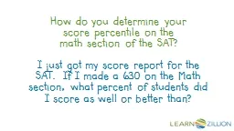
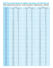
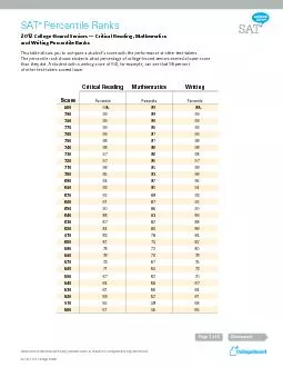
I just got my score report for the SAT If I made a 630 on the Math section what percent of students did I score as well or better than In this lesson you will learn how to find percentiles ID: 745682
Download Presentation The PPT/PDF document "How do you determine your score percenti..." is the property of its rightful owner. Permission is granted to download and print the materials on this web site for personal, non-commercial use only, and to display it on your personal computer provided you do not modify the materials and that you retain all copyright notices contained in the materials. By downloading content from our website, you accept the terms of this agreement.
Slide1
How do you determine your score percentile on the math section of the SAT?
I just got my score report for the SAT. If I made a 630 on the Math section, what percent of students did I score as well or better than?Slide2
In this
lesson,
you
will learn how to find percentiles
by using a normal curve to represent the distribution of
univariate
data.Slide3
Remember that normal distributions are symmetric, bell-shaped curves with no significant gaps or outliers that approximately follow the
empirical
rule:Slide4
The
empirical
rule states that for a normal distribution:
about 68% of the data lie within one standard deviation of the mean
about 95% of the data lie within two standard deviations of the mean
about 99.7% of the data lie within three standard deviations of the mean.Slide5
The distribution on the following
dotplot
is approximately normal. It is symmetric about the mean, bell-shaped and approximately follows the
empirical
rule.Slide6
If your SAT math score is one standard deviation to the right of the
mean
, it does not mean that your score is at the 68
th
percentile. Percentiles represent the total percent that score at or below your score.Slide7
Suppose that the distribution of math SAT scores in your state is approximately normal with a mean of 520 and a standard deviation of 110. How can we graph the distribution without knowing every individual score? Slide8
Well, statisticians often approximate normal distributions of data to a smooth curve that displays the shape of the data without all the lumpiness. Slide9
We know the normal curve for the distribution of SAT math scores in your state would look something like this:Slide10Slide11
Now we can use this normal curve to determine the percent of SAT math scores that are at or below your score of 630. Since 630 is one standard deviation to the right of the mean, the area of interest would look like this:Slide12Slide13
We know 50% of your state’s SAT math scores are at or below 520. We determine that a score of 630 is one standard deviation above the mean, so we must add this additional area in order to determine your score percentile.Slide14
We also know 68% of the data on a normal curve is between one standard deviation left and right of the mean, so we just need to add half of that area to 50% in order to have our area of interest:
50% + 1/2(68%)=84%Slide15
By using the normal curve for this distribution of data, we have now been able to determine that your score on the math SAT is in the 84
th
percentile of all test takers in your state.Slide16
We now see that although 68 percent of the data was
between
one standard deviation of the mean, that is not equivalent to the percent of data that is located to the left. Percentiles represent
the total area left
of a variable of interest.Slide17
In this lesson you
have learned how to find percentiles
by using a normal curve to represent the distribution of
univariate
data.Slide18
Now, how would you determine the percentile of a student who scores a 410 on the SAT math section in your state?Slide19
Since a score of 410 would be one standard deviation
to the left
of the mean, you would need to
subtract
the area from 50%, so the area of interest is 50%-1/2(68%)=16%.Slide20
So a student who scores a 410 on the SAT math section is in the 16
th
percentile of all test takers in the state.Slide21
Finally, determine the percentile of a student who scores a 740 on the SAT math section in your state.Slide22
A score of 740 would be located two standard deviations above the mean:
50%+1/2(95%)=97.5%.
A score of 740 on the SAT math section in your state is in the 97.5
th
percentile of all test takers.Slide23
The distribution of exam scores in the math department of a large university is approximately normal with a mean of 81 and a standard deviation of 7. Sketch and label a normal curve to represent this distribution. Next, shade the region under the curve that represents the percent of exam scores at or below 67. What percent of the data would be in this shaded region?Slide24
The distribution of heights of adult American men is approximately normal with a mean of 69.2 inches and a standard deviation of 3.1 inches. Determine the height percentile for a male who is 75.4 inches tall.Slide25
The distribution of exam scores in the math department of a large university is approximately normal with a mean of 81 and a standard deviation of 7. What percent of students score
higher
than a 95 on the exam?Slide26
Use the information provided here to answer the questions on the next slide:
In 2009, the mean ACT score was 18 and the standard deviation was 6. The distribution of ACT scores is approximately normal.Slide27
A score of 24 on the ACT in 2009 would place a student in what percentile?
About what percent of the 2009 ACT test-takers scored at or below a 6?Slide28
Lesson Slides Rubric
Use this rubric to ensure your lesson plan is great!Slide29
Math Rubric
Criteria for Success
Things to avoid
Storyline or Arc of the Lesson
There is a clear arc to the lesson. One slide leads naturally to the next so that there is a flow and a building of meaning
All the components of the lesson are there but they seem disconnected, as if the author wrote each without thinking about how they fit into the whole.
Hook Slide
The teacher poses a simple question that illicits the response, “yeah, I do wonder how that works…”
The question is short
A relevant example is included when it is short and further pulls the learner in
The question mirrors what the student will learn, then need to do later in the guided practice
The question seems formulaic, inauthentic, or overly “school-ish” (message: you have to learn this because you’re in school rather than, this is genuinely interesting)
The hook is overly-complicated and potentially confusing
The question does not parallel the guided practice questions
Objective Slide
The objective follows the form (you will learn X by doing Y)
Is concise and follows the form provided in the examples
Does not follow the form
Is overly vague in describing either the X or the Y
Is too long
Is written for teachers but not students
Let’s Review
Reminds the student of how this lesson fits with other lessons (the lesson, however, should still be able to stand on its own)
Reminds the student of important vocabulary
Is as concise as possible
Uses visuals whenever possible
Is either too detailed or not detailed enough in connecting the lesson to other lessons
Leaves out important touch points
Makes the lesson overly dependent on the other lessons (student will be confused or feel like they’ve made a mistake, if they watch this lesson alone)Slide30
Common Mistake
Points out a common mistake that students make
Concisely explains the thought process that leads to that mistake
Isn’t actually a mistake students make (too simple)
Is confusing or vague
Modeling a Way of Looking at It
Clearly models a way to look at the standard
Uses visuals as often as possible to show how the way of looking works
Is in “think aloud” format. The teacher is opening up his/her thought process to the student
Takes advantage of every opportunity to explain why the math works the way it works
Engages the learner by asking questions along the way to build suspense
Uses an an example to show the way in action
Explains how this way of looking at it shows why the common mistake (see above) is a mistake
Focuses on the algorhythm (or trick) instead of on showing a way of looking at the math
Fails to use visuals to show a way
Fails to explain his/her thinking along the way. The teacher effortlessly runs through the steps as if it’s all obvious and easy
Does not ask any questions along the way to pull the learner in
Misses opportunities to explain the why behind the math
Fails to explain why this way of looking at the math addresses the common mistake
Objective Review
Reviews the objective in a way which conveys, “we’ve come full cicle and now you see this objective with new eyes.”
Serves as a “let’s pull this all together” moment that helps organize the lesson in the learner’s mind
Creates abrupt feeling between the lesson and the reviewing (subtext: “we’re done with this lesson, let’s quickly bring it to a close.”)
Guided Practice
Is at the same difficulty level modeled in the lesson
Is connected to the initial hook question
Seem unrelated to the hook question
Is at a different difficulty level than that modeled in the lessonSlide31
Extension Activity Suggestions
Includes a suggestion for a struggling student who needs more opportunities for practice
Includes a suggestion for students who seem to get it but need more practice
Includes a suggestion for students who get it and are ready to be challenged further
Suggestions should clearly build from the approach in the core lesson
Does not include differentiation
Does not thoughtfully connect or flow from the lesson
Does not clearly build from the approach in the core lesson
Does not give a range of activities
Aesthetics
The slides use the correct colors (blue, green, red) in the correct
sequence.
The
slides use the correct fonts
The slides use handwriting and the handwriting appears as written in the right places
The slides only use the headers/titles provided
The slides use the provided visuals or include visuals created by the author or
LearnZillion
The slides use animation, highlighting, and circling to scaffold the learning, keeping the eye focused on what the teacher is introducing/explaining
The slides clean and uncluttered. The visuals and text do not exceed the maximum amount (see tutorial for example of maximum)
The slides use other colors or vary the order of the colors
The slides add new headers/titles that aren’t part of the template
The slides use clip art
The slides are cluttered
Animation is distracting and feels more like sizzle than part of the steakSlide32
Graphic and Image Templates
Copy and Paste items from these slides to make your presentation look great!Slide33
You can copy and paste these items into any slide
Green text box that appears letter by letter
Green text box that fades in
Blue text box that appears letter by letter
Blue text box that fades in
Red text box that appears letter by letter
Red text box that fades inSlide34
You can copy and paste these items into any slide—make sure you copy both the bubble and the text!
Do I feel strongly about it?
Do I have a lot to say?
Do I feel strongly about it?
Do I have a lot to say?
Do I have a lot to say?Slide35
You can copy and paste these items into any slide. You can resize them as needed!
Use black text when you write in me please! Also, keep my text left-justified rather than centered!
Use black text when you write in me please! Also, keep the text left-justified rather than centered!Slide36
All arrows can
be
recolored by
changing the “shape fill.” You can also resize them or rotate them!Slide37
[Write first step here…]
1
2
[Write second step here…]
3
[Write third step here…]
You can use these when discussing main ideas or steps in a process…Slide38
You can resize any of these
boxes and use them to highlight text
or ideas
.Slide39
Let’s Review
Let’s Review
Let’s Review
A Common Mistake
Let’s Review
Guided Practice
Let’s Review
Quick Assessment
Let’s Review
Extension Activities
Core Lesson