/
Anatomy and usage of type for graphic designers Anatomy and usage of type for graphic designers

Anatomy and usage of type for graphic designers - PowerPoint Presentation

melody
melody . @melody
Follow
344 views
Uploaded On 2022-06-11

Anatomy and usage of type for graphic designers - PPT Presentation

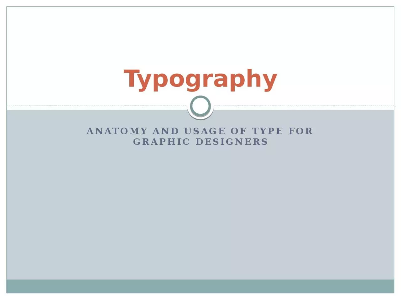
Typography Typography for designers Type terminology is based on the machine age and so seems quaint in the computer age Typography for designers Type is measured in points and picas 12 points pts1 pica ID: 916870

designers typography style type typography designers type style serif space typeface roman body popular sans text leading modern amount

Share:

Link:

Embed:

Download Presentation from below link

Download Presentation The PPT/PDF document "Anatomy and usage of type for graphic de..." is the property of its rightful owner. Permission is granted to download and print the materials on this web site for personal, non-commercial use only, and to display it on your personal computer provided you do not modify the materials and that you retain all copyright notices contained in the materials. By downloading content from our website, you accept the terms of this agreement.


Presentation Transcript

Slide1

Anatomy and usage of type for graphic designers

Typography

Slide2

Typography for designers

Type terminology is based on the machine age, and so seems quaint in the computer age.

Slide3

Typography for designers

Type is measured in points and picas.

12 points (pts)=1 pica (

p

); 6 picas=1 inch.

Display type is generally measured in units of 6 or 12 pts.

“Agate” type is very small, about 5 pt. Other body type is between 7 and 12 pts.

Display type is 14, 18, 24, 30, 36, 48 pts.

Etc.

Slide4

Typography for designers

Type is measured on the amount of space it sits on, the “stamp.”

Type of the same point size can be larger or smaller depending on its x-height.

Slide5

Typography for designers

A “font” is strictly speaking one size, one style of type, like a typewriter keyboard.

A typeface is all possible permutations of one font, as designed by a type designer.

Slide6

Typography for designers

Leading (“

ledding

”) is the amount of space between each line of type.

Expressed in points: 12 pt type with 3 pts of leading between each line is called “twelve on fifteen,” 12/15.

Type with no leading, such as 12/12, is “set solid.” But it still has space between each line, due to size of the (now imaginary) stamp.

Slide7

Typography for designers

Kerning is adjusting the amount of space between letters. (Strictly speaking, kerning is reducing space; letter spacing is increasing.) Applies mostly to display text.

Tracking is the spacing between letters in body text.

Slide8

Typography for designers

We can separate typefaces into six broad categories or “races”:

Roman

Sans serif

Egyptian (slab serif)

Script

Blackletter

Novelty

Slide9

Typography for designers

Roman (spelled with lower case “

r

”) dates from the beginning of printed books (“incunabula,” before 1500)

As a serif style, it is still extensively used today.

Slide10

Typography for designers

Roman is so important that it is separated into three categories:

Old style

Transitional

Modern

Slide11

Typography for designers

Old style is closest to calligraphic writing.

Thick and thin areas slanted (oblique)

Little brilliance (difference between

thicks

and thins).

Brackets.

This is

garamond

, an old style roman face designed centuries ago, but still popular today.

Slide12

Typography for designers

Roman transitional is less slanted, more brilliant, and less obvious brackets. It dates from 1700s-early 1800s.

Baskerville is a typical transitional typeface commonly used today.

Slide13

Typography for designers

Roman modern reflects machine-age ability to create metal type with no slant, strong brilliance, and no brackets. It dates from 1700s as well.

Bodoni

is a commonly used modern roman typeface.

Slide14

Typography for designers

Sans serif typefaces, or “sans,” date from the early 1800s, but became popular mostly in the last century.

“Form follows function,” Bauhaus popularized sans.

Helvetica is a popular sans serif style

designed in the 1950s. It is so widespread that it’s featured in a film, “

Helvetica

.”

Slide15

Typography for designers

Egyptian, or “slab serif,” was the rage in nineteenth-century America and Europe, as it supposedly resembled Egyptian cuneiform at a time when Egyptology was popular.

Rockwell, with its blocky serifs, has a 1920s feel.

Exaggerated slabs shout like an Old-West poster:

Wanted!

Dead or Alive.

Slide16

Typography for designers

Script resembles hand writing.

Useful for advertising and specialized publications.

Script may resemble printing…

or

cursive writing.

Slide17

Typography for designers

Blackletter

resembles original Church-based gothic style of the middle ages.

Used in Germany until the twentieth century.

Mostly decorative, advertising and specialty pubs.

Blackletter

is often called Old English, although that is a specific typeface name.

Slide18

Typography for designers

Other decorative styles are used sparingly, and never for body text.

Some resemble ancient Greek or roman.

Some resemble stencil.

Some resemble, um…?

Slide19

Typography for designers

“Dingbats” are typographic flourishes like arrows, stars, pointing hands, etc. Also called “pi

” faces.

Called glyphs in

InDesign

.

Hert

a3L

som

*

dinIU&ts

.

Slide20

Typography for designers

Most type is designed to be proportional, that is, a different amount of space between each letter for attractiveness.

Monospaced

typefaces are similar to typewriter-style faces, giving the same amount of space to each letter.

Monospaced

fonts are often used for screen fonts, seldom for printed material.

Courier is a common

monospaced

font based on the Smith Corona typewriter.

Slide21

Typography for designers

Choosing body type and leading are critical to the personality and readability of your publication.

Old style

type is nostalgic, eloquent, trustworthy, personal, traditional, sincere, informal.

Modern type

is crisp, dressy, technical, modern, formal.

Sans serif type

is contemporary and efficient.

Slab serif type

is loud and persistent, not often used nowadays for body type.

Script

,

blackletter

,

fancy fonts

are seldom body type.

Slide22

Typography for designers

Old style typeface

Slide23

Typography for designers

Modern typeface

Slide24

Typography for designers

Sans serif typeface

Slide25

Typography for designers

Egyptian typeface.

(Also called slab serif.)

Slide26

Typography for designers

Type choices also reflect historical usage and cultural tastes.

Cheltenham, a late-transitional face, was popular in the 1920s, and so newspapers from that period are identified with “Roaring 20s.”

Bodoni

was popular for headlines in the 1960s.

Helvetica was popular in the 1970s.

In choosing type, we need a sensitivity not only to our style of publication, but to zeitgeist—spirit of the day.

Slide27

Typography for designers

Readability studies beginning in the 1920s have shown:

Legibility and readability are different;

blackletter

may be legible but not readable.

All capitals or capitalizing every word is less readable.

Very short or long lines are less readable: one and one-half alphabet maximum.

Tinted backgrounds, justified type make no difference.

Slide28

Typography for designers

Basic rules for type:

Never mix faces of the same race, especially if they are similar;

bodoni

and schoolbook on the same page, for example, looks uncomfortable; readers will feel something is wrong.

Use one family for headlines, another family for body text; allow one family to dominate.

To maintain harmony yet add variety, choose display same typeface in boldface (bf), italic (ital), expanded, condensed.

Slide29

Typography for designers

Typographic pitfalls:

Poor spacing, particularly in justified text.

Two spaces after each sentence.

“Rabbit-ear” quotes instead of typographer’s quotes.

Two hyphens (or one) instead of— an

em

-dash (Option-shift-hyphen).

Hyphen instead of en-dash for time expressions, such as 8–5 p.m. (Option-hyphen).

Wrong apostrophe for year contractions: ‘99 should be ’99 (Option-shift- ]).

Slide30

Typography for designers

More typographic pitfalls:

Relying on “Auto” leading. Choose a leading so that if you make text larger, space will stay the same.

Leaving the same amount of space above and below a headline. Leave a little more above, a little less below.

Punctuation outside quotes, such as “The Golden Rule”. Always punctuate first, except for semicolons and colons.

Inconsistency: spacing should be the same between photos and

cutlines

, heads and text, subheads, etc.