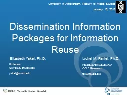
/
CSS Layout Mimi Opkins CSS saves time - You can write CSS once and then reuse the same CSS Layout Mimi Opkins CSS saves time - You can write CSS once and then reuse the same

CSS Layout Mimi Opkins CSS saves time - You can write CSS once and then reuse the same - PowerPoint Presentation

mila-milly
mila-milly . @mila-milly
Follow
65 views
Uploaded On 2023-11-11

CSS Layout Mimi Opkins CSS saves time - You can write CSS once and then reuse the same - PPT Presentation

Pages load faster If you are using CSS you do not need to write HTML tag attributes every time Just write one CSS rule of a tag and apply it to all the occurrences of that tag So less code means faster download times ID: 1031221

html positioning element css positioning html css element page position div perspectives blended xhtml elements left property code text

Share:

Link:

Embed:

Download Presentation from below link

Download Presentation The PPT/PDF document "CSS Layout Mimi Opkins CSS saves time - ..." is the property of its rightful owner. Permission is granted to download and print the materials on this web site for personal, non-commercial use only, and to display it on your personal computer provided you do not modify the materials and that you retain all copyright notices contained in the materials. By downloading content from our website, you accept the terms of this agreement.


Presentation Transcript

1. CSS LayoutMimi Opkins

2. CSS saves time - You can write CSS once and then reuse the same sheet in multiple HTML pages. You can define a style for each HTML element and apply it to as many web pages as you want. Pages load faster - If you are using CSS, you do not need to write HTML tag attributes every time. Just write one CSS rule of a tag and apply it to all the occurrences of that tag. So, less code means faster download times.Advantages of CSS------1

3. Easy maintenance - To make a global change, simply change the style, and all the elements in all the web pages will be updated automatically.Superior styles to HTML - CSS has a much wider array of attributes than HTML, so you can give a far better look to your HTML page in comparison to HTML attributes.Advantages of CSS -----2

4. Multiple Device Compatibility - Style sheets allow content to be optimized for more than one type of device. By using the same HTML document, different versions of a website can be presented for handheld devices such as PDAs and cellphones or for printingGlobal web standards – Now HTML attributes are being deprecated and it is being recommended to use CSS. So it’s a good idea to start using CSS in all the HTML pages to make them compatible with future browsers.Advantages of CSS ------3

5. Selector: A selector is an HTML tag at which a style will be applied. This could be any tag like or etc. Property: A property is a type of attribute of HTML tag. Put simply, all the HTML attributes are converted into CSS properties. They could be color, border, etc.  Value: Values are assigned to properties. For example, color property can have the value either red or #F1F1F1 etc.CSS ─ SYNTAX selector { property: value }

6. The <div> element is well-suited as a layout tool. It is a block-level element that is used to divide the page into logical sections, and can hold whatever you need inside it. You can have blocks of text in <div>s and then put them together in a layout. You have immense freedom, with the ability to add these blocks, or “layers”, on top of each other. Check out this example.Working with <div>s

7. The div tag has few attributes of its own (along with align="left | right | center"), with all of its formatting applied through stylesheets. To set up a simple navigation block, we would use code like this (with the CSS being in an external .css file or style block):div#navigation {width: 200px; background: gray; padding: 10px; }<div id="navigation">...navigation links...</div>Working with <div>s

8. This example code uses some very simple CSS code. All block-level elements can have a width property, specified in units or as a percentage, Background color and some padding space were added around the div content.Working with <div>s

9. Since divisions are block-level (i.e., they default to 100% of the available screen width and add line breaks between each other), they will all just stack up underneath one another unless you position them in some way. The simplest way to do this is to use the CSS float property, the backbone of most CSS layouts. You can float any element left or right, and it will align itself over to the side of whatever element it is contained within. #column1 {float: left; width: 200px; padding: 10px; }#column2 {float: left; width: 200px; padding: 20px; }Floating Elements

10. To create columned layouts, you simply float all of the column divisions to the same side and they will line up beside each other, as long as they fit. Laying out content in this way has immediate benefits such as progressive downloading (as the text is loaded it is displayed onto the page immediately, so your visitor can read as the page is forming around the text). You can also give each column specific margins and padding, giving you greater freedom to space your content out. Floating Elements

11. Below is an example of code like the CSS above, with both div elements given the float: left; property:Floating Elements

12. With these floating elements you can mimic a table structure, and have your page in a traditional layout without all the drawbacks of tables. Floating elements takes a little bit of practice (especially if the columns are not the same height), but can result in many traditional and non-traditional layouts. But CSS wasn’t content to merely emulate the layout mechanisms of the past — now you can control the position of elements on the page down to the pixel.Floating Elements

13. There are two other types of positioning beyond floating: absolute and relative. The codes you’ll be using aretag {position: choice; top: 0px; bottom: 0px; left: 0px; right: 0px; } CSS Positioning

14. If you position an element (an image, a table, or whatever) absolutely on your page, it will appear at the exact pixel you specify. If you wanted a graphic to appear 46 pixels from the top of the page and 80 pixels in from the right, you could do it. The CSS code you’ll need to add into the image isimg {position: absolute; top: 46px; right: 80px; } Absolute Positioning

15. You just add in which method of positioning you’re using at the start, and then push the image out from the sides it’s going to be closest to. You can add the CSS directly into the tag using the style attribute or you can use classes and ids and put them into your stylesheet. It works the same way. The recommended method is to add classes for layout elements that will appear on every page, but put the code inline for once-off things.Absolute Positioning

16. The image would appear like this. As you can see, it is possible to have things overlapping with absolute positioning.Absolute Positioning

17. To create what we call layers with the div tag, use code like this:<div style="position: absolute; left: 610px; top: 80px; height: 400px; width: 100px; padding: 1em;">layer stuff</div> First you specify the position of the layer, then its dimensions (which is optional, the layer will resize itself). Positioning Layers

18. If you want to give color to the layer’s background, add the background-color: red; attribute in with the rest of your CSS code. Anything that could go on a normal page can be positioned with <div>s. With layers, all the information a browser needs is contained in the style attributes you’ve added. Therefore, it will display as soon as any part of it is downloaded.Positioning Layers

19. To get layers overlapping each other you need to use the z-index command. Add z-index: 1 in with the positioning code and this element will appear above everything without this command. If you want something else to go over this layer too, add z-index: 2 and so on. The higher the index, the closer the div will appear to the front of the page.Positioning Layers

20. Put the layer that holds your page’s content at the top of your code. This is what readers want to see immediately. Your navigation and other presentational components can then load around this, allowing your reader to begin reading as soon as possible and making your navigation available when it is most likely to be used: after the page has been read.To see some examples of designs laid out with both float and absolute positioninghttp://www.yourhtmlsource.com/redesigns/Positioning Layers

21. When you position something relatively, you are modifying its position from where it would have been if you hadn’t changed anything. For instance, in the next sentence, we’ll offset “some words” 12px down and 22px right relative to their start position.Relative Positioning

22. The words in parentheses are the words in their original positions, and the bold ones are the moved words. The CSS code to move them was<span style="position: relative; top: 12px; left: 22px;">some words</span> You should notice that if you want to move something left, you use the right code, and push it away from that side and vice-versa.To override an inherited position property, and make the element just a normal part of the page again, set it to position: static.Relative Positioning

23. Centering a div or any other block-level element horizontally is a special case for CSS layout, even more so because there is a bug in Internet Explorer’s implementation of the standard way of doing it. The standard way is to set the element’s horizontal margin values to auto, like so:#wrapper {width: 760px; margin: 0 auto; } Horizontal Centering

24. body {text-align: center; } One final step is then necessary. The line above will, of course, center all the text inside the centered elements as well, which is generally not what we want, so we need to align the text within back to the left. So here’s all the code:body {text-align: center; }#wrapper {width: 760px; margin: 0 auto; text-align: left; } Horizontal Centering

25. Be careful if you’re planning on mixing absolute positioning and this centering method in the same layout. If you want other elements to be absolutely positioned inside the wrapper, make it relatively positioned first.#wrapper {position: relative; width: 760px; margin: 0 auto; text-align: left; } This will make an inner element that you absolutely position at, for example, top: 0; left: 0; appear at the top left corner of the wrapper, and not of the top left of the entire window.Horizontal Centering

26. This presentation is taken fromHTML Source : HTML TutorialsCredits

27. New Perspectives on Blended HTML, XHTML, and CSS27ObjectivesCreate boxes for layoutSize and position boxesDetermine how to control overflow for a boxUse the <div> tag to create formatting sections of a document

28. ObjectivesList the positioning propertiesUse the z-index property to stack elementsUse the media attribute and its valuesCreate print stylesUse multiple style sheetsNew Perspectives on Blended HTML, XHTML, and CSS28

29. Sizing and Positioning BoxesWeb page developers refer to the header area as the masthead, banner, or headerThey call the main window the main, content, body, container, box, or frame areaThey often refer to the bottom of the page as the footerNew Perspectives on Blended HTML, XHTML, and CSS29

30. Sizing and Positioning BoxesDesigners typically use layouts that include one or more of the following design components: a horizontal banner, or bar, at the top of the page that usually includes a corporate logoa sidebar, which is a narrow vertical column commonly used for linksthe main document window, which is the largest window and contains most of the page contenta footer, which is a row at the bottom of the page, which usually displays the contact information for the Web site, such as the addressNew Perspectives on Blended HTML, XHTML, and CSS30

31. Sizing and Positioning BoxesNew Perspectives on Blended HTML, XHTML, and CSS31

32. Sizing and Positioning BoxesNew Perspectives on Blended HTML, XHTML, and CSS32The overflow property is used to determine what happens if there is too much text (or an image is too large) to be displayed in the space for the boxvisible allows the box to expand as much as possiblehidden does not display overflow text; no scroll barsscroll displays scroll bars so users can scroll through the box; the size of the box remains the same.auto displays scroll bars only if necessary; the size of the box remains the same

33. Sizing and Positioning BoxesNew Perspectives on Blended HTML, XHTML, and CSS33

34. Sizing and Positioning BoxesNew Perspectives on Blended HTML, XHTML, and CSS34To add a background image to a sidebar:

35. Sizing and Positioning BoxesTo center the text of the sidebar:New Perspectives on Blended HTML, XHTML, and CSS35

36. Sizing and Positioning BoxesNew Perspectives on Blended HTML, XHTML, and CSS36If you lay out pages using boxes, create styles for elements by using descendant selectorsIf you are styling the same element more than once, make sure that the elements all have the same properties (though they can have different values)

37. Using the Positioning PropertiesThe largest box is the browser window itself (the HTML element)Inside this box is the body box, which in turn contains other smaller boxes, such as headings, paragraphs, and em and strong elementsThis is called the normal flow of the HTML documentNew Perspectives on Blended HTML, XHTML, and CSS37

38. Using the Positioning PropertiesNew Perspectives on Blended HTML, XHTML, and CSS38The positioning properties allow you to display an element out of the normal flowCSS positioning allows you to create pages with elements with layering, which means that you can have text or images overlap each otherThe position property takes several values, with the two most important values being absolute and relative

39. Using the Positioning PropertiesNew Perspectives on Blended HTML, XHTML, and CSS39When you use absolute positioning, the element is displayed in the exact position you specifyWhen you use relative positioning, you are shifting the element’s position from the point where that element normally would be displayed

40. Using the Positioning PropertiesThe left property with:A positive value positions an element a certain distance from the left edge of the screen, moving the element to the rightA negative value positions an element to the leftThe top property with:A positive value positions an element a certain distance from the top edge of the screen, moving the element downA negative value positions an element above the normal positionNew Perspectives on Blended HTML, XHTML, and CSS40

41. Using the Positioning PropertiesNew Perspectives on Blended HTML, XHTML, and CSS41

42. Using the Positioning PropertiesThe z-index property is used to stack elements in the browser windowThe value for the z-index property determines the stacking orderThe higher the z-index value, the higher the text or the image is in the stackNew Perspectives on Blended HTML, XHTML, and CSS42

43. Using the Positioning PropertiesNew Perspectives on Blended HTML, XHTML, and CSS43Although HTML does not have a headers and footers feature, it is a common convention to set the style for the last line of a Web page and describe that line as being the footer box