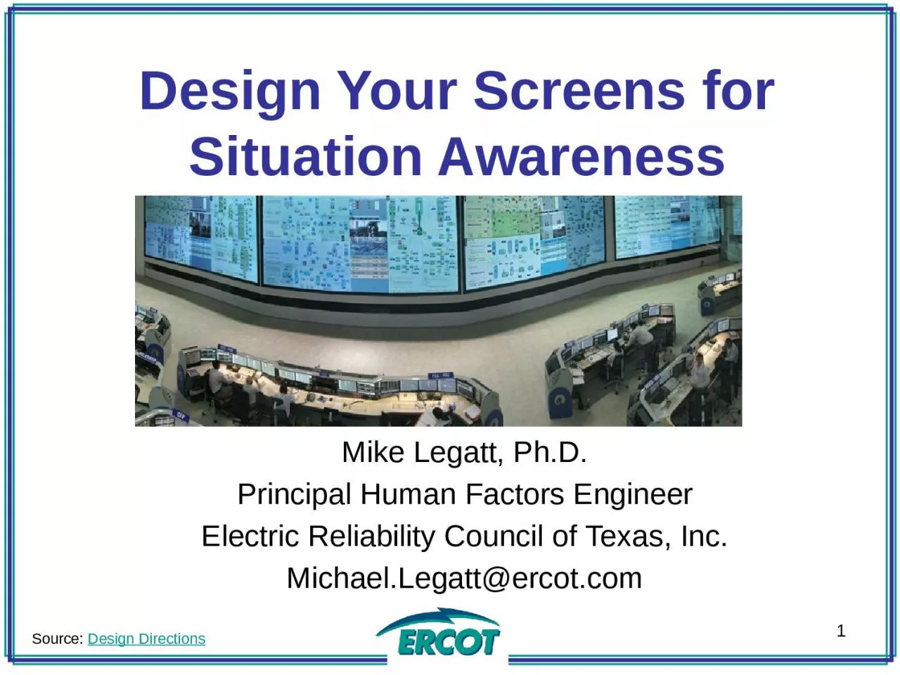
Mike Legatt PhD Principal Human Factors Engineer Electric Reliability Council of Texas Inc MichaelLegattercotcom 1 Source Design Directions Introduction This presentation is cover how humans perceive visual information and control visual attention so that you can optimize yo ID: 1044382
Download Presentation The PPT/PDF document "Design Your Screens for Situation Awaren..." is the property of its rightful owner. Permission is granted to download and print the materials on this web site for personal, non-commercial use only, and to display it on your personal computer provided you do not modify the materials and that you retain all copyright notices contained in the materials. By downloading content from our website, you accept the terms of this agreement.
1. Design Your Screens for Situation AwarenessMike Legatt, Ph.D.Principal Human Factors EngineerElectric Reliability Council of Texas, Inc.Michael.Legatt@ercot.com1Source: Design Directions
2. IntroductionThis presentation is cover how humans perceive visual information and control visual attention, so that you can optimize your displays and control room environment to maximize situation awareness.2
3. ObjectivesYou will:Comprehend and report key components of how people process visual informationComprehend and report the role of working memory on human performanceComprehend and report the levels and characteristics of situation awarenessEvaluate the layout of operator workstations, maximizing information processingFormulate UI design improvements to reduce working memory loading3
4. DefinitionsColor Discriminability/Deficiency/BlindnessSignal Detection Theory (SDT)Situation AwarenessVisual pathwaysMagnocellularParvocellularKoniocellularNon-linear contrast gainWorking memory4
5. Question 15Which text can you read most quickly, due to the nonlinear contrast gain control system and pathway speed?Gray text against a white background Black text against a white backgroundYellow text against a blue backgroundGreen text against a red background
6. Starting Small…Eye to LGN to several areas of brain:“What” system“Where / how” systemBoth involved in visual attention6
7. Starting Small…Magnocellular (large cells): Edges, motion, low contrast“Low resolution”Black/Gray/WhiteFast processingStrongly linked to attentionNonlinear contrast gain control system – speeds up visual processing to high contrast7Source: Legatt, 2005
8. Starting Small…Parvocellular (small cells): Red/green color, form, high contrast, slower processing“High resolution”80% of LGN areaKoniocellular (“sand” cells) Yellow/blue color, slowest processingRecently discovered, hidden between layers8Source: Legatt, 2005
9. Signal Detection TheoryGreen & Swets (1966)Ability to correctly identify stimuli on a radar screenHow accurately can you detect stimuli?Hit / False Alarm ProportionAccuracy (% correct)Sensitivity (accuracy)Response criterion (bias in ambiguous situations)9TargetNoiseResponseHitFalse AlarmNo ResponseMissCorrect RejectionSource: Legatt, 2005
10. Measuring Visual Attention: VC-CPT10Source: Legatt, 2005
11. Question 111Which text can you read most quickly, due to the nonlinear contrast gain control system and pathway speed?Gray text against a white background Black text against a white backgroundYellow text against a blue backgroundGreen text against a red background
12. Situation Awareness12
13. Question 213Which of the following indicates the highest level of situation awareness when looking at a screen?Being able to locate important informationUnderstanding the status of the equipment Being able to predict the status of the equipment one minute from nowSeeing a flashing alarm when there’s a problem
14. Situation Awareness14“The perception of elements in the environment within a volume of time and space, the comprehension of their meaning, and the projection of their status into the near future” (Endsley, 1995).Level 1: Perception (What?)Level 2: Comprehension (So what?)Level 3: Projection (Now what?)Both individual and team SASource: Endsley, 2011
15. Question 215Which of the following indicates the highest level of situation awareness when looking at a screen?Being able to locate important informationUnderstanding the status of the equipment Being able to predict the status of the equipment one minute from nowSeeing a flashing alarm when there’s a problem
16. Question 316Which designing your workstation, how should your content be laid out, if you’re facing forward?User Interfaces(Left to Right)Desk MaterialsA)Within 60°To sidesB)Within 30°ForwardC)Within 15°ForwardD)Within 15°To sides
17. Field of Vision17Resolution on retina highest at center, lower towards periphery.Farther out, you can only detect motion & vague shapes. Motion in the periphery can be distracting Try to keep content within FOV A(-15 to +15).Source: Lean Valley
18. Area of Reach18Lay out your workspace, and user interfaces so the most commonly-used interfaces and materials are in front of you, and less frequently used materials/interfaces are on the periphery.Source: UN Enable
19. Blind Spot19Close one eye and stare at the cross (if right eye open) or dot (if left eye open). Move your head back or forwardSource: Serendip Studio
20. Question 320Which designing your workstation, how should your content be laid out, if you’re facing forward?User Interfaces(Left to Right)Desk MaterialsA)Within 60°To sidesB)Within 30°ForwardC)Within 30°To SidesD)Within 15°To sides
21. Question 421What is absolutely necessary for good information organization and consolidation in a UI?Operator trust in the systemShowing only warning/error informationAvoiding colors at all costsPreventing redundant data across screens
22. Ambient Lighting22Source: Lean ValleyHigh contrast differences between environment and your screen/UI can cause stress. For example,Full brightness in the middle of the nightLow brightness screen in direct sunlightTransitioning between the screen and other factors of the environment can be frustrating.
23. Colors23Color is a fascinating subjectCultural values associated with colorsEvolutionary issues Favorite color blue (60% of men, 35% of women)Source: Color Blindness SimulatorProcessing speed increases when large red objects seenIn the eye, three types of cones process color
24. Issues with color24Color discriminability decreases both with age and nicotine useColor deficiency / blindnessSource: Chroma: A wearable augmented reality…
25. Targeting our visual system25Based on knowledge on the visual system:If colors are being used, critical information should have strong red/green components (but check users for color blindness)Motion captures attention – only use when you want to capture attentionCritical information should not have low contrast differentialsSource: UN Enable
26. Information Organization26Try to group UIs based on task, frequency of use, and/or how critical its informationTry to minimize redundant data across multiple screensIf possible, integrate information from multiple sources to support operationsIf possible, stay involved in development/vendor efforts; make sure the screens you receive work for you.
27. Information Organization27When possible, show as little “all good” information – especially in complex systemsProvide straightforward paths to navigating to detail and searchingWhenever possible, test screens in simulations under a variety of conditions before deploying.
28. Processing under stress28Source: Hancock & Warm (1989)It’s most difficult to process information under extreme stressWorking memory decreases under stress7±2 items => 3-5 long term damage
29. Trust is key!29A low trust in system is a major source of stress and forces changes in processing
30. Question 430What is absolutely necessary for good information organization and consolidation in a UI?Operator trust in the systemShowing only warning/error informationAvoiding colors at all costsPreventing redundant data across screens
31. User-Centered Design31Organize around: User procedures and abilitiesThe way we process information and make decisionsSource: Bernardo MalfitanoUsers understanding the state of the system (e.g., avoid early auto-pilot failures)
32. Focus on the message32“This system is powerful”Source: StackExchange
33. Focus on the message33“This system is powerful”Source: Rudy Vessup
34. Focus on the message34“This system is powerful”Source: Gizmodo
35. Focus on the message35“This system is powerful”Source: YouTube
36. Focus on the message36“This system is powerful”Source: Design Directions
37. Focus on the message37“This system is powerful” vs.“This system is optimized so you can quickly understand what is going on”Source: UN Enable
38. Focus on the message38“This system is trying to optimize SA”Sources: SA Tech, DHS,
39. Question 539Which of these statements is always true?“Powerful system” user interfaces should never be usedOperator error risk can be mitigated, even with increased data complexityUser interface design can completely compensate for operator fatigueAn operator in a dark, quiet room will perform best
40. Focus on the message40Why “this system is powerful?”Dignitaries and others visiting control rooms“cool” / “wow” factorWhy “Optimizing SA?”Important, mission critical systemsData that may be changing rapidly, and is of importanceTrust in core systems – show primarily the exceptions, not all informationBoth messages have their place!Source: UN Enable
41. Avoid Pitfalls41Attentional narrowing – attention grabbed, drawing focus away from critical informationData overload – More/faster information presented than a human can processMisplaced salience – Avoid the wrong things standing and catching your attentionSource: Endsley, 2011
42. Avoid Pitfalls42Complexity Creep – Additions to a UI or procedure may affect far more than one screenAlarm screens“Alarm storms” – critical information scrolling off the screen due to other important alarms“Dust storms” – critical information scrolling off the screen due to unimportant alarmsSource: Endsley, 2011
43. Avoid Pitfalls43Human factors still matterUser Interfaces can’t compensate fully for fatigue, stress, etc.People’s personality types influence how they perform in different environmentsLow operator confidence in systemsUncertainty in data not represented to usersSource: Endsley, 2011
44. Question 544Which of these statements is always true?“Powerful system” user interfaces should never be usedOperator error risk can be mitigated, even with increased data complexityUser interface design can completely compensate for operator fatigueAn operator in a dark, quiet room will perform best
45. Watch for Data Context & Misinterpretation Risk45Source: J. Merlo
46. Watch for Data Context & Misinterpretation Risk46Source: J. Merlo
47. Focus On What’s Important47Source: J. Merlo
48. Focus On What’s Important48Source: J. Merlo
49. Blind Spot49Close one eye and stare at the cross (if right eye open) or dot (if left eye open). Move your head back or forwardSource: Serendip Studio
50. Questions??50
51. Question 151Which text can you read most quickly, due to the nonlinear contrast gain control system and pathway speed?Gray text against a white background Black text against a white backgroundYellow text against a blue backgroundGreen text against a red background
52. Question 252Which of the following indicates the highest level of situation awareness when looking at a screen?Being able to locate important informationUnderstanding the status of the equipment Being able to predict the status of the equipment one minute from nowSeeing a flashing alarm when there’s a problem
53. Question 353Which designing your workstation, how should your content be laid out, if you’re facing forward?User Interfaces(Left to Right)Desk MaterialsA)Within 60°To sidesB)Within 30°ForwardC)Within 30°To SidesD)Within 15°To sides
54. Question 454What is absolutely necessary for good information organization and consolidation in a UI?Operator trust in the systemShowing only warning/error informationAvoiding colors at all costsPreventing redundant data across screens
55. Question 555Which of these statements is always true?“Powerful system” user interfaces should never be usedOperator error risk can be mitigated, even with increased data complexityUser interface design can completely compensate for operator fatigueAn operator in a dark, quiet room will perform best