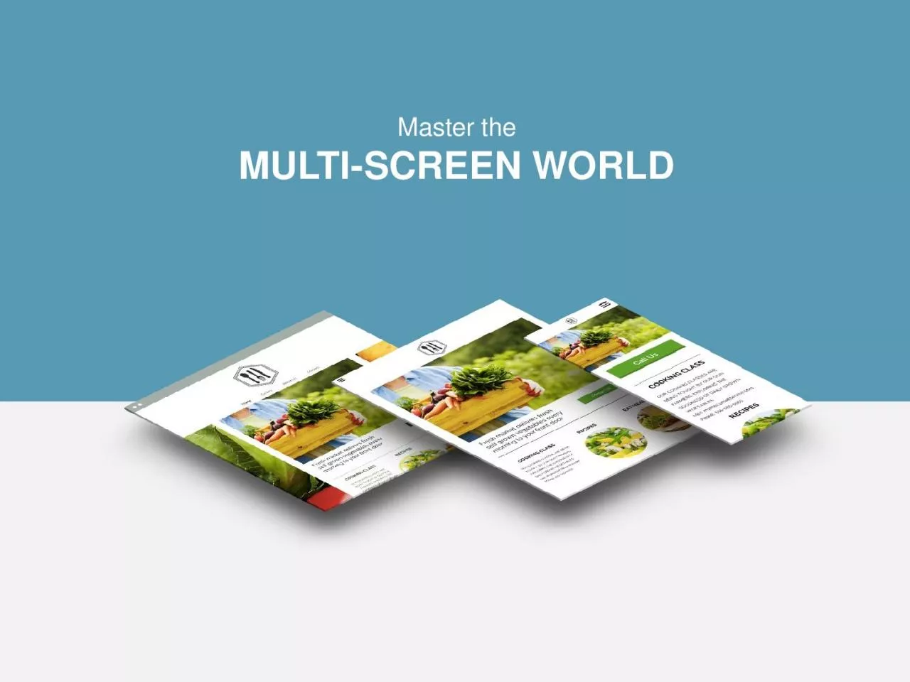
AGENDA What is a multiscreen website The growing importance of multiscreen sites What Google recommends Turning visitors into customers Providing a custom experience Dynamic content eCommerce ID: 812034
Download The PPT/PDF document "Master the MULTI-SCREEN WORLD" is the property of its rightful owner. Permission is granted to download and print the materials on this web site for personal, non-commercial use only, and to display it on your personal computer provided you do not modify the materials and that you retain all copyright notices contained in the materials. By downloading content from our website, you accept the terms of this agreement.
Slide1
Master the
MULTI-SCREEN WORLD
Slide2AGENDA
What is a multi-screen website
The growing importance of multi-screen sites
What Google recommendsTurning visitors into customers
Providing a custom experienceDynamic content
eCommerce
Weighing your options
Getting started
Slide3What is a
MULTI-SCREEN SITE?
A multi-screen site refers to one website that is optimized for desktop, tablet and mobile. A common, but more technical, term for these kind of websites is “responsive.”
Slide4A desktop-only website used to cut it,
but
not anymore…
DESKTOP
TABLET
SMARTPHONE
Device share of website traffic:
Devices are diversifying
& WEBSITES
MUST ADAPT
Slide5DIFFERENT DEVICES DOESN’T MEAN DIFFERENT CUSTOMERS
90% use multiple screens sequentially to accomplish a task over time
The
average person uses a combination of 3 different screens every daySmartphones are the most common starting place for online activities
PCs/laptops are most
often a starting point for more complex activities
Tablets
are most often a starting point for shopping and trip planning
Slide6A MULTI-SCREEN SITE
IS SEO GOLD
In June 2012, Google declared that they prefer responsive web design over separate mobile and desktop websites
THE
REASON
One
single URL makes it easier
for Google
to search
a
site for relevant content.
THEREFORE
Responsive
websites generally
rank much
higher in search
results.
Slide7WE GO BEYOND
RESPONSIVE
With Business-Driving Features
Our multi-screen websites are unique. We build in high-powered
features to meet the specific needs of your business and customers.
Here are just a few examples.
CLICK-TO-CALL
Enables your customers to contact you with just the push of a button
MAPS
Ensures your customers will always be able to find their way to your door
YELP REVIEWS
Inspires confidence in your business and assures customers you’re the right
choice
CUSTOM COUPONS
Places your most enticing deal front and center on your website
Slide8v
To Provide a Custom Experience
DEVICE BY DEVICE
Different devices
means
different customer needs.
When visitors
land on your site via mobile or a tablet, they
don’t necessarily
need all of the same information that’s on
your desktop
site.
Image Slider
for tablet users
A Click-to-Call button
for mobile users
Full navigation only
for desktop users
Slide9And Leverage
DYNAMIC CONTENT
Everyone wants a personalized experience and we can deliver just that.
Using technology that has traditionally been reserved for enterprise-level
companies
like Amazon, we’ll set up a custom experience for your
customers based
on their physical location, time of day, number of previous visits to
the site
and more.
FIRST-TIME VISITORS
Will view a welcome video
AFTER HOURS
Ask your users to leave a message
Slide10THE ECOMMERCE OPTION
In addition to creating a website that encourages customers to visit your brick-and-mortar store, we can give them the convenience to shop anywhere from any device.
Depending on your needs, your store can include:
COUPON CODES
Generate
coupon codes for a particular product, or overall order, for customers to use at checkout.
30+ PAYMENT OPTIONS
Customers can pay using secure
, trusted payment providers like PayPal, Stripe,
Authorize.net
and more.
E
-GOODS
Offer
digital content for purchase and download (e.g. video and audio files, images, documents, etc.).
AND SO MUCH MORE.
Slide11WHICH WAY DO YOU
WANT TO GO?
Stick with what you’re doing
Create a responsive
w
ebsite?
Slide12GO MULTI-SCREEN:
73
% of visitors prefer a
site that’s optimized for
mobile
Faster load times
Takes
full advantage of
the 4.4 hours of leisure
time customers spend in
front of different screens
each day
THE RESULTS
You only get one chance to make a first impression. A responsive website ensures you’ll be
putting your
best foot forward, no matter what device your customers are using to view your site.
STAY THE COURSE
61% of visitors will abandon a
site that isn’t mobile-friendly
40% of consumers will
abandon a web page that
takes more than 3 seconds to
load
KISS metrics Google 2013
Slide13ONE LAST REASON TO
BE RESPONSIVE
It’s future-proof!
Our multi-screen websites are built using a framework that adapts to all device types. This means that no matter what someone is
using
to view your site, it will display perfectly.
So
in the future, as new devices, like TVs, watches and Google Glass, grow in web capabilities, your responsive site will still provide visitors with a fantastic user experience.
Slide14READY TO GET STARTED?
www.mca-tech.com
CONTACT
Bill Wyandt
610
-476-6727
Bill@mca-tech.com