/
Stacked Graphs – Geometry & Aesthetics Stacked Graphs – Geometry & Aesthetics

Stacked Graphs – Geometry & Aesthetics - PDF document

tatiana-dople
tatiana-dople . @tatiana-dople
Follow
424 views
Uploaded On 2016-08-06

Stacked Graphs – Geometry & Aesthetics - PPT Presentation

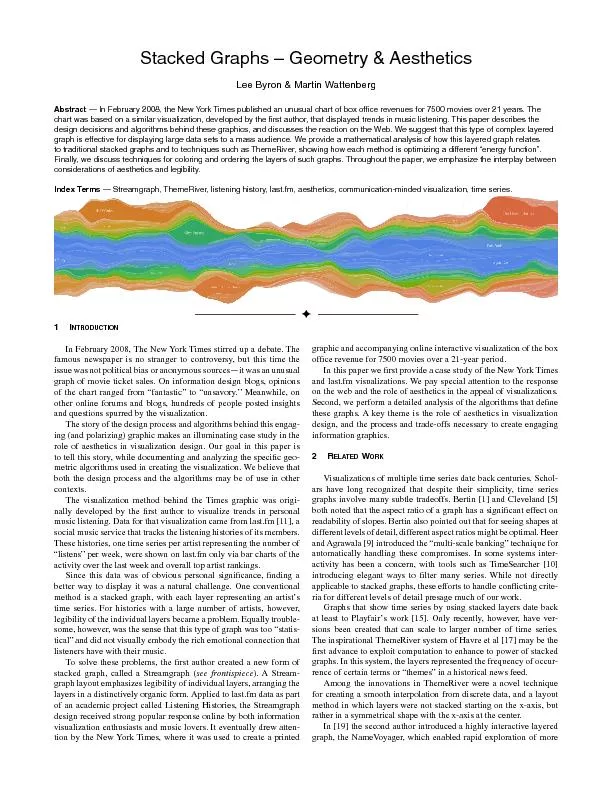
Lee Byron Martin Wattenberg Abstract 151 In February 2008 the New York Times published an unusual chart of box ofce revenues for 7500 movies over 21 years The chart was based on a similar vi ID: 435819

Lee Byron Martin Wattenberg Abstract

Share:

Link:

Embed:

Download Presentation from below link

Download Pdf The PPT/PDF document "Stacked Graphs – Geometry & Aesthet..." is the property of its rightful owner. Permission is granted to download and print the materials on this web site for personal, non-commercial use only, and to display it on your personal computer provided you do not modify the materials and that you retain all copyright notices contained in the materials. By downloading content from our website, you accept the terms of this agreement.


Presentation Transcript

Stacked Graphs – Geometry & Aesthetics Lee Byron & Martin Wattenberg Abstract — In February 2008, the New York Times published an unusual chart of box ofce revenues for 7500 movies over 21 years. The chart was based on a similar visualization, developed by the rst author, that displayed trends in music listening. This paper describes the design decisions and algorithms behind these graphics, and discusses the reaction on the Web. We suggest that this type of complex layered graph is effective for displaying large data sets to a mass audience. We provide a mathematical analysis of how this layered graph relates to traditional stacked graphs and to techniques such as ThemeRiver, showing how each method is optimizing a different “energy function”. Finally, we discuss techniques for coloring and ordering the layers of such graphs. Throughout the paper, we emphasize the interplay between considerations of aesthetics and legibility. Index Terms — Streamgraph, ThemeRiver, listening history, last.fm, aesthetics, communication-minded visualization, time series. NTRODUCTON In February 2008, The New York Times stirred up a debate. The famous newspaper is no stranger to controversy, but this time the issue was not political bias or anonymous sources—it was an unusual graph of movie ticket sales. On information design blogs, opinions of the chart ranged from “fantastic” to “unsavory.” Meanwhile, on other online forums and blogs, hundreds of people posted insights and questions spurred by the visualization. The story of the design process and algorithms behind this engag - ing (and polarizing) graphic makes an illuminating case study in the role of aesthetics in visualization design. Our goal in this paper is to tell this story, while documenting and analyzing the speci�c geo - metric algorithms used in creating the visualization. We believe that both the design process and the algorithms may be of use in other contexts. The visualization method behind the Times graphic was origi - nally developed by the �rst author to visualize trends in personal music listening. Data for that visualization came from last.fm [11], a social music service that tracks the listening histories of its members. These histories, one time series per artist representing the number of “listens” per week, were shown on last.fm only via bar charts of the activity over the last week and overall top artist rankings. Since this data was of obvious personal signi�cance, �nding a better way to display it was a natural challenge. One conventional method is a stacked graph, with each layer representing an artist’s time series. For histories with a large number of artists, however, legibility of the individual layers became a problem. Equally trouble - some, however, was the sense that this type of graph was too “statis - tical” and did not visually embody the rich emotional connection that listeners have with their music. stacked graph, called a Streamgraph ( see frontispiece ). A Stream - graph layout emphasizes legibility of individual layers, arranging the layers in a distinctively organic form. Applied to last.fm data as part of an academic project called Listening Histories, the Streamgraph design received strong popular response online by both information visualization enthusiasts and music lovers. It eventually drew atten - tion by the New York Times, where it was used to create a printed graphic and accompanying online interactive visualization of the box In this paper we �rst provide a case study of the New York Times on the web and the role of aesthetics in the appeal of visualizations. Second, we perform a detailed analysis of the algorithms that de�ne these graphs. A key theme is the role of aesthetics in visualization design, and the process and trade-offs necessary to create engaging information graphics. RELATEDORK Visualizations of multiple time series date back centuries. Schol - ars have long recognized that despite their simplicity, time series graphs involve many subtle tradeoffs. Bertin [1] and Cleveland [5] readability of slopes. Bertin also pointed out that for seeing shapes at different levels of detail, different aspect ratios might be optimal. Heer and Agrawala [9] introduced the “multi-scale banking” technique for automatically handling these compromises. In some systems inter - activity has been a concern, with tools such as TimeSearcher [10] introducing elegant ways to �lter many series. While not directly applicable to stacked graphs, these efforts to handle con�icting crite - ria for different levels of detail presage much of our work. Graphs that show time series by using stacked layers date back at least to Playfair’s work [15]. Only recently, however, have ver - sions been created that can scale to larger number of time series. The inspirational ThemeRiver system of Havre et al [17] may be the �rst advance to exploit computation to enhance to power of stacked graphs. In this system, the layers represented the frequency of occur - rence of certain terms or “themes” in a historical news feed. Among the innovations in ThemeRiver were a novel technique for creating a smooth interpolation from discrete data, and a layout method in which layers were not stacked starting on the x-axis, but rather in a symmetrical shape with the x-axis at the center. In [19] the second author introduced a highly interactive layered graph, the NameVoyager, which enabled rapid exploration of more than 6,000 data sets at once. While the layout method of the Name - Voyager was not novel—it used a standard stacked graph layout, with some level-of-detail calculations—the popular response to the applet suggested that stacked graphs have the ability to engage mass audiences. A follow-up design to the NameVoyager, described in [20], showed hierarchical time series. That is, it used interactivity and color to display time series that were arranged into categories and subcategories. In the Many Eyes system [17], this technique was made broadly available on the web. A �nal related work is the Revisionist [7] visualization of changes in source code over time. While not technically a stacked graph, the geometry is related since each line of code is represented by a curved stripe. Revisionist minimizes visual distortion by having a curved baseline that allows the visualization to roughly align identical lines of code between releases. LASTFMANDHEORKMES 3.1Listening History - Last.fm Listening History was created by the �rst author for a class project at Carnegie Mellon University. The six-week assignment was to collect and display a data set in an interesting and novel way. As described in the introduction, Listening History [4] visualizes trends in an individual’s music listening, as derived from data in the last. fm service. The x-axis represents time and each stripe represents an artist. The thickness of a stripe shows the number of times that songs from the artist were listened to in a given week. The color, as detailed in section 5, encodes two dimensions: the saturation is determined by the overall number of times an artist is listened, and the hue is related to the earliest date at which one of the artist’s songs were heard. A critical design goal for this visualization was to create a graphic that did not look scienti�c or mathematical, but rather felt organic and emotionally pleasing. In section 5 we will see that, ironically, achieving this goal relied on signi�cant computation. A side effect of the algorithm is the signature asymmetry between the top and bottom curves which form the organic shape and, as discussed later, minimizes internal distortion. At the end of the course, a few large-scale posters, some over 12 feet long, were printed as holiday gifts. The reaction of the recipients provides evidence, if anecdotal, that the graphic succeeded in elicit - ing strong emotional reactions when people saw their own listening history. People often remarked at the ability to see critical life events One pointed to the beginning and end of three separate relation - ships, and how his listening trends changed dramatically. Another noted the moment when her dog had died, and the resulting impact on the next month of listening. A third pointed out his dramatic differ - ences between summer and winter listening trends. As in the Themail system of Viégas et al . [18], the visualization of historical and per - sonal data seemed effective at eliciting re�ective storytelling. After Listening History was made public, there was high demand for personalized versions of these graphics by other last.fm members. In fact this demand was so strong that a number of imita - tors emerged, including Maya’s Extra Stats [12] and Godwin’s Last Graph [13] Interestingly, these services and other imitators use the simpler ThemeRiver layout and a simpler color scheme. The popularity of these imitators (Last Graph has created visu - alizations for more than 24,000 users) suggests the hypothesis that stacked graphs have an ability to communicate large amounts of data to the general public in an intriguing and satisfactory way. New York Times - Box Ofce Revenue The Box Of�ce Revenue graph, created by the �rst author and the graphics department of the Times [2,6] highlighted the dichotomy between box of�ce hits and Oscar nominations, discussed in the orig - inal article. The printed graphic ran vertically to best use the avail - able space, time running top to bottom; the online version ran left to right. To allow a quick reading of the graph, coloring was much simpler than in Listening History: a discrete palette signi�ed ranges of overall revenue. Furthermore, stroke lines were added because of issues with print registration. The online response to these graphics was intense and rapid. Many blogs and social websites featured long lists of comments dis - cussing data-points shown in the graph. As with the NameVoyager, blog posters and their commenters engaged in a social style of data analysis and critique of the new visual form. What follows are anec - dotes discussing these visualizations, which provide a rough sense of the breadth and intensity of the online response. Individual bloggers often found particular discoveries and pointed note the double spike on ‘Harry Potter an the Order of the Phoenix’. And the long hump on ‘Alvin and the Chipmunks’. ‘Juno’ also has an interesting curve as it did almost nothing for a month before popping out later in it’s run. Though that may be because it was released in just enough theaters to become Oscars �g 1 – section from Listening History of primary author �g 2 – �lms from the summer of 2007 eligible before going into wide release. Others looked at broader trends. As time goes on, movies open bigger but don’t last nearly as long in the theater as they used to. There are also more movies to choose from in 2007 than in 1986. One of the most extensive analytical conversations took place on the popular community news site Digg, where the discussion around the graph consisted of 156 comments at the time of writing. Here the talking points were briefer. Many times people posed questions: Why would Top Gun have such a long tail? You’d think they’d �gure out to take advantage of the lull in March and April. Looks like they are doing just �ne. F**k the MPAA. In addition to comments on the data, many people expressed opinions on the technique itself. Negative comments often expressed It’s a little confusing at �rst because the vertical scale is basi - cally irrelevant Uselessly complex, endlessly confusing, and the stuff below and above...what? On the other hand, many commenters were extremely enthusias - tic, calling the graph “amazing,” “fantastic,” and “brilliant.” More detailed positive comments seemed to focus on the richness of the As an avid fan of Tufte’s Visual Display of Quantitative Infor - mation… I relish content-rich graphics such as the one you cite. The graph is SO well done. Really good data and easy to read. This has to be one of the most intuitive data visualizations I’ve seen in a long time. Finally, many readers found the shape and colors of the graph suggestive. As the popular media blog Gawker put it: C11: New York Times Makes Box Of�ce Analysis Seem Cool, Vaguely Erotic Other comments echoed this theme. One of the printable ones came from a prominent academic who stepped into the blog space to speak This was a great graphic, visually appealing and even sen - suous (in a Georgia O’Keefe way). Others noted different connotations; some viewers liked these, some didn’t, and some felt both ways at once: anyone else �nd that chart either disgustingly gross or strangely delicious? it’s either the trail left behind a big brown slug, or someone spilled a bucket of dulce de leche pudding. awesome chart none the less ; ) A rigorous content analysis of these comments is beyond the scope of this paper. The various types of comments, however, suggest hypotheses for future study. Comments C1-C5 indicate there might have occurred the same kind of social data analysis seen around the NameVoyager. Opinion on the legibility of the graph was mixed. Comments C6 and C7 indicate the asymmetric top and bottom curves caused some people trouble. Despite this, many people claimed to read overall trends: C2, C4, and C5. At the same time C1, C2, C3 suggest that viewers are able to extract details of individual movie sales effectively; C8-C10 seem to refer to this fact implicitly. As dis - cussed below, these comments indicate there may be subtle tradeoffs in readability of various aspects of the graph. Finally, C11- C13, point to the idea that the general look of the graph effectively caught and held many people’s attention. CONSDERATONSTACKEDRAPHESIG The popular reactions to the NameVoyager, Listening History and its imitators, and the Box Of�ce Revenue graph suggest that this type of visualization is capable of conveying a large amount of data in a manner that engages mass audiences. The ThemeRiver system’s success indicates that these graphs are helpful for expert analysts as well. At the same time, all these systems have subtly different variations on the techniques for de�ning the geometry, layout, color, and interaction of the graph. We believe it is worthwhile to produce a uni�ed treatment of the issues involved with these graphs, partly as a guide for designers, and partly as a way of pointing out some unresolved issues that are ripe for future research. The design considerations for stacked graphs fall into two catego - ries. First, as with any information graphic, legibility of the data is critical. Indeed, one of the main polarizing aspects of the visualiza - tion related to its overall legibility. Second, as the reactions to the Listening History and New York Times visualizations show, aesthet - ics seem to play an important role in the popularity of this type of graphic. We present these perceived design issues so we may later refer to them as rationality for making particular design decsions. To ease reference, we have marked each issue with a letter, i.e. (A). 4.1Legibility The main idea behind a stacked graph follows Tufte’s macro/ micro principle [16]: the twin goals are to show many individual time series, while also conveying their sum. Since the heights of the individual layers add up to the height of the overall graph, it is pos - sible to satisfy both goals at once. At the same time, this involves certain trade-offs. There can be no spaces between the layers, since this would distort their sum. As a consequence of having no spaces between layers, changes in a middle layer will necessarily cause wiggles in all other surrounding layers, wiggles which have nothing to do with the underlying data of those affected time series (A). Reading and comparing the thicknesses of the various layers can be problematic for this reason, but for other reasons as well. Two layers of the same vertical height but with different slopes may appear to have radically different thicknesses (B). A related issue is related to Cleveland’s principle of banking to 45 degrees [5]: with typical data, there may be a trade-off between having individual layers being ). A second issue for both individual layers and the overall graph shape is the dif�culty in comparing the vertical thickness of two curves with different slopes. This is why, of course, traditional statistical stacked graphs have their bottom at the x-axis: it makes the overall height at each point easy to estimate. The trade-off in the case of traditional stacked graphs with many layers, however, is that this may cause the individual layers to be harder to read (D). A third issue is the ability of a reader to distinguish effectively the many layers of a stacked graph (E). In several stacked graphs with thousands of time series (the NameVoyager, the Listening History graph) color serves a twofold purpose: to convey a particular dimen - sion of data and to distinguish layers without using heavy borders. In the case of the NameVoyager, stripes are colored according to the gender of a name and the most recent value of the time series. The Listening History graphic uses the time of onset and relative personal popularity of musician. In the Many Eyes implementation of a “stack graph with categories,” the colors are chosen to convey a sense of the overall hierarchy. 4.2Aesthetics Legibility is not the only consideration, however. Just as important in the case of stacked graphs may be their aesthetic quality. Many of the comments on the Box Of�ce Revenue graphic support the idea that the visual appearance of the graph drew people in or kept them looking at the graphic (F). We speculate that some of the aesthetically pleasing—or at least engaging—qualities may be in con�ict with the need for legibility. The fact that the New York Times graph does not look like a standard statistical graphic may well be part of its appeal. If this is true, it is unclear how much weight to put on this fact in creating designs. If the graphic becomes commonly used, could its appeal actually diminish? On the other hand, if the appeal is more enduring, perhaps this is a good example of how a pleasing look may entice readers to dig deep into a set of data. The relative priorities of aesthetic and utilitarian considerations in a visualization clearly depend on context. In a situation with a �xed captive audience, there may be no need to compromise leg - ibility in order to get the attention of a viewer. In other situations, it may be worth prioritizing aesthetics to broade the appeal of a graphic. Through example, we display speci�c decisions based on this tradeoff. Exploring this balance, and studying when and how to compromise, may be an important area for future research. AORTHMSFORTACKEDRAPHESIG There are four main ingredients that determine a generalized stacked graph. The shape of the overall silhouette is the �rst ingredi - ent; this shape is critical since it determines the overall slopes and curvature of the individual layers. The second important parameter is the ordering of the layers, which may be chosen to conform to differ - ent aesthetic criteria. As with any visualization, labels are important as well—but the organic forms of a Streamgraph mean that labels require additional attention. Finally, color choice is critical, enabling viewers to distinguish different layers and potentially conveying additional data dimensions. In this section we describe algorithms that address each of these four ingredients with respect to the design issues of leigbility and aesthetics. A Unied Approach to Stacked Graph Geometry The geometry of a stacked graph consists of a set of layers, cor - responding to the time series. To conform to the “macro/micro” prin - ciple there can be no space between layers, so that the thickness of the overall stack re�ects the sum of the individual time series. Given this constraint, the overall geometry of the stacked graph is deter - mined by two factors: the shape of the “baseline,” or bottom of the lowest layer, and the order of the layers. In this section we discuss the effect of the baseline on the overall geometry of the graph, and in the next section discuss layer ordering. To describe the geometry precisely, we use the following nota - tion. We model our time series as a set of n real-valued non-negative functions, f , …, f n . In what follows, for simplicity, we will assume these are differentiable and de�ned on the interval [0,1]. One might also consider functions taking values at a discrete set of points, but the notation becomes more cumbersome and in any case it is easy to move from the discrete case to the differentiable case through interpolation. We refer to the baseline function that de�nes the bottom of the stacked graph as g . The top of the layer corresponding to the i th time series f i is therefore given by the function g i , where . How should the baseline function g be chosen? There are a variety of possible criteria. The simplest is the traditional stacked graph, which has This has the effect of making the graph of the sum of all the series into a traditional graph, based at zero ( �g 5 ). (In this and the fol - lowing �gures, we use a synthetic data set with randomly assigned i and g i used in this section �g 5 – A traditional stacked graph with a baseline g colors to distinguish layers.) In this layout the size of the sum of the series is easy to read, potentially at the expense of the legibility of the individual layers as mentioned in design issue (D). A simple alternative layout was suggested by Havre et al in the ThemeRiver system. They used a layout symmetric around the x-axis. Mathematically, this can be expressed as: or, from the de�nition of g n , which yields the ThemeRiver ( ) solution for g This is a simple enough de�nition, but there is another way to look at this formula which suggests some generalizations. What is special about the symmetric layout? Aside from a certain aesthetic quality, this layout has the effect of minimizing some important quantities. In particular, at each point, the silhouette is as close as possible to the x-axis, and in addition the slopes of the top and bottom of the sil - houette are in a sense as small as possible (in the sense of total sums of squares). This directly addresses design issue (C) by making the overall graph much less “spiky” thus greatly reducing the horizontal space needed to satisfy Cleveland’s principal. To see this, recall the following fact about averages. For any set of real numbers { a ,…, a n }, the value of x that minimizes is From this fact it follows that the value of g that gives the sym - metric ThemeRiver layout minimizes the sum of squares of the top since A similar calculation shows that the ThemeRiver layout also min - imizes the sum of squares of the slopes of g and g n at each point. Seen in this light, the ThemeRiver layout does not just produce a pretty symmetry, but is optimal in the sense of minimizing certain mathematical measures of distortion, a hint at addressing minimizing wiggles, design issue (A). Since a stacked graph depends on the readability of the individual layers, as noted in design issue (D), it is natural to ask about applying the same optimization criteria to each layer overall. For example, one might ask for a layout that reduced the overall sum of squares of the distance from the x-axis of all layer edges. In other words, we might like to minimize a deviation (Note: In this and future formulas, we adopt a special, convenient subscript notation. When a summation’s top subscript is less than the bottom, as in the case , we take the sum to be empty and equal to zero.) We might also be interested in minimizing the sum of squares of By the same logic, the deviation quantity is minimized when Moreover, differentiating this yields: which minimizes the wiggle measure as well. In other words, this choice of g has the effect of simultaneously minimizing both dis - tance from the x-axis and variation in slope. Moreover, the formula is extremely ef�cient to calculate. As �g 7 shows, it creates a more “even” layout compared to the ThemeRiver graph. This minimiza - tion directly addresses design issue (A) by attempting to reduce the effect of middle “wiggles” on the surrounding layers. Nonetheless, the layout can be improved further. In particular, it is potentially problematic that very thin layers receive the same treatment as very thick ones. After all, the thick layers are visually more important. Thus we might want instead to optimize the follow - ing quantity, which represents an average of the squares of slopes between the midpoints of each layer, weighted by layer thickness: By the properties of weighted averages, this is minimized at each point in [0,1] when which can be integrated numerically to yield a solution for g . Indeed, it turns out to be equivalent to the algorithm used in the Streamgraph method, as portrayed in Listening History and Box Of�ce Revenue graph. While this formula, which minimizes weighted_wiggle , is not as computationally ef�cient as the formula for optimizing wiggle, it seems to have better visual properties ( �g 8 ). Focusing on mini - mizing wiggle per layer in this way attempts to solve design issue (B) by making the height of a layer at any point easier to read at the cost of causing the silhouette of the whole graph to be slightly more dif�cult to read in this same way. In the appropriate context, such as the examples given in sections 2 and 3, this layout method also approaches design issue (F) by creating a subjectively beautiful aesthetic form. We believe that framing layout choices in terms of the quantities they minimize provides a useful way to organize the design space of stacked graphs. In a sense, the various distortion functions serve the same role as conventional “aesthetic criteria” in graph drawing, namely a translation of design judgment into quantitative form. Furthermore, this method points to natural extensions: it is easy to imagine “distortion functions” besides silhouette , deviation , wiggle , and weighted_wiggle . One could also write formulas that optimized weighted_wiggle(g ) a weighted average of several criteria. Of course, more complicated distortion functions may not admit the simple point wise optimiza - tions above, possibly requiring results from the calculus of variations or numerical optimization. 5.2Color Choice Coloring stack graphs with many layers is challenging. Although color is an opportunity to communicate additional data, strong or jarring colors become visually distracting and make the graphic hard to read. At the same time, there must be enough local contrast between layers in order to differentiate each layer, a particularly important issue as raised in design issue (E). The design problem is complicated by the need to balance these perceptual considerations with aesthetic ones which stem from design issue (F): does the �nal graphic look good? Are its emotional connotations consistent with the nature of the data? These complex trade-offs mean that choosing a color scheme is highly dependent on the underlying data as well as the context in which it will be presented. In this section we describe the decisions behind the Listening History and the Box Of�ce Revenue graph. In both cases, the darkness and saturation of the color for a particular time series re�ected the sum total of the series; this drew attention to series with larger sums—favorite musicians and blockbuster In the Listening History graphic, the color of each time series also encoded the time of onset. In this version of the visualization, onset time is shown using a visual gradient from cool colors to warm colors. This signi�cance of onset time for Listening History is due to the particular form of the last.fm data. Musicians may peak once when discovered, but then often experience many later resurgences. Box of�ce �lms do not experience this same resurgence trend. Due to the short duration of box of�ce �lms and their lack of resurgence, there is no need for differentiation based on time of onset since it is almost always apparent by placement alone. For Listening History, the colors chosen to represent the spectrum of old to new, of most signi�cant, or most listened, to least signi�cant construct a two dimensional gradient ( �g 9 ). The gradient across the x axis is a detailed movement through hue representing the “cold core” of known musicians versus the “hot new” discoveries of recent musicians, while the gradient down the y axis represents signi�cant to not signi�cant, consistently decreasing in saturation and increas - ing slightly in brightness. The colors used in Listen - ing History are not strictly computer generated, and not a pure transition through hue. Instead they are assembled to be visually expressive from the designer’s subject point of view, contextually addressing design issue (F). The colors are chosen from highly saturated images of nature. The blue is from a clear sky, the green from a tree leaf, and the reds, oranges and yellows from images of �ame. These colors are then formed into a gradient using Photoshop, giving speci�c care to the interpolation of color between these core points, compensating for the differences between numerical and perceptual consistency. Notably these colors appear natural and pleasing, and are not over-saturated. The range of color should not be confused with a round-trip hue “rainbow map” [3]. Firstly, this range represents only half of the available hues, marking a clear difference between extremes of the dataset. Rather, the range of color is chosen to represent a comple - mentary color scheme between old and new layers while also repre - senting analogous color schemes amongst individual layers. “Core” musicians, which appear early in the data set, tend to com - prise much more area than recently discovered musicians. In order to avoid a heavily blue colored graphic, this color gradient is biased towards the warmer colors. This counteracts the common area bias towards earlier onset time series and gives the resulting graphic a balance between warm and cool colors. The result of this handcrafted expressive palette is a wide range of colors to represent each layer of data which work together in an analogous way to please the eye but are also different enough to create local contrast between layers to ease differentiation as per design issue (E). Related to these two examples is the color scheme of the second author’s Name Voyager [14]. Name Voyager creates a simultaneous complementary color scheme between male and female names and analogous color scheme within each gender in order to create local contrast. This approach is very similar to that taken by Listening History. This coloring scheme is effective in communicating broad information as well as differentiating a large number of time series. 5.3Layer Labeling Design issue (E) considers distinguishing individual layers. Solving this, however, is pointless if it is not clear what each indi - vidual layer represents. Stacked graphs with a small number of layers do not necessarily need labels for the layers, since a legend and color coding scheme may be appropriate. Unfortunately, such a simple solution is not possible for a graph with hundreds or thousands of time series. A critical aspect of the design of stacked graphs is there - fore the placement of layer labels. Ideally a label is visually associ - ated with the data it represents, will not overlap other labels or layers, �g 7 – the same data set optimized to reduce the ”wiggle” function, or overall variation in slope �g 8 – the same data set optimized to reduce the “weighted_wiggle,” the algorithm used in Streamgraph and will not distract from the rest of the graphic. Listening History places labels within the layers themselves, rather than using a call-out line, not allowing the label to overlap the boundary of the layer ( �g 10 ). The font size of the labels is adjusted to �t each layer, and the labels are placed in an optimal spot along the graph where the font size could be the largest. (A simple brute-force approach to �nding this best position had acceptable performance for of�ine processing.) When printed at a high resolution, even the smallest layers have readable labels. To minimize unnecessary con - trast, and to visually connect the labels to the layers, labels are drawn white and slightly transparent to take on a portion of its layer’s color. This also creates the higher local contrast on more saturated—signif - icant—layers. For the graphic printed in the New York Times, the resolution of the printing process was not reliable; to compensate, labels were added by hand. The online interactive piece does not use this pro - posed label placement strategy because of the poor real-time per - formance of the brute-force algorithm. Rather it allows for roll-over details for smaller layers ( �g 11 ). 5.4Layer Ordering A �nal choice in the design of a stacked graph is the order of the layers. In some cases there may be a particular intrinsic sequence. For example, in the NameVoyager the ordering is alphabetical, since the emphasis of the visualization is on the initial letters of the name. In other cases, however, the ordering can be chosen to enhance legibility or to make a better-looking graph. approaching the design issues (A-C) and (F). In the remainder of this section we describe how these choices were made for Listening History and the Box Of�ce Revenue graph. These examples illustrate the interplay between aes - thetic and communicative concerns (F), as well as how particular statistical characteristics of data sets may affect the geometry (A-C). We end with a general discussion of other ways to use ordering. A particular type of burstiness characterizes both the Listening History and Box Of�ce Revenue data sets. A typical time series in each set begins at zero—a musician is unknown or a movie not yet released—and remains zero for a while, and then suddenly “bursts” to a maximum—a musician is discovered, a movie released to great fanfare—followed by decay in value —a musician becomes boring, a movie fades from public view. This pattern presents a challenge for the stacked graph layout, since bursts can cause disruptive wiggly artifacts in the geometry ( �g 12 ). By the same token, the “onset time” of a time series—i.e., the moment when it is �rst nonzero—becomes a variable that users may want to see highlighted. One might consider sorting the data set by “onset time”. If the “new” layers are always added along the top, the graph takes on a distracting downward diagonal stripe pattern in addition to an upward angle to the overall silhouette due to the layout algorithm’s effort to keep the sum of slopes low ( ). To prevent this, layers are given a “inside-out” ordering, in which early-onset time series are placed at the middle, with later-onset series at the top and bottom. This has three bene�ts in addition to avoiding the diagonal-stripe effect. First, it places the biggest bursts in the layers—the �rst non-zero value—at the outside the graph, where they will disrupt the layout of other layers the least, drastically improving legibility, design issues (A-C). Second, we speculate that the top and bottom regions of the graph tend to be most prominent areas, since they occur near the high-contrast silhouette. The central “core” of the graph, the middle, may be read secondarily. Since the bursts are the most “interesting” part of the data in many cases, the inside-out layout places them in the potentially prominent position ( �g 14 ). Third, it prevents a drift of the layout away from the x-axis, an artifact that can be seen dramatically in . The particular inside-out ordering is de�ned as follows. Note that one easy method would be simply to sort the layers by onset time, and then add layers alternately to the beginning and end of a layer list. Unfortunately, this simple method could potentially lead to a highly asymmetric graph if the layers that end up at the beginning of the list represent much larger values than the ones at the end. To prevent this asymmetry, we use the following algorithm in �g 13 – the same data set, naively sorted in order of “onset time” exhibiting the distracting diagonal striping effect highlight the initial onset of each time series �g 11 – detail of a roll-over label in the New York Times graphic ordering the layers. First, we de�ne the “weight” of a time series as the sum of all its values. Then after sorting by onset time, we add time series to the list one by one, attempting to “even out” the weight between the top and bottom half: more precisely, if the sum of the weight of the �rst half of the current list is greater than half the total weight, we add the series the end; otherwise, we add to the beginning. For data sets with different statistical properties, other layouts are possible. Indeed, this is a promising area for future research. For example, in order to further improve design issue (A), one might cal - culate a volatility measure for each time series, which would then be used in place of time of onset for the algorithm described above ( ). This approach would lend to minimizing the energy function of layer distortion by placing the individual series with the least amount of change in the center of the graph and the series with the most amount of change along the edges. Another possibility would be to �nd an order that minimized the aesthetic criteria of section 5.1, e.g., by making sure that the “wiggles” of neighboring layers cancelled out to the greatest extent possible. CONCLUSON In this paper we have described a new kind of stacked graph, the Streamgraph. We began with a case study of the design of the method and a general description of the popular reaction to two instances of this visualization. Using this description as a jumping-off point, we then turned to a detailed discussion of the compromises involved in specifying a streamgraph. In doing so, we speci�ed a uni�ed approach to de�ning stacked graph layouts with respect to a set of primary design criteria and provided a mathematical treatment of the various possible geometric algorithms. The unifying theme behind our treatment is that each layout optimizes a certain quantity, such as the overall slope of the layers. By treating each layout method as the solution to an optimization problem, we are able to connect the various layout options to aesthetic criteria. An important purpose of this paper is to spotlight stacked graphs as an interesting object of study. There are many unresolved ques - tions in their design and evaluation. From a design perspective, one might ask for new algorithms for stacked graph layouts that optimize the aesthetic criteria discussed in this paper. For instance, we only touched brie�y above on the question of reordering layers; this may be a fruitful area for future research. A second interesting design question is how best to show hierarchical information. The Many Eyes method of using color to show tree structure has clear limita - A second issue for stacked graphs is assessment. Here the issue is as much �nding the right questions as answering them. From a traditional point of view, the varying baseline of the Streamgraph layout should make the overall graph much harder to read. One can ask: does it indeed make it more dif�cult to read? And if the answer is yes (as may be expected), then the real question may be: does this matter? For instance, are there gains in legibility of individual layers that can be shown to outweigh the problems in reading the overall shape? More radically, one might ask whether the engaging nature of a more �uid view actually outweighs the loss of legibility, and how the context of delivery affects the answers to all these questions. We believe these questions are interesting in themselves, but also cut to the heart of issues with visualization as it is used in the mass media. CKNOLEDEMENTS The authors wish to thank Ben Fry for his support and guidance during the Listening History project. We also thank Amanda Cox, Mathew Bloch, and Shan Carter from the New York Times for their insight and efforts in the creation of the Box Of�ce Revenue visu - alizations. We would also like to thank Last.fm for their support of the project and the many individuals in the blogging world for all of their collective constructive feedback and interest in both projects. Finally, we thank Fernanda Viégas and the anonymous referees for helpful comments on this paper. EFERENCES &&& Bertin, J. (1983) Semiology of Graphics (translated by A. Berg). Uni - versity of Wisconsin Press. &&& Bloch, M., Byron, L. Carter S., and Cox, A., (2008) The Ebb and Flow of Movies: Box Of�ce Receipts 1986-2007. http://www.nytimes.com/ interactive/2008/02/23/movies/20080223_REVENUE_GRAPHIC.html Borland, D and Taylor, R.M. (2007) Rainbow Map (Still) Considered Harmful. IEEE Comp. Graphics and Applications [4]Byron, L. Cleveland, W. (1993) Visualizing Information . Hobart Press. Cox, A. and Byron, L., (2008) “The Ebb and Flow of Box Of�ce Sales, The New York Times , February 23, 2008. Fry, B. (2003) Revisionist. Havre, S., Hetzler, B., Nowell, L. (2000) ThemeRiver: Visualizing Theme Changes over Time. Proceedings of the IEEE Symposium on Information Visualization . Heer, J. and Agrawala, M. (2006) Multi-Scale Banking to 45 Degrees. IEEE Transactions on Visualization and Computer Graphics (TVCG) , &&& Hochheiser, H., Shneiderman, B., (2004) Dynamic Query Tools for Time Series Data Sets, Timebox Widgets for Interactive Exploration, Information Visualization 3, 1 . [11]Last.fm, http://www.last.fm Last.fm Extra Stats, http://www.lastfm.de/user/C26000/ [13] , http://lastgraph.aeracode.org/ [14] NameVoyager Playfair, W. (1786) Commercial and Political Atlas and Statistical Bre - viary . &&& Tufte, E. (1986) The Visual Display of Quantitative Information . Graph - ics Press. Viégas, F.B., Wattenberg, M., van Ham, F., Kriss, J., & McKeon, M. Many Eyes: A Site for Visualization at Internet Scale . In Proc. of IEEE InfoVis 2007. Viégas, F.B., Golder, S., and Donath, J. Visualizing Email Content: Portraying Relationships from Conversational Histories, Proceedings of ACM CHI, 2006 . Wattenberg, M. (2005) Baby Names, Visualization, and Social Data Analysis. Proceedings of the IEEE Symposium on Information Visual - ization . Wattenberg, M. and Kriss, J. (2006) Designing for Social Data Analysis. IEEE Trans. Vis. And Comp. Graphics . 12(4). �g 15 – before and after applying an “inside out” sort using a “measure of