PPT-4.02 Responsive Web Design Concepts
Author : trish-goza | Published Date : 2017-06-09
Designing for mobile devices Guiding Questions What are the challenges of designing for mobile devices How big is a pixel What is responsive web design What is the
Presentation Embed Code
Download Presentation
Download Presentation The PPT/PDF document "4.02 Responsive Web Design Concepts" is the property of its rightful owner. Permission is granted to download and print the materials on this website for personal, non-commercial use only, and to display it on your personal computer provided you do not modify the materials and that you retain all copyright notices contained in the materials. By downloading content from our website, you accept the terms of this agreement.
4.02 Responsive Web Design Concepts: Transcript
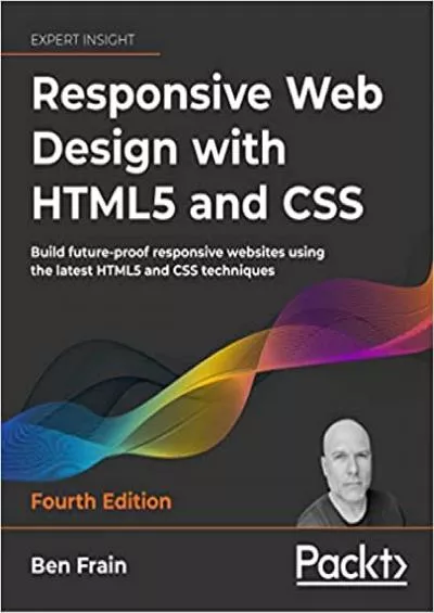
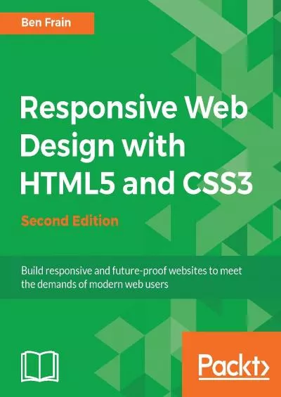
Designing for mobile devices Guiding Questions What are the challenges of designing for mobile devices How big is a pixel What is responsive web design What is the difference between fixed and fluid layouts. Designing for mobile devices. Guiding Questions. What are the challenges of designing for mobile devices?. How big is a pixel?. What is responsive web design?. What is the difference between fixed and fluid layouts?. Seth Neistadt, Vice President of Product Development. Seth.Neistadt@micronetonline.com. Responsive Websites. What is responsive web design. Google . and responsive design. Tablets . and . desktops . and . NYU Webmaster . Meetup. , October 3. rd. , 2014. Who am I. Uwe Kristen . I grew up in . ze. Black Forest. Front-end developer since 1997. . . Boyle Software, Inc. . What is it? Who’s using it? Why you should be today!. What is Responsive Design?. An Industry Buzz Word De-mystified. Responsive . websites respond to their environment. .. R. esponsive designs are comprised of fluid grids and flexible images. Code . An . in-depth look into building . responsive . web design. Rita Zhang, GE. Eric . Overfield. , . PixelMill. SPC345. Software Architect. , General . Electric. Founder . and Architect, . SP.me. Author. Mike Hamilton. V.P. Product Evangelism at . MadCap. Software. mhamilton@madcapsoftware.com. Agenda. Responsive Design. Core Components of Responsive Design. The Role of Content Structure. The Role of CSS. V.P. Product Evangelism. MadCap Software. mhamilton@madcapsoftware.com. Content Authoring for Responsive Design. Agenda. Responsive Design. Core Components of Responsive Design. The Role of Content Structure. Jason Occhipinti. @. occtopia. Agenda. Part I: . Responsive Web Design (RWD) Overview. Part II: . New Developments in RWD. Part I: RWD Overview. Background. Consumer technology/media availability has fueled changes in web design.. Remove auto-advancing after creating a video version:. On/Off:. In the tabs (not menu): “Slide Show” . [X] Play Narrations. [X] Use Timings. [ ] Show Media Controls. Clear the timings completely:. There are a. . lot. . of design patterns.. ui-patterns.com. pttrns.com. konigi.com. welie.com. Context. progressive disclosure. hover controls. toggles. contextual functionality. progressive disclosure. . What it is and why you need it. Today’s Topics. RWD v Mobile. Which is right for you and your site(s)?. A Few Numbers to Blow Your Mind. So many devices, so little time…. Remember the Entire Conversion Path. Designing for mobile devices. Guiding Questions. What are the challenges of designing for mobile devices?. How big is a pixel?. What is responsive web design?. What is the difference between fixed and fluid layouts?. Designing for mobile devices. Guiding Questions. What are the challenges of designing for mobile devices?. How big is a pixel?. What is responsive web design?. What is the difference between fixed and fluid layouts?. Learn the HTML5 and CSS3 you need to help you design responsive and future-proof websites that meet the demands of modern web usersAbout This BookLearn and explore how to harness the latest features of HTML5 in the context of responsive web designLearn to wield the new Flexbox layout mechanism code responsive images and understand how to implement SVGs in a responsive projectMake your pages interactive by using CSS animations transformations and transitionsWhat You Will LearnUnderstand what responsive design is and why it\'s vital for modern web developmentHTML5 markup is cleaner faster and more semantically rich than anything that has come before - learn how to use it and its latest featuresIntegrate CSS3 media queries into your designs to use different styles for different media. You\'ll also learn about future media queries which are evolving in CSS4.Responsive images allow different images to be presented in different scenarios. We\'ll cover how to load different sets of images depending upon screen size or resolution and how to display different images in different contexts.Conquer forms Add validation and useful interface elements like date pickers and range sliders with HTML5 markup alone.Implement SVGs into your responsive designs to provide resolution independent images and learn how to adapt and animate themLearn how to use the latest features of CSS including custom fonts nth-child selectors (and some CSS4 selectors) CSS custom properties (variables) and CSS calcIn DetailDesktop-only websites just aren\'t good enough anymore. With mobile internet usage still rising and tablets changing internet consumption habits you need to know how to build websites that will just \'work\' regardless of the devices used to access them. This second edition of Responsive Web Design with HTML5 and CSS3 explains all the key approaches necessary to create and maintain a modern responsive design.The changing way in which we access the web means that there has never been a greater range of screen sizes and associated user experiences to consider. With these recent trends driving changes in design typical desktop-only websites fail to meet even minimum expectations when it comes to style and usability which can be vital when your website is central to yours or your client\'s brand. Responsive Web Design with HTML5 and CSS3 Second Edition is an updated and improved guide that responds to the latest challenges and trends in web design giving you access to the most effective approaches to modern responsive design.Learn how to build websites with a responsive and mobile first methodology allowing a website to display effortlessly on every device that accesses it. Packed with examples and a thorough explanation of modern techniques and syntax Responsive Web Design with HTML5 and CSS3 Second Edition provides a comprehensive resource for all things \'responsive\'.This updated new edition covers all the most up-to-date techniques and tools needed to build great responsive designs ensuring that your projects won\'t just be built \'right\' for today but in the future too.Chapter example code is all hosted on rwd.education a dedicated site.Table of ContentsThe Essentials of Responsive Web DesignMedia Queries - Supporting Differing ViewportsFluid Layouts and Responsive ImagesHTML5 for Responsive Web DesignsCSS3 - Selectors Typography Color Modes and New FeaturesStunning Aesthetics with CSS3Using SVGs for Resolution IndependenceTransitions Transformations and AnimationsConquer Forms with HTML5 and CSS3Approaching a Responsive Web Design
Download Document
Here is the link to download the presentation.
"4.02 Responsive Web Design Concepts"The content belongs to its owner. You may download and print it for personal use, without modification, and keep all copyright notices. By downloading, you agree to these terms.
Related Documents