
1. Student engagement during presentations Pastel

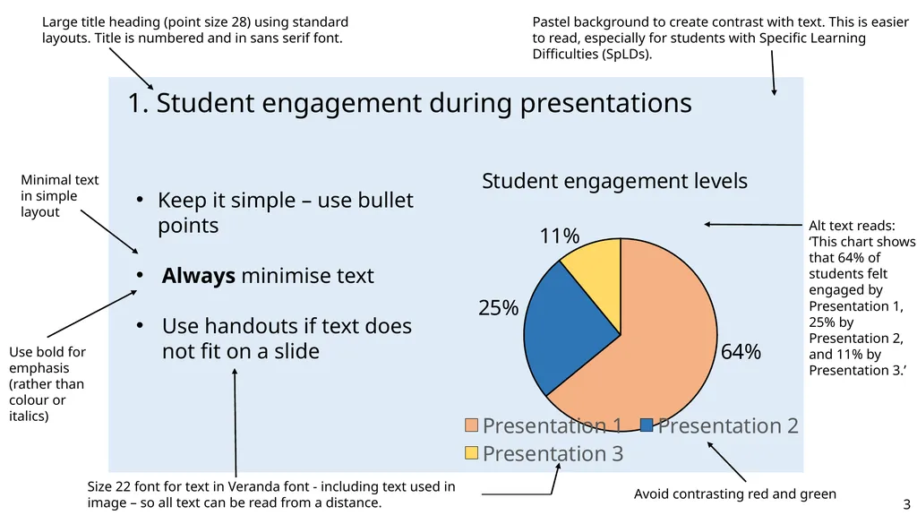
Description: 1. Student engagement during presentations Pastel background to create contrast with text. This is easier to read, especially for students with Specific Learning Difficulties (SpLDs). Large title heading (point size 28) using standard
Related Topics
Download Presentation
"1. Student engagement during presentations Pastel" is the property of its rightful owner. Permission is granted to download and print the materials on this website for personal, non-commercial use only, and to display it on your personal computer provided you do not modify the materials and that you retain all copyright notices contained in the materials. By downloading content from our website, you accept the terms of this agreement.
Presentation Transcript
slide1. 1. Student engagement during presentations Pastel background to create contrast with text. This is easier to read, especially for students with Specific Learning Difficulties (SpLDs). Large title heading (point size 28) using standard layouts. Title is numbered and in sans serif font. Keep it simple – use bullet points
Always minimise text
Use handouts if text does not fit on a slide Alt text reads: ‘This chart shows that 64% of students felt engaged by Presentation 1, 25% by Presentation 2, and 11% by Presentation 3.’ Minimal text in simple layout Use bold for emphasis (rather than colour or italics) Avoid contrasting red and green Size 22 font for text in Veranda font - including text used in image – so all text can be read from a distance. 3<br>
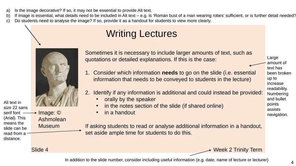
slide2. Slide 4 Week 2 Trinity Term Writing Lectures Sometimes it is necessary to include larger amounts of text, such as quotations or detailed explanations. If this is the case:
Consider which information needs to go on the slide (i.e. essential information that needs to be conveyed to students in the lecture)
Identify if any information is additional and could instead be provided:
orally by the speaker
in the notes section of the slide (if shared online)
in a handout If asking students to read or analyse additional information in a handout, set aside ample time for students to do this. Image: © Ashmolean Museum Is the image decorative? If so, it may not be essential to provide Alt text.
If image is essential, what details need to be included in Alt text – e.g. is ‘Roman bust of a man wearing robes’ sufficient, or is further detail needed?
Do students need to analyse the image? If so, provide it as a handout for students to view more clearly. In addition to the slide number, consider including useful information (e.g. date, name of lecture or lecturer) Large amount of text has been broken up to increase readability. Numbering and bullet points assists navigation. All text in size 22 sans serif font (Arial). This means the slide can be read from a distance. 4<br>
Always minimise text
Use handouts if text does not fit on a slide Alt text reads: ‘This chart shows that 64% of students felt engaged by Presentation 1, 25% by Presentation 2, and 11% by Presentation 3.’ Minimal text in simple layout Use bold for emphasis (rather than colour or italics) Avoid contrasting red and green Size 22 font for text in Veranda font - including text used in image – so all text can be read from a distance. 3<br>
slide2. Slide 4 Week 2 Trinity Term Writing Lectures Sometimes it is necessary to include larger amounts of text, such as quotations or detailed explanations. If this is the case:
Consider which information needs to go on the slide (i.e. essential information that needs to be conveyed to students in the lecture)
Identify if any information is additional and could instead be provided:
orally by the speaker
in the notes section of the slide (if shared online)
in a handout If asking students to read or analyse additional information in a handout, set aside ample time for students to do this. Image: © Ashmolean Museum Is the image decorative? If so, it may not be essential to provide Alt text.
If image is essential, what details need to be included in Alt text – e.g. is ‘Roman bust of a man wearing robes’ sufficient, or is further detail needed?
Do students need to analyse the image? If so, provide it as a handout for students to view more clearly. In addition to the slide number, consider including useful information (e.g. date, name of lecture or lecturer) Large amount of text has been broken up to increase readability. Numbering and bullet points assists navigation. All text in size 22 sans serif font (Arial). This means the slide can be read from a distance. 4<br>