04
Example: Probability vs. Inferential Statistics Consider drivers’ use of manual lap belts in cars equipped with automatic shoulder belt systems (“Automobile seat Belts: Usage patterns in Automatic Belt Systems,” Human Factors, 1998: 126-135.)
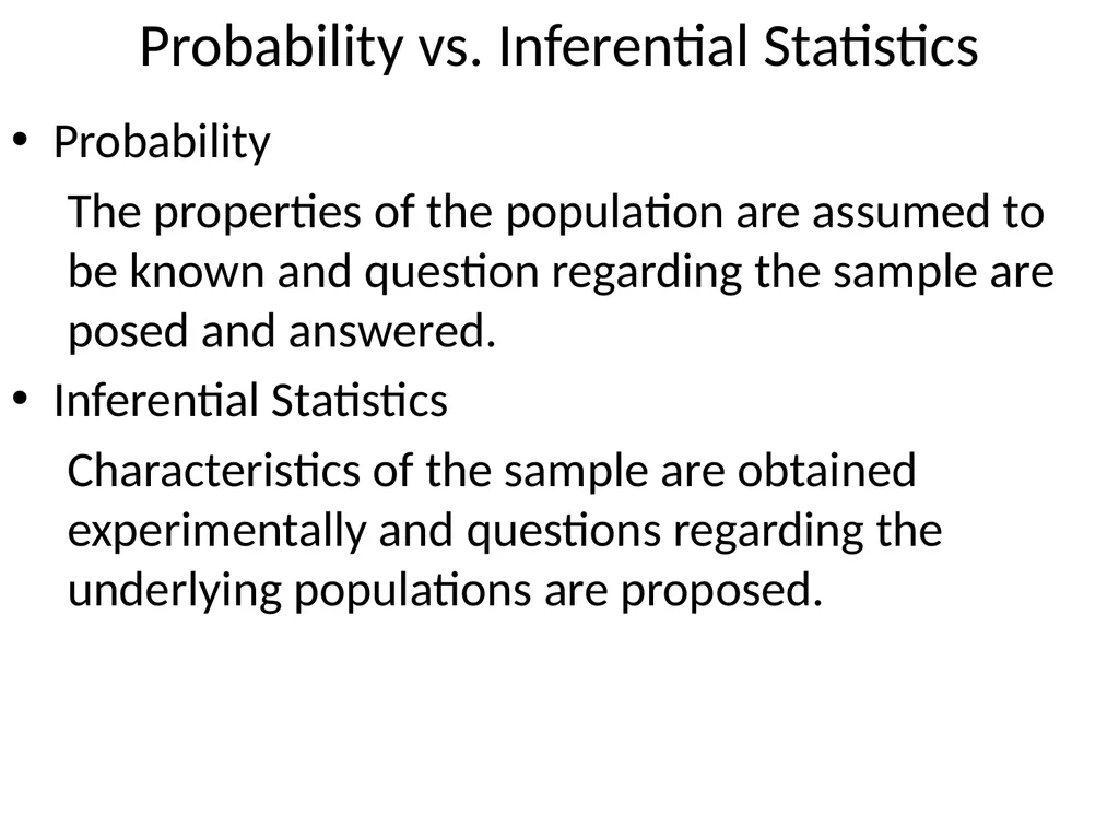
Probability:
Assume that 50% of all drivers of cars with this type of seatbelt use their lap belt (population).
Q1: How likely that in a sample of 50 drivers, 35 will use their lap belt?
Q2: On average, how many drivers in the sample of 50 will use their lap belt?<br>
05
Example: Probability vs. Inferential Statistics (cont) Consider drivers’ use of manual lap belts in cars equipped with automatic shoulder belt systems (“Automobile seat Belts: Usage patterns in Automatic Belt Systems,” Human Factors, 1998: 126-135.)
Inferential Statistics:
Observe that 32 out of 50 drivers use their lap belt (sample).
Q1: Does this provide evidence to conclude that more than 50% of all the drivers in this area regularly use their lap belt?<br>
06
Collecting Data Methods of Collection
Simple random sampling (SRS)
Stratified Sampling
Type of Study
Observational Study
Experiment<br>
07
Stem-and-Leaf Display Methodology
Select one or more leading digits for the stem values. The trailing digits become the leaves.
List possible stem values in a vertical column.
Record the leaf for each observation beside the corresponding stem value. On WebAssign, you will need to order these values.
Indicate the units for stems and leaves someplace in the display.<br>
08
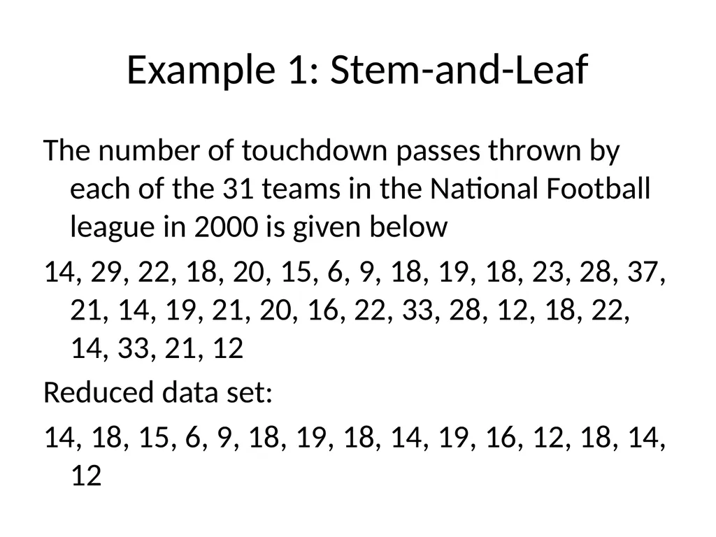
Example 1: Stem-and-Leaf The number of touchdown passes thrown by each of the 31 teams in the National Football league in 2000 is given below
14, 29, 22, 18, 20, 15, 6, 9, 18, 19, 18, 23, 28, 37, 21, 14, 19, 21, 20, 16, 22, 33, 28, 12, 18, 22, 14, 33, 21, 12
Reduced data set:
14, 18, 15, 6, 9, 18, 19, 18, 14, 19, 16, 12, 18, 14, 12<br>
09
Stem-and-Leaf Displays Typical Value
Spread
Gaps
Symmetry of distribution
Number and location of peaks
Outliers<br>
10
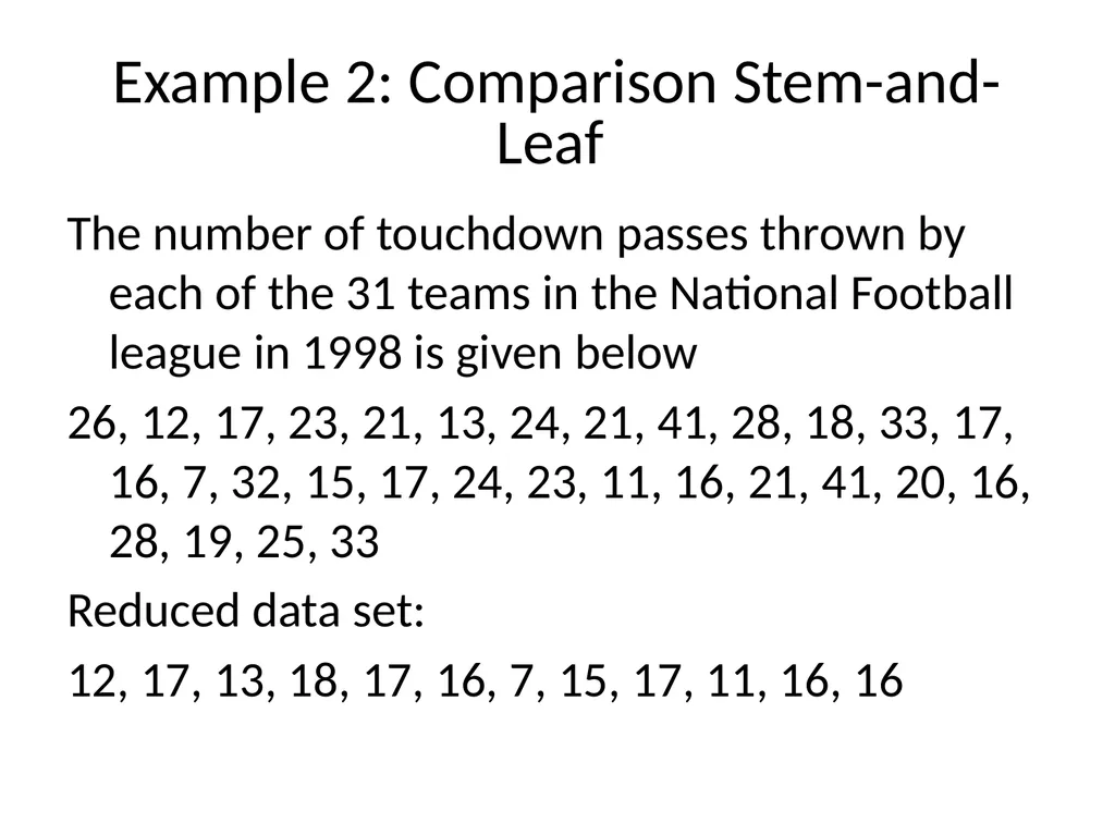
Example 2: Comparison Stem-and-Leaf The number of touchdown passes thrown by each of the 31 teams in the National Football league in 1998 is given below
26, 12, 17, 23, 21, 13, 24, 21, 41, 28, 18, 33, 17, 16, 7, 32, 15, 17, 24, 23, 11, 16, 21, 41, 20, 16, 28, 19, 25, 33
Reduced data set:
12, 17, 13, 18, 17, 16, 7, 15, 17, 11, 16, 16<br>
11
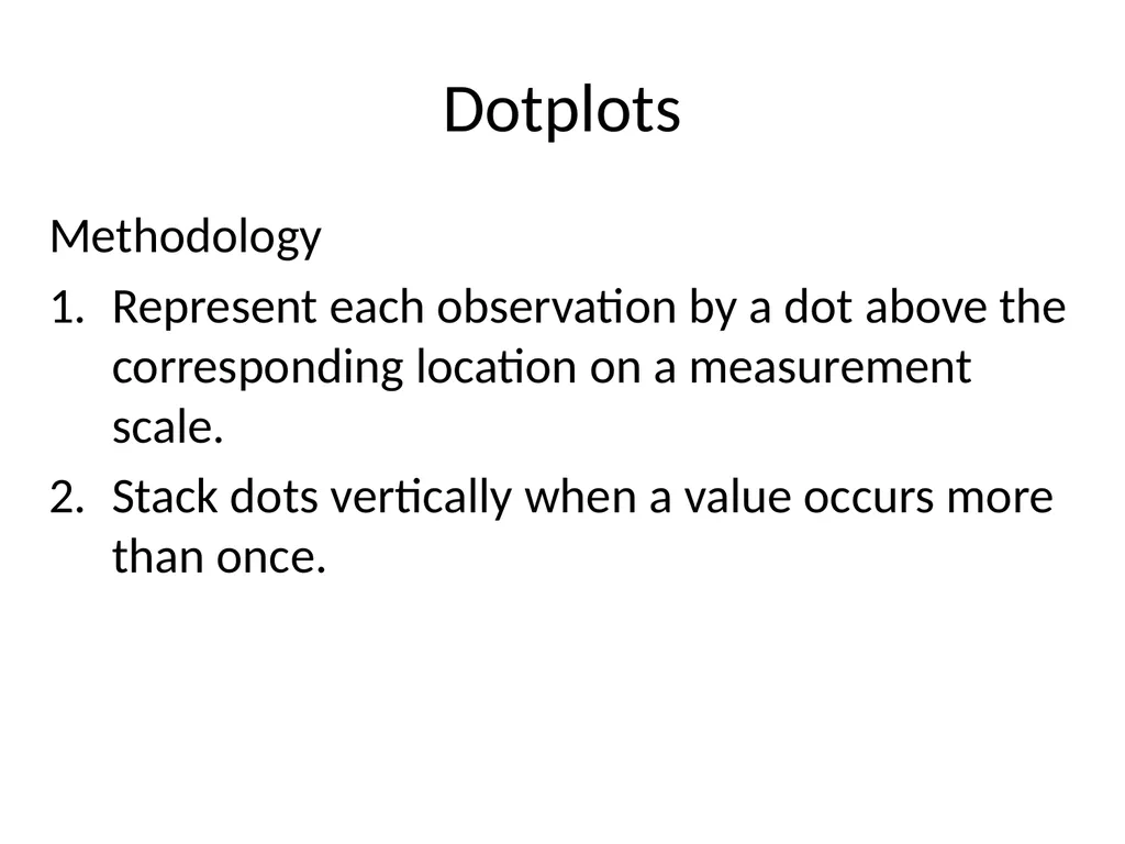
Dotplots Methodology
Represent each observation by a dot above the corresponding location on a measurement scale.
Stack dots vertically when a value occurs more than once.<br>
12
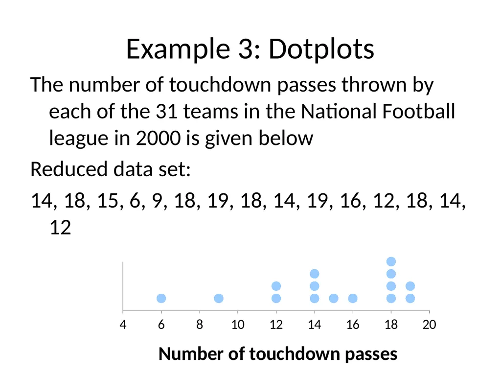
Example 3: Dotplots The number of touchdown passes thrown by each of the 31 teams in the National Football league in 2000 is given below
Reduced data set:
14, 18, 15, 6, 9, 18, 19, 18, 14, 19, 16, 12, 18, 14, 12<br>
13
Dotplots Typical Value
Spread
Gaps
Symmetry of distribution
Number and location of peaks
Outliers<br>
14
Histogram - discrete Methodology
Calculate the frequency and/or relative frequency of each x value.
Mark the possible x values on the x-axis.
Above each value, draw a rectangle whose height is the frequency (or relative frequency) of that value.<br>
15
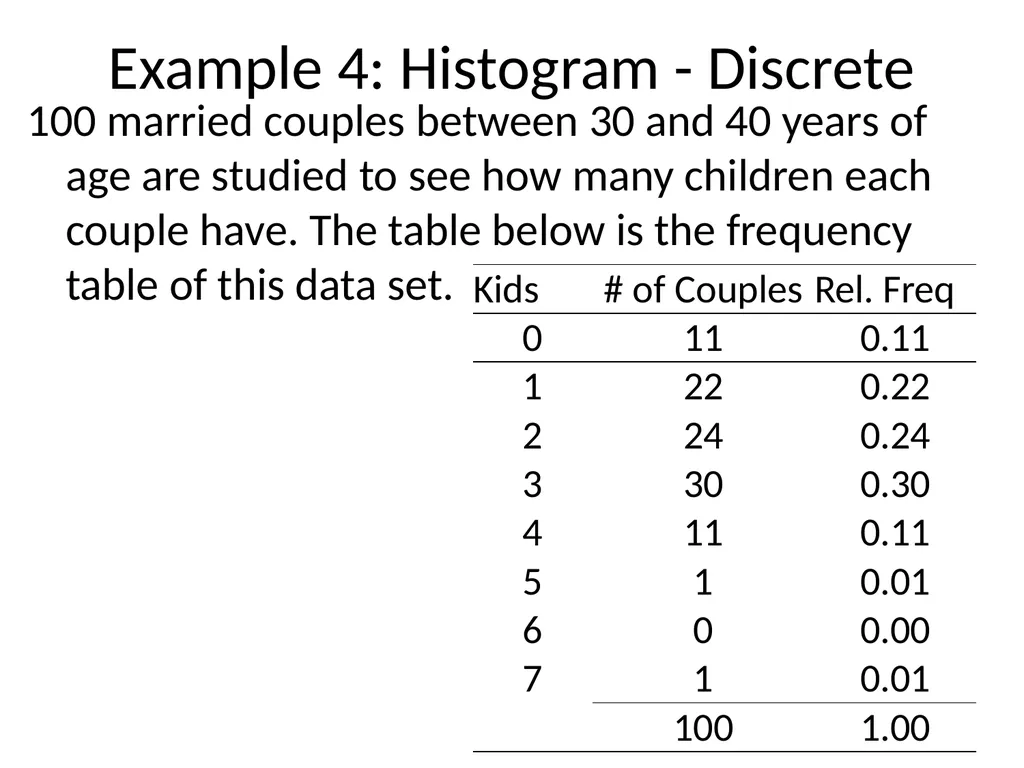
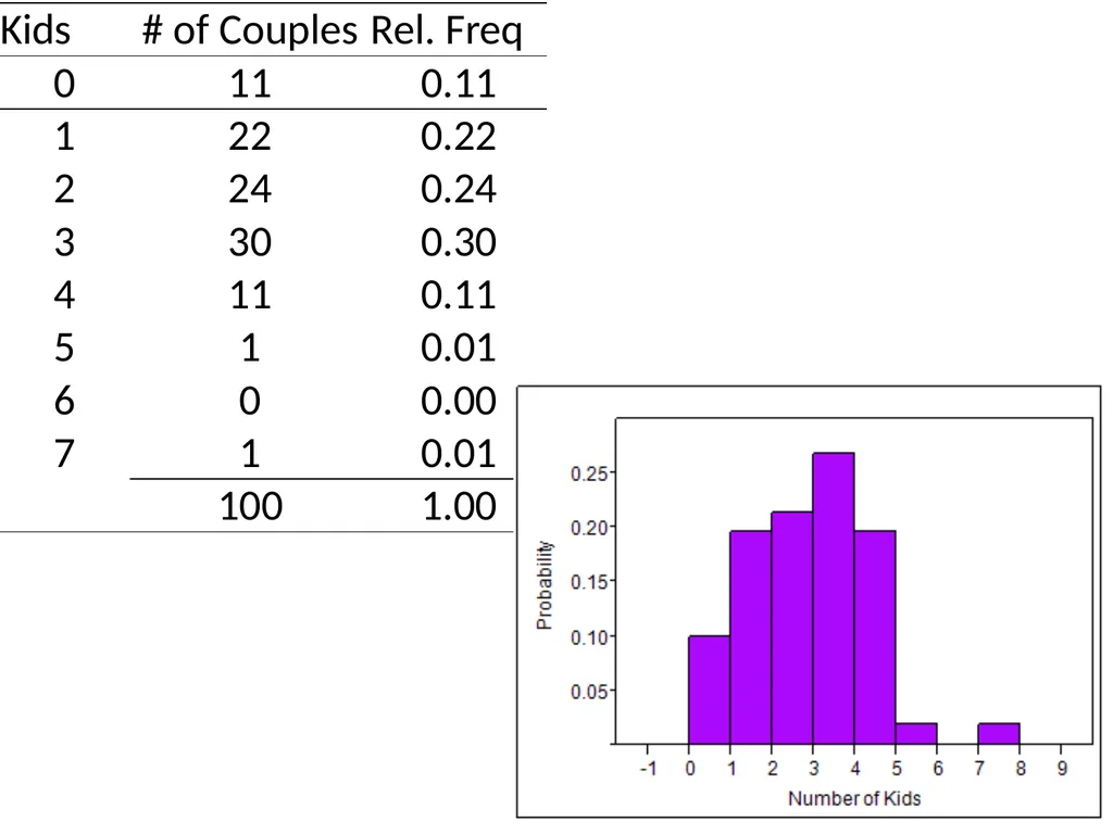
Example 4: Histogram - Discrete 100 married couples between 30 and 40 years of age are studied to see how many children each couple have. The table below is the frequency table of this data set.<br>
16
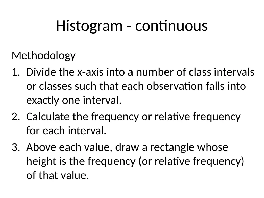
Histogram - continuous Methodology
Divide the x-axis into a number of class intervals or classes such that each observation falls into exactly one interval.
Calculate the frequency or relative frequency for each interval.
Above each value, draw a rectangle whose height is the frequency (or relative frequency) of that value.<br>
17
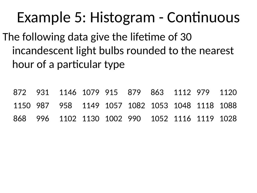
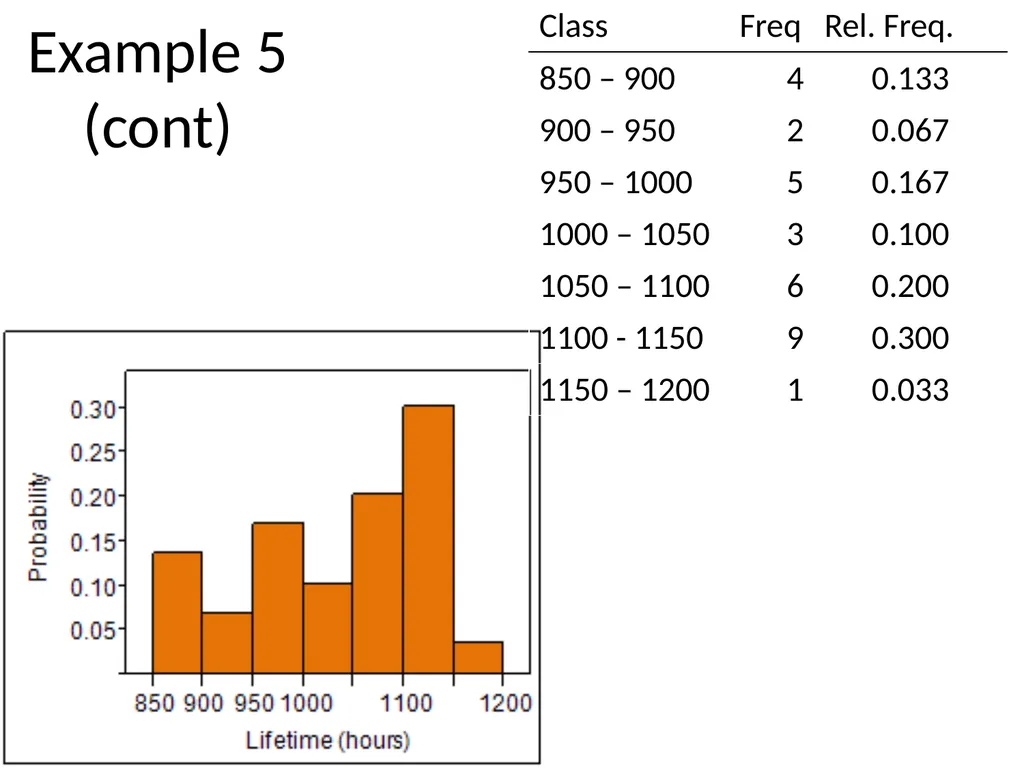
Example 5: Histogram - Continuous The following data give the lifetime of 30 incandescent light bulbs rounded to the nearest hour of a particular type<br>
19
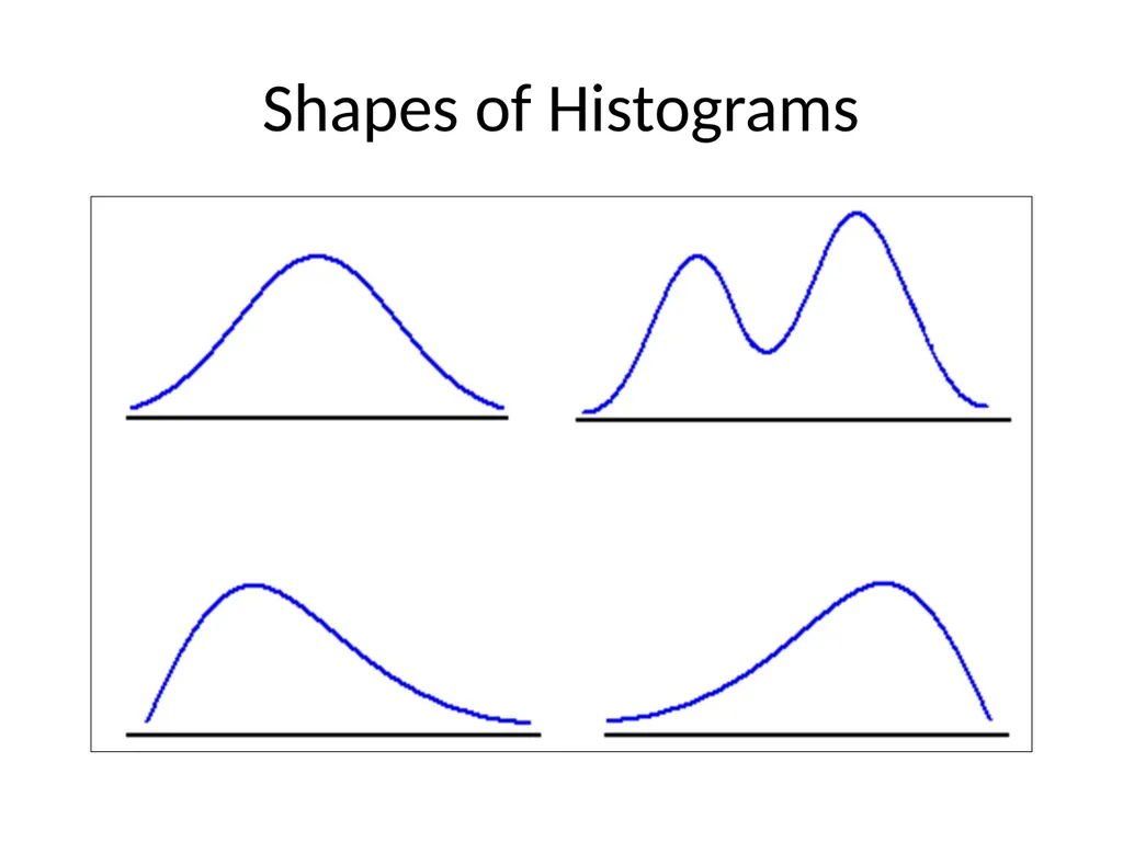
Shapes of Histograms<br>
20
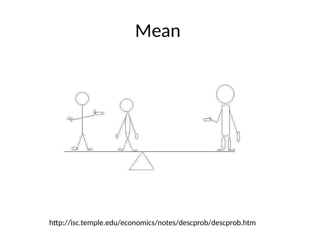
Mean http://isc.temple.edu/economics/notes/descprob/descprob.htm<br>
21
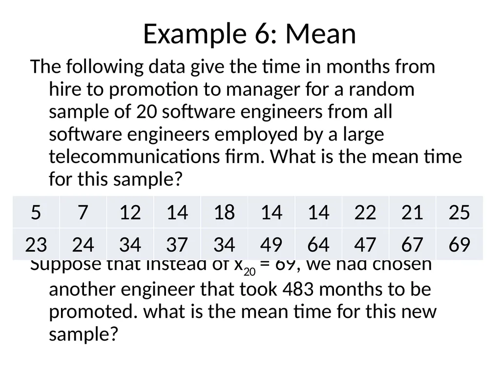
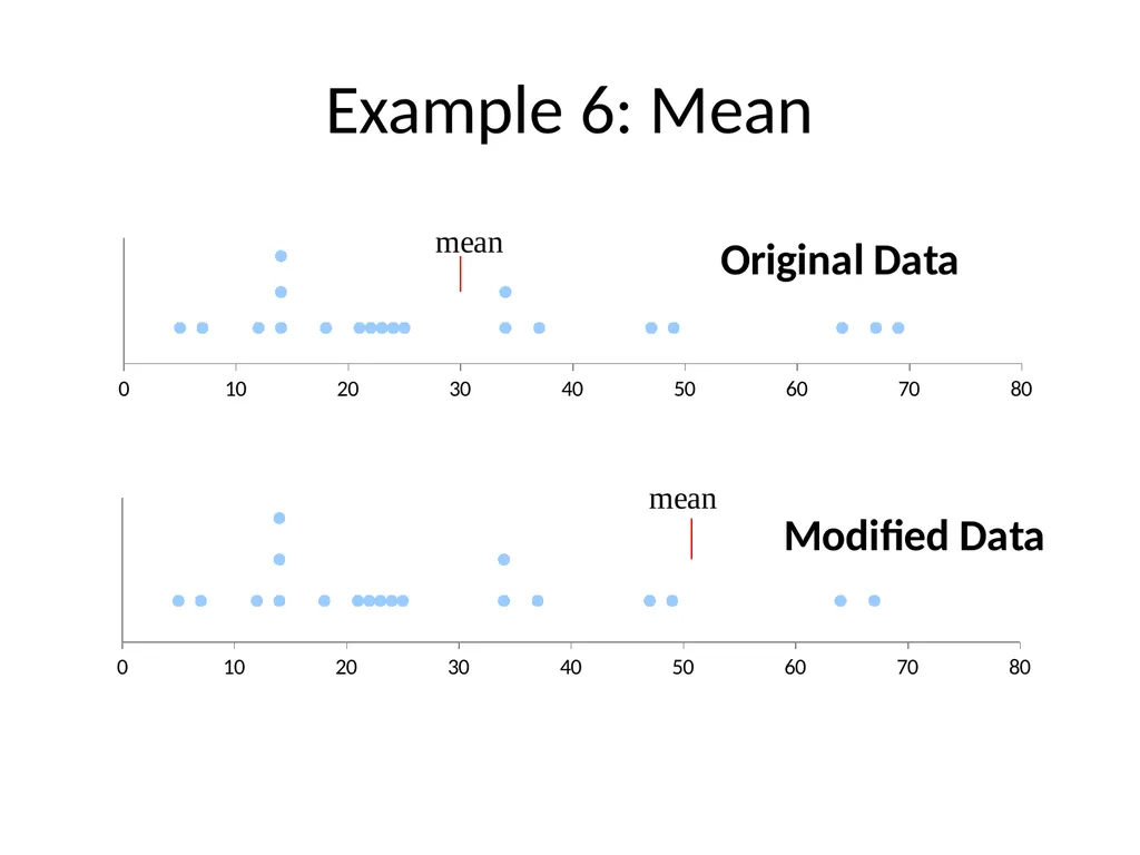
Example 6: Mean The following data give the time in months from hire to promotion to manager for a random sample of 20 software engineers from all software engineers employed by a large telecommunications firm. What is the mean time for this sample?
Suppose that instead of x20 = 69, we had chosen another engineer that took 483 months to be promoted. what is the mean time for this new sample?<br>
24
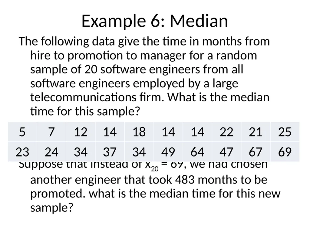
Example 6: Median The following data give the time in months from hire to promotion to manager for a random sample of 20 software engineers from all software engineers employed by a large telecommunications firm. What is the median time for this sample?
Suppose that instead of x20 = 69, we had chosen another engineer that took 483 months to be promoted. what is the median time for this new sample?<br>
25
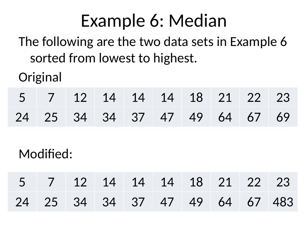
Example 6: Median The following are the two data sets in Example 6 sorted from lowest to highest.
Original
Modified:<br>
26
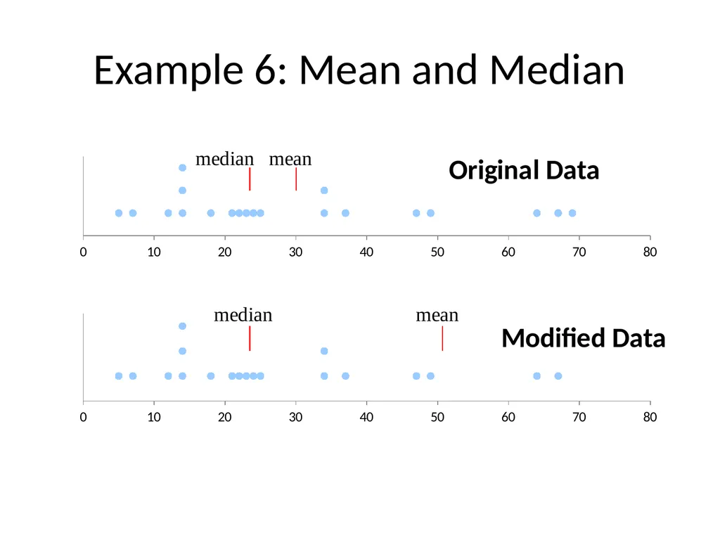
Example 6: Mean and Median<br>
27
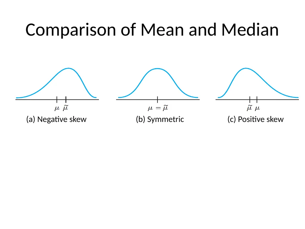
Comparison of Mean and Median<br>
28
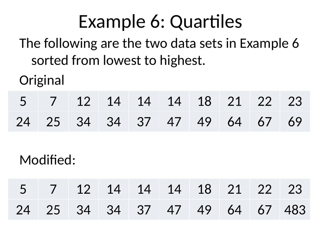
Example 6: Quartiles The following are the two data sets in Example 6 sorted from lowest to highest.
Original
Modified:<br>
29
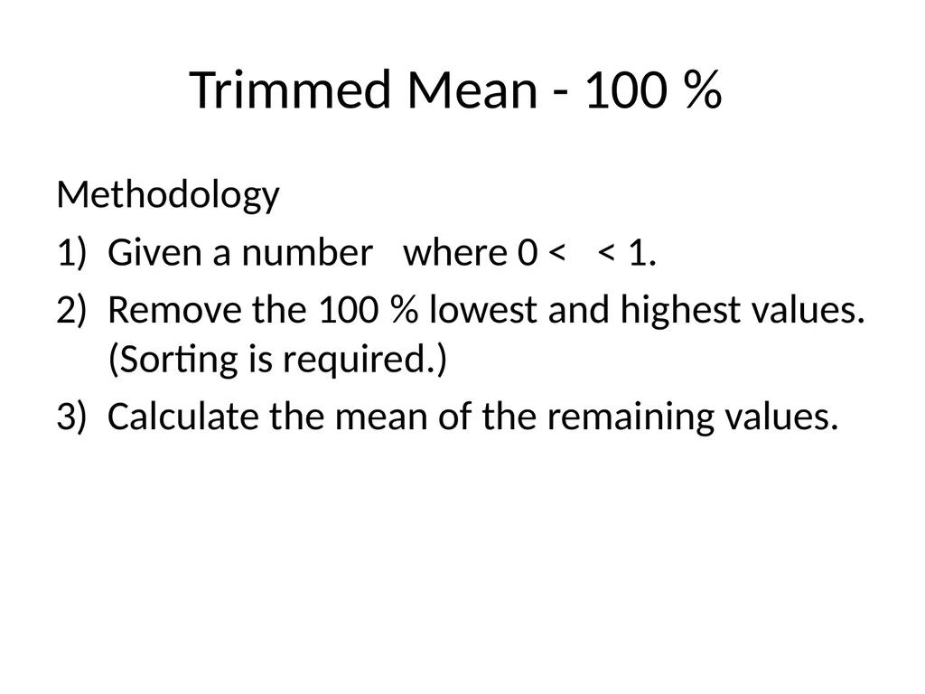
Trimmed Mean - 100% Methodology
Given a number where 0 < < 1.
Remove the 100% lowest and highest values. (Sorting is required.)
Calculate the mean of the remaining values.<br>
30
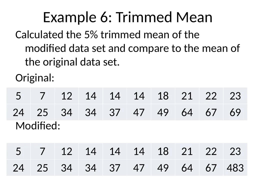
Example 6: Trimmed Mean Calculated the 5% trimmed mean of the modified data set and compare to the mean of the original data set.
Original:
Modified:<br>
32
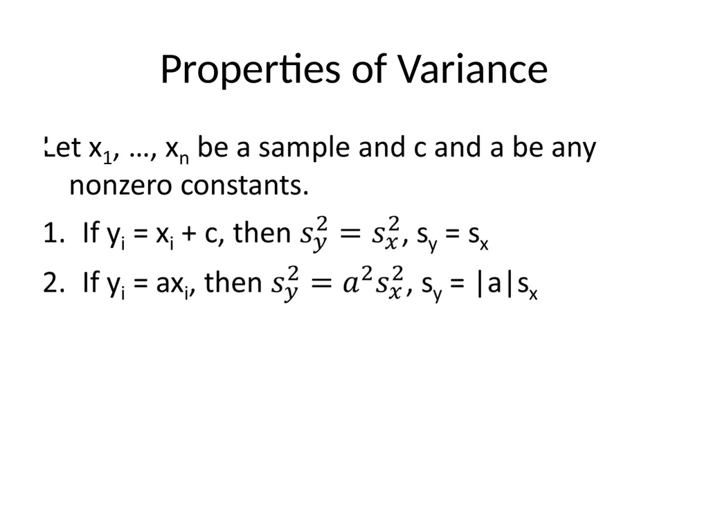
Properties of Variance<br>
33
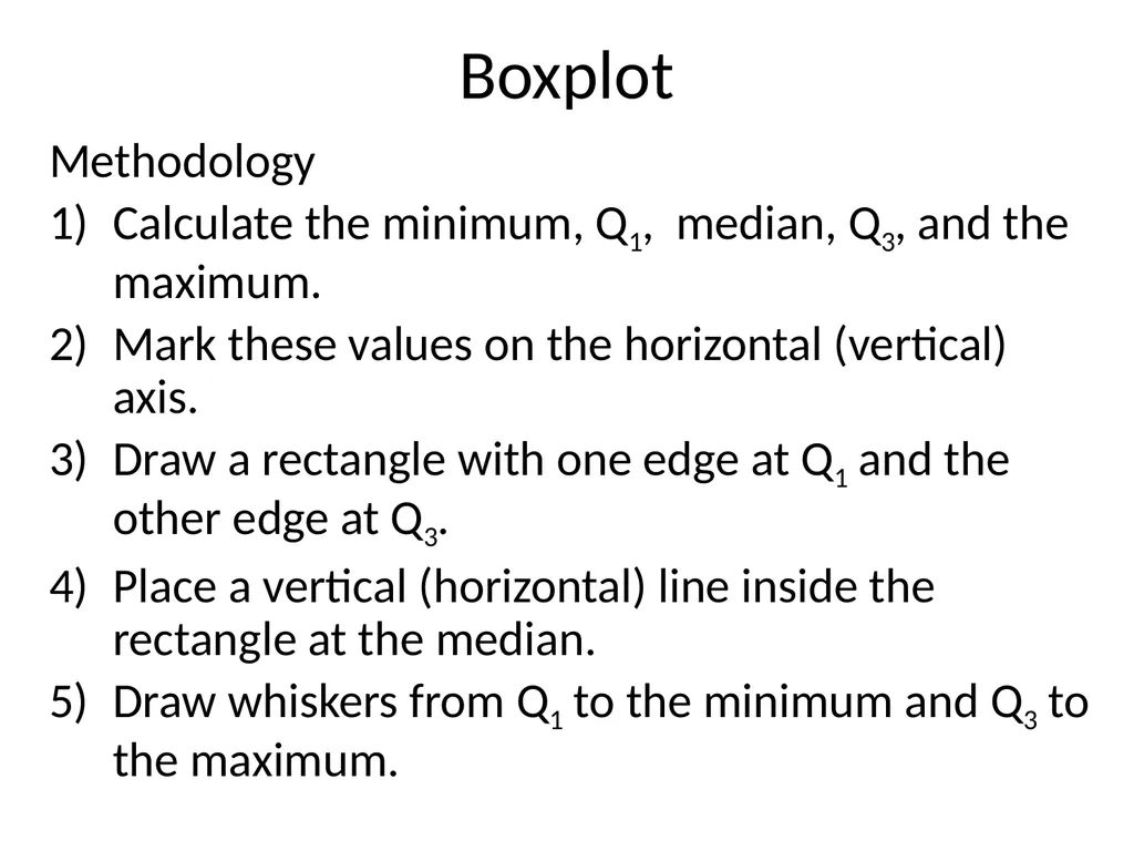
Boxplot Methodology
Calculate the minimum, Q1, median, Q3, and the maximum.
Mark these values on the horizontal (vertical) axis.
Draw a rectangle with one edge at Q1 and the other edge at Q3.
Place a vertical (horizontal) line inside the rectangle at the median.
Draw whiskers from Q1 to the minimum and Q3 to the maximum.<br>
34
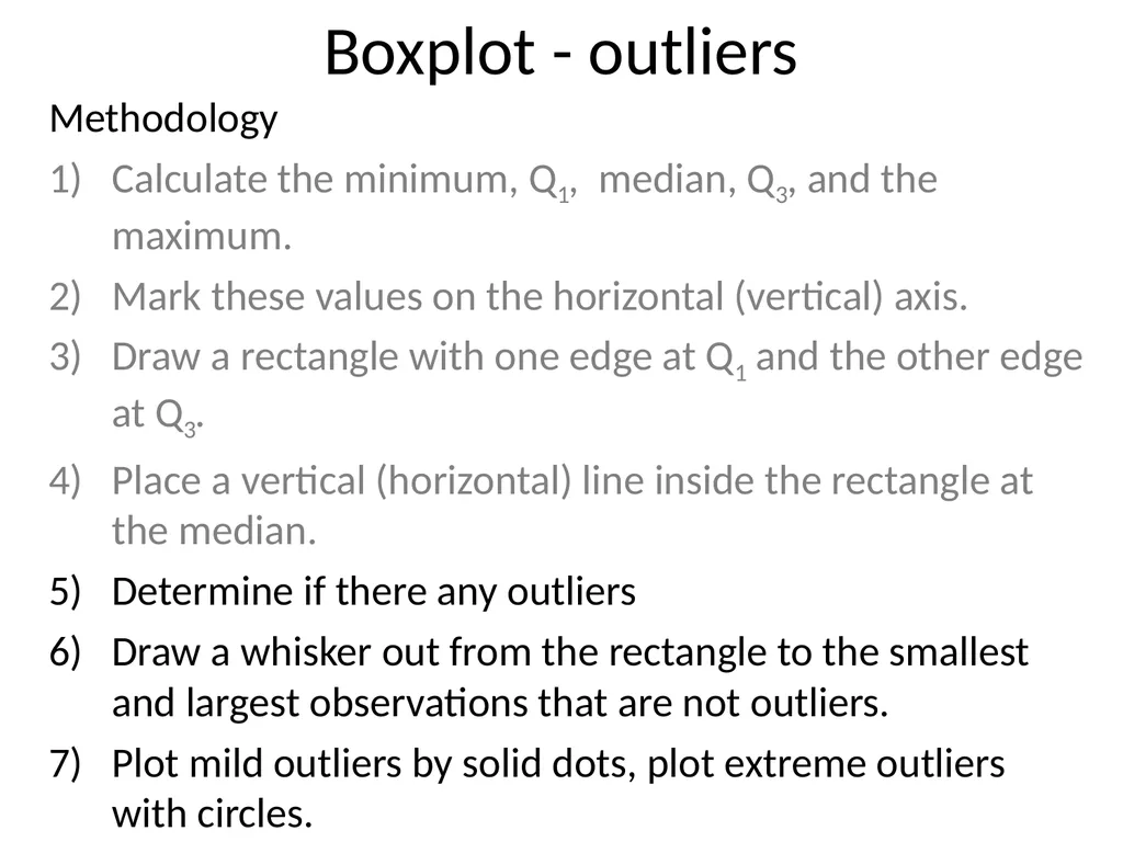
Boxplot - outliers Methodology
Calculate the minimum, Q1, median, Q3, and the maximum.
Mark these values on the horizontal (vertical) axis.
Draw a rectangle with one edge at Q1 and the other edge at Q3.
Place a vertical (horizontal) line inside the rectangle at the median.
Determine if there any outliers
Draw a whisker out from the rectangle to the smallest and largest observations that are not outliers.
Plot mild outliers by solid dots, plot extreme outliers with circles.<br>
35
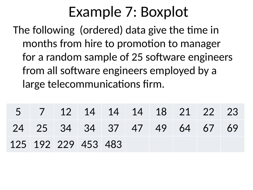
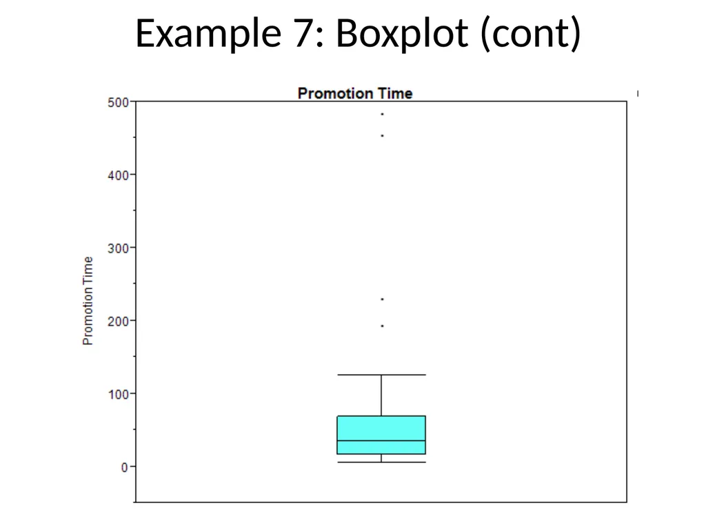
Example 7: Boxplot The following (ordered) data give the time in months from hire to promotion to manager for a random sample of 25 software engineers from all software engineers employed by a large telecommunications firm.<br>
36
Example 7: Boxplot (cont)<br>
37
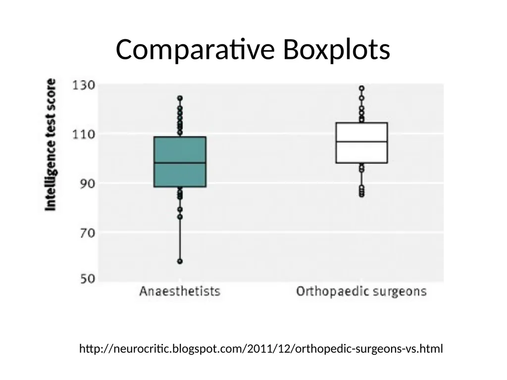
Comparative Boxplots http://neurocritic.blogspot.com/2011/12/orthopedic-surgeons-vs.html<br>
38
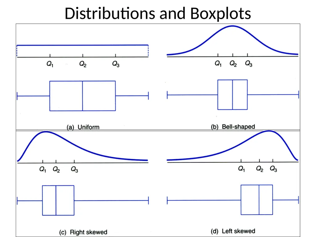
Distributions and Boxplots<br>