ζ Cumulative Frequency Graphs Dr Frost Starter:
Description: ζ Cumulative Frequency Graphs Dr Frost Starter: Problems involving mean Girl ? ? The Whole Picture... MedianLQUQ class interval Estimate of MedianLQUQnum values in range Determine MedianLQUQ Widths (cm): 4, 4, 7, 9, 11, 12, 14, 15,
Related Topics
Download Presentation
"ζ Cumulative Frequency Graphs Dr Frost Starter:" is the property of its rightful owner. Permission is granted to download and print the materials on this website for personal, non-commercial use only, and to display it on your personal computer provided you do not modify the materials and that you retain all copyright notices contained in the materials. By downloading content from our website, you accept the terms of this agreement.
Presentation Transcript
slide1. ζ Cumulative Frequency Graphs Dr Frost<br>
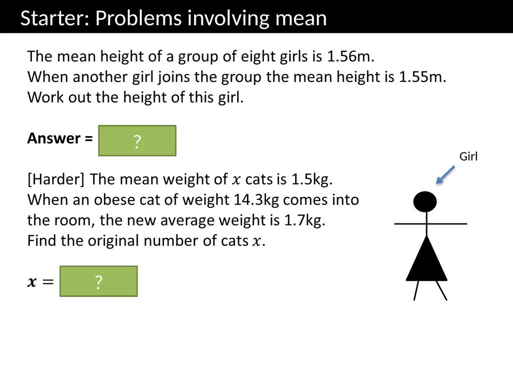
slide2. Starter: Problems involving mean Girl ? ?<br>
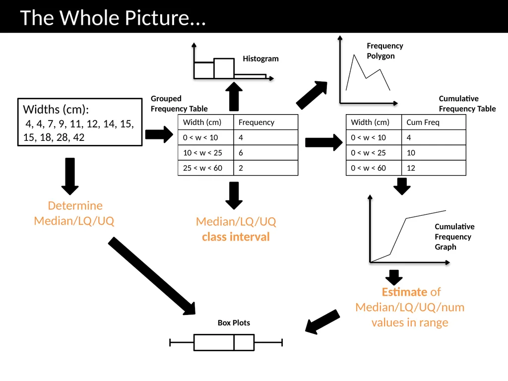
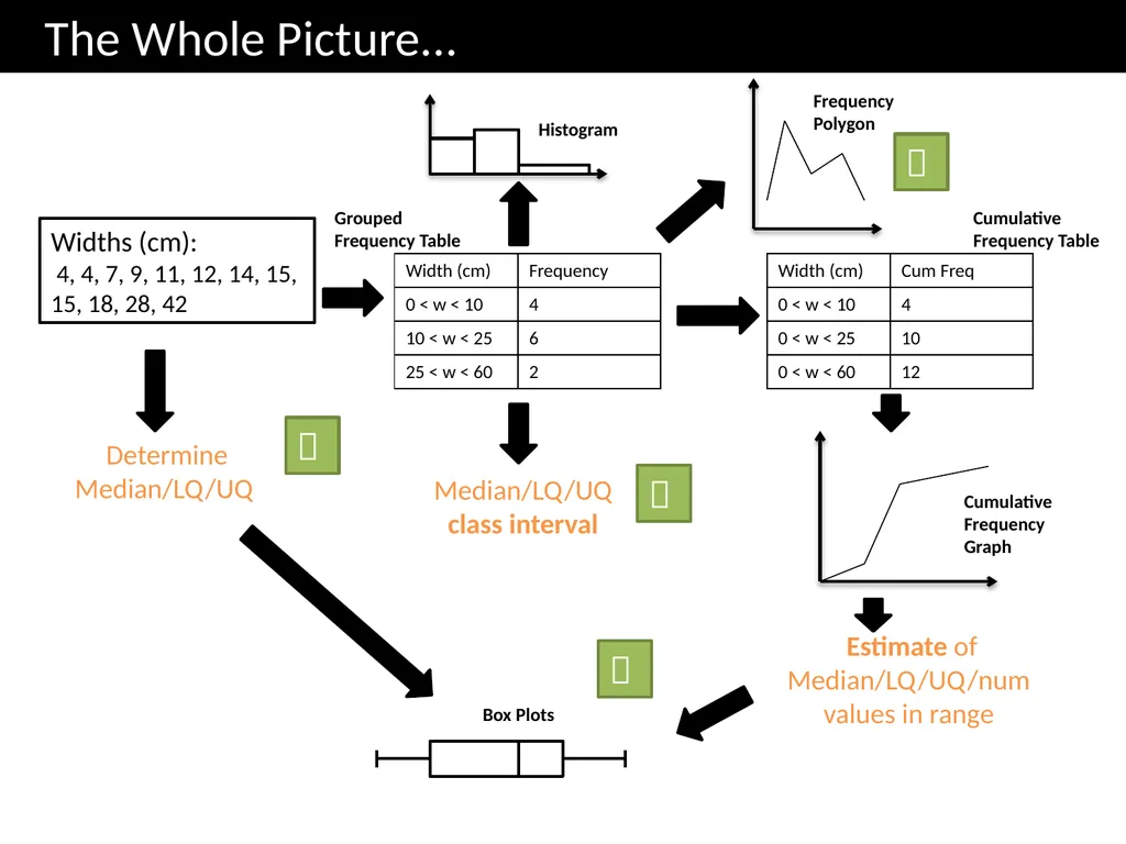
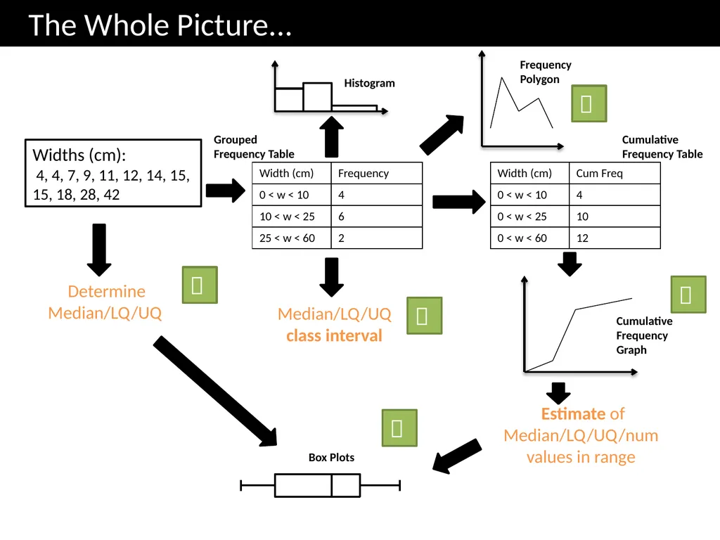
slide3. The Whole Picture... Median/LQ/UQ class interval Estimate of Median/LQ/UQ/num values in range Determine Median/LQ/UQ Widths (cm):
4, 4, 7, 9, 11, 12, 14, 15, 15, 18, 28, 42 Cumulative Frequency Table Cumulative Frequency Graph Box Plots Histogram Grouped Frequency Table Frequency Polygon<br>
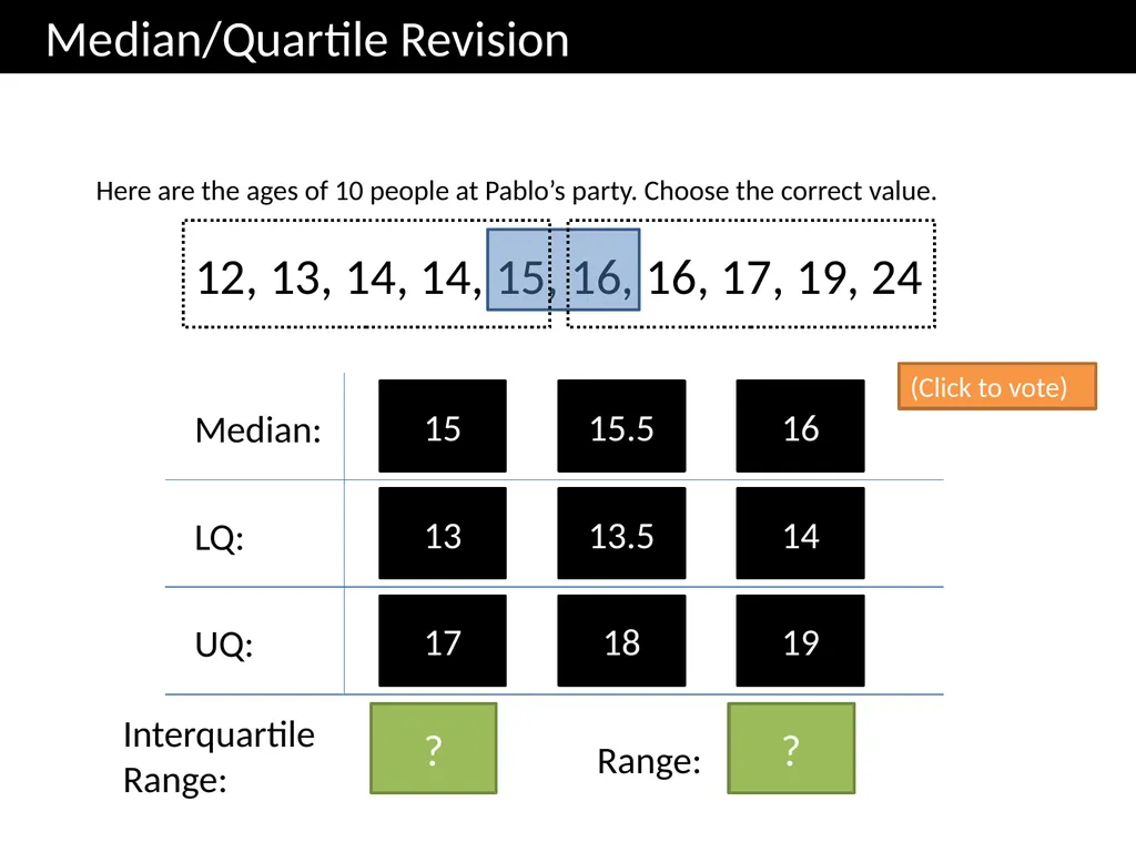
slide4. Median/Quartile Revision Here are the ages of 10 people at Pablo’s party. Choose the correct value. 12, 13, 14, 14, 15, 16, 16, 17, 19, 24 15 16 Median: 15.5 13 14 LQ: 13.5 17 19 UQ: 18 (Click to vote) Interquartile
Range: 3 Range: 12 ? ?<br>
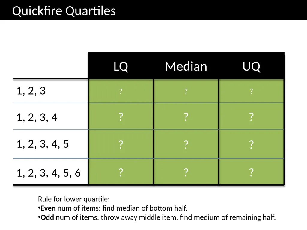
slide5. 3 2.5 1.5 3.5 1.5 2 4.5 2 3.5 5 2 1 ? ? ? ? ? ? ? ? ? ? ? ? Quickfire Quartiles 1, 2, 3 LQ Median UQ 1, 2, 3, 4 1, 2, 3, 4, 5 1, 2, 3, 4, 5, 6 Rule for lower quartile:
Even num of items: find median of bottom half.
Odd num of items: throw away middle item, find medium of remaining half.<br>
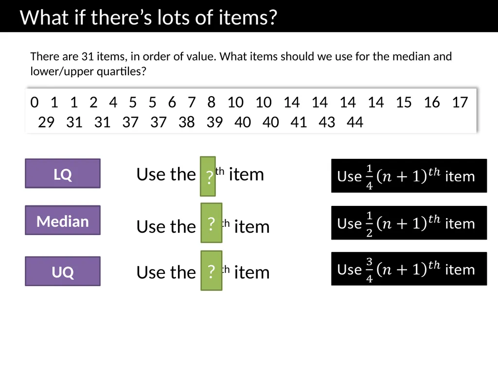
slide6. What if there’s lots of items? There are 31 items, in order of value. What items should we use for the median and lower/upper quartiles? 0 1 1 2 4 5 5 6 7 8 10 10 14 14 14 14 15 16 17 29 31 31 37 37 38 39 40 40 41 43 44 Use the 16th item Median LQ UQ Use the 8 th item Use the 24th item ? ? ?<br>
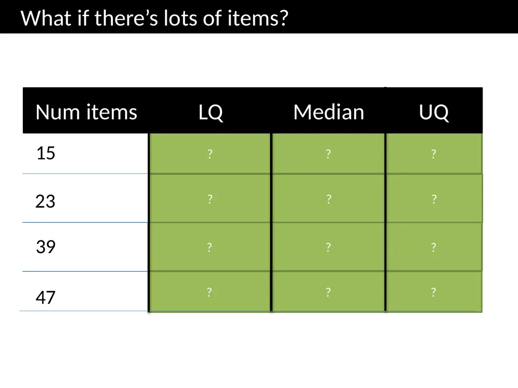
slide7. Num items 15 23 39 4th 8th 12th 6th 12th 18th 10th 20th 30th 12th 24th 36th 47 ? ? ? ? ? ? ? ? ? ? ? ? What if there’s lots of items? LQ Median UQ<br>
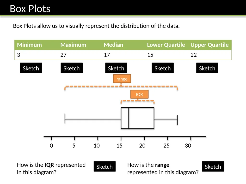
slide8. Box Plots Box Plots allow us to visually represent the distribution of the data. 0 5 10 15 20 25 30 Sketch Sketch Sketch Sketch Sketch How is the IQR represented in this diagram? How is the range represented in this diagram? Sketch Sketch<br>
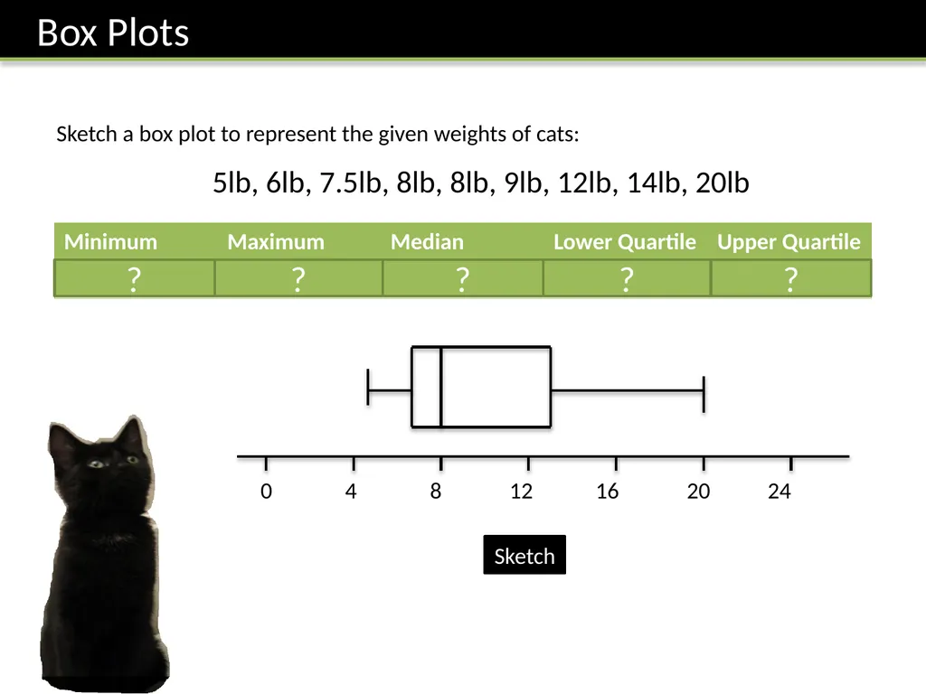
slide9. 0 4 8 12 16 20 24 Sketch a box plot to represent the given weights of cats: 5lb, 6lb, 7.5lb, 8lb, 8lb, 9lb, 12lb, 14lb, 20lb ? ? ? ? ? Sketch<br>
slide10. Printed handout. Q1 Reference: GCSE-BoxPlotsQuartileStemLeaf<br>
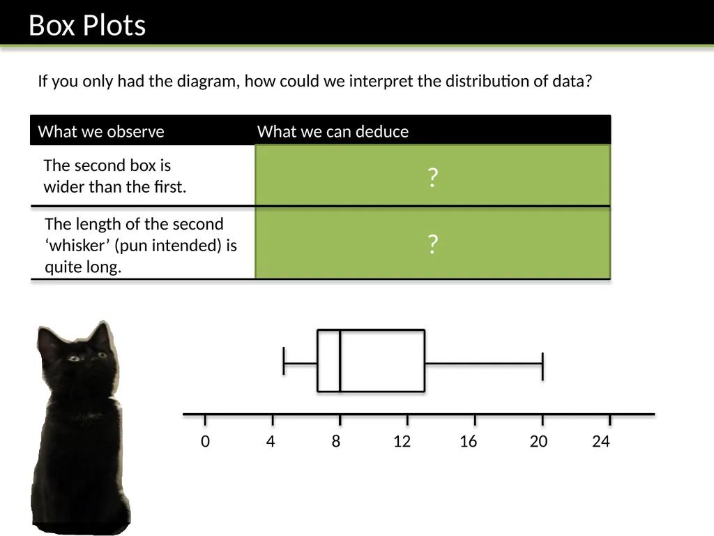
slide11. 0 4 8 12 16 20 24 If you only had the diagram, how could we interpret the distribution of data? What we observe What we can deduce The second box is wider than the first. There is a greater spread of weights in the top half. This is known as positive skew. The length of the second ‘whisker’ (pun intended) is quite long. The fattest cat has a weight that is an extreme value, because the weight is far above the Upper Quartile. ? ?<br>
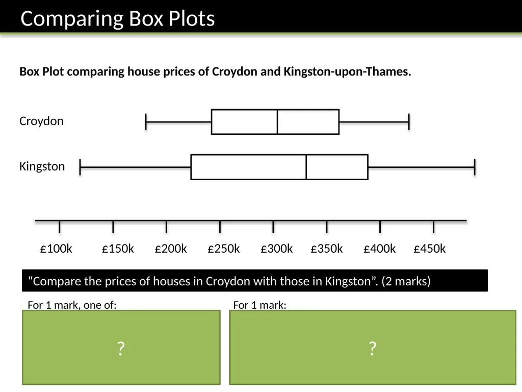
slide12. £100k £150k £200k £250k £300k £350k £400k £450k Kingston Croydon Box Plot comparing house prices of Croydon and Kingston-upon-Thames. “Compare the prices of houses in Croydon with those in Kingston”. (2 marks) For 1 mark, one of:
In interquartile range of house prices in Kingston is greater than Croydon.
The range of house prices in Kingston is greater than Croydon. For 1 mark:
The median house price in Kingston was greater than that in Croydon.
(Note that in old mark schemes, comparing the minimum/maximum/quartiles would have been acceptable, but currently, you MUST compare the median) ? ?<br>
slide13. Printed handout. Q7 Reference: GCSE-BoxPlotsQuartileStemLeaf<br>
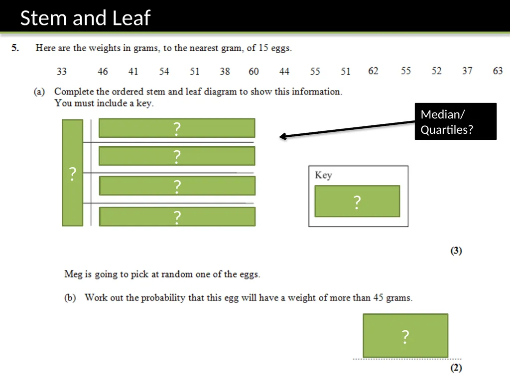
slide14. 1|3 means 13 3 4 5 6 3 7 8 1 4 6 1 1 2 4 5 5 0 2 3 ? ? ? ? ? ? ? Median/
Quartiles?<br>
slide15. Printed handout. Q3 Reference: GCSE-BoxPlotsQuartileStemLeaf<br>
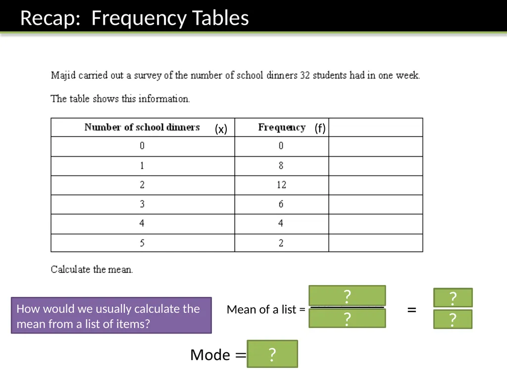
slide16. How would we usually calculate the mean from a list of items? (x) (f) Mean of a list = Total of values
Num values = ? ? ? ? ?<br>
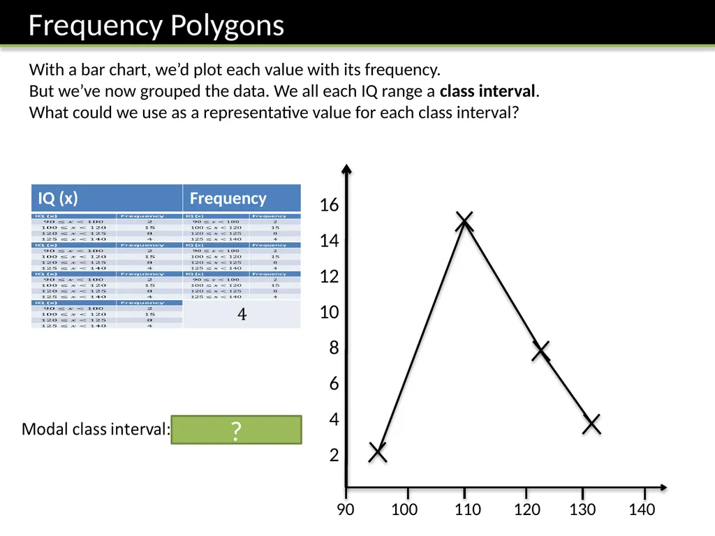
slide17. With a bar chart, we’d plot each value with its frequency.
But we’ve now grouped the data. We all each IQ range a class interval.
What could we use as a representative value for each class interval? 90 100 110 120 130 140 16
14
12
10
8
6
4
2 ?<br>
slide18. Frequency Polygons
Printed handout. Q5, 8 Reference: GCSE-BoxPlotsQuartileStemLeaf<br>
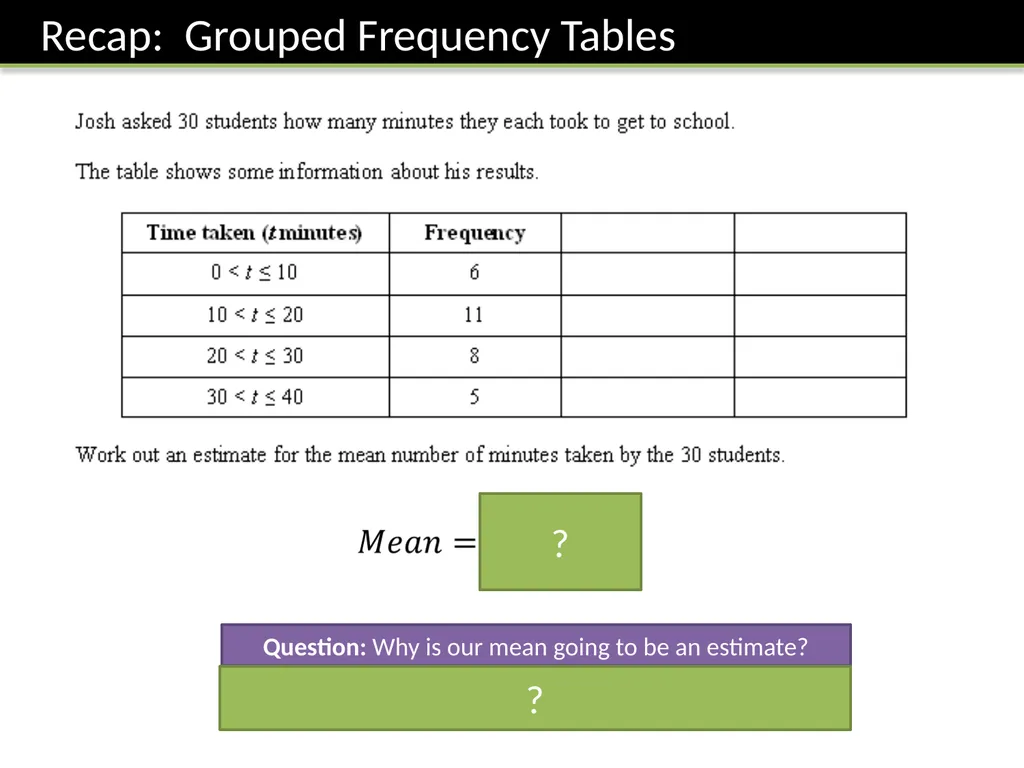
slide19. Question: Why is our mean going to be an estimate? ? Because we don’t know the exact times within each range. ?<br>
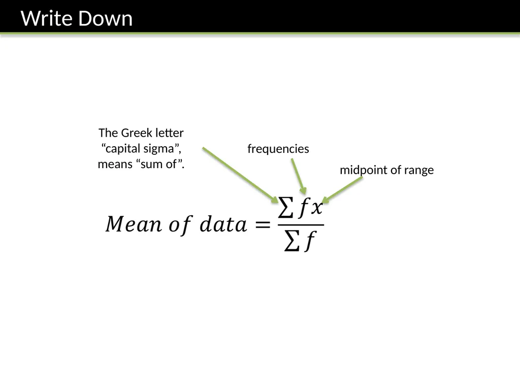
slide20. frequencies midpoint of range The Greek letter “capital sigma”, means “sum of”.<br>
slide21. Grouped Frequency Tables
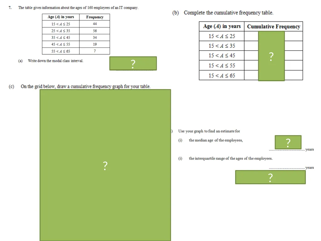
Printed handout. Q1, 2 Reference: GCSE-GroupedDataCumFreq<br>
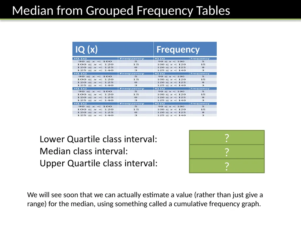
slide22. ? ? ? We will see soon that we can actually estimate a value (rather than just give a range) for the median, using something called a cumulative frequency graph.<br>
slide23. The Whole Picture... Median/LQ/UQ class interval Estimate of Median/LQ/UQ/num values in range Determine Median/LQ/UQ Widths (cm):
4, 4, 7, 9, 11, 12, 14, 15, 15, 18, 28, 42 Cumulative Frequency Table Cumulative Frequency Graph Box Plots Histogram Grouped Frequency Table Frequency Polygon <br>
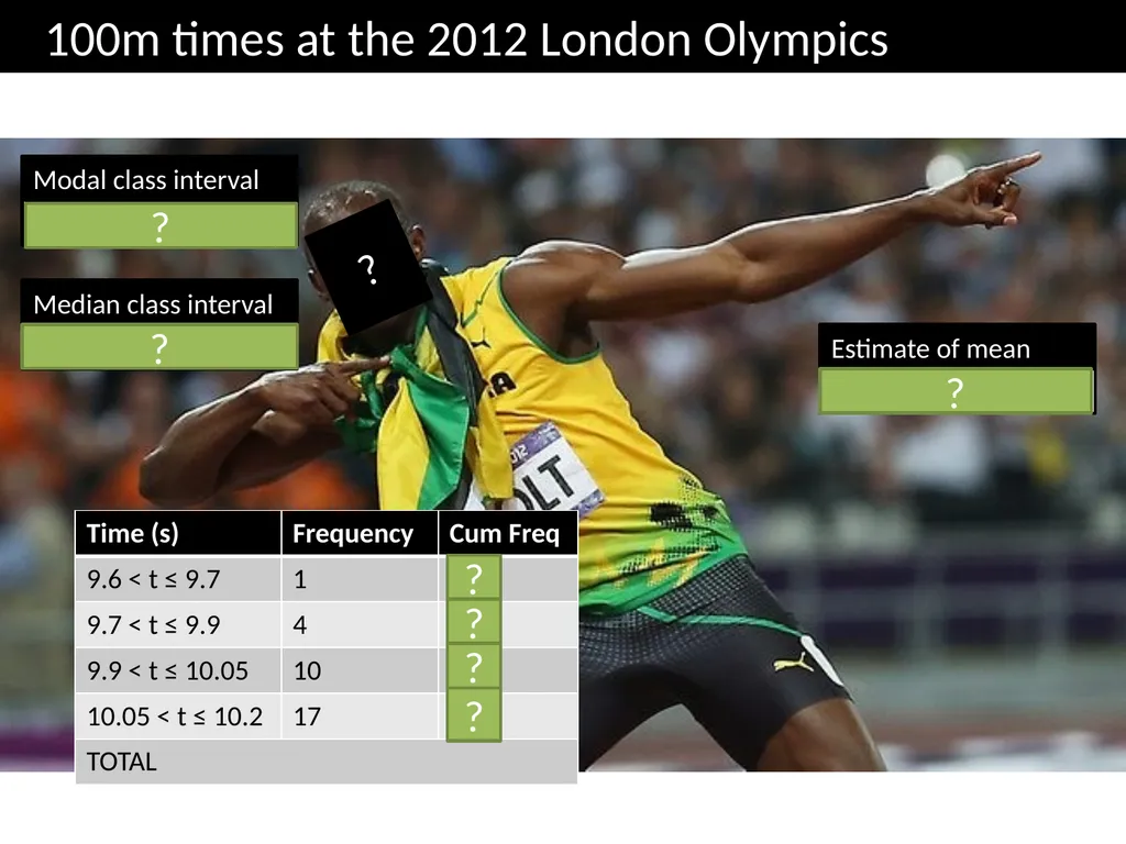
slide24. 10.05 < t ≤ 10.2 Modal class interval 10.05 < t ≤ 10.2 Median class interval Estimate of mean 10.02 100m times at the 2012 London Olympics ? ? ? ? ? ? ? ?<br>
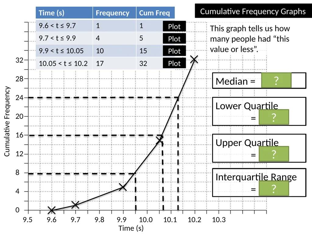
slide25. 9.5 9.6 9.7 9.8 9.9 10.0 10.1 10.2 10.3 Time (s) Cumulative Frequency 32
28
24
20
16
12
8
4
0 Median = 10.07s Lower Quartile
= 9.95s Upper Quartile
= 10.13s ? ? ? Interquartile Range
= 0.18s ? Cumulative Frequency Graphs Plot Plot Plot Plot This graph tells us how many people had “this value or less”.<br>
slide26. 9.5 9.6 9.7 9.8 9.9 10.0 10.1 10.2 10.3 Time (s) Cumulative Frequency 32
28
24
20
16
12
8
4
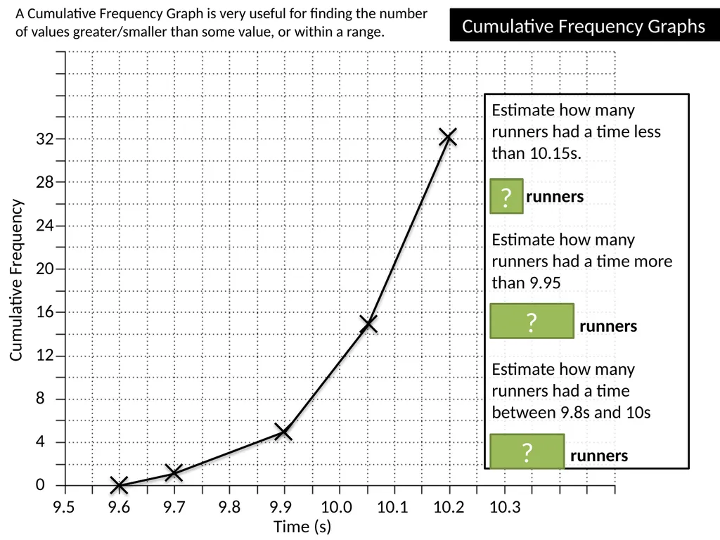
0 Cumulative Frequency Graphs Estimate how many runners had a time less than 10.15s.
26 runners
Estimate how many runners had a time more than 9.95
32 – 8 = 24 runners
Estimate how many runners had a time between 9.8s and 10s
11 – 3 = 8 runners ? ? A Cumulative Frequency Graph is very useful for finding the number of values greater/smaller than some value, or within a range. ?<br>
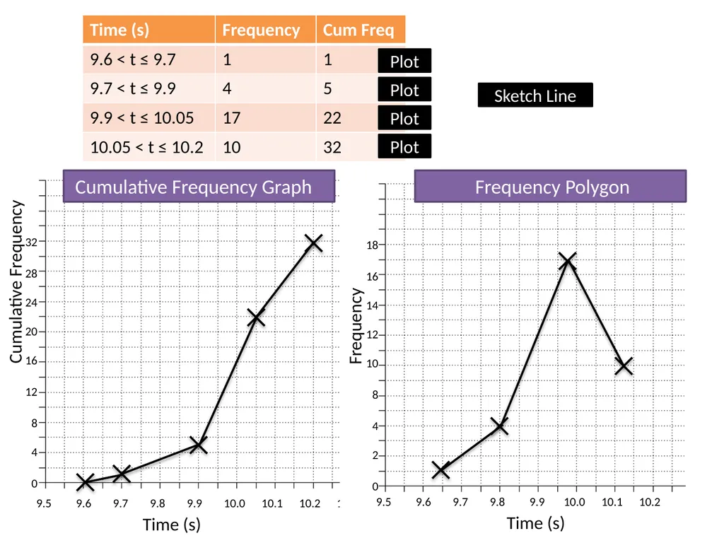
slide27. 9.5 9.6 9.7 9.8 9.9 10.0 10.1 10.2 10.3 Time (s) Cumulative Frequency 32
28
24
20
16
12
8
4
0 Cumulative Frequency Graph Plot Plot Plot Plot Frequency 18
16
14
12
10
8
4
2
0 9.5 9.6 9.7 9.8 9.9 10.0 10.1 10.2 Time (s) Frequency Polygon Sketch Line<br>
slide28. Cumulative Frequency Graphs
Printed handout. Q5, 6, 7, 8, 9, 10 Reference: GCSE-GroupedDataCumFreq<br>
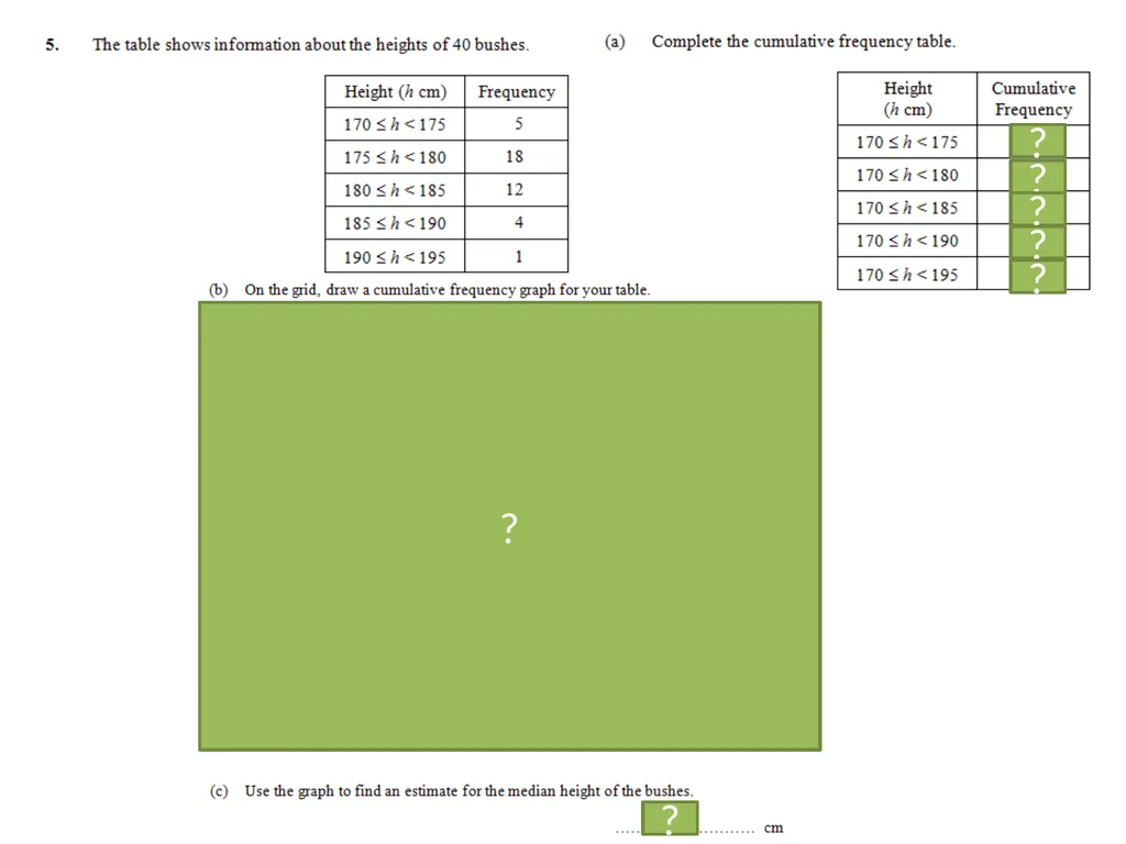
slide29. 5
23
35
39
40 ? ? ? ? ? 179 ? ?<br>
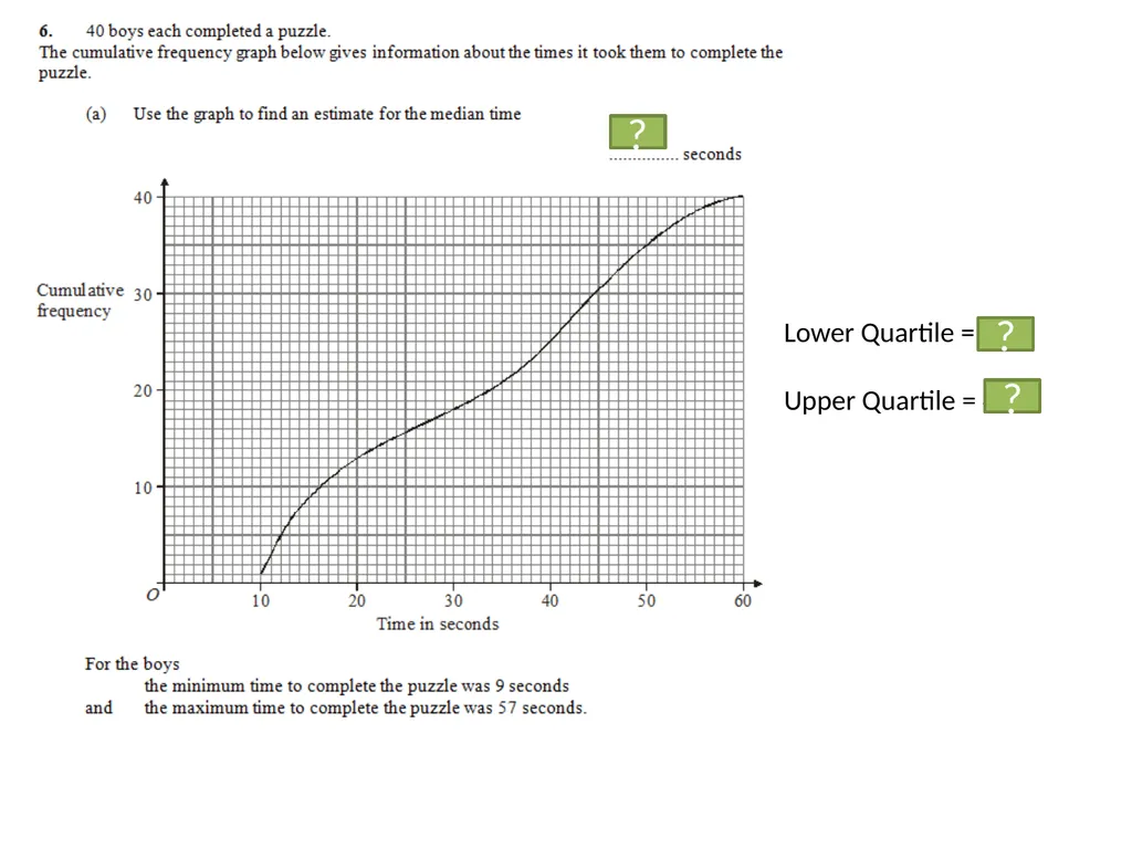
slide30. 34 Lower Quartile = 16
Upper Quartile = 44.5 ? ? ?<br>
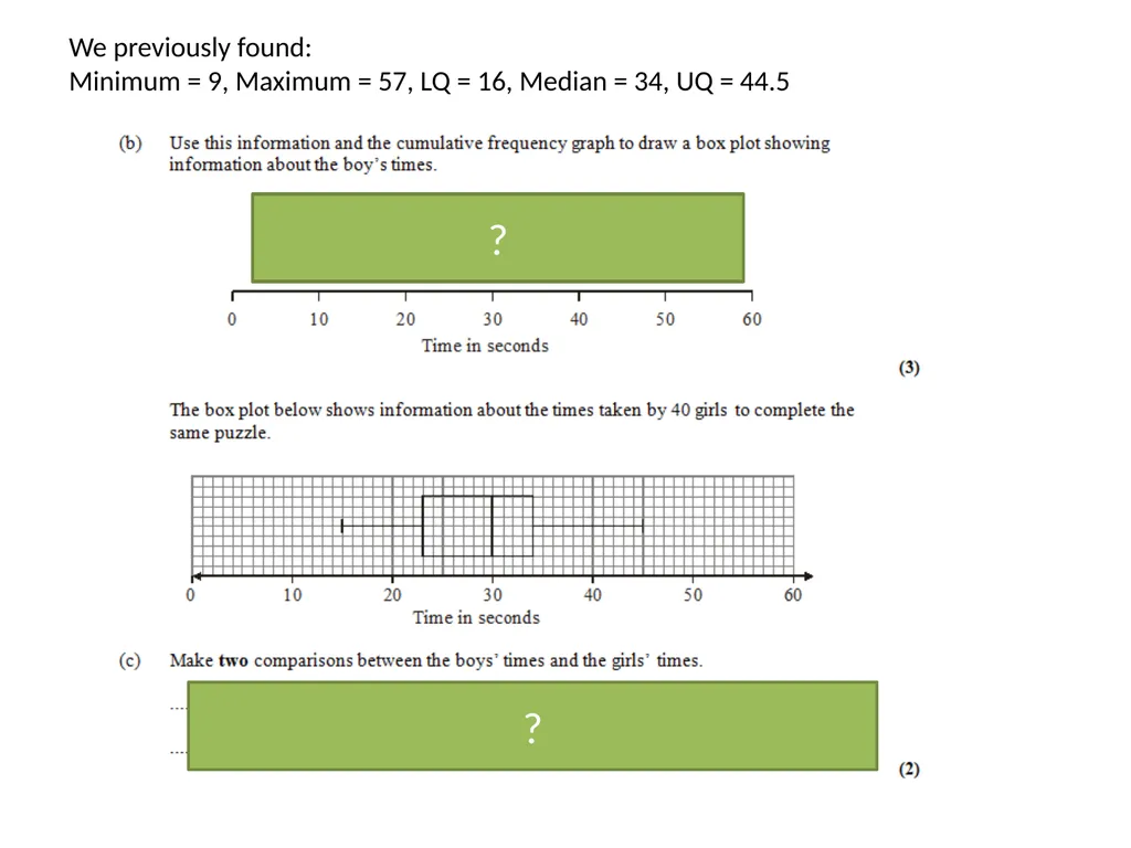
slide31. We previously found:
Minimum = 9, Maximum = 57, LQ = 16, Median = 34, UQ = 44.5 1 mark: Range/interquartile range of boys’ times is greater.
1 mark: Median of boys’ times is greater. ? ?<br>
slide32. 44
100
134
153
160 30 ? ? ? ? ?<br>
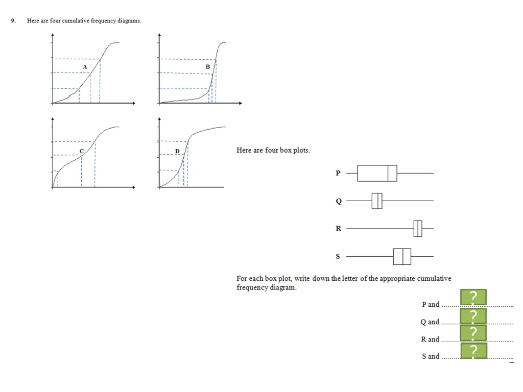
slide33. B C D A ? ? ? ?<br>
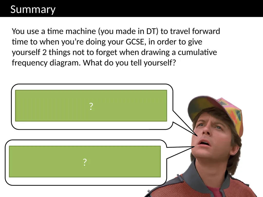
slide34. Summary You use a time machine (you made in DT) to travel forward time to when you’re doing your GCSE, in order to give yourself 2 things not to forget when drawing a cumulative frequency diagram. What do you tell yourself? Plot the point with 0 cumulative frequency at the START of your first range, not necessarily at the start of the x-axis. Use the END of each range when plotting points, so that your cumulative frequency includes all the people in the range. ? ?<br>
slide35. The Whole Picture... Median/LQ/UQ class interval Estimate of Median/LQ/UQ/num values in range Determine Median/LQ/UQ Widths (cm):
4, 4, 7, 9, 11, 12, 14, 15, 15, 18, 28, 42 Cumulative Frequency Table Cumulative Frequency Graph Box Plots Histogram Grouped Frequency Table Frequency Polygon <br>
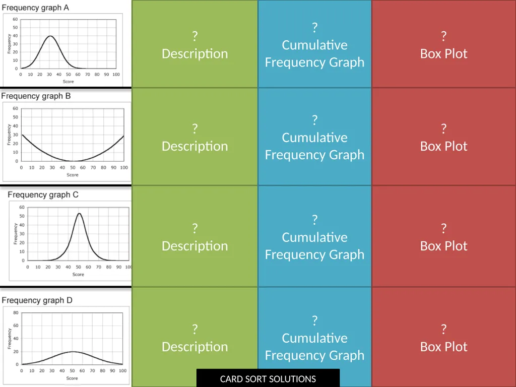
slide36. ?
Description ?
Description ?
Description ?
Description ?
Cumulative Frequency Graph ?
Box Plot ?
Box Plot ?
Box Plot ?
Box Plot CARD SORT SOLUTIONS<br>
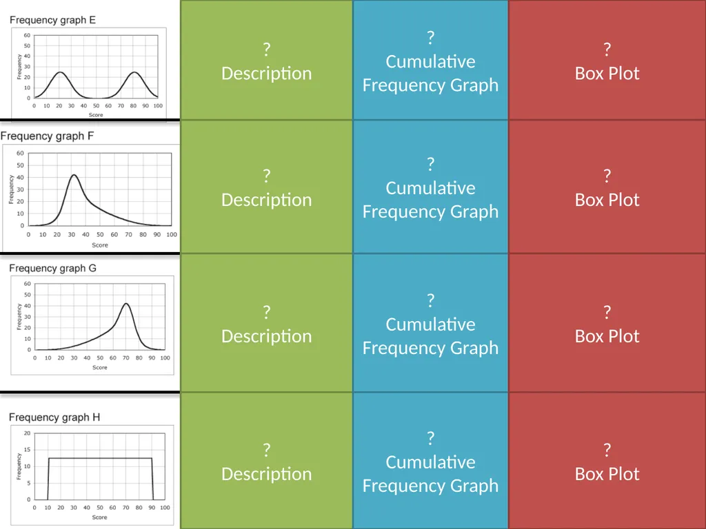
slide37. ?
Description ?
Description ?
Description ?
Description ?
Cumulative Frequency Graph ?
Box Plot ?
Box Plot ?
Box Plot ?
Box Plot<br>

slide2. Starter: Problems involving mean Girl ? ?<br>
slide3. The Whole Picture... Median/LQ/UQ class interval Estimate of Median/LQ/UQ/num values in range Determine Median/LQ/UQ Widths (cm):
4, 4, 7, 9, 11, 12, 14, 15, 15, 18, 28, 42 Cumulative Frequency Table Cumulative Frequency Graph Box Plots Histogram Grouped Frequency Table Frequency Polygon<br>
slide4. Median/Quartile Revision Here are the ages of 10 people at Pablo’s party. Choose the correct value. 12, 13, 14, 14, 15, 16, 16, 17, 19, 24 15 16 Median: 15.5 13 14 LQ: 13.5 17 19 UQ: 18 (Click to vote) Interquartile
Range: 3 Range: 12 ? ?<br>
slide5. 3 2.5 1.5 3.5 1.5 2 4.5 2 3.5 5 2 1 ? ? ? ? ? ? ? ? ? ? ? ? Quickfire Quartiles 1, 2, 3 LQ Median UQ 1, 2, 3, 4 1, 2, 3, 4, 5 1, 2, 3, 4, 5, 6 Rule for lower quartile:
Even num of items: find median of bottom half.
Odd num of items: throw away middle item, find medium of remaining half.<br>
slide6. What if there’s lots of items? There are 31 items, in order of value. What items should we use for the median and lower/upper quartiles? 0 1 1 2 4 5 5 6 7 8 10 10 14 14 14 14 15 16 17 29 31 31 37 37 38 39 40 40 41 43 44 Use the 16th item Median LQ UQ Use the 8 th item Use the 24th item ? ? ?<br>
slide7. Num items 15 23 39 4th 8th 12th 6th 12th 18th 10th 20th 30th 12th 24th 36th 47 ? ? ? ? ? ? ? ? ? ? ? ? What if there’s lots of items? LQ Median UQ<br>
slide8. Box Plots Box Plots allow us to visually represent the distribution of the data. 0 5 10 15 20 25 30 Sketch Sketch Sketch Sketch Sketch How is the IQR represented in this diagram? How is the range represented in this diagram? Sketch Sketch<br>
slide9. 0 4 8 12 16 20 24 Sketch a box plot to represent the given weights of cats: 5lb, 6lb, 7.5lb, 8lb, 8lb, 9lb, 12lb, 14lb, 20lb ? ? ? ? ? Sketch<br>
slide10. Printed handout. Q1 Reference: GCSE-BoxPlotsQuartileStemLeaf<br>
slide11. 0 4 8 12 16 20 24 If you only had the diagram, how could we interpret the distribution of data? What we observe What we can deduce The second box is wider than the first. There is a greater spread of weights in the top half. This is known as positive skew. The length of the second ‘whisker’ (pun intended) is quite long. The fattest cat has a weight that is an extreme value, because the weight is far above the Upper Quartile. ? ?<br>
slide12. £100k £150k £200k £250k £300k £350k £400k £450k Kingston Croydon Box Plot comparing house prices of Croydon and Kingston-upon-Thames. “Compare the prices of houses in Croydon with those in Kingston”. (2 marks) For 1 mark, one of:
In interquartile range of house prices in Kingston is greater than Croydon.
The range of house prices in Kingston is greater than Croydon. For 1 mark:
The median house price in Kingston was greater than that in Croydon.
(Note that in old mark schemes, comparing the minimum/maximum/quartiles would have been acceptable, but currently, you MUST compare the median) ? ?<br>
slide13. Printed handout. Q7 Reference: GCSE-BoxPlotsQuartileStemLeaf<br>
slide14. 1|3 means 13 3 4 5 6 3 7 8 1 4 6 1 1 2 4 5 5 0 2 3 ? ? ? ? ? ? ? Median/
Quartiles?<br>
slide15. Printed handout. Q3 Reference: GCSE-BoxPlotsQuartileStemLeaf<br>
slide16. How would we usually calculate the mean from a list of items? (x) (f) Mean of a list = Total of values
Num values = ? ? ? ? ?<br>
slide17. With a bar chart, we’d plot each value with its frequency.
But we’ve now grouped the data. We all each IQ range a class interval.
What could we use as a representative value for each class interval? 90 100 110 120 130 140 16
14
12
10
8
6
4
2 ?<br>
slide18. Frequency Polygons
Printed handout. Q5, 8 Reference: GCSE-BoxPlotsQuartileStemLeaf<br>
slide19. Question: Why is our mean going to be an estimate? ? Because we don’t know the exact times within each range. ?<br>
slide20. frequencies midpoint of range The Greek letter “capital sigma”, means “sum of”.<br>
slide21. Grouped Frequency Tables
Printed handout. Q1, 2 Reference: GCSE-GroupedDataCumFreq<br>
slide22. ? ? ? We will see soon that we can actually estimate a value (rather than just give a range) for the median, using something called a cumulative frequency graph.<br>
slide23. The Whole Picture... Median/LQ/UQ class interval Estimate of Median/LQ/UQ/num values in range Determine Median/LQ/UQ Widths (cm):
4, 4, 7, 9, 11, 12, 14, 15, 15, 18, 28, 42 Cumulative Frequency Table Cumulative Frequency Graph Box Plots Histogram Grouped Frequency Table Frequency Polygon <br>
slide24. 10.05 < t ≤ 10.2 Modal class interval 10.05 < t ≤ 10.2 Median class interval Estimate of mean 10.02 100m times at the 2012 London Olympics ? ? ? ? ? ? ? ?<br>
slide25. 9.5 9.6 9.7 9.8 9.9 10.0 10.1 10.2 10.3 Time (s) Cumulative Frequency 32
28
24
20
16
12
8
4
0 Median = 10.07s Lower Quartile
= 9.95s Upper Quartile
= 10.13s ? ? ? Interquartile Range
= 0.18s ? Cumulative Frequency Graphs Plot Plot Plot Plot This graph tells us how many people had “this value or less”.<br>
slide26. 9.5 9.6 9.7 9.8 9.9 10.0 10.1 10.2 10.3 Time (s) Cumulative Frequency 32
28
24
20
16
12
8
4
0 Cumulative Frequency Graphs Estimate how many runners had a time less than 10.15s.
26 runners
Estimate how many runners had a time more than 9.95
32 – 8 = 24 runners
Estimate how many runners had a time between 9.8s and 10s
11 – 3 = 8 runners ? ? A Cumulative Frequency Graph is very useful for finding the number of values greater/smaller than some value, or within a range. ?<br>
slide27. 9.5 9.6 9.7 9.8 9.9 10.0 10.1 10.2 10.3 Time (s) Cumulative Frequency 32
28
24
20
16
12
8
4
0 Cumulative Frequency Graph Plot Plot Plot Plot Frequency 18
16
14
12
10
8
4
2
0 9.5 9.6 9.7 9.8 9.9 10.0 10.1 10.2 Time (s) Frequency Polygon Sketch Line<br>
slide28. Cumulative Frequency Graphs
Printed handout. Q5, 6, 7, 8, 9, 10 Reference: GCSE-GroupedDataCumFreq<br>
slide29. 5
23
35
39
40 ? ? ? ? ? 179 ? ?<br>
slide30. 34 Lower Quartile = 16
Upper Quartile = 44.5 ? ? ?<br>
slide31. We previously found:
Minimum = 9, Maximum = 57, LQ = 16, Median = 34, UQ = 44.5 1 mark: Range/interquartile range of boys’ times is greater.
1 mark: Median of boys’ times is greater. ? ?<br>
slide32. 44
100
134
153
160 30 ? ? ? ? ?<br>
slide33. B C D A ? ? ? ?<br>
slide34. Summary You use a time machine (you made in DT) to travel forward time to when you’re doing your GCSE, in order to give yourself 2 things not to forget when drawing a cumulative frequency diagram. What do you tell yourself? Plot the point with 0 cumulative frequency at the START of your first range, not necessarily at the start of the x-axis. Use the END of each range when plotting points, so that your cumulative frequency includes all the people in the range. ? ?<br>
slide35. The Whole Picture... Median/LQ/UQ class interval Estimate of Median/LQ/UQ/num values in range Determine Median/LQ/UQ Widths (cm):
4, 4, 7, 9, 11, 12, 14, 15, 15, 18, 28, 42 Cumulative Frequency Table Cumulative Frequency Graph Box Plots Histogram Grouped Frequency Table Frequency Polygon <br>
slide36. ?
Description ?
Description ?
Description ?
Description ?
Cumulative Frequency Graph ?
Box Plot ?
Box Plot ?
Box Plot ?
Box Plot CARD SORT SOLUTIONS<br>
slide37. ?
Description ?
Description ?
Description ?
Description ?
Cumulative Frequency Graph ?
Box Plot ?
Box Plot ?
Box Plot ?
Box Plot<br>