Design Principles And therefore design elements DART 230 Dr. Beatty The Big 4 Credited to Robin Williams of the non-designers book series Easy to remember as CRAP (or PARC) C ??? Contrast. Think of it as contrast in each of the design
"Design Principles And therefore design elements" is the property of its rightful owner. Permission is granted to
download and print the materials on this website for personal, non-commercial use only, and to display it
on your personal computer provided you do not modify the materials and that you retain all copyright
notices contained in the materials. By downloading content from our website, you accept the terms of this
agreement.
Presentation Transcript
01
Design Principles And therefore design elements
DART 230
Dr. Beatty<br>
02
The Big 4 Credited to Robin Williams of the non-designers book series
Easy to remember as CRAP (or PARC)
C = ???
Contrast. Think of it as contrast in each of the design elements. Elements are the lower-level components you have to work with. My list is color, line, shape, texture, ground, form, type, size/scale, value
R = ??? (could be two answers)
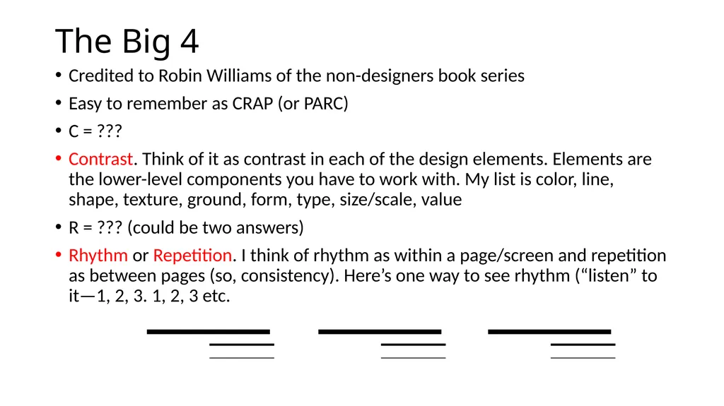
Rhythm or Repetition. I think of rhythm as within a page/screen and repetition as between pages (so, consistency). Here’s one way to see rhythm (“listen” to it—1, 2, 3. 1, 2, 3 etc.<br>
03
The Big 4 cont. Credited to Robin Williams (not that Robin Williams)
A = ???
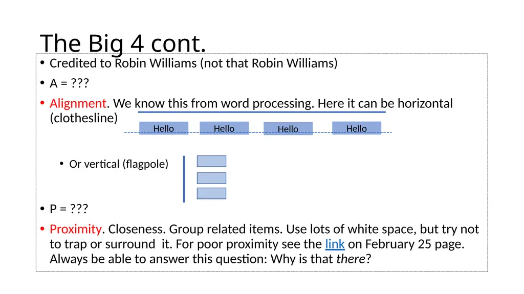
Alignment. We know this from word processing. Here it can be horizontal (clothesline)
Or vertical (flagpole)
P = ???
Proximity. Closeness. Group related items. Use lots of white space, but try not to trap or surround it. For poor proximity see the link on February 25 page. Always be able to answer this question: Why is that there? Hello Hello Hello Hello<br>
04
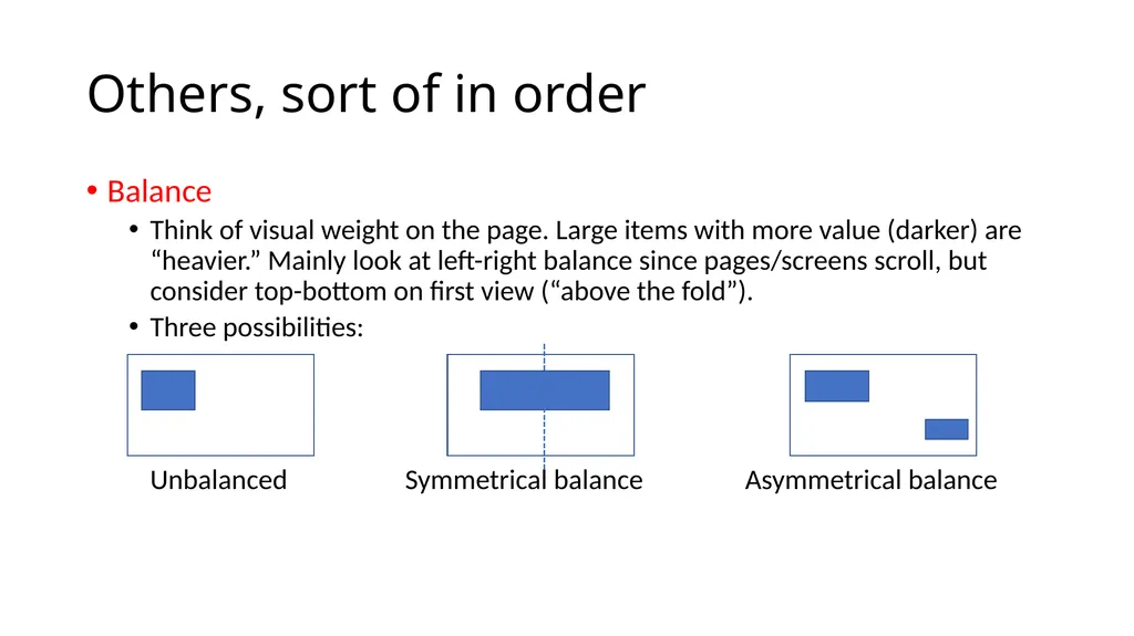
Others, sort of in order Balance
Think of visual weight on the page. Large items with more value (darker) are “heavier.” Mainly look at left-right balance since pages/screens scroll, but consider top-bottom on first view (“above the fold”).
Three possibilities: Unbalanced Symmetrical balance Asymmetrical balance<br>
05
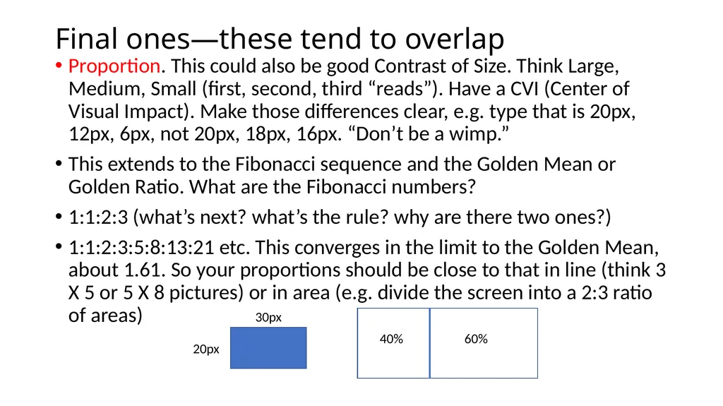
Final ones—these tend to overlap Proportion. This could also be good Contrast of Size. Think Large, Medium, Small (first, second, third “reads”). Have a CVI (Center of Visual Impact). Make those differences clear, e.g. type that is 20px, 12px, 6px, not 20px, 18px, 16px. “Don’t be a wimp.”
This extends to the Fibonacci sequence and the Golden Mean or Golden Ratio. What are the Fibonacci numbers?
1:1:2:3 (what’s next? what’s the rule? why are there two ones?)
1:1:2:3:5:8:13:21 etc. This converges in the limit to the Golden Mean, about 1.61. So your proportions should be close to that in line (think 3 X 5 or 5 X 8 pictures) or in area (e.g. divide the screen into a 2:3 ratio of areas) 40% 60% 20px 30px<br>
06
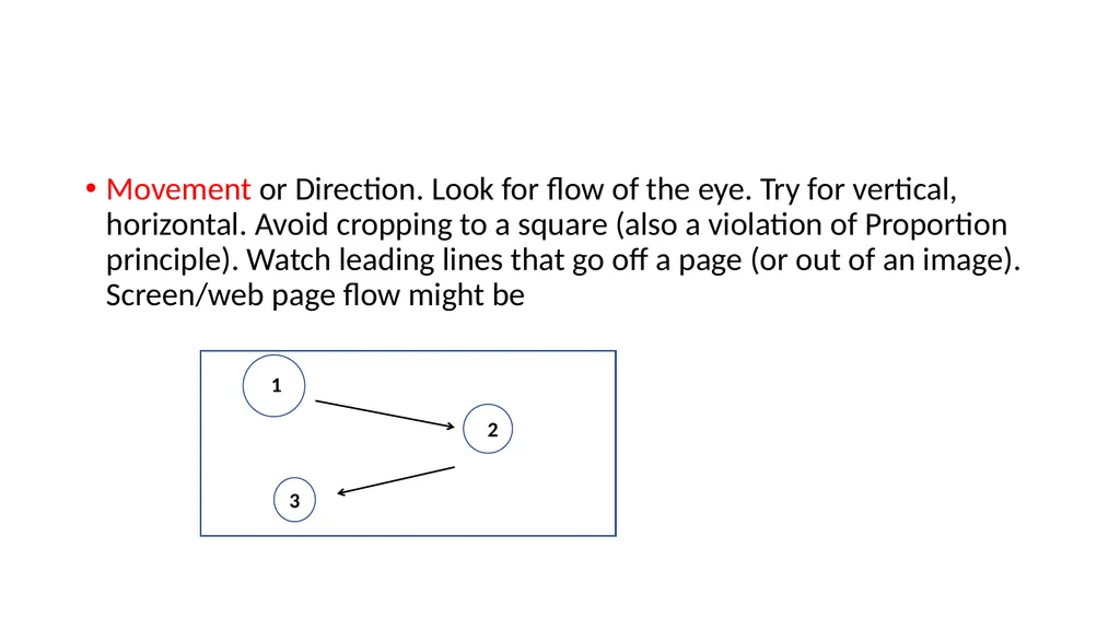
Movement or Direction. Look for flow of the eye. Try for vertical, horizontal. Avoid cropping to a square (also a violation of Proportion principle). Watch leading lines that go off a page (or out of an image). Screen/web page flow might be 1 2 3<br>
07
Your list may vary … Harmony or Unity. Everything works together. Enough Contrast but not too much. Typically limit to two typefaces, and use variations within those Two basic colors, or color groups, etc.
Lots of examples on February 25 page. Here’s a list that is similar to mine.<br>