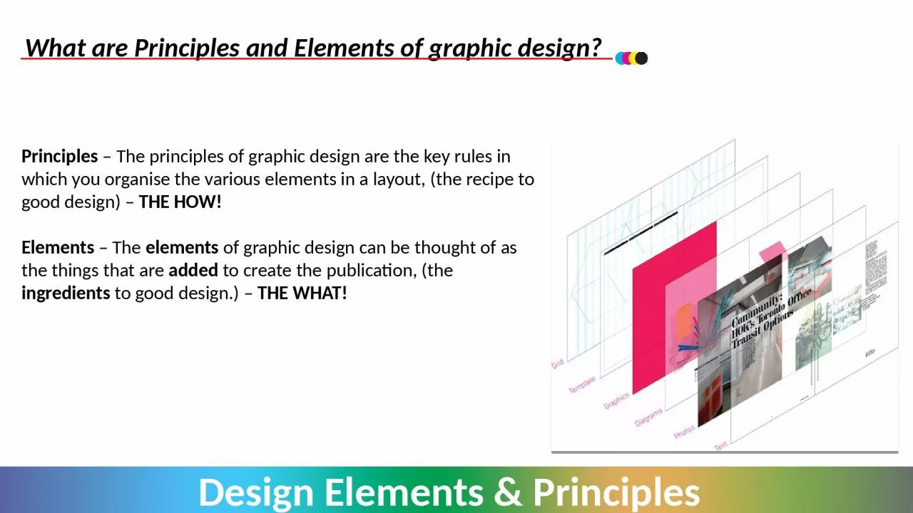
Principles The principles of graphic design are the key rules in which you organise the various elements in a layout the recipe to good design THE HOW Elements The elements of graphic design can be thought of as the things that are ID: 919033
Download Presentation The PPT/PDF document "What are Principles and Elements of grap..." is the property of its rightful owner. Permission is granted to download and print the materials on this web site for personal, non-commercial use only, and to display it on your personal computer provided you do not modify the materials and that you retain all copyright notices contained in the materials. By downloading content from our website, you accept the terms of this agreement.
Slide1
What are Principles and Elements of graphic design?
Principles
– The principles of graphic design are the key rules in which you organise the various elements in a layout, (the recipe to good design) – THE HOW!Elements – The elements of graphic design can be thought of as the things that are added to create the publication, (the ingredients to good design.) – THE WHAT!
Slide2The Design Principles & Elements PRINCIPLESBalance
Rhythm
DepthUnityProximityAlignmentEmphasisDominanceWhite SpaceGrid StructureContrastTypography
ELEMENTS
Line
Shape
Texture
ColourValueSizeWeightMass
A list of the various principles and element are shown.You will need to be able to understand and apply these in your own work within Higher Graphic Communication.You may click the terms to view each Principle and Element.
Slide3BALANCEWhen we look at publications and documents they will have some form of visual balance or visual weight of different graphic elements in their layouts. There are 2 main types of balance within graphic design and these are described below:-
Symmetrical
Asymmetrical
Slide4BALANCE - SYMMETRICALPublications with symmetrical balance are ones that have an equal distribution of visual weight, all their elements on the page are centred and balanced. It is generally seen as equal visual weight that can be described as having mirror reflection vertically and horizontally.
Uses:
Symmetrical design can communicate stability and strength, which are appropriate for a traditional or conservative piece, often used by banks, lawyers and medical profession documents.
Slide5BALANCE - ASYMMETRICALInstead of symmetrical balance you can have Asymmetrical balance.
This
is when publications have a layout that have a number of elements arranged in an order that can be weighted to a particular side of a document. Uses Asymmetrical layouts are generally more dynamic and by intentionally ignoring balance the designer can create tension, express movement, contrast, variety or convey a mood such as anger, excitement, joy, or casual amusement.
Slide6RHYTHMIn most publications rhythm is used to create movement and is reflected in the repetition of DTP elements in a varied pattern. The two key aspects of Rhythm are repetition
and variation.
Repetition – repeats the DTP elements throughout document. Variation – Change in size, placement or style of DTP element.Repetition helps to unify a piece, without the use of variation, repetition can be boring. Many pages of identical columns of text should be varied with the use of headlines, sub headlines and images.
Slide7RHYTHM – REPITITION OF COLOURS & SHAPESColour: The blue of the girl's skirt is echoed in the blue writing on the wall and the blue title ("Affirmation #416") Patterns/Shapes
: The main background is a repeating brick pattern, the skirt also contains a repeating pattern.
Words: The words on the wall repeat over and over.
Slide8RHYTHM – REPITITION OF DTP ELEMENTSThe primary repeating element in this page is the number 5.
5 on the clock5 on the tape measure (which becomes part of the page title "5 things I do every day")the list of five thingsthe 5 lines above and 5 lines below the number 5 on the listthe 5 fingers of the hand
Slide9RHYTHM – MOVEMENTRepetition in the triangle shapes, helps create movement for the reader to follow the article across the page.
Repetition
of header & rule at top of page along with use of the same two colours for fonts has also been used.
Slide10DEPTHDepth is the effect of creating designs that appear to stand out from the page, simple techniques can make your publication more eye catching to the reader.Ways in which you can create depth in your publication can be seen below:- Placing text behind and image.
Using drop shadow to make it standout.
Placing an object in front of other elements (line, shapes, images etc)
Slide11UNITYUnity in graphic design allows the reader to have visual cues telling them which parts of the layout are linked together. As
seen before in rhythm, Unity
is closely linked to the repetition of colour, shapes and textures. This create an instant unity within a document but unity can also be gained through layout structure and grouping of items and typography.
Slide12UNITY – KEY POINTSUnity can be seen within layouts such asUnity in ColourUnity in
ShapesUnity in
Close ConnectionsThe example shown demonstrates unity within the publication through the repetition of the hexagonal shape from one graphic to another. The use of the red and green colours in fonts and borders, links with elements within the images.
Slide13PROXIMITYAdjusting the spacing between a number of design elements to create a close proximity can be enough to enhance your overall effectiveness and style of your publication.
Proximity allows information and content to be presented a lot
easier, quicker and more enjoyable to read for the user.The publication above shows how the proximity of the square shapes helps to frame the layout and images and guide the reader to a heading within the document.
Slide14ALIGNMENTAlignment of DTP elements can help improve the layout structure of a publication, alignment will often vary from one layout to another. As with all layouts, it depends on the purpose of the publication and the target market it’s aimed for.
The alignment of a publication can be shown through,
The structure of body text within an articlePositioning of the various DTP elements on the page.
Slide15ALIGNMENT – BODY TEXTThe alignment of body text can be produced into several formats such as Left, Right,
Centred and
Fully Justified. “Lorem ipsum dolor sit amet, sumo malis usu eu. Duo brute saepe recteque eu, dicam doming consetetur nam no. Sit an voluptatum ullamcorper, ad duis dolore nonumy vix. Discere assueverit ne qui.His te mutat aperiri. Et dolorum forensibus est, vix doctus omittam et, ne eam omnis aliquid scriptorem. No inermis corpora est, brute detraxit definitionem mel eu. Vidit ipsum eu duo, vix te deseruisse efficiendi definitionem.”“Lorem ipsum dolor sit amet, sumo malis usu eu. Duo brute saepe recteque eu, dicam doming consetetur nam no. Sit an voluptatum ullamcorper, ad duis dolore nonumy vix. Discere assueverit ne qui.His te mutat aperiri. Et dolorum forensibus est, vix doctus omittam et, ne eam omnis aliquid scriptorem. No inermis corpora est, brute detraxit definitionem mel eu. Vidit ipsum eu duo, vix te deseruisse efficiendi definion” “Lorem ipsum dolor sit amet, sumo malis usu eu. Duo brute saepe recteque eu, dicam doming consetetur nam no. Sit an voluptatum ullamcorper, ad duis dolore nonumy vix. Discere assueverit ne qui.”
“Lorem ipsum dolor sit amet, sumo malis usu eu. Duo brute saepe recteque eu, dicam doming consetetur nam no. Sit an voluptatum ullamcorper, ad duis dolore nonumy vix. Discere assueverit ne qui.
His te mutat aperiri. Et dolorum forensibus est, vix doctus omittam et, ne eam omnis aliquid scriptorem. No inermis corpora est, brute detraxit definitionem mel eu. Vidit ipsum eu duo, vix te deseruisse efficiendi definitionem.”
Left Aligned
Right Aligned
Fully JustifiedCentred
Slide16ALIGNMENT – POSITIONING OF DTP ELEMENTSAlignment of elements such as text, images and shapes on the page should be placed in a way that does not appear random.
By
aligning elements you should be looking to connect the various elements in the document visually to achieve a neat and structured layout, this should be carried out deliberately.The layout to the left shows how alignments has been carried out in the positioning of images, columns of text and headings. They have been aligned with each other.
Slide17ALIGNMENT – POSITIONING OF DTP ELEMENTSStrong alignment can make a huge difference to the overall layout of a publication, it should make the publication appear neater and easier to follow for the reader.
Poor alignment in a publication can make the reader distracted and lost in the layout making it harder to present the message of the publication.
Slide18EMPHASIS & DOMINANCEEmphasis and Dominance are similar elements, the difference between are show below:- Emphasis – happens when an item is made more eye catching.
Dominance
– occurs when one item stands out more than others, it dominates the layout.Dominance placed on large logo / company name. Emphasis has been carried out by changing colour of key information.
Slide19EMPHASISEmphasis has been created in the headline, structured body texts with varying background colours as well as reversed text in the layout.
Slide20DOMINANCEDominance placed on the graphic on the top right of the page, as it a largest element on the page creating a focal point.
Slide21WHITE SPACEWhite space refers to the canvas space left in between different elements of your design. You may have also heard it referred to as negative space. It’s important because it keeps your design from being too cluttered or too confusing.
The term “
white space” is actually a bit of a confusing one because it implies that the space has to be white in colour. White space can actually be any colour
Slide22WHITE SPACE – USED TO SEPARATE & GROUP ELEMENTSWhite space provides the brain with visual clues as to which graphic design elements belong together and which are separate.The white space between the different lines of numbers give your brain the signal that each is a part of a new and different sequence instead of one long number.
Space is also used to separate each individual character from the rest, making them legible and easy to comprehend.
Slide23WHITE SPACE – ADDS EMPHASISAs you can see from example images, our brains tend to put emphasis and importance on design elements that are surrounded by white space. This is because the negative space is giving you visual clues about where you should be looking, providing plenty of buffer room around an element so that your brain can quickly process it.
This
is why important design elements like logos are often surrounded by white space, so that they are emphasized and clearly visible
Slide24GRIDS & GUIDLINESGrids in graphic design refers to a series of intersecting horizontal and vertical lines that are used to structure content on a page. Grids act as a framework that a designer can use to organise
content in a rational manner.
Grids give order to graphic design. They speed up the design process by helping designers decide where content should be placed rather than where it could be placed.
Slide25GRIDS & GUIDLINESAlthough grids should be used to structure content, they are only intended to guide the graphic design process, not dictate it. They shouldn’t be ignored nor should they be strictly followed.
Simply flowing all the content into rows or columns can lead to a rigid, repetitive and uninteresting design
Grids and guidelines
aren’t visible
to the audience when
printed.
Slide26GRIDS & GUIDELINES – RULE OF THIRDS The rule states that a publication can be divided into nine equal parts by two space horizontal lines and vertical lines. The intersection points can be used to focus on your main elements, or the boxes formed can provide a space for your elements.
The theory is that if you place points of interest in the intersections or along the lines that your photo becomes more balanced and will enable a viewer of the image to interact with it more naturally.
Slide27GRIDS & GUIDELINES – VISUAL CENTRE
Figure 1 - Geometric
Figure 2 - OpticalIn the images above you can see that Figure 1, the logo has been placed centrally to the borders in the image, but visually it does not sit well. If we change the location of the logo as seen in Figure 2 and place it in the optical centre, it now looks more balanced and visually comfortable for the reader.
Slide28CONTRASTContrast occurs when two elements are different. The greater the difference the greater the contrast. The key to working with contrast is to make sure the differences are obvious.
Four common methods of creating contrast are by using differences in:
SizeColourShapeTypeface
Slide29CONTRAST - SIZEHaving a contrast of size adds visual interest in the composition, and will help you establish the key elements in your layout so you can be sure the viewer is focusing on the right area.Contrast of size is not applicable to just text; it can also be the images in the publication.
Slide30CONTRAST - COLOURContrast of colour is arguably one of the key principles of design and, as mentioned before, it’s probably one you’re familiar with. You can get a very simple example of this theory if you take a white background and drop black text on it. The contrast between white and black values is pretty clear.
Slide31CONTRAST - SHAPESUtilising contrast in shape for your publication can really help make things stand out. It’ll allow you to make the principal elements of your publication stand out by creating a noticeable difference in shape compared to the rest of the elements in the layout.
The contrast in colour found between the colourful shapes and the grey lines.
From the example to the right, the obvious contrast in shapes are created in the circular shapes and the geometric lines.
Slide32CONTRAST - SHAPESTwo layouts showing how contrasting shapes have been used in a publication. This creates a visual appeal that is often used to draw attention to a specific message.
Slide33CONTRAST - TYPEFACEWhen working with a layout, you never want to have the same font used for the entire design. Instead, you should find places where you can create variation, such as areas are of most significance.
For example, you can use the same typeface but have one bold and the other light or regular.
This gives you contrast, but also keeps that unity in your design.
Slide34CONTRAST - TYPEFACEContrast create by change size of type.
Contrast heavy weights with light weights
of type.Example of combined thick and thin weighted type.Caps vs lowercase is contrast of form, as well as different families of fonts (i.e. Serif font & Sans Serif font)Type that has been stretched horizontally versus tall, narrow columns of type rather type on a slant.
Slide35TYPOGRAPHY & FONTSGood typography comes from paying attention to tiny details, as this can make the difference between graphic design work that is just acceptable or really good.
There is more to it than just choosing fonts and making text look good though – it is also about making things legible and readable (some of most basic functions of good typography) as well as making layouts look good in an aesthetic way.
Slide36TYPOGRAPHY – SERIF & SANS SERIFThere are many different classifications and sub-classification of typefaces, but the most common two types you will find are:
Slide37TYPOGRAPHY – SERIFAboutSerif typefaces are among some of the oldest modern typefaces. They are used in everything from book publishing to newspapers and magazines to billboards and websites. When to use them
The mood and feelings most associated with serif typefaces are classic, elegant, formal, confident and established. Some of the most well-known serif typefaces include:
Times Roman RockwellGeorgiaBaskerville.
Slide38TYPOGRAPHY – SANS SERIFAboutSans serif typefaces are considered more modern and include a variety of widths and shapes.When to use themThe mood and feelings most associated with sans serif typefaces are modern, friendly, direct, clean and minimal. Some of the most well-known sans serif typefaces include:
Helvetica
ArialCalibriFranklin Gothic
Slide39TYPOGRAPHY – ANATOMY OF TYPEThese are some of the basic parts of the anatomy of typographic characters.
Slide40TYPOGRAPHY – KERNINGKerning is the adjustment of the spacing between individual characters.
Slide41TYPOGRAPHY – TRACKINGTracking, however, is the spacing of a group of characters.
Slide42TYPOGRAPHY – LEADINGLeading describes the amount of space between lines of text
The image show the effect that can be created when leading is adjusted.
Often used to create clarity for the reader or emphasis on a particular body of text within the publication
Slide43LINELines are an important element in the design of publication, they are used to separate parts of a layout, connect parts of a layout or create emphasis to particular text of a layout
.
The width of a line has a direct effect on its visual impact. Thick lines are bold and strong; they draw attention to themselves. Thin lines tend to do the opposite.
Slide44LINECurved lines often give a more dynamic or fluid look to a design. They indicate movement and energy. They’re also more common in designs with an organic nature, as they’re more likely to be seen in nature. Straight lines are more formal and structured, and indicative of “civilised” culture.
Slide45SHAPEShapes are two-dimensional. Circles, squares, rectangles, triangles, and any other kind of polygon or abstract shapes.Designers use shapes to: Organise information through connection and
separation.
Symbolise different ideas. Create movement, texture, and depth. Convey mood and emotion. Emphasise and create entry points and areas of interest. Lead the eye from one design element to the next.
Slide46SHAPEFor example, circles are often associated with movement, and also with organic and natural things. Squares are more often seen with orderly, structured designs. The colour, style, and texture of a shape can make a huge difference in how it is perceived.
Slide47TEXTURETextures are an important part of just about any publication. Even publications that, on the surface, don’t seem to use textures actually are (“smooth” and “flat” are textures, too). Textures can add to the feeling and mood of a design, or they can take away. The most commonly seen textures, apart from flat or smooth, are things like paper, stone, concrete, brick, fabric, and natural elements.
Slide48TEXTURETextures can be subtle or pronounced, used liberally or sparingly, depending on the individual design. But texture is an important aspect of design that can have a surprising effect on how a design comes across.Examples of how textures can be used are shown, in a background and also as a connection to create unity linking one item to another.
Slide49COLOURWhen working with colour in our publications it can be used to create moods and create a visual connection to the message being promoted. Colour combinations are used to create identity of brand but also to create unity and depth within a publication.
Slide50COLOUR – COLOUR WHEELYellow-OrangeYellow
Yellow-Green
GreenBlue-GreenBlueBlue-VioletVioletRed-VioletOrangeRed-Orange
Red
Structure of the colour wheel is show below:-
Primary
- Red Blue Yellow Secondary- Orange Green Violet Tertiary - Yellow-Green Yellow-Orange Red-Orange Red-Violet Blue-Green Blue-Violet
Slide51COLOUR – MOODS
Passion, Love, Anger
Happiness, Hope, DeceitCalm, Responsible, SadnessMystery, Elegance, EvilPurity, Cleanliness, Virtue
Conservative, Piety, Dull
Energy, Happiness, Vitality
New Beginnings, Abundance, Nature
Creativity, Royalty, Wealth
Moody, Conservative, Formality
Nature, Wholesomeness, Dependability
Calm, Elegant, Purity
Slide52COLOUR – ADVANCING COLOURSWarm colours include red, orange, and yellow, and variations of those three colours. These are the colours of fire, of fall leaves, and of sunsets and sunrises, and are generally energising, passionate, and positive. They are also known as
advancing colours
as they appear to be closer to the readerRed and yellow are both primary colours, with orange falling in the middle, which means warm colours are all truly warm and aren’t created by combining a warm colour with a cool colour. You can use warm colours in your publications to reflect: - passion, happiness, enthusiasm, and energy.
Slide53COLOUR – RECEDING COLOURSCool colours include green, blue, and purple, are often more subdued than warm colours. They are the colours of night, of water, of nature, and are usually calming, relaxing, and somewhat reserved. They are also known as receding colours as they appear to be further away to the reader.Blue is the only primary colour within the cool spectrum, which means the other colours are created by combining blue with a warm colour (yellow for green and red for purple). Greens take on some of the attributes of yellow, and purple takes on some of the attributes of red. You can use cool colours in your publications to give a sense of: calm or professionalism.
Slide54COLOUR – RECEDING COLOURSCool colours include green, blue, and purple, are often more subdued than warm colours. They are the colours of night, of water, of nature, and are usually calming, relaxing, and somewhat reserved. They are also known as receding colours as they appear to be further away to the reader.Blue is the only primary colour within the cool spectrum, which means the other colours are created by combining blue with a warm colour (yellow for green and red for purple). Greens take on some of the attributes of yellow, and purple takes on some of the attributes of red. You can use cool colours in your publications to give a sense of: calm or professionalism.
Slide55COLOUR – HARMONIOUS COLOURSHarmonious colour schemes are the next easiest to create. Harmonious schemes are created by using three colours that are next to each other on the colour wheel. Generally, Harmonious colour schemes all similar is colour level, but by using tones, shades and tints we can add interest to these schemes and adapt them to our needs for designing publications to help establish unity and colour connections within the document.
Harmony with Red-Violet
Harmony with Blue-Green
Slide56COLOUR – HARMONIOUS COLOURSContrasting schemes are created by combining colours from opposite sides of the colour wheel. In their most basic form, these schemes consist of only two colours, but can easily be expanded using tones, tints, and shades.Caution must be taking though as using colours that are exact opposites with the same colour and/or value right next to each other can be very jarring visually (they’ll appear to actually vibrate along their border in the most severe uses
Slide57VALUEValue is closely related to colour, but it’s more general. It is how light or dark a specific design is.
Again
, this relates directly to the mood a piece gives. Darker designs convey a different feeling than lighter designs, even with all other design elements being equal.The contrast between light and dark is often used to create emphasis to a particular part of design, i.e. headlines, brand names, slogans to name a few.
Slide58SIZE, MASS & WEIGHTIn your design publication, most items within your layout can be thought of having mass. A heading that has been bold will carry a greater mass than other possible headings or body text. Elements like line
and colour
can add mass to publication by their thickness and size. Mass is size. There is physical size and visual size.Size can be relative. A physically small brochure can have a great deal of mass through the use of heavy text and graphic elements. A physically large brochure can appear smaller, lighter by using text and graphics sparingly.
Slide59SIZE, MASS & WEIGHTIt is easy to distinguish the header from the headline, subheadings and
body text. This is because they vary in
size and your eye is naturally drawn to the largest element first. Note the drop cap, too; it’s a great way to indicate where the reader should start and an example of using size to direct the viewer’s eye.