
Displaying Numerical Data on Histograms 1 2 Lesson
CP
Published · 73 slides · 0 views
1 / 1

Description
Displaying Numerical Data on Histograms 1 2 Lesson Overview (1 of 6) 3 Lesson Overview (2 of 6) 4 Lesson Overview (3 of 6) 5 Lesson Overview (4 of 6) 6 Lesson Overview (5 of 6) 7 Lesson Overview (6 of 6) Warm Up OBJECTIVE: SWBAT display
Related Topics
Share
Embed code
Download this presentation From Below
"Displaying Numerical Data on Histograms 1 2 Lesson" is the property of its rightful owner. Permission is granted to download and print the materials on this website for personal, non-commercial use only, and to display it on your personal computer provided you do not modify the materials and that you retain all copyright notices contained in the materials. By downloading content from our website, you accept the terms of this agreement.
Presentation Transcript
01
Displaying Numerical Data on Histograms 1<br>
02
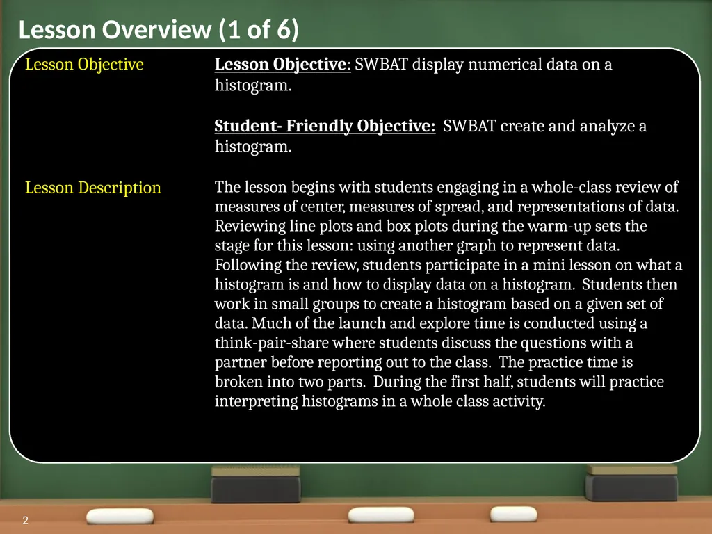
2 Lesson Overview (1 of 6)<br>
03
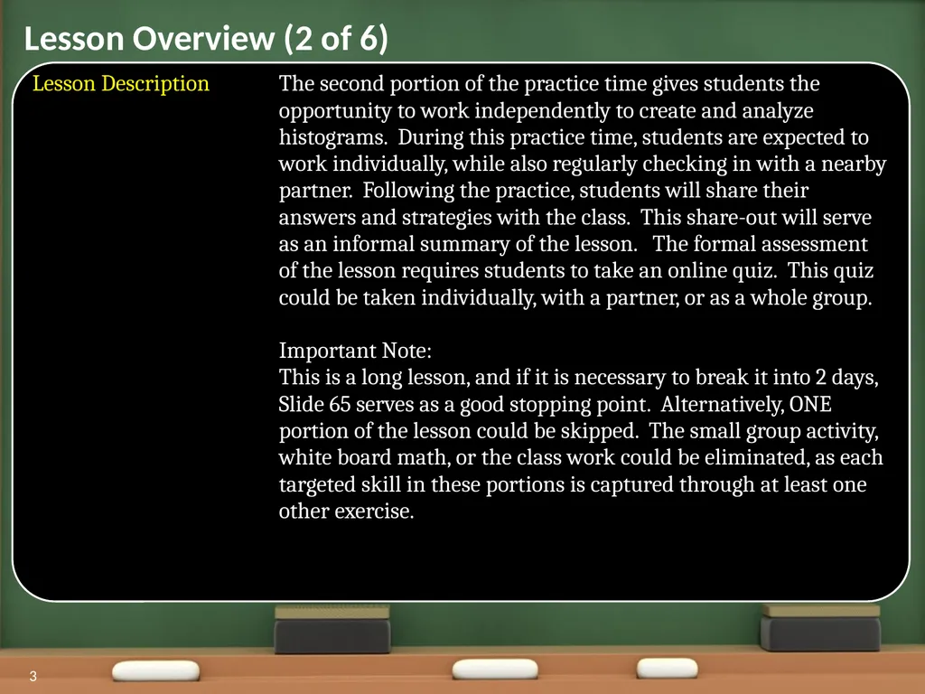
3 Lesson Overview (2 of 6)<br>
04
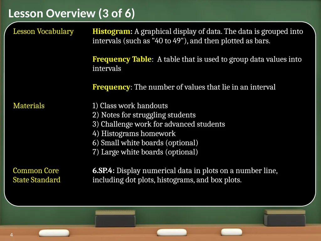
4 Lesson Overview (3 of 6)<br>
05
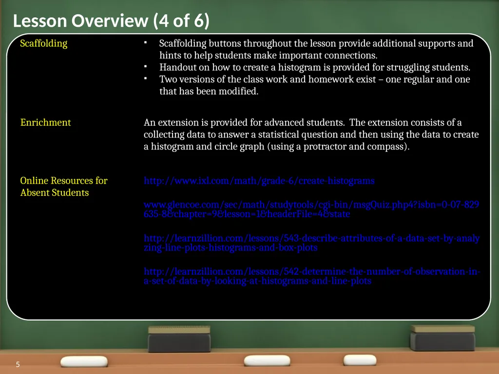
5 Lesson Overview (4 of 6)<br>
06
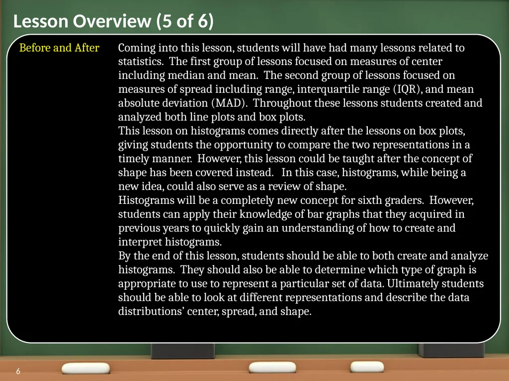
6 Lesson Overview (5 of 6)<br>
07
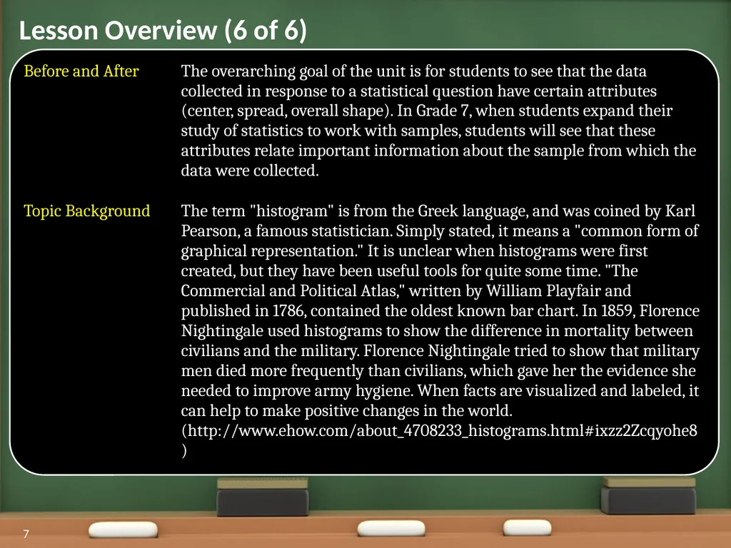
7 Lesson Overview (6 of 6)<br>
08
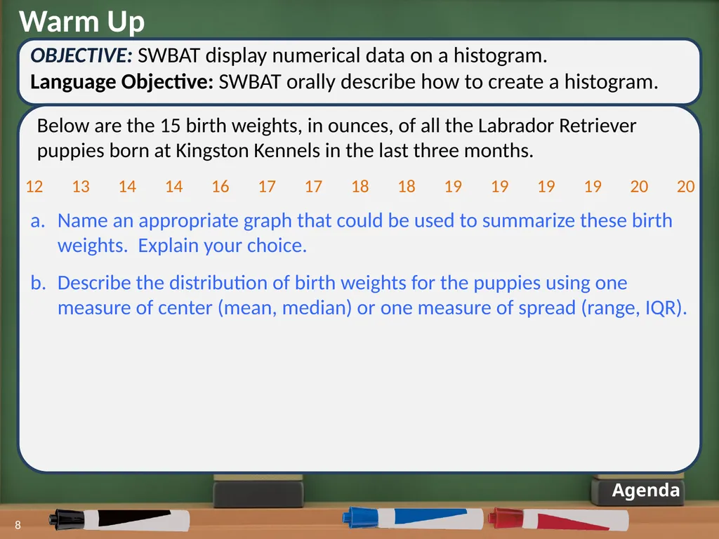
Warm Up OBJECTIVE: SWBAT display numerical data on a histogram.
Language Objective: SWBAT orally describe how to create a histogram. Agenda 8 Below are the 15 birth weights, in ounces, of all the Labrador Retriever puppies born at Kingston Kennels in the last three months. Name an appropriate graph that could be used to summarize these birth weights. Explain your choice.
Describe the distribution of birth weights for the puppies using one measure of center (mean, median) or one measure of spread (range, IQR). 12 13 14 14 16 17 17 18 18 19 19 19 19 20 20<br>
Language Objective: SWBAT orally describe how to create a histogram. Agenda 8 Below are the 15 birth weights, in ounces, of all the Labrador Retriever puppies born at Kingston Kennels in the last three months. Name an appropriate graph that could be used to summarize these birth weights. Explain your choice.
Describe the distribution of birth weights for the puppies using one measure of center (mean, median) or one measure of spread (range, IQR). 12 13 14 14 16 17 17 18 18 19 19 19 19 20 20<br>
09
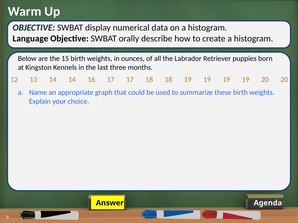
Warm Up OBJECTIVE: SWBAT display numerical data on a histogram.
Language Objective: SWBAT orally describe how to create a histogram. Agenda 9 Below are the 15 birth weights, in ounces, of all the Labrador Retriever puppies born at Kingston Kennels in the last three months. Name an appropriate graph that could be used to summarize these birth weights. Explain your choice. 12 13 14 14 16 17 17 18 18 19 19 19 19 20 20 Answer<br>
Language Objective: SWBAT orally describe how to create a histogram. Agenda 9 Below are the 15 birth weights, in ounces, of all the Labrador Retriever puppies born at Kingston Kennels in the last three months. Name an appropriate graph that could be used to summarize these birth weights. Explain your choice. 12 13 14 14 16 17 17 18 18 19 19 19 19 20 20 Answer<br>
10
Warm Up OBJECTIVE: SWBAT display numerical data on a histogram.
Language Objective: SWBAT orally describe how to create a histogram. Agenda 10 Below are the 15 birth weights, in ounces, of all the Labrador Retriever puppies born at Kingston Kennels in the last three months. Name an appropriate graph that could be used to summarize these birth weights. Explain your choice. Puppy Weights 12 13 14 15 16 17 18 19 20 Ounces 12 13 14 14 16 17 17 18 18 19 19 19 19 20 20<br>
Language Objective: SWBAT orally describe how to create a histogram. Agenda 10 Below are the 15 birth weights, in ounces, of all the Labrador Retriever puppies born at Kingston Kennels in the last three months. Name an appropriate graph that could be used to summarize these birth weights. Explain your choice. Puppy Weights 12 13 14 15 16 17 18 19 20 Ounces 12 13 14 14 16 17 17 18 18 19 19 19 19 20 20<br>
11
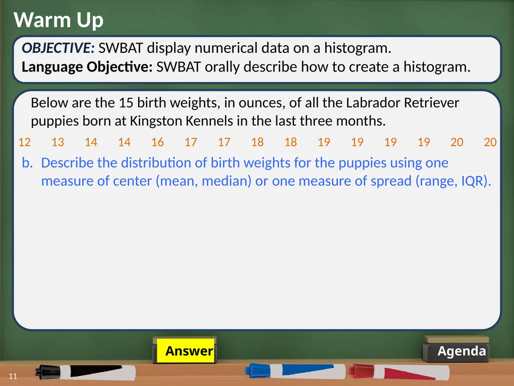
Warm Up OBJECTIVE: SWBAT display numerical data on a histogram.
Language Objective: SWBAT orally describe how to create a histogram. Agenda 11 Below are the 15 birth weights, in ounces, of all the Labrador Retriever puppies born at Kingston Kennels in the last three months. 12 13 14 14 16 17 17 18 18 19 19 19 19 20 20 b. Describe the distribution of birth weights for the puppies using one measure of center (mean, median) or one measure of spread (range, IQR). Answer<br>
Language Objective: SWBAT orally describe how to create a histogram. Agenda 11 Below are the 15 birth weights, in ounces, of all the Labrador Retriever puppies born at Kingston Kennels in the last three months. 12 13 14 14 16 17 17 18 18 19 19 19 19 20 20 b. Describe the distribution of birth weights for the puppies using one measure of center (mean, median) or one measure of spread (range, IQR). Answer<br>
12
Warm Up OBJECTIVE: SWBAT display numerical data on a histogram.
Language Objective: SWBAT orally describe how to create a histogram. Agenda 12 Below are the 15 birth weights, in ounces, of all the Labrador Retriever puppies born at Kingston Kennels in the last three months. 12 13 14 14 16 17 17 18 18 19 19 19 19 20 20 b. Describe the distribution of birth weights for the puppies using one measure of center (mean, median) or one measure of spread (range, IQR). Measures of Center
Mean:
Median: Measures of Spread
Range:
IQR: 17 ounces 18 ounces 8 ounces 5 ounces<br>
Language Objective: SWBAT orally describe how to create a histogram. Agenda 12 Below are the 15 birth weights, in ounces, of all the Labrador Retriever puppies born at Kingston Kennels in the last three months. 12 13 14 14 16 17 17 18 18 19 19 19 19 20 20 b. Describe the distribution of birth weights for the puppies using one measure of center (mean, median) or one measure of spread (range, IQR). Measures of Center
Mean:
Median: Measures of Spread
Range:
IQR: 17 ounces 18 ounces 8 ounces 5 ounces<br>
13
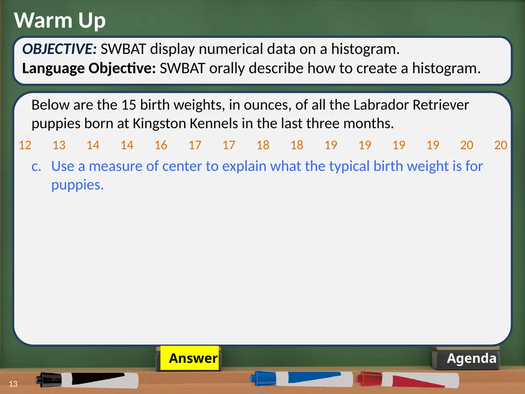
Warm Up OBJECTIVE: SWBAT display numerical data on a histogram.
Language Objective: SWBAT orally describe how to create a histogram. Agenda 13 Below are the 15 birth weights, in ounces, of all the Labrador Retriever puppies born at Kingston Kennels in the last three months. c. Use a measure of center to explain what the typical birth weight is for puppies. 12 13 14 14 16 17 17 18 18 19 19 19 19 20 20 Answer<br>
Language Objective: SWBAT orally describe how to create a histogram. Agenda 13 Below are the 15 birth weights, in ounces, of all the Labrador Retriever puppies born at Kingston Kennels in the last three months. c. Use a measure of center to explain what the typical birth weight is for puppies. 12 13 14 14 16 17 17 18 18 19 19 19 19 20 20 Answer<br>
14
Warm Up OBJECTIVE: SWBAT display numerical data on a histogram.
Language Objective: SWBAT orally describe how to create a histogram. Agenda 14 Below are the 15 birth weights, in ounces, of all the Labrador Retriever puppies born at Kingston Kennels in the last three months. c. Use a measure of center to explain what the typical birth weight is for puppies. 12 13 14 14 16 17 17 18 18 19 19 19 19 20 20 The mean is 17 ounces. The typical weight could be 17 ounces, because that would be like redistributing the puppy weight so that each puppy weighed the same.
The median is 18 ounces. The typical weight could be 18 ounces, because that would mean that half of the puppies weighed less than or equal to 18 ounces and half of the puppies weight greater than or equal to 18 ounces.
The mode, or most frequent weight, is 19 ounces. The typical weight could be 19 ounces, because most puppies weighed that amount at birth.<br>
Language Objective: SWBAT orally describe how to create a histogram. Agenda 14 Below are the 15 birth weights, in ounces, of all the Labrador Retriever puppies born at Kingston Kennels in the last three months. c. Use a measure of center to explain what the typical birth weight is for puppies. 12 13 14 14 16 17 17 18 18 19 19 19 19 20 20 The mean is 17 ounces. The typical weight could be 17 ounces, because that would be like redistributing the puppy weight so that each puppy weighed the same.
The median is 18 ounces. The typical weight could be 18 ounces, because that would mean that half of the puppies weighed less than or equal to 18 ounces and half of the puppies weight greater than or equal to 18 ounces.
The mode, or most frequent weight, is 19 ounces. The typical weight could be 19 ounces, because most puppies weighed that amount at birth.<br>
15
Warm Up OBJECTIVE: SWBAT display numerical data on a histogram.
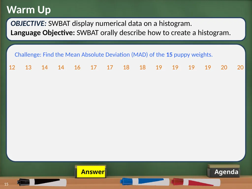
Language Objective: SWBAT orally describe how to create a histogram. Agenda 15 Challenge: Find the Mean Absolute Deviation (MAD) of the 15 puppy weights. 12 13 14 14 16 17 17 18 18 19 19 19 19 20 20 Answer<br>
Language Objective: SWBAT orally describe how to create a histogram. Agenda 15 Challenge: Find the Mean Absolute Deviation (MAD) of the 15 puppy weights. 12 13 14 14 16 17 17 18 18 19 19 19 19 20 20 Answer<br>
16
Warm Up OBJECTIVE: SWBAT display numerical data on a histogram.
Language Objective: SWBAT orally describe how to create a histogram. Agenda 16 Challenge: Find the Mean Absolute Deviation (MAD) of the 15 puppy weights. 12 13 14 14 16 17 17 18 18 19 19 19 19 20 20 Mean = 17 ounces 5 + 4 + 3 + 3 + 1 + 0 + 0 + 1 + 1 + 2 + 2 + 2 + 2 + 3 + 3 = 32 32 ÷ 15 = 2.13 MAD = 2.13 ounces 12 13 14 14 16 17 17 18 18 19 19 19 19 20 20 17 17 17 17 17 17 17 17 17 17 17 17 17 17 17<br>
Language Objective: SWBAT orally describe how to create a histogram. Agenda 16 Challenge: Find the Mean Absolute Deviation (MAD) of the 15 puppy weights. 12 13 14 14 16 17 17 18 18 19 19 19 19 20 20 Mean = 17 ounces 5 + 4 + 3 + 3 + 1 + 0 + 0 + 1 + 1 + 2 + 2 + 2 + 2 + 3 + 3 = 32 32 ÷ 15 = 2.13 MAD = 2.13 ounces 12 13 14 14 16 17 17 18 18 19 19 19 19 20 20 17 17 17 17 17 17 17 17 17 17 17 17 17 17 17<br>
17
17 Agenda OBJECTIVE: SWBAT display numerical data on a histogram.
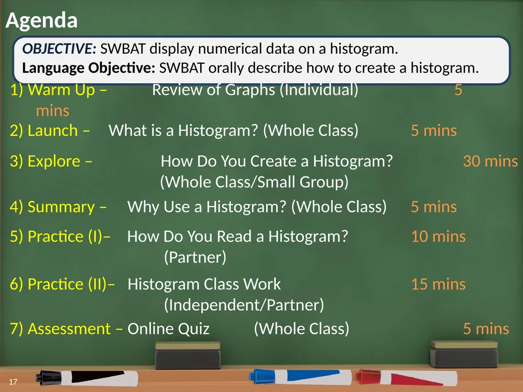
Language Objective: SWBAT orally describe how to create a histogram. 1) Warm Up – Review of Graphs (Individual) 5 mins 2) Launch – What is a Histogram? (Whole Class) 5 mins 3) Explore – How Do You Create a Histogram? 30 mins
(Whole Class/Small Group) 5) Practice (I)– How Do You Read a Histogram? 10 mins
(Partner) 4) Summary – Why Use a Histogram? (Whole Class) 5 mins 7) Assessment – Online Quiz (Whole Class) 5 mins 6) Practice (II)– Histogram Class Work 15 mins
(Independent/Partner)<br>
Language Objective: SWBAT orally describe how to create a histogram. 1) Warm Up – Review of Graphs (Individual) 5 mins 2) Launch – What is a Histogram? (Whole Class) 5 mins 3) Explore – How Do You Create a Histogram? 30 mins
(Whole Class/Small Group) 5) Practice (I)– How Do You Read a Histogram? 10 mins
(Partner) 4) Summary – Why Use a Histogram? (Whole Class) 5 mins 7) Assessment – Online Quiz (Whole Class) 5 mins 6) Practice (II)– Histogram Class Work 15 mins
(Independent/Partner)<br>
18
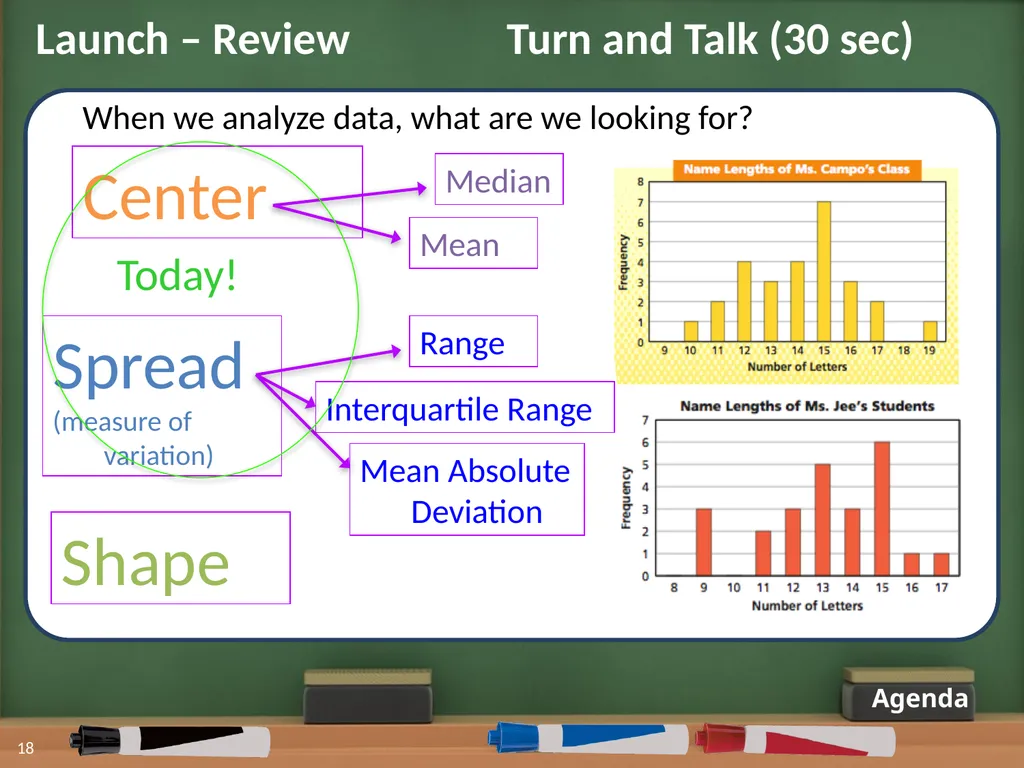
Agenda 18 When we analyze data, what are we looking for? Center Spread
(measure of variation) Shape Launch – Review Turn and Talk (30 sec) Today!<br>
(measure of variation) Shape Launch – Review Turn and Talk (30 sec) Today!<br>
19
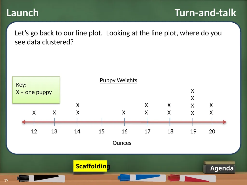
Launch Turn-and-talk Agenda 19 Puppy Weights Key:
X – one puppy 12 13 14 15 16 17 18 19 20 X X X
X X X
X X
X
X
X X
X Ounces X
X Let’s go back to our line plot. Looking at the line plot, where do you see data clustered? Scaffolding<br>
X – one puppy 12 13 14 15 16 17 18 19 20 X X X
X X X
X X
X
X
X X
X Ounces X
X Let’s go back to our line plot. Looking at the line plot, where do you see data clustered? Scaffolding<br>
20
Launch Turn-and-talk Agenda 20 Puppy Weights Key:
X – one puppy 12 13 14 15 16 17 18 19 20 X X X
X X X
X X
X
X
X X
X Ounces X
X Let’s go back to our line plot. Looking at the line plot, where do you see data clustered? Clustered: located very close to one another, like in a group<br>
X – one puppy 12 13 14 15 16 17 18 19 20 X X X
X X X
X X
X
X
X X
X Ounces X
X Let’s go back to our line plot. Looking at the line plot, where do you see data clustered? Clustered: located very close to one another, like in a group<br>
21
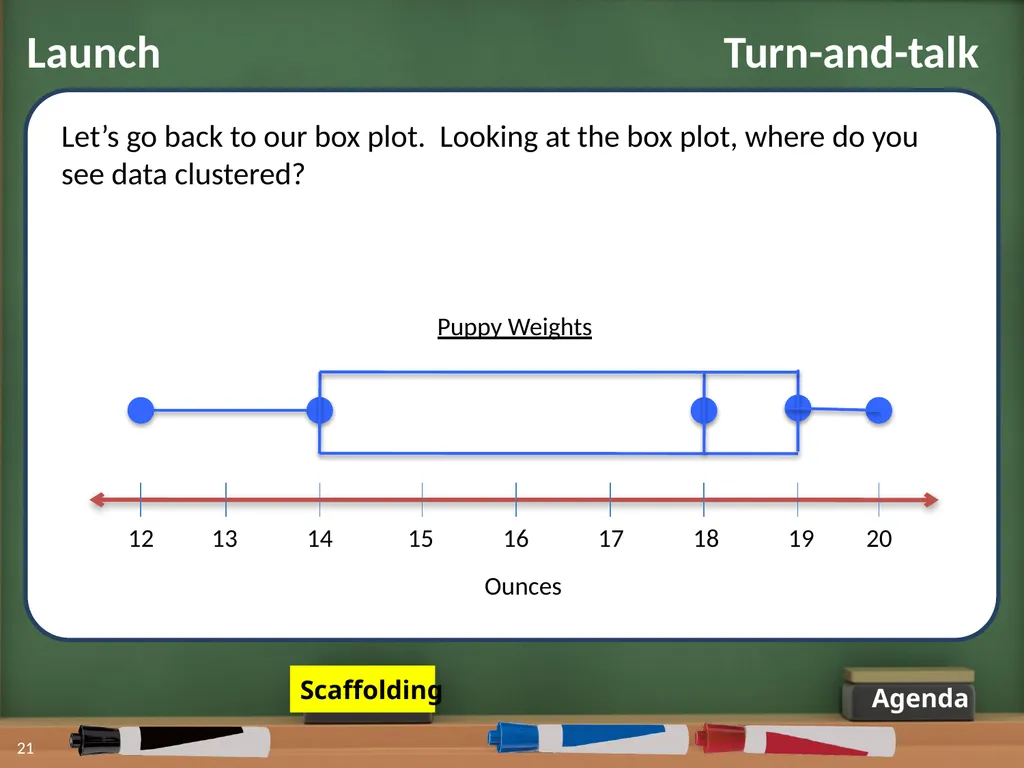
Agenda 21 Puppy Weights 12 13 14 15 16 17 18 19 20 Ounces Let’s go back to our box plot. Looking at the box plot, where do you see data clustered? Scaffolding Launch Turn-and-talk<br>
22
Agenda 22 Puppy Weights 12 13 14 15 16 17 18 19 20 Ounces Let’s go back to our box plot. Looking at the box plot, where do you see data clustered? Clustered: located very close to one another, like in a group Launch Turn-and-talk<br>
23
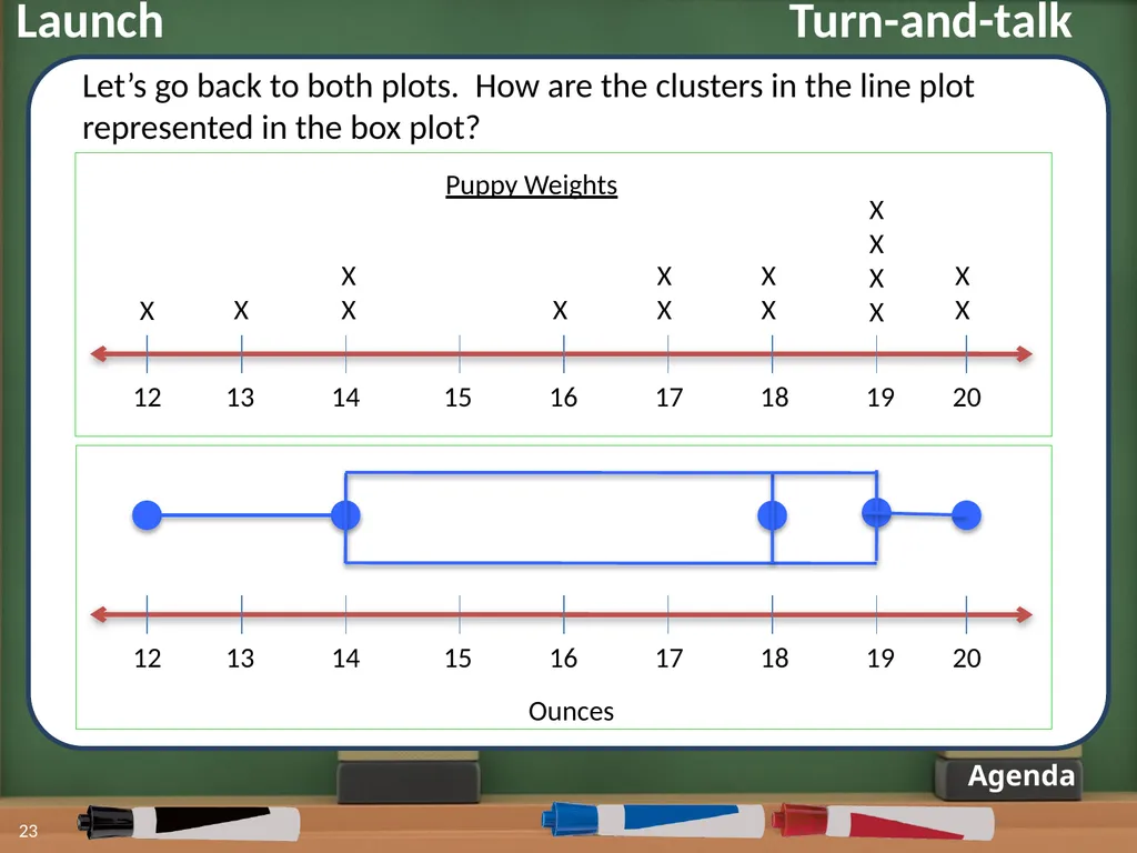
Agenda 23 12 13 14 15 16 17 18 19 20 Ounces Puppy Weights 12 13 14 15 16 17 18 19 20 X X X
X X X
X X
X
X
X X
X X
X Let’s go back to both plots. How are the clusters in the line plot represented in the box plot? Launch Turn-and-talk<br>
X X X
X X
X
X
X X
X X
X Let’s go back to both plots. How are the clusters in the line plot represented in the box plot? Launch Turn-and-talk<br>
24
Launch Agenda 24 Today in class we will be looking at another type of graph that displays data. This graph makes it easy to see where data is clustered.
Do you know the name of this graph?<br>
Do you know the name of this graph?<br>
25
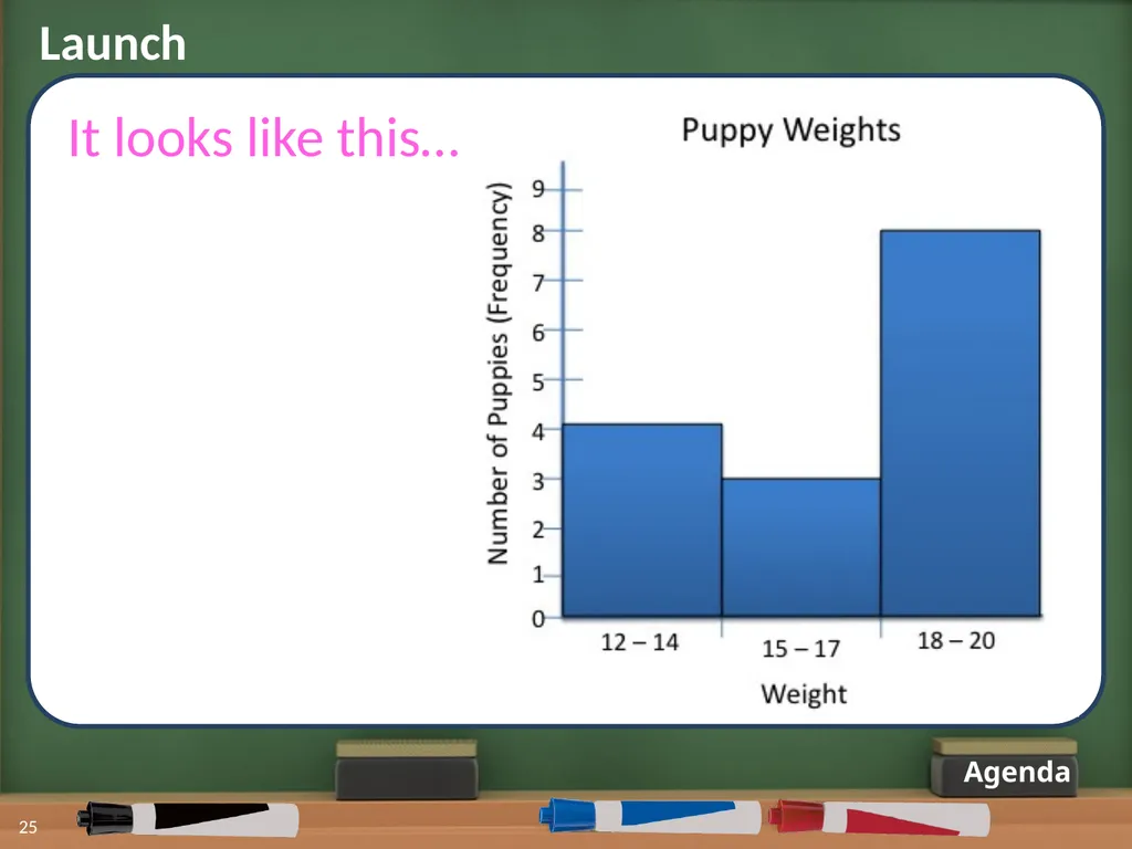
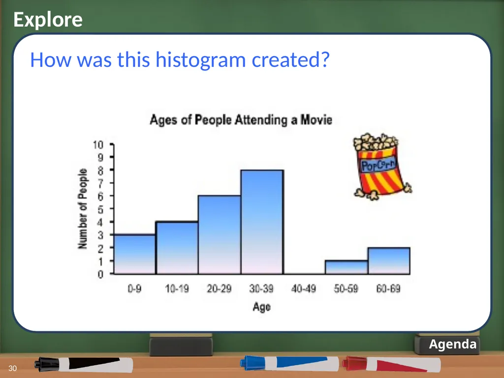
Launch Agenda 25 It looks like this…<br>
26
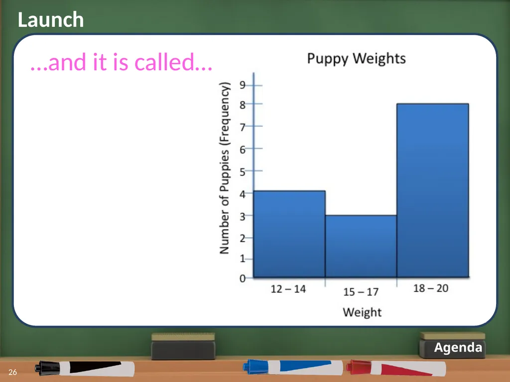
Launch Agenda 26 …and it is called…<br>
27
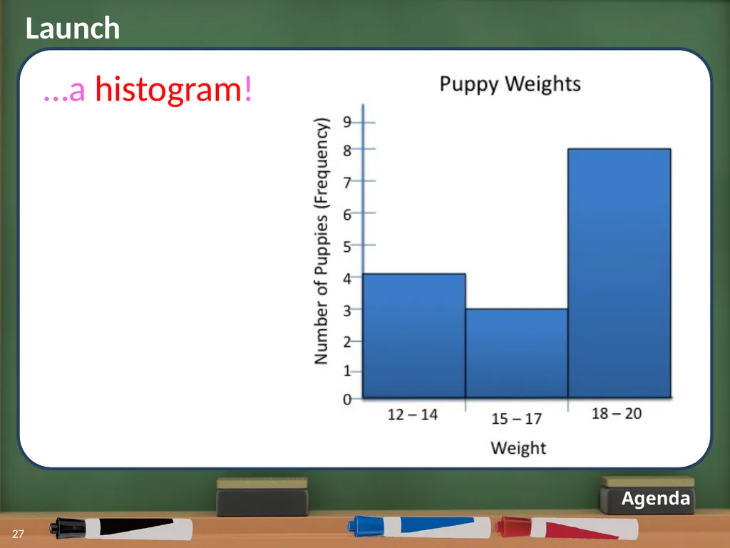
Launch Agenda 27 …a histogram!<br>
28
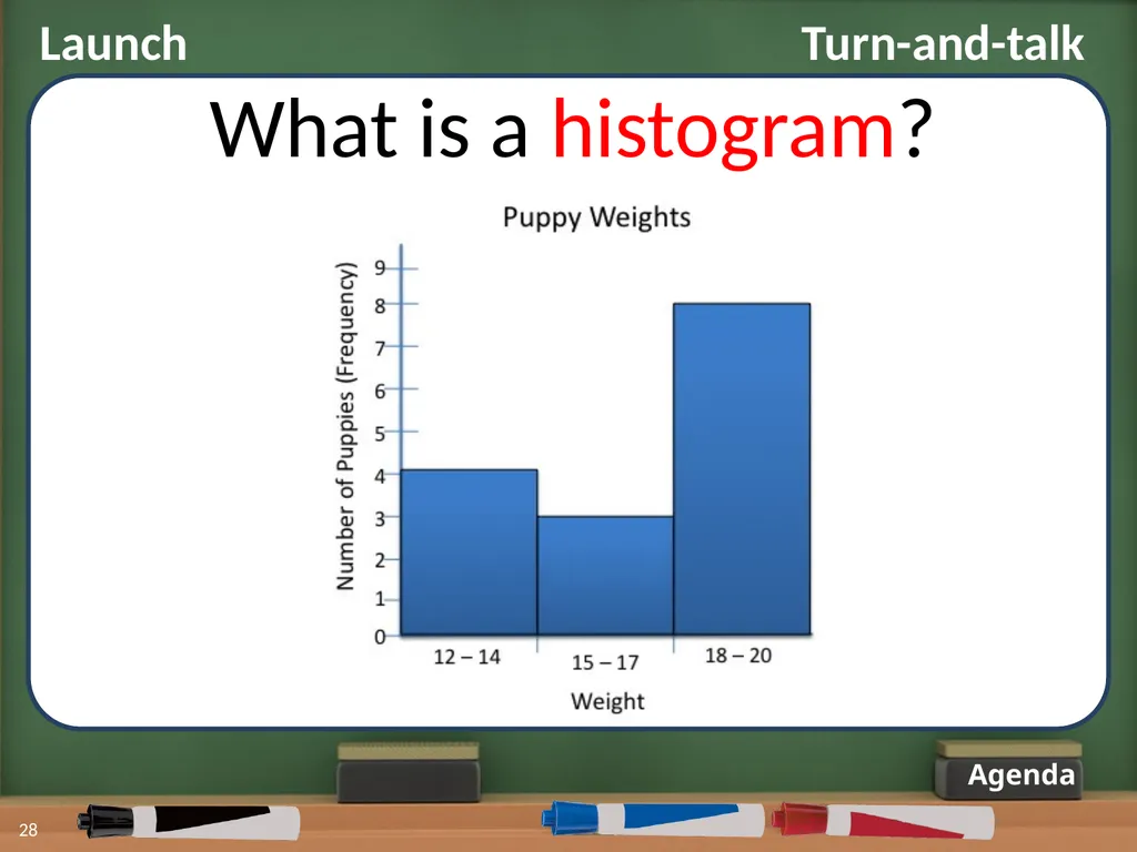
Launch Turn-and-talk Agenda 28 What is a histogram?<br>
29
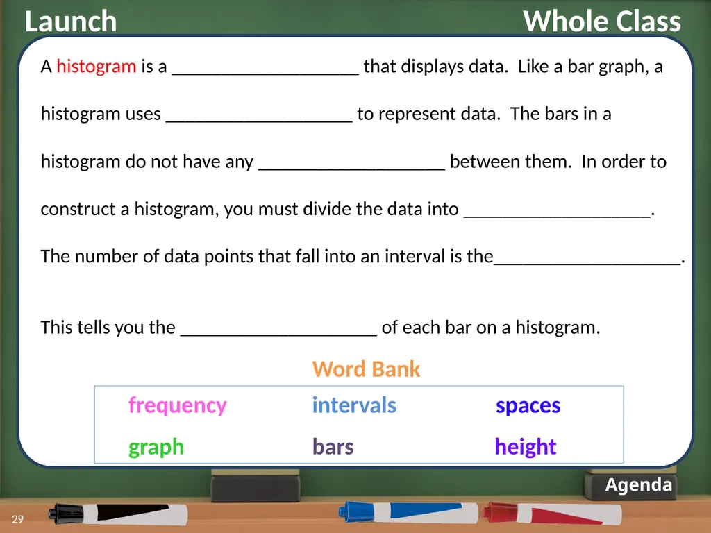
Launch Whole Class Agenda 29 A histogram is a ___________________ that displays data. Like a bar graph, a
histogram uses ___________________ to represent data. The bars in a
histogram do not have any ___________________ between them. In order to
construct a histogram, you must divide the data into ___________________.
The number of data points that fall into an interval is the___________________.
This tells you the ____________________ of each bar on a histogram. Word Bank graph intervals bars spaces height frequency<br>
histogram uses ___________________ to represent data. The bars in a
histogram do not have any ___________________ between them. In order to
construct a histogram, you must divide the data into ___________________.
The number of data points that fall into an interval is the___________________.
This tells you the ____________________ of each bar on a histogram. Word Bank graph intervals bars spaces height frequency<br>
30
Explore 30 Agenda How was this histogram created?<br>
31
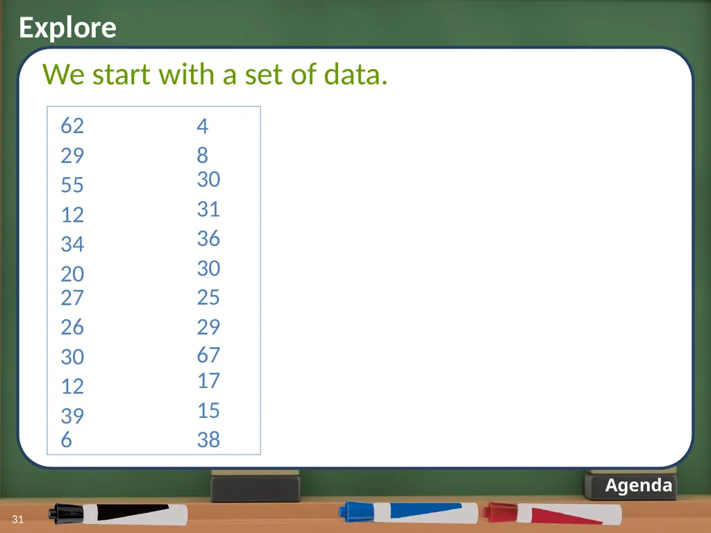
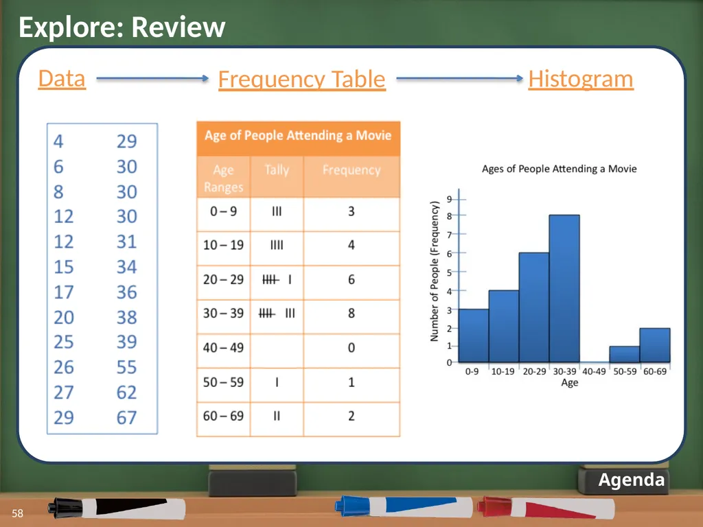
Explore 31 Agenda We start with a set of data. 62 29 55 12 34 20 27 26 30 12 39 6 4 8 30 31 36 30 25 29 67 17 15 38<br>
32
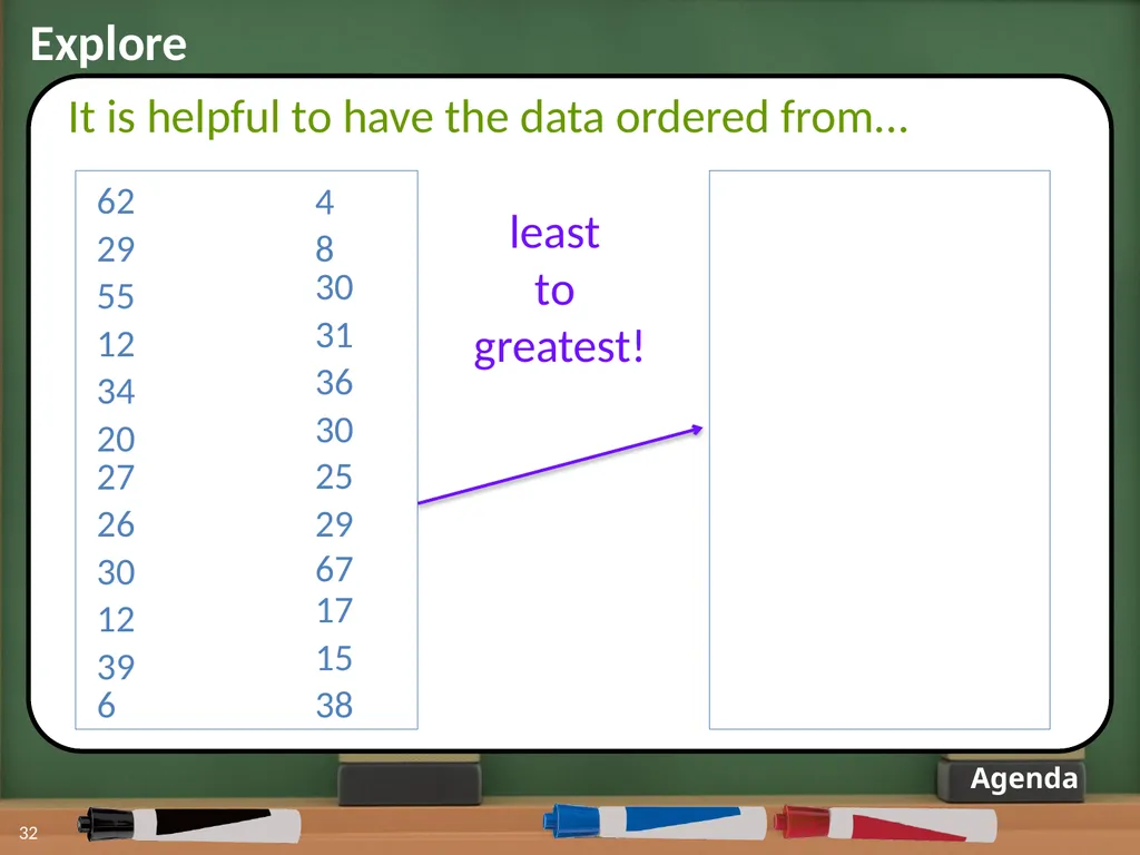
Explore 32 Agenda It is helpful to have the data ordered from... least
to
greatest! 62 29 55 12 34 20 27 26 30 12 39 6 4 8 30 31 36 30 25 29 67 17 15 38<br>
to
greatest! 62 29 55 12 34 20 27 26 30 12 39 6 4 8 30 31 36 30 25 29 67 17 15 38<br>
33
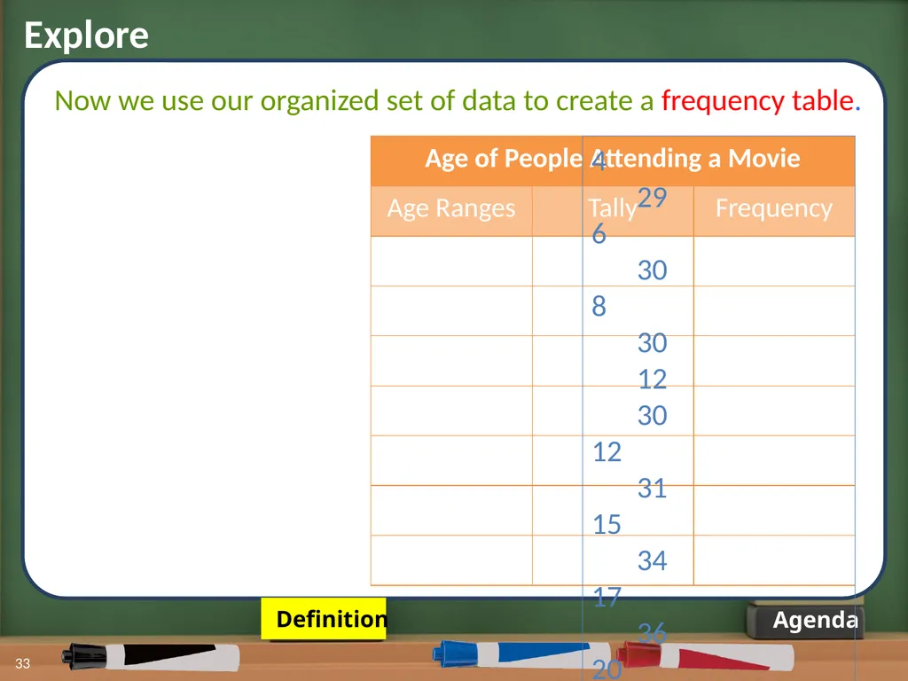
Explore 33 Agenda Now we use our organized set of data to create a frequency table. Definition 29
30
8 30
12 30
31
34
36
20 38
39
55
62
29 67<br>
30
8 30
12 30
31
34
36
20 38
39
55
62
29 67<br>
34
Explore 34 Agenda Now we use our organized set of data to create a frequency table. 29
30
8 30
12 30
31
34
36
20 38
39
55
62
29 67 Frequency Table:
A table that is used to group data values into intervals<br>
30
8 30
12 30
31
34
36
20 38
39
55
62
29 67 Frequency Table:
A table that is used to group data values into intervals<br>
35
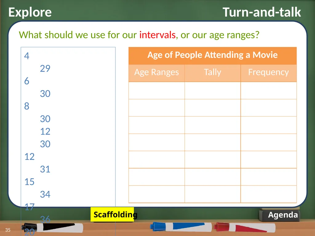
Explore Turn-and-talk 35 Agenda What should we use for our intervals, or our age ranges? 29
30
8 30
12 30
31
34
36
20 38
39
55
62
29 67 Scaffolding<br>
30
8 30
12 30
31
34
36
20 38
39
55
62
29 67 Scaffolding<br>
36
Explore Turn-and-talk 36 Agenda What should we use for our intervals, or our age ranges? 29
30
8 30
12 30
31
34
36
20 38
39
55
62
29 67 Important things to remember!
Each interval needs to be equal (count by 3’s, 5’s, etc.)
Your intervals cannot overlap or exclude any values.<br>
30
8 30
12 30
31
34
36
20 38
39
55
62
29 67 Important things to remember!
Each interval needs to be equal (count by 3’s, 5’s, etc.)
Your intervals cannot overlap or exclude any values.<br>
37
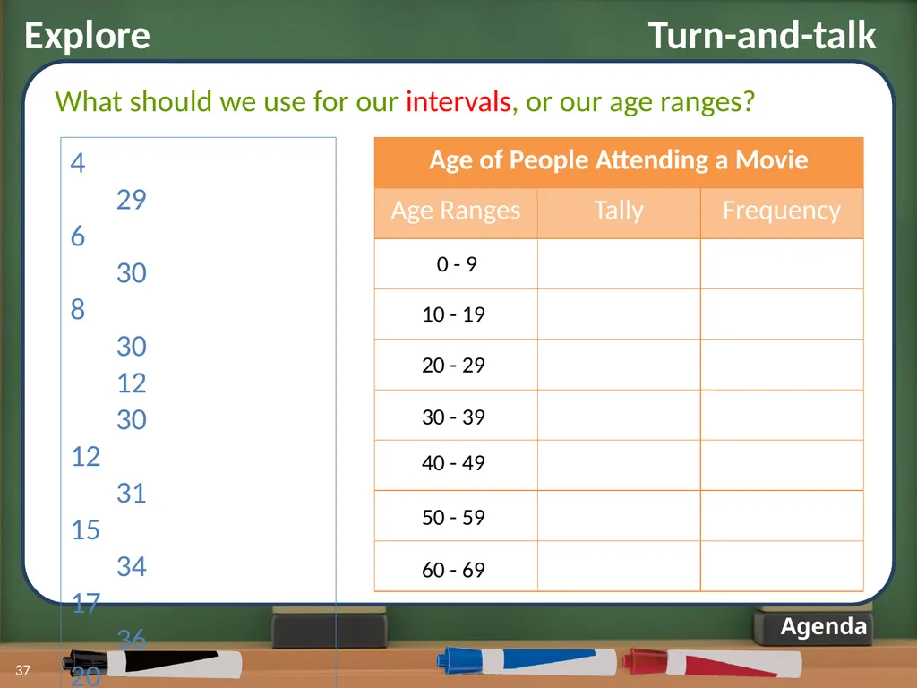
Explore Turn-and-talk 37 Agenda What should we use for our intervals, or our age ranges? 29
30
8 30
12 30
31
34
36
20 38
39
55
62
29 67 0 - 9 10 - 19 20 - 29 30 - 39 40 - 49 50 - 59 60 - 69<br>
30
8 30
12 30
31
34
36
20 38
39
55
62
29 67 0 - 9 10 - 19 20 - 29 30 - 39 40 - 49 50 - 59 60 - 69<br>
38
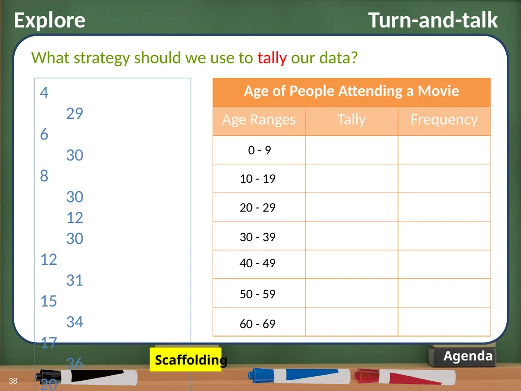
38 Agenda What strategy should we use to tally our data? 29
30
8 30
12 30
31
34
36
20 38
39
55
62
29 67 Explore Turn-and-talk Scaffolding<br>
30
8 30
12 30
31
34
36
20 38
39
55
62
29 67 Explore Turn-and-talk Scaffolding<br>
39
39 Agenda What strategy should we use to tally our data? 29
30
8 30
12 30
31
34
36
20 38
39
55
62
29 67 Explore Turn-and-talk A tally mark, I, represents one data value. The mark IIII represents five data values.<br>
30
8 30
12 30
31
34
36
20 38
39
55
62
29 67 Explore Turn-and-talk A tally mark, I, represents one data value. The mark IIII represents five data values.<br>
40
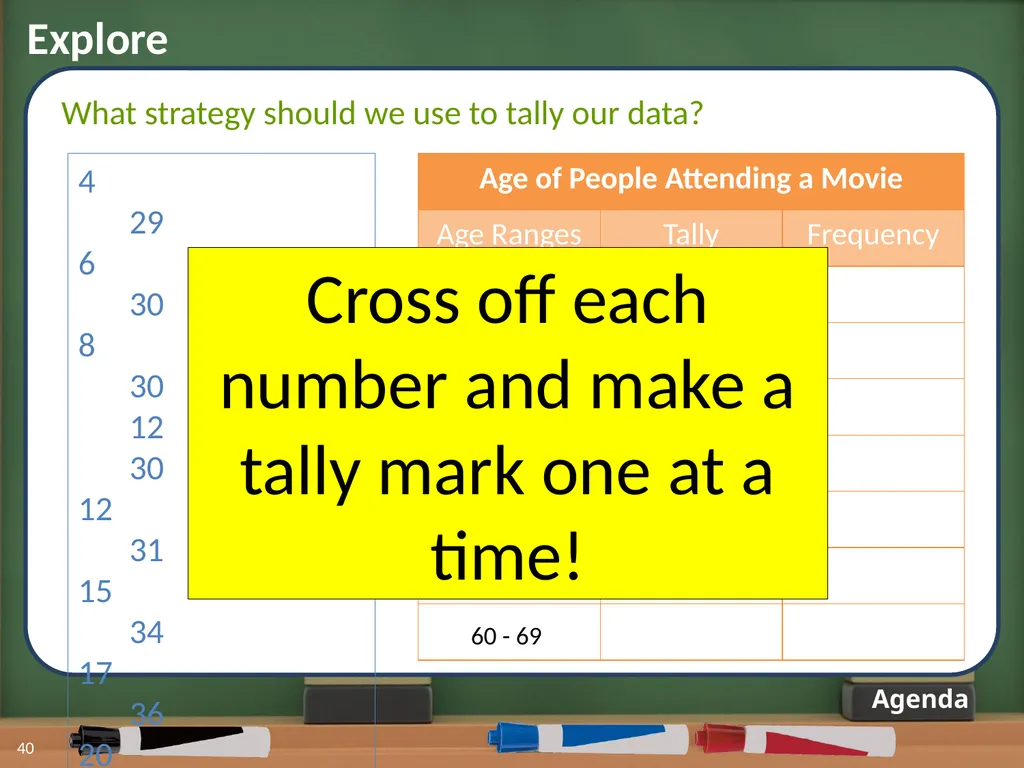
Explore 40 Agenda What strategy should we use to tally our data? 29
30
8 30
12 30
31
34
36
20 38
39
55
62
29 67 Cross off each number and make a tally mark one at a time!<br>
30
8 30
12 30
31
34
36
20 38
39
55
62
29 67 Cross off each number and make a tally mark one at a time!<br>
41
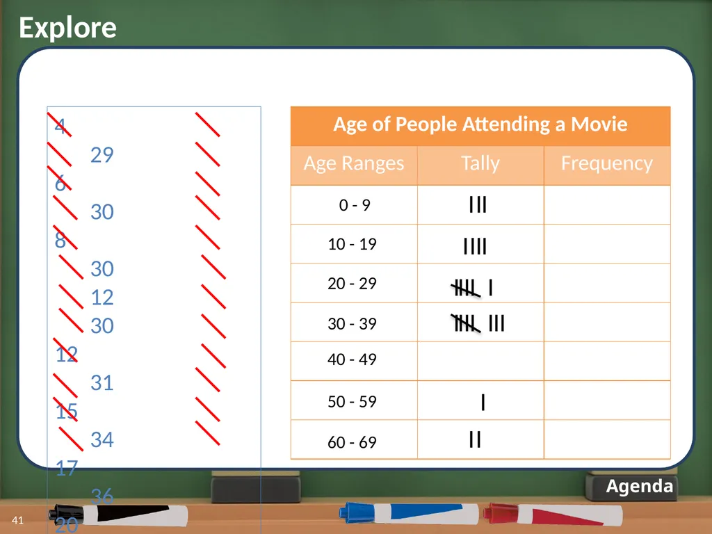
Explore 41 Agenda 29
30
8 30
12 30
31
34
36
20 38
39
55
62
29 67 I I I I I I I I I I I I I I I I I I I I I I<br>
30
8 30
12 30
31
34
36
20 38
39
55
62
29 67 I I I I I I I I I I I I I I I I I I I I I I<br>
42
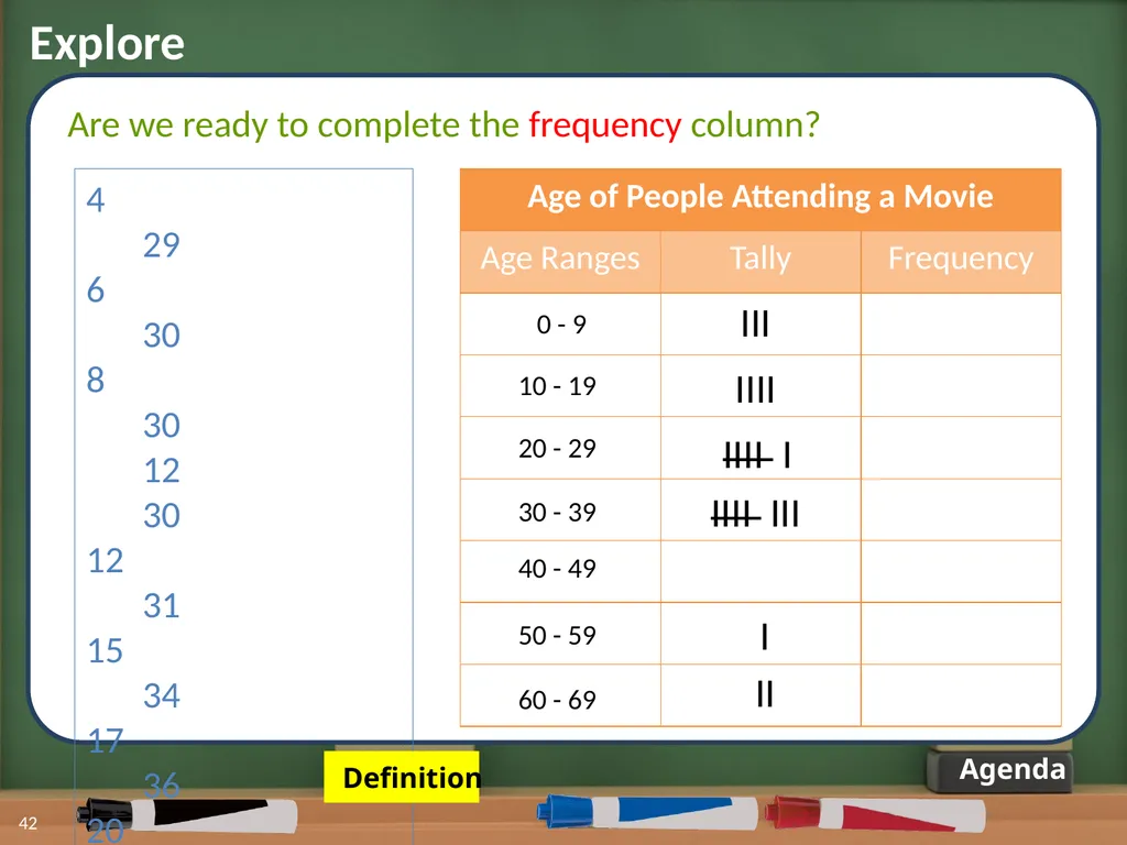
Explore 42 Agenda Are we ready to complete the frequency column? 29
30
8 30
12 30
31
34
36
20 38
39
55
62
29 67 Definition<br>
30
8 30
12 30
31
34
36
20 38
39
55
62
29 67 Definition<br>
43
Explore 43 Agenda Are we ready to complete the frequency column? 29
30
8 30
12 30
31
34
36
20 38
39
55
62
29 67 Frequency:
The number of values that lie in an interval<br>
30
8 30
12 30
31
34
36
20 38
39
55
62
29 67 Frequency:
The number of values that lie in an interval<br>
44
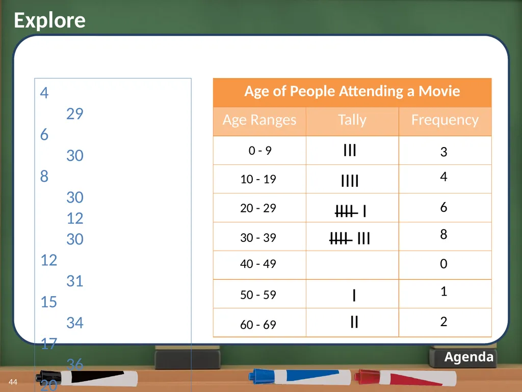
Explore 44 Agenda 29
30
8 30
12 30
31
34
36
20 38
39
55
62
29 67 3 4 6 8 0 1 2<br>
30
8 30
12 30
31
34
36
20 38
39
55
62
29 67 3 4 6 8 0 1 2<br>
45
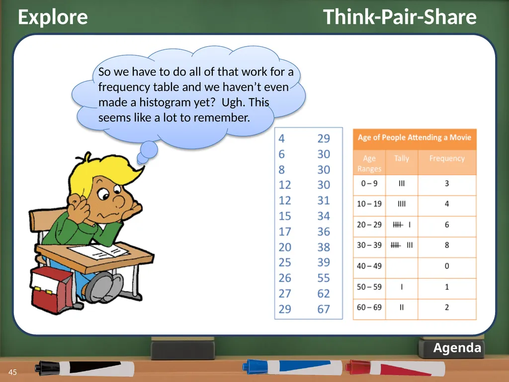
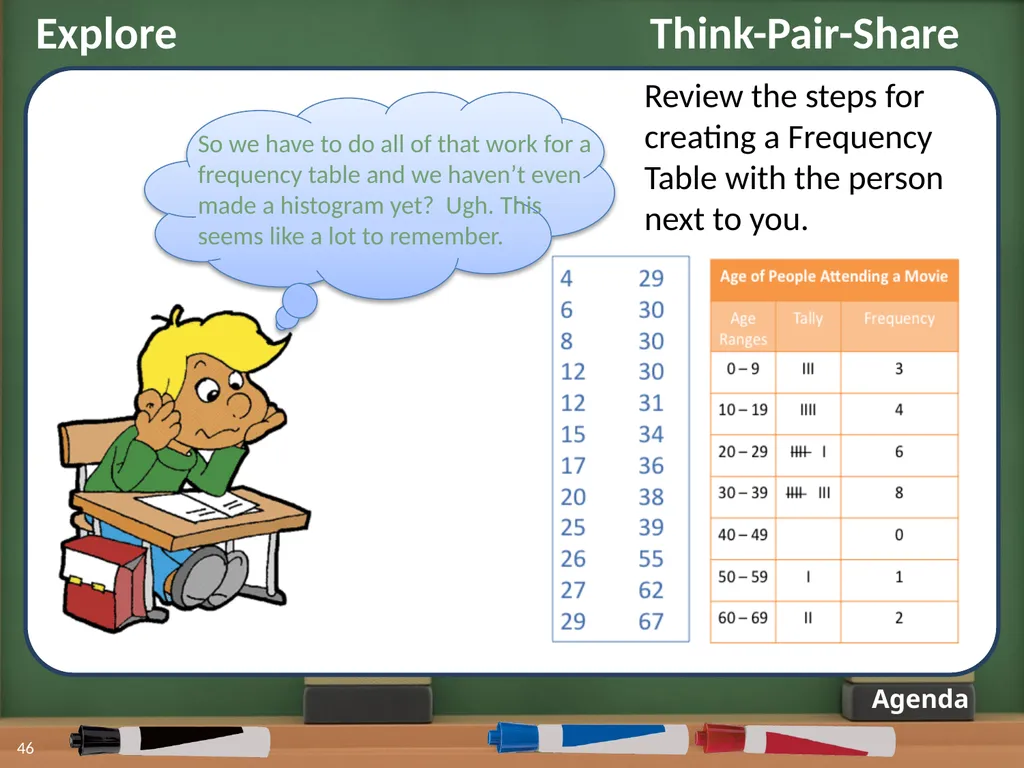
45 Agenda So we have to do all of that work for a frequency table and we haven’t even made a histogram yet? Ugh. This seems like a lot to remember. Explore Think-Pair-Share<br>
46
Agenda Review the steps for creating a Frequency Table with the person next to you. So we have to do all of that work for a frequency table and we haven’t even made a histogram yet? Ugh. This seems like a lot to remember. Explore Think-Pair-Share 46<br>
47
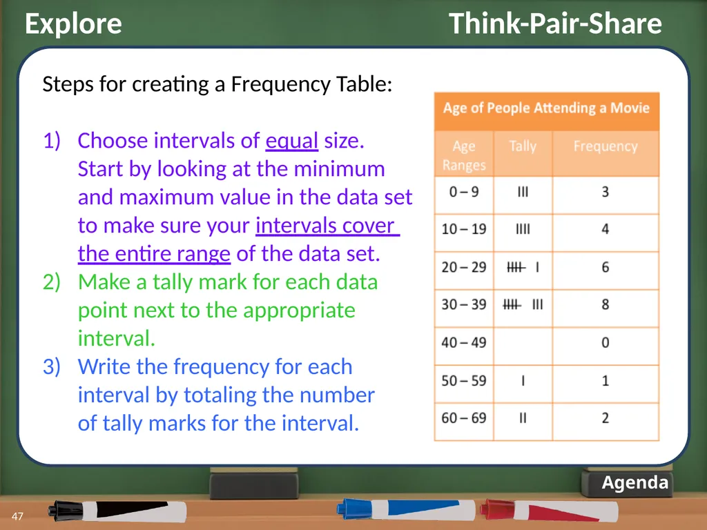
Explore Think-Pair-Share 47 Agenda Steps for creating a Frequency Table:
Choose intervals of equal size.
Start by looking at the minimum
and maximum value in the data set
to make sure your intervals cover
the entire range of the data set.
Make a tally mark for each data
point next to the appropriate
interval.
Write the frequency for each
interval by totaling the number
of tally marks for the interval.<br>
Choose intervals of equal size.
Start by looking at the minimum
and maximum value in the data set
to make sure your intervals cover
the entire range of the data set.
Make a tally mark for each data
point next to the appropriate
interval.
Write the frequency for each
interval by totaling the number
of tally marks for the interval.<br>
48
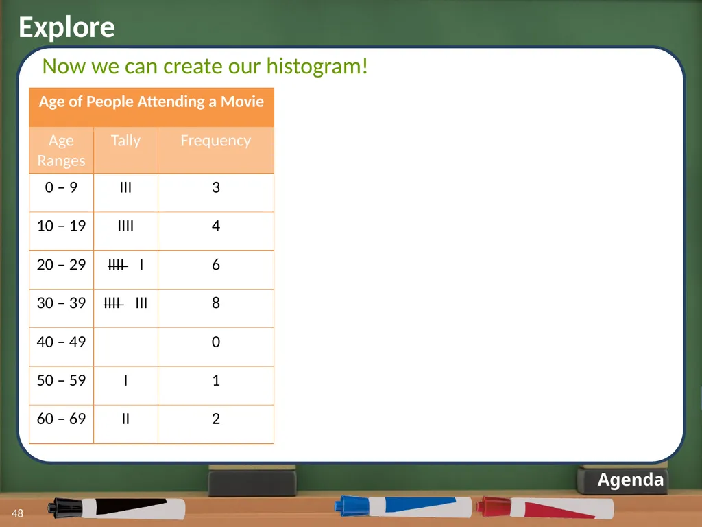
Explore 48 Agenda Now we can create our histogram!<br>
49
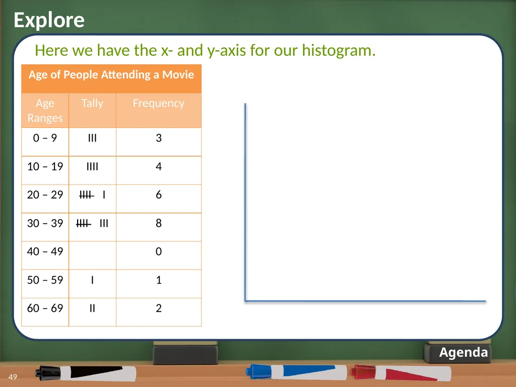
Explore Agenda Here we have the x- and y-axis for our histogram. 49<br>
50
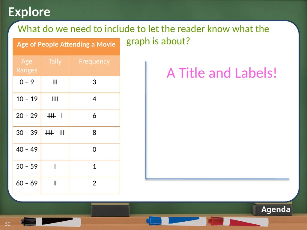
Explore Agenda A Title and Labels! What do we need to include to let the reader know what the
graph is about? 50<br>
graph is about? 50<br>
51
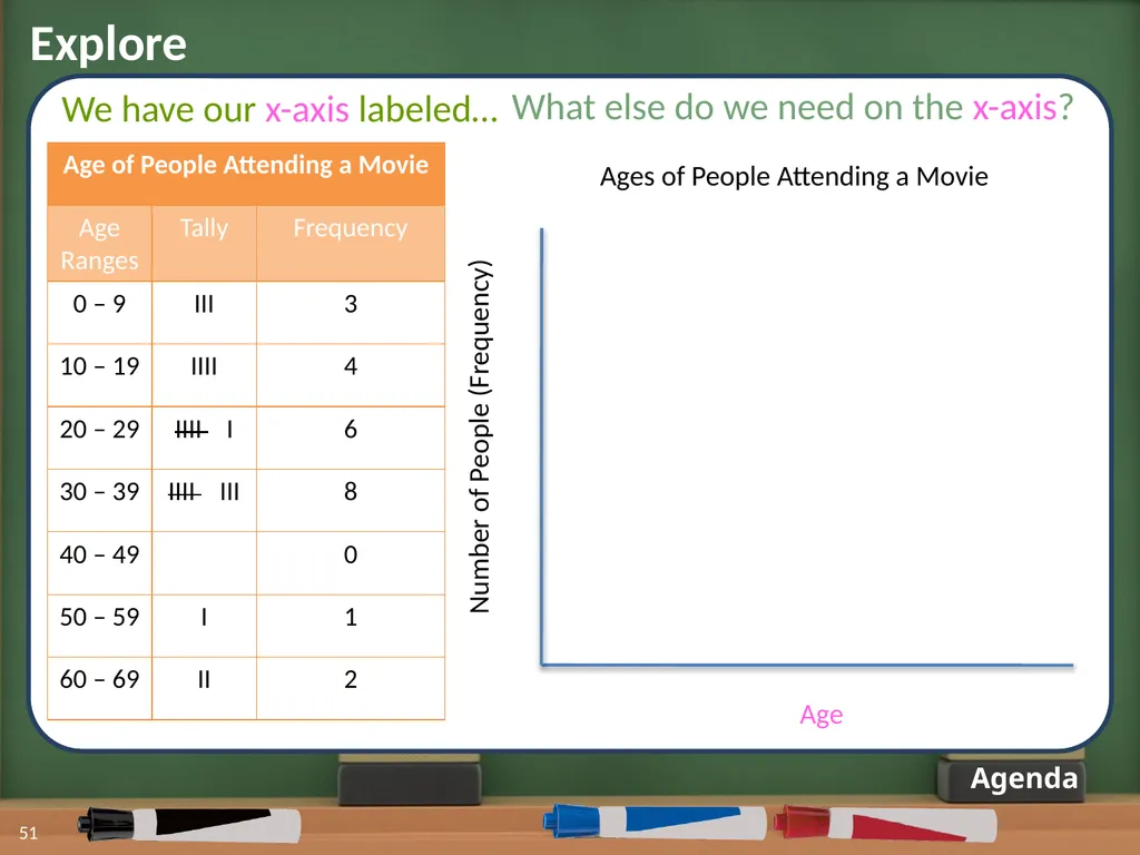
Explore 51 Agenda We have our x-axis labeled… Ages of People Attending a Movie Age Number of People (Frequency) What else do we need on the x-axis?<br>
52
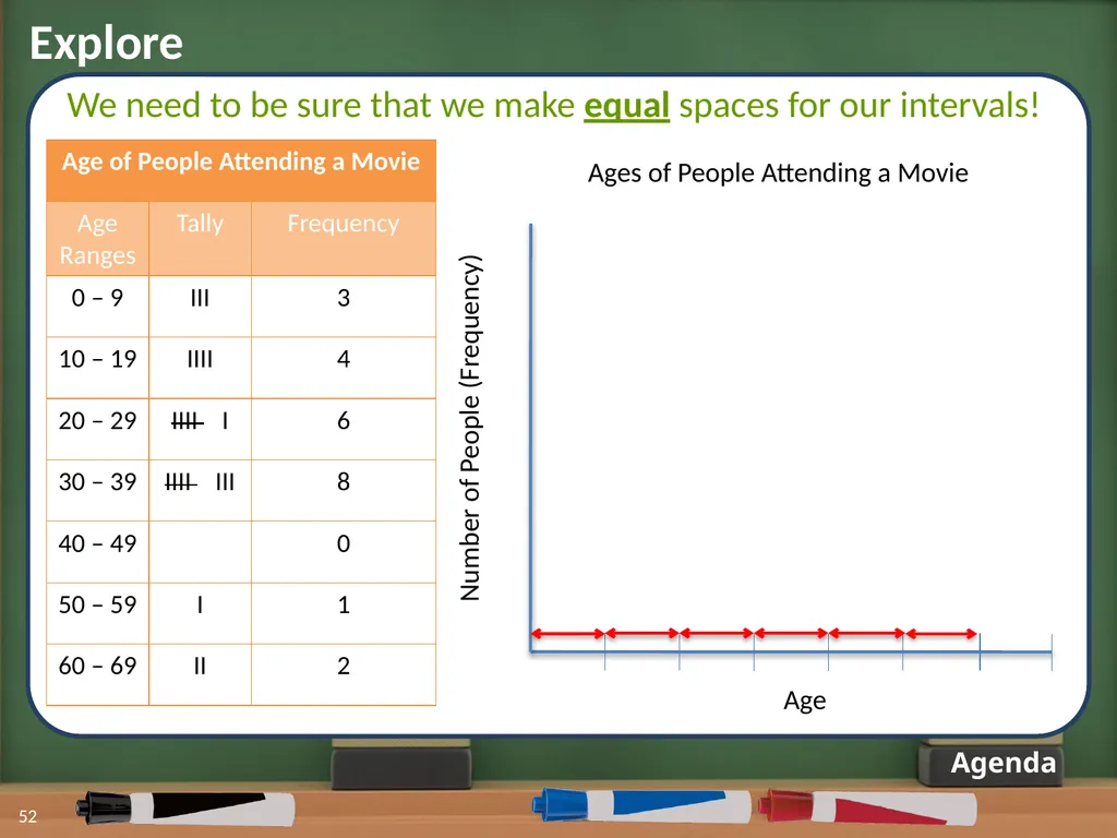
Explore 52 Agenda We need to be sure that we make equal spaces for our intervals! Ages of People Attending a Movie Age Number of People (Frequency)<br>
53
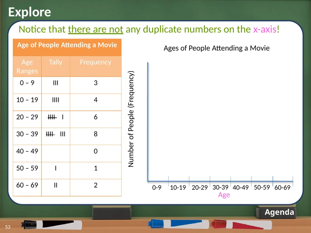
Explore 53 Agenda Notice that there are not any duplicate numbers on the x-axis! Ages of People Attending a Movie Age Number of People (Frequency) 0-9 10-19 20-29 30-39 40-49 50-59 60-69<br>
54
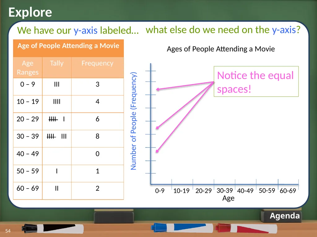
Explore 54 Agenda Ages of People Attending a Movie Age Number of People (Frequency) 0-9 10-19 20-29 30-39 40-49 50-59 60-69 We have our y-axis labeled… Notice the equal spaces! what else do we need on the y-axis?<br>
55
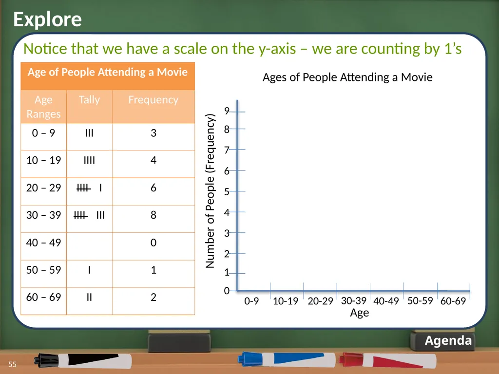
Explore 55 Agenda Notice that we have a scale on the y-axis – we are counting by 1’s Ages of People Attending a Movie Age Number of People (Frequency) 0-9 10-19 20-29 30-39 40-49 50-59 60-69 0 1 2 3 4 5 6 7 8 9<br>
56
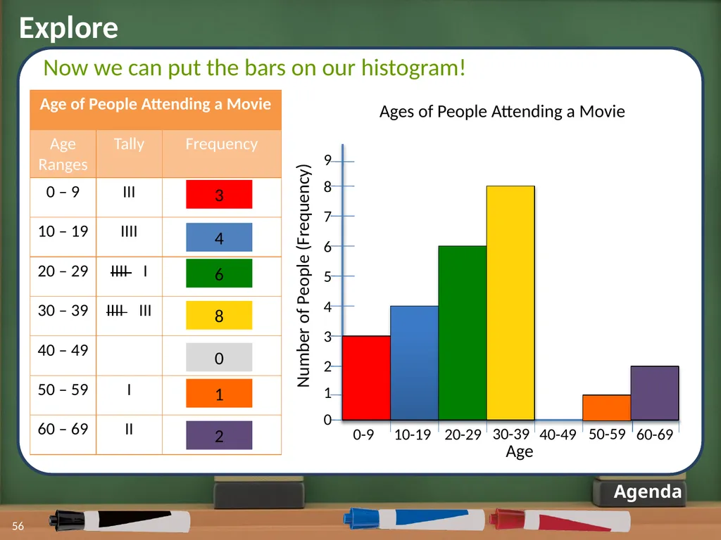
Explore 56 Agenda Now we can put the bars on our histogram! Ages of People Attending a Movie Age Number of People (Frequency) 0-9 10-19 20-29 30-39 40-49 50-59 60-69 0 1 2 3 4 5 6 7 8 9 3 4 6 8 0 1 2<br>
57
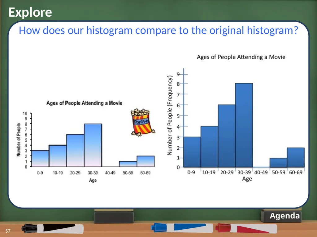
Explore 57 Agenda How does our histogram compare to the original histogram?<br>
58
Explore: Review 58 Agenda Data<br>
59
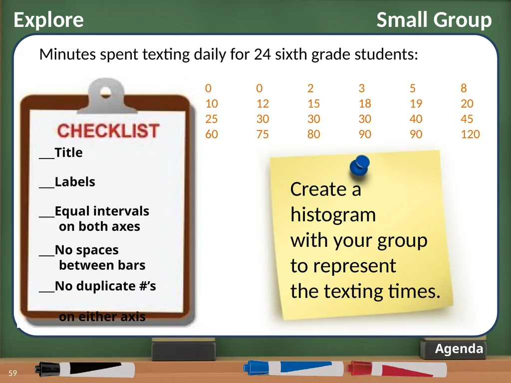
Explore Small Group 59 Agenda Minutes spent texting daily for 24 sixth grade students: ___Title ___Labels ___Equal intervals
on both axes ___No spaces
between bars ___No duplicate #’s
on either axis Create a
histogram
with your group
to represent
the texting times. 0 0 2 3 5 8
10 12 15 18 19 20
25 30 30 30 40 45
60 75 80 90 90 120<br>
on both axes ___No spaces
between bars ___No duplicate #’s
on either axis Create a
histogram
with your group
to represent
the texting times. 0 0 2 3 5 8
10 12 15 18 19 20
25 30 30 30 40 45
60 75 80 90 90 120<br>
60
Summary 60 How does your histogram compare? Quietly walk around the room to view the histograms made by other groups.
Questions to think about:
-What is great about the mathematics you see?
-What suggestions do you have for the other groups?
You have 3 minutes! Agenda<br>
Questions to think about:
-What is great about the mathematics you see?
-What suggestions do you have for the other groups?
You have 3 minutes! Agenda<br>
61
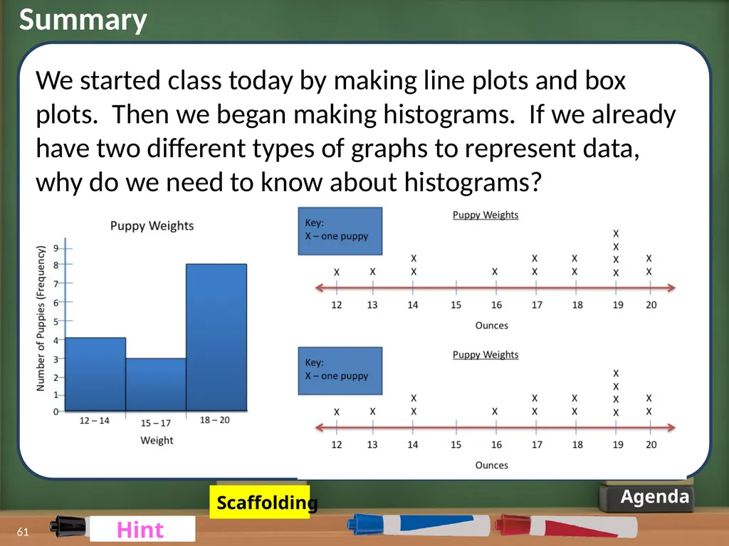
Summary 61 Agenda We started class today by making line plots and box plots. Then we began making histograms. If we already have two different types of graphs to represent data, why do we need to know about histograms? Scaffolding Hint Hint<br>
62
Agenda Hint Summary We started class today by making line plots and box plots. Then we began making histograms. If we already have two different types of graphs to represent data, why do we need to know about histograms? Guiding Question:
Can you think of some situations where a histogram might be more appropriate to use than a line plot or box plot? 62<br>
Can you think of some situations where a histogram might be more appropriate to use than a line plot or box plot? 62<br>
63
Agenda Summary We started class today by making line plots and box plots. Then we began making histograms. If we already have two different types of graphs to represent data, why do we need to know about histograms? Hint: What would a line plot look like if your data ranged from 1 to 683? 63 Scaffolding<br>
64
Practice: Part I 64 Agenda Create
histograms
☐Interpret
histograms Now that we know how to create histograms, we need to make sure we know how to interpret them!<br>
histograms
☐Interpret
histograms Now that we know how to create histograms, we need to make sure we know how to interpret them!<br>
65
Practice: White Board Math 65 Agenda On each of the following slides you will see a question
about the related histogram. Your job – after the question has been read aloud:
Read the question a second time to yourself (silently)
Write your answer down on your white board
Confer with a peer
Wait quietly as everyone finishes
When you hear two claps, silently raise your white board in the air<br>
about the related histogram. Your job – after the question has been read aloud:
Read the question a second time to yourself (silently)
Write your answer down on your white board
Confer with a peer
Wait quietly as everyone finishes
When you hear two claps, silently raise your white board in the air<br>
66
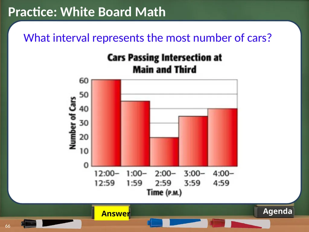
66 Agenda What interval represents the most number of cars? Practice: White Board Math Answer<br>
67
67 Agenda What interval represents the most number of cars? Practice: White Board Math Answer:
12:00 – 12:59<br>
12:00 – 12:59<br>
68
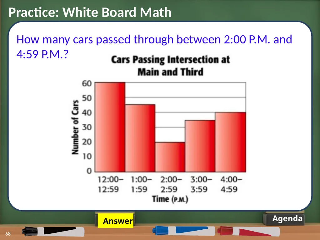
68 Agenda How many cars passed through between 2:00 P.M. and 4:59 P.M.? Practice: White Board Math Answer<br>
69
Agenda How many cars passed through between 2:00 P.M. and 4:59 P.M.? Practice: White Board Math 20 35 40 Answer:
95 cars 69<br>
95 cars 69<br>
70
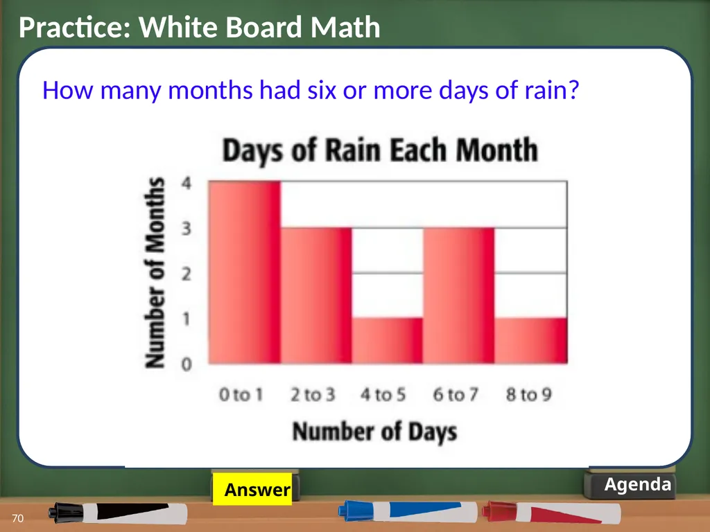
70 Agenda How many months had six or more days of rain? Practice: White Board Math Answer<br>
71
71 Agenda How many months had six or more days of rain? Practice: White Board Math Answer:
4 months 3 1<br>
4 months 3 1<br>
72
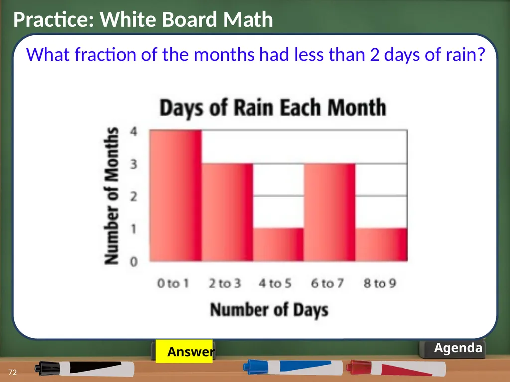
72 Agenda Practice: White Board Math Answer What fraction of the months had less than 2 days of rain?<br>
73
Agenda Practice: White Board Math Answer:
or of the months What fraction of the months had less than 2 days of rain? 4 + 3 + 1 + 3 + 1 = 12 73<br>
or of the months What fraction of the months had less than 2 days of rain? 4 + 3 + 1 + 3 + 1 = 12 73<br>
74
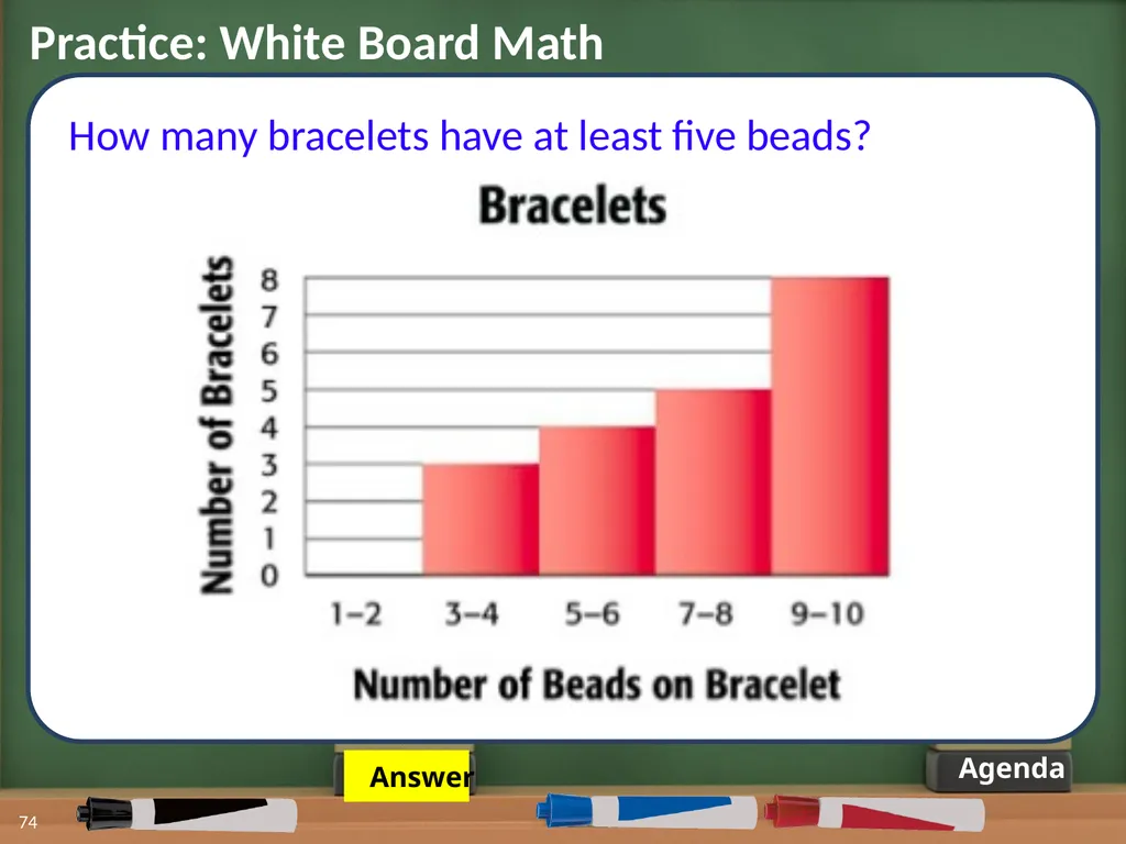
74 Agenda How many bracelets have at least five beads? Practice: White Board Math Answer<br>
75
75 Agenda How many bracelets have at least five beads? Practice: White Board Math Answer:
17 bracelets 4 5 8<br>
17 bracelets 4 5 8<br>
76
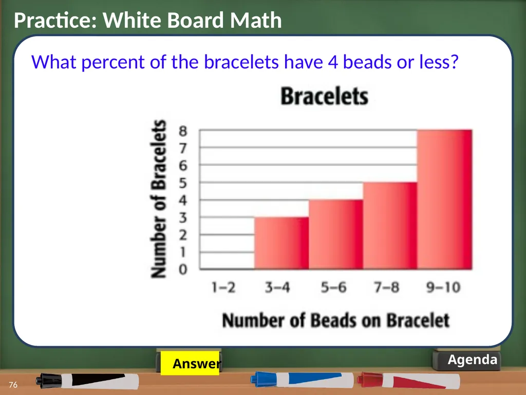
76 Agenda What percent of the bracelets have 4 beads or less? Practice: White Board Math Answer<br>
77
77 Agenda What percent of the bracelets have 4 beads or less? Practice: White Board Math Answer:
15% of the bracelets 3 + 4 + 5 + 8 = 20<br>
15% of the bracelets 3 + 4 + 5 + 8 = 20<br>
78
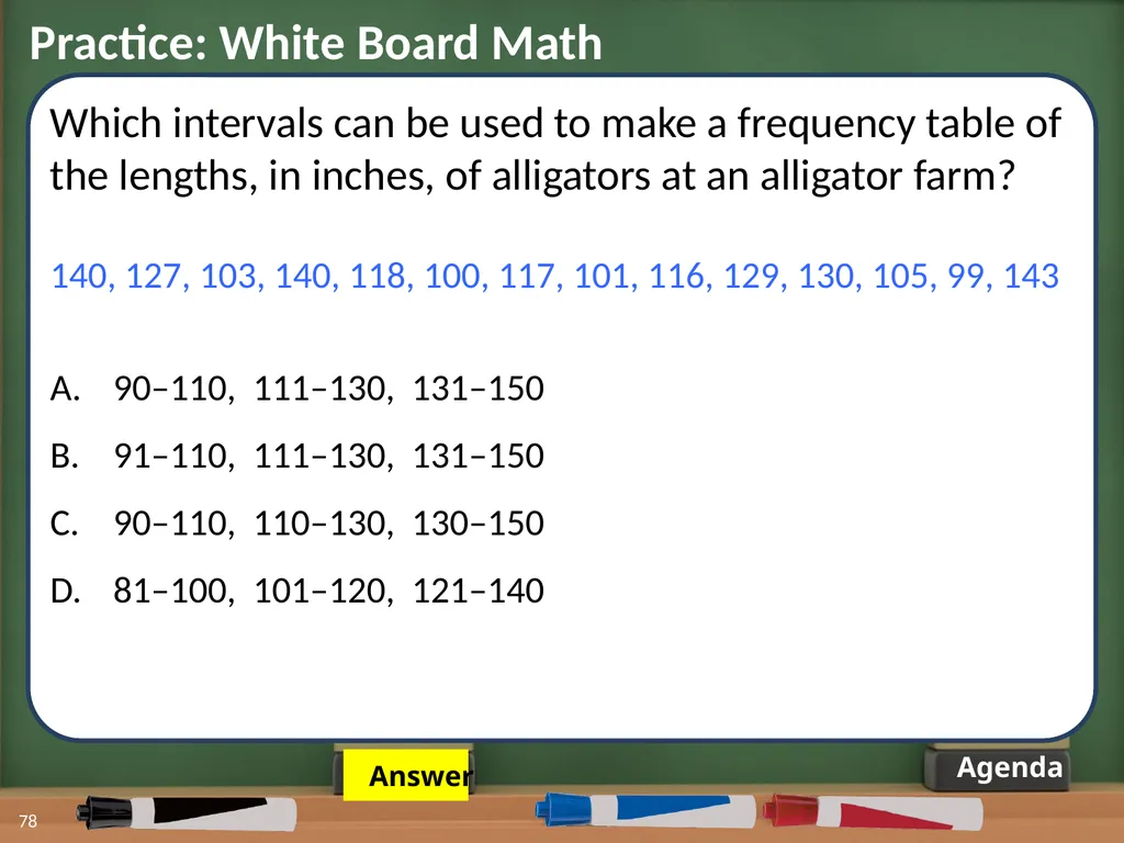
78 Agenda Which intervals can be used to make a frequency table of the lengths, in inches, of alligators at an alligator farm?
140, 127, 103, 140, 118, 100, 117, 101, 116, 129, 130, 105, 99, 143
90–110, 111–130, 131–150
91–110, 111–130, 131–150
90–110, 110–130, 130–150
81–100, 101–120, 121–140 Practice: White Board Math Answer<br>
140, 127, 103, 140, 118, 100, 117, 101, 116, 129, 130, 105, 99, 143
90–110, 111–130, 131–150
91–110, 111–130, 131–150
90–110, 110–130, 130–150
81–100, 101–120, 121–140 Practice: White Board Math Answer<br>
79
79 Agenda Which intervals can be used to make a frequency table of the lengths, in inches, of alligators at an alligator farm?
140, 127, 103, 140, 118, 100, 117, 101, 116, 129, 130, 105, 99, 143
90–110, 111–130, 131–150
91–110, 111–130, 131–150
90–110, 110–130, 130–150
81–100, 101–120, 121–140 Practice: White Board Math<br>
140, 127, 103, 140, 118, 100, 117, 101, 116, 129, 130, 105, 99, 143
90–110, 111–130, 131–150
91–110, 111–130, 131–150
90–110, 110–130, 130–150
81–100, 101–120, 121–140 Practice: White Board Math<br>
80
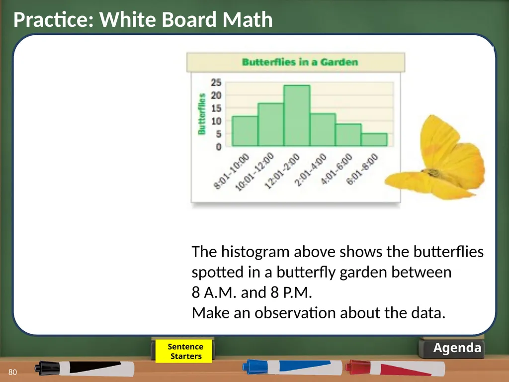
80 Agenda The histogram above shows the butterflies spotted in a butterfly garden between
8 A.M. and 8 P.M.
Make an observation about the data. Practice: White Board Math Sentence
Starters<br>
8 A.M. and 8 P.M.
Make an observation about the data. Practice: White Board Math Sentence
Starters<br>
81
81 Agenda The histogram above shows the butterflies spotted in a butterfly garden between
8 A.M. and 8 P.M.
Make an observation about the data. Practice: White Board Math Possible Sentence Starters:
The most butterflies…
There were ____ butterflies...
The fewest number of butterflies…<br>
8 A.M. and 8 P.M.
Make an observation about the data. Practice: White Board Math Possible Sentence Starters:
The most butterflies…
There were ____ butterflies...
The fewest number of butterflies…<br>
82
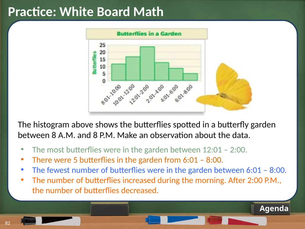
82 Agenda The histogram above shows the butterflies spotted in a butterfly garden between 8 A.M. and 8 P.M. Make an observation about the data. Practice: White Board Math The most butterflies were in the garden between 12:01 – 2:00.
There were 5 butterflies in the garden from 6:01 – 8:00.
The fewest number of butterflies were in the garden between 6:01 – 8:00.
The number of butterflies increased during the morning. After 2:00 P.M., the number of butterflies decreased.<br>
There were 5 butterflies in the garden from 6:01 – 8:00.
The fewest number of butterflies were in the garden between 6:01 – 8:00.
The number of butterflies increased during the morning. After 2:00 P.M., the number of butterflies decreased.<br>
83
Practice – Part II 83 Part 2 - (10 Min)
Work independently and check in with a partner to complete your class work. 1-Worksheet 2-Share Out In 10 minutes you will be asked to stop and share your answers! Click on the timer! Agenda<br>
Work independently and check in with a partner to complete your class work. 1-Worksheet 2-Share Out In 10 minutes you will be asked to stop and share your answers! Click on the timer! Agenda<br>
84
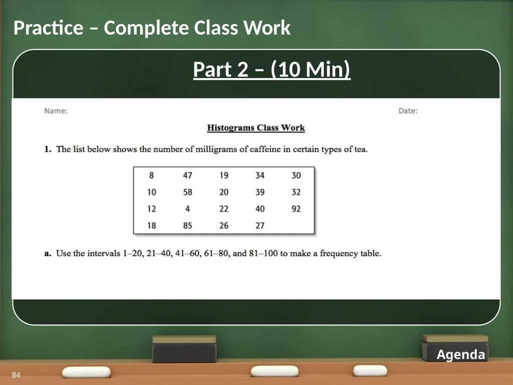
Practice – Complete Class Work 84 Part 2 – (10 Min) Agenda<br>
85
Practice – Student Share Out 85 Part 3 – (5 Min)
Students share out work. Classwork Questions Agenda<br>
Students share out work. Classwork Questions Agenda<br>
86
Practice – Sharing Question #1a 86 Use intervals 1–20, 21–40, 41–60, 61–80, and 81–100 to make
a frequency table. Answer<br>
a frequency table. Answer<br>
87
Practice – Sharing Question #1a 87 Use intervals 1–20, 21–40, 41–60, 61–80, and 81–100 to make
a frequency table.<br>
a frequency table.<br>
88
Practice – Sharing Question #1b 88 Use the frequency table you created to construct a histogram. Answer<br>
89
Practice – Sharing Question #1b 89 Use the frequency table you created to construct a histogram.<br>
90
Practice – Sharing Question #1c 90 Make two observations about the data based on the histogram you constructed. Answer<br>
91
Practice – Sharing Question #1c 91 Make two observations about the data based on the histogram you constructed. Most tea has between 21-40 mg of caffeine.
Seven types of tea have between 1-20 mg of caffeine.
More than half of the tea has 40 mg or less of caffeine.
About 20% of the tea has more than 40 mg of caffeine.
There are not any teas that have 61 – 80 mg of caffeine.<br>
Seven types of tea have between 1-20 mg of caffeine.
More than half of the tea has 40 mg or less of caffeine.
About 20% of the tea has more than 40 mg of caffeine.
There are not any teas that have 61 – 80 mg of caffeine.<br>
92
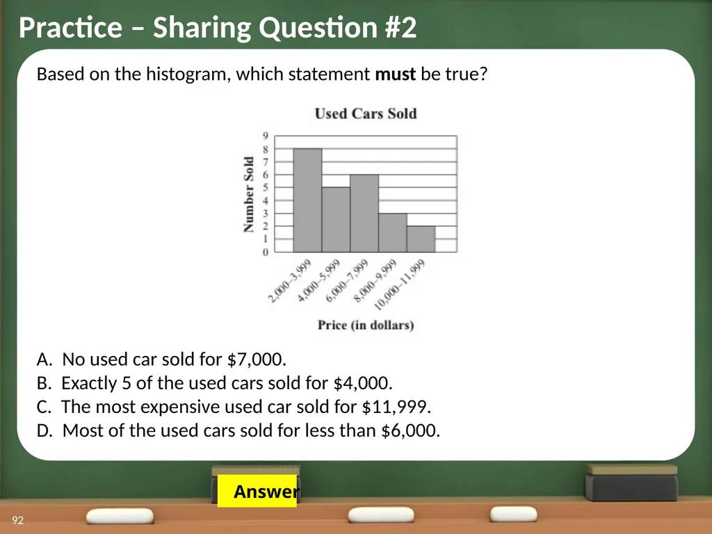
Practice – Sharing Question #2 92 Based on the histogram, which statement must be true?
A. No used car sold for $7,000.
B. Exactly 5 of the used cars sold for $4,000.
C. The most expensive used car sold for $11,999.
D. Most of the used cars sold for less than $6,000. Answer<br>
A. No used car sold for $7,000.
B. Exactly 5 of the used cars sold for $4,000.
C. The most expensive used car sold for $11,999.
D. Most of the used cars sold for less than $6,000. Answer<br>
93
Practice – Sharing Question #2 93 Based on the histogram, which statement must be true?
A. No used car sold for $7,000.
B. Exactly 5 of the used cars sold for $4,000.
C. The most expensive used car sold for $11,999.
D. Most of the used cars sold for less than $6,000.<br>
A. No used car sold for $7,000.
B. Exactly 5 of the used cars sold for $4,000.
C. The most expensive used car sold for $11,999.
D. Most of the used cars sold for less than $6,000.<br>
94
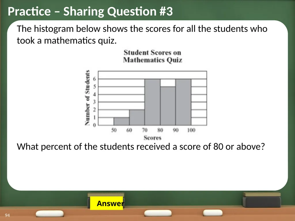
Practice – Sharing Question #3 94 The histogram below shows the scores for all the students who took a mathematics quiz.
What percent of the students received a score of 80 or above? Answer<br>
What percent of the students received a score of 80 or above? Answer<br>
95
Practice – Sharing Question #3 95 The histogram below shows the scores for all the students who took a mathematics quiz.
What percent of the students received a score of 80 or above? 5 6 5 + 6 = 11<br>
What percent of the students received a score of 80 or above? 5 6 5 + 6 = 11<br>
96
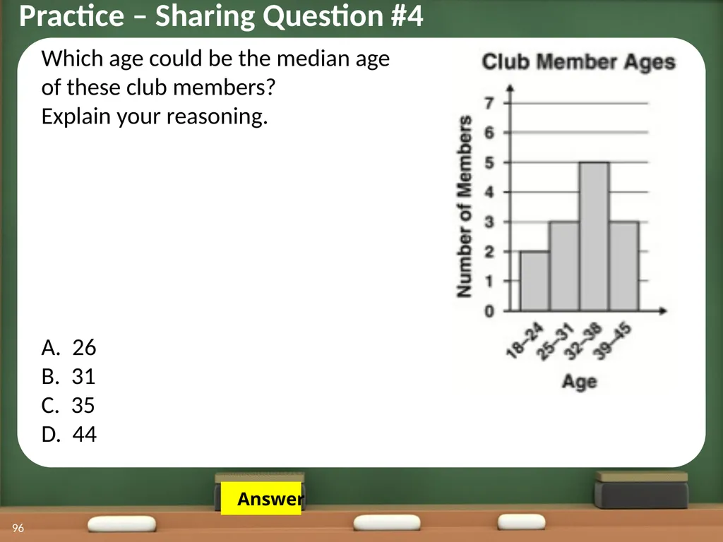
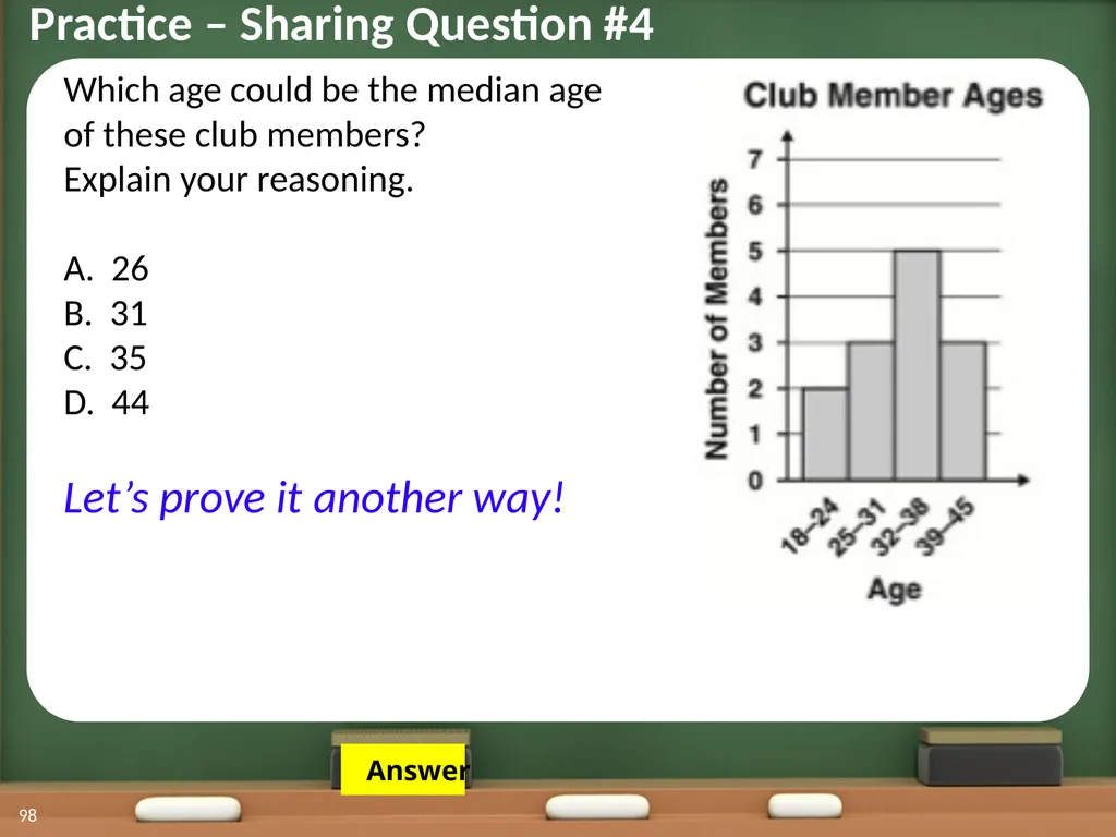
Practice – Sharing Question #4 96 Which age could be the median age
of these club members?
Explain your reasoning.
A. 26 B. 31 C. 35 D. 44 Answer<br>
of these club members?
Explain your reasoning.
A. 26 B. 31 C. 35 D. 44 Answer<br>
97
Practice – Sharing Question #4 97 Which age could be the median age
of these club members?
Explain your reasoning.
A. 26 B. 31 C. 35 D. 44 The median is the middle value in an
ordered set of data.
There are a total of 13 data points (2 + 3 + 5 + 3)
in this set of data.
That means the 7th data point would be the median, which falls in the 32 – 38 age interval.<br>
of these club members?
Explain your reasoning.
A. 26 B. 31 C. 35 D. 44 The median is the middle value in an
ordered set of data.
There are a total of 13 data points (2 + 3 + 5 + 3)
in this set of data.
That means the 7th data point would be the median, which falls in the 32 – 38 age interval.<br>
98
Practice – Sharing Question #4 98 Which age could be the median age
of these club members?
Explain your reasoning.
A. 26 B. 31 C. 35 D. 44
Let’s prove it another way! Answer<br>
of these club members?
Explain your reasoning.
A. 26 B. 31 C. 35 D. 44
Let’s prove it another way! Answer<br>
99
Practice – Sharing Question #4 99 Which age could be the median age
of these club members?
Explain your reasoning.
A. 26 B. 31 C. 35 D. 44
Let’s prove it another way! 18 22 40 41 44 26 26 31 32 35 36 37 38<br>
of these club members?
Explain your reasoning.
A. 26 B. 31 C. 35 D. 44
Let’s prove it another way! 18 22 40 41 44 26 26 31 32 35 36 37 38<br>
100
Assessment: Online Quiz 100 Agenda How well do you understand histograms?
Your class needs to
pass the QUIZ
to leave!!<br>
Your class needs to
pass the QUIZ
to leave!!<br>
101
101 Standards for This Unit Back to Overview Next Slide The lesson that you are currently looking at is part of a unit that teaches the following Common Core Standards:
*6.SP.1 Recognize a statistical question as one that anticipates variability in the data related to the question and accounts for it in the answers. For example, “How old am I?” is not a statistical question, but “How old are the students in my school?” is a statistical question because one anticipates variability in students’ ages.
*6.SP.2 Understand that a set of data collected to answer a statistical question has a distribution which can be described by its center, spread, and overall shape.
*6.SP.3 Recognize that a measure of center for a numerical data set summarizes all of its values with a single number, while a measure of variation describes how its values vary with a single number.<br>
*6.SP.1 Recognize a statistical question as one that anticipates variability in the data related to the question and accounts for it in the answers. For example, “How old am I?” is not a statistical question, but “How old are the students in my school?” is a statistical question because one anticipates variability in students’ ages.
*6.SP.2 Understand that a set of data collected to answer a statistical question has a distribution which can be described by its center, spread, and overall shape.
*6.SP.3 Recognize that a measure of center for a numerical data set summarizes all of its values with a single number, while a measure of variation describes how its values vary with a single number.<br>
102
102 *6.SP.4 Display numerical data in plots on a number line, including dot plots, histograms, and box plots.
MA.4.a. Read and interpret circle graphs.
*6.SP.5 Summarize numerical data sets in relation to their context, such as by:
a. Reporting the number of observations.
b. Describing the nature of the attribute under investigation, including how it was measured and its units of measurement.
c. Giving quantitative measures of center (median and/or mean) and variability (interquartile range and/or mean absolute deviation), as well as describing any overall pattern and any striking deviations from the overall pattern with reference to the context in which the data were gathered. d. Relating the choice of measures of center and variability to the shape of the data distribution and the context in which the data were gathered. Standards for This Unit Back to Overview Next Slide<br>
MA.4.a. Read and interpret circle graphs.
*6.SP.5 Summarize numerical data sets in relation to their context, such as by:
a. Reporting the number of observations.
b. Describing the nature of the attribute under investigation, including how it was measured and its units of measurement.
c. Giving quantitative measures of center (median and/or mean) and variability (interquartile range and/or mean absolute deviation), as well as describing any overall pattern and any striking deviations from the overall pattern with reference to the context in which the data were gathered. d. Relating the choice of measures of center and variability to the shape of the data distribution and the context in which the data were gathered. Standards for This Unit Back to Overview Next Slide<br>