
Human Factors / User Interface Design Guidelines
Description: Human Factors User Interface Design Guidelines Slides adapted from Craig Zilles How hard was week 10 Naïve Bayes code review assignment? Easy Moderate Challenging Unreasonable How long did week 10 Naïve Bayes assignment take? Less than 3
Related Topics
Download Presentation
"Human Factors / User Interface Design Guidelines" is the property of its rightful owner. Permission is granted to download and print the materials on this website for personal, non-commercial use only, and to display it on your personal computer provided you do not modify the materials and that you retain all copyright notices contained in the materials. By downloading content from our website, you accept the terms of this agreement.
Presentation Transcript
slide1. Human Factors / User Interface Design Guidelines Slides adapted from Craig Zilles<br>
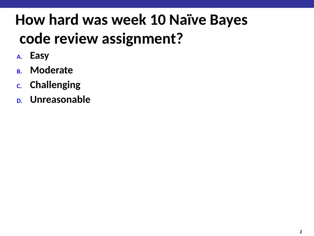
slide2. How hard was week 10 Naïve Bayes code review assignment? Easy
Moderate
Challenging
Unreasonable<br>
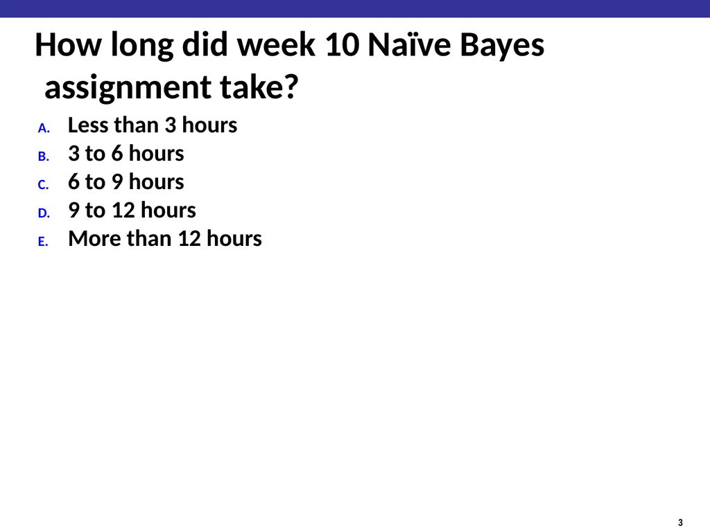
slide3. How long did week 10 Naïve Bayes assignment take? Less than 3 hours
3 to 6 hours
6 to 9 hours
9 to 12 hours
More than 12 hours<br>
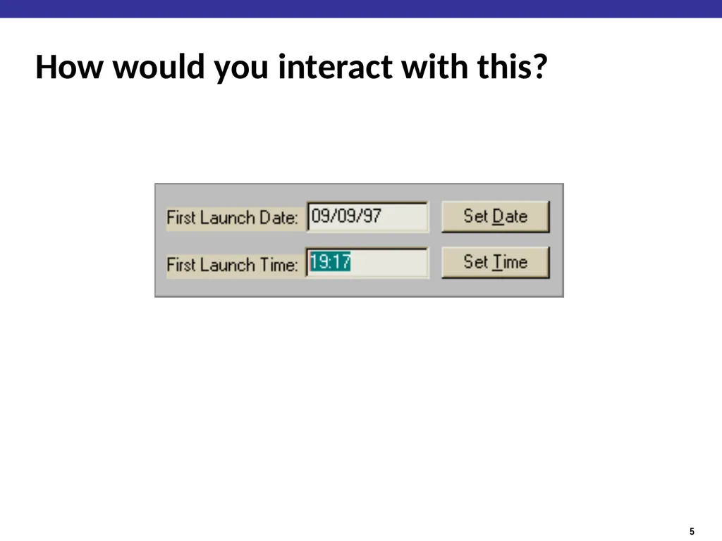
slide5. How would you interact with this?<br>
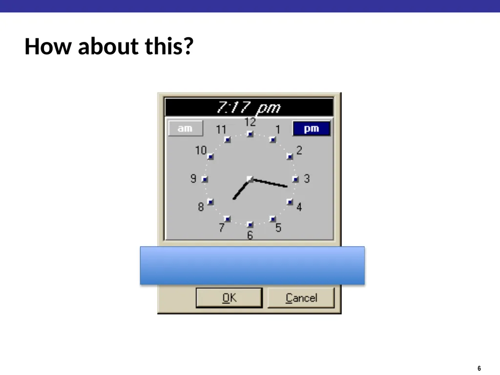
slide6. How about this?<br>
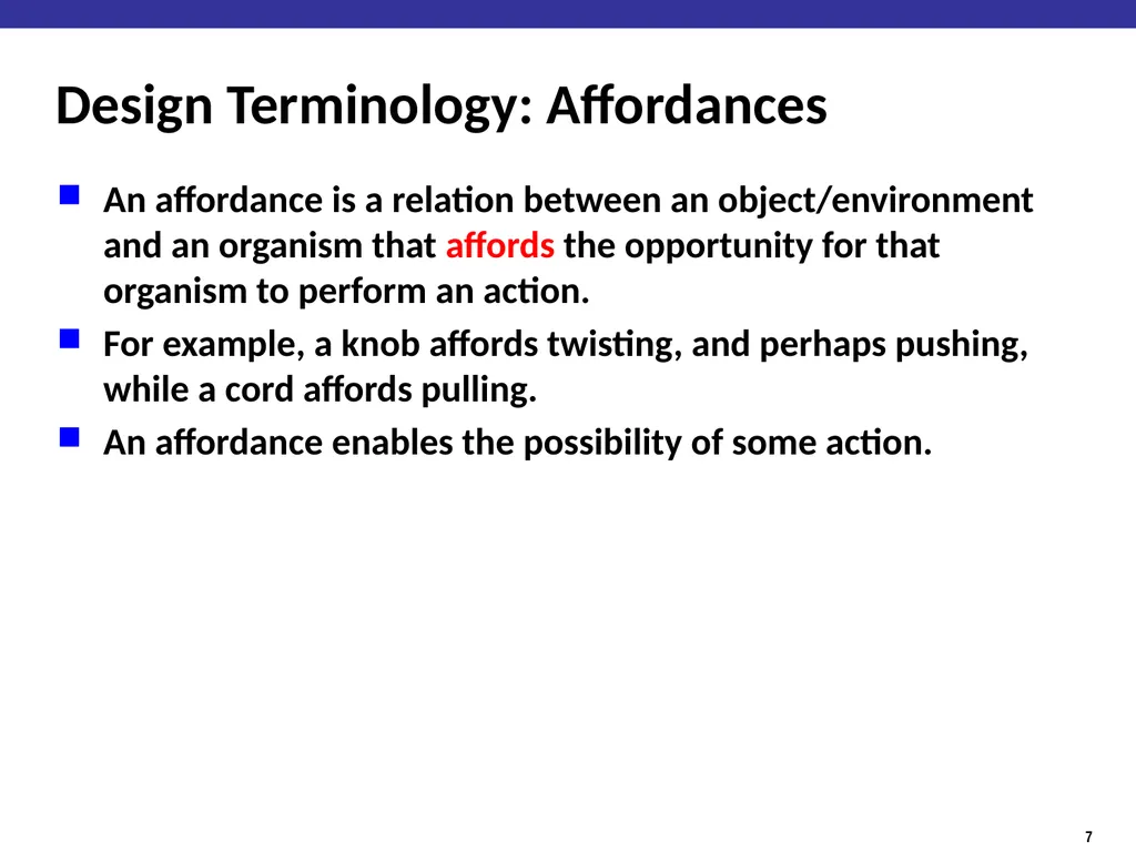
slide7. Design Terminology: Affordances An affordance is a relation between an object/environment and an organism that affords the opportunity for that organism to perform an action.
For example, a knob affords twisting, and perhaps pushing, while a cord affords pulling.
An affordance enables the possibility of some action.<br>
slide8. Design Terminology: Signifiers A "signifier" is some sort of indicator, some signal in the physical or social world that can be interpreted meaningfully<br>
slide9. User Experience design in a nutshell 1. Provide the affordances desired by users
2. Organize those affordances appropriately
“Information Architecture”
3. Make your affordances obvious through correct use of signifiers
Sounds pretty easy…<br>
slide10. User Experience Design is Hard Most users are not like you
Users can’t always tell you what they want
But, they can sure tell you what is wrong.
Consistent problems are the system’s fault<br>
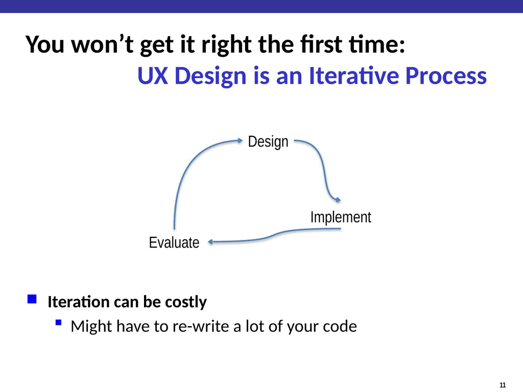
slide11. You won’t get it right the first time: UX Design is an Iterative Process Iteration can be costly
Might have to re-write a lot of your code Design Implement Evaluate<br>
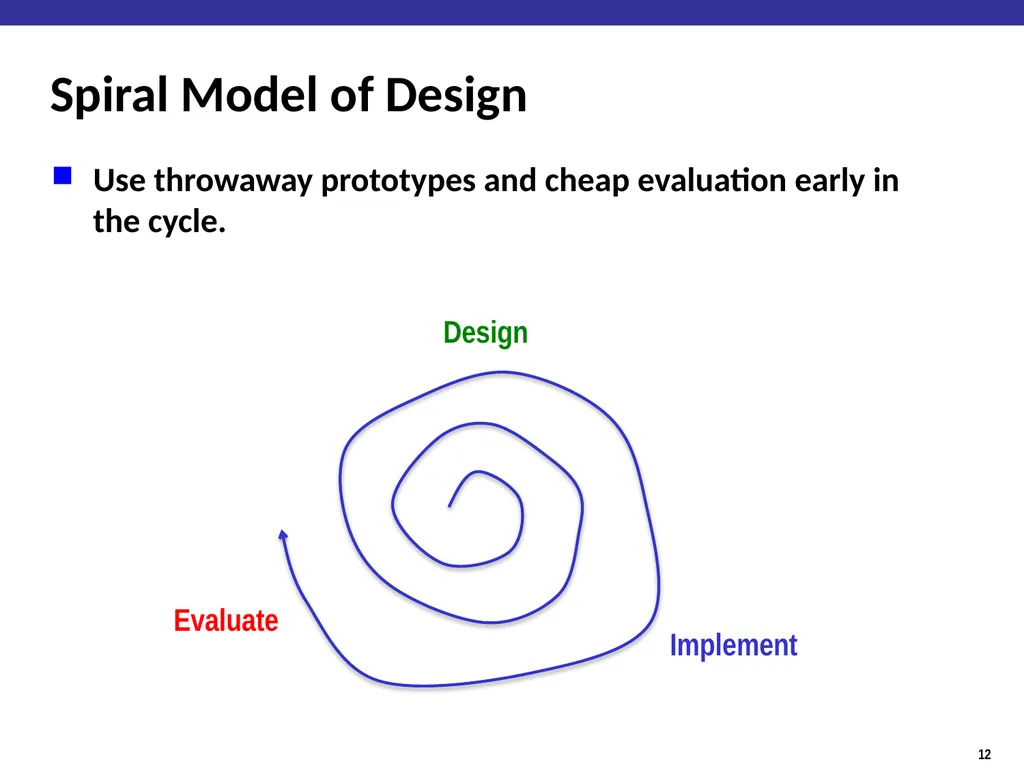
slide12. Spiral Model of Design Use throwaway prototypes and cheap evaluation early in the cycle. Design Implement Evaluate<br>
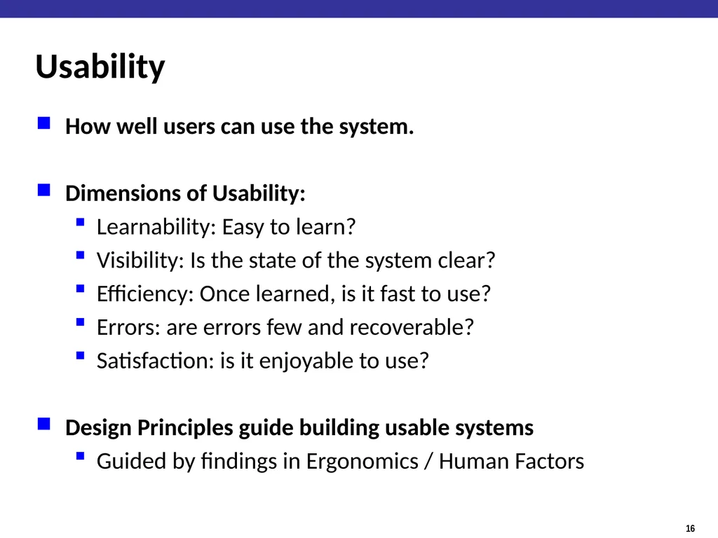
slide13. Usability How well users can use the system.
Dimensions of Usability:
Learnability: Easy to learn?
Visibility: Is the state of the system clear?
Efficiency: Once learned, is it fast to use?
Errors: are errors few and recoverable?
Satisfaction: is it enjoyable to use?
Design Principles guide building usable systems
Guided by findings in Ergonomics / Human Factors<br>
slide14. Ergonomics / Human Factors the scientific discipline concerned with the understanding of interactions among humans and other elements of a system
applies theory, principles, data and methods to design in order to optimize human well-being and overall system performance
Characterizes the capabilities and limitations of humans<br>
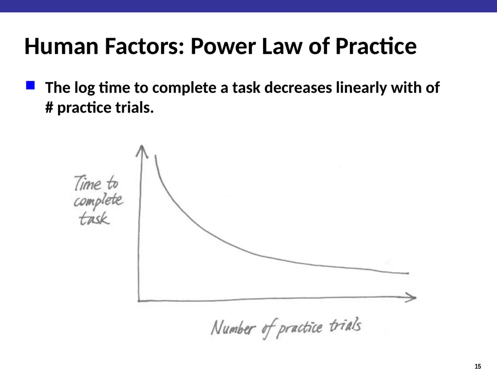
slide15. Human Factors: Power Law of Practice The log time to complete a task decreases linearly with of # practice trials.<br>
slide16. Usability How well users can use the system.
Dimensions of Usability:
Learnability: Easy to learn?
Visibility: Is the state of the system clear?
Efficiency: Once learned, is it fast to use?
Errors: are errors few and recoverable?
Satisfaction: is it enjoyable to use?
Design Principles guide building usable systems
Guided by findings in Ergonomics / Human Factors<br>
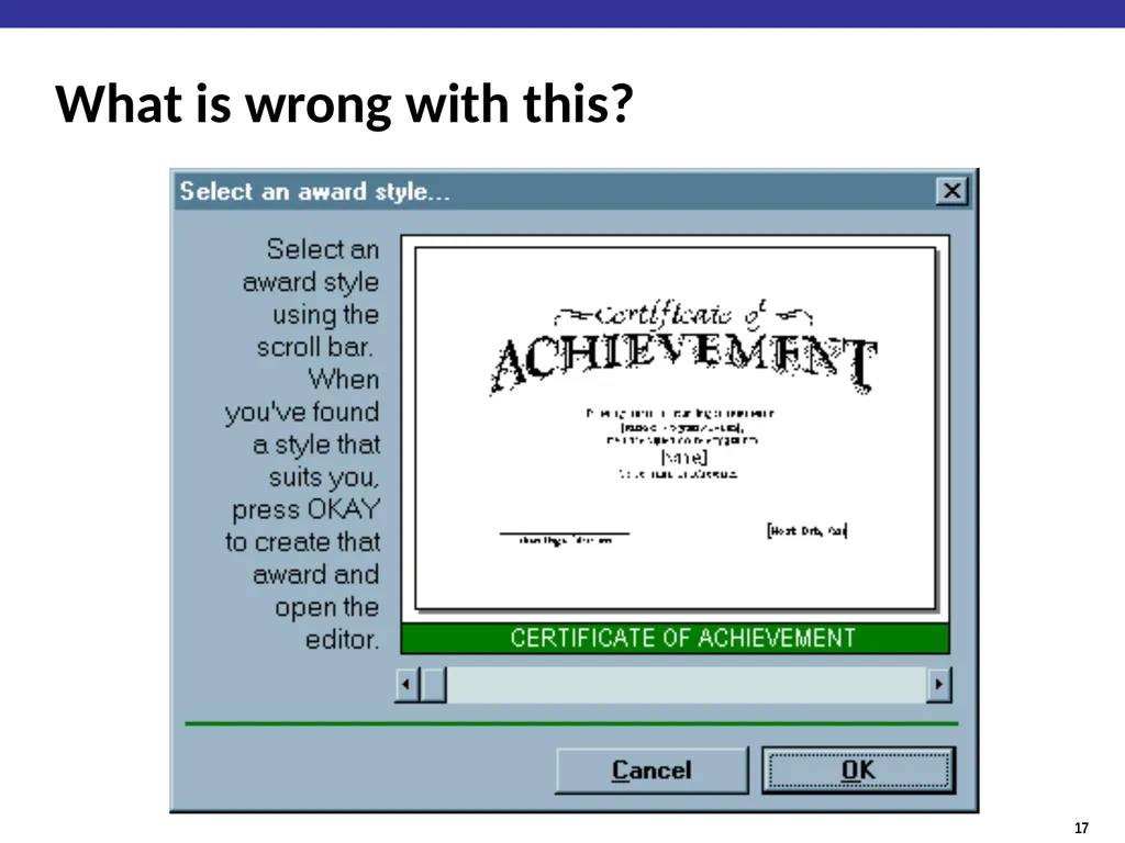
slide17. What is wrong with this?<br>
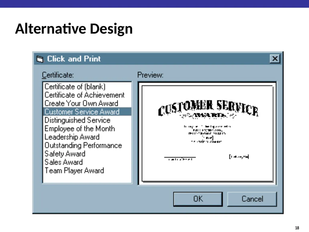
slide18. Alternative Design<br>
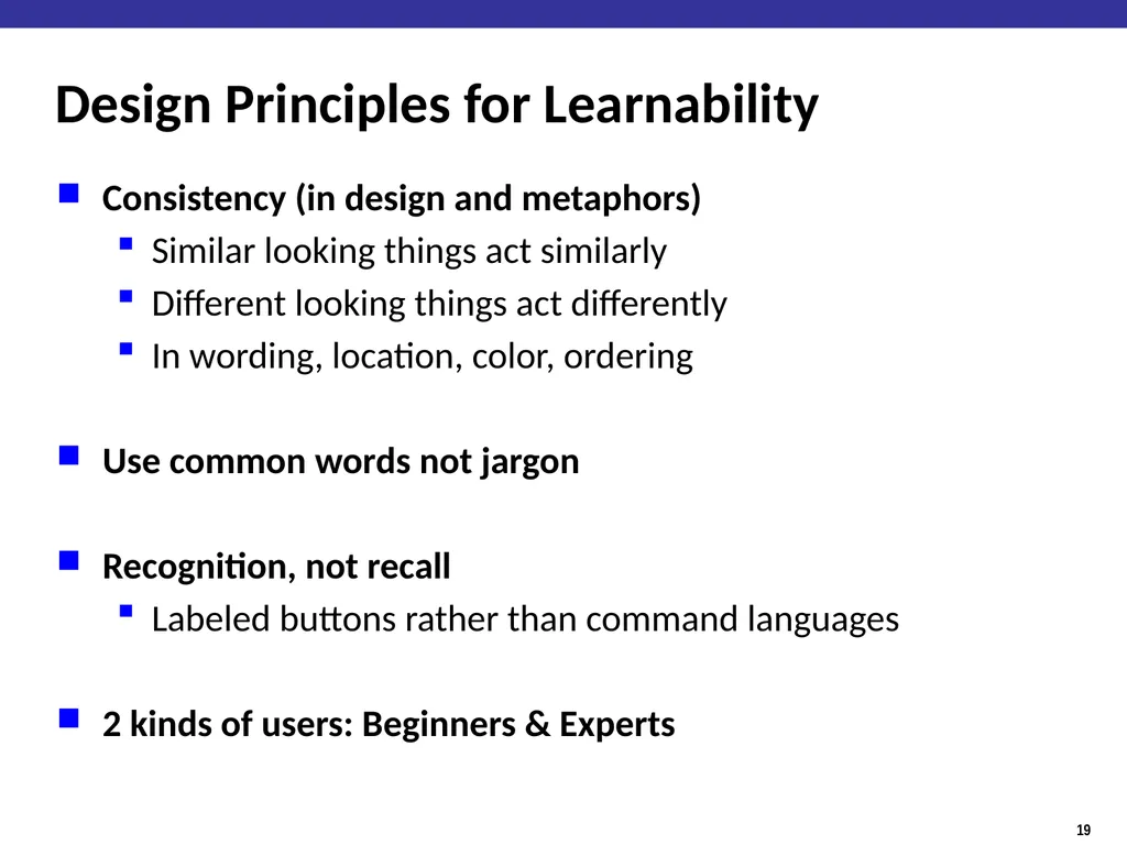
slide19. Design Principles for Learnability Consistency (in design and metaphors)
Similar looking things act similarly
Different looking things act differently
In wording, location, color, ordering
Use common words not jargon
Recognition, not recall
Labeled buttons rather than command languages
2 kinds of users: Beginners & Experts<br>
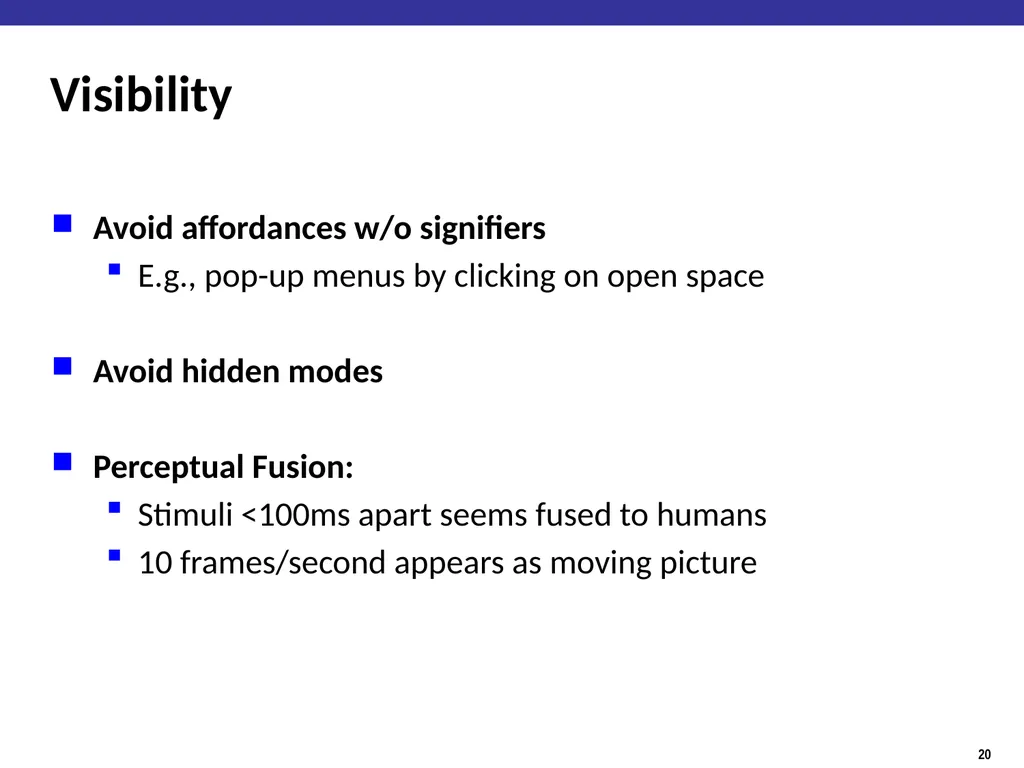
slide20. Visibility Avoid affordances w/o signifiers
E.g., pop-up menus by clicking on open space
Avoid hidden modes
Perceptual Fusion:
Stimuli <100ms apart seems fused to humans
10 frames/second appears as moving picture<br>
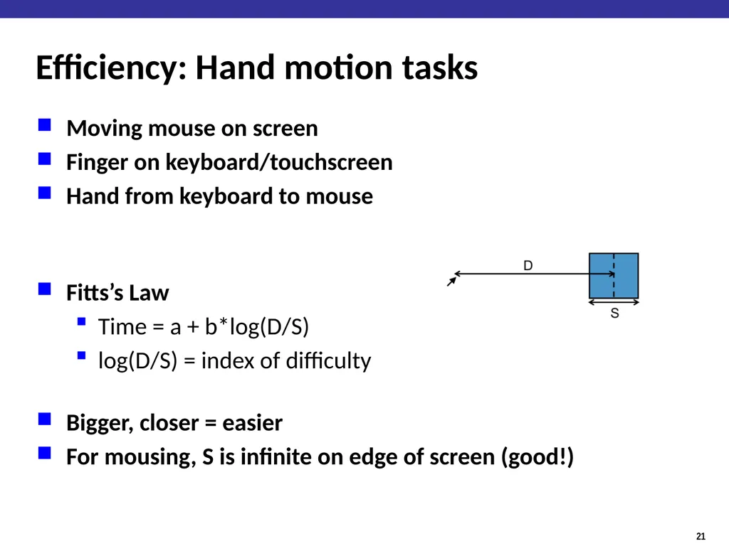
slide21. Efficiency: Hand motion tasks Moving mouse on screen
Finger on keyboard/touchscreen
Hand from keyboard to mouse
Fitts’s Law
Time = a + b*log(D/S)
log(D/S) = index of difficulty
Bigger, closer = easier
For mousing, S is infinite on edge of screen (good!)<br>
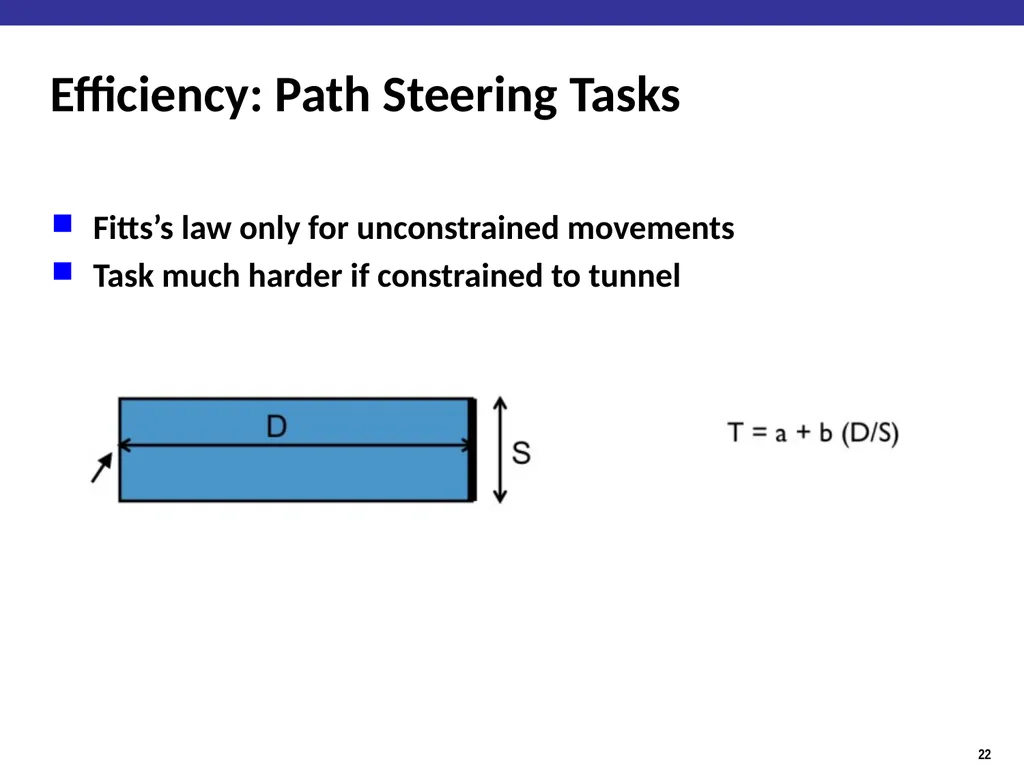
slide22. Efficiency: Path Steering Tasks Fitts’s law only for unconstrained movements
Task much harder if constrained to tunnel<br>
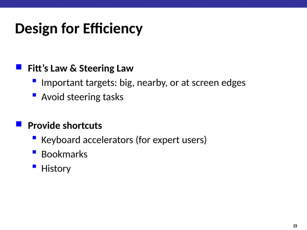
slide23. Design for Efficiency Fitt’s Law & Steering Law
Important targets: big, nearby, or at screen edges
Avoid steering tasks
Provide shortcuts
Keyboard accelerators (for expert users)
Bookmarks
History<br>
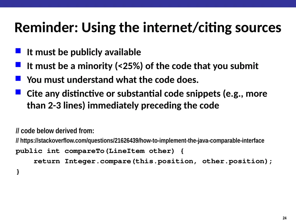
slide24. Reminder: Using the internet/citing sources It must be publicly available
It must be a minority (<25%) of the code that you submit
You must understand what the code does.
Cite any distinctive or substantial code snippets (e.g., more than 2-3 lines) immediately preceding the code
// code below derived from:
// https://stackoverflow.com/questions/21626439/how-to-implement-the-java-comparable-interface
public int compareTo(LineItem other) {
return Integer.compare(this.position, other.position);
}<br>
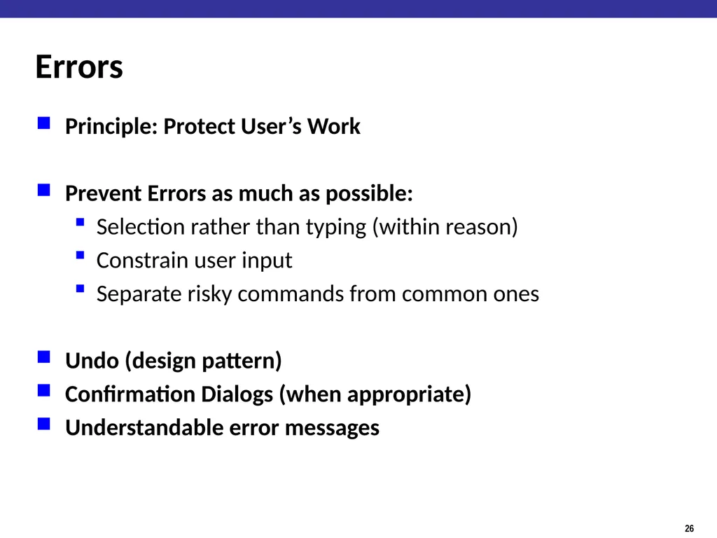
slide26. Errors Principle: Protect User’s Work
Prevent Errors as much as possible:
Selection rather than typing (within reason)
Constrain user input
Separate risky commands from common ones
Undo (design pattern)
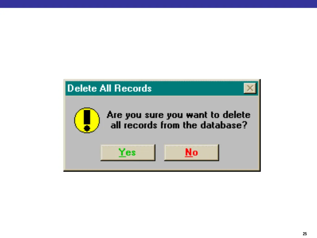
Confirmation Dialogs (when appropriate)
Understandable error messages<br>
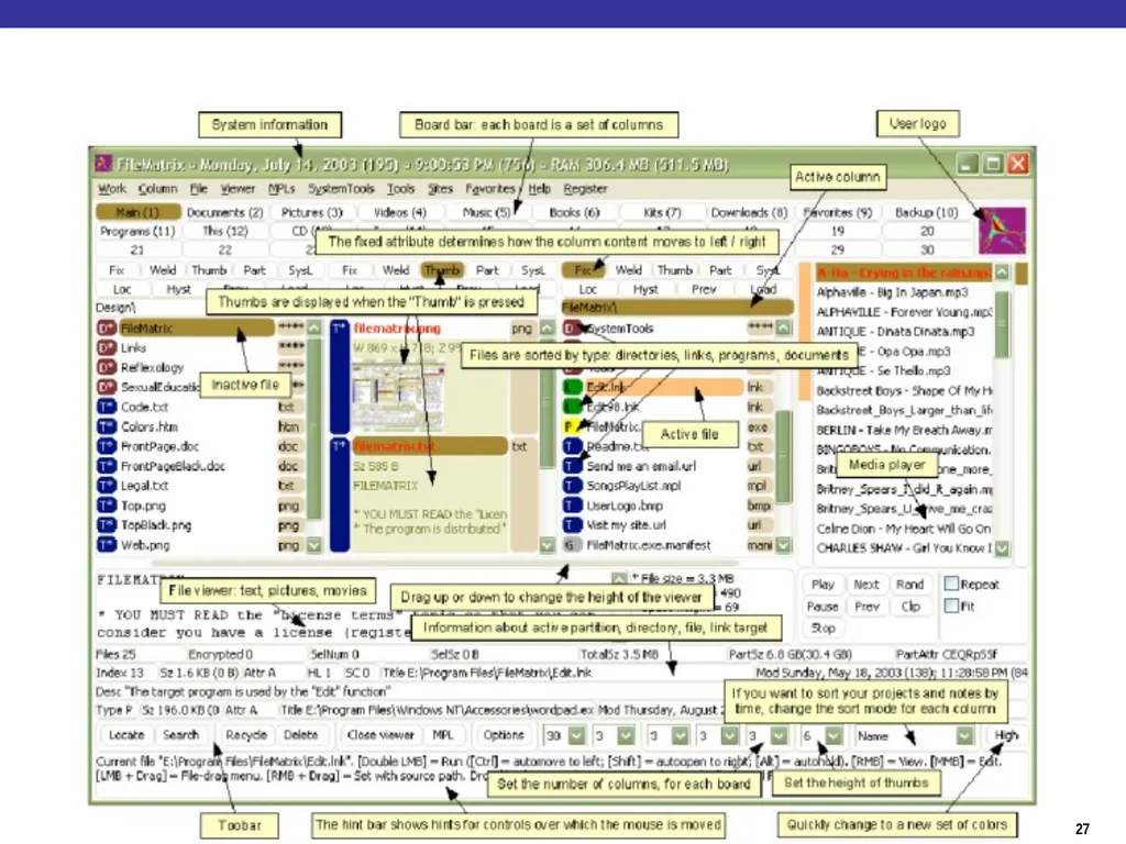
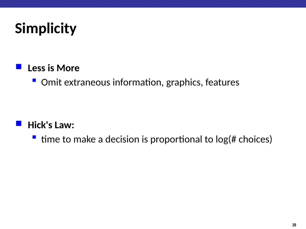
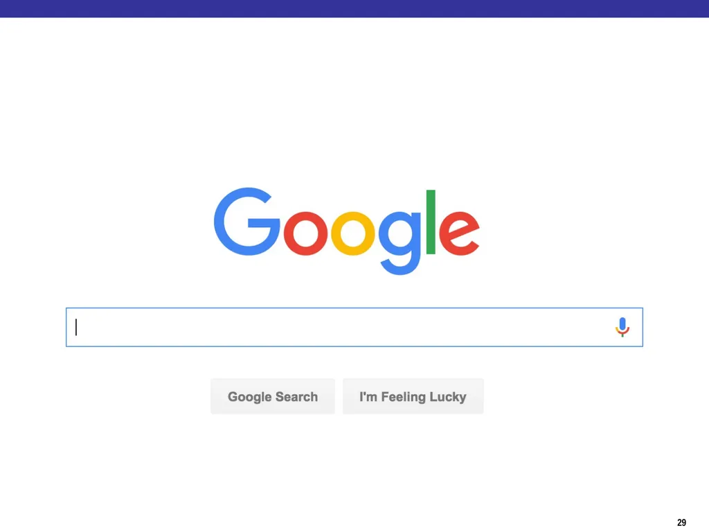
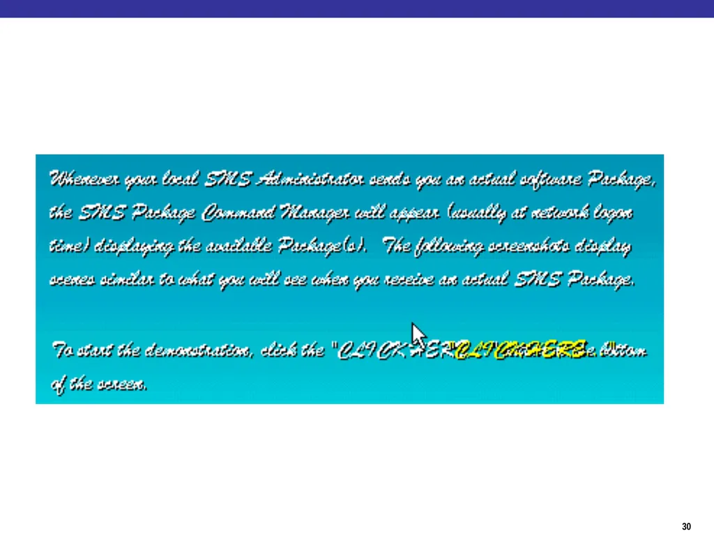
slide28. Simplicity Less is More
Omit extraneous information, graphics, features
Hick's Law:
time to make a decision is proportional to log(# choices)<br>
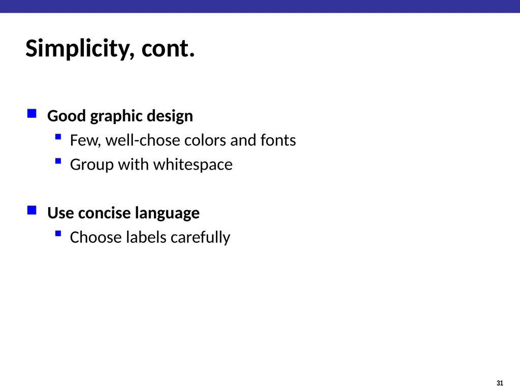
slide31. Simplicity, cont. Good graphic design
Few, well-chose colors and fonts
Group with whitespace
Use concise language
Choose labels carefully<br>
slide32. How not to design https://www.uxpin.com/studio/blog/10-worst-design-failures-of-all-times/<br>
slide33. How do users hold phones http://www.uxmatters.com/mt/archives/2013/02/how-do-users-really-hold-mobile-devices.php
http://scotthurff.com/posts/how-to-design-for-thumbs-in-the-era-of-huge-screens<br>
slide2. How hard was week 10 Naïve Bayes code review assignment? Easy
Moderate
Challenging
Unreasonable<br>
slide3. How long did week 10 Naïve Bayes assignment take? Less than 3 hours
3 to 6 hours
6 to 9 hours
9 to 12 hours
More than 12 hours<br>
slide5. How would you interact with this?<br>
slide6. How about this?<br>
slide7. Design Terminology: Affordances An affordance is a relation between an object/environment and an organism that affords the opportunity for that organism to perform an action.
For example, a knob affords twisting, and perhaps pushing, while a cord affords pulling.
An affordance enables the possibility of some action.<br>
slide8. Design Terminology: Signifiers A "signifier" is some sort of indicator, some signal in the physical or social world that can be interpreted meaningfully<br>
slide9. User Experience design in a nutshell 1. Provide the affordances desired by users
2. Organize those affordances appropriately
“Information Architecture”
3. Make your affordances obvious through correct use of signifiers
Sounds pretty easy…<br>
slide10. User Experience Design is Hard Most users are not like you
Users can’t always tell you what they want
But, they can sure tell you what is wrong.
Consistent problems are the system’s fault<br>
slide11. You won’t get it right the first time: UX Design is an Iterative Process Iteration can be costly
Might have to re-write a lot of your code Design Implement Evaluate<br>
slide12. Spiral Model of Design Use throwaway prototypes and cheap evaluation early in the cycle. Design Implement Evaluate<br>
slide13. Usability How well users can use the system.
Dimensions of Usability:
Learnability: Easy to learn?
Visibility: Is the state of the system clear?
Efficiency: Once learned, is it fast to use?
Errors: are errors few and recoverable?
Satisfaction: is it enjoyable to use?
Design Principles guide building usable systems
Guided by findings in Ergonomics / Human Factors<br>
slide14. Ergonomics / Human Factors the scientific discipline concerned with the understanding of interactions among humans and other elements of a system
applies theory, principles, data and methods to design in order to optimize human well-being and overall system performance
Characterizes the capabilities and limitations of humans<br>
slide15. Human Factors: Power Law of Practice The log time to complete a task decreases linearly with of # practice trials.<br>
slide16. Usability How well users can use the system.
Dimensions of Usability:
Learnability: Easy to learn?
Visibility: Is the state of the system clear?
Efficiency: Once learned, is it fast to use?
Errors: are errors few and recoverable?
Satisfaction: is it enjoyable to use?
Design Principles guide building usable systems
Guided by findings in Ergonomics / Human Factors<br>
slide17. What is wrong with this?<br>
slide18. Alternative Design<br>
slide19. Design Principles for Learnability Consistency (in design and metaphors)
Similar looking things act similarly
Different looking things act differently
In wording, location, color, ordering
Use common words not jargon
Recognition, not recall
Labeled buttons rather than command languages
2 kinds of users: Beginners & Experts<br>
slide20. Visibility Avoid affordances w/o signifiers
E.g., pop-up menus by clicking on open space
Avoid hidden modes
Perceptual Fusion:
Stimuli <100ms apart seems fused to humans
10 frames/second appears as moving picture<br>
slide21. Efficiency: Hand motion tasks Moving mouse on screen
Finger on keyboard/touchscreen
Hand from keyboard to mouse
Fitts’s Law
Time = a + b*log(D/S)
log(D/S) = index of difficulty
Bigger, closer = easier
For mousing, S is infinite on edge of screen (good!)<br>
slide22. Efficiency: Path Steering Tasks Fitts’s law only for unconstrained movements
Task much harder if constrained to tunnel<br>
slide23. Design for Efficiency Fitt’s Law & Steering Law
Important targets: big, nearby, or at screen edges
Avoid steering tasks
Provide shortcuts
Keyboard accelerators (for expert users)
Bookmarks
History<br>
slide24. Reminder: Using the internet/citing sources It must be publicly available
It must be a minority (<25%) of the code that you submit
You must understand what the code does.
Cite any distinctive or substantial code snippets (e.g., more than 2-3 lines) immediately preceding the code
// code below derived from:
// https://stackoverflow.com/questions/21626439/how-to-implement-the-java-comparable-interface
public int compareTo(LineItem other) {
return Integer.compare(this.position, other.position);
}<br>
slide26. Errors Principle: Protect User’s Work
Prevent Errors as much as possible:
Selection rather than typing (within reason)
Constrain user input
Separate risky commands from common ones
Undo (design pattern)
Confirmation Dialogs (when appropriate)
Understandable error messages<br>
slide28. Simplicity Less is More
Omit extraneous information, graphics, features
Hick's Law:
time to make a decision is proportional to log(# choices)<br>
slide31. Simplicity, cont. Good graphic design
Few, well-chose colors and fonts
Group with whitespace
Use concise language
Choose labels carefully<br>
slide32. How not to design https://www.uxpin.com/studio/blog/10-worst-design-failures-of-all-times/<br>
slide33. How do users hold phones http://www.uxmatters.com/mt/archives/2013/02/how-do-users-really-hold-mobile-devices.php
http://scotthurff.com/posts/how-to-design-for-thumbs-in-the-era-of-huge-screens<br>