Quantitative Qualitative Assessment ROC Curve Analysis, and Visual Inspection Version: 05 25, 2018 Disclaimer To simplify the process for us, we assume each landslide point translates to a single landslide pixel. This material can be a
"Quantitative & Qualitative Assessment ROC Curve" is the property of its rightful owner. Permission is granted to
download and print the materials on this website for personal, non-commercial use only, and to display it
on your personal computer provided you do not modify the materials and that you retain all copyright
notices contained in the materials. By downloading content from our website, you accept the terms of this
agreement.
Disclaimer To simplify the process for us, we assume each landslide point translates to a single landslide pixel.
This material can be a bit confusing! Ask questions, and take careful notes!<br>
03
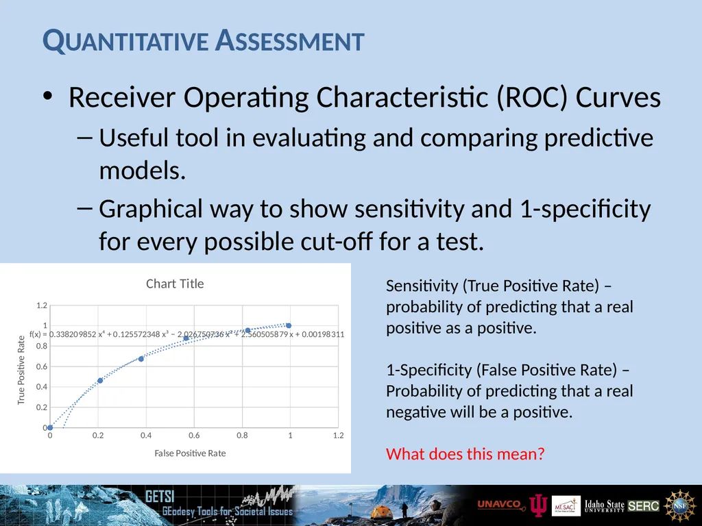
Quantitative Assessment Receiver Operating Characteristic (ROC) Curves
Useful tool in evaluating and comparing predictive models.
Graphical way to show sensitivity and 1-specificity for every possible cut-off for a test. Sensitivity (True Positive Rate) – probability of predicting that a real positive as a positive.
1-Specificity (False Positive Rate) – Probability of predicting that a real negative will be a positive.
What does this mean?<br>
04
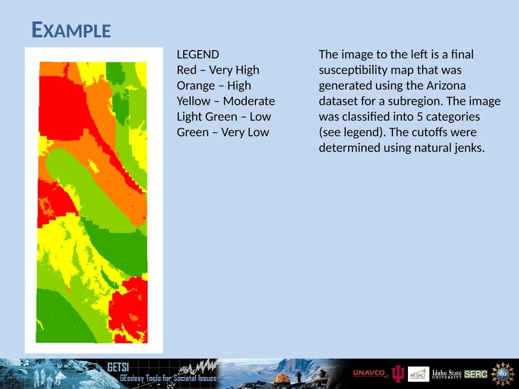
Example LEGEND
Red – Very High
Orange – High
Yellow – Moderate
Light Green – Low
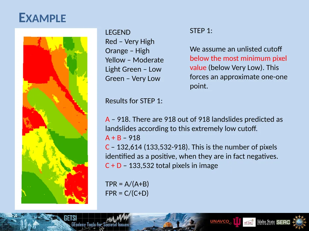
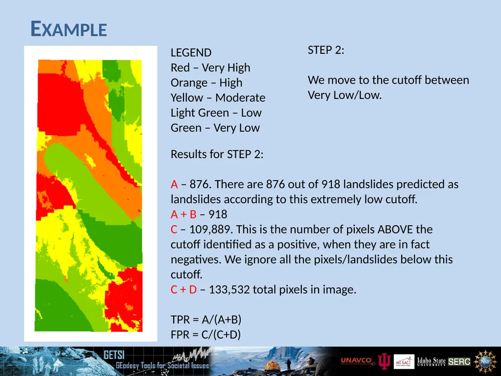
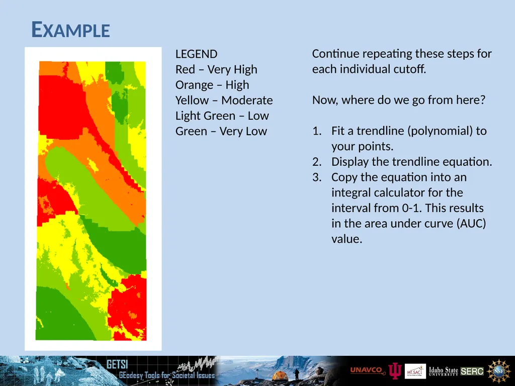
Green – Very Low The image to the left is a final susceptibility map that was generated using the Arizona dataset for a subregion. The image was classified into 5 categories (see legend). The cutoffs were determined using natural jenks.<br>
05
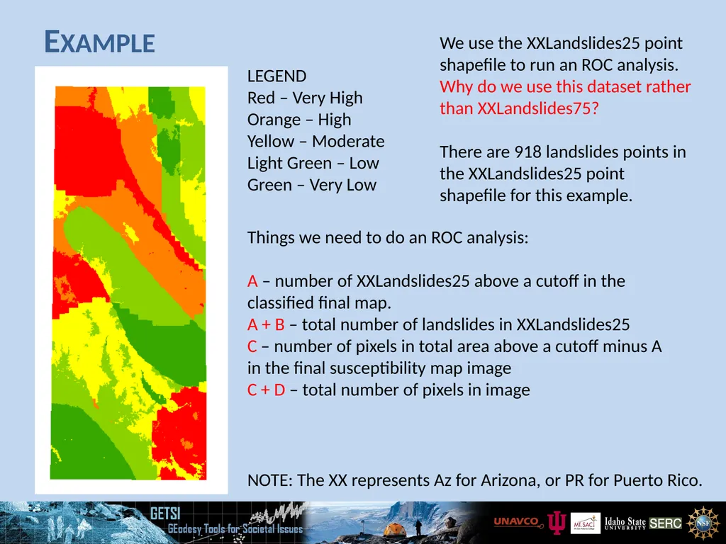
Example LEGEND
Red – Very High
Orange – High
Yellow – Moderate
Light Green – Low
Green – Very Low We use the XXLandslides25 point shapefile to run an ROC analysis. Why do we use this dataset rather than XXLandslides75?
There are 918 landslides points in the XXLandslides25 point shapefile for this example. NOTE: The XX represents Az for Arizona, or PR for Puerto Rico. Things we need to do an ROC analysis:
A – number of XXLandslides25 above a cutoff in the classified final map.
A + B – total number of landslides in XXLandslides25
C – number of pixels in total area above a cutoff minus A in the final susceptibility map image
C + D – total number of pixels in image<br>
06
Example LEGEND
Red – Very High
Orange – High
Yellow – Moderate
Light Green – Low
Green – Very Low STEP 1:
We assume an unlisted cutoff below the most minimum pixel value (below Very Low). This forces an approximate one-one point. Results for STEP 1:
A – 918. There are 918 out of 918 landslides predicted as landslides according to this extremely low cutoff.
A + B – 918
C – 132,614 (133,532-918). This is the number of pixels identified as a positive, when they are in fact negatives.
C + D – 133,532 total pixels in image
TPR = A/(A+B)
FPR = C/(C+D)<br>
07
Example LEGEND
Red – Very High
Orange – High
Yellow – Moderate
Light Green – Low
Green – Very Low STEP 2:
We move to the cutoff between Very Low/Low. Results for STEP 2:
A – 876. There are 876 out of 918 landslides predicted as landslides according to this extremely low cutoff.
A + B – 918
C – 109,889. This is the number of pixels ABOVE the cutoff identified as a positive, when they are in fact negatives. We ignore all the pixels/landslides below this cutoff.
C + D – 133,532 total pixels in image.
TPR = A/(A+B)
FPR = C/(C+D)<br>
08
Example LEGEND
Red – Very High
Orange – High
Yellow – Moderate
Light Green – Low
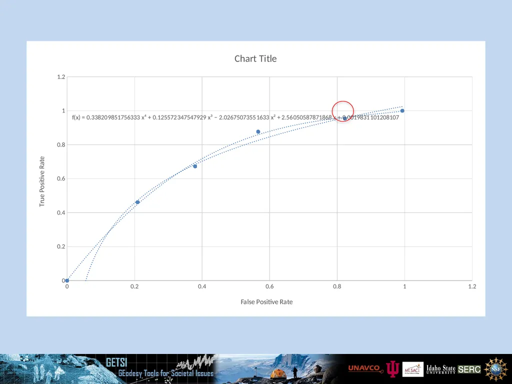
Green – Very Low Continue repeating these steps for each individual cutoff.
Now, where do we go from here?
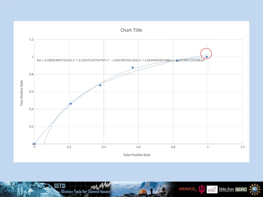
Fit a trendline (polynomial) to your points.
Display the trendline equation.
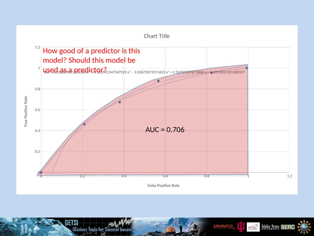
Copy the equation into an integral calculator for the interval from 0-1. This results in the area under curve (AUC) value.<br>
09
What Does the AUC Mean? A value less than 0.5 should not be possible.
Values from 0.5 – 0.6 mean the model is not a good predictor.
Values from 0.6 – 0.7 mean the model is OK as a predictor, but not ideal.
Values 0.7- 0.8 mean the model is a good predictor.
Values in excess of 0.8 mean the model is a great predictor.
A value of 1.0 means the model is an excellent predictor.<br>
10
AUC = 0.706 How good of a predictor is this model? Should this model be used as a predictor?<br>
11
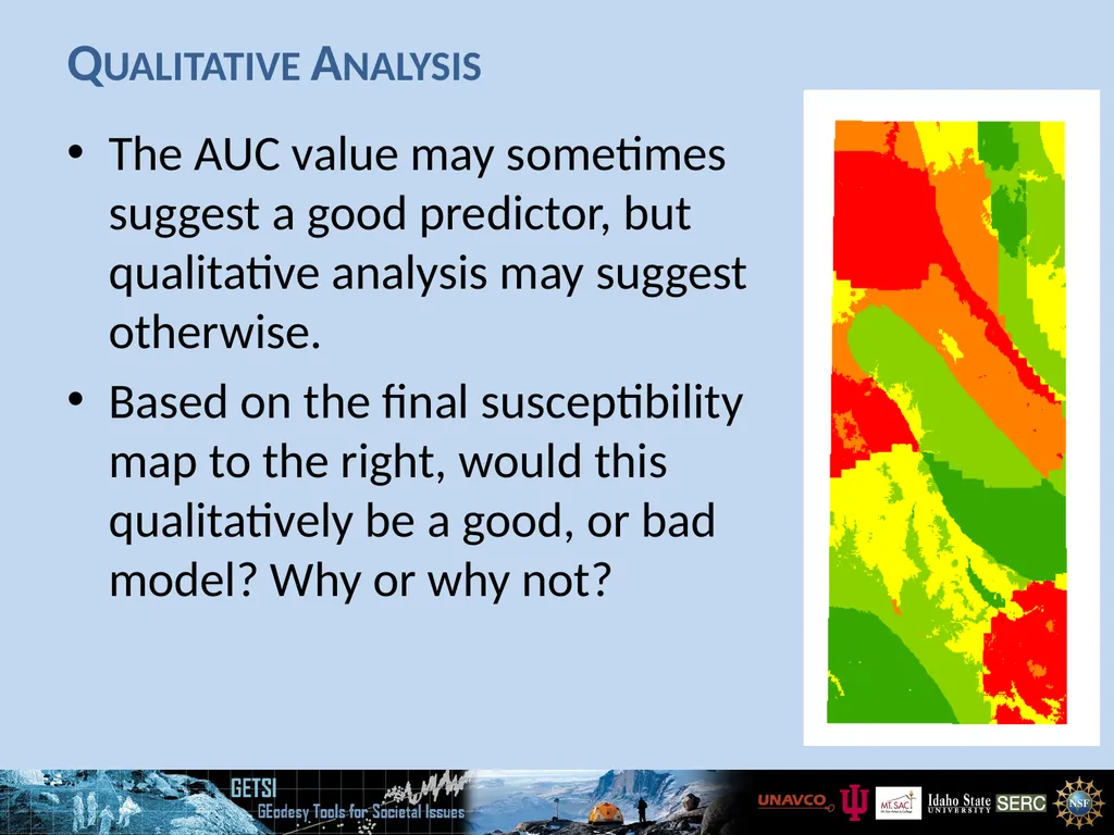
Qualitative Analysis The AUC value may sometimes suggest a good predictor, but qualitative analysis may suggest otherwise.
Based on the final susceptibility map to the right, would this qualitatively be a good, or bad model? Why or why not?<br>